
Do you want to know the mistakes to avoid when selecting white? This is the question I am asked the most, either through this blog, or when I am working with clients – ‘which white should I use?' Decorating with white colour palettes is very popular for all styles, whichever country you are in. Whether you prefer an Australian Coastal or Country style, an East Coast American Hamptons look, the ever popular Scandi style or a slick inner city urban look – you will be faced with the same dilemma. Which white should I choose?
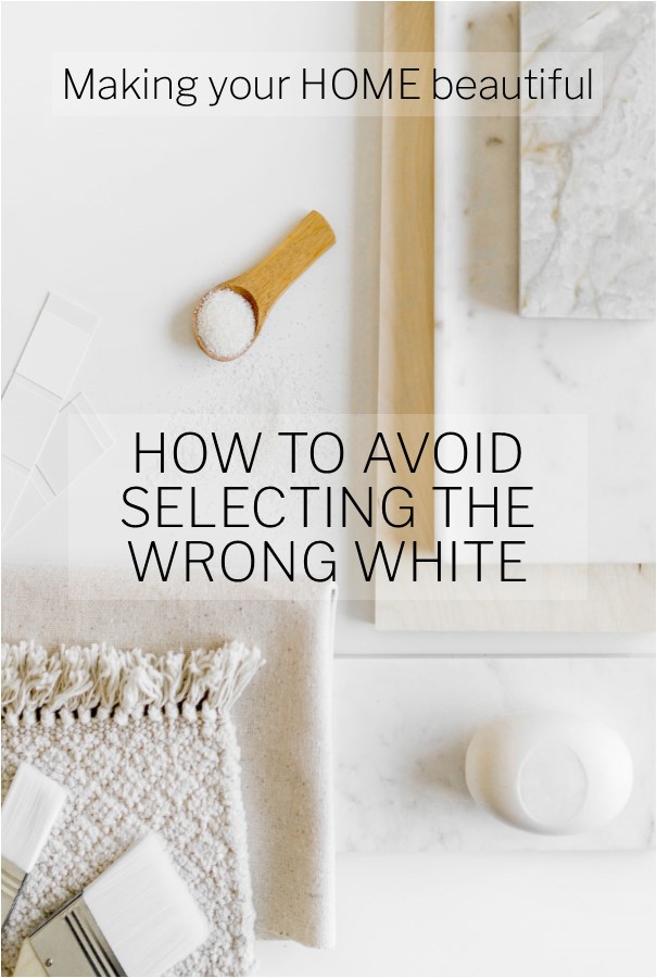
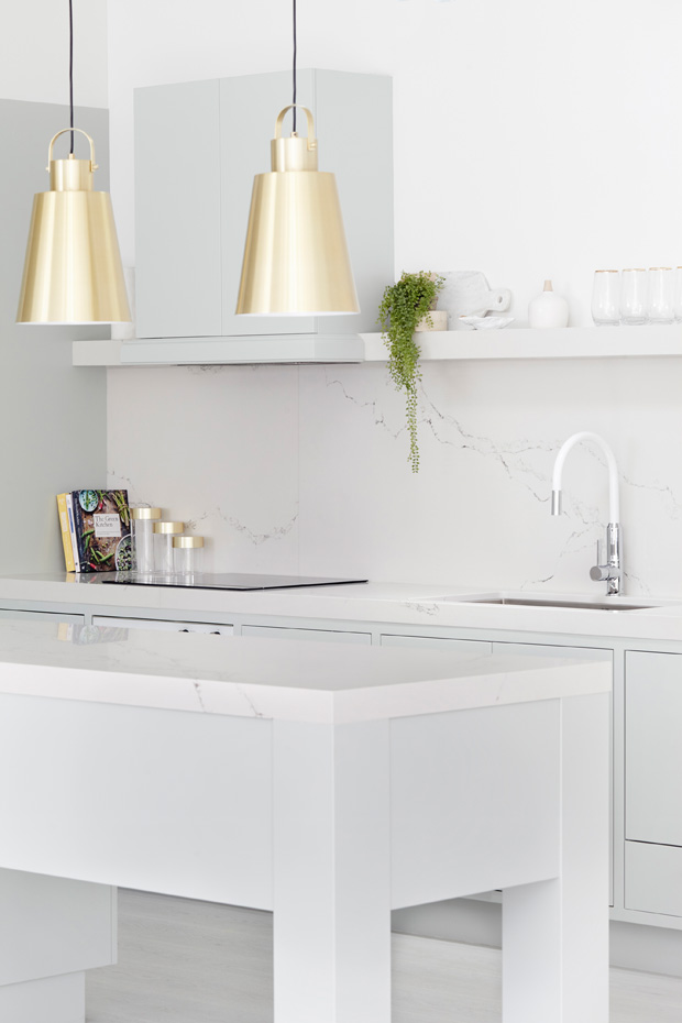
I have already written an in-depth article on my blog about how to select the right white but I thought it would be really useful, from the experience that I have, to just list the 5 biggest mistakes to avoid when selecting white. This beautiful kitchen below from Three Birds Renovations demonstrates how great white looks when you get it right.
Mistakes to avoid when choosing white paint
- Looking at the white sample in isolation. You must view your whole colour palette as one. Therefore you should pull together all the finishes that you plan to use for your new scheme. Start with the floor as this is the base for your scheme. Then consider your kitchen cabinets – if these are new, are you using a melamine, in which case your selection is a little more limited, or do you have a two pack polyurethane painted finish that can be any colour? Now consider your benchtop, splashback, pieces of furniture you already have, for example sofas, chair, upholstered bedhead etc. Consider rugs and accessories that you either have to work around or would like to purchase. Only make your selection of white paint once you have all of these items together. It is much easier to see the flow of the palette as a whole, rather than just choosing a white that you have seen work in a friend's house or magazine.
- Viewing the sample in a small colour chip. You really can't see the underlying colour when you view the sample in a small amount. All neutrals will have a base and you have to see the colour in an A4 size or larger and view this against a pure white background, for example a plain piece of paper, to really appreciate the underlying colour. You will be surprised how the creamy yellow tones, grey or blue tones etc will jump out at you in a way they wouldn't when viewed as a small paint chip on a colour card.
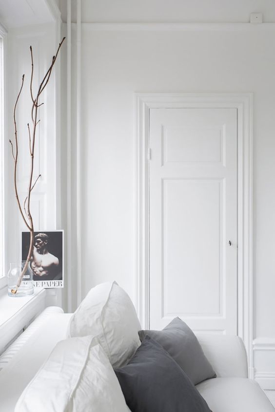
- Using the same white throughout without varying the textural finishes. This can leave you with a scheme that works together colourwise but doesn't work for the room as it is too flat. If you use just one colour or tone, ensure that you introduce different finishes. For example if you have brick feature walls, you can simply paint these white and then use the same white on a plastered wall to great effect. Consider your soft furnishings and rugs and use various layers of texture to create interest. This way you can have a completely white room that will look great. With such a simple palette, don't underestimate the impact that introducing another colour will bring. For example, just a touch of black in a scheme like this can look fantastic as the strong tonal variation is very striking.
- Using a cool white palette in an area of your home that tends to be cold and doesn't receive a lot of natural light or a warm palette in a hot and sunny area. Ensure that you consider the aspect of the space before you select the colour palette – you may love cool, almost grey or blue colour palettes but the effect could be awful if the aspect is not right. You can still achieve a cool, fresh look, you may just have to adjust the amount of grey. Don't feel that you have to keep your entire colour palette either warm or cool. Just go predominantly with one to create a theme but don't be afraid to mix it up a little. Remember opposites attract but as far as interiors are concerned they are best suited in an 80/20 mix.
- Not considering your ceiling colour. A ceiling white will often include a touch of grey or even blue and I find that this can sometimes throw the entire scheme. You can follow all the rules above and then ruin it by not considering the ceiling and cornice. Remember that in addition to your wall colour meeting the ceiling, kitchen cabinets will also often reach to the ceiling too. The white you choose for walls, cabinetry, internal doors and trim therefore must relate to this all important area.
The difference between a cool and a warm white colour palette
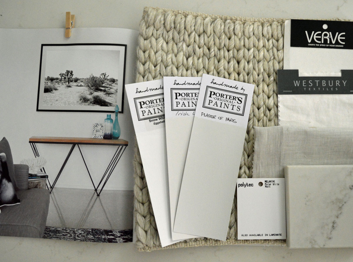
A picture speaks a thousand words and you can see the difference between this cool white palette and the warm colour palette below. You can also see how beneficial it is to put everything that you plan to use together, including inspiration from magazines of what you would like to achieve for your home.
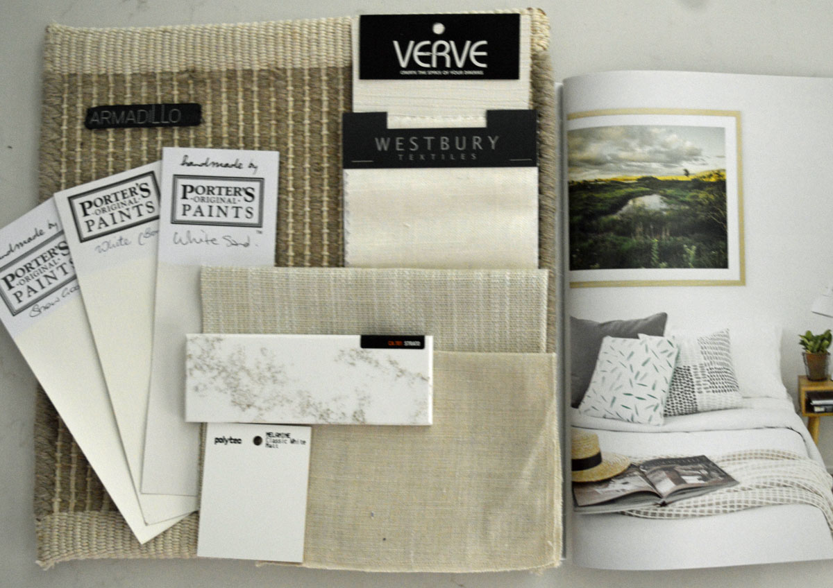
Lovers of the modern grey trend can see from this colour palette that although your room aspect may demand a warmer colour palette, you can still introduce some grey. You just need to ensure that the basics are warm – remember that 80/20 rule for opposites.
For example, a warm timber frame with a lovely warm grey throw balances the scheme nicely. The benchtop sample too has beautiful warm gold tones running through it but is still essentially grey.
A beautiful cool simple living room scheme. Slip wash covers that can be removed for washing or dry cleaning are a good idea here!
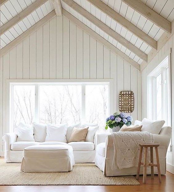
A gorgeous warm living room scheme – I could quite happily spend an afternoon in this room. There are the white slip covers again – a must for this type of look! And remember what I said about varying textures to introduce interest in a simple colour palette – this beautiful image demonstrates the point perfectly.
Remember point 5? I go into more detail about this here. What colour do I paint my ceiling?
Related: What colour do I paint my skirting boards and architraves?
When considering the mistakes to avoid when selecting white, do not forget your internal doors. Often these are part of a white colour palette. Find out how to treat them here.
Point 3 discussed introducing texture. You can do this by painting your bricks white.
I hope that by highlighting the 5 biggest mistakes people make when selecting the right white that you now have more confidence when choosing your colour scheme. Remember not to work against the environment that you have, rather embrace it and find the right white to complement it, so that the space is one that you love to spend time in.
For a more in-depth article you should read the following: How to find the right white
Don't forget the outside – just as important when selecting white paint:
Avoid the mistakes when selecting white by putting together a mood board – I have a FREE e-book for you to download here which tells you all about how to put one together.
Still confused? I have an online colour consultation service where I review your photos and problems on a one-one basis. Find out more here
Hi I love your ideas! Could you give me some advice about white please? I have white kitchen cabinets with frosty carina bench and splash back and stainless steel appliances and kick boards, and 2 beautiful grey lamps above the breakfast bar from Norman Copenhagen. Now trying to decide on s white for the ceiling , walls and trims. The floor is a warming walnut but not throwing very much red. Do you think that Dulux snowy mountains would be a good pick? In half or quarter? And we have chocolate coloured exposed beams on the raked ceiling , will these match with a ceiling white??? Thankyou for your advice!
Hi Elaine I like to avoid ceiling white and prefer to go for a quarter strength of what you have on the walls. If you like the Snowy Mountains range then have half strength on the walls and quarter on the trim and ceiling. Make sure you try a sample out next to your white kitchen cabinets though as these could have an underlying colour and you need to ensure it will work with the walls. Good luck! Samantha
Hi Sam, thanks for being a life saver in this beautiful world of color.
We are in process of renovating a federation style home with a classic look. We have 2pac white gloss Hampton style kitchen, calacutta classic benchtop and splashback, oak floors. North facing kitchen. Looking to paint Vivid White for ceiling, walls – Antique white USA. Not sure whether doors to paint vivid white (semi gloss) or Antique white USA with trims and skirts (semi gloss) for the contrast.
With sincere thanks.
Hi Mary if you choose Vivid White for your trims and internal doors it will make the Antique White appear a little darker and will tie in your kitchen colours into the scheme. If everything is in Antique White, you don’t notice the depth of the AW as much. There isn’t a right or wrong – all in one colour is more subtle but the contrast of Vivid White would give you more of a classic Hamptons look. Good luck Samantha
Hi Samantha,
thanks for the article on choosing whites. I’m putting a white kitchen into a new build. Have chosen Lexicon half for the walls. I can’t afford 2-pac to paint the cabinets to match. Do you think Chalk white laminex would be ok? The bench top is Ash concrete by Essastone or similar. Hope you can help me. Thanks,
Mary
Hi Mary Chalk White will be fine with Dulux Lexicon Half – Laminex has put together a range of whites to match the Dulux colours and this is their recommendation. All sounds good – hope you love your new kitchen Samantha
Hi Samantha,
I’m stuck in 2 minds.
Dulux vivid white- walls, trims, ceilings, doors (everything!!)
Or
Dulux vivid white ceilings and trims with a warmer white on the walls such a Dulux natural white.
Your opinion is so so appropriated! Xx
Hi Gordana It really depends whether you want to see a contrast or not. A very ultra contemporary space would be all in pure white. But if you prefer a slightly more relaxed look then it’s good to have a slight contrast for the walls. Dulux Vivid White doesn’t have much, if any, pigment and therefore it can need a few coats to get the finish right so this may be something to bear in mind too. Think about the overall look and feel that you want and this may help you decide. Good luck Samantha
Hi Samantha
Thanks for your insightful article.
We are wanting to paint for a more hamptons style. I was thinking Vivid White for trims, architraves and ceiling and either grand Piano, hog bristle or white beach quarter or antique white USA for walls. I have a taupe couch with white furniture and a white kitchen in Polytec Oberon in classic white . Your thoughts are appreciated
Hi Lisa Classic White kitchen cabinets are easy to match so the main thing to bear in mind is the taupe sofa. My pick would probably be White Beach Quarter so perhaps start with a sample of this and check it next to the sofa. Good luck Samantha
Hi Samantha,
Thank you for your generous insight and experience that you share with us all on your website. I have referred back to your blog a number of times whilst making colour decisions. I have a question that I can’t seem to resolve and so have decided to take an internet leap and ask for your opinion. We are restoring a late 19th century Victorian home in South Aus: pine floors with black japanning, large skirts, cornices and roses, North facing windows in all rooms (except west faced living), very long/wide hallway with no windows (filtered light from front door, back door and respective bedrooms). We get the most beautiful light in this house and deciding on the right whites vs our preference vs what is right for the house has been a challenge. In the end we have gone with the tried and true favourite ‘Dulux Natural White’ for nearly all of the rooms. My Q is, we have bought Vivid White for the trim, however after painting one door I think it is too stark for this Victorian home. Do you have a white for the trim that you would recommend? Or, is it better to stick with Natural at 1/2? Thank you very much for your help!
PS: We have also gone to the dark side… we will be painting our entire lounge room Porter’s Paint ‘Black Blue’! We were inspired by both what the house is ‘asking’ for as well as your blogs on dark paint/manipulating mood, etc.
Hi Adelle Yes – I can see from the description of your beautiful home that Vivid White will definitely be too stark. Half strength of Dulux Natural White should work well or try White Polar Quarter which will be similar. Just try a litre of the paint on one door to check you like the effect. I’m so glad you have made the plunge with a dark colour. I lived in a Victorian home in Melbourne for a while and used dark colours in some rooms and it looked amazing. Glad you are finding the blog useful! Hope this helps Samantha
Deciding to paint interior of house white throughout but not sure what colour white – I have beige/fawn (couch) with beige/black and white cushions – bedroom is white cover with grey / mustard throw rugs black curtains ?- please help walls and door frames plus skirtings
Thanking you ❤️
Hi Renee You have some nice warm colours – beige and mustard so a warm white would work well and you can just use the same throughout and keep it light and simple. You need to consider how much light the house receives but generally I would recommend a warmer white, particularly with these tones. Either Dulux Natural White or Dulux Whisper White if you want a touch more grey in it. Both lovely whites so try a sample of these and see what you think. Hope this helps Samantha
Hi Samantha, my husband has painted in our TV room a feature wall of Dulux Metallic Stella Glow. Am trying to find just the right white to paint the rest of the walls so not to clash with this.
A lot of the whites I tried through yellow or cream and didn’t enhance the Stella Glow. We will be also painting the rest of our house white.
We have very soft grey/white floor tiles throughout and kitchen bench stone top is similar colour.
I have narrowed it down to Natural White and Casper White Quarter .??
Also would appreciate your thoughts and also for window frames and skirting boards.
Thank you Samantha
Glenys
Hi Glenys I think you should opt for Dulux Casper White Quarter with the Metallic Stella Glow and I would just continue this on the architraves and skirting boards but in a semi gloss so that you get a slightly different finish and therefore a touch of contrast. Good luck Samantha
I really enjoy your posts. My painter is suggesting lexicon half for the walls, to make my house bright and fresh, however, I’m a bit concerned, my kitchen is warm white cupboards and warm soft green upper cupboards in jute and kitchen tops in Limestone Coupe in gloss. My floor is Queensland spotted gum. My tiles elsewhere are in a soft muted grey. I was thinking more a colour like natural white in half strength. I also want to say that I’m an artist and will feature my artworks on my walls as well as convert my garage into an art gallery. I know that artworks don,t look as good on warmer yellowed tinted walls. Thankyou in advance for your advice.
Hi Lyn glad you’re enjoying the posts! Dulux Lexicon Half is definitely too cold and blue for your scheme. You could try a sample pot of Dulux White Verdict Quarter, a very neutral pale white which if anything throws green. Hopefully that will work? Good luck Samantha
Thankyou so much Samantha. I was going to try Casper White Quarter on the walls before I received your post. I like your suggestion of going 1/2 strength on the ceilings, and gloss on the trims, and full strength on the doors. I will go this afternoon to get a sample pot of Dulux White Verdict Qurter. Many thanks, Lyn
That sounds great Samantha, I will get a sample of White Verdict Quarter today. I have agonized over this. I forgot to tell you that my windows are framed in black. I live one street away from the sea, but have alot of greenery and trees surrounding my place. Could you suggest a colour for the ceiling and trims, many thanks again.
thank you so much for your articles they are so great. Can I please ask a question. My husband and I are building a modern home with smooth lines, no skirtings cornices, all square stop. In the kitchen we are having polytec polar white cabinetry. I cant decided between lexicon 1/4 strength or white on white for the walls through out the house. What would be your suggestion please? We have lots of windows and in the living area lots of highlight windows in the 3.7 racked ceiling. Thanks so so much
Hi Kelly Both Dulux Lexicon Quarter and White on White will work with Polytec Polar White as they are all cool. Personally I prefer Lexicon Quarter as it is crisp and cool and will suit your style of home without being too blue. White on White does throw blue and can be very cold so you need to consider where you live and whether you like the idea of the stronger blue undertone of White on White. Hope this helps Samantha
Hi , I am so confused As to what colour to paint the interior of my whole house . I have quite a lot of dark Balinese furniture and my walls atm are a colour called mini tan . I am looking for an off white that’s not too clinical and also doesn’t throw any yellow or greys . Please help ?
Hi Tina Dulux White Verdict Quarter is a nice white that doesn’t look grey and is fairly neutral as it has a green base. This might be worth a try in a sample pot. Good luck Samantha
Hi, I am looking for a white to go in my East facing living room. I have light grey sofa’s and a mid coloured wood floor, was thinking about going with white on white or lexicon Qtr but the samples look too blue in the dark room. Any ideas?
Hi Alison Dulux White on White has a very definite blue undertone and is a cool white which I donb’t think will suit your east facing room. Dulux Lexicon Quarter is a very crisp contemporary white and the blue is not as obvious but it is still a cool colour. For that aspect room, you should be looking for something warmer and also consider the colours for your ceilings, internal door and trim. Dulux Snowy Mountains Quarter is a nice white which doesn’t have the blue and is a little warmer – perhaps try a sample of that and also remember to consider all the whites in the room.
Hi Samantha,
Great articles! Got hooked!
Would appreciate your advice, as torn between silver tea set and terrace white for walls. We have chosen vivid white for ceiling, skirts, internal doors and windows. Lights are cool white instead of warm. Thanks.
Hi Jaja glad you’re enjoying the articles. Silver Tea Set is a softer and warmer grey with warm lavender undertones while Terrace White is a cool blue pale grey – both are lovely so you need to consider the other furnishings in the room and also the mood and feel you want to create with either a warm or a cool grey. Good luck Samantha
Hi Samantha
I have very light creamy terracotta floor tiles with Tasmanian oak kitchen joinery with a green bench top, I think I need a warm white could you suggest a Dulux colour for the walls to go with white ceiling.
Hi Judith Dulux Natural White is a lovely interior white that is warm and works with soft terracotta flooring. Just try a small sample though to check it isn’t too warm for you. Good luck Samantha
I have south-west facing kitchen and living room and ikea kitchen off – white cabinets, neutral light gray sofa, high ceilings and lot of light. Which white or gray would match? I want white ceilings and some matching color for the walls. Thank you for your advice.
Hi Elizabeth you need to take the kitchen cabinetry as your reference point as the white you use will need to match that. Most of the Ikea white cabinets tend to be a warmer creamy white. You will need to collect some white samples from the paint store and put them next to the cupboards to see which one has the right undertone to match or tie in with the cupboards. This is really important for finding a white to match. The same is true for the grey and you should use your reference point of your sofa – it may be a blue grey or a warm pink grey. By collecting some grey paint samples and holding them against the sofa it will help you to identify those undertones. Hope this helps Samantha
Hi Samantha,
Completely at a loss in regard to choosing a white bench top for our kitchen. We have shaker style 2 pac matt 1/2 strength Lexicon colour cabintry, warm wood floors, wood louvers, and a lot of wood features near the kitchen. We wanted to keep it white so it is timeless. Any suggestions would be much appreciated.
Hi Amanda With Dulux Lexicon half strength you need to consider that it has a slight blue undertone so don’t opt for a white benchtop with a creamy base. You also need to consider if you want it plain white or with some veins through the design. It’s difficult to say for sure but if you visit the kitchen store with a large sample of the joinery colour then you will easily be able to see the undertones in the stone. Hope this helps Samantha
Hi Samantha,
We are in the process of installing a new kitchen. The kitchen has one medium window so it’s not a well lite area but seems to be enough on a bright day. The colour of bench top and cupboards is vivid white. Splash back is polymer winter breeze colour. Door handles, sink, appliances are all black. All furniture is also black. We have not put cornice or skirting boards down at this point. I was thinking painting vivid white but was worried about it being to much? Also looking for suggestions on floating board colours that would work well in this area.
Hi Janny I like to keep the house trim the same colour as the kitchen so I would stick with Vivid White. I think that a lighter flooring like blackbutt would work with this fresh scheme. Good luck Samantha
Hello Samantha, renovating a 1930 weatherboard out at Warren NSW 2824 where it is very hot in the summer. The renovation is coming along beautifully, a little bit Hamptons etc. We have chosen Dulux Vivid White for interiors and thinking Surfmist for exterior with Domino for front door etc. we have several ‘French doors’ around verandahs and ‘stumped’ with what colour we paint the doors (as they will open out onto the verandahs). Do we do 1 colour, which colour? Thank you, Esther
Hi Esther it can be tricky finding a white paint for doors that will be seen inside and outside. Dulux Vivid White is a good trim colour with Surfmist and then would work outside too. Or you could paint them in the Domino which would look very striking and would be a nice feature inside too. It depends on the look that you want. Also be careful if any of these doors are in the sun as they will warp with a dark colour but hopefully they are all covered by the verandah. Sounds a lovely project – hope you love the end result Samantha
Dear Samantha
I am renovating my kitchen and am panicking Regarding my colour scheme. I have picked white exchange half for two pac cabinetry, shiitake Caesar stone bench top and French blue infinity tiles for splashback on two walls. Do you think this will work? I am open to all suggestions as have just made the decision so not too late to change!
I have never picked my own colour scheme before and lack confidence in my decision making. Please help!
Hi Nicola Dulux White Exchange Half is a very popular white which has some grey and a touch of warmth. I think it will work well – just ensure that you use this white or a similar one for either the trim or the walls in the area and continue the partnership of the soft browns and blues in your decorating. Hope this helps Samantha
Hi Samantha, We have just painted with Dulux Natural white on walls and trims. We have aluminium windows floor to ceiling in Merino colour (greyish beige) Now the window frames really stick out. We have not done the narrow hallway which is bathed in north west sunlight with floor to ceiling windows in the aluminium merino. I am too scared to continue. How can I fix up this mistake and make the walls and trim blend with the merino. We want to avoid all that repainting of the walls. Could I change the trim to a white that meets the natural and merino halfway so the the contrast blends better? Our hardwood floors are being re done soon. They are a warn yellowish timber now but we can restain to help with the colour scheme. Our soft furnishings are neutrals. There is lots of jungle green in the garden as a back drop. Really hope I can get out of this mess, Thanks Julie
Hi Julie Whichever white you choose, it will stand out against the Merino colour. I don’t think that I would paint the trim a mid colour as this will stand out too and may make the effect worse. When I have this problem with houses, I try to disguise the windows as much as possible with window dressings. By adding some simple inexpensive sheer blinds or curtains to match the Natural White, you start to substantially hide the frames and although you still see them, they don’t stand out and are not an issue. This is an added expense but will add to the overall look of the house and help with heating and cooling costs. I don’t see any reason to change the colour of your floor but if you do think that the yellow in the timber is adding to the window issue, you could stain them slightly darker. Hope this helps Samantha
Hi Samantha
We have just bought a 1930s brick home with very high ceilings and decorative cornices. It has already been renovated by previous owners but painted in a lot of dark colours – both walls & ceilings. The house is East facing, with no northern light so it feels very cold and dark. The house has wooden floorboards and natural coloured timber kitchen cabinets. I want to paint the entry hallway, living/kitchen area and 2 bedrooms white. I’m looking to brighten the whole place with white; I’m not a fan of creamy whites but at the same time I don’t want it to look cold/grey. Lexicon quarter seems to be very popular but I have seen it look grey in rooms with not much natural light. I was wondering about Taubmans Cotton Sheets? or Dulux Snowy Mountains half? Do you think they would tick the boxes of bright but not cold looking? And would I do the trims and ceilings in the same colours but 1/4 strength? Thanks very much, Anita
Hi Anita Dulux Snowy Mountains is a warmer white with a touch of grey and most importantly doesn’t have a cold blue undertone. Quarter strength would work for the trim and ceiling. I recommend buying a sample pot and rather than painting the wall which can be problematic (particularly on top of dark colours), I would paint a large piece of board with two coats and then move it around the area to check that you like the feel of it. Hope this helps Samantha
Hi Samantha, we have painted natural white in many areas of our house and to me it looks pink. I am now doing the guest room and don’t want to repeat the same mistake. The room is very sunny and throws yellow from the pergola outside. I have a light grey fabric bed and warm white furniture. Would White Polar Qtr a better choice with less of a pink or grey undertone? I have tried Fair Bianca half but it is too yellow.
Hi Lisa Dulux Natural White does have a slight apricot/pink undertone. This makes it a lovely warm white without it being too creamy or yellow. Dulux White Polar Quarter is a favourite of mine for a warm white – it does have a very slight creamy undertone but you only notice this when it is next to another very crisp white. Hope this helps Samantha
Hi Samantha,
I have a 2story Federation house and after 25 years of having Dulux China White on the interior wall, trim and ceiling throughout I am in desperate need of a re vamp. The front rooms face south and hall way , lounge, dining don’t get much light. I have Baltic pine timber floor downstairs and sisal type of carpet up stairs. What would you suggest to get a “ light, warm feeling? I was thinking of vivid white throughout, including trim, ceiling. I will bring colour in with paintings, and cushions etc.
The kitchen, which was done 15 years ago and not replacing, faces north and gets lots of light.The cabinetry is in Dulux Sandy Day and splash back has greenish mosaic tiles and bench top stone with off white subtle flecks. The floor is a light brown ish tile .At the moment the China
White walls blend in with the cabinets what colour wall, ceiling, trine do you
suggest? I think if I go with the Vivid
White the cabinets will look “ dirty”.
Maybe Sandy Day or 1/2 strength on walls and Vivid White trim, ceiling?
Your advice would be very much appreciated,
Catherine
Hi Catherine Dulux Vivid White is a very clean, fresh white that has a touch of underlying warmth and I think you will like it but it will really contrast against the kitchen cabinets and make them look very dark. You should try a sample next to the cupboards to see what you think. Perhaps your thought of Sandy Day half strength with Vivid White trim may be a safer option. Hope this helps Samantha