
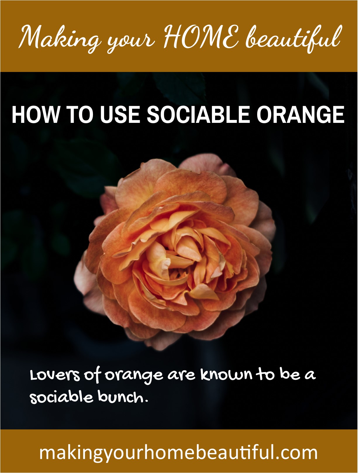
Lovers of orange are known to be a sociable bunch. They are often urban dwellers who enjoy the company of others so it is great to find friends who embrace this colour – it means they will be fun and interesting people to know. Let me show you how to decorate with orange
How to decorate with orange
Orange is a beautifully rich colour and the only one in the spectrum that is a truly warm colour. Yellow is its neighbour and of course can be warm but when it leans towards green, it can be considerably cooler. Its other neighbour, red, can also become quite cool with the addition of blue. Orange however being a secondary colour, made by combining red and yellow, can only ever be lovely and warm.
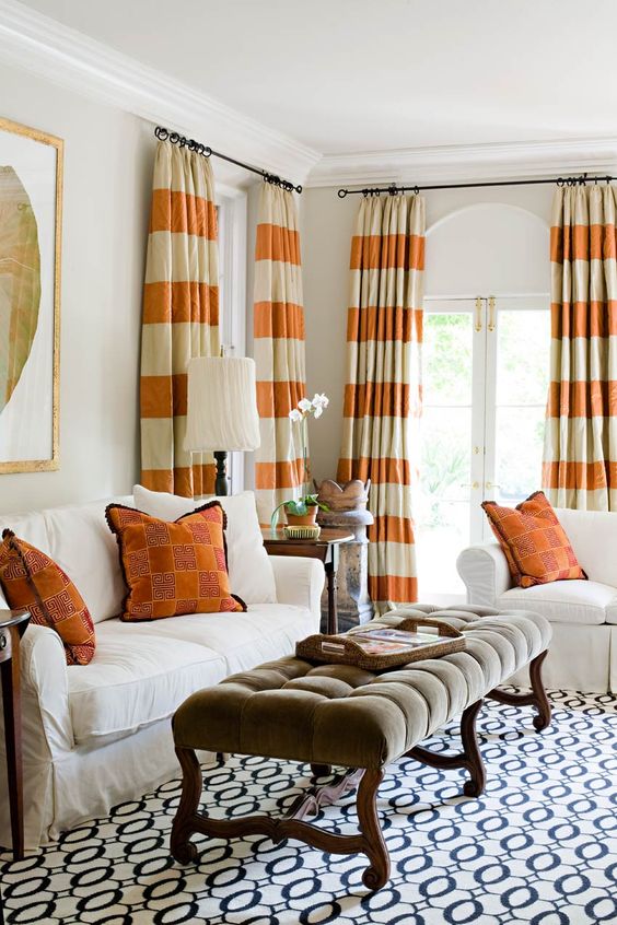
Brown is a great neutral to use in place of black or grey and this is a good place to start if you like the idea of introducing orange as it is the perfect partner and foil to this warm and gregarious colour. Orange and brown are a beautiful combination for autumn but it can also be a sophisticated palette that is really comfortable to live with all year round.
Related: How to decorate with luscious warm brown tones
Do think about the aspect of the space that you are decorating though as a room that gets very hot, particularly in summer, will benefit from cooler tones. However if you have a basement or an area that doesn’t get a lot of natural light or sunshine, this would be the perfect colour combination to consider.
Alternatively, you can have a palette of a warm white with dark timber tones and accents of orange in artworks or cushions.
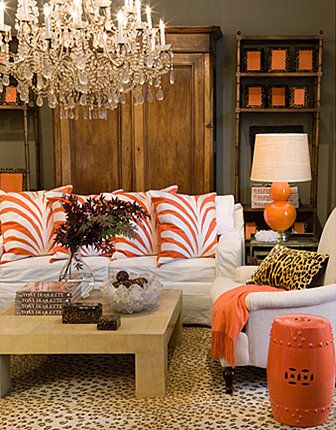
Another favourite colour combination of mine is orange with navy blue. Dark navy is a fabulous neutral and can be a great alternative to black or grey. Partnering navy and orange gives you a different look to that of orange and brown. It definitely gives you a more contemporary feel and works well when orange is the accent colour.
Orange and blue are opposites on the colour wheel which means they are complementary and naturally work well together however one of them must be an accent – think of the 80/20 rule.
Related: Complementary colour schemes – lesson 3
So, it depends how adventurous you are with colour – you can have conservative blue as the main colour with an accent of orange or you can go the other way! This image from Ralph Lauren is a great example using a brighter blue as the accent.
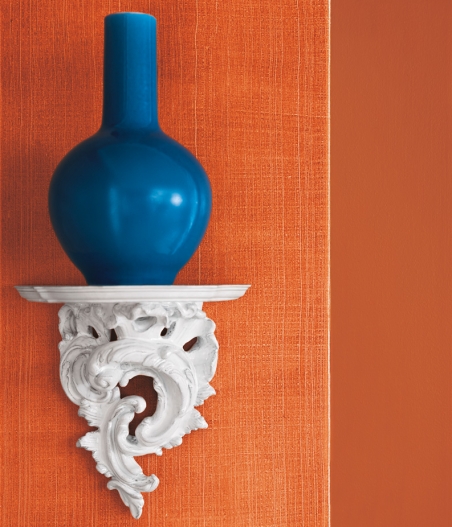
It is a brave person who paints their wall orange but nonetheless it can be done. If you do want to do this then ensure you use a muted orange, as in the above image, that is not too bright. An orange colour that looks dull in a small colour chip will in fact work well once on a large expanse of wall.
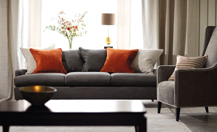
Grey, black and white together is a classic neutral palette, but look how the palette comes alive with some orange accents – just beautiful.
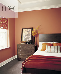
This is a great illustration of how you can use orange in a bedroom without it becoming overwhelming.

It is sometimes difficult to think where to start with a colour palette so I always recommend that you find a good inspirational starting point. This could be a beautiful rug, cushion or artwork. Or you could turn to nature for inspiration which always has the best examples, naturally.
I absolutely love this image below so I extracted the colours that I found in the flower and translated them to commercial paint colours from around the world to make a beautiful natural palette.
You could add a fresh white for walls and introduce a dark neutral, either a dark grey, navy, black or brown and you will have the perfect interior colour scheme.
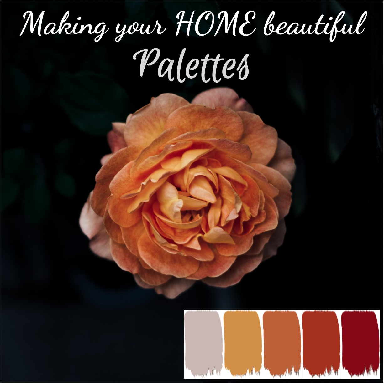
- Colour 1, Hex c9b7b3, Thebe Touch—Dulux Australia, Cold Turkey—Resene, 90RR—Dulux UK, Batik—Benjamin Moore
- Colour 2, Hex d29047, Gold Foil—Dulux Australia, Party Animal—Resene, Honey Drizzle—Dulux UK, Jack O’lantern—Benjamin Moore
- Colour 3, Hex bc5f37, Orangeade—Dulux Australia, Smoke Tree—Resene, 60YR—Dulux UK, Rust—Benjamin Moore
- Colour 4, Hex a42f1d, Red Stop—Dulux Australia, Bonfire—Resene, Volcanic Splash—Dulux UK, Smouldering Red—Benjamin Moore
- Colour 5, Hex 860816, Red Box—Dulux Australia, Code Red—Resene, Ruby Fountain 1—Dulux UK, Caliente—Benjamin Moore
Final word! Do consider that less can be more, so if you love the colour you can achieve a great effect just with accent cushions and throws and then these can be changed with the seasons.
Therefore if you want to give the room a different feel in the summer, it is as simple as replacing some cushions. I really love how Romo Fabrics has put this scheme together using contemporary grey with just a touch of orange – it really is very effective and lifts an otherwise neutral scheme.
Related: Cushions 101
I would love to hear from you if you are an orange person.
In a world of neutrals and safe decorating it is great to see people experimenting with colour and introducing it into their decorating schemes, even in just an accent.
I have lots more inspiration about using orange on my Pinterest board, Orange Interior Colour Schemes which I would love you to visit. If you feel overwhelmed with choosing colour, it is a good idea to put together a mood board. I have a free e-book to show you how to put together a mood board together with other invaluable checklists and e.books to help you to decorate and renovate your home. Sign up to my Free Resource Library here.
Related: Pantone Living Coral – how to use it in your home