
Decorating a home can be a time consuming and expensive undertaking so I often recommend that clients turn to the classic warm neutrals when looking for a foundation to their scheme. This creates a welcoming and timeless home that can be partnered with many other colours. Decorating with warm neutrals isn't perfect for every style or home – nothing is – but it could be your answer if you are unsure of the look that you want to commit to.
I am going to show you why warm neutrals are so easy to use for your decorating palette.
Why you should be decorating with warm neutrals
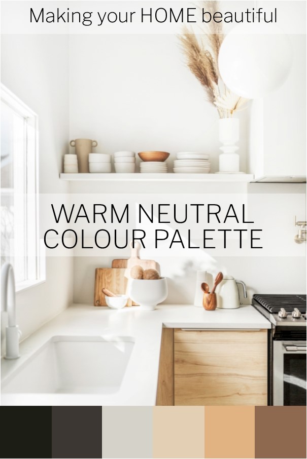
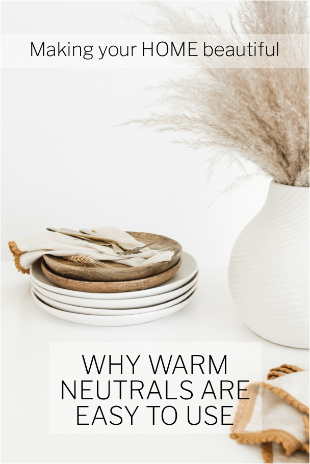
We have all heard the term, earthy colour palette. It sounds so grounded and comforting, which is exactly what it is. The colours in an earthy palette are rich and inviting. Caramel, biscuit, sand, nut oil, ploughed earth and mocha are just a few of the names you will come across in a paint fandeck when researching this palette.
All of these are very easy to live with. They might not necessarily set the world on fire but when partnered with some soft whites they will give you years of a great classic and classy foundation to your home.
What is a neutral?
The colours from an earthy palette are warm but not necessarily neutral. A true neutral doesn't have any obvious underlying colour. It's difficult to see whether its base is a green, yellow, pink or blue. However, I find that there are very few true neutrals but a whole bunch of lovely understated soft tones that we refer to as neutrals.
A warm neutral will have a yellow or possibly pink base. This is where I hear you say, but I don't like cream! Fortunately, a warm neutral is often far removed from a traditional buttery cream. If you take many of the beige or greige tones and ensure they are pale enough, you will have a classic warm neutral.

What I like about a warm neutral colour palette
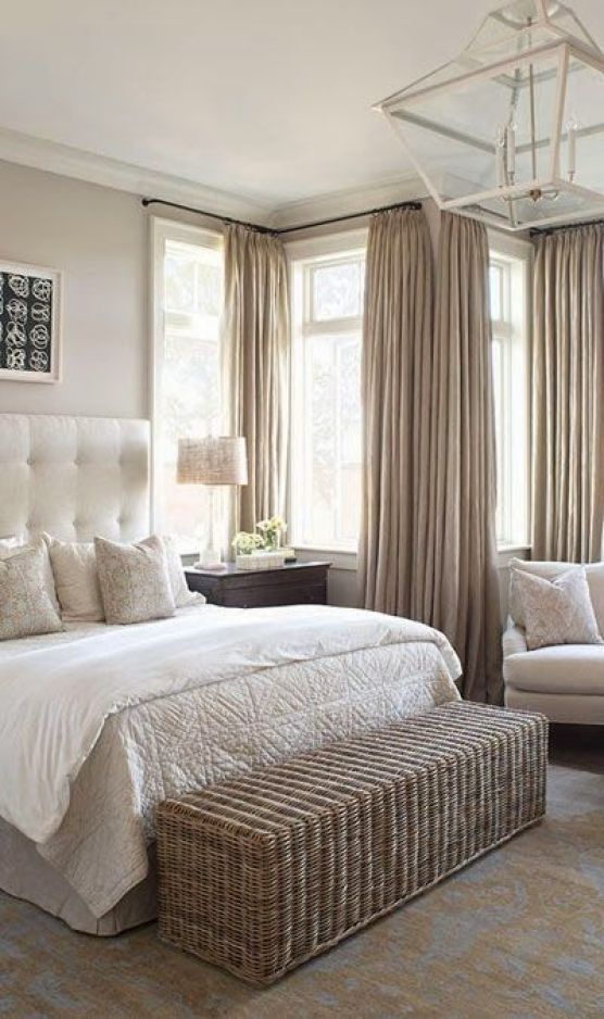
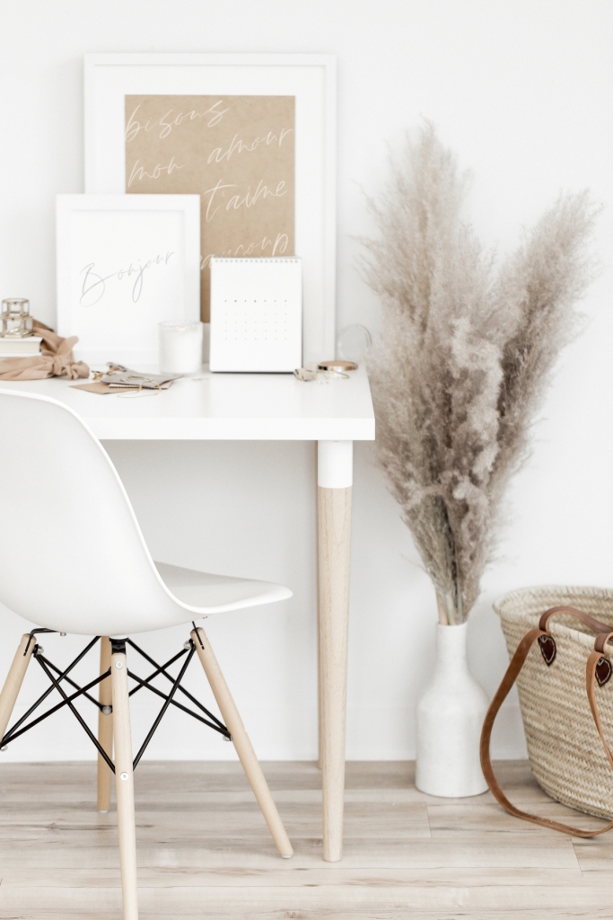
My main reason for liking them is that it is a very natural palette which relies heavily on nature. Natural floorcoverings, sofas upholstered in linen fabrics, natural clay pottery, sandstone fireplaces and gorgeous natural timber floors all fit into this scheme. There is nothing cream about any of this.
Related: Let me show you how to use a natural colour palette
Many of the best colour palettes will be those that include some strong tonal contrast. Elements of black and white bring some distinction to a warm neutral palette and there is no reason that you can't introduce some simple grey to the scheme too.
Mustard tones are very on trend for 2020. A colour that has been so shunned in the past is making a comeback and is a gorgeous way of adding some rich colour to a warm neutral palette.
Related: How to decorate with Mustard
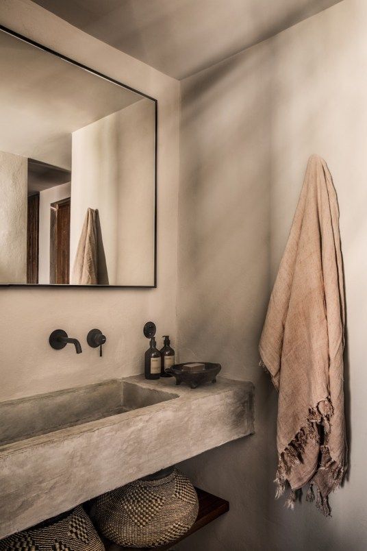
A warm neutral palette in a bathroom is particularly effective. We often associate bathrooms with crisp, cool colours but in fact often these rooms are used early in the morning when the weather is cool, even in warmer climates. It therefore makes sense to consider a more approachable palette for these spaces.
Some of my favourite warm neutrals
Dulux Baltic Sand is a great soft, almost white, warm neutral. Opononi, from their New Zealand range is another lovely warm neutral with enough grey to make it sophisticated and comes in varying strengths.
The Organic range from Haymes is a great example of some warm neutrals. Ranging from almost white (no.1) to a lovely rich brown (no.7). Or their Whitewash range may work for you if you prefer a little more grey added.
If you prefer a white wall you can still introduce a warm neutral palette with rugs, sofas and accessories. Rich timber flooring, furniture and artworks can also bring warmth to a scheme. Bear in mind though that the white that you select should be a warm one.
Related: How to find the right white
With any colour scheme that you are putting together you should begin with a mood board. This is the best way to see whether all your ideas work together. By laying out your colours, finishes and images of furniture etc. you can easily see if something jumps out that isn't working. I have a FREE guide on how to put a mood board together which you can download here.
Is there a way to find the formula for American paint, like Sherwin Williams and Benjamin Moore, so that it can be mixed here? So many of the warm neutral rooms that I am drawn to on Pinterest are painted in Agreeable Gray or Pale Oak and I would like to get sample pots made up to see if they are what I’m after. Or can you recommend a close match to these colours from the Dulux range? Many thanks, Samantha.
Hi Anne All colours have a HEX code which you can easily find out on google and then they offer a match to a local brand but I have found that it isn’t always reliable. A good paint mixer may be able to mix it from this code and you can also find the RGB code too. However, I have looked online at the images which are lovely and I think this can be achieved with Dulux Narrow Neck. This is in their New Zealand range but available here and it comes in full, half and quarter. Perhaps try a sample of that? Let us know how you go. Good luck Samantha
Loved this post. There is so much covered: it’s very informative and inspiring with helpful hints and practical advice.
Hi Samantha,
Can you please advise me on a wall colour, for my villa in Spain please. the room is open plan with a church type ceiling . We have brown leather sofas and oatmeal curtains, so as you can see we are starting with only sofa and curtains. We tend to us Dulux paints. Thank you I truly appreciate your help
Hi Julie I’m sorry but the colours from Dulux in Spain are different to the ones that I have access to in Australia – same name but they’re different companies with a different range of colours. My feeling with the Spanish style and the open Church type ceiling is to keep the walls white and then bring in the warm neutrals with rugs, cushions etc. Hope this helps and that you are safe and well. Samantha