
Faced with global uncertainty, life as we know it is on hold. Cut off from our normal freedoms and routines, home is now the epicentre of our lives where many of us work, study, eat, sleep and relax. Technology has become more important than ever before as we rely on connection with the outside world. Yet at the same time we yearn to switch off so we can take a moment to ground ourselves, reflect and recharge.
Dulux Colour Forecast 2021 – Connection through colour
“This global crisis has changed our relationship with our homes – not just on a practical level, the lines between our work and home have blurred beyond recognition. This also affects us on an emotional level too,” says Andrea Lucena-Orr, Dulux Colour and Communications Manager. “We need flexible spaces that can multi-task as spaces to conduct our professional lives and perform household tasks, however, at the same time we need our homes to provide balance, calm and a sense of comfort and security.”
In response, design trends for 2021 will reflect our desire for reassurance and strength, with nurturing palettes drawn from nature and furniture and décor that speaks of familiarity and comfort. At the same time, expect to see unpredictable material and colour combinations creeping in that encourage us to adapt our homes to new ways of living and working.
The Dulux colour team research trends consistently throughout the year, staying connected with international colour trend professionals and keeping informed of local and global lifestyle influences to predict global trends and how they will affect Australians. With most European design and architecture shows cancelled this year, the Dulux Colour Forecast for 2021 has been informed by extensive virtual research into global trends to stay abreast of key product updates and launches. This includes research from Maison & Objet in Paris and Stockholm Design Week & Furniture Fair, a virtual tour on Dezeen, reports organised by the Color Marketing Group, and numerous virtual updates and engagements with local and international brands.
The Dulux Colour Forecast for 2021 comprises of three soothing palettes, inspired by nature along with moments of stronger colour to lighten the mood and brighten our outlook.
“Surrounding colour can be a remedy for the soul in challenging times,” says Lucena-Orr. “This year’s soft, earthy neutrals, muted greens and gentle mauve-greys provide a reassuring connection with nature, whilst richer and brighter hues, such as coral and stormy blue awaken our senses and allow for moments of optimism.”
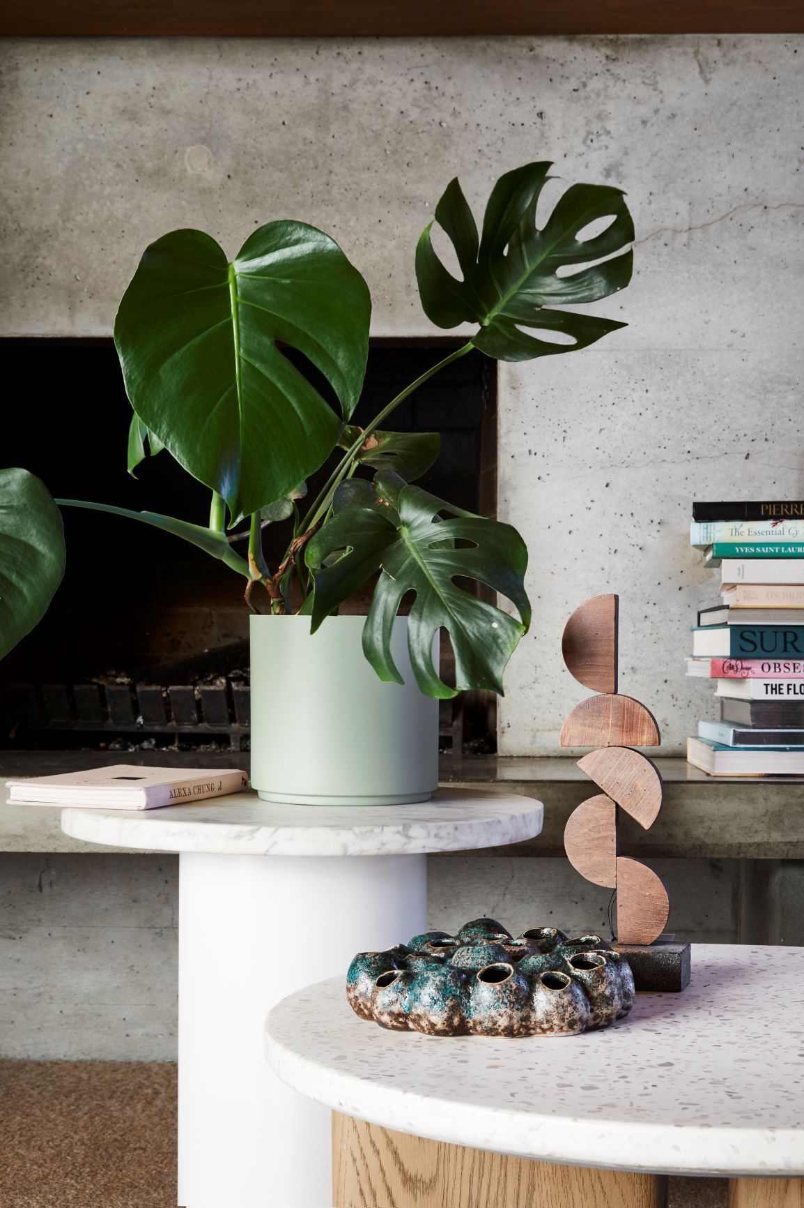
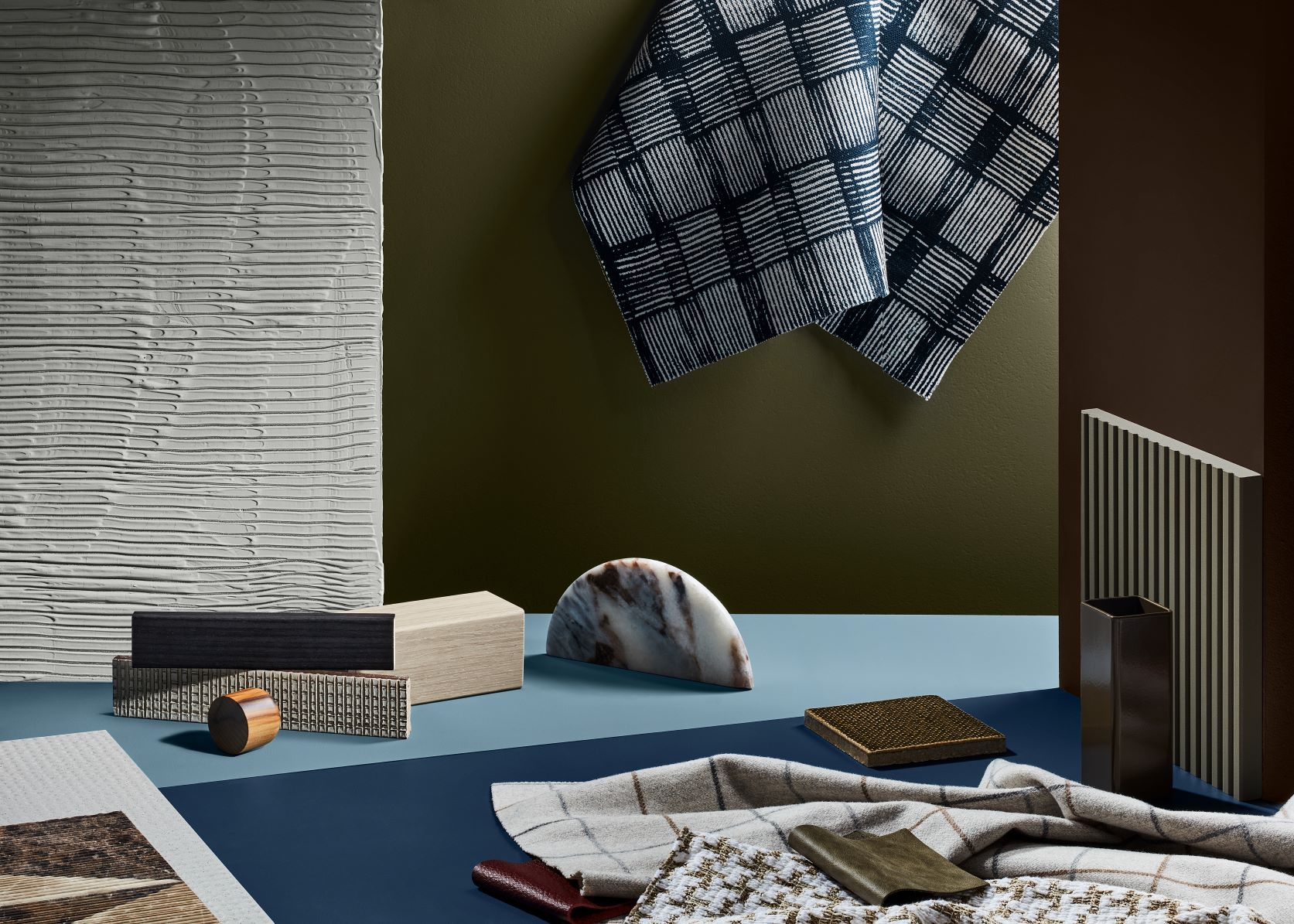
Dulux Retreat colour palette
Retreat is a palette of warm whites, brown-based neutrals and dusty blues that conveys a sense of a soft luxury, alongside vintage-inspired tones of burgundy and deep ocean blue.
“The Retreat palette feels tranquil and sentimental – reminiscing tradition, whilst hinting at better times to come,” says Lucena-Orr. “It speaks of renewal and growth. As work-life boundaries blur, we look to style our interiors to be hybrid and high-functioning; spaces are mindfully curated with versatile pieces in authentic designs and materials, and art and decoration that has personal meaning.”
Main background colour: Dulux Mangrove with Dulux Five Fingers Peninsula and Dulux Meerkat
Colours used in the above: Walls in Dulux Diffused Grey and Ceiling in Dulux Whisper White
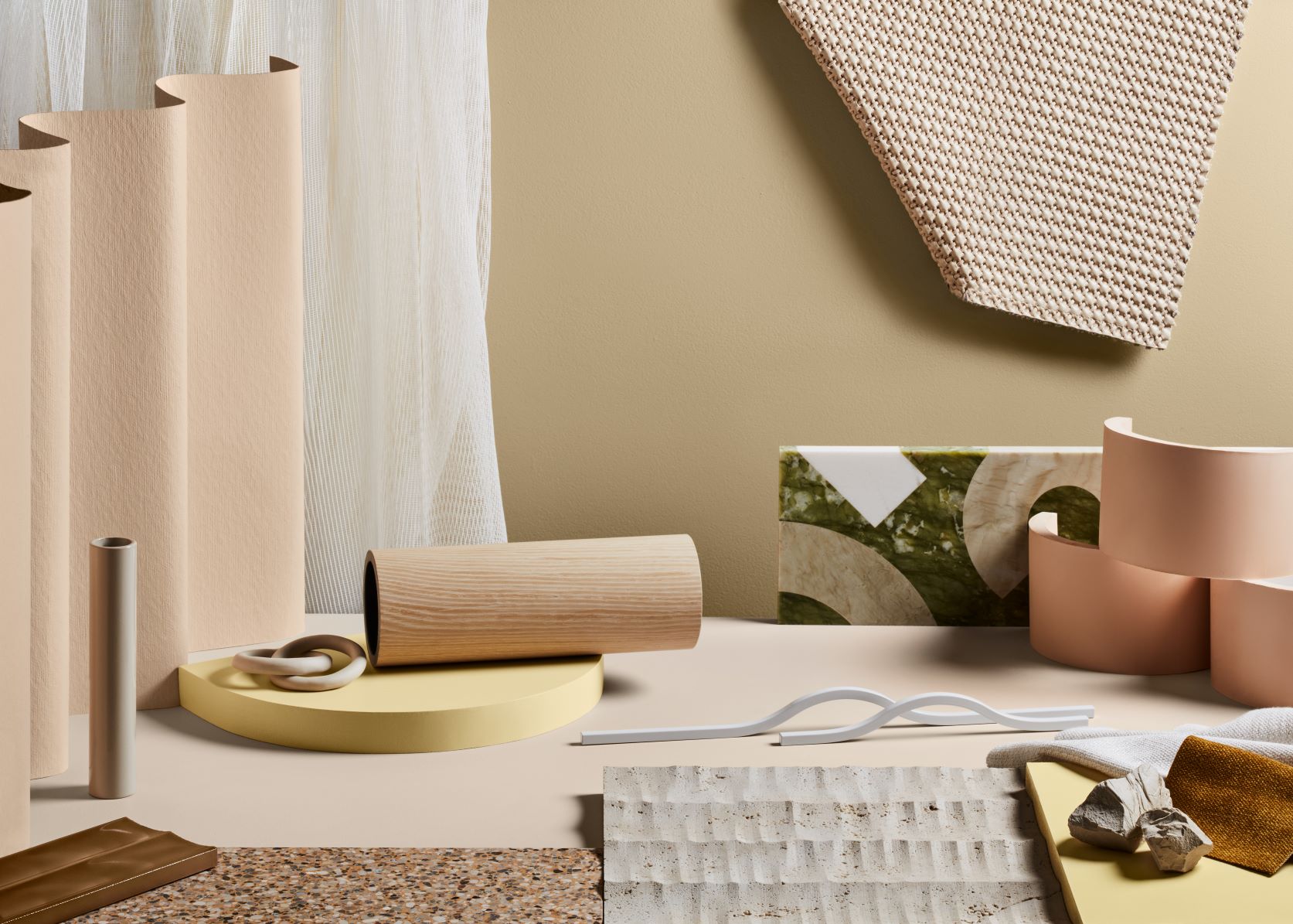
Dulux Nourish colour palette
With gentle, buff neutrals and touches of tan, soft olive and muted ochre, the Nourish palette captures our renewed appreciation for natural beauty.
“These colours allow for moments of stillness and quiet; an opportunity to reduce the stress and digital fatigue we’re currently experiencing,” says Lucena-Orr. “Use them to delineate areas in your home where you can switch off and ground yourself in the moment. Pair them with simple, handcrafted pieces with raw textures and matte finishes.”
Main background colour is Dulux Balsa Stone with Dulux Buff It and Dulux Very Cashmere
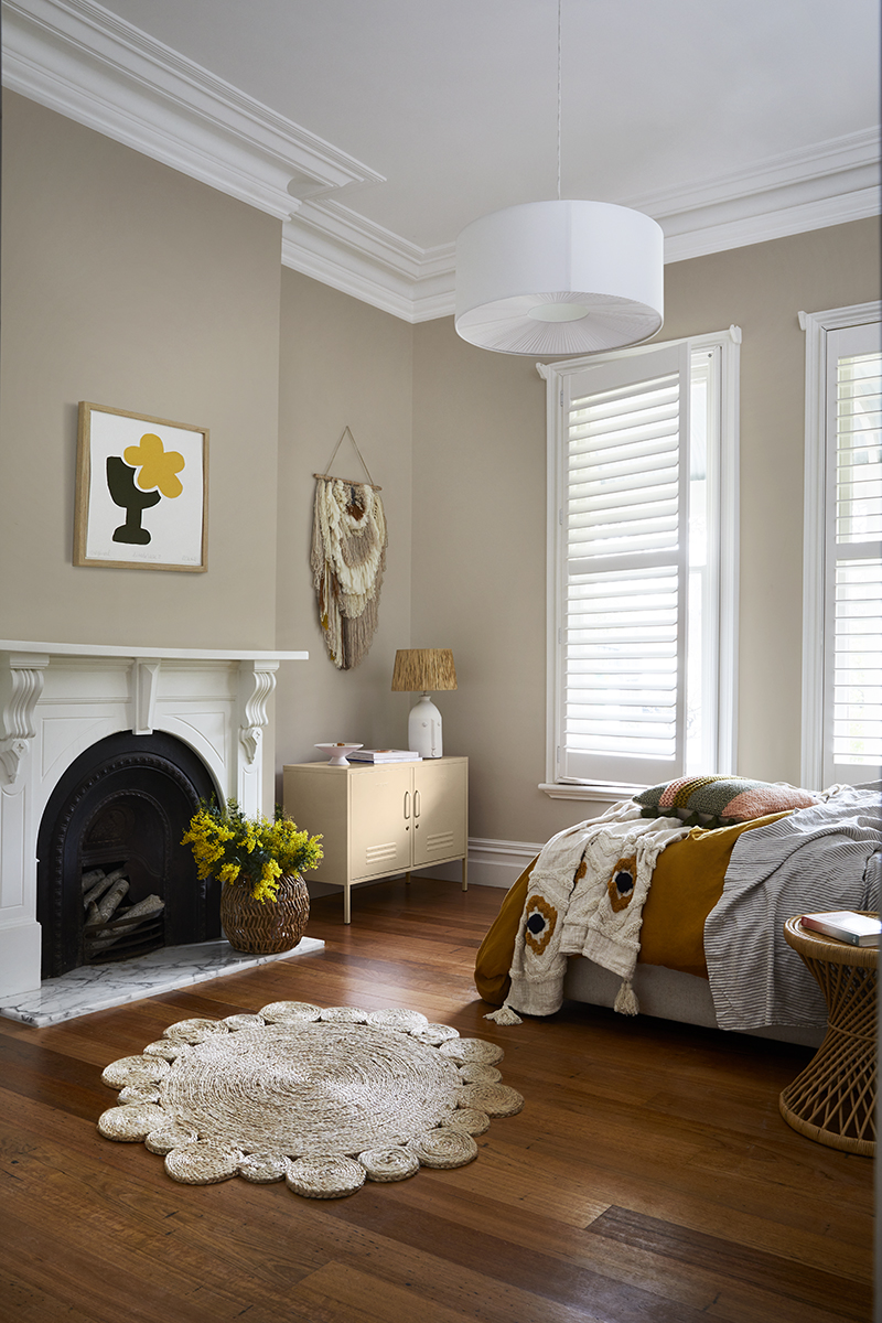
Colours used in the above: Wall colour: Dulux Warm Neutral, Skirting boards, architraves and fireplace: White Exchange Half & ceiling/cornice: Dulux Vivid White
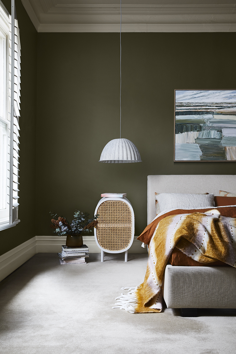
Colours used in the above: Walls, Dulux Olive Blend, Skirting boards and ceilings/cornice: Dulux Tuft
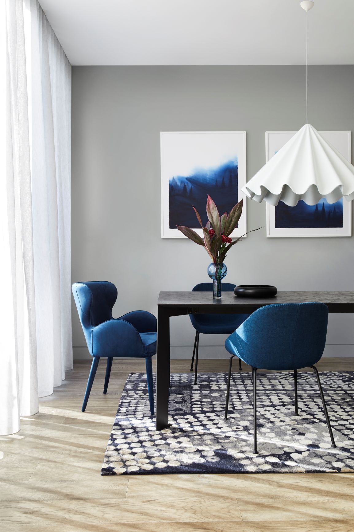
Dulux Reset colour palette
Reset is an uplifting and optimistic palette of enriching and brighter hues; rich blue and coral, warm rust and playful mash-ups of pink and terracotta hint at 70s nostalgia and evoke memories of travel and fun.
“As we retreat indoors, fond memories of past adventures and discoveries inspire our home spaces,” she says. “Life may be slower, but there’s joy to be had in a less frantic pace. We draw closer to family and our local community, building new connections with those around us. There is much to be grateful for and building resilience is our latest attribute.” Styling is eclectic and inviting; old and new sit side by side, furniture is durable and generously proportioned, and soft furnishings are tactile and forgiving – think boucle and quilting.
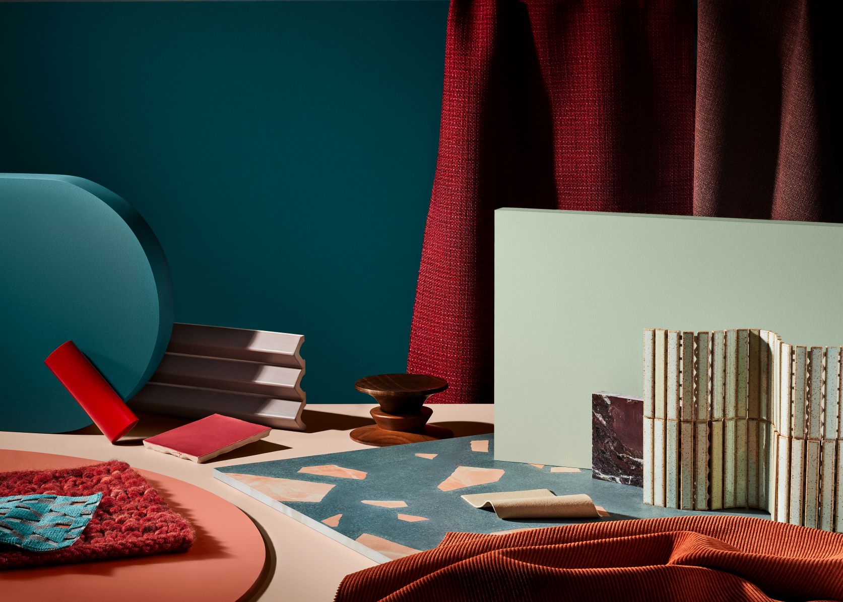
Main background colour: Dulux Daintree
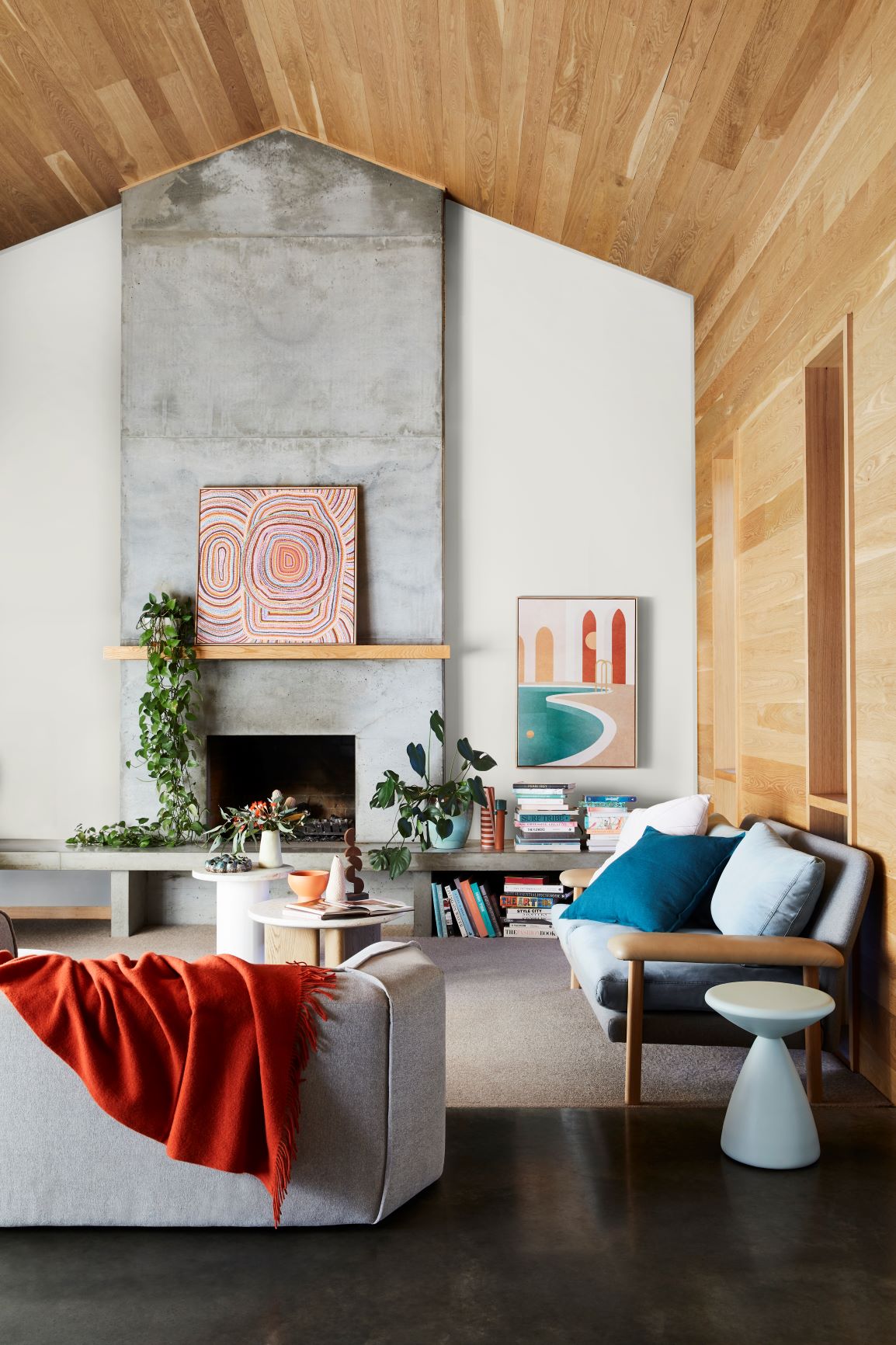
Colours used in the above: Back Wall: Dulux Snowy Mountains Half
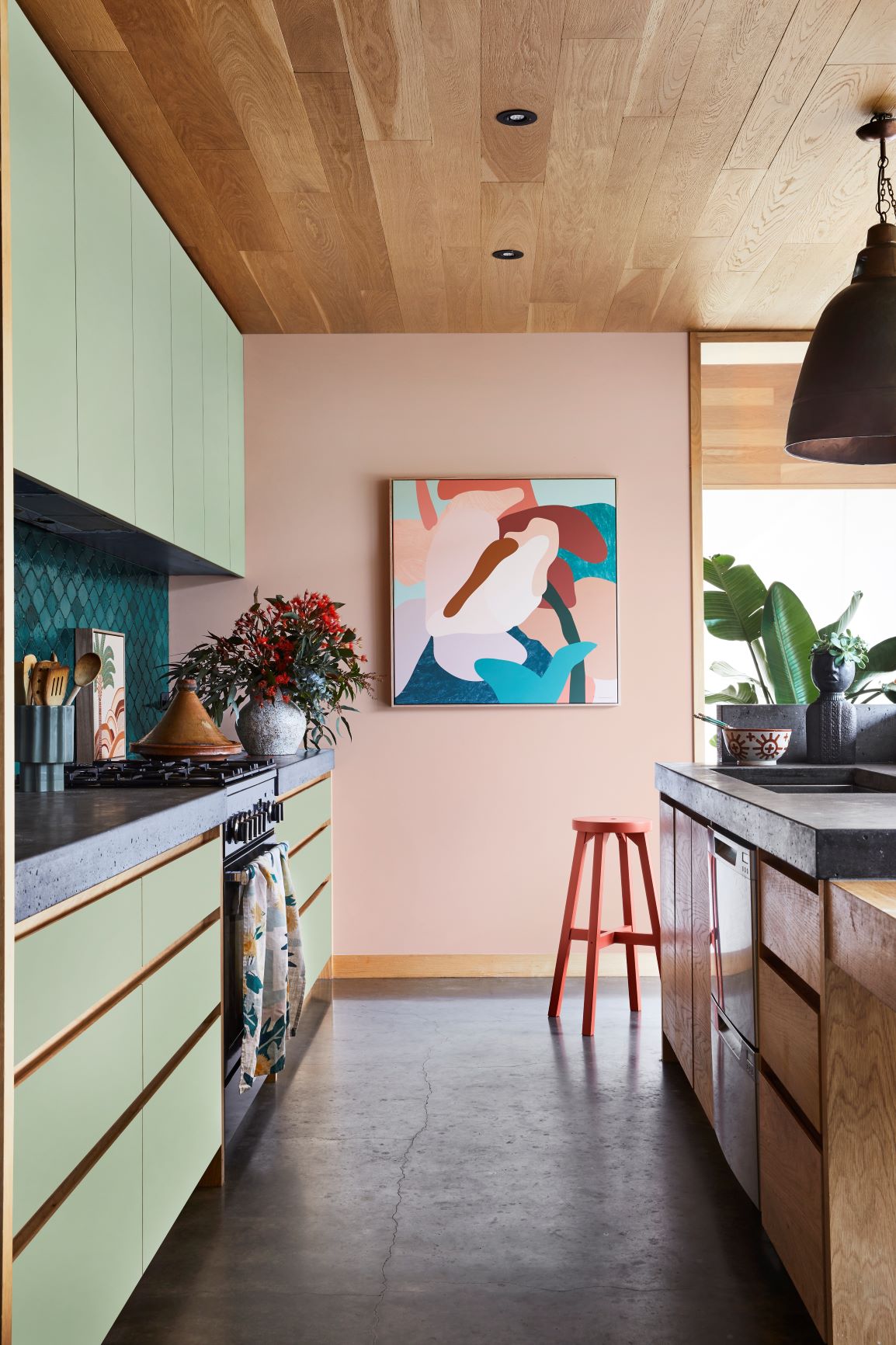
Colours used in the above: Dulux Treeless on wall and Dulux Light Ceramic on cupboards, Dulux Hot Chillie on Ikea barstool.
“Months of being stuck indoors staring at the same four walls creates the urge to pick up a paint brush that’s impossible to resist,” says Lucena-Orr. “Taking inspiration from the 2021 palettes is a great place to start when choosing colour for your home. You’ll also need to consider existing colours in your scheme, such as sofa upholstery, carpet tones and joinery finishes, to ensure the colour(s) you love will sit comfortably together.
Understand the mood you want to create
“The important decision is to understand what look and feel you’re trying to create. For a subtle, neutral look, Nourish is a good palette to work with. For something moodier and more dramatic, try the Retreat palette. If you’re keen to incorporate bold tones that won’t overwhelm a space, consider the brighter hues in the Reset palette. And don’t forget, you can always select colours between the palettes to create a look that’s all your own.
“Simple ways to introduce colour include painting your front door, creating an accent wall behind your bed or in a study nook, or colours in this year’s forecast will work beautifully on exteriors too.
“My top tip is if you’re just starting on your colour journey, start with one space and complete it – this will give you the confidence and encouragement to keep going. The bedroom is a great place to kick off your colour adventure as it’s so personal, which gives you the freedom to experiment. From there, introduce colour to create different moods in the various rooms in your home – for example, add shades that make you feel creative and inspired in your home office and something cosy and relaxing in the living room. Small or large volumes of colour – it’s up to you. Once you start on your colour journey and experience the positive emotional connections, you’ll never want to stop!”
Further information and images can be found at Dulux Australia.
What do you think of the Dulux colour forecast 2021? Can you connect with any of these? I really love the Nourish palette as I feel it is organic and comforting but my favourite is the Reset palette. It is so much fun and the gorgeous uplifting tones, which for many of us are outside of our comfort zone, challenges us to be a little more daring and embrace colour next year.
If you need help with a colour scheme, I have an online colour consultancy. Full details can be found here.