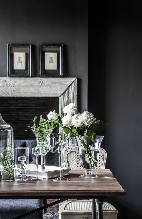
Colour trends come and go. When we didn't think anything could take over from our beloved greys, beige has popped back up on the horizon and the warm terracotta tones are featuring everywhere. It can be difficult to keep up so you should opt for what you like. However there are two colours that are always in fashion – black and white. How we use them changes, but there is no doubt that this classic partnership can work in so many different settings and is always on trend.
What are monochromatic colour schemes
Take any colour and add varying degrees of black, white or grey to it and you will have a fabulous range of different tones to select from for a very simple, yet effective decorating palette. Designers refer to this as a monochromatic colour scheme as you are starting with just one colour and tinting with white and shading with black.
Black and white is the best example of a monochromatic colour scheme
The most popular and obvious of all these possibilities is the most simple of all – the classic and much loved black and white decorating palette. It is sophisticated and timeless. This colour combination is excellent to use for a classy Parisian feel or for a more contemporary look. The beauty is that a black and white palette lends itself to either a very traditional and classic way of decorating or a more modern cutting edge look.
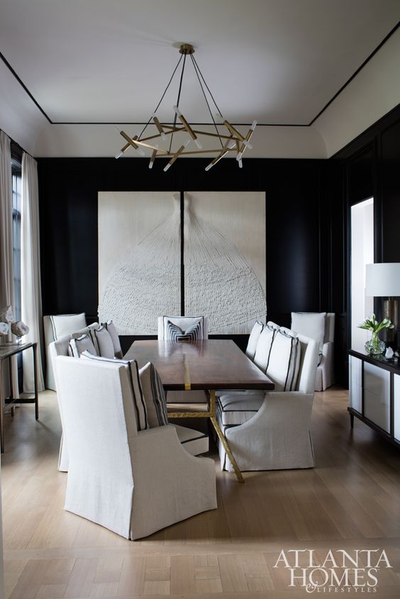
The point though that I want to convey here is the importance of tonal variation in such a simple scheme. It is easy to explain with black and white as you can picture a scheme that is predominantly white with just a few light greys to create interest. This combination will give you a light and airy feel to your decorating scheme.
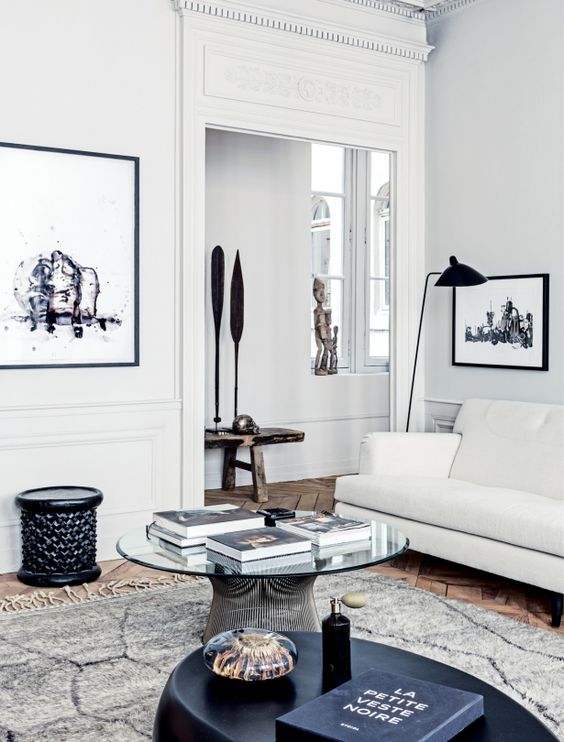
If however you include more dark grey or black elements in the scheme, you create quite a different mood with the strong tonal variation between pure white and jet black. This tonal difference makes a very strong design statement.
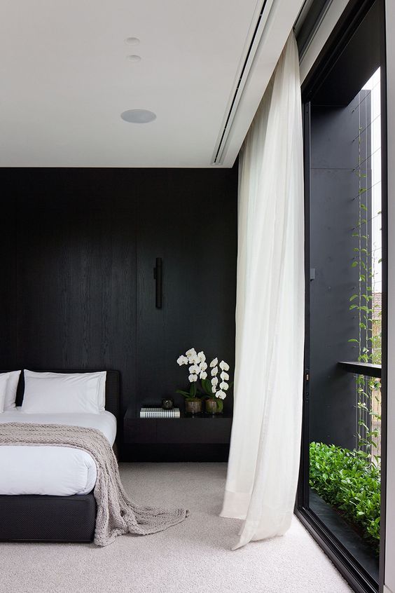
At the other end of the tonal scale, you may opt to simply use the dark greys and black for your scheme which creates an entirely different mood. This is a scheme that is dark with intrigue and shadow. Great for rooms that will be used in the evening where you want to create a cosy environment.
Often when clients say that they are stuck and confused with colour they haven’t considered the mood that they want to create in the room.
Once you realise this, it is easier to select the tones that you want to suit the environment that you are endeavouring to achieve. So before you even consider a colour, think first about the mood you want to create.
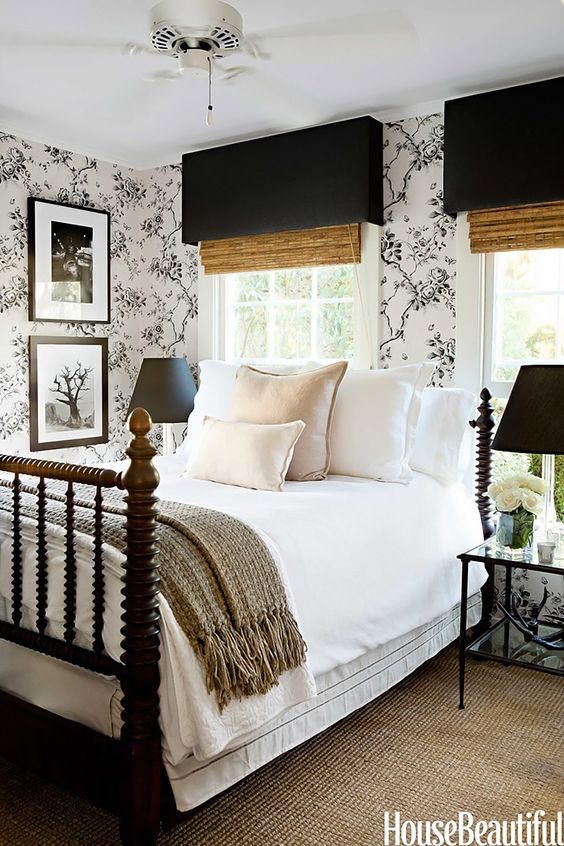
Monochromatic black and white palettes also work well for wallpaper and textile designs as this combination gives a very classic look. The appeal is in the simplicity as you can get away with using more elaborate designs when you have a plain colour palette. The pretty design in this wallpaper works well as it is partnered with strong blocks of white and black.
Monochromatic Styling
Monochromatic styling is very effective too as the strong tonal variation provides a good contrast between the individual pieces. Even if you have colour throughout the room, a small vignette that is simply styled, relying on the contrast between the two tones, can be very effective.
So hopefully you can see that monochromatic colour schemes are simple but can give really excellent results. This scheme can create a light and airy look with just a touch of black to add elegance. Or you can achieve a very striking effect with a bold combination of black and white or a very moody, interesting scheme using predominantly dark grey and black.
There is certainly nothing boring or pedestrian about a black and white scheme!
Using black and white for different styles
Black and white works with pretty much any interior style. Remember that it is the mood you need to consider, rather than the style. I really like the touch of black in this coastal style scheme below. The black lends a touch of sophistication and elegance. This is a definite coastal style but with a more upmarket feel.
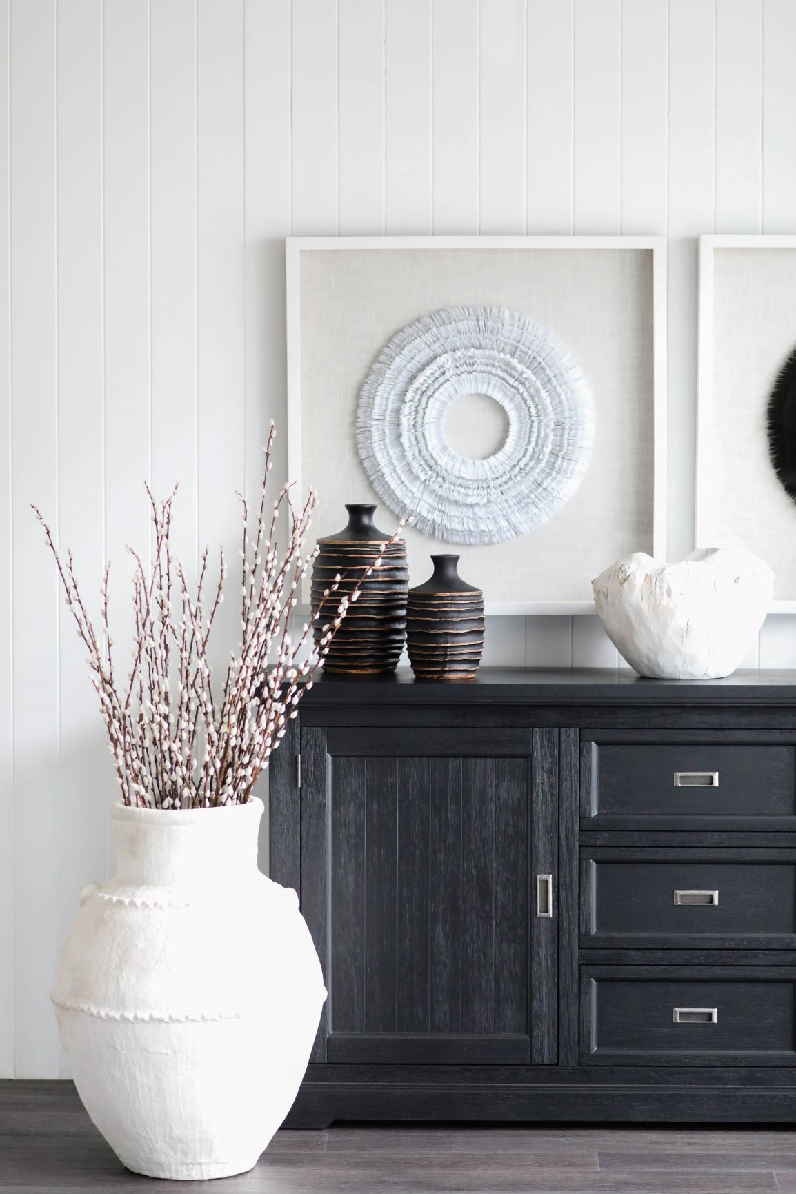
Another coastal scheme but with a touch of a Hamptons style too.
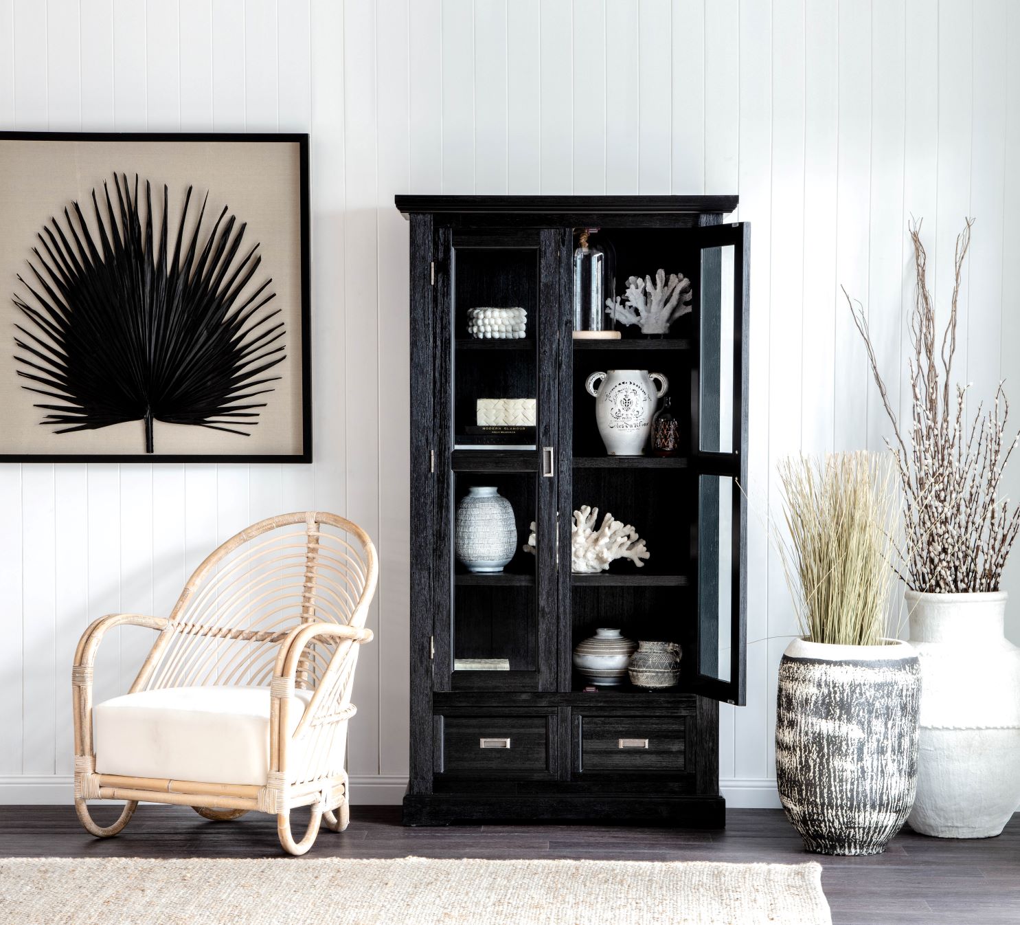
Remember that you can always add just a touch of colour as an accent, depending on your mood and the current trends. This is the beauty of a monochromatic black and white scheme that it is the basis for so many other colours and styles.
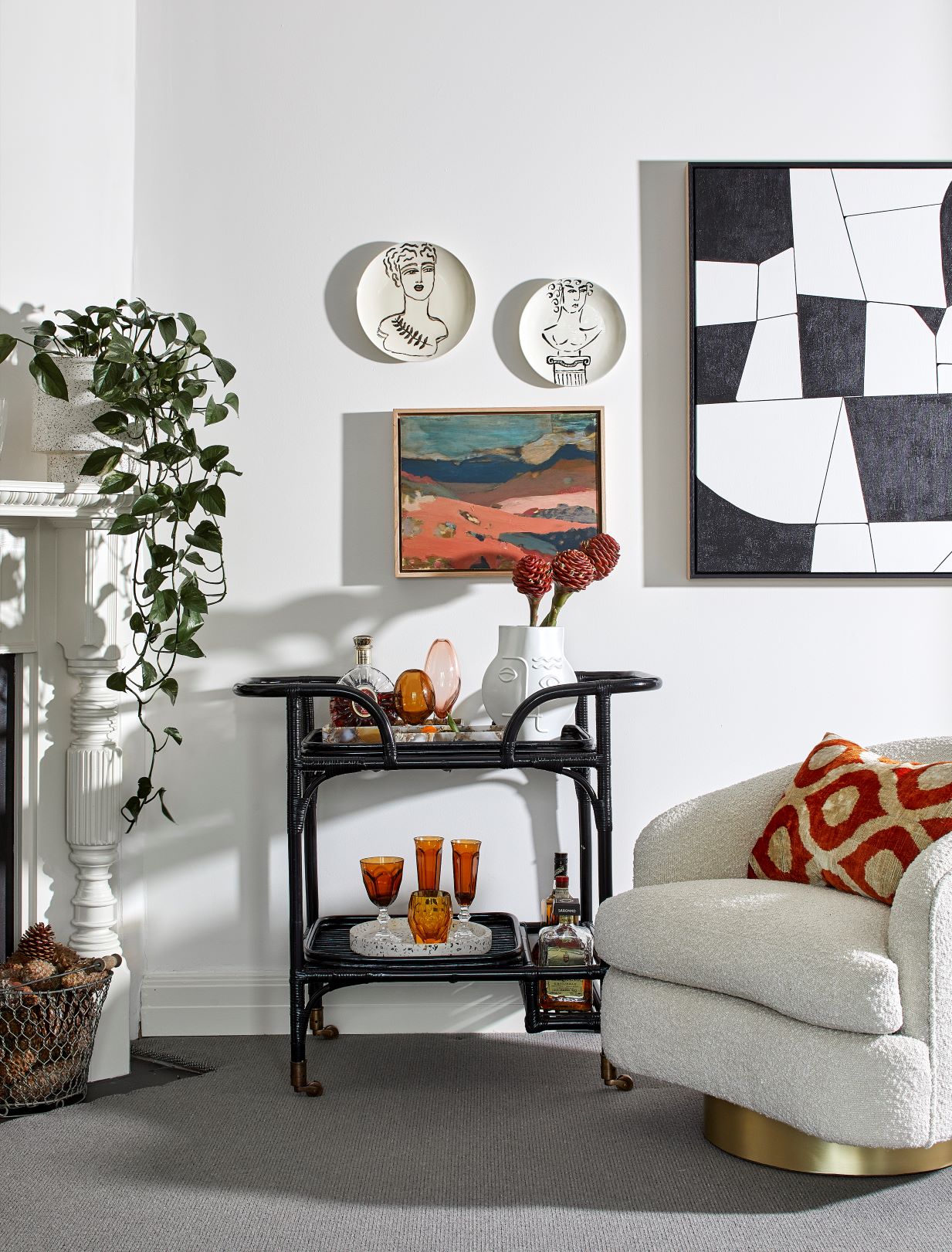

If you feel that monochromatic colour schemes are just too simple for your styling you can add just a touch of another colour without spoiling the effect. This is always best achieved with a natural colour, for example some timber or terracotta, as in the image above. Elements of gold and copper work well too with a black and white colour palette.
I have heaps of inspiration on my Pinterest boards with lots more images of black and white schemes and I would love you to comment in the section below if you have used this combination or just need a touch of advice.
Do you enjoy learning about colour and how to use it or just want to be a little bit more informed? If so you might like my other colour lessons – see below
If you love a white colour palette with a hint of black then you might find my post about the 5 mistakes to avoid when selecting white helpful
I have a FREE Resource Library with e-books and checklists to help you with your next project – sign up for free here.


