I found the reveal of the living and dining room on The Block this week extremely disappointing. There wasn't one room that I really loved. All of the rooms had issues and many of the contestants couldn't seem to pinpoint a style. There were a mix of styles in most of the spaces and I didn't feel that some of them brought the look together well. Rachel and Ryan did deserve first place. There was great continuity in their style and an excellent connection to the kitchen area. The colour palette was beautiful.
Let's start by saying though that a large barn like space is the most difficult to plan and furnish. Although open plan living can be great, it is all there in one place which is a big challenge to get right. You need to fill the area with a lot of furniture that is well proportioned – that is pretty big! This is no mean feat, which I think the contestants found. It is also a fairly expensive undertaking too to get the look right
Related: Open plan vs Individual rooms and Neale Whitaker on the move away from open plan living
Having said all that, each space did have some redeeming features and there were snippets of delight. I have all the reveals below with the judges' comments and my own.
The Block 2022 Living and Dining Room reveals
First Place: Rachel & Ryan, Score: 29.5
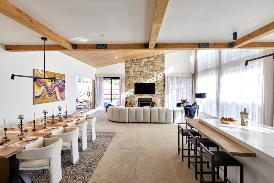
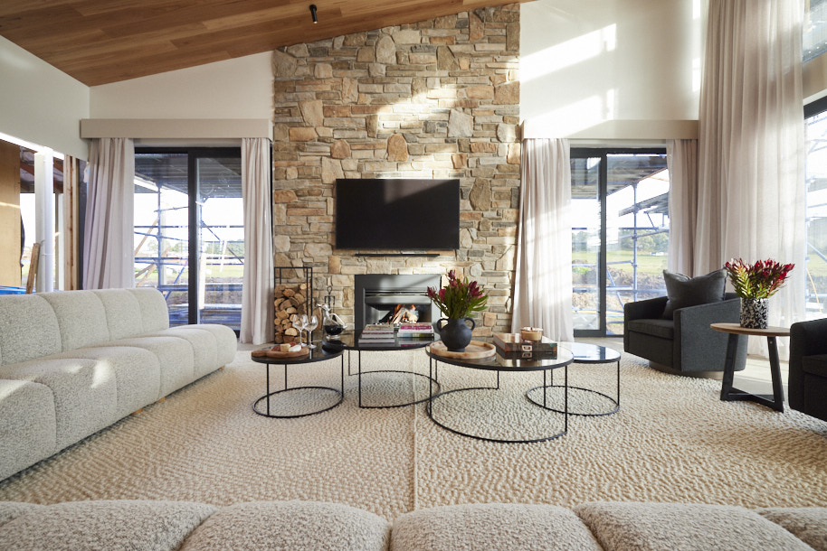
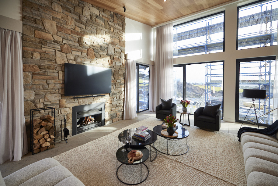
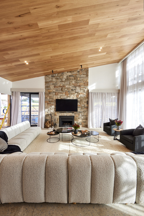
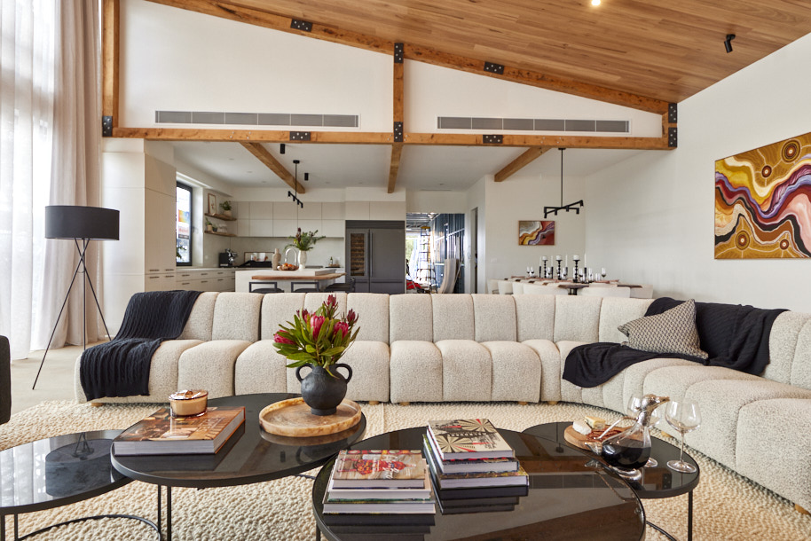
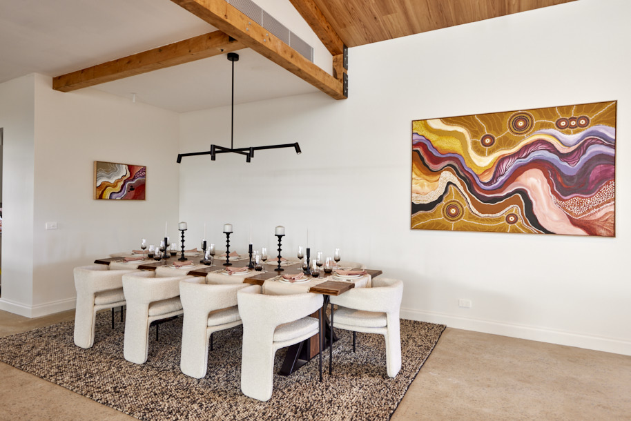
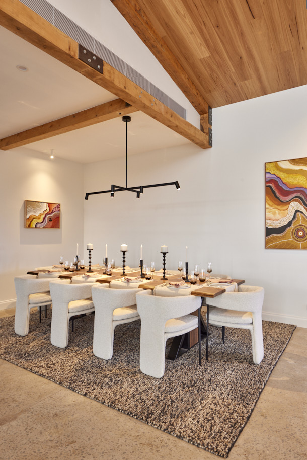
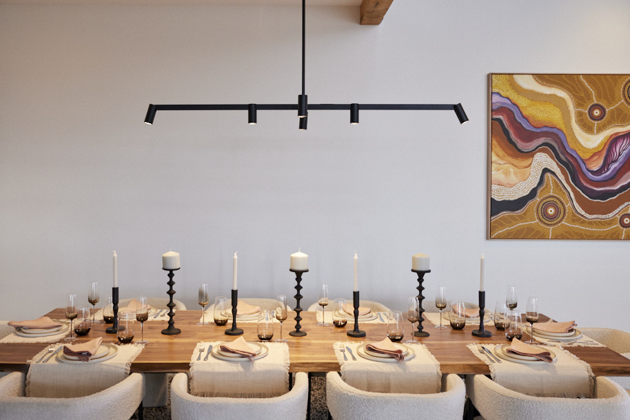
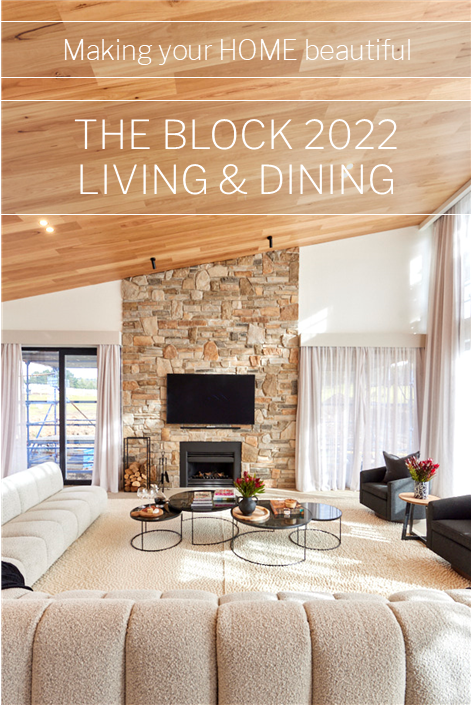
It’s been a long time coming, but from the moment the judges walk into Rachel and Ryan’s country lodge living and dining space, they finally see the couple’s vision. “I’ve got goosebumps!” Darren says. “They’ve done it!” Shaynna yells as she admires the floor to ceiling stone fireplace with a massive lounge wrapped in front, dining table expertly positioned to take in the winery views, exposed wooden beams highlighting an innovative Blackbutt ceiling that all combines to create what Neale sums up as a “minimalistic lodge” aesthetic that completes the kitchen and suits the home and region.
My comments on Rachel & Ryan's living and dining room
- These guys provided the best continuity from their kitchen. The space has been brought together really well, particularly with the ceiling treatments.
- The dining table is a great size for the space and is well proportioned, while the look of it also works so well in the room. In terms of the dining space, the artwork at the end of the table could have been larger and the rug underneath the dining table needed to be a bit longer, but these are minor points.
- I really like the sofa with the collection of coffee tables, which fill the large space well. The fireplace stone is fabulous and brings the warmth that the kitchen was lacking. The fire and TV are perfectly proportioned with the TV at a good height. So many TVs are placed too high so that you run the risk of severe neck pain to watch anything!
- I think the window pelmets are dated and the standard lamp won't work where it has been placed, but overall this is a very successful living and dining room that is cohesive and connects well to the kitchen.
- Rachel and Ryan deserved first place, particularly as they didn't deserve last place for their kitchen. This reveal has demonstrated that in fact, their kitchen was right all along!
Tied second place: Tom & Sarah-Jane, Score: 25.5
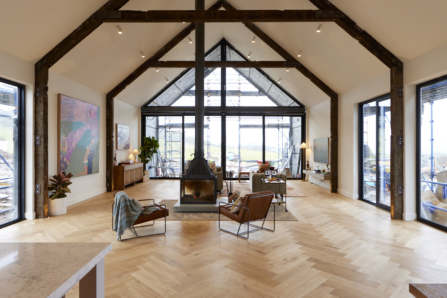
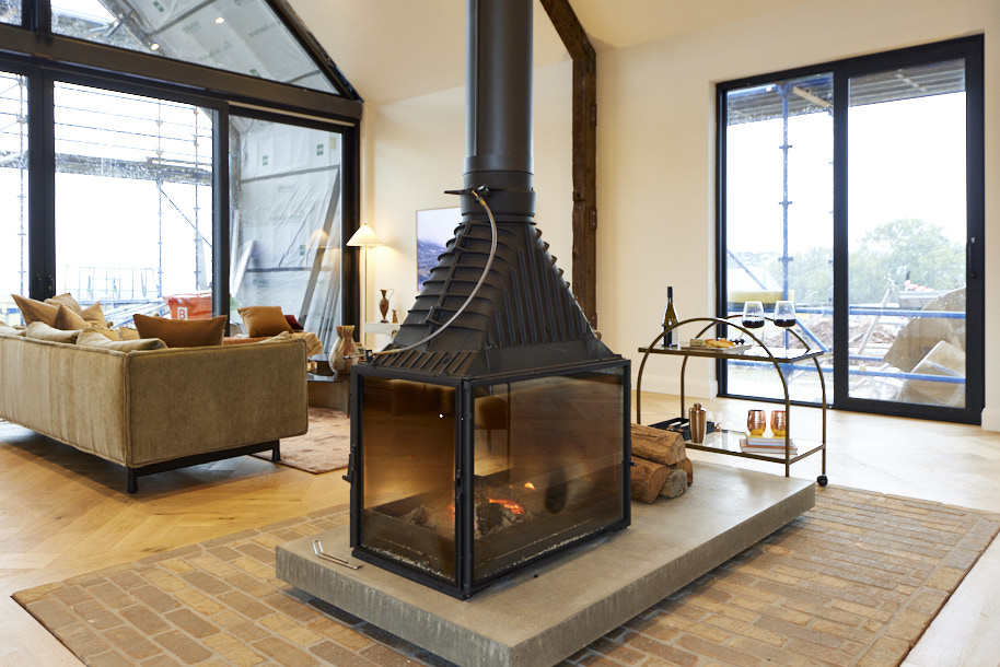
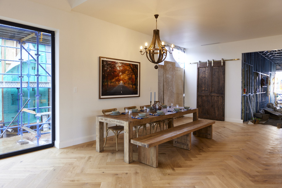
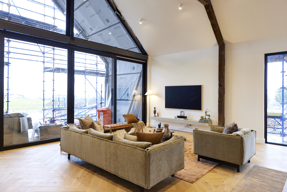
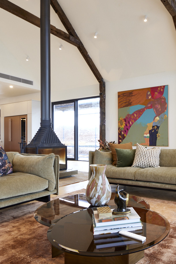
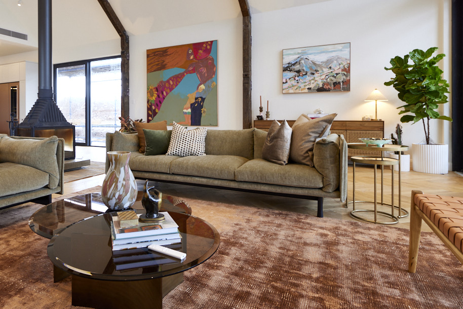
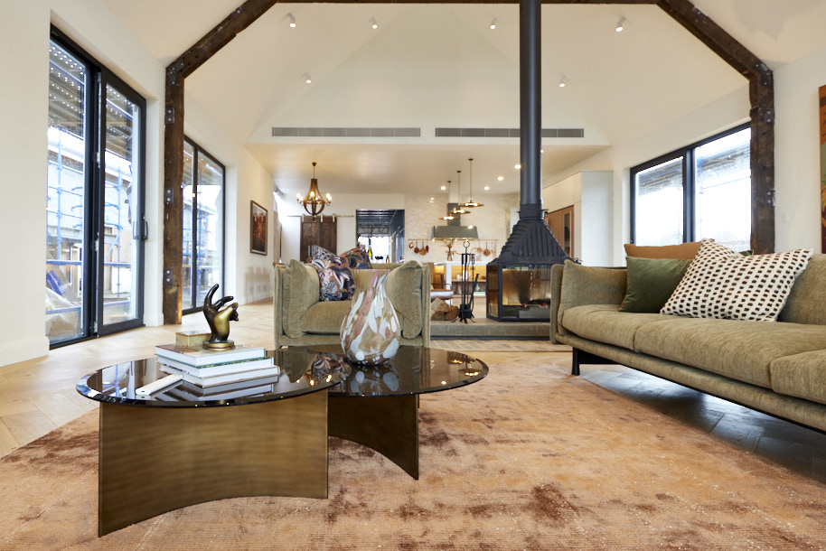
Aimed straight at their magnificent view, with a central fireplace to bring heat and cosiness and timber-clad beams to accentuate the sheer size of it all, Tom and Sarah Jane’s living dining area is, Neale sums up: “Magnificent!”. It was, however, a room that needed more, they said. More furniture, more rugs and possibly more thought into the styling. A bench seat at the dining table left them confused as well, but the lighting plan, Darren added, made up for a lot. A great room, they said, but would it be enough to continue their winning streak?
My comments on Tom & Sarah-Jane's Living and Dining room
- I run hot and cold on Tom & Sarah-Jane's reveals. They either delight, as with their fabulous kitchen reveal, or they leave me completely confused.
- I agree with the judges in that the space needed more – a lot more. The furniture that was there, in the majority of cases, needed to be larger.
- The dining table with rustic bench bore absolutely no relation to the sophisticated kitchen. The kitchen stools from last week were sublime. What went wrong here? I don't know what to say. Also the dining table needed a rug.
- I was confused with the flooring for the fireplace as the concrete base didn't work with the lovely brick finish.
- The occasional chairs by the fireplace were completely out of place. The living area sofas, chairs and rug are really great, and the artworks are to scale, but not enough I'm afraid to redeem this room for me.
Tied second place: Omar & Oz, Score: 25.5 (they were on 28.5 but 3 points deducted for not paying correct price for piano)
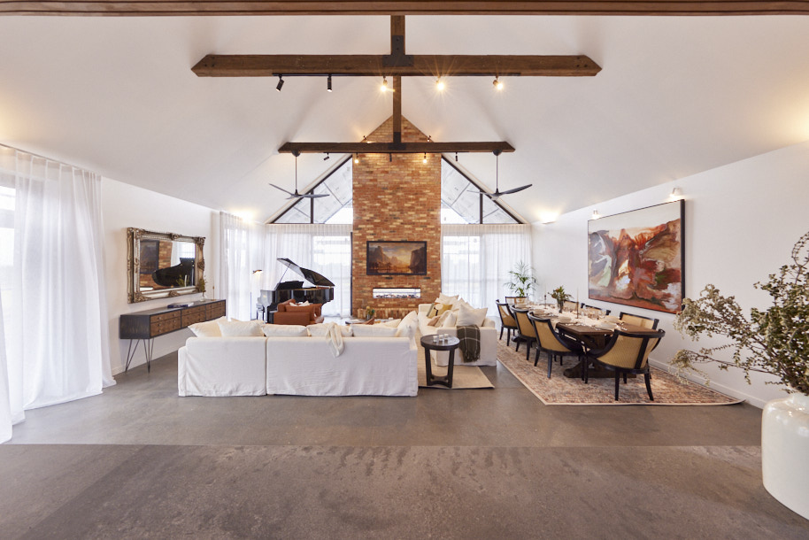
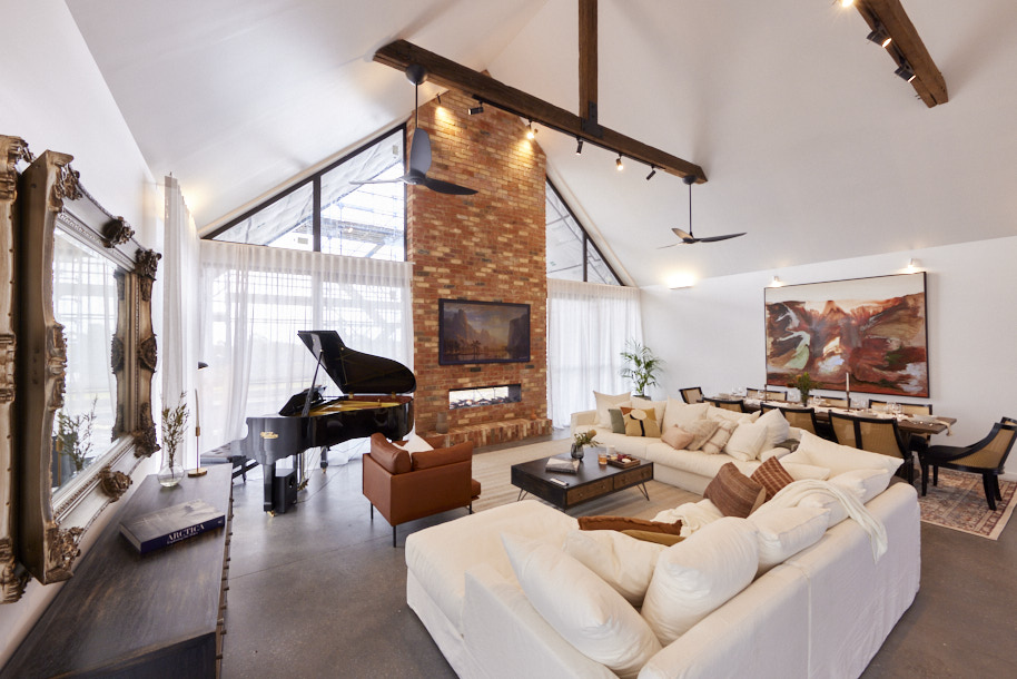
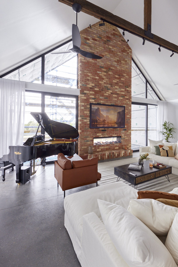
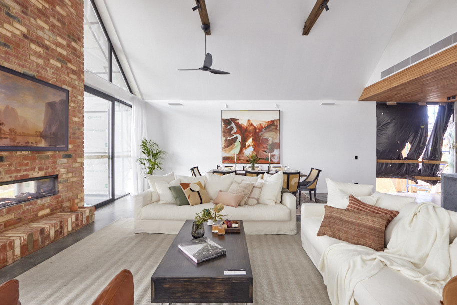
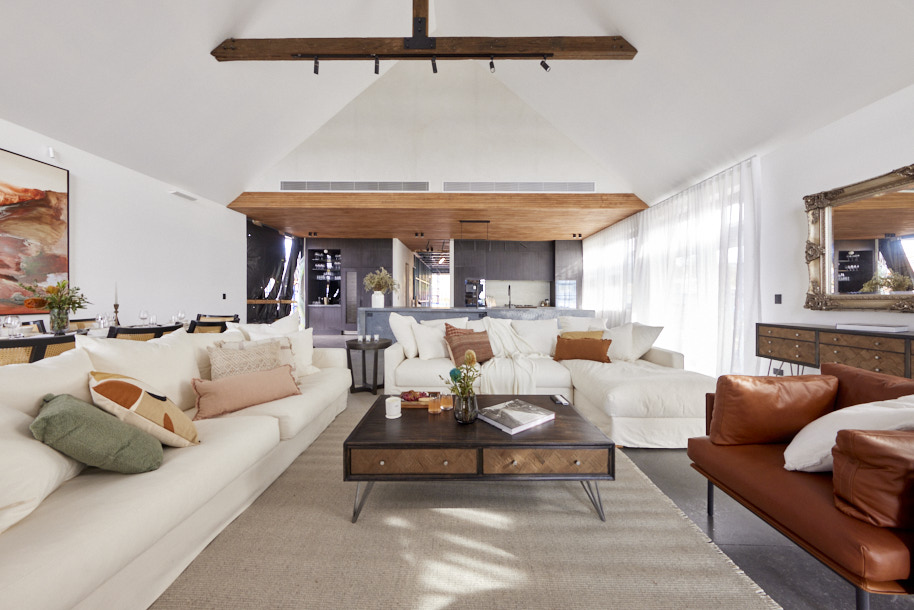
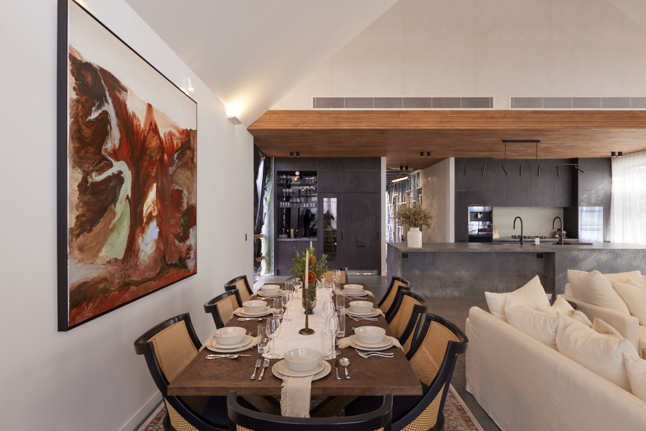
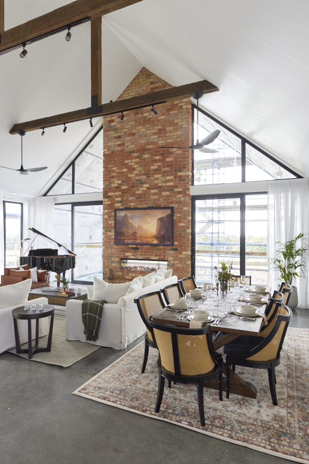
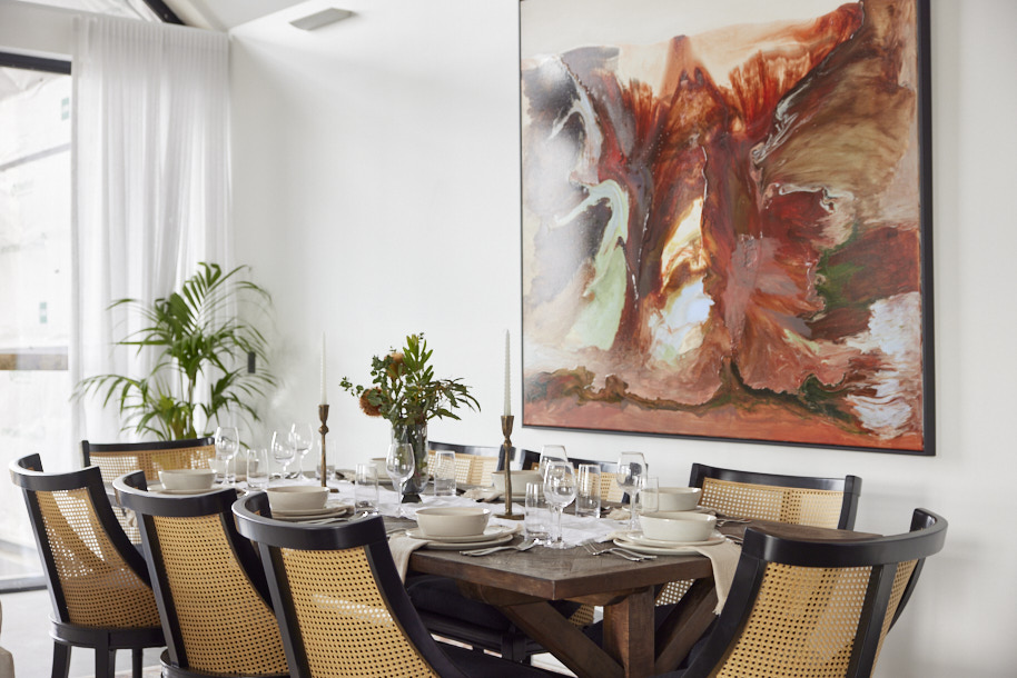
“Is that a baby grand piano?” the judges asked as they entered house 5 and from that statement piece, the tone was set for the space. “This is impressive,” Darren said as he realised how it took the room to another level, “like really impressive!”. From the rattan-backed chairs to an ornate mirror and huge sofas creating a grand feel, that feeling went on, with the judges agreeing buyers would love this room… and if they’d played by the rules instead of paying less than 50% of retail for their piano, it would have pushed them into second place.
My comments on Omar & Oz's Living and Dining Room
- I did quite like this space. Omar and Oz continue to amaze me with their styling and furniture selections. The sofas look really comfortable and the occasional chair is stylish and provides a lovely contrast. I really like the dining chairs and table and the artwork and accessories work well.
- I am so pleased to see that the colour palette is warm and friendly, which makes up a little for the dark kitchen that I wasn't a fan of.
- However, there is just simply too much crammed in here. Although the piano looks fantastic and creates a homely feel, the furniture then doesn't fit well. The dining table is too close to the wall and the rug underneath actually touches the skirting boards. There really isn't enough room to comfortably dine and relax here. These guys were working with a smaller space, by the looks of it, but I think it was a little crammed in.
- There is a lot to love about this room reveal though, particularly the colour palette.
Fourth place: Dylan & Jenny, Score: 22
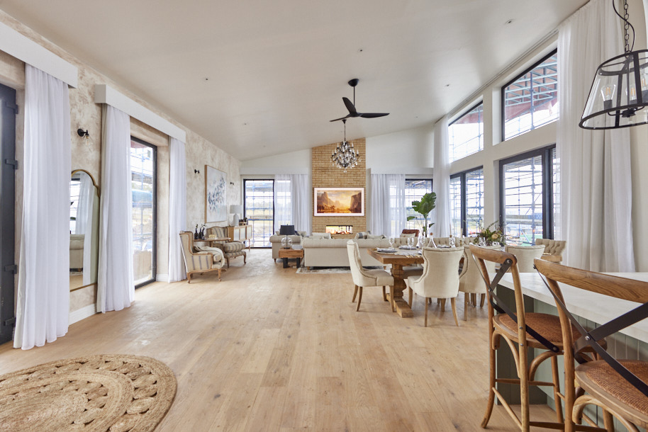
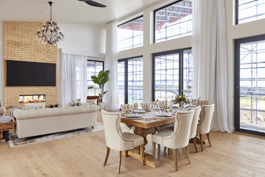
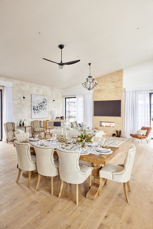
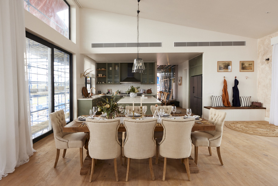
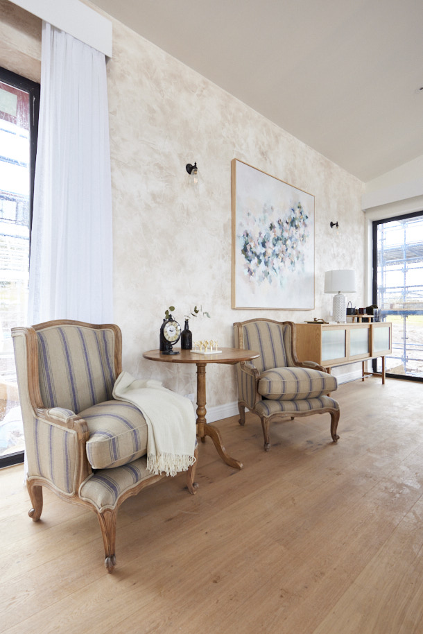
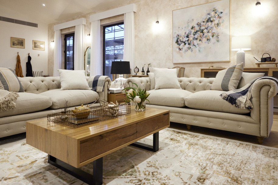
A “classic” and “traditional” space greeted the judges in house four, with the MyPlace automation panel a rare modern touch in a room that borrowed heavily from the past. A bit too much perhaps, they decided as they continued on and noticed styling touches and furnishing choices that would have looked more at home in a country cottage than a luxe home. Scale up the furniture, they advised, revisit the lighting plan (that reminded them of a Seven Eleven store and featured a chandelier that could have been much bigger) and the room would get there, they said.
My comments on Dylan & Jenny's Living Room and Dining Room
- This was the area with the biggest disconnect between the furniture choices and the beautiful kitchen from last week. The Scandi style coffee table and buffet didn't work at all with Chesterfield sofas and French provincial armchairs and dining table. I am all for mixing things up a little, but these were two styles that were really fighting each other.
- I wasn't a fan of the wallpaper or the artwork and I thought that the pelmets were dated. The choice of brick for the fireplace was completely out of keeping with the style of the room.
- I am not sure why there is a mud room style corner in the living/dining space when the houses have their own dedicated mudrooms.
- Although the dining table and chairs were nice, the table was simply too small. You couldn't sit that close to another person and eat!
- I absolutely loved Dylan and Jenny's kitchen and butler's pantry and there are elements to like here, but overall I am disappointed with this room reveal.
Last Place: Ankur & Sharon, Score: 19
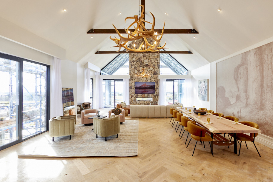
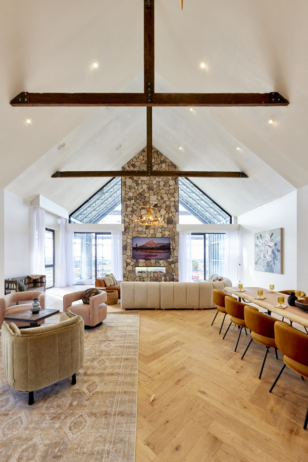
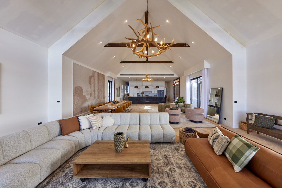
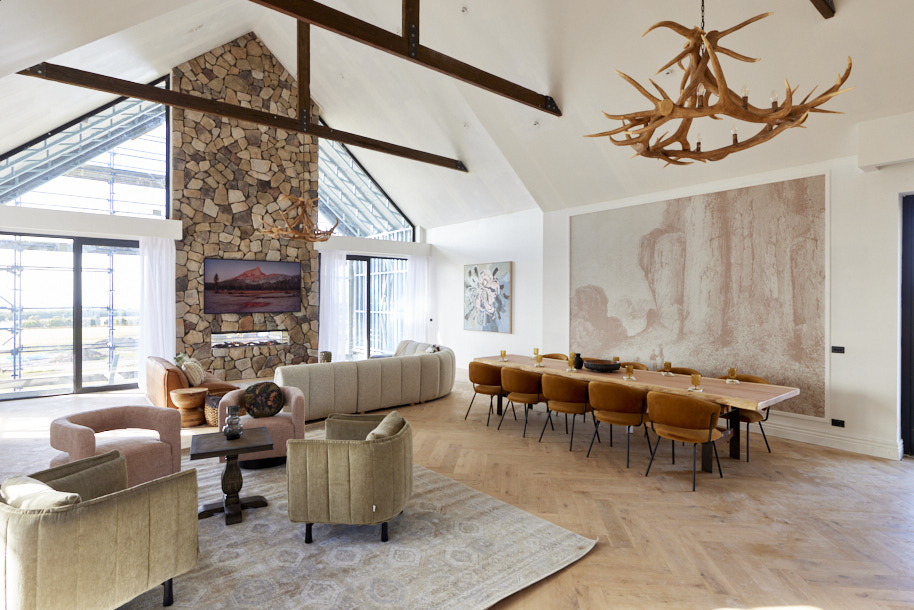
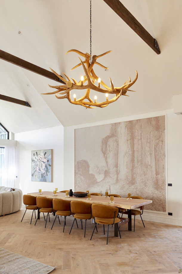
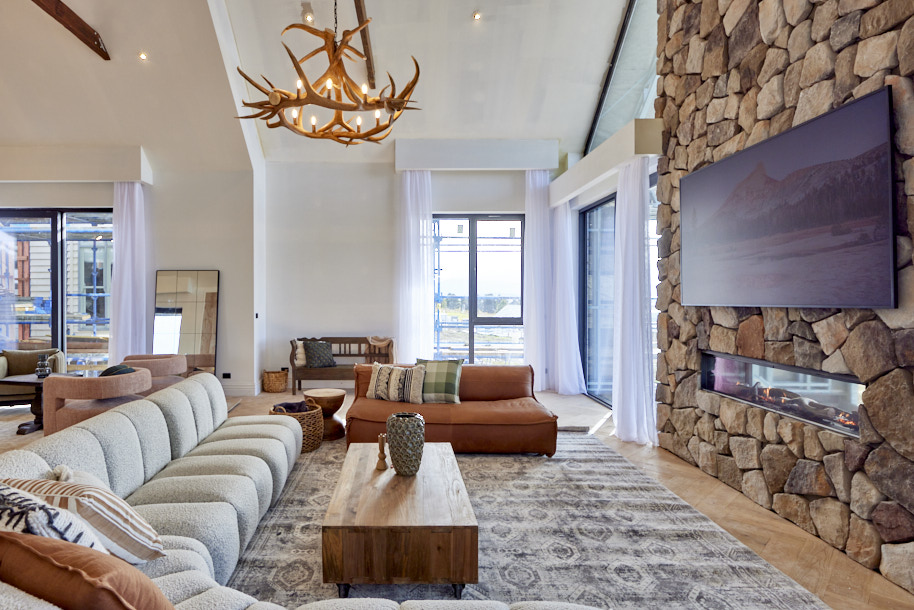
With big timber beams, antler lights and a stone feature fireplace wall, there was a lot to like in Sharon and Ankur’s living dining space as the judges walked in… but it didn’t take long for them to find more they didn’t like at all. “Like the lobby of a hotel,” Neale said as he spotted a collection of chairs around a coffee table to one side. “Like a Flintstones fireplace,” Darren noted after spotting the lack of grout. “Paint the walls,” Shaynna joined in. For all, it was a space with enormous potential, but one that looked rushed and hit by a tight budget.
My comments on Ankur & Sharon's Living Room and Dining Room
- I have been overwhelmed with Ankur and Sharon's room reveals, they go over the top and just add in too much. However, this week I didn't think that for a moment they deserved last place.
- These guys produced the best dining table solution. The table and chairs are really stylish and in proportion to the room. I loved the wall mural too which worked really well in that space. A rug would have been good underneath the table.
- The fireplace stone is gorgeous, but I would have preferred to see mortar used here and I think the TV placement is too high.
- I don't mind the arrangement of chairs, this is a large space and it is important to fill it well. There should have been a low coffee table here that was styled with greenery/books etc. as the side table they have used here is completely inappropriate and I don't think it worked that well, but I did like the principle.
- I do love the colour palette, the flooring is beautiful and the overhead beams are striking without being too dominant.
- I'm not a fan of the pelmets, which most people seem to be using. A simple elegant rod, installed close to the ceiling is far less obtrusive.
Related: Don't design your curtains without this one thing
Photography: David Cook Photography
More background information can be found at The Block Channel 9
Many of the gorgeous items seen on The Block 2022 Living room and dining room reveal can be found at The Block Shop.
One of the hardest things is starting a renovation and defining your style. It needs to be something that you love but also is appropriate for the style of house you are building or renovating. Ensure you do this before you start and not as you progress through the project as the end result will not be as cohesive as it could be if there is a change in direction. Read my post on How to define your decorating style for more inspiration.
Did you know that I have a Free Resource Library? Whether you are building a new dream home or just undertaking a weekend redecorating project, there will be something there to help and inspire you. Included in my library is a guide on how to put together a mood board. You can download the free checklists and e-books here.
