Finding the right white for an exterior project contains all the pitfalls that are there when selecting whites for an interior scheme, and more! However there are rules to follow and I have some great tips to help you to select a colour scheme for your white exterior project that you will love.
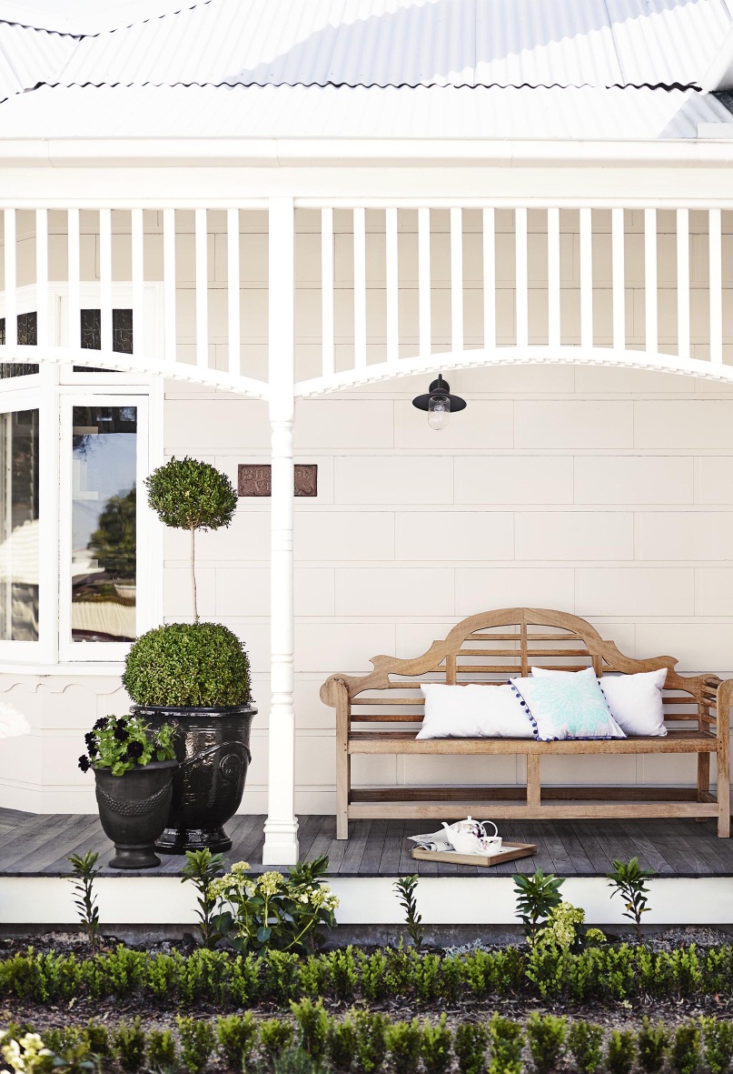
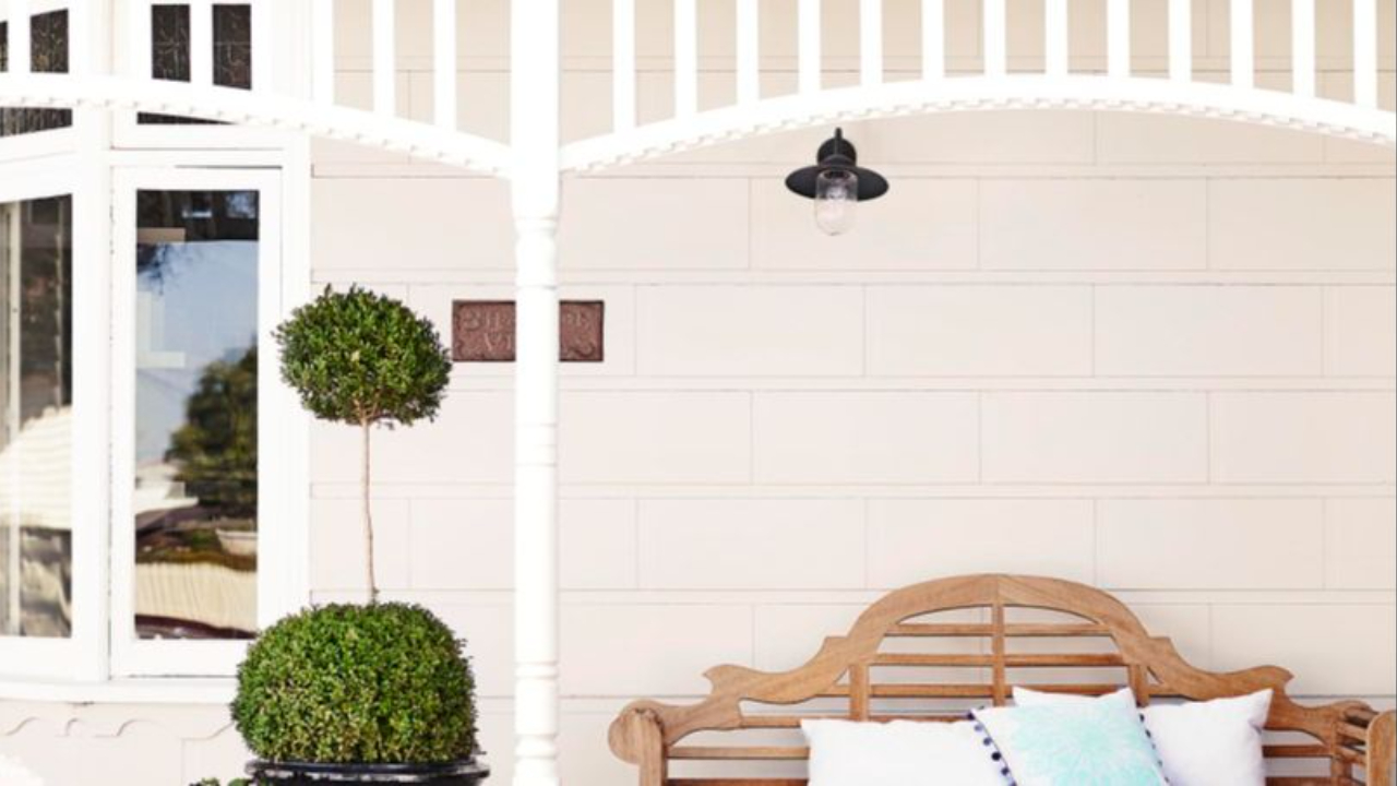
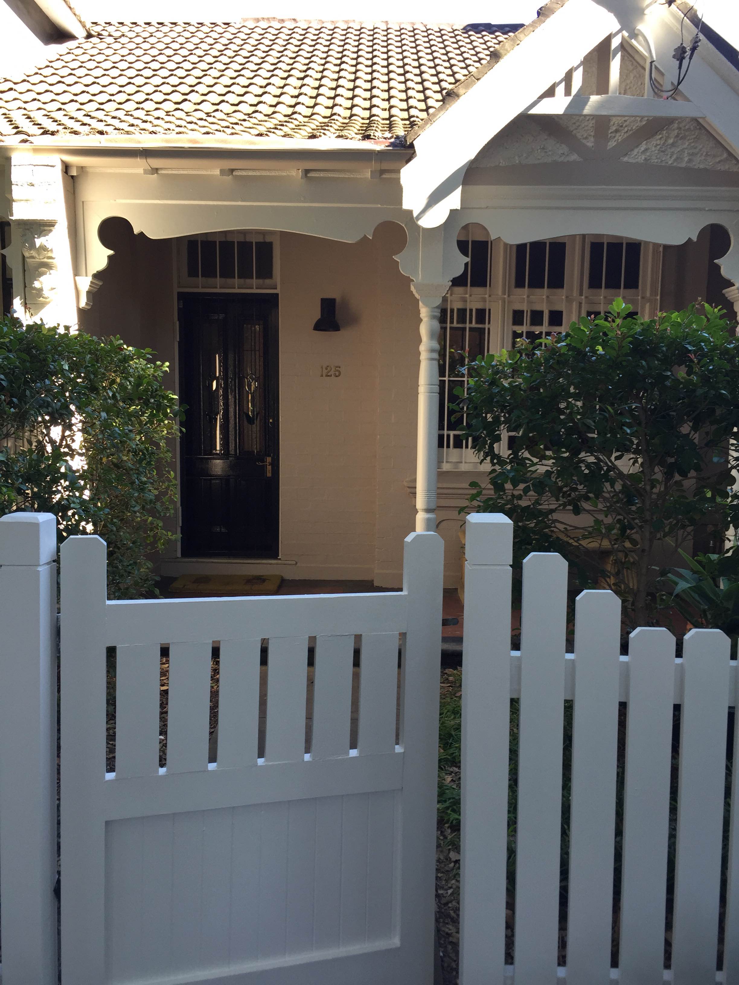
This pretty cottage has Dulux Antique White USA on the walls, which looks lovely as it is in shadow and you can really see the creamy underlying colour. The trim in Dulux Vivid White, which is in the direct sunlight and offers a nice contrast.
View your white exterior paint choice in sunlight
Do not underestimate the impact that natural sunlight will have on a white exterior scheme.
This changes significantly around the world as the natural light in England is very different to the strong unforgiving sunlight of Australia. The intensity of the sun will vary throughout the country too and will have a greater impact in a rural environment, particularly in the outback, than in a leafy Melbourne suburb.
So the point that I really want you to take away from this is that colours will vary depending upon where you are, so a white that works well in one environment cannot necessarily be used for another.
It is also good to remember that some whites will be in shadow, particularly if you have a cottage style home with a wraparound verandah, while the trim may be in the direct sunlight.
There is therefore no point viewing two white samples next to each other inside. Here you may see a contrast and think that this will be exactly the effect that you want to achieve.
You must view both samples outside and consider whether one will be in sun and the other in shade. Do not under-estimate the impact that sunlight will have on the exterior paints that you select.
White exterior paint - It’s all about the base
I have talked about this in my interior post on whites and it is just as important when looking for an exterior white.
- Cool whites will have a blue or black base that makes them very crisp but also in the sunlight can make them very bright.
- Warm whites have a creamy yellow or warm pink base and are effective to partner with other warm colours or for a soft country look.
- My favourite whites for exteriors though are the ones that have a green base. These are the most neutral and I find just work really well for an exterior scheme. They are very forgiving and won’t land you in trouble like a very blue or yellow white can.
The base colour of a white sample is easier to see if you hold it against a sheet of white paper.
Large samples of each exterior white that you are interested in should be looked at side by side against a pure white background and you will begin to see that all important underlying colour.
Resene Merino is a great exterior white as it is a little dirty but you can see on this house that it looks like a very fresh clean white. If you view it against other Resene white samples, you may think it would be too dark but once outside, it is perfect.
Remember not to go too white for exterior weatherboards as they will soon get dirty!

A White on White exterior scheme
After the location of your property, the next most important point to remember with exterior colours, is that the natural bulk and shadow of the building, together with the intensity of the sunlight, will mean that you need a large gap between the colours to see a difference.
I know I am repeating myself, but DO NOT LOOK AT YOUR COLOUR SAMPLES INSIDE!
This may sound like the most obvious statement that you will hear but I see it all the time. People will put together a colour scheme at the kitchen table and not take into account the effect of daylight. Therefore two whites that look great together inside, will just look exactly the same outside and the lovely fresh white trim that you thought you would have is actually the same as the wall colour.
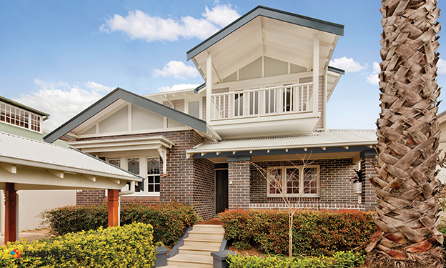
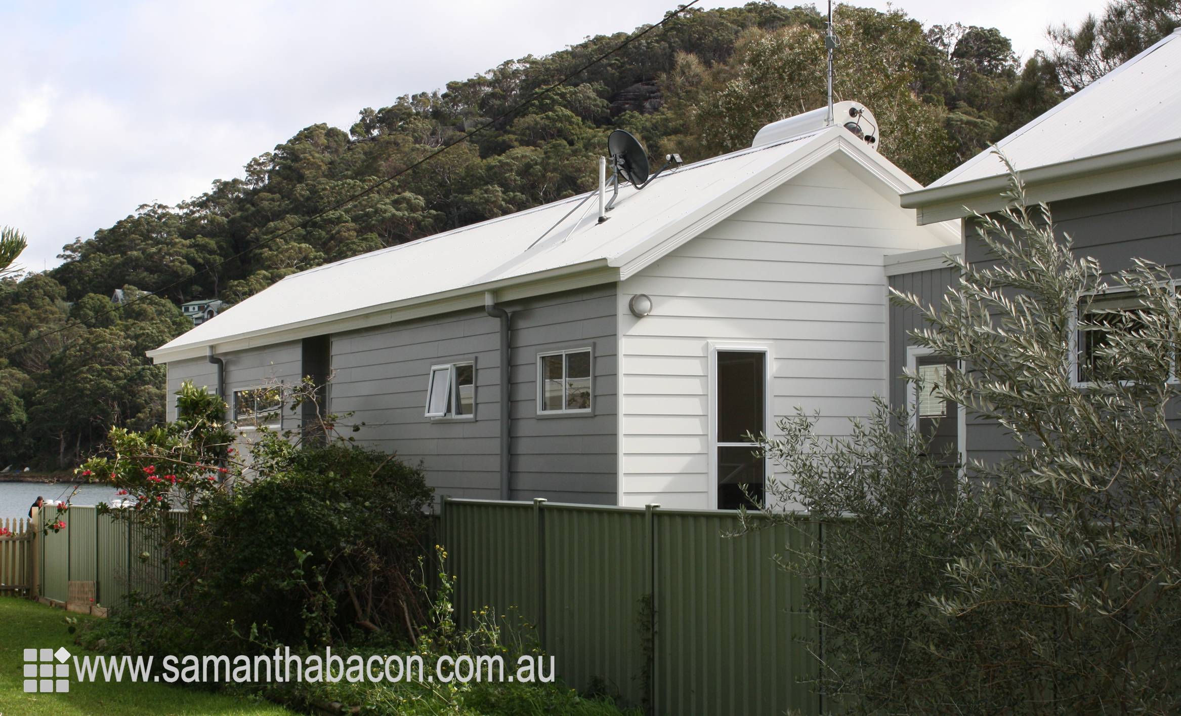
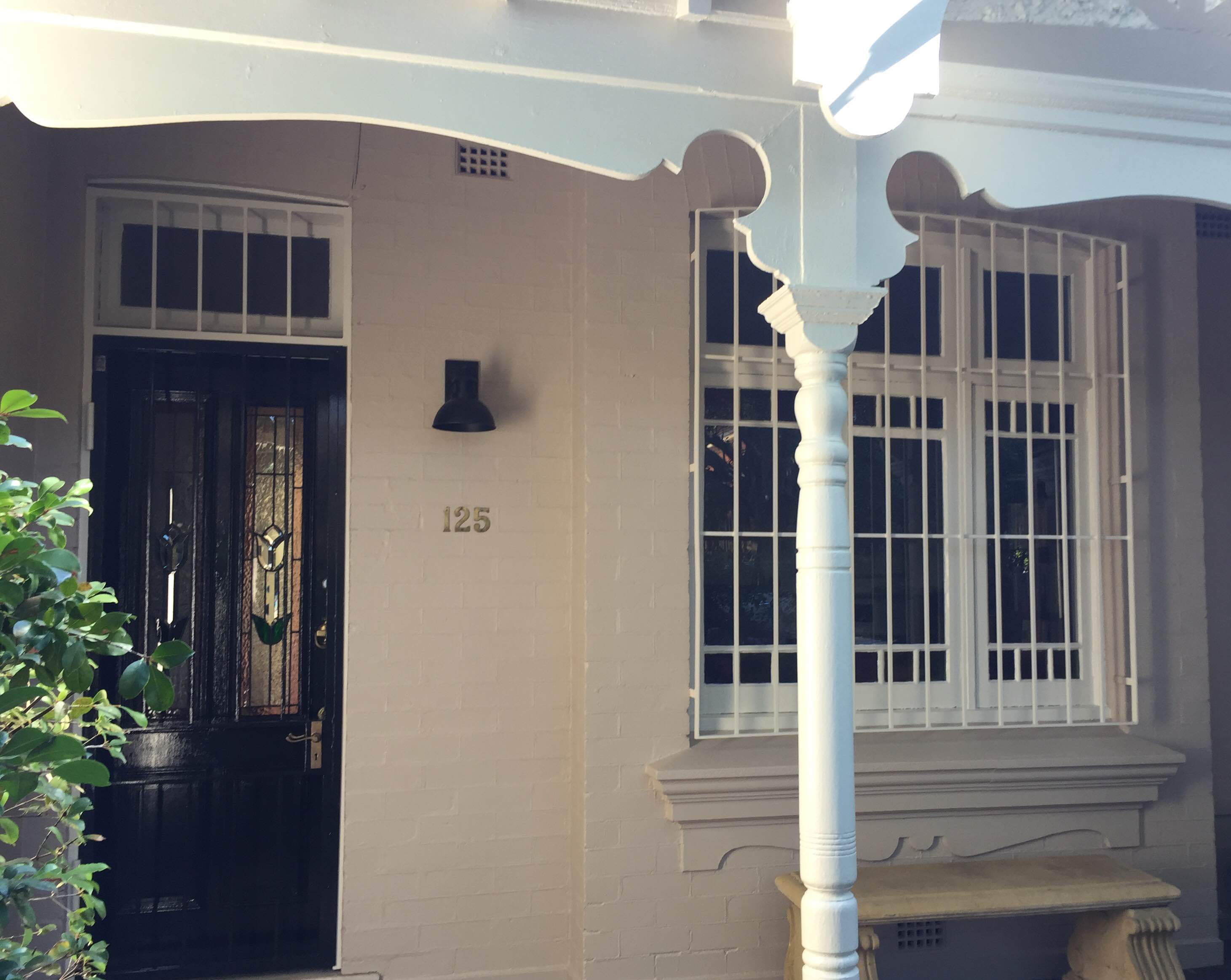
This house below demonstrates how the natural bulk and shadow will impact on a house exterior with one wall in shadow appearing much darker than the one in sunlight.
So if you do like the idea of white on white then ideally you should have a quarter strength of the white for the trim and a double strength of the white for the main colour.
If you don’t want to see any difference between your trim and wall colour then I recommend opting for a darker white that will be more serviceable and using this for the trim and wall colour.
Basically, you either need a large difference in tone or none at all - in between will just look like you didn't colour match correctly.
Partnering white exterior paint with other architectural elements
Windows, roofing, gutters and fascia, particularly for new houses, will often be in a powder-coated finish which means your selection of whites is quite limited. Remember that if you don’t want to see a difference between your trim and wall colour then it is a good idea to match your wall colour to your powder-coated, Colorbond, or other steel colour so that you get the continuity of your white.
Colorbond Surfmist is a popular roofing, window and trim colour in Australia and when you look at this sample next to most white paints, it is actually quite grey and dark. This is good as it will stand up to bright sunlight well but if partnered with another white, it can end up looking grubby and in some lights a little creamy.
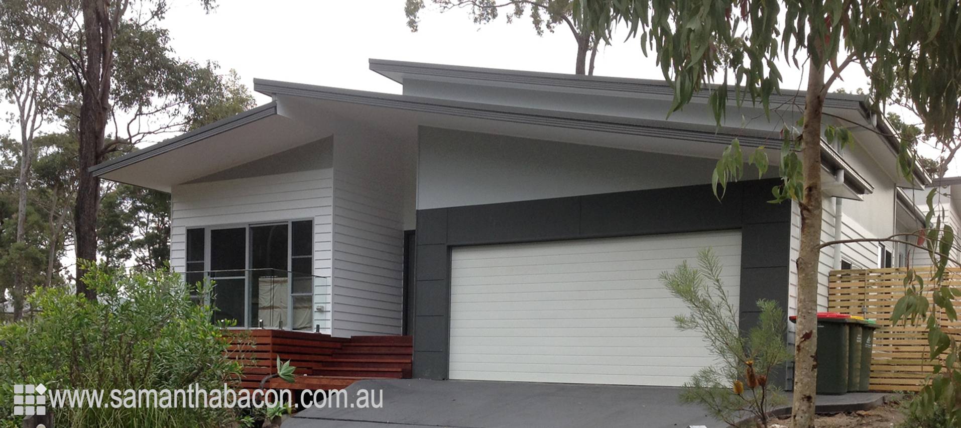
On the house below I have used Colorbond Surfmist for the garage door and weatherboards to ensure that the whites used on the front elevation are exactly the same. You will see that they both look to be a lovely crisp, fresh white but Colorbond Surfmist is actually much darker than most whites in a colour chart.
For a cottage style house, it is nice to see some variation between the weatherboards and the windows and this image below with Taubmans Brilliant White fascia, eaves and windows partnered with Taubmans Windswept Beach for the weatherboards works really well.
Ideal white exterior trim paints
If you are painting a house in its entirety and simply using a white for your trim you will need to consider what will work with your wall colour, as you would for an interior.
You also need to consider the look that you want to achieve. If you like the idea of a really fresh white trim, you can opt for something like Dulux Vivid White. However, if you want something a little more serviceable then I would recommend a softer, dirtier white like Dulux Caspar White. Remember that these two whites together are very different but outside and when partnered with a darker neutral for the walls, you don’t notice the difference, you will just achieve a different effect.
I go into more detail in this related post Why I love a crisp white trim
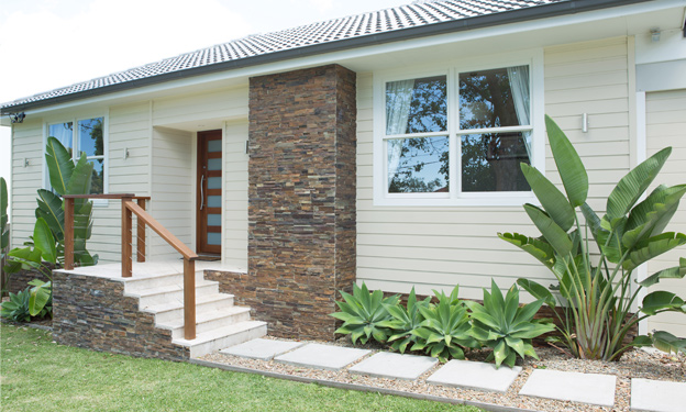
One of my favourite trim colours, particularly for older heritage style houses, is Dulux White Duck Quarter strength. This is one of those great whites with a green neutral base and I find it is very user friendly. I have used it on this house below with Dulux Camel Train on the walls and it works perfectly.
Don’t forget to paint the eaves and verandah ceilings
Colours look twice as dark when you hold them horizontally above you so a white that looks great on your trim can end up being too dark for your exterior ceilings.
Therefore if you have a full strength of a white on your trim, it is a good idea to use a half or even a quarter strength of the colour on the eaves. If you are already using a very light white for your trim it is usually safe to continue this on your eaves but do remember that it will appear slightly different.
I go into much great detail in this post.
Related: My guide to painting eaves
I would love to hear from you in the comments section below if you have used white for an exterior project. Happy Painting!
Stay connected with news and updates!
Join our mailing list to receive the latest news and updates from our team.
Don't worry, your information will not be shared.
We hate SPAM. We will never sell your information, for any reason.