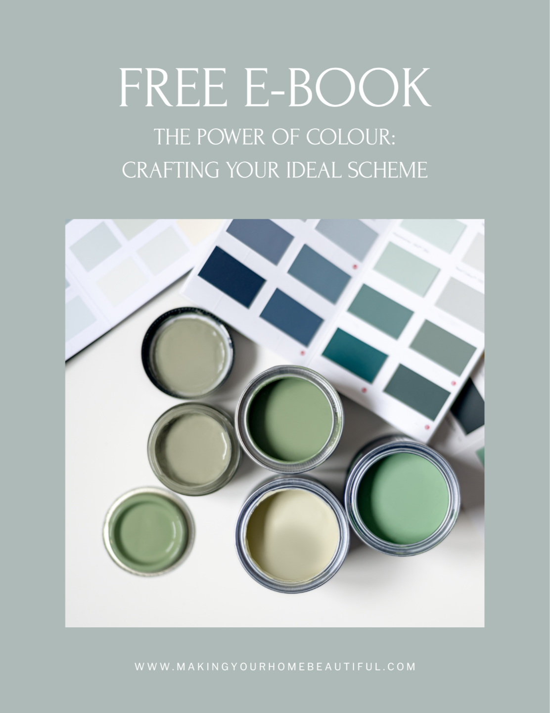
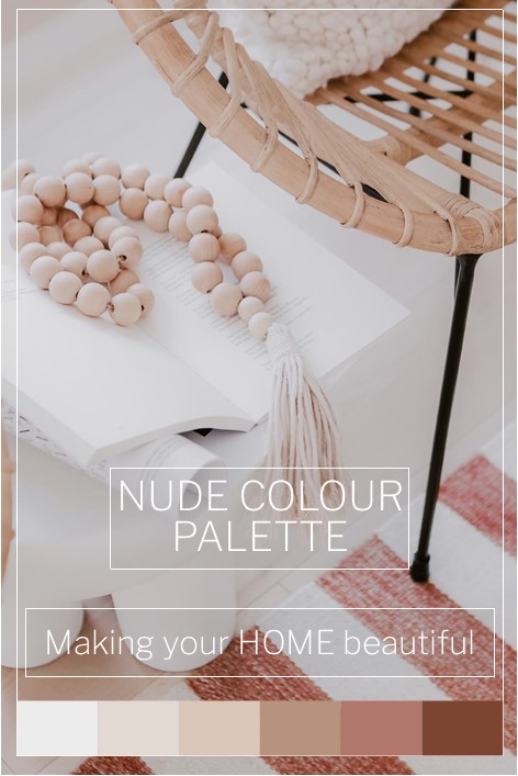
How does everyone feel about the warm colours, whites and neutrals that are gaining in popularity? I love warmer tones as they are comforting and gentle on the eye. However, I know some people are mystified that terracotta has made a comeback and that blush and apricot tones are now in vogue again. If this is all too much for you, but you do want to explore using some warmer tones, then a soft Nude colour palette may be just what you are looking for.
The beauty of a Nude colour palette is that you get the warmth of pink and orange but without the deep and strong colour statement. It's a way of bringing some softness to a scheme which is somewhere between a colour and a white.
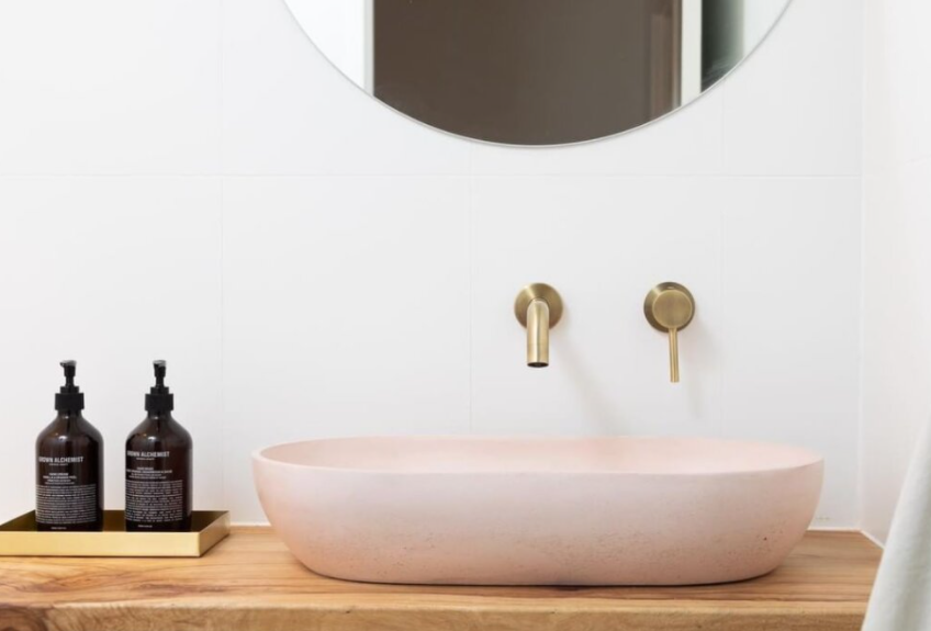
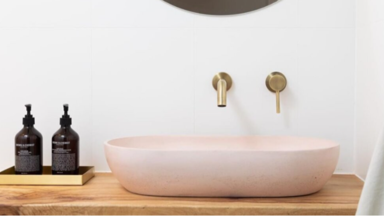
A white bathroom is gorgeous and crisp and of course timeless but they can sometimes look a touch clinical. Some warm timber tones go a long way to addressing this but by adding just a simple basin in a nude natural concrete, you elevate the scheme to another level.
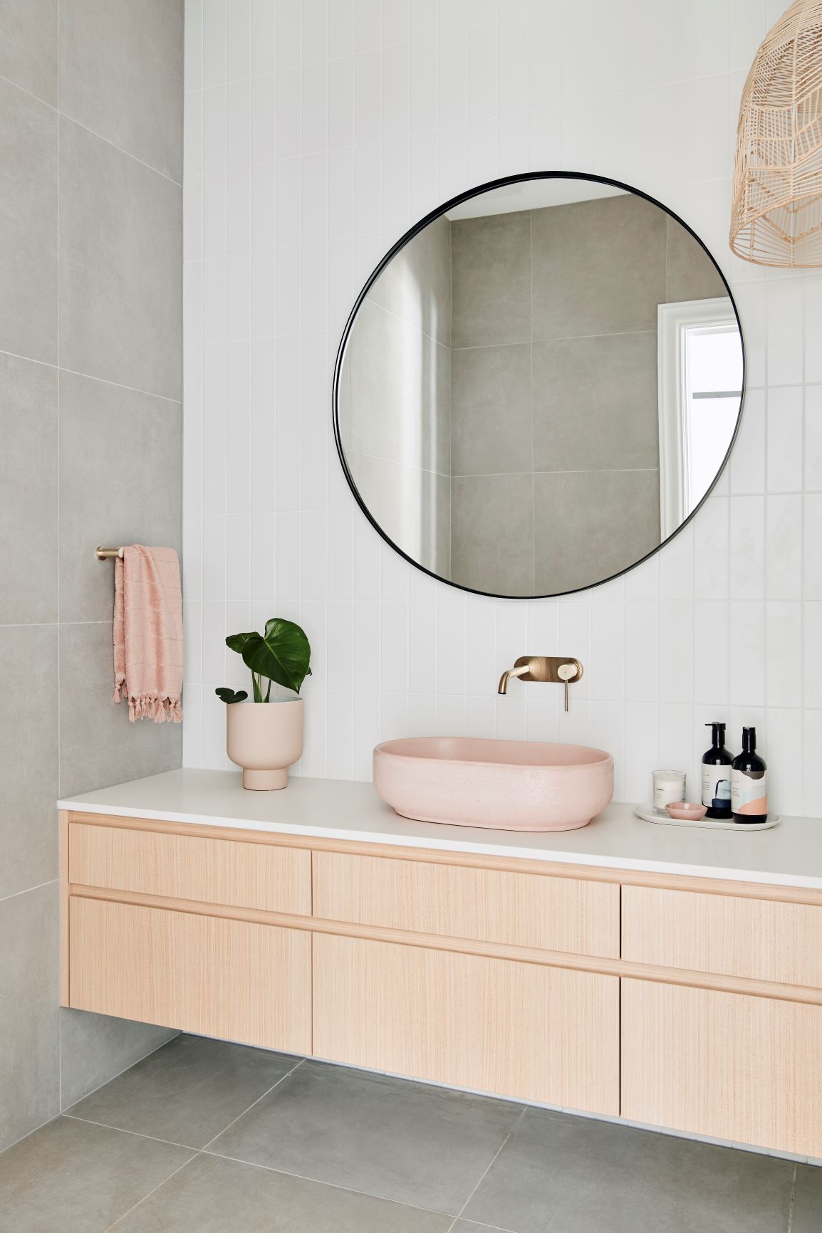
Have you also noticed that tapware is becoming far more adventurous in its colour offerings? For many years, we simply had chrome and more chrome to choose from. Then we started to see a little brass and lots of black on the market and now there is a range of more than a dozen finishes to select from, many that suit this gorgeous nude colour palette.
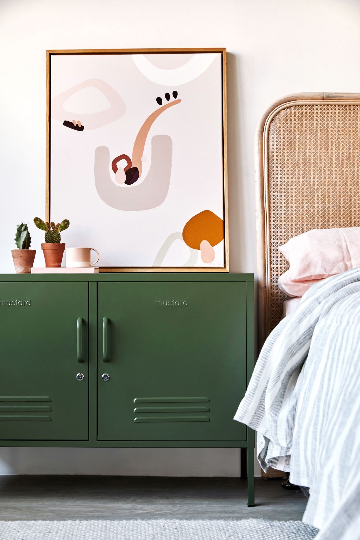
If you love the rattan trend, the odds are that you would also like this colour palette. You can see from the image above that the nude and warmer colour tones that they derive from, fit perfectly with natural rattan. These are the elements that we have been introducing into our interior schemes over the last couple of years in an effort to introduce texture, but also soft natural colour.
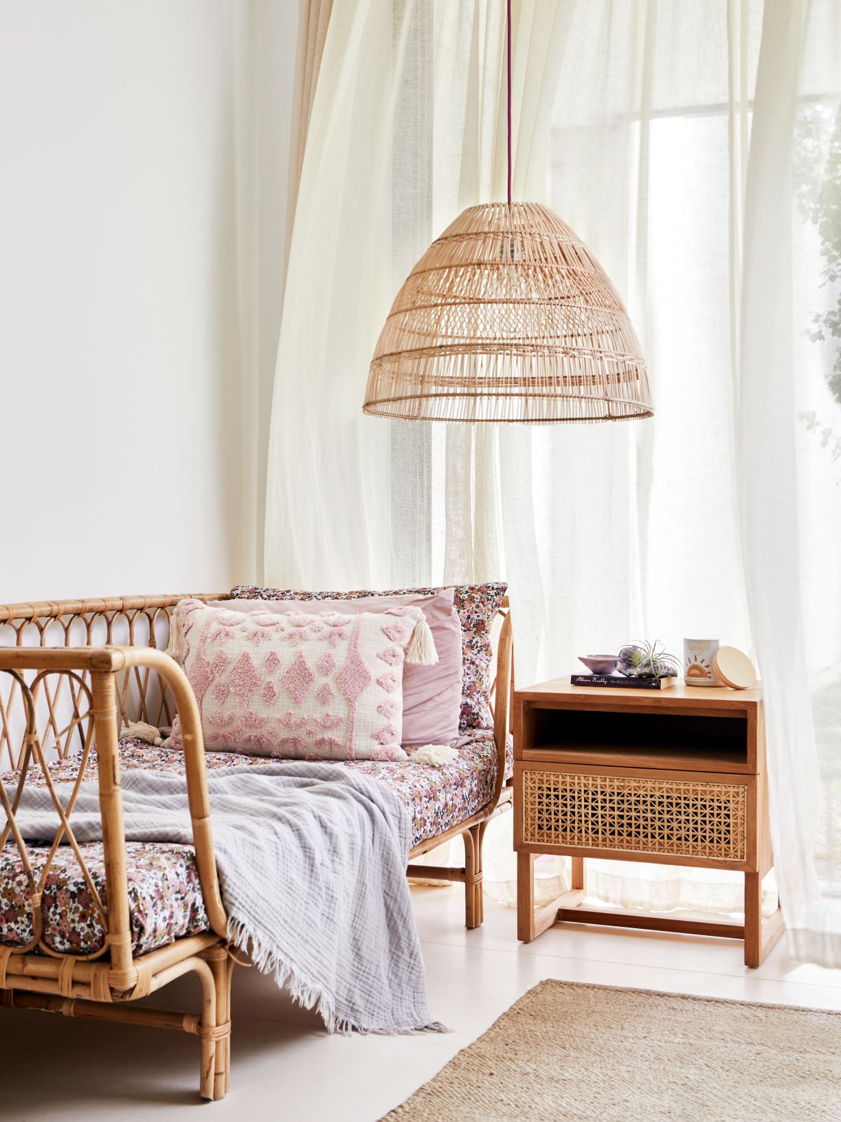
Related: The Rattan Trend - how to introduce it into your home
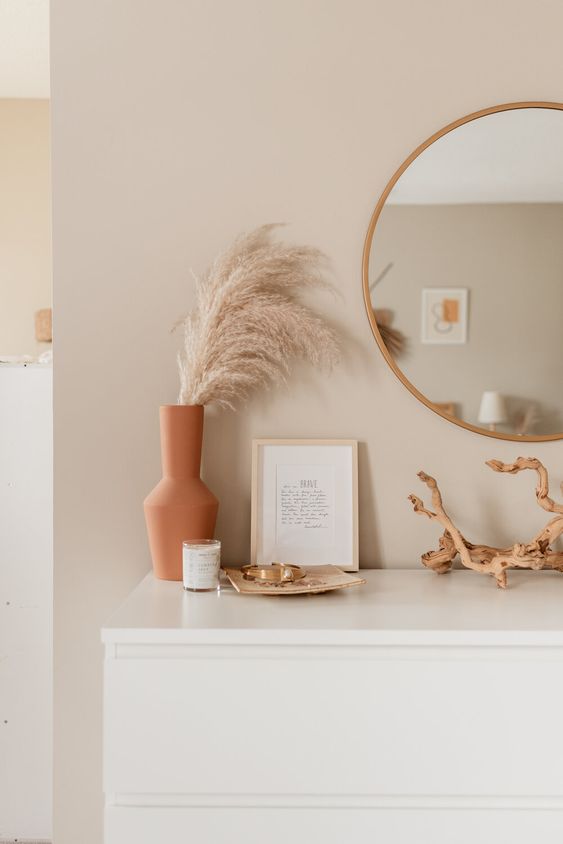
As lovely as a soft nude colour palette is, I do like to see some contrast in tone and this colour palette above demonstrates how you can use these tones with crisp white, beige, pink and terracotta.
Related: Let me show you how to use Terracotta
A Nude colour palette and it's relationship to beige
A nude colour tends to be slightly more pink than the more traditional tones of a warm yellow beige. However, as they are adjacent on the colour wheel, soft nude tones sit very well with a warm beige and creates a harmonious colour palette. An injection of crisp white prevents the palette from becoming too sugary and sickly.
Related: Decorating with the new beige
Other colours that work with this palette
A Nude colour palette is a very natural one and I love to see it as a backdrop to green, which is its complementary colour. In its very lightest form, a nude tone is almost white.
Don't be afraid to match some warm greys with this type of colour scheme. Soft taupe greys suit a nude colour palette perfectly.
Stay connected with news and updates!
Join our mailing list to receive the latest news and updates from our team.
Don't worry, your information will not be shared.
We hate SPAM. We will never sell your information, for any reason.