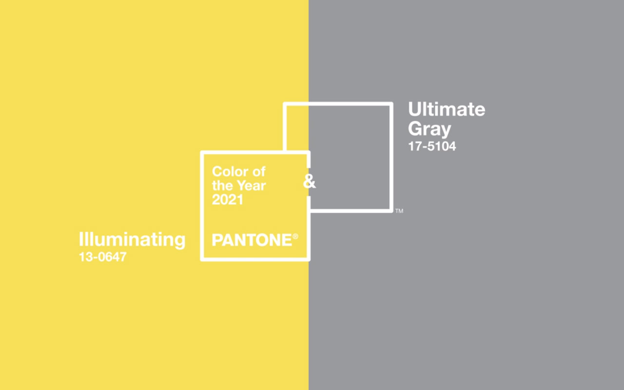
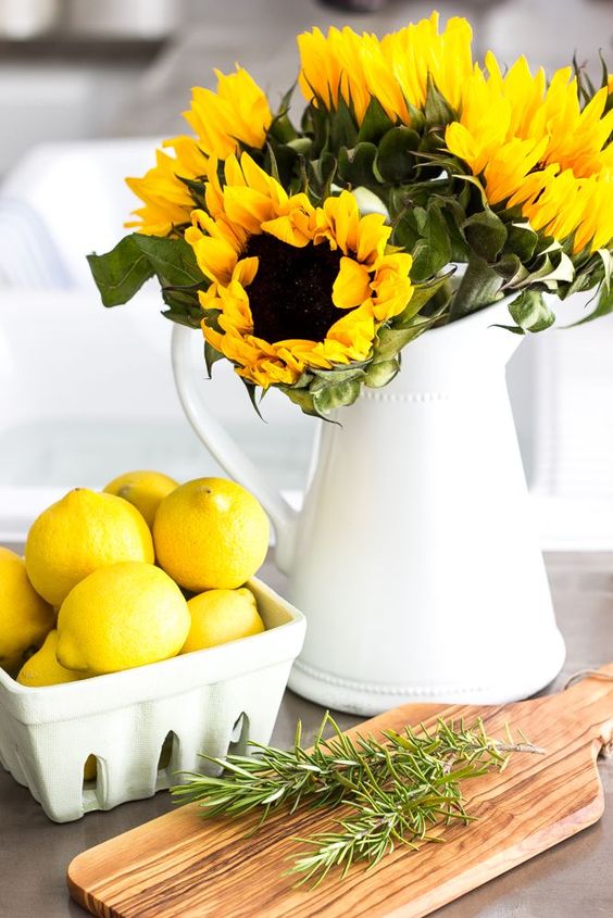
Yellow is the happy colour of the spectrum. Uplifting and bright, this colour evokes images of beautiful sunflowers, bobbing heads turned towards the sun and brings warmth to all it touches. Good news for those of you who profess to love yellow as it is purported that this beautiful bright colour is liked by intelligent people who appreciate innovation and originality. 2021 sees it playing a starring role as Pantone's colour of the year, complemented by grey. Let me show you how to use yellow in your home here.
Yellow can however be one of the trickiest colours to get right in an interior scheme as its chroma (brightness) level is so high and in large amounts, particularly with a fair degree of natural light, can be quite overwhelming.
My favourite way therefore to add yellow to an interior is as an accent colour - remember the old adage that less is more? Well, this definitely applies here! A touch of yellow brings an uplifting and quite stunning element to a neutral scheme that no other colour can achieve. The good news is too that cool, fresh yellow is on trend at the moment so there are lots of lamps, cushions and throws in this colour.
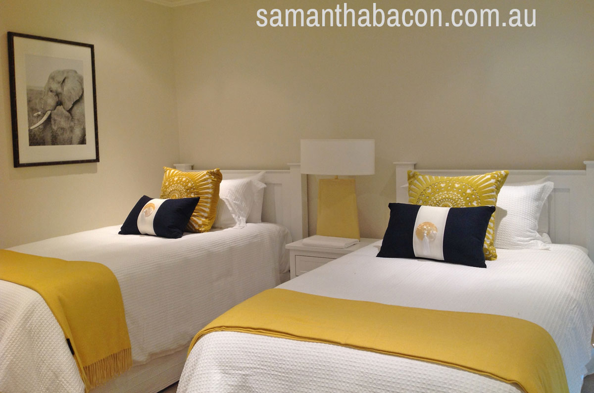
Yellow goes with:
The classic partnership is with white and this dates back to the Regency era in England during the 19th century. Regency Yellow was seen as a very daring choice for interiors and if you used it, you were a trailblazer at the time.
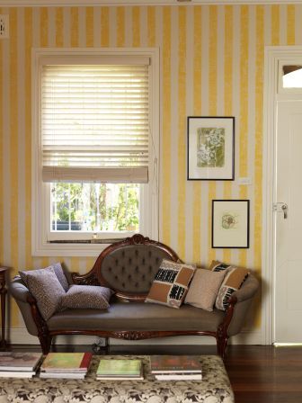
This image of yellow and white striped wallpaper is from a Florence Broadhurst design, Smudge Stripe, in a custom colour, hand printed in Signature Prints’ studio in Sydney. Rather than a solid stripe, the edges of the yellow are softened with white making this very easy to live with. This style is particularly suited to period homes and works well in small amounts.

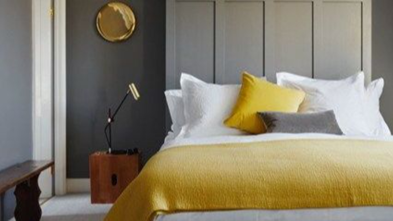
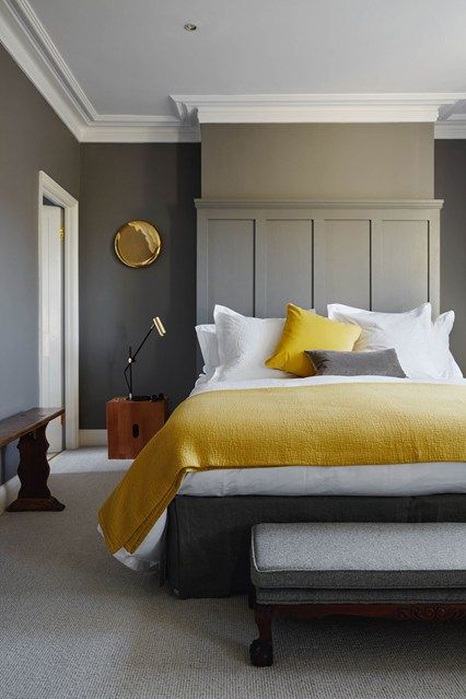
A modern partnership is to use yellow with grey, the neutral of the moment.
As a real lemon cuts through oily food and makes a great accompaniment to fish, the colour lemon - or in posh circles, Citron - has the same effect on grey. It truly makes it come alive and I must say that this bedroom is one of my all time favourites - a really beautiful bedroom that I think you would agree, would be quite flat without these bright accessories.
A classic colour combination is yellow and navy blue.
Dark navy is a great alternative neutral colour. Where black is too strong, or grey, too flat, Navy Blue works really well. It's interesting to see one of the darkest colours partnered with the brightest and I think it offers a really classy look that is timeless.
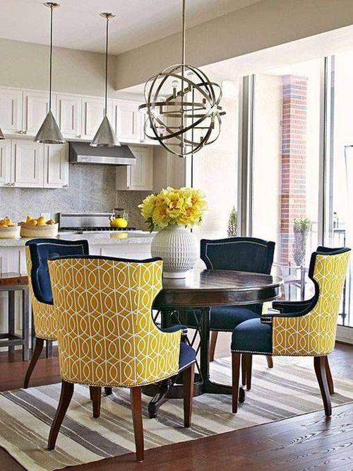
The richness of a natural dark timber floor works well with this colour as it provides an effective tonal contrast that would not be achieved with a lighter more yellowish tone of timber. This is important as these colours together can really be quite sickly and one of the tricks of using a strong bright colour is to also employ strong tonal variation.
Using Yellow for walls
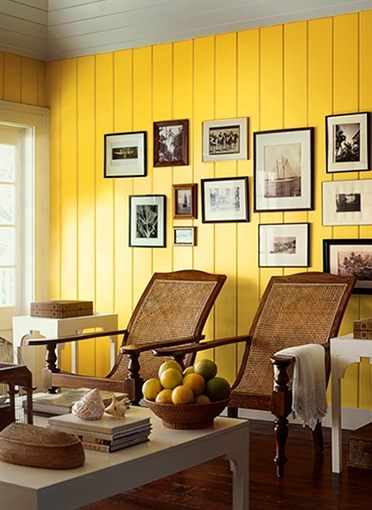
I have recommended that yellow be used as an accent, due to its brightness, but it can be used on walls if you follow these rules:
- Choose a yellow that is muted. Yellows made from natural pigments are more successful for walls than those from the mainstream paint suppliers so look for companies that hand make paints in a traditional manner. This way you achieve a colour that has beautiful depth without being glaringly bright and overwhelming.
- A yellow with some white will produce a creamy colour that gives you the warmth and the sunny mood without the brightness.
- Traditional ochre is a gorgeous natural yellow and although not as uplifting, it still gives you a lovely comfortable and warm environment.
- If you do want to use this colour on a wall then think about adding texture. Wall panelling is great to offset a bright colour, either inside or outside, as the natural shadow lines break up the brightness and you can get away with far more than if you were painting a plain surface. The image above from Ralph Lauren demonstrates this perfectly and the strong contrast of the dark timber for both the flooring and furniture helps to pull this look together.
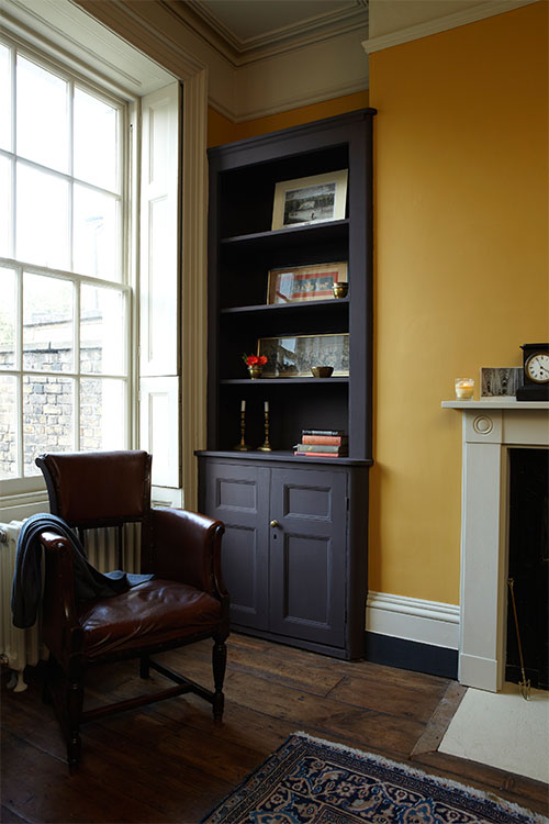
If you have a space in your home that is low on sunlight and needs a welcoming colour then you could consider using India Yellow. There is a myth that this colour originally came from a pigment collected from cow's urine and was due to their diet solely of mango leaves. This has been disputed and although a great story, I am not sure how true it is! Today India Yellow is achieved with a pigment that has touches of burnt orange and is a lovely warm and mellow yellow that is muted and perfect for walls. Farrow & Ball has a lovely India Yellow which is shown below:
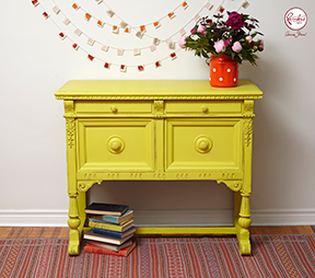
A great way to introduce yellow into a colour scheme is to paint a piece of furniture. Chalk Paints are perfect for this look as again, being traditionally made, their pigments are natural and the brightness just seems to work. Annie Sloan's yellow sideboard demonstrates this point really well with this very cool, almost green yellow.
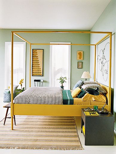
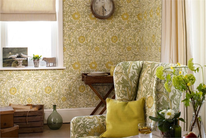
I love to put colour palettes together from nature and this one demonstrates a lovely range of yellows from a warm, almost orange yellow to a cooler, crisper one and a lovely soft creamy example that could be used for walls in a room that craves light and warmth. Gorgeous stone neutrals and natural greens are fantastic partners to this bright and happy colour range and create a beautiful natural feel. I have a few examples below of this colour scheme.
This bedroom demonstrates how well this palette works together:
For a more traditional country cottage look, this image from Morris & Co is another great example of this natural colour palette.
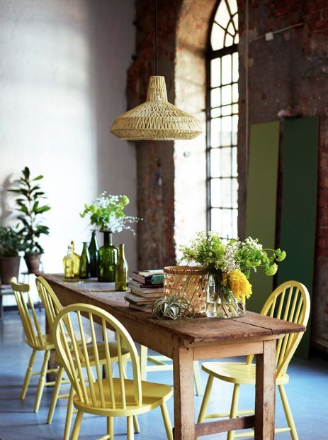
To complement the Greenery trend. Funky yellow chairs work really well with this beautiful natural palette.
So, whether your style is contemporary or traditional, you can see that yellow really does work beautifully in interior schemes. Partnered with its related colour, green for a classic feel or with grey for a very modern look, it can really bring a room to life. Remember when you are looking for the perfect colour that they can always look sharp and bright or soft and mellow - it is just a case of choosing the right one for your room and style.
Pastel hues are also gaining in popularity so if you like a touch of yellow but find it too bright, then select more of a pastel tone. These work so well as they contain a large degree of white - the more you add - the easier the colour is to match with others.
Related: How to decorate with pastels
If you have enjoyed this article but want to find out more about using this colour, you may be interested in an article that I wrote for Modern Home magazine about partnering this uplifting hue with black, white and grey.
Stay connected with news and updates!
Join our mailing list to receive the latest news and updates from our team.
Don't worry, your information will not be shared.
We hate SPAM. We will never sell your information, for any reason.

