Skirting boards and architraves are often given the least thought - they are in fact an after-thought but the colour and tone that you use here can make or break your colour scheme. I have some guidelines and tips to help you to decide the right colour for your look.
Skirting Boards and Architraves are the link between rooms
Often people will just use one white or neutral to go through their house which works well - particularly if you are simply using a crisp white which won't really change much.
Sometimes though a house can benefit from different tones of a white or neutral if the aspects of the rooms are vastly different. For example a darker, south facing room without much natural light may benefit from quite a different tone to a bright sun-drenched north west facing room.
A soft neutral or white will appear quite different depending on the room that you use it in. This isn't necessarily wrong but you need to double-check that you like the effect.
I always recommend painting a large board with two coats of your chosen colour and then move it around the house, viewing in daylight and at night time with artificial light. This may seem like an onerous task but nowhere near as much work as re-painting a room!
You may also choose to paint different colours in rooms thoughout your home. I have used a dark grey in my living room, a mid grey in my kitchen and then an off-white in my dining room. They all flow into one so I had to ensure the colours worked together.
What helps to make it work though is that I have one trim colour for my skirting boards and architraves that I take throughout the house. This colour becomes my link for the scheme and helps to make the colour palette flow.
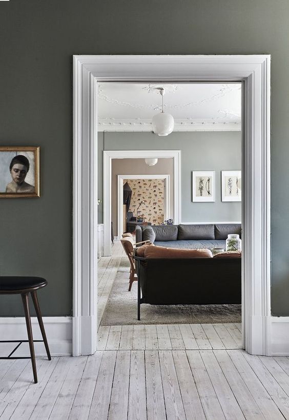
This image above is the perfect example of adjoining rooms with different colours/tones/wallpaper which works because you have a definite white connecting trim colour.
I have written an article about using white trim on exteriors which is relevant to interiors too.
Related: Why I love a crisp white trim
Usually you would also use the chosen colour for your skirting boards and architraves on the internal doors - unless you have beautiful timber doors which you want to keep - and you can also link it to other accent areas like shelving, bookcases and kitchen cabinets.
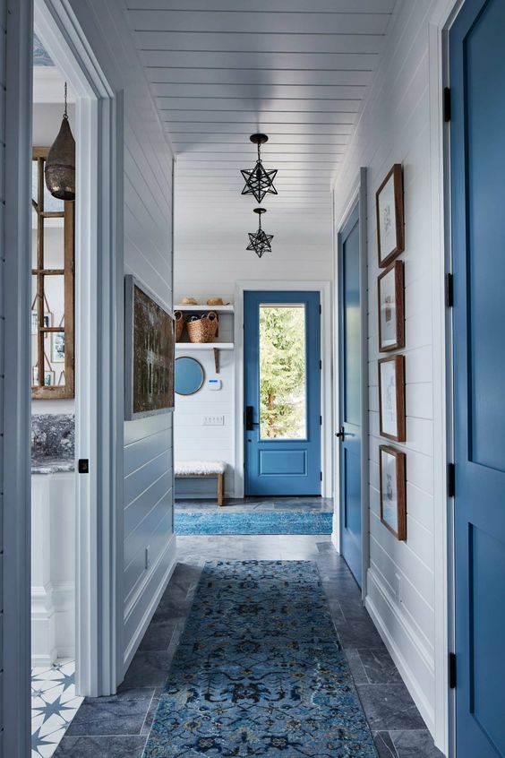
Alternatively, you can use your internal doors to make a colour statement. Gone are the days when we choose an entire wall and paint it another colour, you need to think differently about how you introduce colour and this image below shows you how successful this idea can be. Skirting boards and architraves are white to match the walls while all the doors, including the external one is a gorgeous blue.
If you have powdercoated windows then you can't change these but if you have timber ones you can choose to paint them the same or highlight them. Generally they would be painted the same but you can make a real statement by painting the frames a different colour - just ensure you have nice windows as you will be drawing attention to them!
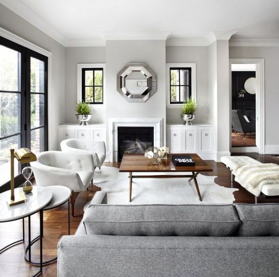
This is the perfect example of a linking white trim with a soft neutral on the walls and black window and door frames - I think this combination, highlighting these beautiful windows, is terrific.
Which colour to use?
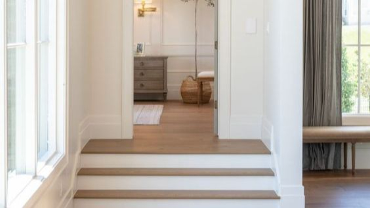
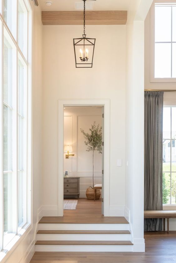
The colour that springs to mind for your trim is usually a white. Contemporary decorating generally sees us painting our skirting boards and architraves a white as in the image below. If you have white walls you can use an even brighter white or the same white in a different finish to your walls.

This doesn't have to be the case though as you can create quite a different and I think, stunning, effect by painting the trim colours a darker tone. This could be a soft grey and could also be used as the accent colour through your house for internal doors, cabinetry etc.

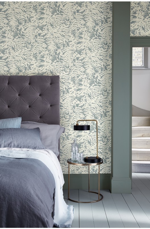
In the image above the designer has used a soft grey for the skirting boards, architraves and the ceiling cornice. I really like this effect as it means you can have a simple white wall without the rooms being too plain. This of course works particularly well in a period style house. As the designer has used dark shutters, they have painted the architrave around the window to match which prevents the look from becoming too busy.
If you are a wallpaper fan you can tie your skirting boards and architraves into the wallpaper colours. This works best though if you keep this colour scheme throughout the house, even if the other rooms are a soft grey, neutral or white on the walls. Alternatively you can decide on a convenient place to stop and switch to a more neutral trim - find an area where the whole scheme is not on show - perhaps a turning into a hallway.
My tips for painting skirting boards and architraves
- If you are using a white or pale neutral on your walls then use a half strength or for more contrast, a quarter strength of the wall colour for the trim. My general rule is full on wall, half on trim and quarter on ceiling and cornice.
- If you are using a crisp white on your walls you can simply use the same white on your trim. As trim paint should be a little more durable - or a lot more durable depending on children/dogs/tricycles used inside! - the finish will be different and therefore you will get a slight variation as the light will reflect differently.
- If you are using a darker neutral on your walls you will need to look at the undertone to find the correct white to go with it. Remember that there are cool whites and warm whites as there are warm and cool neutrals - greige, beige, stone and grey colours.
- If you have a white kitchen or are planning one, then use the same white as your trim white. This keeps things really simple and ensures that the kitchen cabinets and the skirting boards and architraves will both work with the wall colour.
- If you would like to introduce a neutral into your colour scheme but like the idea of keeping the walls a very light colour or a white then consider using this for your trim colour. This can be a dominant choice though so ensure you like it through all your rooms.
- You can either paint your internal doors the same as your trim colour or have something different. If you have beautiful timber doors and window frames that you don't want to paint then you can leave these and just paint the architraves.
- Although wherever possible you should use your trim colour to link the colour palette throughout the house you can make exceptions, for example if you have dark shutters on a window and you want the architraves to blend in.
- Always consider the effect that you will achieve if you have a strong contrast - white trims on a dark wall or as below dark trim on a white wall. The effect can be stunning but you need to ensure that you will like it!
Stay connected with news and updates!
Join our mailing list to receive the latest news and updates from our team.
Don't worry, your information will not be shared.
We hate SPAM. We will never sell your information, for any reason.