Let me explain to you why I love a crisp white trim. The ubiquitous neutrals are a perennial favourite for exterior and interior decorating schemes. In fact, I really don't get asked about much else when it comes to selecting paint colours.
So, what exactly is a neutral?
In theory it should be just that - a grey or stone colour that doesn't have any underlying colour. In reality however, when it comes to decorating, the word is bandied around to encompass anything that is not a definite colour, so includes warm taupes, subtle beige and biscuit tones, green based stone colours and of course the ubiquitous grey - the neutral of the moment. Some more than others have a definite underlying colour but there is one thing that I believe they all have in common - they come alive when you partner them with a crisp white trim.
Stritt Design and Construction
I'm concentrating on exteriors in this post and wanted to show you some examples so you can see what I am talking about. Scroll down and you will also find out my go to white trim choices and some important points to consider when selecting your white trim.
Viewing a neutral against white
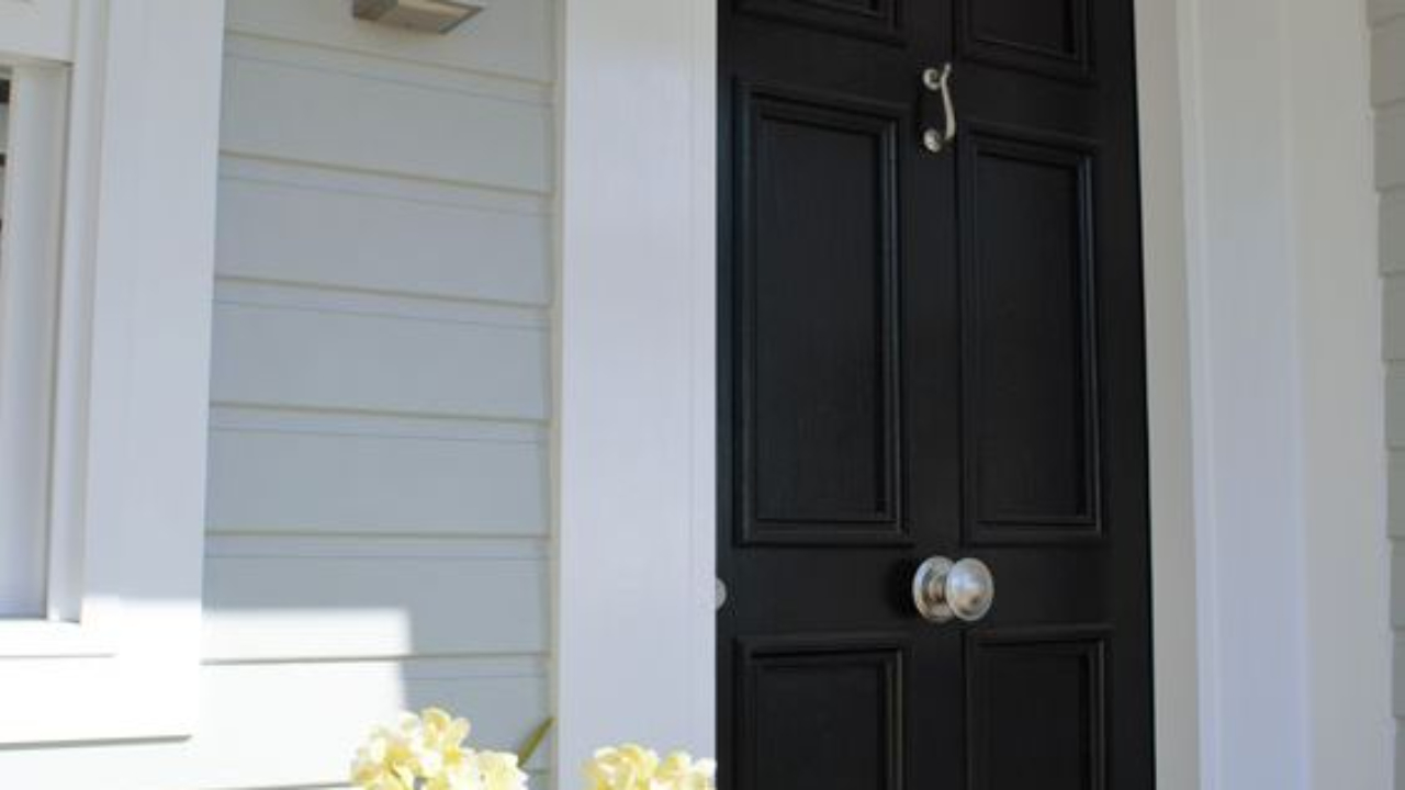
Whenever you look at a neutral colour, they really come alive once you view a white sample with them and the beauty of introducing white is that the neutral looks much deeper in tone than it would on its own. This means that you can use a lighter neutral on your exterior scheme but make it work with a crisp white trim. This is also the classic partner to a sleek black front door.
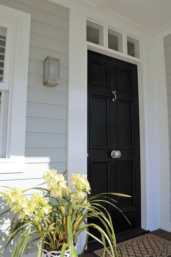
Introducing a white trim on white weatherboards
This image also demonstrates how you can use a light white neutral on a weatherboard but finish it with fresh white to make it pop. If you used the same white as the weatherboards on the trim, the effect would be lost and the house would be too one dimensional. The black door is there again - that classic black and white partnership!
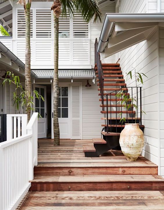
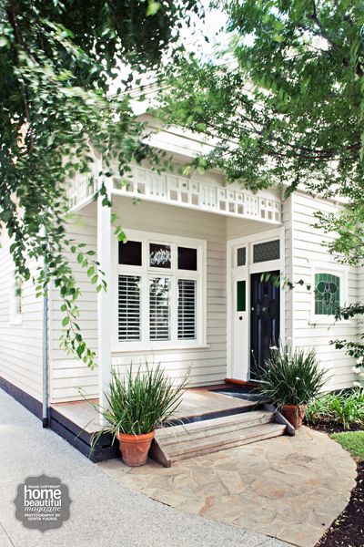
Just a subtle difference here but the crisp trim makes all the difference. Remember that you don't always have to make an amazing colour statement - just a gradual tonal variation helps to define the architectural elements. I think you will agree that this accommodation in Byron Bay is quintessential Australian Coastal style - I love it!
Smart white trim on a black weatherboard home
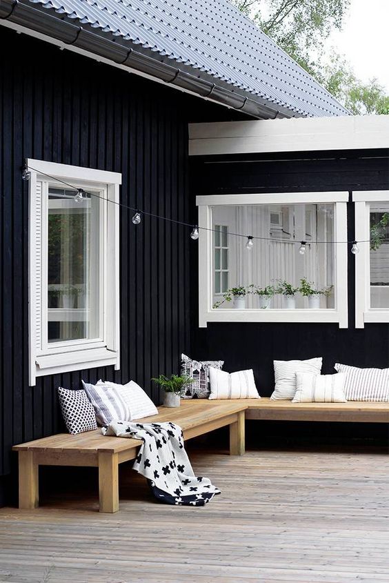
And of course, this article wouldn't be complete without a mention of the classic black weatherboard house. This house would have a very different vibe without the white trim.
So what is a crisp white? See my go-to trim whites here and my 4 steps on how to use them
My go to white trim colour is either Dulux Lexicon Quarter strength or for a softer look Dulux Vivid White. Porters Snow White also works well and from the Haymes range I love Greyology 1. There are a few points though that you have to bear in mind when selecting the right white for your exterior trim:
- Are you using Colorbond colours for your gutter and fascia? If so, the lightest is Surfmist and depending upon the style of your house you may need to continue this as a trim colour. If you are not a fan, you can restrict this to the roof line and then change to a fresher white for window architraves, posts, balustrades etc. I know people often find Colorbond Surfmist too grey but in fact you do need some grey to stand up to the harsh Australian sunlight. An update to this in August 2022 - Colorbond has just released a crisp white called Dover White which gets around this problem if you want to use it.
- Consider the neutral that you are using on your exterior. Is it a grey or a beige tone? This will dictate whether you use a clean fresh white like Dulux Lexicon quarter or you may want a softer white like Dulux Natural White. Don't forget to view and test these neutrals and whites outside as this will make a huge difference.
- Consider the depth of the neutral that you are using on your exterior. How deep is the tonal level? If very pale then you will definitely need a really crisp white to see a difference. If you are using a deeper tone then you could get away with a white that has more depth and still achieve the same effect.
- Don't forget your eaves and veranda ceilings - with all this white trim, it's a good idea to continue the look here too.
Related: My guide to painting eaves
So the next time you are considering using a neutral for an exterior scheme, don't forget your trim colour. Remember that this will make an impact on your chosen wall colour and if chosen correctly, will really help to define the house and pull the colour scheme together. I would love to hear from you and answer your questions about which white is right for your exterior trim!
Stay connected with news and updates!
Join our mailing list to receive the latest news and updates from our team.
Don't worry, your information will not be shared.
We hate SPAM. We will never sell your information, for any reason.