Decorating a home can be a time consuming and expensive undertaking so I often recommend that clients turn to the classic warm neutrals when looking for a foundation to their scheme. This creates a welcoming and timeless home that can be partnered with many other colours. Decorating with warm neutrals isn't perfect for every style or home - nothing is - but it could be your answer if you are unsure of the look that you want to commit to.
I am going to show you why warm neutrals are so easy to use for your decorating palette.
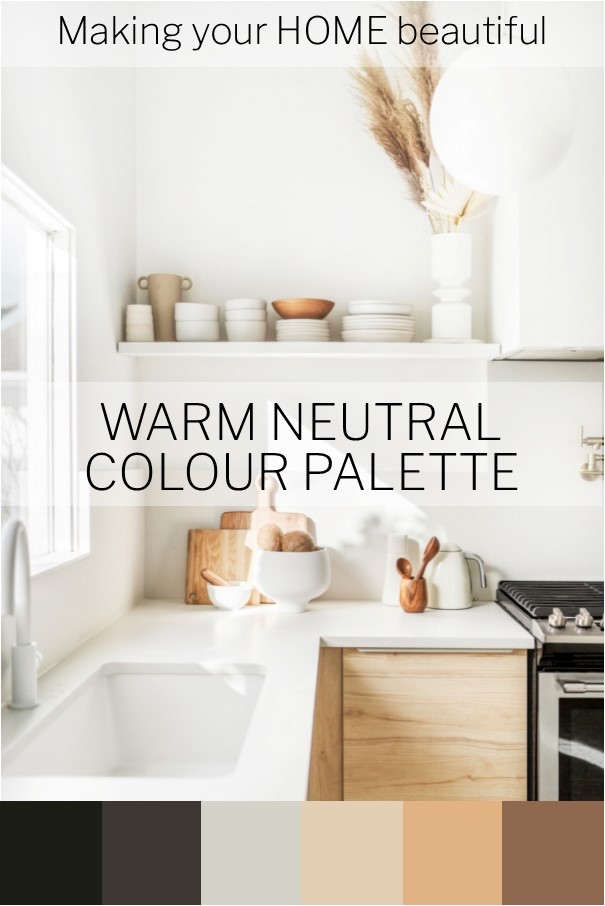
Why you should be decorating with warm neutrals
We have all heard the term, earthy colour palette. It sounds so grounded and comforting, which is exactly what it is. The colours in an earthy palette are rich and inviting. Caramel, biscuit, sand, nut oil, ploughed earth and mocha are just a few of the names you will come across in a paint fandeck when researching this palette.
All of these are very easy to live with. They might not necessarily set the world on fire but when partnered with some soft whites they will give you years of a great classic and classy foundation to your home.
What is a neutral?
The colours from an earthy palette are warm but not necessarily neutral. A true neutral doesn't have any obvious underlying colour. It's difficult to see whether its base is a green, yellow, pink or blue. However, I find that there are very few true neutrals but a whole bunch of lovely understated soft tones that we refer to as neutrals.
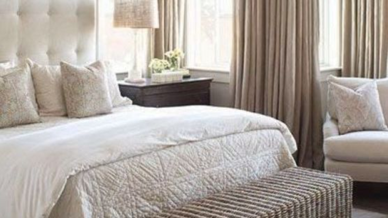
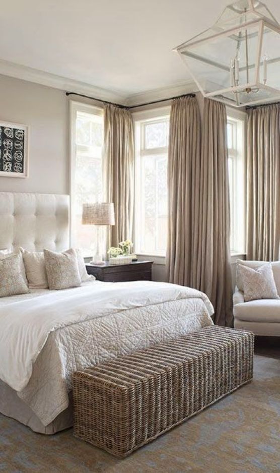
A warm neutral will have a yellow or possibly pink base. This is where I hear you say, but I don't like cream! Fortunately, a warm neutral is often far removed from a traditional buttery cream. If you take many of the beige or greige tones and ensure they are pale enough, you will have a classic warm neutral.

What I like about a warm neutral colour palette
My main reason for liking them is that it is a very natural palette which relies heavily on nature. Natural floorcoverings, sofas upholstered in linen fabrics, natural clay pottery, sandstone fireplaces and gorgeous natural timber floors all fit into this scheme. There is nothing cream about any of this.

Related: Let me show you how to use a natural colour palette
Many of the best colour palettes will be those that include some strong tonal contrast. Elements of black and white bring some distinction to a warm neutral palette and there is no reason that you can't introduce some simple grey to the scheme too.
Mustard tones are very on trend for 2020. A colour that has been so shunned in the past is making a comeback and is a gorgeous way of adding some rich colour to a warm neutral palette.
Related: How to decorate with Mustard
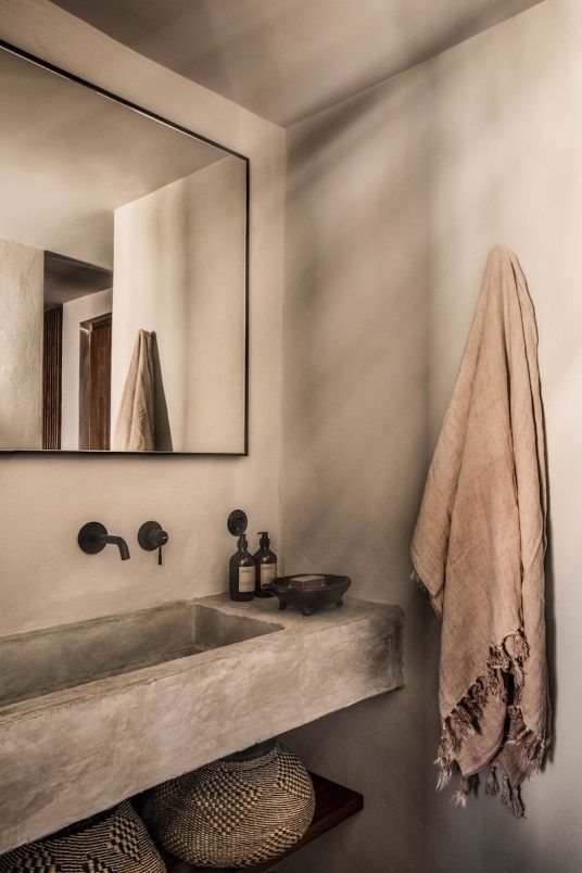
A warm neutral palette in a bathroom is particularly effective. We often associate bathrooms with crisp, cool colours but in fact often these rooms are used early in the morning when the weather is cool, even in warmer climates. It therefore makes sense to consider a more approachable palette for these spaces.
Some of my favourite warm neutrals
Dulux Baltic Sand is a great soft, almost white, warm neutral. Opononi, from their New Zealand range is another lovely warm neutral with enough grey to make it sophisticated and comes in varying strengths.
The Organic range from Haymes is a great example of some warm neutrals. Ranging from almost white (no.1) to a lovely rich brown (no.7). Or their Whitewash range may work for you if you prefer a little more grey added.
If you prefer a white wall you can still introduce a warm neutral palette with rugs, sofas and accessories. Rich timber flooring, furniture and artworks can also bring warmth to a scheme. Bear in mind though that the white that you select should be a warm one.
Related: How to find the right white
Stay connected with news and updates!
Join our mailing list to receive the latest news and updates from our team.
Don't worry, your information will not be shared.
We hate SPAM. We will never sell your information, for any reason.