If you love the relaxed feel of coastal style but want something more refined, grounded and timeless, then a Warm Coastal Calm colour palette is the perfect direction.
This palette takes everything we love about coastal living—light, softness, connection to nature—and elevates it with warm undertones, gentle contrast and a more sophisticated finish. The result is a home that feels calm, welcoming and effortlessly elegant.
What is Warm Coastal Calm?
Warm Coastal Calm moves away from the cooler blue-and-white coastal schemes and instead embraces:
- Soft, sun-warmed neutrals
- Sandy beiges and muted taupes
- Creamy whites rather than stark whites
- Subtle depth through layered tones
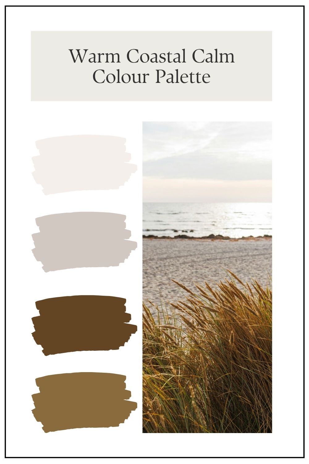
It’s inspired by natural coastal elements—think driftwood, dune grasses, warm sand and sun-faded textures—rather than crisp nautical contrasts.
How to Use Warm Coastal Calm on Your Home
What makes this palette so successful is the way each colour plays a specific role. There’s a clear balance between warmth, softness and depth—nothing feels too stark, and nothing feels too heavy.
Let’s break down the colours in this scheme.
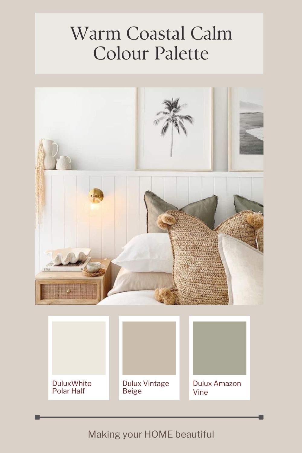
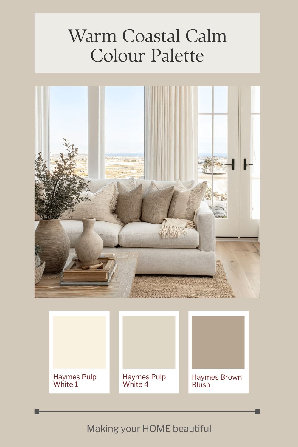
Warm Whites: The Soft Foundation
Dulux White Polar Half and Haymes Pulp White 1 & Pulp White 4
These whites are doing a lot of heavy lifting in this palette. Unlike cooler, blue-based whites, these have a gentle warmth that immediately softens the overall look.
- Dulux White Polar Half works beautifully as a crisp but still warm trim or wall colour. It gives you that clean coastal feel without looking harsh.
- Haymes Pulp White 1 is slightly creamier, perfect if you want a softer, more relaxed finish.
- Haymes Pulp White 4 introduces a touch more depth, making it ideal for layering or for spaces where you want a subtle contrast without moving into darker tones.
Together, these whites create a tonal flow rather than sharp contrast—which is key to achieving that calm, coastal aesthetic.
Warm Neutrals: The Heart of the Palette
Dulux Vintage Beige and Haymes Brown Blush
This is where the palette gets its warmth and personality.
- Dulux Vintage Beige is a beautiful, sun-washed neutral. It sits perfectly between beige and greige, making it incredibly versatile for both interiors and exteriors. It brings that “sand” reference into the scheme.
- Haymes Brown Blush adds a slightly deeper, more grounded tone. It has a soft, earthy warmth that prevents the palette from feeling too light or washed out.
These tones are what give the scheme its coastal calm feel—they mimic natural materials like sand, timber and stone.
Muted Green: The Natural Accent
Dulux Amazon Vine is a muted, earthy green that works as a perfect accent within this palette. It’s soft enough not to dominate, but strong enough to add interest and contrast.
Use it for:
- Front doors
- Feature joinery
- Accent walls or cabinetry
It pairs beautifully with the warm neutrals and adds that subtle coastal vegetation reference—think dune grasses and coastal shrubs.
Why These Colours Work Together
What’s particularly successful about this palette is the consistency in undertone.
- Every colour leans warm
- There are no cool, blue-based interruptions
- The contrast is gentle rather than sharp
This creates a cohesive, layered look that feels effortless - exactly what you want from a coastal-inspired home.
How to Use This Palette in Practice
- Use your warm whites across large areas to create lightness
- Bring in Vintage Beige or Brown Blush to ground the scheme
- Add Amazon Vine sparingly for depth and interest
The key is restraint—this palette isn’t about bold statements, it’s about subtle layering and balance.
Exterior Application
- Choose a soft beige or warm greige as your main colour
- Use a warm white for trims and detailing
- Add a slightly deeper neutral for contrast (doors, windows or feature areas)
The key is subtle variation—not high contrast.
Interior Flow
This palette works beautifully when carried inside:
- Walls in warm whites or soft neutrals
- Natural materials like timber, linen and stone
- Layered textures rather than bold colour
Final Thoughts
Warm Coastal Calm is about creating a home that feels like a retreat—soft, inviting and deeply connected to its surroundings.
It’s coastal style, but grown up.
If you’re looking for a palette that feels timeless, effortless and beautifully balanced, this is one you can’t go wrong with.
If you’re drawn to this palette but unsure how it would translate into your own home, remember that colour is always influenced by light, materials and context. These schemes are intended as a starting point — something to adapt rather than copy exactly. And if you’d like help refining a palette for your specific space, aspect or style, this is exactly what I do through my colour consultation services.
Stay connected with news and updates!
Join our mailing list to receive the latest news and updates from our team.
Don't worry, your information will not be shared.
We hate SPAM. We will never sell your information, for any reason.