When you want to add depth, contrast and definition to your home, charcoal is a colour worth considering.
What exactly is charcoal?
Charcoal sits between a deep grey and an off-black and takes its name from the appearance of burnt wood. Many of these colours have a subtle blue undertone and for me, this is where charcoal really comes into its own.
It is dark enough to create contrast, but softer and more nuanced than black.
And because these deeper cool greys are so effective at creating definition, they can be used in both interiors and exteriors in a surprisingly versatile way.
Charcoal is a deep, dark grey that sits towards the black end of the colour spectrum.
It is darker than a conventional grey but generally softer than pure black. Many charcoal colours have a cool, blue or blue-grey undertone, although the exact appearance varies considerably between colours.
This is important when choosing a charcoal for your home.
A charcoal with a blue undertone can feel crisp, sophisticated and contemporary, while a warmer charcoal can have a softer, more earthy appearance.
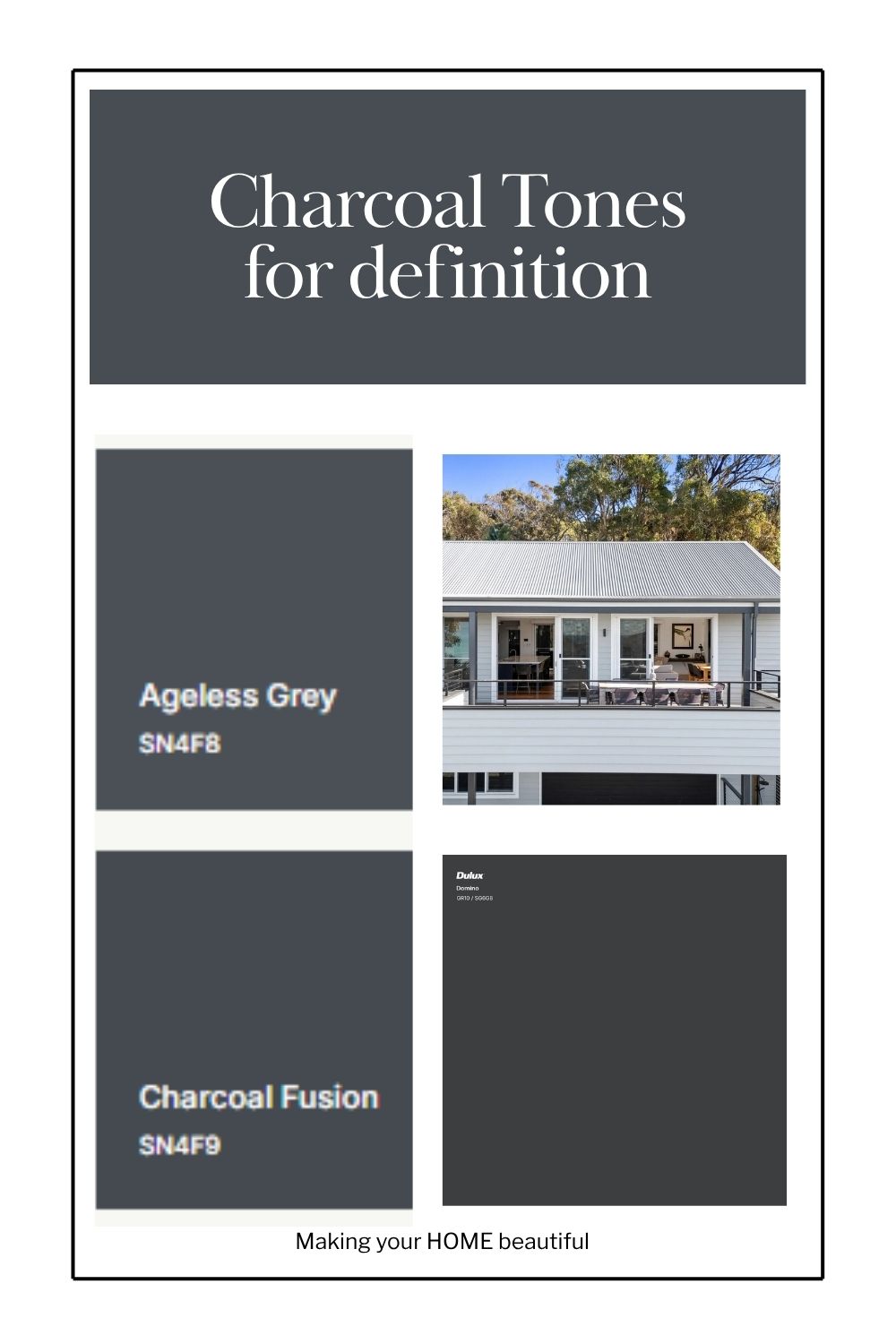
The charcoals I'm looking at here — Dulux Charcoal Fusion, Dulux Domino and Dulux Oolong — have that beautiful cool, blue-based quality that makes them particularly effective as accent colours.
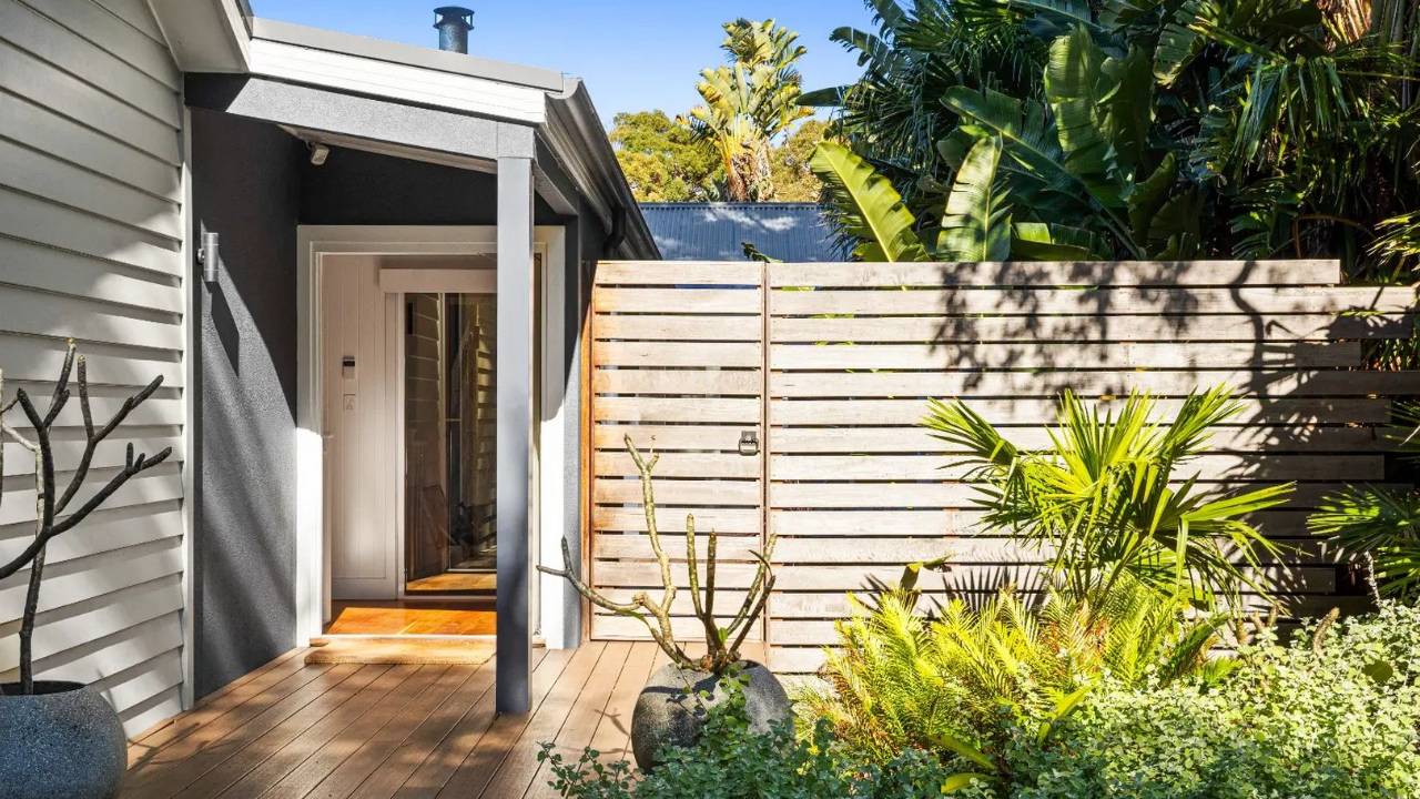
Accents of Dulux Charcoal Fusion
Why I love charcoal as an accent colour
One of the reasons I use dark colours in schemes is that a home needs contrast.
If everything is light and similar in tone, the eye has nowhere to stop. The architecture, joinery and individual elements can start to blend together.
Charcoal gives you somewhere to create that definition.
It can be used to:
- highlight architectural features
- define windows and doors
- create a strong front door
- add depth to an exterior
- anchor a kitchen island
- create contrast in cabinetry
- highlight a bookcase or built-in joinery
- frame a fireplace
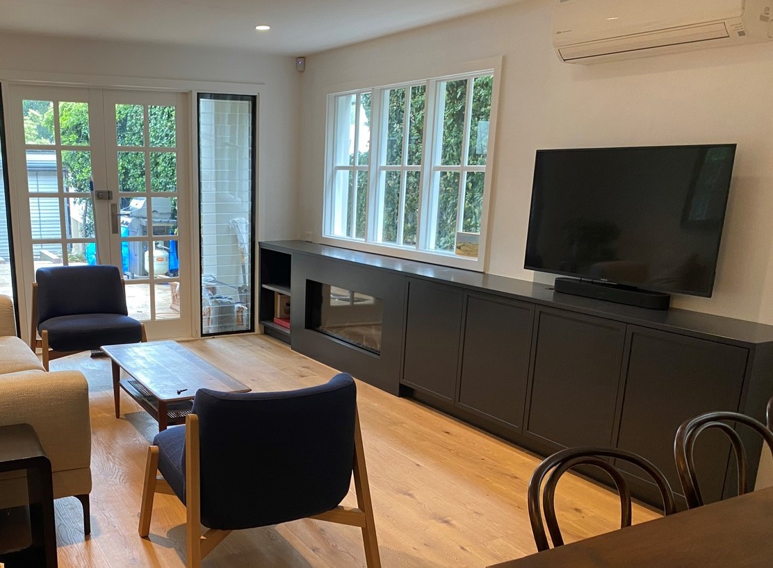
- add depth to a media wall
- create a dramatic piece of furniture.
And because charcoal is still essentially a neutral, it can work with a remarkably wide range of colours and materials.
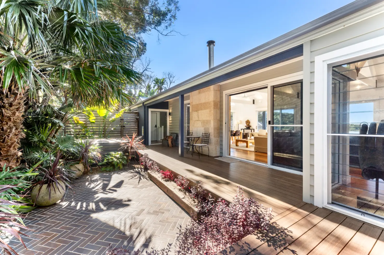
Charcoal on the exterior
This is where I think charcoal really shines.
Exterior schemes benefit enormously from contrast. You might have a light wall colour, timber elements, white trim and then introduce charcoal to provide the darker punctuation.
It gives the house structure and definition.
A charcoal can be used across larger areas too, particularly on contemporary homes, weatherboards and architectural extensions.
And look at what happens when you put charcoal next to greenery.
It is beautiful.
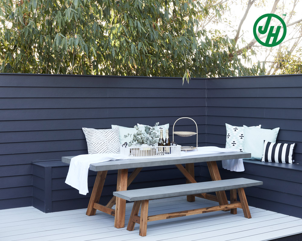
Image: James Hardie
The cool darkness of the charcoal creates a wonderful backdrop for foliage. Greens become more vibrant and the organic shapes of plants stand out against the simplicity of the dark wall.
This is particularly effective if you have a lush garden, tropical planting or even just a few carefully placed pots.
Charcoal + greenery + timber is one of my favourite exterior combinations.
The timber introduces warmth, the planting introduces colour and movement, and the charcoal provides the grounding element.
COLORBOND Basalt
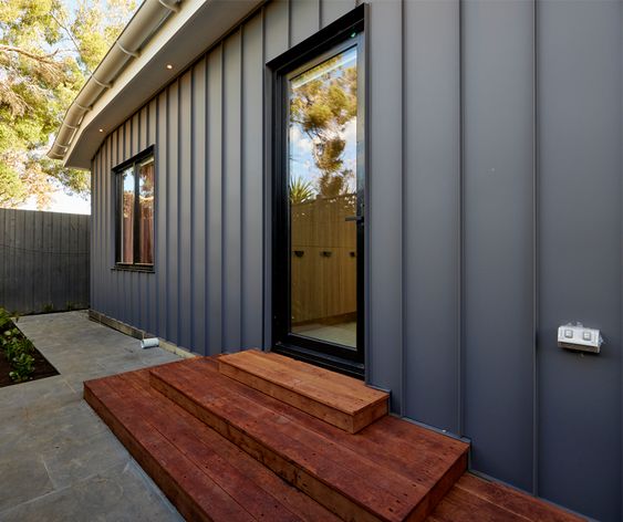
A great Australian example of this colour family is COLORBOND Basalt.
Basalt is described by COLORBOND as a deep, cool grey, inspired by the mineral tones of basalt rock. It is designed to work particularly well with natural materials including greyed timbers, recycled brick and concrete, and COLORBOND specifically highlights its ability to create a strong base against lush landscaping.
I think this is a really good illustration of what I mean by a charcoal-like exterior colour.
It isn't black.
It isn't a traditional mid-grey.
It has enough depth to create contrast, but there is still complexity within the colour. And this is particularly important outdoors because natural light changes the way these deep colours are perceived.
A colour that looks almost black in a shaded area can reveal considerably more of its underlying colour when sunlight hits it.
Related: How to use Colorbond Basalt
Charcoal in interiors
You don't need to commit to charcoal walls to bring this colour into your interior.
In fact, one of my favourite ways to use it is as an accent.
Think about a kitchen island.
If the perimeter cabinetry is a soft white, warm neutral or timber, a charcoal island can become the anchor of the kitchen.
The same principle works with:
- bookcases
- entertainment units
- bathroom vanities
- fireplace surrounds
- built-in cabinetry
- internal doors
- occasional furniture.
It creates a focal point without necessarily introducing a bright or highly saturated colour.
And this is one of the great advantages of using a dark neutral.
It has presence without competing with everything else in the room.
Dulux Charcoal Fusion
Dulux Charcoal Fusion is a lovely example of this deep charcoal family.
It has the depth you expect from charcoal but retains enough colour complexity to avoid looking like a simple black. This makes it particularly useful for exterior accents, doors and architectural details, as well as selected interior joinery.
I would use a colour like this when I want the dark element to be noticeable but still sophisticated.
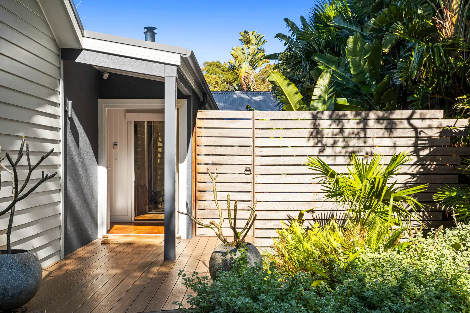
Dulux Charcoal Fusion at entrance
Dulux Domino
Dulux Domino is another strong charcoal option.
This is the sort of colour that can look almost black when used in a low-light situation, but the underlying grey gives it considerably more softness than a true black.
It can be particularly effective for:
- kitchen cabinetry
- feature joinery
- doors
- shelving
- fireplaces
- exterior details.
And remember that dark colours are affected enormously by their surroundings. So don't judge a charcoal from a tiny colour chip alone.
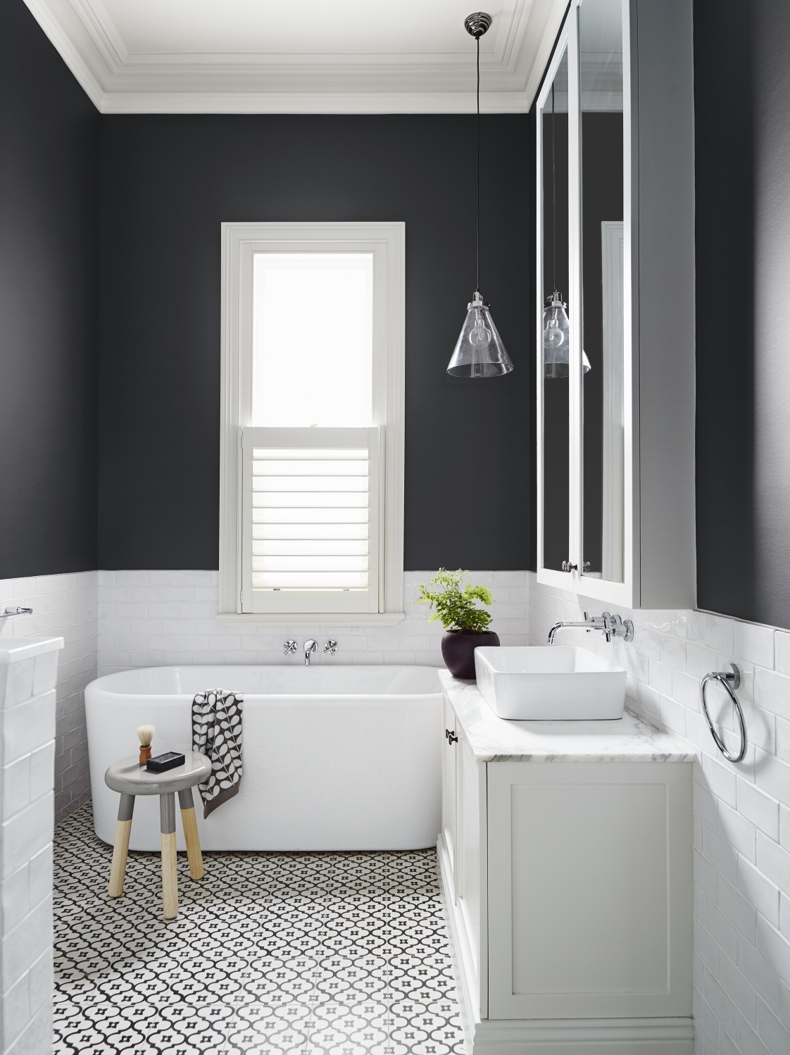
Image: Dulux Australia
Dulux Oolong
Then we have Dulux Oolong, which I think is a beautiful example of how a charcoal can work inside the home. It gives you that strong, dark contrast but has enough colour within it to feel more interesting than simply painting something black.
I particularly like the idea of using a colour such as this on a kitchen island or feature cabinetry.
It can then be balanced with lighter walls, warm timber flooring and softer furnishings.
This is a good example of the principle that I often come back to: You don't need lots of colour to create a beautiful colour scheme. You need variation in tone, depth and texture.
A simple combination of warm white, timber and charcoal can be incredibly effective.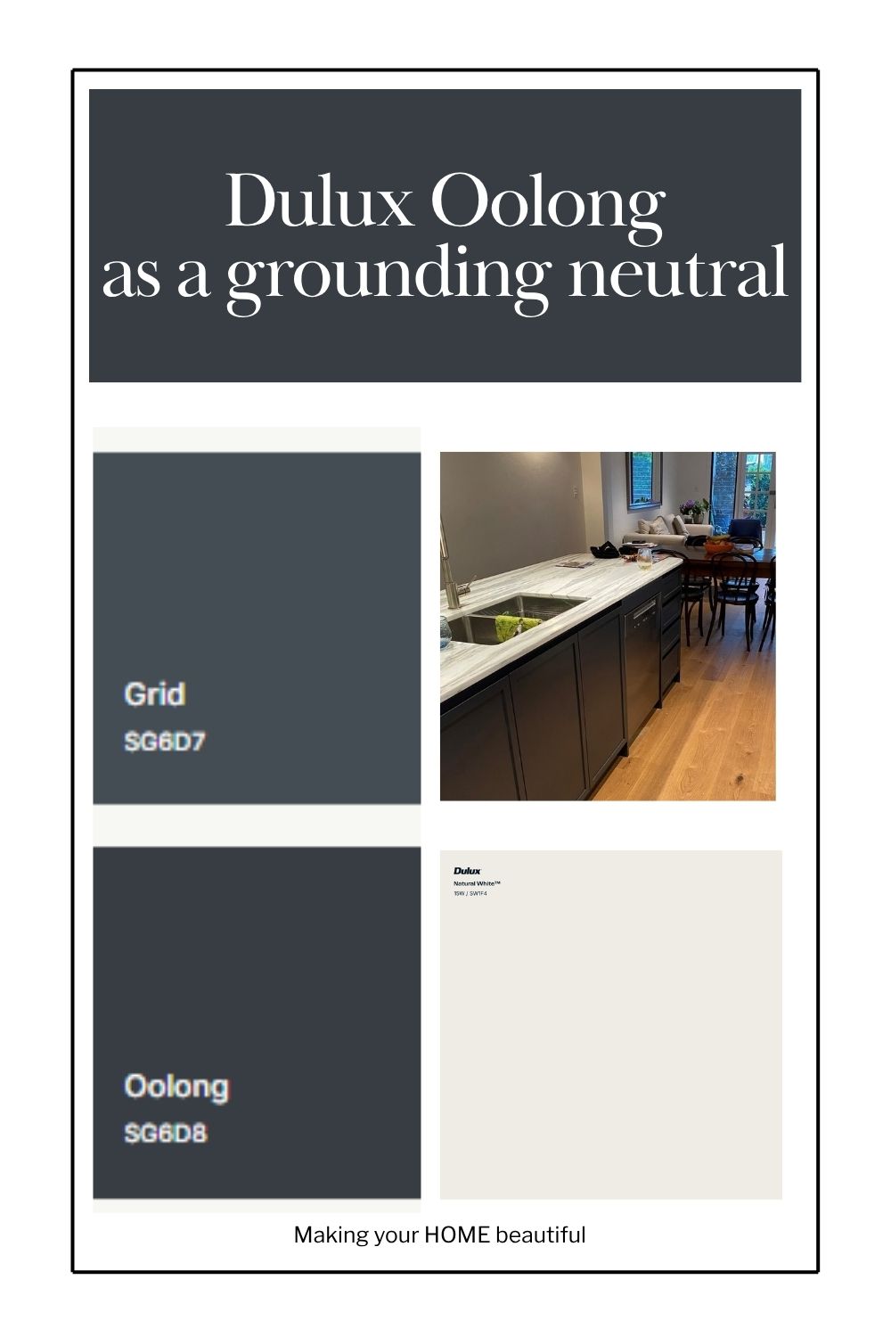
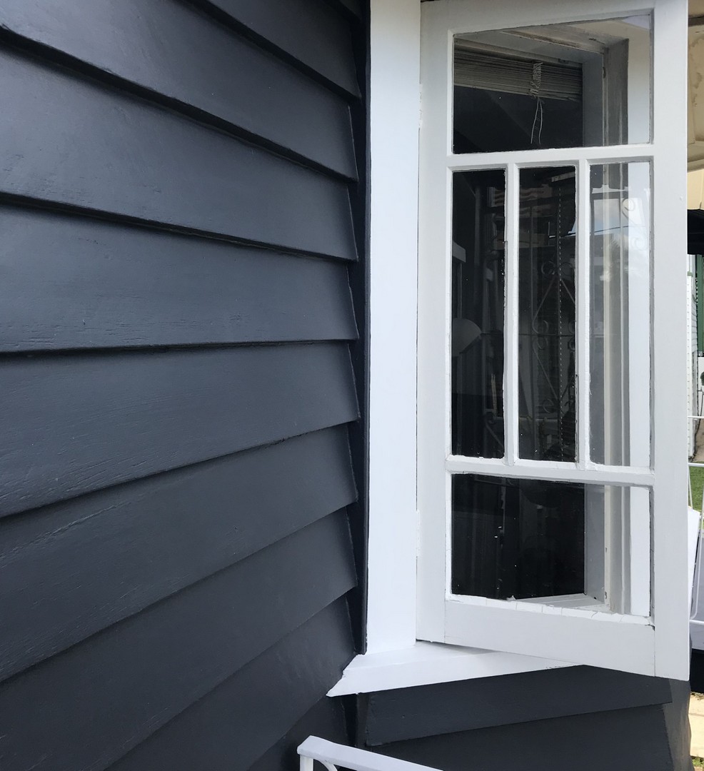
Dulux Oolong is also a fabulous exterior colour and works beautifully on weatherboards.
Don't forget the light
There is one important consideration when working with charcoal: light.
These are deep colours, so they absorb considerably more light than a pale neutral.
That doesn't mean you shouldn't use them in a darker room. It simply means you need to understand the effect you are creating.
In a bright room, charcoal can feel crisp and architectural.
In a darker room, it can feel cocooning and dramatic.
And outdoors, the strong natural light can reveal undertones that aren't obvious on a small paint chip.
This is why I always recommend sampling your colours in the actual space and looking at them at different times of the day.
Related: How to sample paint colours
Charcoal doesn't have to mean black
If you love the drama of black but feel that black is just a little too hard, charcoal is worth exploring.
It gives you the same fundamental qualities — depth, contrast and definition — but with more nuance.
And when you choose a charcoal with a subtle blue undertone, you get a colour that feels particularly clean and sophisticated.
It is dark without necessarily being harsh.
Charcoal is a colour I turn to when a scheme needs depth. It can ground a pale palette, highlight architecture, anchor a kitchen or provide the perfect backdrop for greenery. Used thoughtfully, it is one of the most versatile dark neutrals you can introduce into your home.
I hope that this post has been inspirational for you.
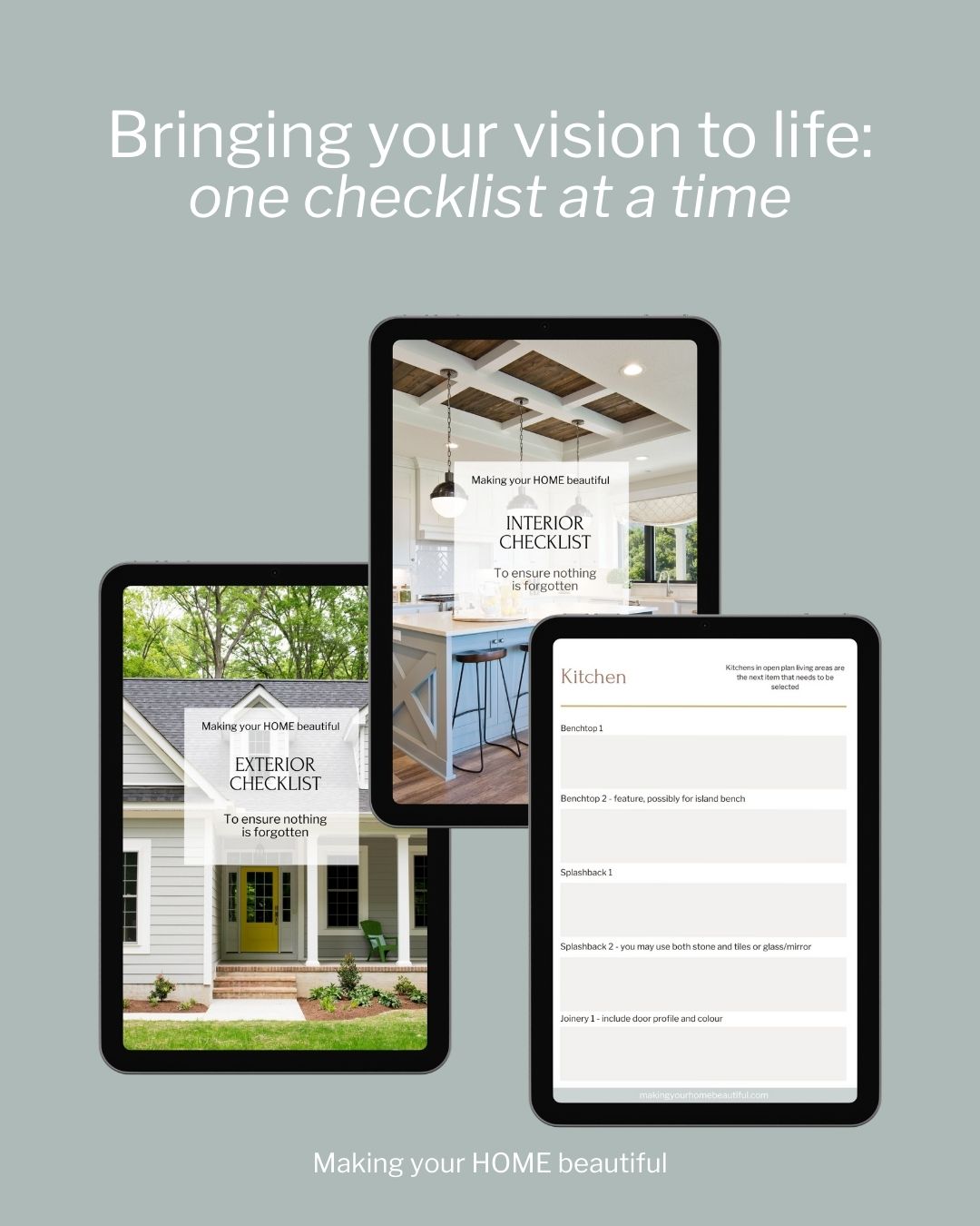
If you are building a new home or renovating the one that you have, you should purchase my checklists. You will find all the elements of a new build or exterior and interior renovation that you need to consider, with plenty of space to write down supplier and product details for reference. Gain control and satisfaction when you can check each one off the list.
I also have an online colour consultation service. From just a quick 30 minute zoom session to address one or two key elements through to a full done for you solution for your entire home.
Don't forget you can also watch the video here:
Stay connected with news and updates!
Join our mailing list to receive the latest news and updates from our team.
Don't worry, your information will not be shared.
We hate SPAM. We will never sell your information, for any reason.