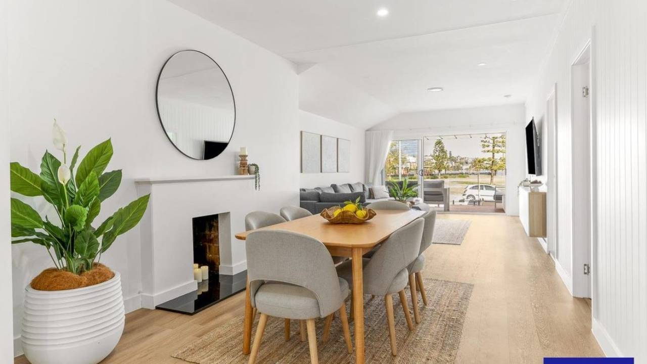
White is one of the most enduring colours in coastal decorating. It brings a sense of light, space and simplicity to a home, reflecting the natural beauty of sandy beaches, weathered timber, sea foam and the changing colours of the ocean.
But choosing the right white isn't always straightforward. Some whites are crisp and cool, with a distinct blue or grey undertone, while others are softer, warmer and more muted. Although they might look similar on a paint colour card, these subtle differences can have a significant impact on the overall feel of your home.
For my Coastal Whites colour palette, I've brought together two different interpretations of coastal white. The Dulux colours offer a warmer, greyer take on coastal neutrals, while the Haymes colours are cooler, crisper and more blue-based.
Both approaches can create a beautiful coastal interior. The key is understanding the undertones and choosing the whites that work best with your flooring, furnishings, natural light and the style of your home.
What makes a beautiful coastal white?
When we think about coastal interiors, we often picture white walls, pale timber floors, natural linen, woven textures and a relaxed connection with the outdoors. White provides the perfect backdrop for these elements, allowing natural materials and carefully chosen accents to take centre stage.
However, a successful coastal scheme doesn't necessarily mean using the brightest white available.
A very crisp white can look fresh and contemporary, particularly when paired with blue and grey accents. A softer, greyer white can feel more relaxed and understated, working beautifully with sandy neutrals, weathered timber and natural stone.
The secret is to look beyond the name of the paint colour and consider its undertone. This is particularly important when selecting whites, as even the slightest hint of blue, grey, yellow or green can change how a colour appears in your home.
The cooler coastal whites: Haymes
For a fresh, crisp interpretation of coastal style, I love the cooler whites from Haymes. These colours have a cooler, blue-based quality that can create a clean and contemporary atmosphere without necessarily resorting to a stark, brilliant white.
They work particularly well in homes where you want to emphasise light, open spaces and a connection with the cooler colours of the sea and sky.
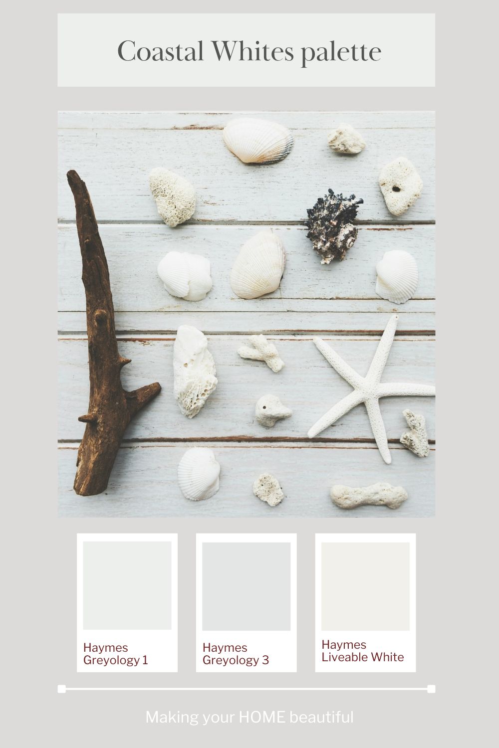
Haymes Greyology 1
Greyology 1 is a lovely choice for a subtle, cool white scheme. Its restrained, cool quality makes it a useful option when you want a white that feels fresh rather than creamy.
Consider using it on walls in a coastal living room, bedroom or open-plan space. It can provide a quiet background for pale timber, white upholstery, soft blue fabrics and natural accessories.
As with any cool white, the surrounding finishes will influence how it looks. Test it alongside your flooring, benchtops and fabrics before committing to the colour, particularly in rooms that receive strong natural light.
Haymes Greyology 3
Greyology 3 offers another option within this cooler coastal family. It is useful when you want to explore a slightly different level of depth and greyness while maintaining a crisp, contemporary feel.
This type of white works well in a restrained palette where you want the architecture, materials and furnishings to create interest rather than relying on strong wall colours.
Try it with white trims, pale grey textiles, natural stone and subtle blue accents. The result can be sophisticated and relaxed, rather than overly decorative.
Haymes Liveable White
Liveable White is a softer alternative within the Haymes selection. It allows you to explore a lighter, more understated neutral while retaining the fresh quality that suits a coastal scheme.
It can be a useful choice when you want a gentle white backdrop that sits comfortably alongside pale timber, linen and natural textures.
When comparing these three Haymes colours, view them together in your own home. The difference between whites can be surprisingly subtle on a colour card but much more noticeable when they cover a large wall.
My tip: Cooler whites are particularly effective when the rest of your scheme has a similar undertone. Look for cool greys, blue-based accents, crisp white fabrics and finishes that complement rather than compete with the paint colour.
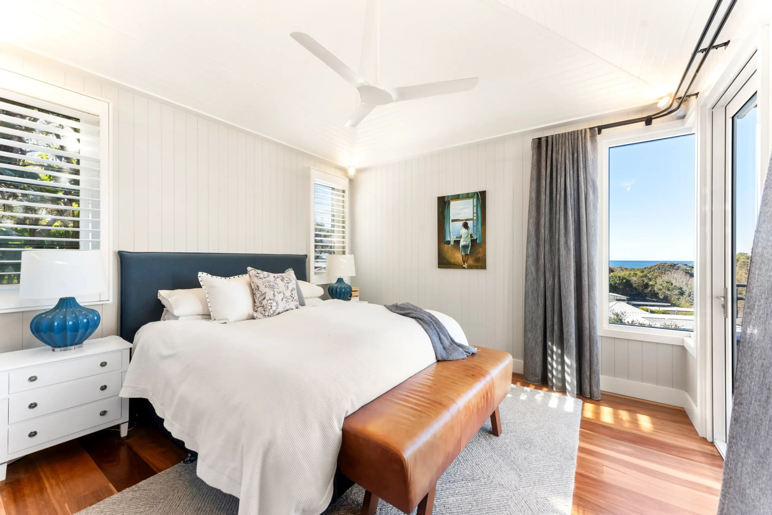
Dulux Snow Season for a cool coastal palette
The warmer coastal whites: Dulux
If you prefer a coastal style that feels softer, more natural and a little less crisp, the Dulux colours in this palette are worth exploring.
These whites have a warmer, greyer quality that works beautifully with the colours of weathered timber, sand, shells and natural stone. Rather than creating a sharp contrast, they can help a room feel calm, comfortable and timeless.
This approach is ideal if you love coastal decorating but don't want your home to feel too cool or overly blue.
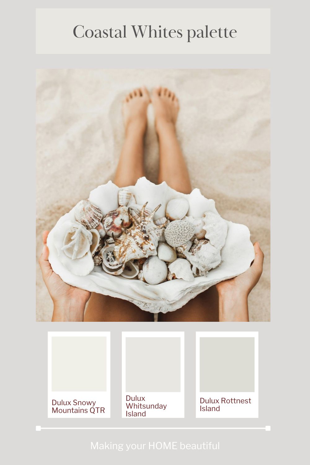
Dulux Snowy Mountains Quarter
Dulux Snowy Mountains Quarter is a lovely starting point for a soft white coastal scheme. Its lighter, subtle character makes it a useful option when you want a white that feels gentle rather than overly stark.
Consider it for living areas, bedrooms and other spaces where you want a light, airy backdrop that still feels comfortable.
It can work particularly well with pale oak or other light timber finishes, natural linen, warm white upholstery and sandy-toned accessories.
As always, the appearance of a white will vary according to the light in the room and the colours around it, so sample it before making your final decision.
Related: How to use Dulux Snowy Mountains
Dulux Whitsunday Island
Dulux Whitsunday Island brings another layer of softness to this coastal palette. It is worth considering when you want to explore a more muted white or pale neutral rather than a very crisp, clean white.
This type of colour can be particularly effective in a relaxed coastal home, where the aim is to create a harmonious backdrop for natural materials and understated furnishings.
Pair it with pale timber, textured fabrics and muted coastal accents. It can also sit comfortably alongside deeper natural tones, helping to balance the contrast between light walls and darker furniture or accessories.
Dulux Rottnest Island
Dulux Rottnest Island introduces a greyer, more grounded note to the palette. This is the colour to explore when you want to move beyond white into a soft coastal neutral.
A muted grey-based neutral can add depth to a scheme without losing the relaxed, understated feeling that makes coastal interiors so appealing.
Consider it for selected walls, cabinetry or other elements where you want a little more definition. It can also be useful when building a tonal palette, with lighter whites on the walls and deeper neutrals introduced through joinery, furniture or accessories.
My tip: Warmer, greyer whites are often a natural fit for schemes featuring sandy beige, warm timber, natural stone and earthy accents. They can help these materials feel connected, creating a cohesive interior rather than a collection of separate finishes.
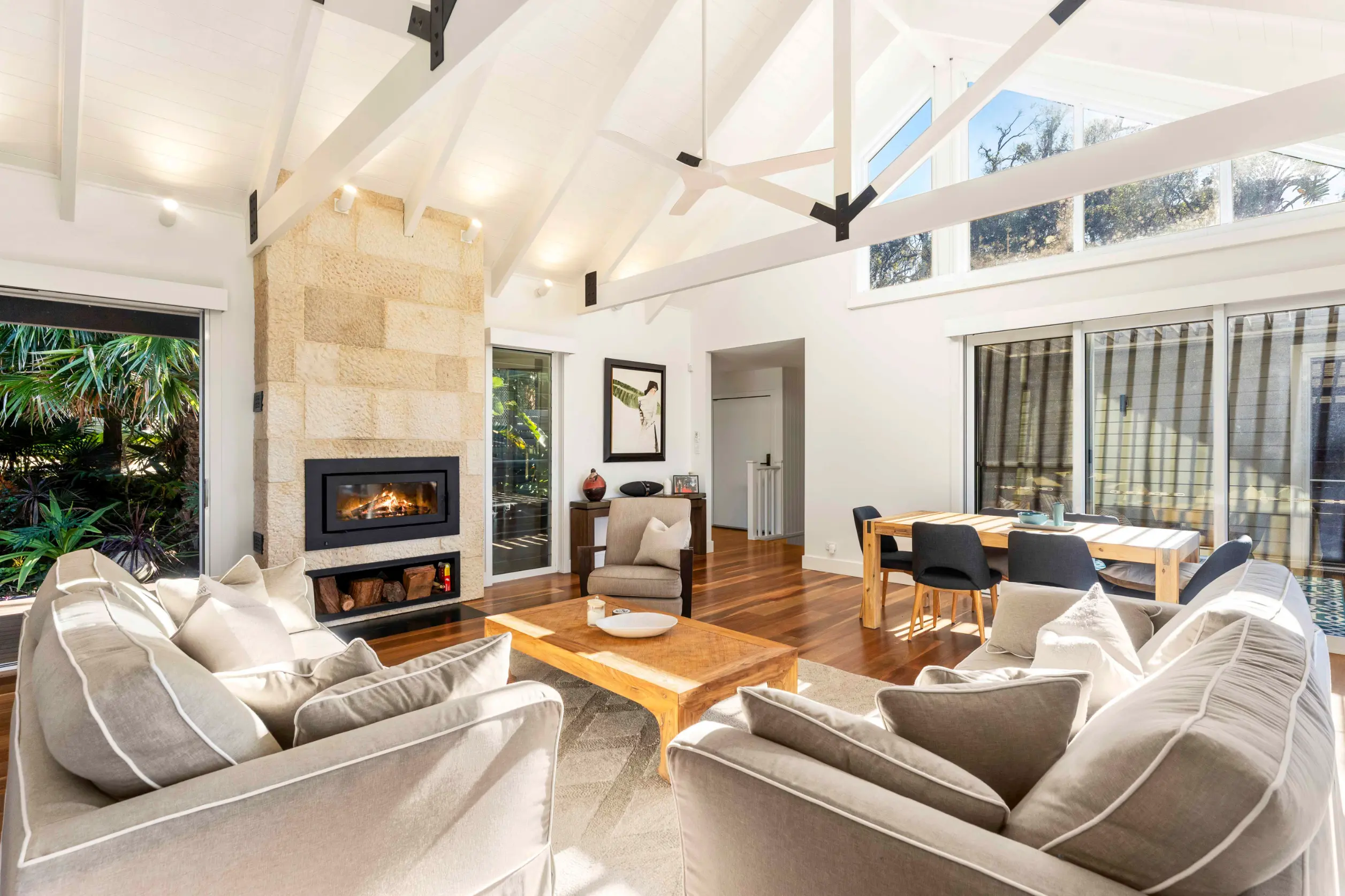
Dulux Snowy Mountains Quarter for a warm but light coastal scheme
How to choose between warm and cool coastal whites
The most important decision is not whether one white is better than another. It is whether the white you choose works with the other colours and materials in your home.
Here are a few things I consider when selecting a white for a coastal scheme.
1. Start with your fixed finishes
If you're building or renovating, begin by looking at the finishes that are difficult or expensive to change. These might include flooring, kitchen cabinetry, benchtops, bathroom tiles and window frames.
If your flooring has a warm, honeyed timber tone or your stone has creamy undertones, a softer, warmer white may create a more harmonious result.
If you have cool grey tiles, crisp white cabinetry or finishes with a distinct blue-grey undertone, a cooler white may be a better starting point.
This isn't an absolute rule, but it is a useful guide. The aim is to create a relationship between the finishes so that each element feels as though it belongs in the scheme.
2. Consider the natural light
Natural light has a significant influence on how a white appears.
A room with cool southern light can make some whites feel greyer or cooler, while strong afternoon sunlight can alter their appearance in quite a different way. Artificial lighting will also affect the colour, particularly in the evening.
For this reason, never select a white from a small colour card alone. Paint a sample on a large piece of card or directly onto a suitable sample surface, then move it around the room and observe it at different times of the day.
3. Think about the atmosphere you want to create
Ask yourself how you want the room to feel.
Do you want a crisp, contemporary coastal home with a fresh, almost gallery-like quality? A cooler white may be the right choice.
Or do you prefer a relaxed, natural interior with pale timber, textured linen, warm neutrals and a softer connection to the beach? A warmer, greyer white may suit you better.
Both can be beautiful. The important thing is to make a deliberate choice rather than selecting a white simply because it is popular.
4. Don't forget your trim colours
Trim is an important consideration when working with white walls. Skirting boards, architraves, internal doors and ceilings all contribute to the finished scheme.
You can create a subtle, tonal look by choosing closely related whites, or introduce a little more definition with a crisper white on the trim.
However, be careful when combining whites with different undertones. A cool white trim can make a warmer wall colour appear creamier by comparison, while a warm trim can make a cooler wall colour look more blue or grey.
For a relaxed coastal interior, I generally prefer a considered approach rather than introducing too many competing whites. The trim should complement the walls and the overall scheme.
5. Use texture to bring the scheme to life
A coastal interior doesn't need lots of colour to feel interesting. In fact, a restrained white palette can be particularly beautiful when you introduce a variety of natural textures.
Think about linen curtains, woven baskets, pale timber, stone, handmade ceramics, natural rugs and tactile upholstery.
These elements prevent a predominantly white room from feeling flat or clinical. They also reinforce the connection with the natural environment that makes coastal decorating so appealing.
Adding contrast to a coastal white palette
Although white is the starting point for this palette, contrast is what gives it character.
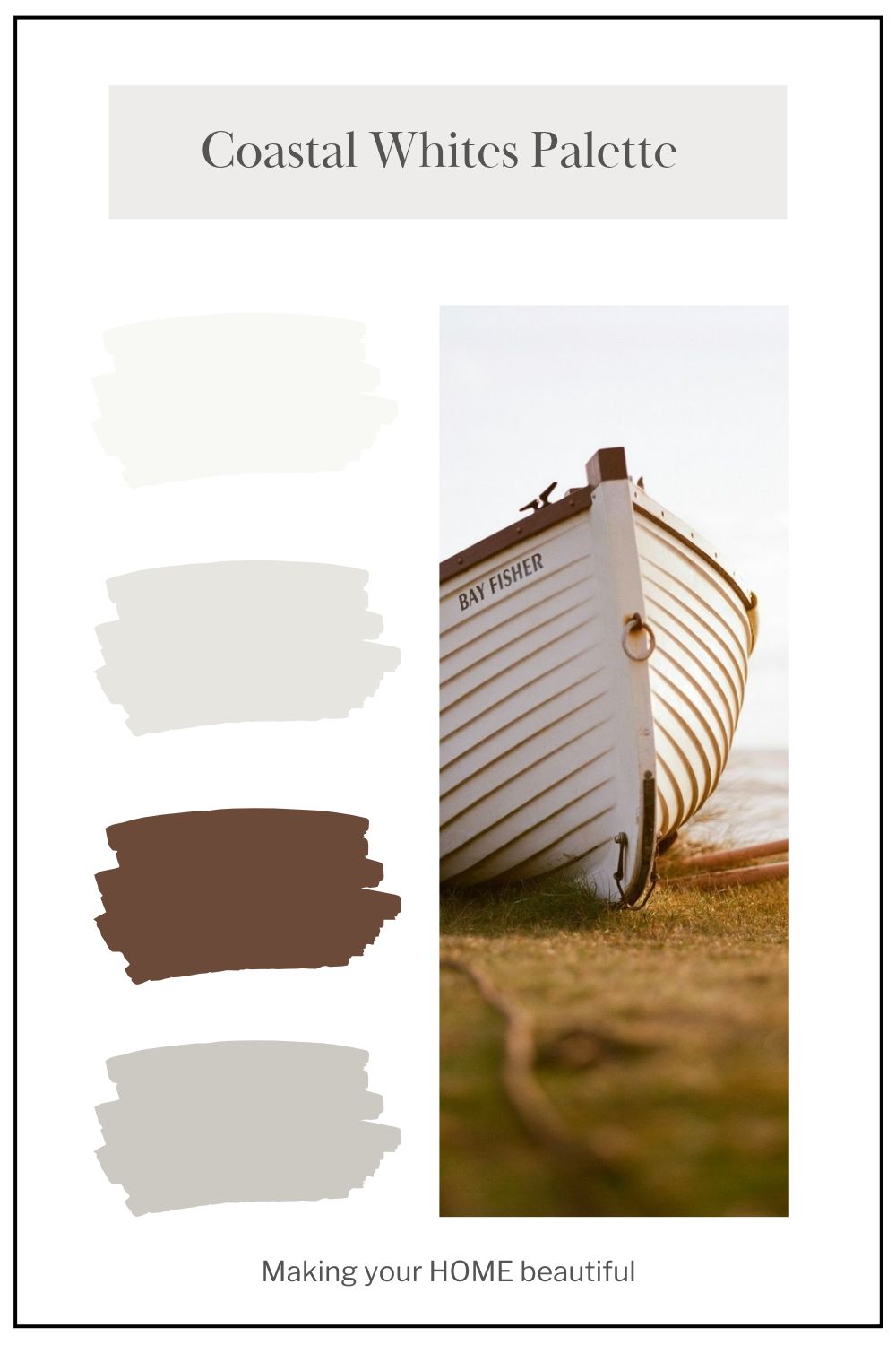
I love the way deeper natural colours can anchor a scheme built around soft whites and greys. The rich brown of driftwood, for example, provides a beautiful contrast against a pale coastal backdrop.
You could introduce this deeper tone through timber furniture, a darker timber floor, a feature piece of furniture or smaller decorative accents.
For a more traditional coastal look, add soft navy or muted blue. For something more contemporary, consider charcoal, weathered grey or restrained black accents.
Alternatively, keep the scheme entirely neutral and let the variation in materials provide the interest. A combination of pale timber, stone, white walls and natural linen can be every bit as effective as a palette with stronger colours.
The trick is to keep the overall scheme balanced. If you use a darker colour, repeat it in a few places so that it feels intentional rather than isolated.
Using coastal whites on your home's exterior
These ideas can also translate beautifully to a coastal exterior.
A white or pale neutral exterior can look timeless, particularly when combined with natural timber, stone, landscaping and carefully selected roof and window colours.
The same principles apply, but exterior colours need to be considered in the context of the surrounding environment. Bright sunlight, reflective surfaces, roof colours and the landscape can all influence how a white appears.
A cooler white may create a fresh, crisp exterior, while a warmer, greyer white can soften the overall look and sit comfortably alongside natural materials.
Remember that exterior colours often appear brighter in strong daylight than they do indoors. Always test samples on the actual exterior and view them in both direct sun and shade.
My final thoughts on this Coastal Whites palette
I love a carefully considered white palette because it provides so much flexibility. It can be crisp and contemporary, soft and understated, or warm and natural, depending on the undertones and finishes you choose.
The Haymes colours in this palette offer a cooler, fresher interpretation of coastal white, while the Dulux selection explores a warmer, greyer direction. Neither approach is inherently better than the other. The best choice will depend on your home's light, fixed finishes and the atmosphere you want to create.
My advice is always to start with the elements you are keeping, identify the undertones that will work best with them, and then narrow your choices to a small selection of whites.
And remember, a beautiful coastal scheme is about more than paint. It is the combination of colour, texture, natural materials and light that creates a home that feels connected to the coast.
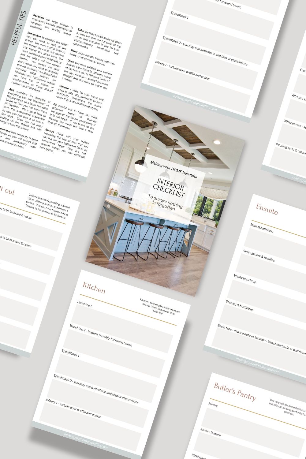
If you are building a new home or renovating the one that you have, you should purchase my checklists. You will find all the elements of a new build or exterior and interior renovation that you need to consider, with plenty of space to write down supplier and product details for reference. Gain control and satisfaction when you can check each one off the list.
I also have an online colour consultation service. From just a quick 30 minute zoom session to address one or two key elements through to a full done for you solution for your entire home.
Stay connected with news and updates!
Join our mailing list to receive the latest news and updates from our team.
Don't worry, your information will not be shared.
We hate SPAM. We will never sell your information, for any reason.