Each week, I share a colour palette designed to spark ideas and show how colours can work together in a real, lived-in way. These palettes aren’t about rigid rules or perfect matches — they’re about mood, balance and how colour actually behaves in a home. You may see a few variations of a similar scheme, because small shifts in tone, warmth or depth can completely change the feel of a space.
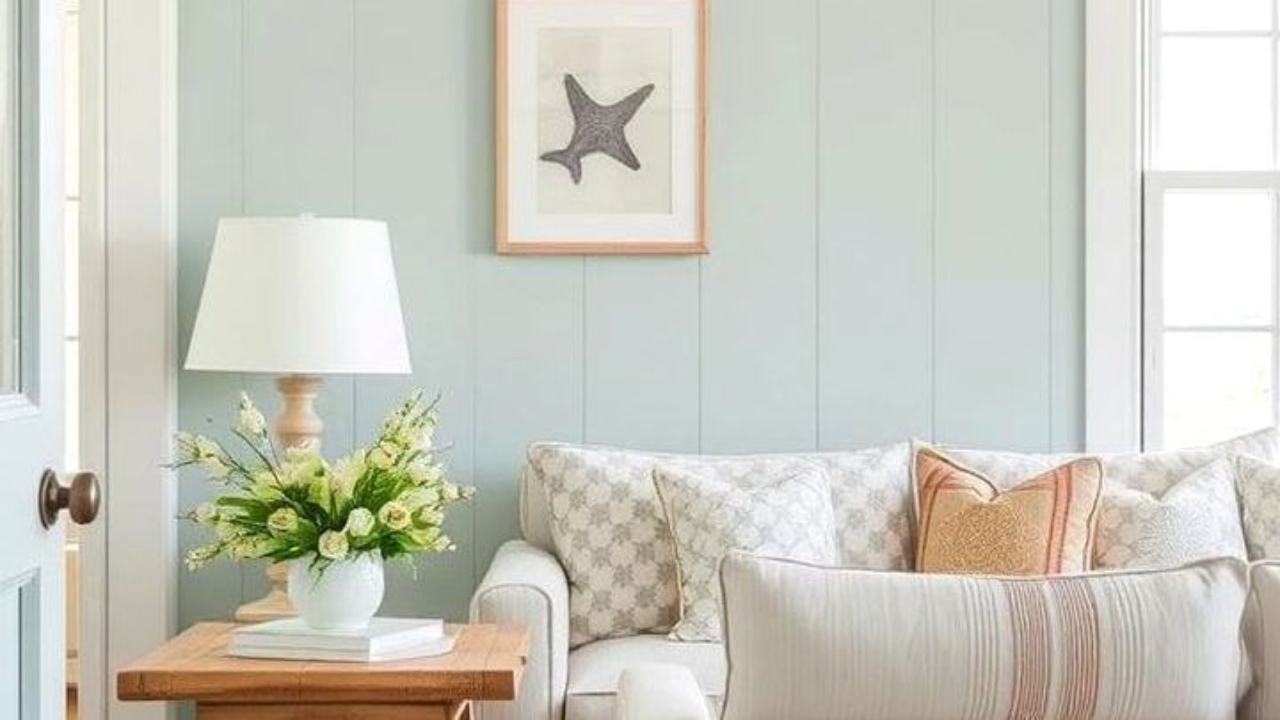
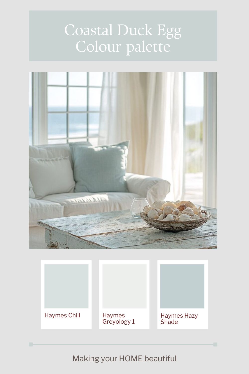
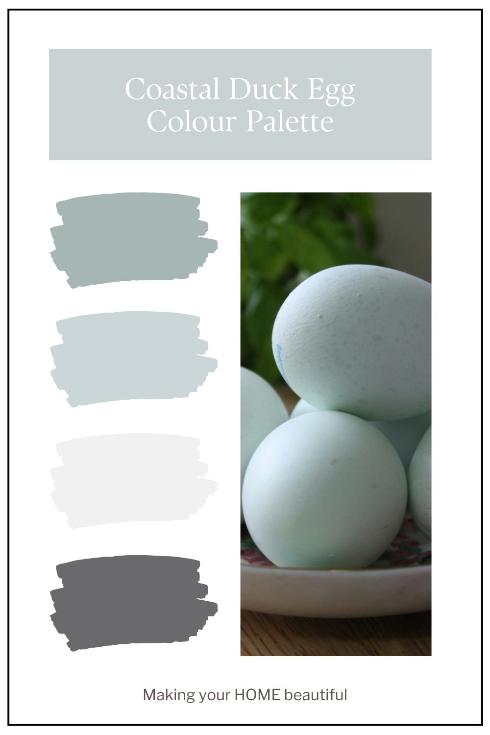
Coastal Duck Egg Blue sits beautifully between blue and green, with a soft grey undertone that keeps it gentle rather than sugary. It’s the colour of weathered timber, sea glass and salt-washed skies — light enough to feel fresh, but muted enough to remain sophisticated. Unlike brighter aqua tones, duck egg has a subtle complexity that allows it to behave almost like a neutral, especially when layered with warm whites, sandy beiges and pale driftwood greys.
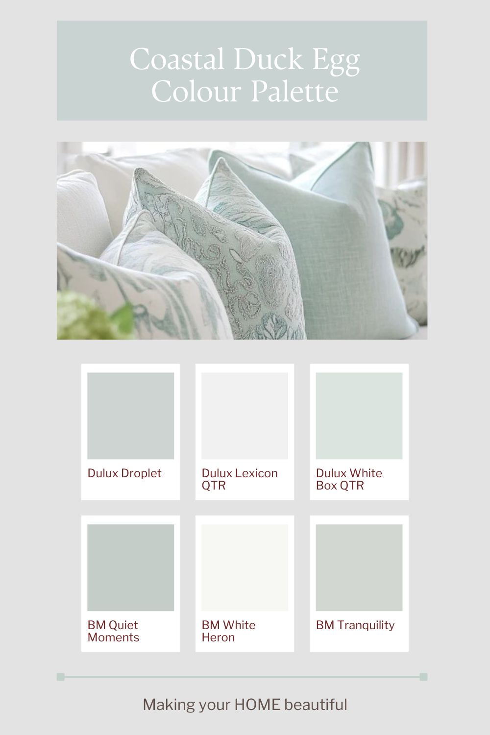
This palette works particularly well in homes where you want to introduce colour without overwhelming the space. In interiors, it can be used on cabinetry, panelling or feature walls, paired with natural textures such as linen, rattan and light oak. On an exterior, Coastal Duck Egg Blue is beautiful as a front door or shutter colour against crisp white trim and soft stone elements. The key is to keep supporting colours quiet and textural so the blue feels airy and refined rather than themed. The result is relaxed and timeless — coastal in spirit, but elevated in execution.
The colours shown here are suggested to create a similar effect. All colours should be tested to ensure they are right for your environment.
Related: How to sample paint colours
If you love these soft coastal colours and you like putting together colour palettes you may be interested in my YouTube video on putting together a Hamptons Style scheme.
Related: Let me show you how to use Beautiful Duck Egg Blue
If you’re drawn to this palette but unsure how it would translate into your own home, remember that colour is always influenced by light, materials and context. These schemes are intended as a starting point — something to adapt rather than copy exactly. And if you’d like help refining a palette for your specific space, aspect or style, this is exactly what I do through my colour consultation services.
Stay connected with news and updates!
Join our mailing list to receive the latest news and updates from our team.
Don't worry, your information will not be shared.
We hate SPAM. We will never sell your information, for any reason.