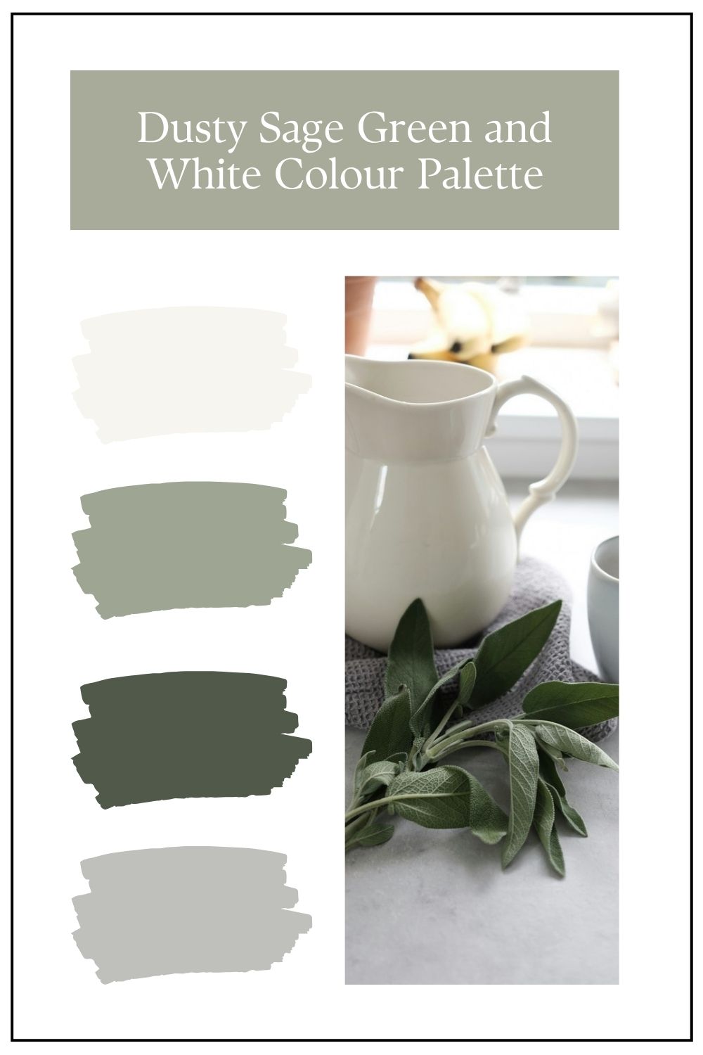
There’s something quietly sophisticated about a dusty sage green paired with soft whites. This palette sits beautifully in that sweet spot between warm and cool, creating interiors that feel grounded, calming, and effortlessly elegant. If you’re looking for a scheme that brings nature indoors while still feeling refined and timeless, this is one to consider.
In these palettes, the balance of muted greens and gentle whites creates depth without overwhelm — perfect for modern Australian homes where light, texture and flow are key.
Why Dusty Sage Works So Well
Dusty sage green is a softened, greyed-off green, which means it behaves almost like a neutral. Unlike brighter greens, it doesn’t dominate a space — instead, it recedes slightly, allowing other elements like texture, joinery, and styling to shine.
What makes this palette particularly successful is its undertone harmony:
- The greens lean slightly warm and earthy
- The whites are soft, not stark
- Together, they create a cohesive, layered look rather than sharp contrast
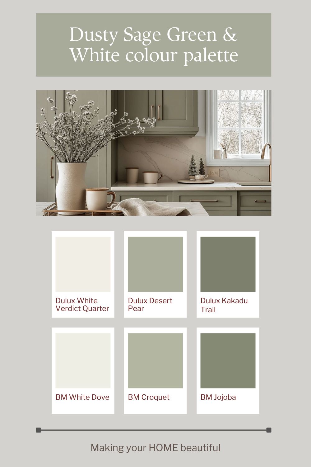
This is why colours like Dulux Desert Pear, Dulux Kakadu Trail, and BM Jojoba feel so natural together — they all share that muted, organic base.
The Role of White in This Palette
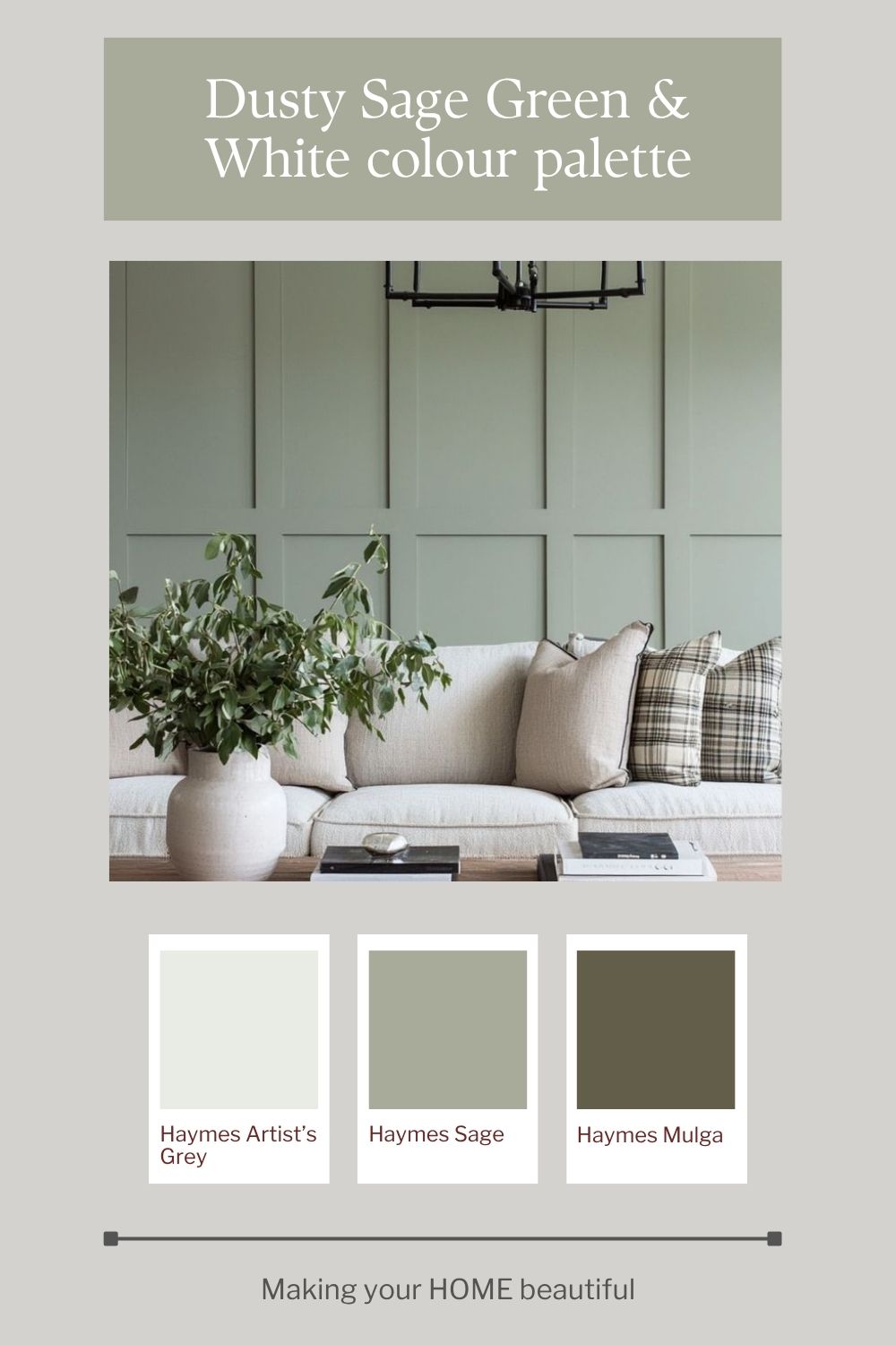
The whites that I have incorporated into these palettes — such as Dulux White Verdict Quarter, BM White Dove and Haymes Artist's Grey 1 — are doing a lot of heavy lifting here.
They:
- Soften the overall palette
- Prevent the greens from feeling too heavy
- Reflect light, keeping spaces feeling open and fresh
These aren’t crisp, blue-based whites. Instead, they have a subtle warmth, which is essential when working with sage tones. A cooler white would create too much contrast and disrupt the calm, tonal feel.
Where to Use Dusty Sage Green
This palette is incredibly versatile and works across multiple applications:
Kitchen Cabinetry
Dusty sage is perfect for kitchen joinery. It adds colour while still reading as neutral, especially when paired with:
- Marble or soft white stone benchtops
- Warm metallics like brass or brushed nickel
- Timber accents for added warmth
Wall Panelling & Feature Walls
Using a deeper sage like Kakadu Trail or Haymes Mulga on panelling creates subtle depth and architectural interest without overpowering the room.
Living Rooms
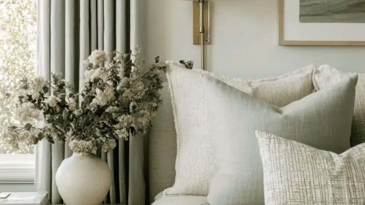
Sage green walls paired with warm whites and layered textiles (linen, wool, boucle) create a relaxed, inviting space that feels both modern and timeless.
Bedrooms
This palette truly shines in bedrooms, where its soft, muted nature promotes rest and calm.
Layering the Palette
The success of this scheme lies in layering tones rather than relying on contrast.
Think of it in three levels:
- Light base: Soft whites like Dulux White Verdict Quarter or BM White Dove
- Mid tones: Dusty sage shades like Dulux Desert Pear or Haymes Sage
- Depth: Deeper greens like Dulux Kakadu Trail or Haymes Mulga
This tonal approach creates a cohesive look that feels considered and sophisticated.
Materials & Finishes That Elevate the Look
To bring this palette to life, materials are key:
- Timber: Oak, Blackbutt, or walnut add warmth and prevent the scheme from feeling flat
- Stone: Marble or lightly veined quartz enhances the softness
- Textiles: Linen, cotton, and wool reinforce the relaxed aesthetic
- Metal finishes: Brass and aged bronze add a touch of refinement
Avoid overly cool finishes like chrome or stark black unless you’re intentionally adding contrast.
Who This Palette is Perfect For
This palette is ideal if you:
- Want a calm, nature-inspired interior
- Prefer soft, muted colours over bold statements
- Are designing a home that feels timeless rather than trend-driven
- Love layering texture and subtle tonal variation
Final Thoughts
Dusty sage green and white is one of those rare palettes that feels both current and enduring. It’s gentle, versatile, and incredibly liveable — making it a perfect choice for whole-home colour schemes or individual rooms.
The key is restraint: keep your whites soft, your greens muted, and let texture and natural materials do the talking.
Related: How to use the colour Sage Green
If you’re drawn to this palette but unsure how it would translate into your own home, remember that colour is always influenced by light, materials and context. These schemes are intended as a starting point — something to adapt rather than copy exactly. And if you’d like help refining a palette for your specific space, aspect or style, this is exactly what I do through my colour consultation services.
Stay connected with news and updates!
Join our mailing list to receive the latest news and updates from our team.
Don't worry, your information will not be shared.
We hate SPAM. We will never sell your information, for any reason.