Each week, I share a colour palette designed to spark ideas and show how colours can work together in a real, lived-in way. These palettes aren’t about rigid rules or perfect matches — they’re about mood, balance and how colour actually behaves in a home. You may see a few variations of a similar scheme, because small shifts in tone, warmth or depth can completely change the feel of a space.
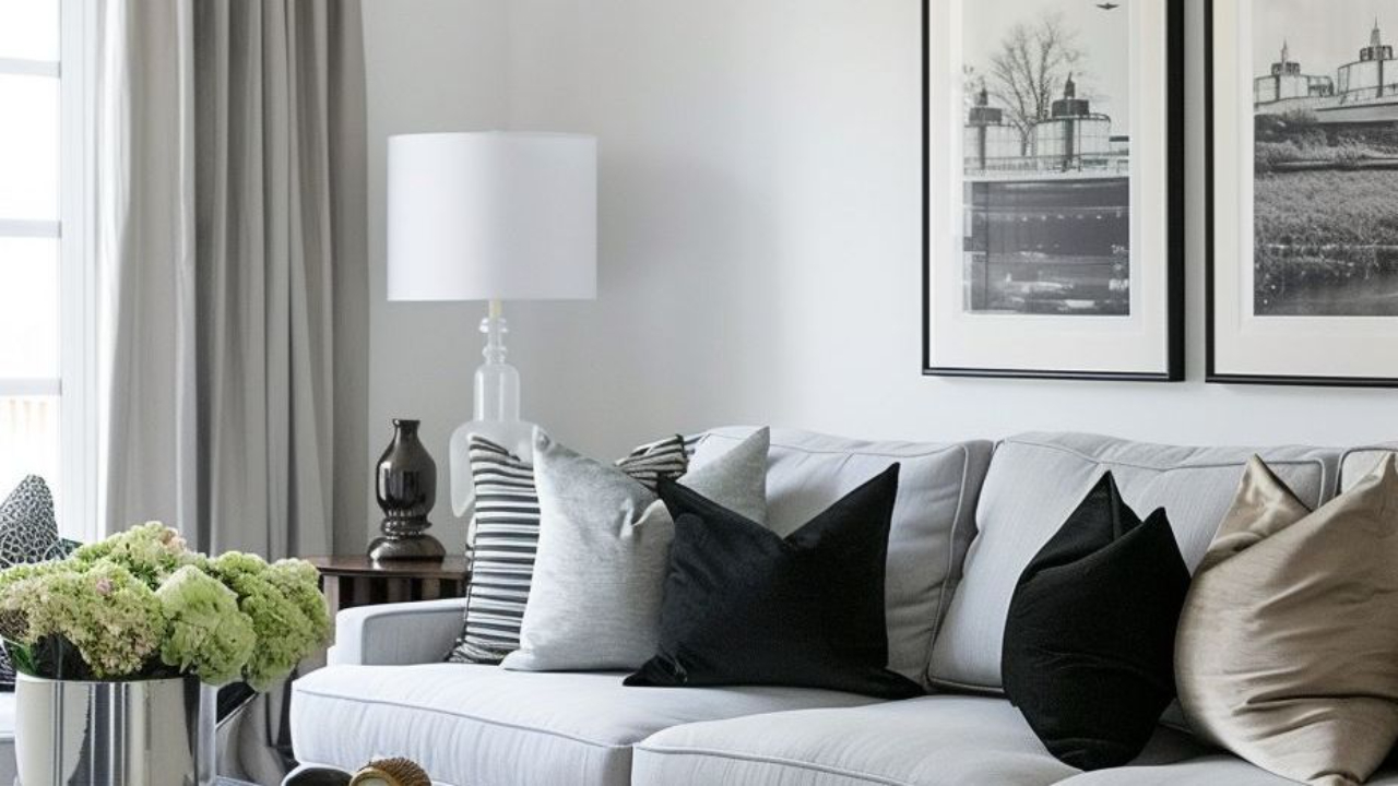
A muted black and white palette offers a softer, more liveable interpretation of contrast. Rather than relying on stark, high-contrast black and crisp white, this version introduces gentle whites, layered greys and softened charcoals that create depth without harshness. The result is a calm, refined scheme that feels timeless and quietly confident.
At the heart of this palette are nuanced whites such as Dulux Casper White Quarter, Haymes Moon White or Benjamin Moore Steam. These whites have subtle undertones that prevent them from feeling clinical or flat. They create a gentle backdrop that allows the deeper tones to sit comfortably within the space. These softened whites work beautifully across walls, helping to bounce light while maintaining a relaxed, understated mood.
The mid-tones play an equally important role. Colours such as Dulux Terrace White, Haymes Solace and Benjamin Moore Paper White introduce a soft grey presence that bridges the gap between light and dark. These shades are ideal for cabinetry, feature walls or larger furniture pieces, adding substance without overpowering the room. They help the palette feel layered and considered, rather than flat or one-dimensional.
The deeper anchor colours, including Dulux Black Caviar, Benjamin Moore Cheating Heart and Gunpowder Smoke, provide contrast in a way that feels elegant rather than dramatic. These softened charcoals work beautifully on joinery, doors, window frames or statement furniture pieces. Because they carry a muted quality rather than a true black intensity, they ground the space while maintaining a sense of calm.
What makes this palette particularly successful is its versatility. It suits both modern and classic interiors, working equally well with natural materials such as timber, stone and linen. Texture becomes especially important in a restrained colour scheme like this — woven fabrics, matte finishes, soft upholstery and natural fibres all enhance the layered effect and prevent the palette from feeling cold.
This softened charcoal version of black and white creates an environment that feels balanced and effortless. It offers contrast without severity, interest without noise, and a timeless foundation that allows architecture, light and texture to take centre stage.
If you’re drawn to this palette but unsure how it would translate into your own home, remember that colour is always influenced by light, materials and context. These schemes are intended as a starting point — something to adapt rather than copy exactly. And if you’d like help refining a palette for your specific space, aspect or style, this is exactly what I do through my colour consultation services.
Stay connected with news and updates!
Join our mailing list to receive the latest news and updates from our team. Don't worry, your information will not be shared.
We hate SPAM. We will never sell your information, for any reason.
Categories
Follow Us
DOWNLOAD FOR FREE
My goal isn’t just to solve a single colour problem for you—it’s to give you the knowledge and confidence to do it yourself. Once you understand the basics of colour, how to read undertones, and how to put schemes together, you’ll no longer feel nervous about making choices or worried about costly mistakes. Instead, you’ll feel empowered, and you might even discover how much fun it is—a chance to explore your creativity while making your home beautiful.