Each week, I share a colour palette designed to spark ideas and show how colours can work together in a real, lived-in way. These palettes aren’t about rigid rules or perfect matches — they’re about mood, balance and how colour actually behaves in a home. You may see a few variations of a similar scheme, because small shifts in tone, warmth or depth can completely change the feel of a space.
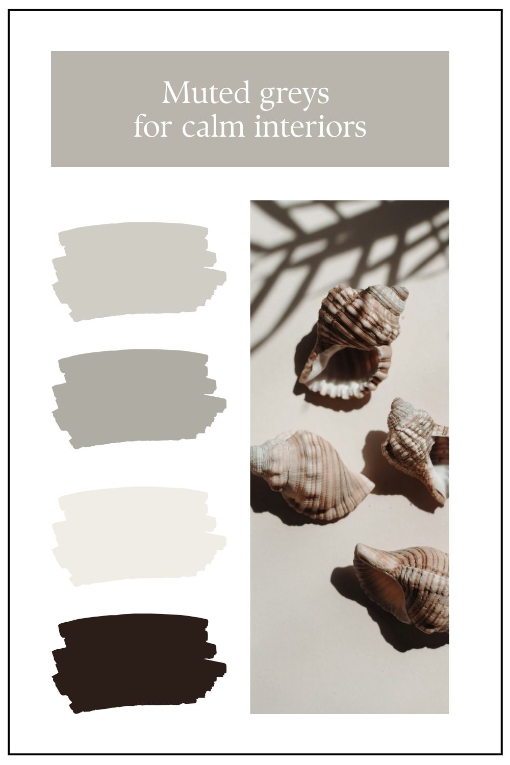
This week I am focusing on muted greys. These greys are fairly neutral in that they don't have an immediately obvious undertone. They are warm with a yellow base but with a very slight leaning towards a neutral undertone of green, they work to bring calmness to a space as the eye doesn't need to adjust to see green. Remember that with the colour wheel you can have a yellow that contains more green or more orange - these are subtle shifts but can make all the difference to a final colour.
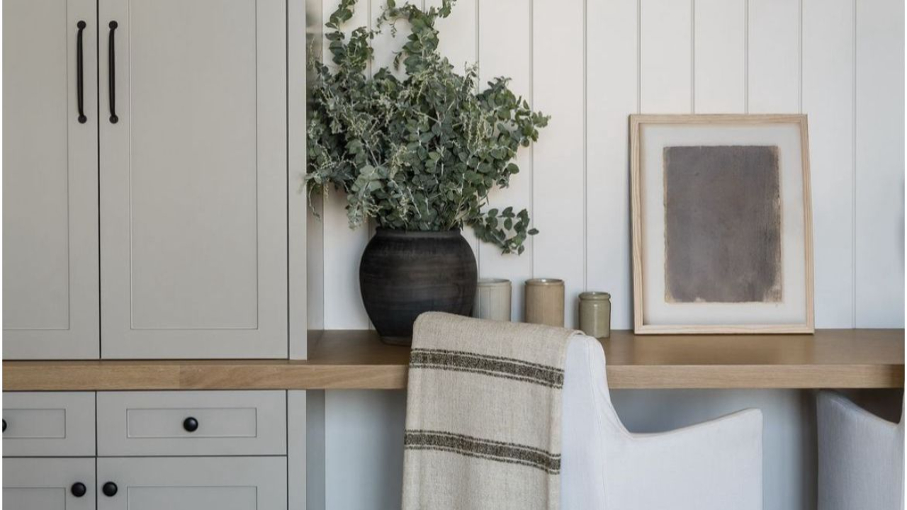
Muted greys have a quiet confidence about them. They don’t demand attention; instead, they create a gentle, enveloping backdrop that allows a space to breathe. When layered with soft whites, chalky off-whites and subtle warm undertones, grey becomes less about stark minimalism and more about serenity. Think of a misty morning sky or weathered stone — tones that feel settled, timeless and reassuring. In an interior, this palette slows everything down. It softens hard architectural lines, diffuses light beautifully and creates a sense of calm that is both modern and enduring.
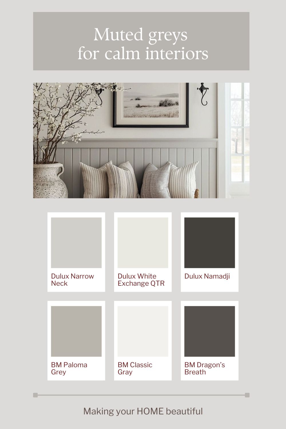
To keep muted greys from feeling flat, introduce just a thread of deeper contrast. A charcoal lamp base, a graphite throw, or even blackened bronze hardware will anchor the scheme and give the eye a place to rest. This darker punctuation prevents the room from drifting into monotony while preserving its tranquil mood. The result is a balanced composition: soft greys and whites doing the quiet work of creating harmony, with deeper notes adding structure and sophistication.
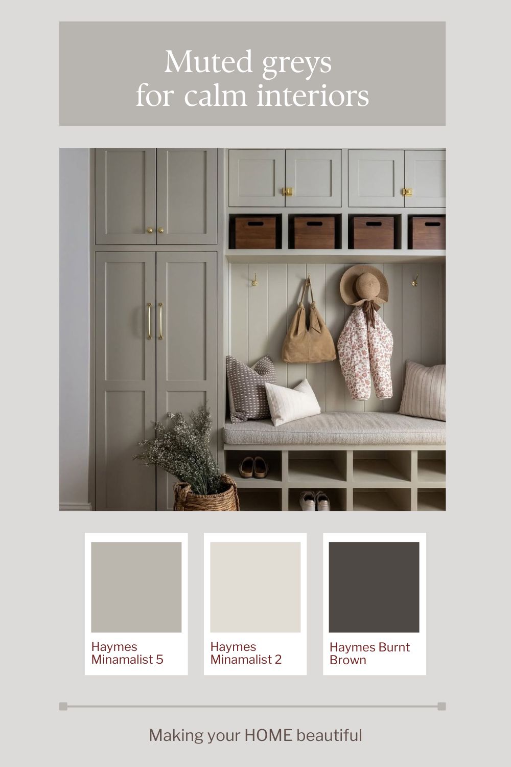
Remember that colour palette inspiration is a starting point and that you can adapt it to suit your environment. Always consider the natural light that your room receives and most importantly, always remember that the mood you want to create the space is so important. This room has similar tones but without such darker contrasts with just the hardware and lighting in a deep bronze colour.
The colours shown here are suggested to create a similar effect. All colours should be tested to ensure they are right for your environment.
Related: How to sample paint colours
If you’re drawn to this palette but unsure how it would translate into your own home, remember that colour is always influenced by light, materials and context. These schemes are intended as a starting point — something to adapt rather than copy exactly. And if you’d like help refining a palette for your specific space, aspect or style, this is exactly what I do through my colour consultation services.
If you love coastal neutrals, you may be interested in this YouTube video of mine:
Stay connected with news and updates!
Join our mailing list to receive the latest news and updates from our team.
Don't worry, your information will not be shared.
We hate SPAM. We will never sell your information, for any reason.