Each week, I share a colour palette designed to spark ideas and show how colours can work together in a real, lived-in way. These palettes aren’t about rigid rules or perfect matches — they’re about mood, balance and how colour actually behaves in a home. You may see a few variations of a similar scheme, because small shifts in tone, warmth or depth can completely change the feel of a space.
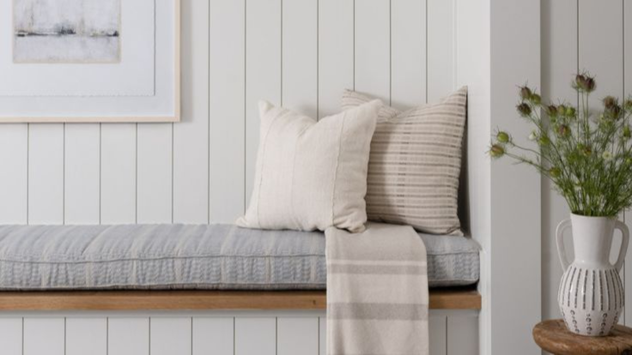
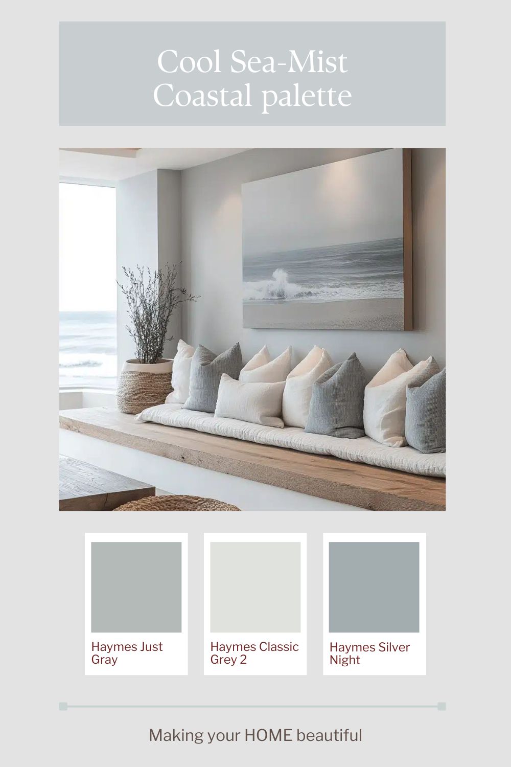
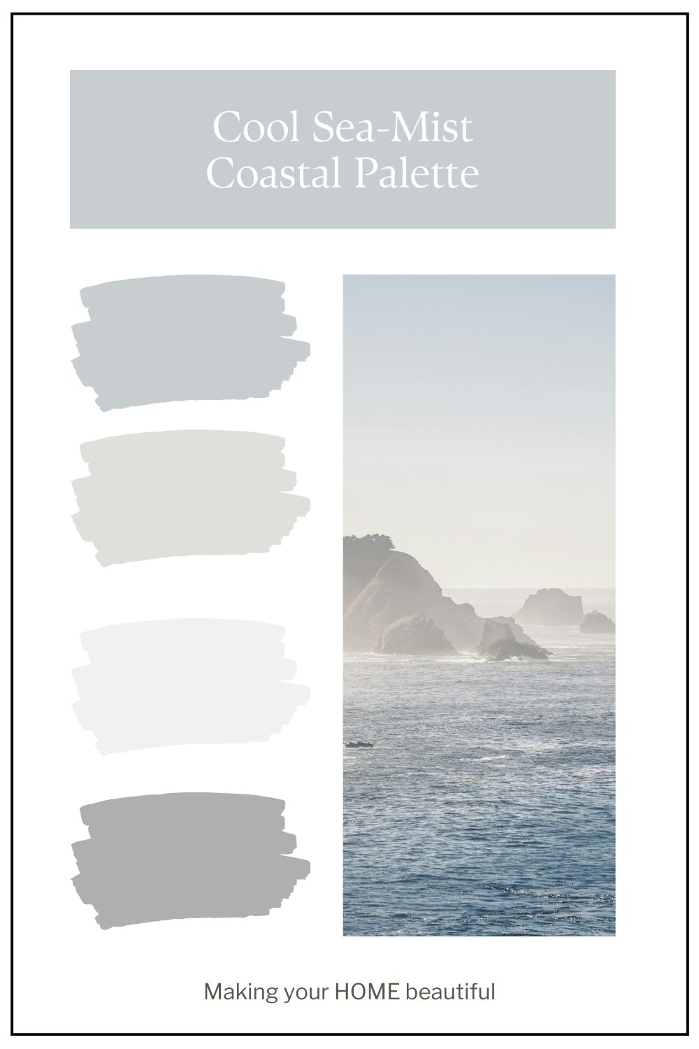
The cool sea-mist version of this palette is all about lightness and clarity. Think crisp, cool whites layered with soft silver greys and the faintest wash of blue — like morning light sitting over still water. These tones feel clean without being stark, especially when the whites have a subtle grey undertone rather than cream. The effect is calm and expansive, creating a sense of air and openness that works beautifully in homes with good natural light or coastal exposure.
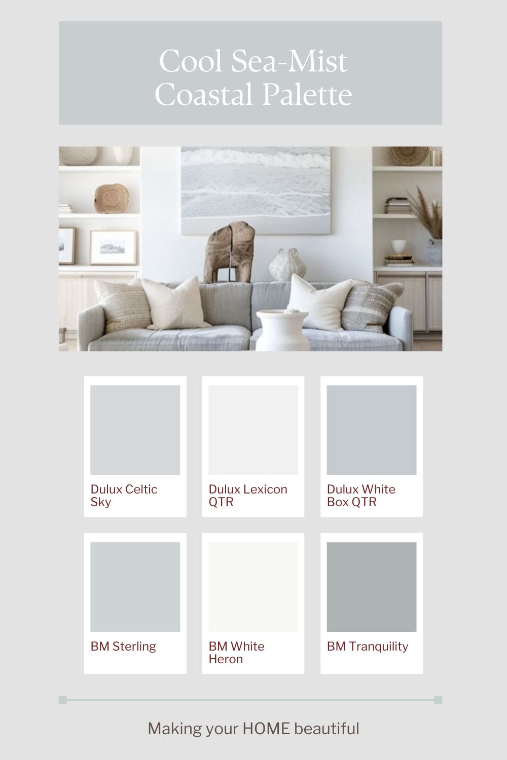
To keep the palette from feeling cold or clinical, texture becomes essential. Pair smooth painted surfaces with linen, brushed nickel, pale stone and lightly weathered timber in cool undertones. On an exterior, this scheme works particularly well with a soft grey roof, white trim and a muted blue-grey front door for quiet contrast. It’s refined rather than decorative — a palette that feels effortless, understated and timeless.
Remember that colour palette inspiration is a starting point and that you can adapt it to suit your environment. Always consider the natural light that your room receives and most importantly, always remember that the mood you want to create the space is so important.
The colours shown here are suggested to create a similar effect. All colours should be tested to ensure they are right for your environment.
Related: How to sample paint colours
If you love these soft coastal colours and you like putting together colour palettes you may be interested in my YouTube video on putting together a Hamptons Style scheme.
One of the whites I recommended for a Sea Mist Coastal palette is Dulux Lexicon Quarter. This YouTube video tells you all about this beautiful crisp white.
If you’re drawn to this palette but unsure how it would translate into your own home, remember that colour is always influenced by light, materials and context. These schemes are intended as a starting point — something to adapt rather than copy exactly. And if you’d like help refining a palette for your specific space, aspect or style, this is exactly what I do through my colour consultation services.
Stay connected with news and updates!
Join our mailing list to receive the latest news and updates from our team.
Don't worry, your information will not be shared.
We hate SPAM. We will never sell your information, for any reason.