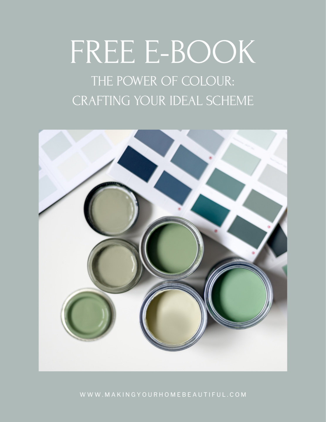
A Warm Classic Transitional palette sits beautifully between traditional comfort and contemporary restraint. It’s the type of scheme that feels timeless rather than trendy — layered, calm and quietly elegant. The colours I have selected work together because they share warm undertones and soft depth, creating a home that feels cohesive and welcoming rather than stark or overly styled.
![]()
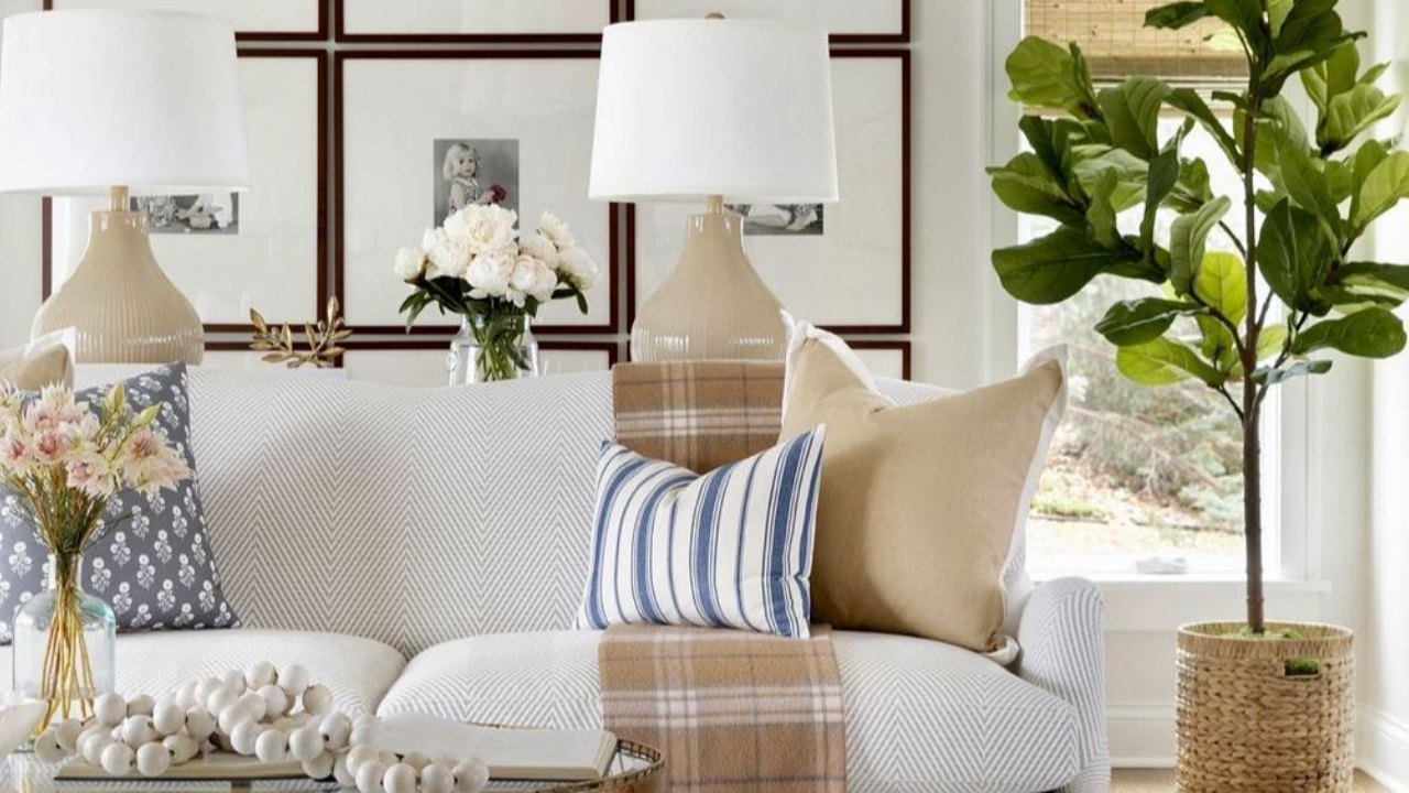
Warm Classic Transitional interiors blend the structure of traditional design with the simplicity of contemporary spaces. Instead of crisp whites and cool greys, the palette leans into creamy whites, soft stone tones and warm tans.
These colours create a backdrop that feels calm and elevated while still being very liveable. They work particularly well in homes with natural materials such as timber flooring, linen upholstery, stone surfaces and brushed brass accents.
Rather than relying on high contrast, the look is achieved through gentle layering of tone — allowing the room to feel soft, balanced and sophisticated.
The foundation of this palette begins with neutral whites that have a subtle warm undertone. These colours avoid the harshness of cooler whites and instead create a gentle, flattering backdrop.
Beautiful options include:
-
Dulux White Verdict Quarter for a neutral white
-
Benjamin Moore Cream Froth for a more creamy white
-
Haymes Cirrus White 1 for a more creamy whtie
These whites work particularly well on walls, ceilings and main living areas, creating a calm envelope for the home. Because they sit slightly off-white, they pair beautifully with warm timber floors, textured fabrics and natural materials.
![]()
Once the base is established, mid-tone neutrals introduce warmth and sophistication. These colours prevent the scheme from feeling flat and allow the room to feel layered and considered.
Excellent mid-tones from my palettes include:
-
Benjamin Moore Natural Wicker
-
Haymes Oak Buff 2
- Dulux White Beach Half
These tones work beautifully on joinery, feature walls, cabinetry, or upholstered furniture, adding depth without dominating the space.
They also pair seamlessly with linen curtains, textured rugs and woven elements, reinforcing the relaxed elegance that defines transitional interiors.
The final layer introduces richer warm tones that anchor the palette and provide visual interest.
Colours such as:
-
Dulux Gnu Tan
-
Benjamin Moore Quincy Tan
-
Haymes Finch
bring warmth and quiet drama to the scheme. These tones are perfect for accent furniture, cushions, throws, feature joinery or even a statement wall.
Used sparingly, they create contrast while still maintaining the soft, cohesive feel of the palette.
Why This Palette Works
The success of a Warm Classic Transitional palette lies in undertone harmony. Every colour in this scheme shares a similar warm base, which allows them to flow naturally from one to the next.
Instead of sharp contrasts, the look is achieved through gradual tonal shifts:
-
Neutral whites
-
Soft stone neutrals
-
Warm beiges
-
Rich tan accents
This layering creates an interior that feels refined, comfortable and enduringly stylish.
Bringing the Look Into Your Home
To complete the palette, consider incorporating:
-
Natural timbers such as oak or walnut
-
Textural fabrics like linen, boucle and wool
-
Stone or marble surfaces with soft veining
-
Warm metallic accents in brass or bronze
-
Soft patterned textiles for subtle interest
These elements reinforce the warmth of the palette and help create the effortless elegance that defines this style.
![]()
Warm Classic Transitional interiors are not about bold statements — they are about balance, softness and timeless appeal.
When layered thoughtfully, these colours create a home that feels welcoming, elegant and beautifully calm.
If you’re drawn to this palette but unsure how it would translate into your own home, remember that colour is always influenced by light, materials and context. These schemes are intended as a starting point — something to adapt rather than copy exactly. And if you’d like help refining a palette for your specific space, aspect or style, this is exactly what I do through my colour consultation services.
Stay connected with news and updates!
Join our mailing list to receive the latest news and updates from our team.
Don't worry, your information will not be shared.
We hate SPAM. We will never sell your information, for any reason.