When you are choosing a white or neutral for your home, it is easy to assume that the safest choice is one that has as little colour as possible.
But here is something I have learned over many years as a colour consultant and interior decorator:
The most beautiful neutrals are rarely completely neutral.
They usually have a very subtle undertone that gives them their character. One of my favourite groups of these understated colours are green-based whites and neutrals.
Green might not be the first colour you think of when choosing a white for your walls, but when the green is incredibly subtle—almost imperceptible—it can create some of the most restful, versatile and timeless colours for your home.
And importantly, a green-based white doesn't necessarily look green. In fact, some of these colours sit right on the cusp of green and yellow, giving you a soft, warm neutral that is incredibly easy to live with.
Why do green-based whites work so well?
Green is an interesting colour when it comes to interiors.
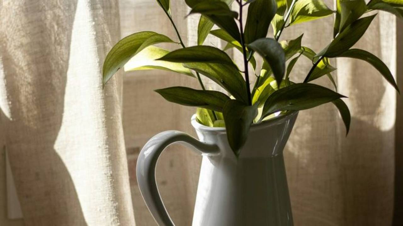
It is often described as a restful colour because of its connection with nature. Think of the colours we see outside every day: foliage, eucalyptus, sage, grasses and moss. Your eye also doesn't need to shift to see green which makes it very calming.
But there is another reason I particularly like green-based whites and neutrals.
Green sits in the middle of the colour spectrum.
It is created by combining yellow and blue, and this gives green a wonderful balancing quality. When you take just the tiniest hint of green and add it to a white or neutral, you get a colour that feels incredibly settled. It doesn't shout for attention. It doesn't feel overly warm or overly cool.
Instead, it simply creates a beautiful backdrop for the rest of your home. And that is exactly what I want from a neutral.
Green-Based Whites
Let's start with the lighter end of this colour family.
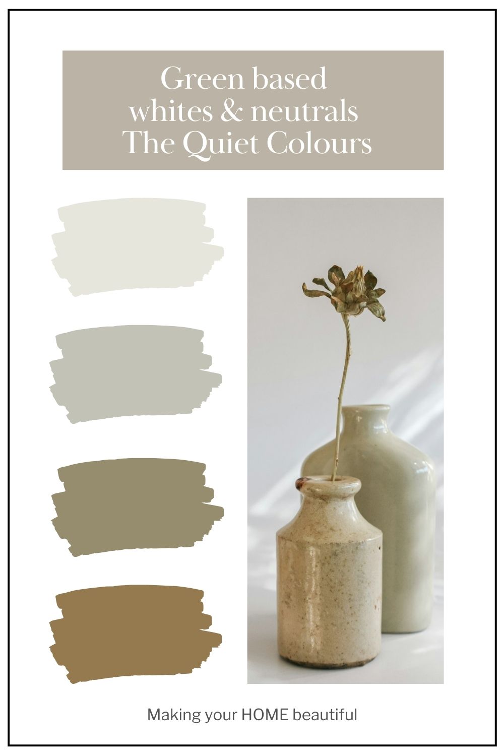
There are a number of beautiful whites that sit right on the cusp of green.
They have enough warmth and softness to avoid feeling stark, but not enough green to actually read as a green paint colour.
Some examples include:
- Dulux White Verdict Quarter
- Dulux White Verdict Half
- Dulux White Duck Quarter
- Dulux Livingstone Quarter
- Porters Bone
- Haymes Soft White
These are the sorts of whites that I would describe as quiet whites. They don't have the crispness of a cool white, nor do they have the obvious creamy quality that you can sometimes get with strongly yellow-based whites. Instead, they have a subtle softness.
And this is where understanding undertones becomes so important.
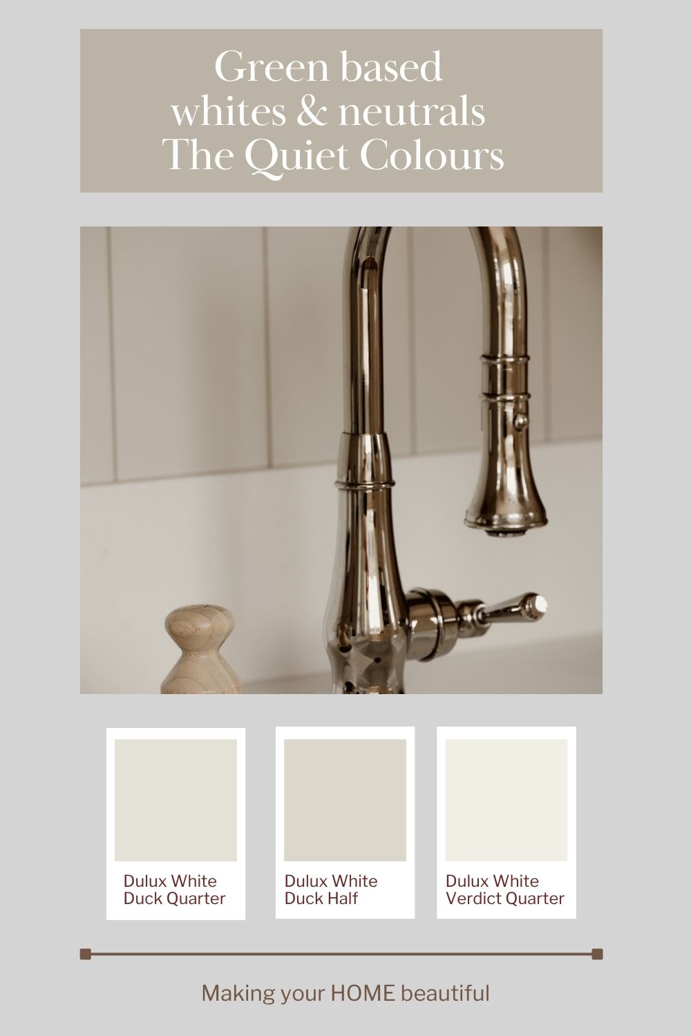
You don't necessarily see the green—you feel it.
If I showed you one of these whites on its own, you might simply describe it as a soft white or warm neutral.
You may not look at it and immediately say:
"That's green!"
And that's precisely the point.
The green undertone is doing its job quietly in the background. It helps prevent the white from becoming too stark while also keeping it from becoming overly creamy or yellow.
This makes these colours incredibly useful when you want a home to feel calm, natural and sophisticated.
The beauty of a white that isn't too warm
One of the problems I see when people are choosing whites is that they can become caught between two extremes. They don't want a stark, clinical white. So they move towards a warmer white. But then the warmth becomes too noticeable and suddenly the walls look yellow or creamy.
A green-based white can be a lovely alternative.
It gives you the softness you are looking for without necessarily introducing a strong yellow undertone.
This is particularly useful if you have natural timber, stone, beige, linen or other earthy finishes throughout your home. The subtle green undertone helps these materials sit together beautifully.
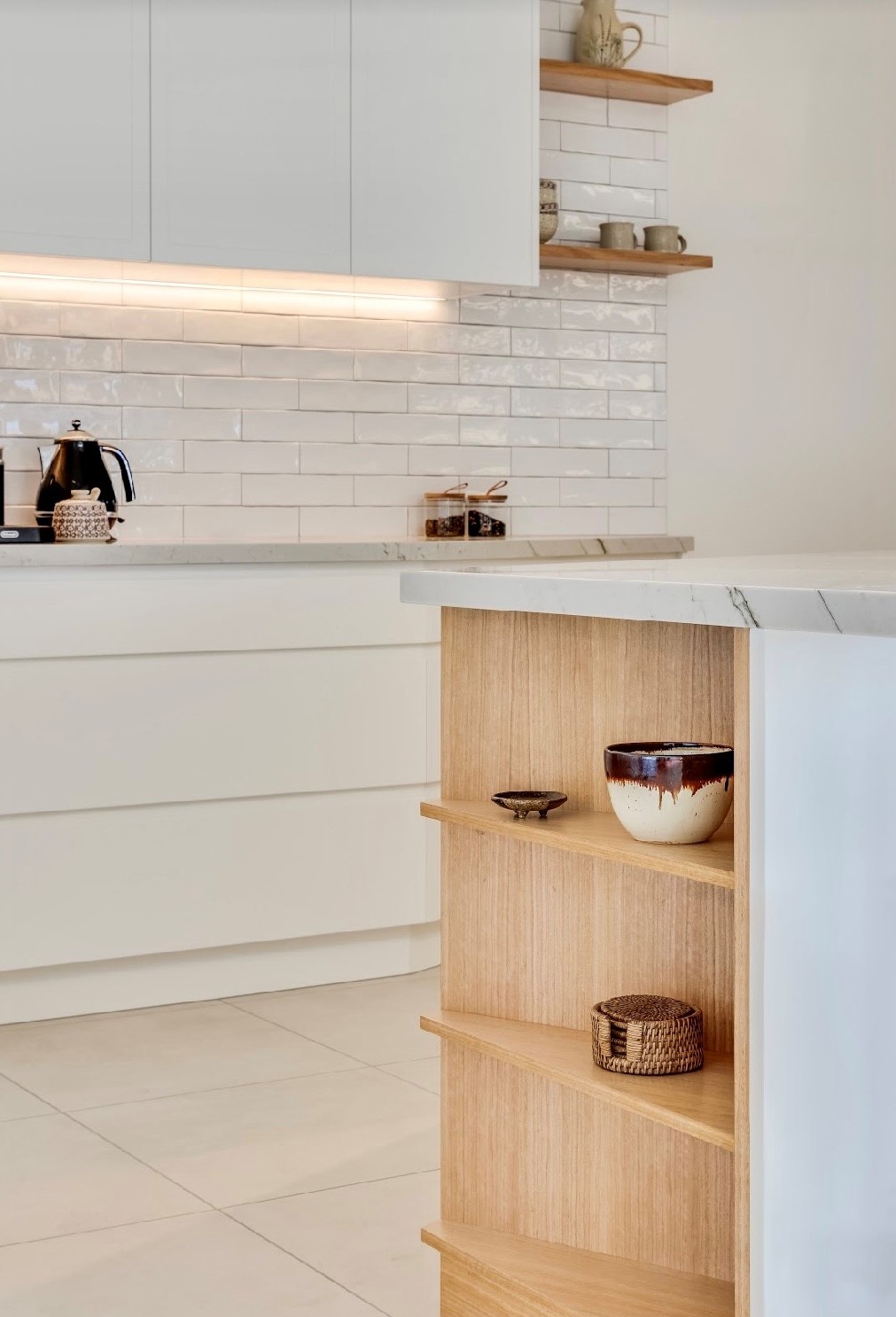
Dulux White Verdict Quarter joinery and walls
Green-Based Neutrals
We can take the same principle and move a little deeper into the colour spectrum. This is where I think green-based neutrals become particularly interesting.
Examples include:
- Dulux White Duck
- Dulux Apparition
- Dulux Linseed
- Porters Halloumi
These colours are deeper than the whites we have just looked at, but they still sit in that lovely space between yellow and green.
And this is where you get those beautiful soft stone colours.
They aren't quite beige.
They aren't quite grey.
They aren't really green either.
They sit somewhere beautifully in between.
Think soft stone rather than beige
This is one of the reasons I love these colours for contemporary homes.
If you want a neutral that has a little more depth but don't want to go down the traditional beige route, a green-based neutral can be a wonderful option.
They have a natural, earthy quality without feeling rustic.
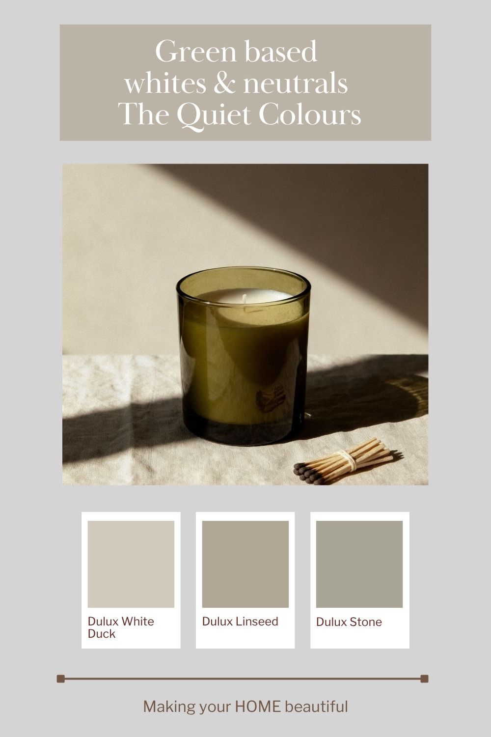
Green-Based Neutrals Are Particularly Beautiful With Natural Materials
There is a reason these colours work so well in today's interiors.
We are surrounded by natural materials and organic textures.
- Timber
- Natural Stone
- Linen
- Rattan
- Woven textures
- Ceramics
- Plants
These materials all have their own subtle colour variations, and a green-based neutral tends to sit very comfortably alongside them. Rather than competing with these finishes, it allows them to become part of the overall palette. This is particularly important when you are designing an open-plan home.
You don't want every element to have a different colour story.
A soft green-based neutral can become the quiet connecting colour that allows your kitchen, living room, dining area and hallway to feel like they belong together.
The importance of understanding the undertone
This is also a great example of why I always encourage you to look beyond the name of a paint colour.
A colour called White isn't necessarily neutral.
A colour called Stone isn't necessarily beige.
And a colour called Natural can have quite a strong undertone.
When you are selecting your colours, I recommend looking at the undertone and the relationship between the colours, rather than simply choosing the colour that looks closest to white or beige on a small paint chip. Because once that colour is on all four walls, the undertone becomes much more important.
And this is where sampling is essential.
Look at your paint samples alongside your flooring, kitchen cabinetry, benchtop, tiles and other fixed finishes.
The surrounding colours can change the way you perceive the undertone.
A green-based white that looks beautifully soft in one room can look quite different beside a particular stone or timber.
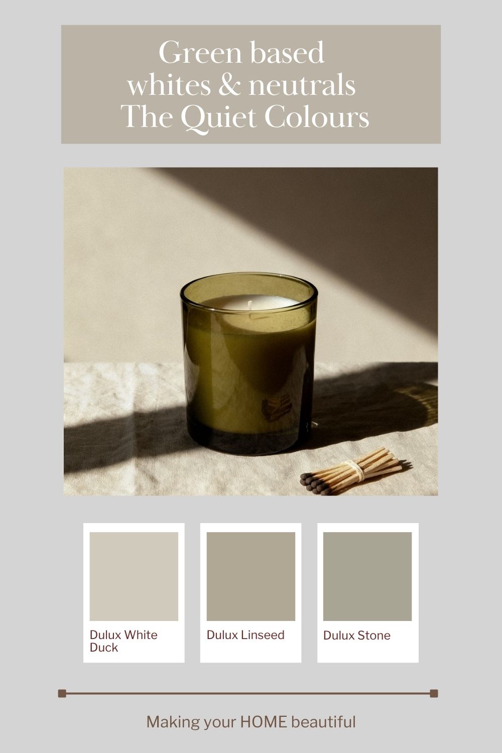
Creating a whole-home colour scheme with green-based neutrals
One of the things I love about this colour family is that you can use different strengths to create a cohesive home.
You might use a very light green-based white for your walls and trims, then introduce a deeper green-based neutral in another room.
For example, you could have:
Soft green-based white → lighter neutral → deeper stone neutral
Rather than every room having a completely different colour, the subtle relationship between the colours creates continuity. This is one of my favourite ways to create a home that feels considered without feeling matchy-matchy.
And it is a particularly useful approach in an open-plan home where you want the colours to flow naturally from one space to another.
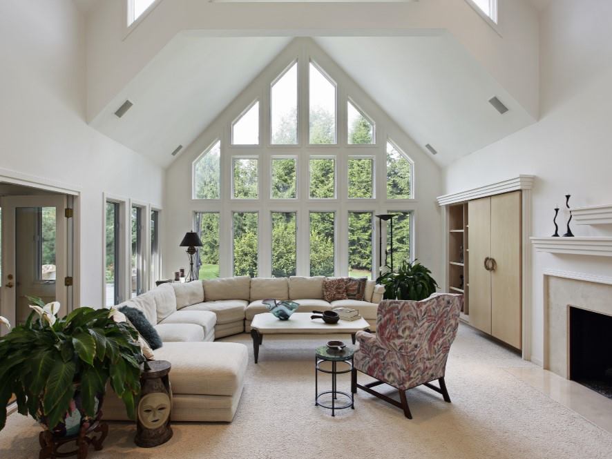
Dulux White Verdict Quarter
Don't be afraid of a little colour
Perhaps the biggest lesson I want you to take from these colours is this:
A neutral doesn't have to be colourless.
That tiny amount of green can be enough to give a white its softness.
It can give a neutral its depth.
And it can help create that wonderful feeling that a home is calm, connected and easy to live in.
So, if you have been searching for the perfect white or neutral and everything you've looked at feels either too stark, too yellow, too grey or simply a little bit blah, have a look at colours sitting on the green side of neutral.
You might be surprised by how beautiful they are.
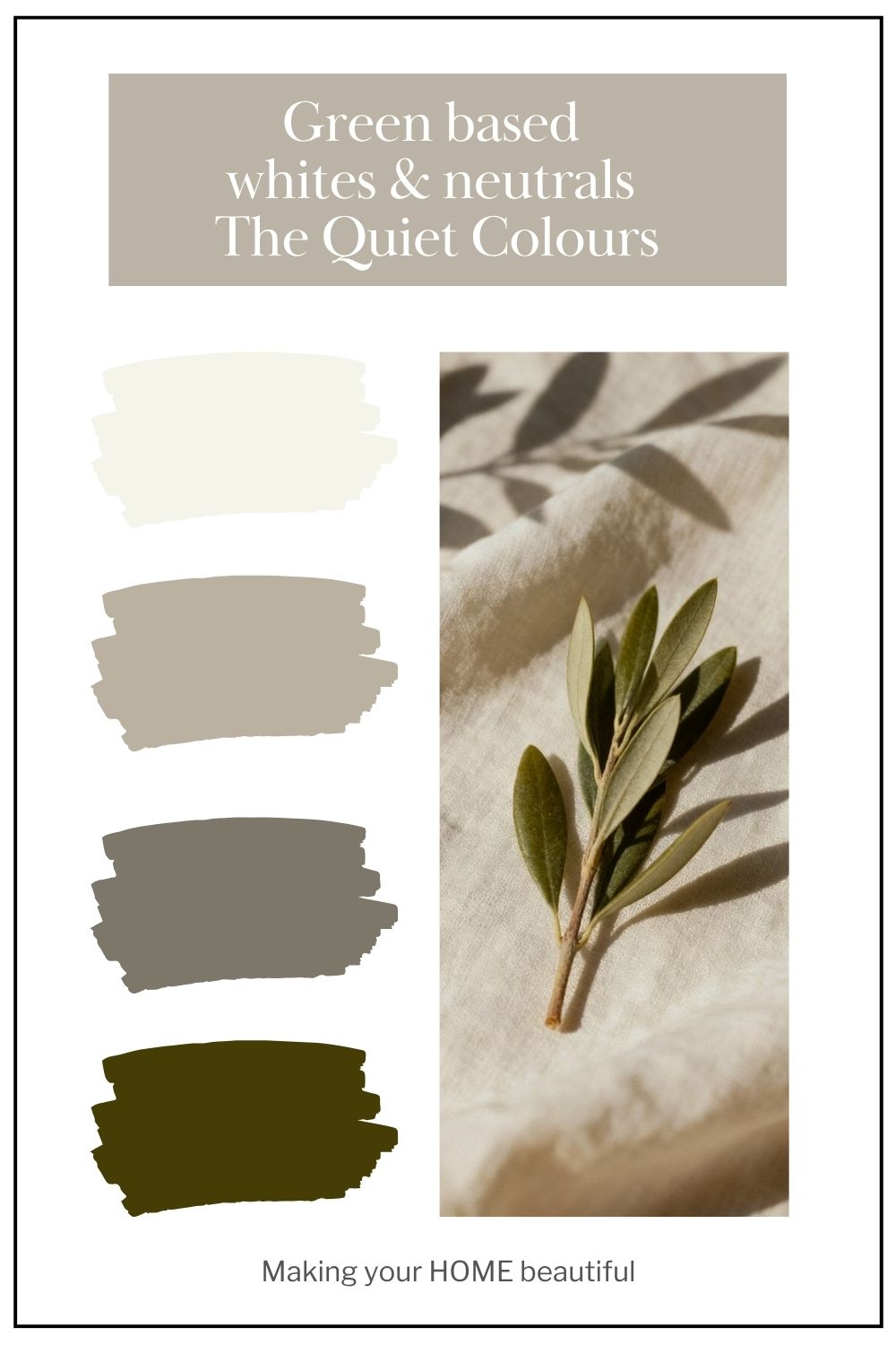
My green-based white and neutral edit
For a soft white:
- Dulux White Verdict Quarter
- Dulux White Duck Quarter
- Porters Bone
- Haymes Soft White
For a deeper, soft stone neutral:
- Dulux White Duck
- Dulux Apparition
- Dulux Linseed
- Porters Halloumi
These colours are a wonderful reminder that sometimes the most restful colours are the ones that sit quietly on the edge of something else.
Did you know I have an online colour consultation service. From just a quick 30 minute zoom session to address one or two key elements through to a full done for you solution for your entire home.
Stay connected with news and updates!
Join our mailing list to receive the latest news and updates from our team.
Don't worry, your information will not be shared.
We hate SPAM. We will never sell your information, for any reason.