If you're searching for a soft grey exterior colour that feels fresh, elegant and timeless, Dulux Tranquil Retreat is well worth considering. This beautiful pale grey sits comfortably between a deep off-white and a true grey, making it a versatile choice for a wide range of architectural styles.
One of the things I love about Dulux Tranquil Retreat is its subtle cool undertone. Unlike warmer greys that can appear beige or creamy, Tranquil Retreat has a crisp, sophisticated quality that works particularly well in Coastal, Hamptons and contemporary exterior colour schemes.
Understanding Tranquil Retreat's Undertones
Dulux Tranquil Retreat is a light neutral grey with a cool base. While it appears distinctly grey on large exterior surfaces, it is soft enough that it won't dominate the facade or make the home feel dark.
Like many pale exterior colours, Tranquil Retreat can appear significantly lighter outdoors than it does on a colour card or sample pot. Bright Australian sunlight has a way of washing out lighter colours, so it's essential to test the colour on multiple elevations of your home before making a final decision.
North-facing walls may appear brighter and lighter, while south-facing elevations often reveal more of the colour's true grey undertone. Viewing large samples throughout the day will help you understand exactly how the colour will perform on your home.
Why Tranquil Retreat Works So Well on Weatherboards
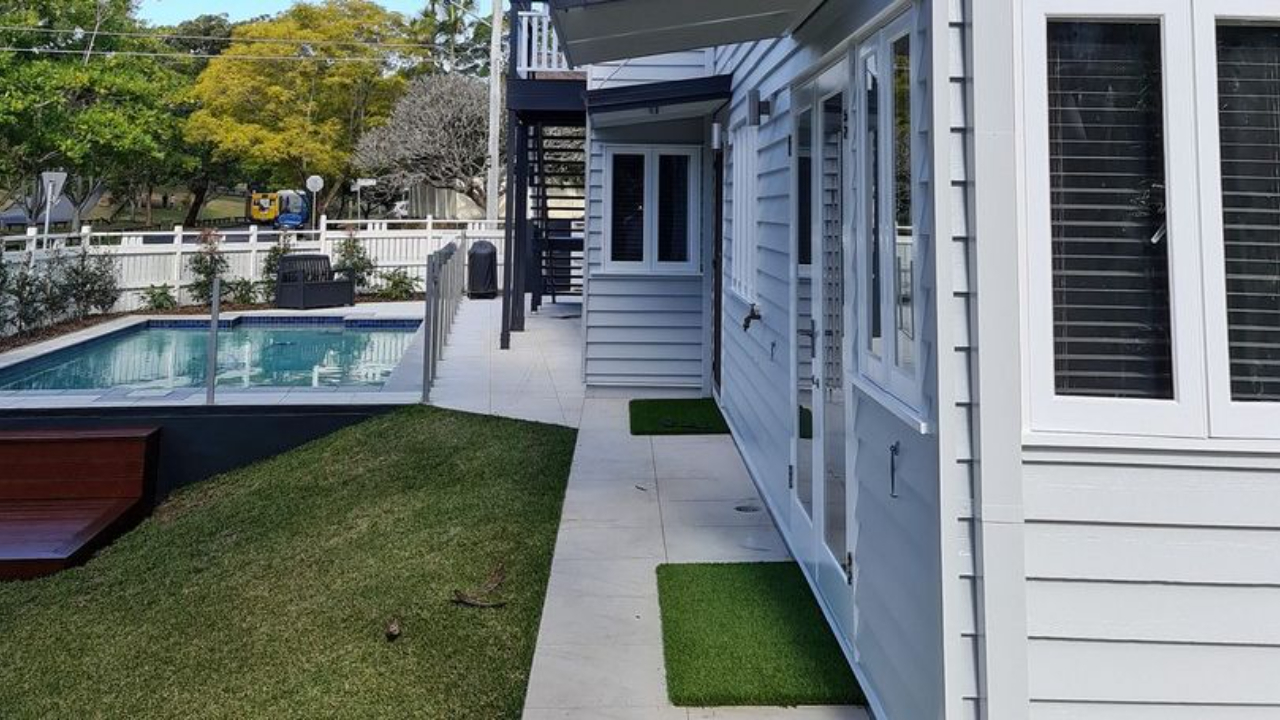
For homeowners who want a soft grey weatherboard colour without moving into darker territory, Tranquil Retreat is an excellent choice.
It provides enough contrast against white trims to create visual interest while maintaining the relaxed, airy feel that works so well for Coastal and Hamptons-inspired homes. The result is a façade that feels elegant and welcoming rather than stark or overly formal.
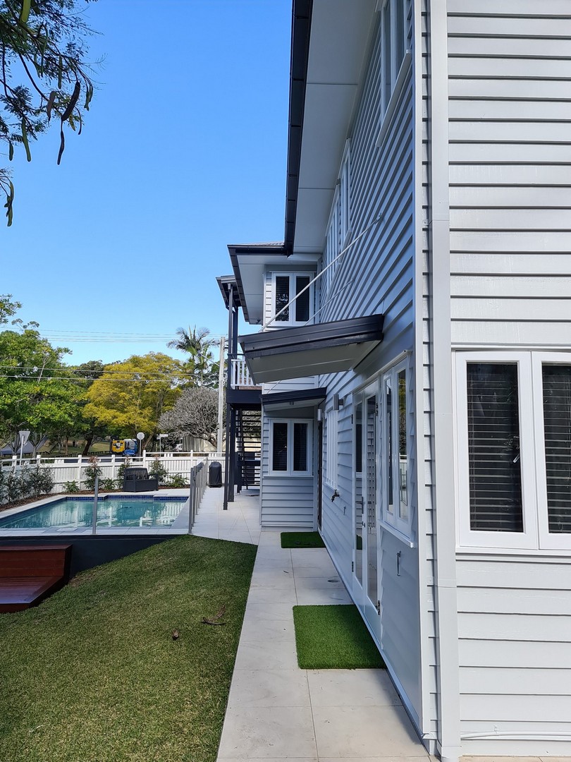
Image: Refined Painting Projects
The Best Trim Colours for Dulux Tranquil Retreat
To create a crisp, classic exterior scheme, I often pair Tranquil Retreat with Dulux Lexicon Quarter on trims and window frames.
Lexicon Quarter provides a fresh white contrast that enhances the cool undertones of Tranquil Retreat without feeling too harsh. It's particularly effective for window frames, decorative mouldings and weatherboard trims.
For garage doors, fascia and other architectural elements, Colorbond Dover White is another excellent companion colour. Its clean white appearance helps create a cohesive and timeless exterior palette.
A front door is beautiful rich Dulux Poor Knights will complete the look.
Hamptons Style Colour Scheme
If you're aiming for a Hamptons-inspired exterior, Dulux Tranquil Retreat provides the perfect soft backdrop.
To anchor the scheme, pair it with a darker roof colour such as Colorbond Monument or Colorbond Basalt. These deeper charcoal tones create the contrast that is synonymous with classic Hamptons architecture while allowing the softness of Tranquil Retreat to shine.
Complete the look with white trims, detailed mouldings and traditional architectural features for a sophisticated coastal-luxury aesthetic.
Coastal Style Colour Scheme
For a lighter and more relaxed Coastal look, Tranquil Retreat works beautifully with Colorbond Surfmist or Colorbond Shale Grey roofing.
These lighter roof colours help maintain the breezy, sun-filled appearance that Coastal homes are known for. When using either Surfmist or Shale Grey, I recommend incorporating Colorbond Dover White on the fascia to keep the overall scheme feeling fresh and bright.
The combination of Tranquil Retreat, a light roof and crisp white detailing creates a calm and welcoming exterior that feels perfectly suited to the Australian coastline.
Using Dulux Tranquil Retreat for Scandinavian Interiors
While Dulux Tranquil Retreat is often chosen for exteriors, it can also be a beautiful option inside the home, particularly if you're creating a Scandinavian-inspired interior.
Scandi design is known for its simplicity, functionality and connection to natural materials. The style typically relies on a restrained colour palette featuring soft whites, pale greys and warm timber tones. Dulux Tranquil Retreat fits perfectly within this aesthetic thanks to its subtle cool undertones and understated elegance.
Unlike stark whites, Tranquil Retreat introduces a gentle layer of softness to walls while still maintaining the light, airy feel that Scandinavian interiors are famous for. It creates a calm backdrop that allows natural textures such as oak timber, linen, wool and stone to take centre stage.
Tranquil Retreat works particularly well in living rooms, bedrooms and open-plan spaces where you want a sense of tranquillity and simplicity. Pair it with light oak flooring, white trims and layered natural textiles to achieve that effortlessly relaxed Nordic look.
For a modern Scandinavian scheme, combine Tranquil Retreat with crisp whites such as Dulux Lexicon Quarter and incorporate black accents through lighting, furniture or hardware. The contrast adds definition and interest while maintaining the clean, minimalist aesthetic.
The result is an interior that feels bright, sophisticated and welcoming—perfect for homeowners who love the timeless appeal of Scandinavian design.
Image: Norsu Interiors
Is Dulux Tranquil Retreat Right for Your Home?
If you're looking for an exterior colour that sits comfortably between white and grey, Dulux Tranquil Retreat is an excellent option. Its subtle cool undertones, versatility and timeless appeal make it particularly effective on weatherboard homes, whether you're creating a classic Hamptons façade or a relaxed Coastal retreat.
Just remember that, like all pale exterior colours, Tranquil Retreat will appear much lighter outdoors than expected. Always test large samples on different sides of your home and view them throughout the day before committing.
When paired with complementary whites such as Dover White or Lexicon Quarter, Dulux Tranquil Retreat creates a beautifully balanced exterior colour scheme that will stand the test of time.
If you’re drawn to this palette but unsure how it would translate into your own home, remember that colour is always influenced by light, materials and context. These schemes are intended as a starting point — something to adapt rather than copy exactly. And if you’d like help refining a palette for your specific space, aspect or style, this is exactly what I do through my colour consultation services.
Stay connected with news and updates!
Join our mailing list to receive the latest news and updates from our team.
Don't worry, your information will not be shared.
We hate SPAM. We will never sell your information, for any reason.