


How to use Dulux White on White

colour May 29, 2026
How to use Dulux White on White

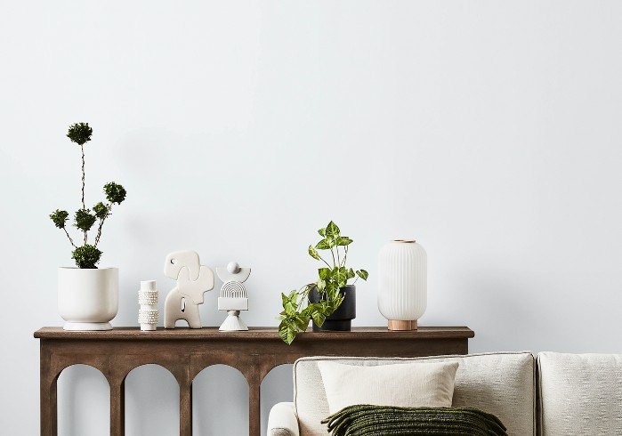
If you’re looking for a fresh, sharp white for a contemporary home, Dulux White on White is often one of the first colours people are drawn to. It’s bright, clean and undeniably modern — the kind of white that creates that crisp architectural aesthetic so many homeowners love.

But while White on White can look stunning in the right setting, it is also one of those whites that needs to be used very carefully. This is not a forgiving “works with everything” white. In fact, its cool blue undertone can create problems if you don’t fully understand how it behaves in different lighting conditions and alongside other finishes.

In my YouTube colour review, I explain why White on White can either look beautifully sophisticated — or unexpectedly cold and clinical.


Understanding the Undertone

The most important thing to know about Dulux White on White is that it is a cool blue-based white.

That underlying blue pigment is what gives the colour its crispness and clarity. In ultra-modern homes with lots of glass, concrete, black accents and streamlined finishes, this can work beautifully. It creates a clean, fresh backdrop that feels minimal and contemporary.

However, blue-based whites behave very differently from softer warm and neutral whites. They reflect light in a cooler way and can easily make a space feel stark if they are not balanced properly.

This is why White on White often suits:

  • Contemporary architecture
  • Modern minimalist interiors
  • Homes with cooler materials and finishes
  • Spaces with strong natural light
  • Crisp monochromatic schemes

It is generally less successful in homes that lean traditional, coastal-soft, farmhouse or classic Hamptons, where warmer or more neutral whites usually create a more welcoming feel.  I have seen other designers recommend White on White for these homes and refer to it as having a slight blue undertone while in my experience it has a very blue undertone which can make what is supposed to be a soft scheme, austere and unwelcoming.

Bear in mind that Coastal and Hamptons style homes rely on white furniture for their furnishings.  The whites in these pieces will be markedly different from your wall colour if you use Dulux White on White.

Why It Can Feel Cold

One of the biggest mistakes people make with White on White is assuming all whites are interchangeable. They’re not.

Because White on White has a noticeable cool undertone, it can quickly feel icy in:

  • South-facing rooms
  • Homes with limited natural light
  • Spaces with cool grey flooring
  • Rooms with lots of chrome, concrete or stark black finishes
  • Interiors lacking warmth and texture

Instead of looking fresh and modern, the room can suddenly feel flat, sterile or overly blue.

This is especially important in Australia where our natural light is incredibly strong. Cool whites often appear even cooler in bright daylight, which can intensify the blue undertone more than homeowners expect.

Dulux Australia

The Biggest Problem: Clashing With Other Whites

This is the issue I stress most strongly in my colour review.

White on White clashes very easily with warmer or more neutral whites.

If you place it next to creamy whites, green based neutral whites, warm trims, off-whites or warmer cabinetry, the contrast in undertones becomes immediately obvious. Suddenly the warmer white can look yellow, where before it just looked like a clean white, while White on White may appear even bluer and colder.

This is why choosing whites in isolation is risky.

When using White on White, you need to carefully consider:

  • Cabinetry colours
  • Benchtops
  • Tiles
  • Window frames
  • Roofing colours
  • Trim colours
  • Flooring tones
  • Existing paint colours

Every finish around it influences how the white will appear.

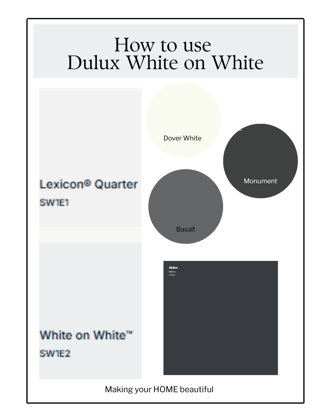
Dulux White on White works well with Dulux Lexicon Quarter as they both have a blue undertone.  You can introduce rich deep charcoal blues like Dulux Baltica for a dramatic statement.  These colours work for interior or exteriors.  With exteriors I recommend partnering it with either Colorbond Monument, Basalt or Dover White. 

My Advice Before Choosing It

Never choose White on White from a paint swatch alone.

Large sample boards are essential because lighting changes everything with this colour. View it:

  • Morning and afternoon
  • In full sun and shade
  • Next to your flooring and cabinetry
  • Alongside your other whites

This is one of those colours where undertone awareness makes all the difference between a polished result and a disappointing one.

I am not anti Dulux White on White as it can be incredibly beautiful — but only when it’s used with intention and a full understanding of how cool whites behave.

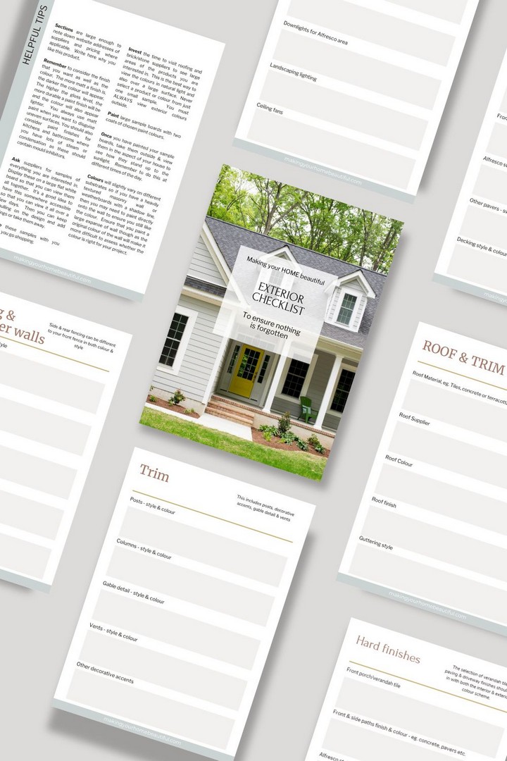
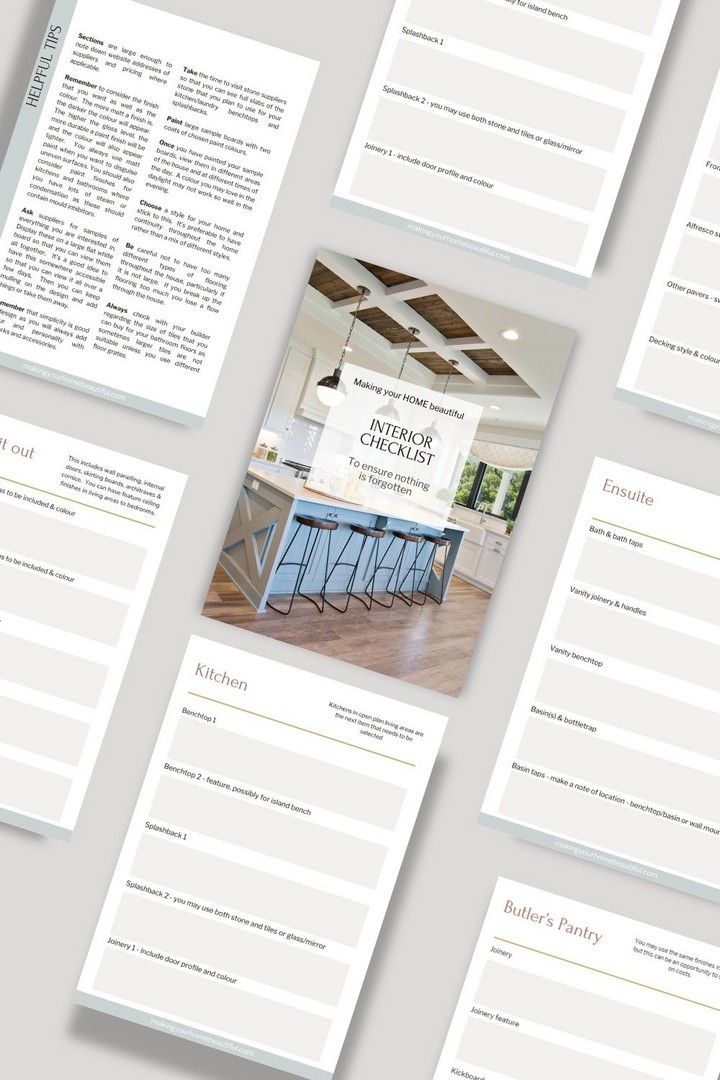
If you are building or renovating your home, I have comprehensive checklists to help you get organised and clear in your mind about what needs to be specified.  Don't wait for your builder to ask you questions - be prepared and gain satisfaction with every choice ticked off.


I also have an online colour consultation service.  From just a quick 30 minute zoom session to address one or two key elements through to a full done for you solution for your entire home.   


Stay connected with news and updates!

Join our mailing list to receive the latest news and updates from our team.
Don't worry, your information will not be shared.

We hate SPAM. We will never sell your information, for any reason.