Discover how dusty pinks, muted greys and rich coffee browns can create a beautifully balanced colour scheme for your home.
Pink is a colour that can sometimes be misunderstood in interiors. We tend to associate it with sweet pastel shades, pretty bedrooms and sugary tones, but there is another side to pink that is far more subtle, sophisticated and wonderfully versatile.
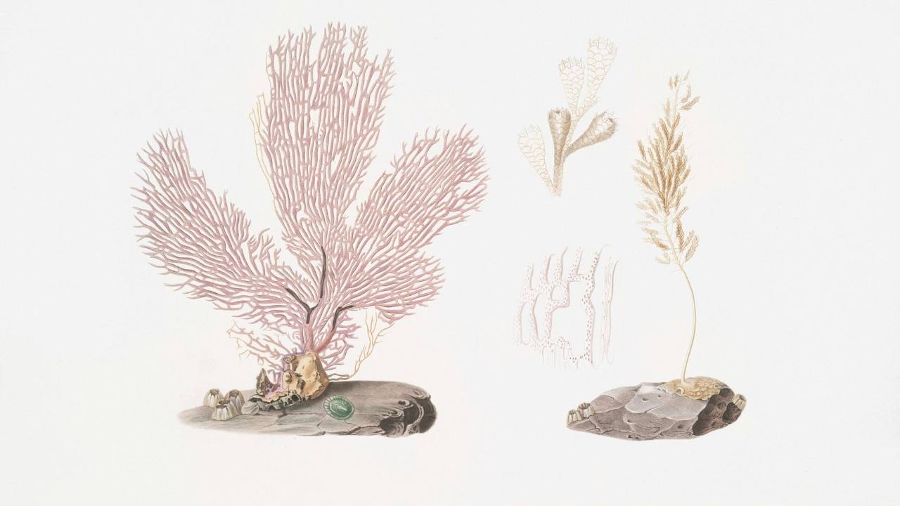
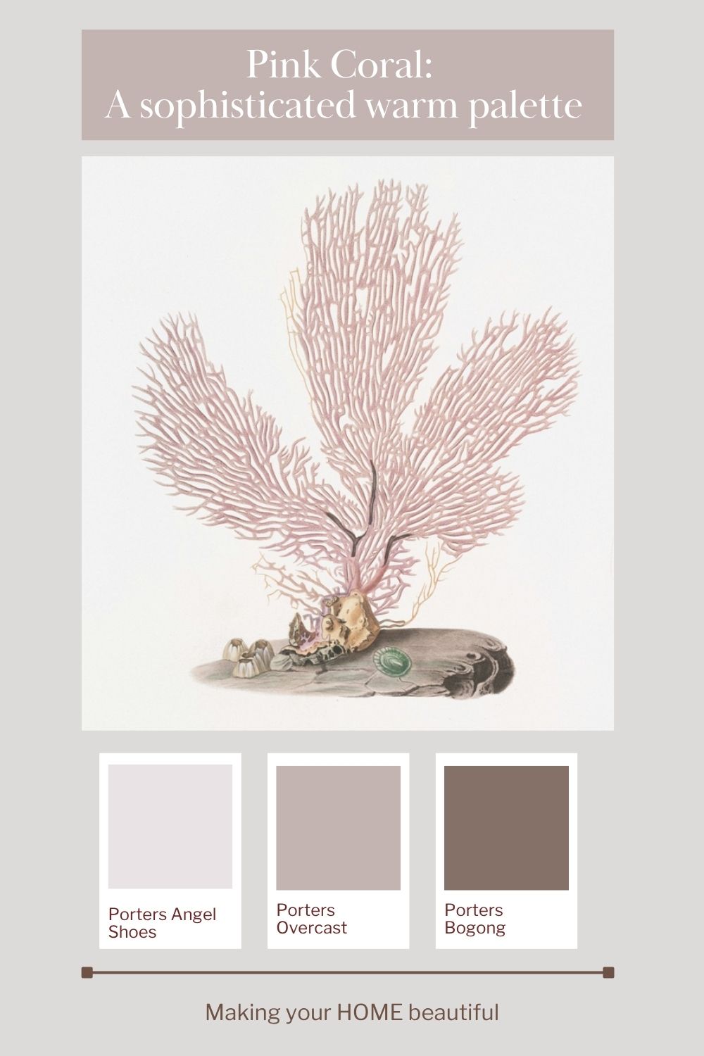
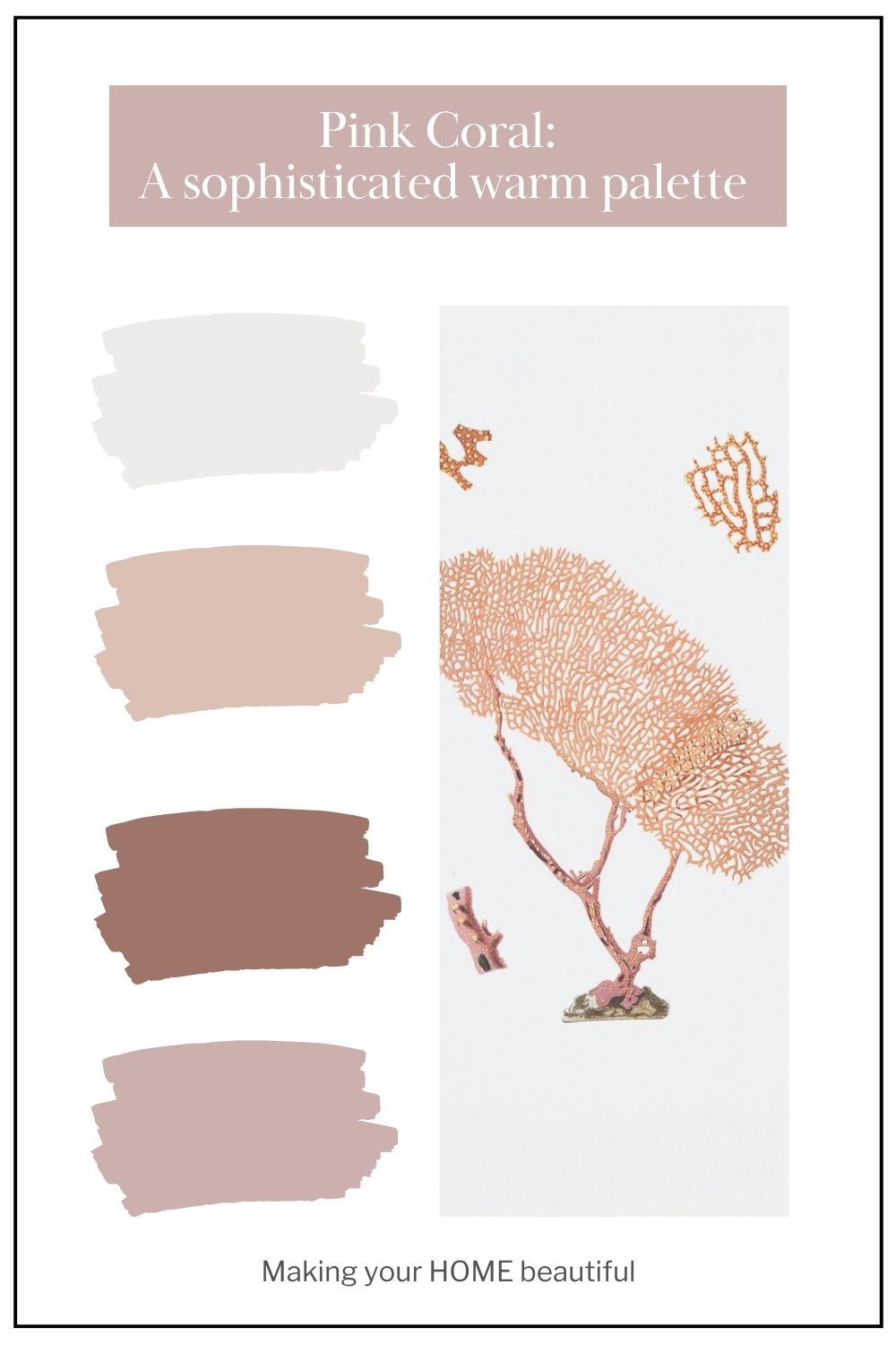
My Pink Coral colour palette, featuring six colours from Porter's Paints, explores this softer, earthier side of pink. Inspired by the delicate branches of coral, the warmth of natural stone and the beautiful colours found along the coastline, this palette combines dusty pinks with muted neutrals and deep, grounding browns.
The result is a scheme that feels warm, organic and quietly confident. It has enough softness to create a relaxing bedroom, enough depth to bring character to a living room, and enough sophistication to make a home office feel both creative and considered.
And one of the best things about this palette? It demonstrates how a piece of artwork or an image that you love can become the perfect starting point for a whole-house colour scheme.
Let artwork inspire your colour palette
One of my favourite ways to develop a colour scheme is to begin with something that inspires me. This might be a beautiful painting, a photograph, a favourite fabric or even an image from nature.
For this Pink Coral palette, the inspiration comes from coral formations and the colours of the natural environment. The delicate pink branches of the coral have a dusty, almost mineral quality, while the deeper brown tones introduce warmth and visual weight. There are also soft, muted neutrals that echo the colours of weathered stone and natural textures.
Look closely at an image that appeals to you and you will often discover that it contains far more colours than you first realise. The trick is to identify the dominant colour, the supporting neutrals and those deeper accent shades that give the image its character.
For this palette, pink is the feature colour, but it is the combination of pink with soft greyed neutrals and rich brown that makes the scheme work so beautifully.
You don't need to reproduce every colour in your inspiration image. Instead, select a small number of colours and decide how you want to use them in your home.
This approach takes the guesswork out of choosing colours and gives you a clear direction when selecting paint, flooring, furniture, fabrics and accessories.
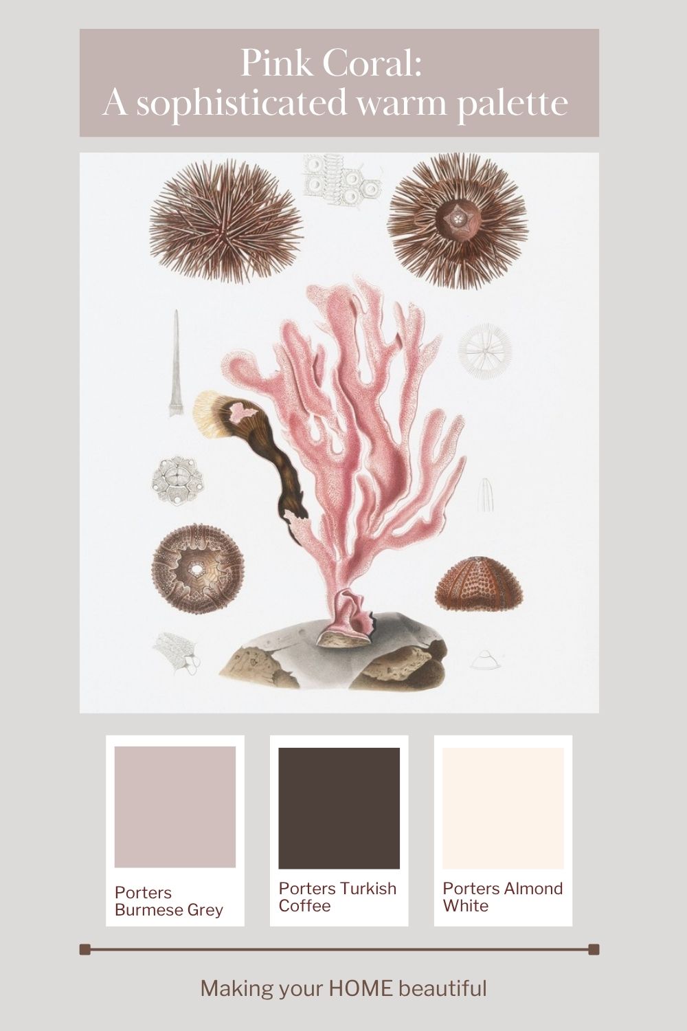
Introducing the Pink Coral palette: six colours from Porter's Paints
The six colours I have selected are Angel Shoes, Burmese Grey, Overcast, Bogong, Turkish Coffee and Almond White from Porter's Paints.
Together, they create a palette that balances softness with depth. There are gentle pink influences, muted and understated neutrals, and two deeper colours that provide contrast and definition.
1. Angel Shoes – the soft pink foundation

Angel Shoes brings the gentle, dusty pink character to this palette. Rather than relying on a bright or sugary pink, the intention is to create a softer, more nuanced effect that feels connected to nature.
Pink can be surprisingly versatile when it is treated as a sophisticated neutral. A muted pink can bring warmth to a room without overwhelming it, particularly when partnered with understated furnishings and natural materials.
Consider using this colour on walls in a bedroom or as a feature in a living space. If you prefer a more restrained approach, introduce pink through upholstered furniture, cushions, bed linen or artwork.
The key is to balance the pink with other elements in the scheme so that it feels intentional rather than decorative for decoration's sake.
2. Burmese Grey – a gentle, complex neutral

Burmese Grey provides a lovely transition between the softer pinks and the deeper browns in this palette. Its muted character helps the overall scheme feel cohesive rather than overly colourful.
A colour like this is useful when you want to introduce warmth and complexity without committing to a distinctly pink wall. It can help create a quiet backdrop for artwork, furniture and accessories while still contributing to the overall atmosphere of the room.
Consider Burmese Grey for walls, adjoining spaces or larger furnishings. It can also be a useful reference point when choosing fabrics and other finishes, helping you bring together colours that might otherwise feel disconnected.
3. Overcast – adding softness and balance

Overcast introduces another layer of muted neutrality. In a palette featuring dusty pink and rich brown, a softer greyed colour helps temper the warmer tones and gives the eye somewhere to rest.
This is particularly important if you are decorating an entire room. Using too many feature colours at equal strength can make a scheme feel busy, whereas a supporting neutral creates breathing space.
Overcast could be used on walls, in upholstery or through decorative details. It is also worth considering how it relates to the other finishes in your room, including flooring, window coverings and cabinetry.
The aim is to create a gentle transition between the lighter and darker colours rather than a series of unrelated colour statements.
4. Bogong – bringing in earthy warmth

Bogong is an important colour in this scheme because it introduces a stronger connection to the earthier side of the palette.
Where the pinks bring softness, Bogong adds a more substantial, grounded quality. It helps bridge the gap between the lighter neutrals and the deep coffee brown, making the overall palette feel layered and considered.
Think about using this colour in selected furnishings, timber-inspired finishes, decorative objects or a more defined area of the interior. It can also be a useful reference when choosing natural materials that have warm, earthy undertones.
The beauty of a layered palette is that no single colour needs to do all the work. Each shade contributes something different to the final result.
5. Turkish Coffee – depth and definition

Every successful colour palette benefits from a little visual weight, and Turkish Coffee provides exactly that.
This is the deep brown that helps ground the Pink Coral scheme. Without a darker shade, the combination of pink and pale neutrals could feel a little insubstantial. Introduce a rich brown, however, and the palette gains definition, contrast and a more sophisticated edge.
Turkish Coffee could be used for accent furniture, dark timber details, picture frames, occasional tables or carefully selected accessories. It can also inspire the choice of deeper brown fabrics and finishes throughout the room.
Don't be afraid of darker colours when working with a soft palette. They don't necessarily make a room feel heavy; when used thoughtfully, they can help the lighter colours appear more delicate and give the scheme a stronger sense of balance.
6. Almond White – a light, fresh neutral
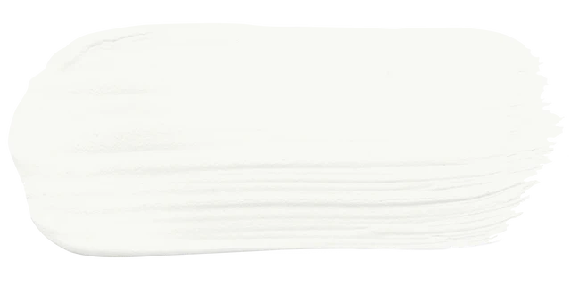
Almond White provides the lighter element in the palette, offering contrast against the dusty pinks and deeper browns.
A light neutral is useful for creating a sense of openness and allowing the more distinctive colours to stand out. It can also help connect the palette to ceilings, trim and other lighter finishes, depending on the requirements of your interior.
Use Almond White where you want a quieter backdrop, or consider it when selecting lighter furnishings and accessories to complement the stronger colours.
Remember that even a seemingly simple off-white needs to be considered in context. Always assess your chosen paint colour alongside the other finishes in the room and under the lighting conditions in which it will be viewed.
How to use Pink Coral in your living room
A living room is an ideal place to explore a palette like this because you can introduce the colours in several different ways.
If you prefer a subtle approach, start with a light neutral backdrop and introduce dusty pink through cushions, artwork, occasional chairs or a beautiful rug. Add brown timber furniture and a few darker accessories to provide contrast.
For a more enveloping scheme, consider using one of the softer pink or muted neutral colours on the walls. Layer this with textured upholstery, natural timber, linen and ceramics in earthy tones.
The combination of materials is just as important as the colours themselves. Natural timber, woven textures, softly textured fabrics and stone finishes all help reinforce the organic inspiration behind this palette.
For a more dramatic living room, bring Turkish Coffee into the scheme through a statement piece of furniture or a collection of darker accents. The contrast between the rich brown and dusty pink can be particularly effective, creating a room that feels warm and sophisticated rather than overly feminine.
The secret is to vary the proportions. Allow one or two colours to dominate, use the others as supporting shades, and reserve the darkest colour for carefully considered accents.
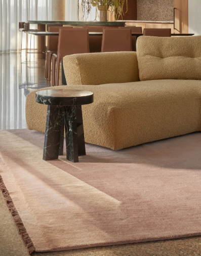
Image: Elan & Earth
Create a restful bedroom with dusty pink
Pink Coral is also a beautiful direction for a bedroom, particularly if you want to create a space that feels restful but still has personality.
Dusty pinks work well in bedrooms because they can introduce warmth without demanding too much attention. Partnered with soft neutrals, they create a gentle backdrop that feels comfortable and inviting.
You could use Angel Shoes as the starting point for your walls, then introduce Alpen through lighter finishes and Burmese Grey or Overcast through bed linen, upholstered furniture and window coverings.
Layer in natural textures such as linen, wool, timber and woven accessories. These materials add depth and prevent the scheme from feeling flat.
Turkish Coffee is particularly useful in a bedroom because it provides contrast. Introduce it through bedside tables, picture frames, darker timber furniture or small decorative elements. Even a few dark accents can make a pale room feel more complete.
For a quieter scheme, keep the walls and larger furnishings light, using pink and brown in smaller doses. Alternatively, if you love colour, allow the dusty pink to play a more prominent role and use the neutrals to maintain balance.
The result is a bedroom that feels soft and welcoming, with enough depth to keep it interesting.
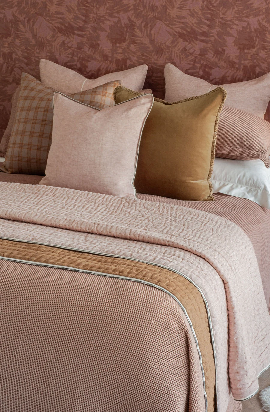
Image: Bianca Lorenne
Pink Coral in a home office: a creative and considered space
Colour can influence the atmosphere of a workspace, and Pink Coral offers an interesting alternative to the usual white, grey or blue home office.
The softer pinks bring warmth and individuality, while the muted neutrals help keep the overall look restrained. The deeper browns introduce a sense of structure and contrast, which is especially useful in a room where you want the scheme to feel purposeful.
Consider a light neutral for the main walls, with dusty pink introduced through artwork, an upholstered chair or carefully chosen accessories. A darker timber desk or Turkish Coffee accents can provide definition.
If you are comfortable using more colour, you could explore a pink-toned wall behind your desk, balanced by neutral shelving and darker accessories.
Artwork is particularly effective in a home office. Choose a piece that inspires you, then draw on its colours for the rest of the room. This creates a personal workspace that feels cohesive without needing to be overly formal.
A well-considered colour palette won't replace good lighting, ergonomic furniture or a practical layout, but it can help create an environment that feels more inviting and enjoyable to work in.
Why the deep browns are so important
One of the defining features of this palette is the contrast between the dusty pinks and the deeper browns.
It can be tempting to focus on the feature colour and use it throughout a room, but the supporting colours are often what make a scheme successful. In this case, Turkish Coffee and Bogong bring a sense of earthiness that stops the pinks from feeling too sweet.
The deeper shades also help create a visual rhythm. They draw the eye around the room, connect different elements and provide contrast against lighter walls and fabrics.
Think about how this works in nature. Coral, weathered stone, darker organic matter and pale sand sit alongside one another without competing for attention. Each contributes to the overall composition.
You can recreate a similar effect in your home by mixing light and dark finishes, combining smooth and textured materials, and repeating your deeper accent colours in several places.
You don't need to use a dark colour on a large surface to benefit from it. A dark timber table, a picture frame, a lamp base or a small decorative object can provide just enough contrast to bring a room together.
My tips for getting this colour scheme right
Before committing to any of the colours in your home, I recommend testing them alongside your existing or planned finishes.
-
Start with your inspiration. Choose the artwork, image or material that gives you the strongest sense of direction.
-
Identify the dominant colour. Decide whether pink, a neutral or a deeper brown will play the leading role in your room.
-
Establish your supporting colours. Use the remaining shades to create balance and continuity.
-
Introduce contrast. Don't overlook the importance of darker colours, even in a pale and delicate scheme.
-
Consider your materials. Timber, stone, fabric and metal finishes all influence how paint colours appear.
-
Test your paint colours in situ. Look at large samples in your own space at different times of the day, and assess them beside your flooring, cabinetry and fabrics.
Final thoughts: a softer, more sophisticated way to use pink
Pink Coral demonstrates that a pink-based palette doesn't need to be sugary, overly feminine or confined to a bedroom.
By combining dusty pink with muted neutrals and rich brown, you can create a scheme that feels grounded, sophisticated and connected to nature. It can be soft and restful, warm and welcoming, or creative and expressive, depending on how you balance the colours and choose your finishes.
Most importantly, remember that your colour palette doesn't have to begin with a paint chart. Sometimes the best starting point is a piece of artwork, a photograph or an image from nature that you simply love.
Look closely at the colours within it, identify the shades that work together, and use them as the foundation for your interior.
A beautiful colour scheme is rarely about choosing one perfect colour. It is about finding the right relationship between all the colours in the room.

Book an online consultation here. From a 30 minute zoom reassurance or help with pinpointing the right colours for your home through to a full interior and exterior service.
Stay connected with news and updates!
Join our mailing list to receive the latest news and updates from our team.
Don't worry, your information will not be shared.
We hate SPAM. We will never sell your information, for any reason.