When we think of coastal interiors, our minds often turn to crisp whites, soft blues and the familiar colours of sea and sky. But there is another side to the coast that I find just as beautiful: the warm, earthy colours of richly coloured seashells, coral, weathered timber and the treasures we collect along the shoreline.
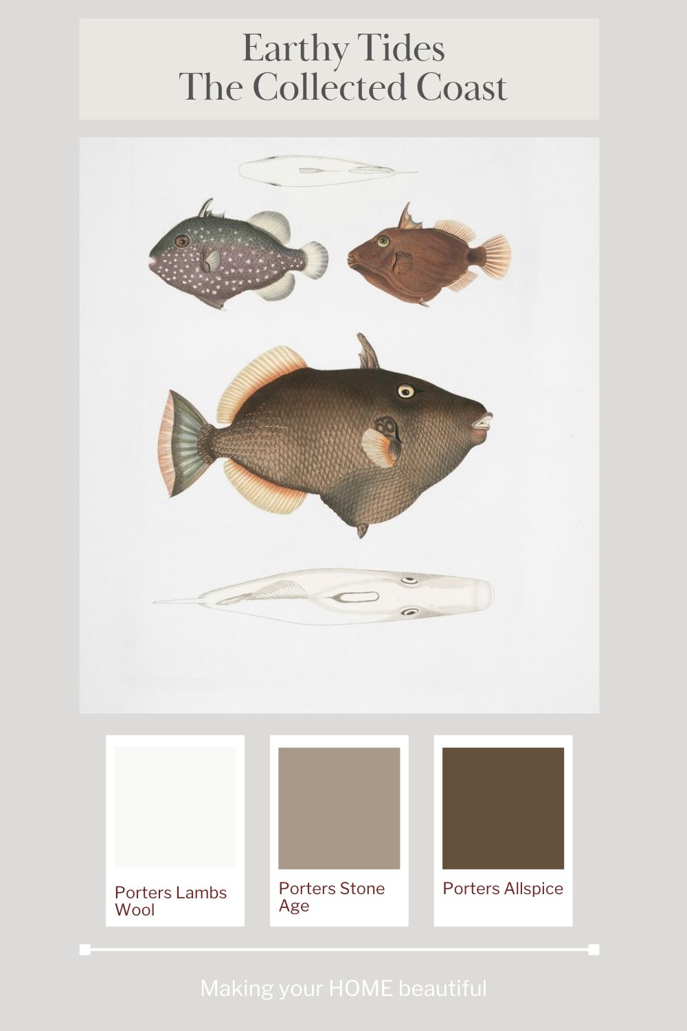
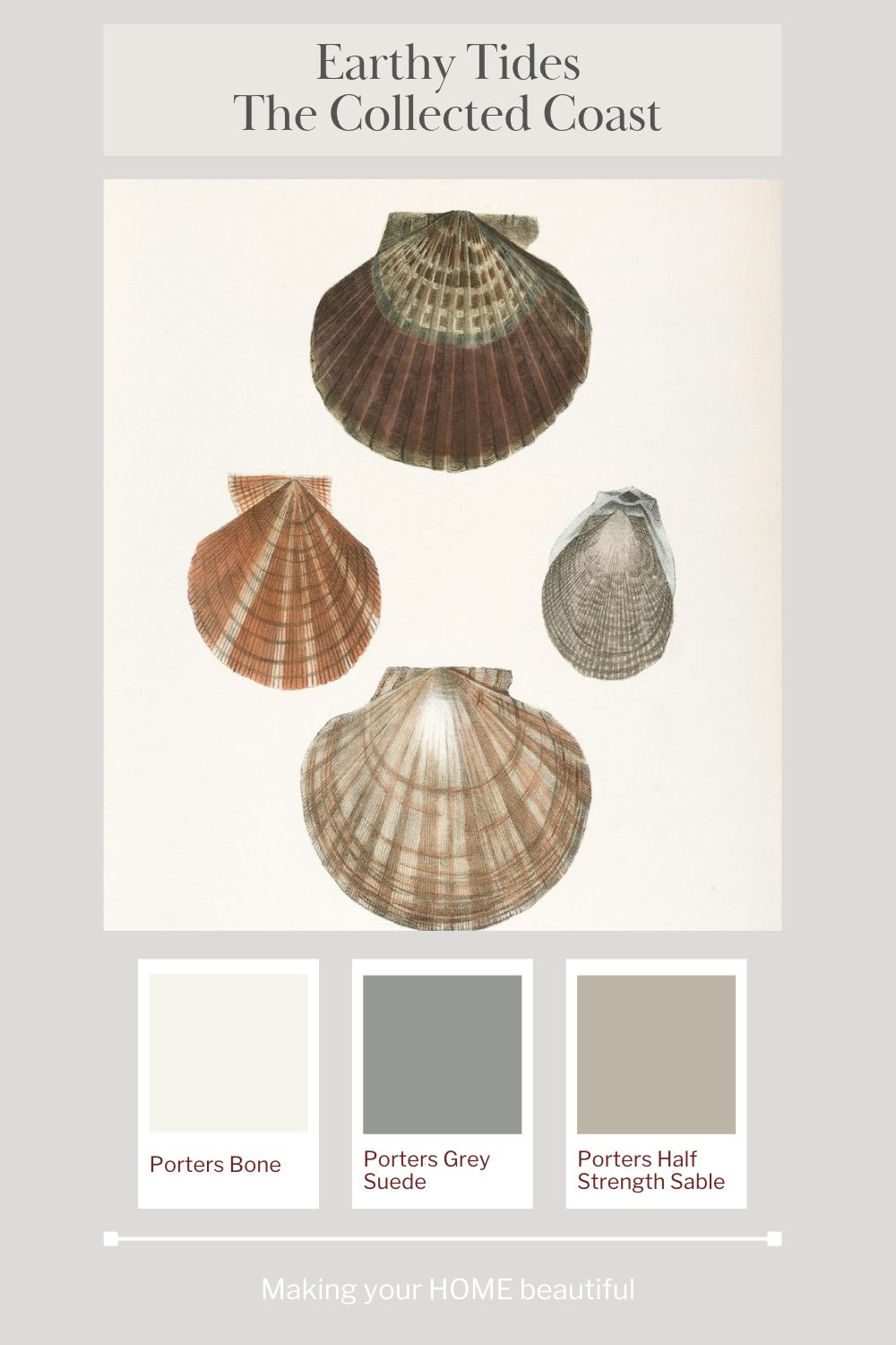
My Earthy Tides – The Collected Coast colour palette is inspired by vintage fish and seashell illustrations, where soft sandy neutrals sit alongside muted terracotta, warm russet, rich brown and subtle grey tones. It is a palette that celebrates the natural beauty of the coast, but moves away from the traditional blue-and-white scheme towards something warmer, more layered and full of character.
This is coastal decorating with a difference. Rather than recreating the colours of the ocean, we are looking at what the tides leave behind.
The inspiration: A collected coast
I love the idea of a home that feels collected over time, with objects that have a story to tell. Vintage illustrations, unusual shells, pieces of coral, natural woven baskets and beautifully aged timber can all provide inspiration for an interior colour scheme.
The two vintage prints that inspired this palette are a wonderful starting point. The fish illustrations feature deep brown, muted rust, soft grey and subtle creamy highlights, while the seashells introduce a more delicate combination of sandy beige, dusty terracotta, mushroom and weathered grey.
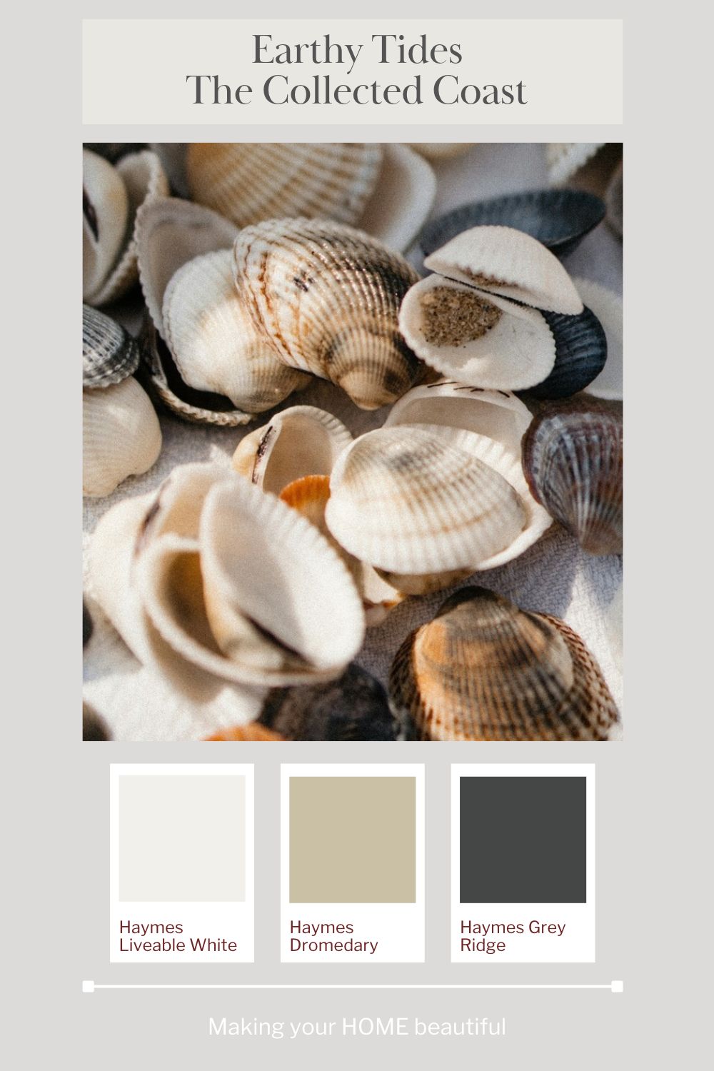
These colours are not necessarily the first ones we associate with coastal decorating, but they are entirely natural to the coastal environment. Think of the warm tones inside a shell, the reddish-brown markings on a scallop, the grey-brown surface of weathered driftwood and the soft, chalky colours of coral.
What makes this palette work so well is the balance between the warmth of the earthy colours and the quieter, more neutral shades. The terracotta and rich browns provide depth, while the soft whites, sandy tones and gentle greys keep the scheme feeling relaxed.
The result is a coastal palette that feels organic, sophisticated and timeless.
Why choose an earthy coastal colour palette?
One of the advantages of working with natural colours is that they are easy to live with. They tend to sit comfortably alongside one another because they share a connection to the natural world.
An earthy coastal palette also offers plenty of decorating flexibility. You can use the lighter colours as a foundation for a room, introduce mid-toned neutrals through larger furnishings, and reserve the deeper browns and terracotta shades for accents or more dramatic features.
The palette works particularly well with natural materials such as timber, rattan, linen, jute and woven grasses. These textures reinforce the relaxed coastal feeling without relying on obvious nautical accessories or seaside motifs.
It is also a lovely way to introduce colour if you prefer a neutral home. Rather than using a collection of unrelated colours, you can build a scheme from warm whites, sandy greys, mushroom, caramel and brown, with terracotta providing a subtle accent.
The overall effect is warm and grounded, but never heavy when the colours are balanced carefully.
Choosing the colours: Porters Paints and Haymes Paints
For my Earthy Tides palette, I have selected colours from both Porters Paints and Haymes Paints. Each range offers beautiful neutrals that work with the inspiration artwork, from soft off-whites through to deeper, more characterful shades.
Porters Paints: Soft neutrals and rich earthy depth
Porters Bone
Porters Bone is a beautiful starting point for the lighter end of this palette. Its soft, natural appearance makes it a useful alternative to a stark white, particularly when you want a room to feel relaxed and connected to natural materials.
Use it on walls to create a quiet backdrop for timber furniture, linen upholstery, woven accessories and vintage artwork. It can also help soften the contrast between lighter furnishings and the deeper colours in the scheme.

Porters Grey Suede
Grey Suede introduces a more muted, weathered quality. It sits comfortably with the grey and brown tones found in the vintage fish and seashell illustrations and offers a way to bring a little more complexity into a neutral scheme.
Consider this shade where you want a gentle contrast to a warm off-white, or when you need a neutral that feels more grounded than a pale cream. It could work particularly well in a study, bedroom or living area with natural timber and textured fabrics.

Porters Half Strength Sable
For a softer, earthy mid-tone, Half Strength Sable is a lovely colour to explore. It brings to mind sandy shells, warm stone and the muted beige-brown tones that appear throughout the inspiration images.
This type of colour is useful when you want to create depth without introducing a very dark wall colour. It could be used on walls, in a reading nook or as part of a tonal scheme that combines several related neutrals.

Porters Lambs Wool
Lambs Wool offers another light neutral for the palette. It is a useful choice when you want to keep the overall scheme feeling open and understated while still moving away from a cold, stark white.
Pair it with natural timber, warm stone, woven textures and the softer colours in your artwork. As with all whites and off-whites, check the colour in your own lighting and alongside your fixed finishes before making a final decision.

Porters Stone Age
Stone Age brings a deeper, earthy neutral into the mix. It helps bridge the gap between the lighter sandy tones and the richer brown shades, creating a palette that feels layered rather than flat.
I particularly like this sort of colour for connecting different materials in a room. It can work with timber flooring, natural linen, textured rugs and accessories in muted terracotta or caramel.

Porters Allspice
Allspice is the deeper, richer colour in this Porters selection. It reflects the dark brown tones in the fish illustration and adds the depth that makes this palette distinctive.
You do not need to use a colour this strong across every wall to enjoy its impact. Consider it for a feature area, cabinetry, a study, a small powder room or another space where a deeper colour can create a sense of intimacy.
It also provides a beautiful reference for choosing accessories, including dark timber, brown ceramics and leather accents.

Haymes Paints: Natural whites, sandy tones and deep grey
Haymes Liveable White
Liveable White provides a light, neutral foundation for this part of the palette. It can help balance the richer earthy colours and allow the natural materials in a room to take centre stage.
Use it as a starting point for walls in a relaxed living space or bedroom, particularly where you want the scheme to feel light without resorting to a very cool white.

Haymes Dromedary
Dromedary brings a sandy, natural quality to the palette. It is the kind of colour that works beautifully with rattan, timber and textured fabrics, helping to create a room that feels warm and cohesive.
Try it alongside off-white upholstery, woven pendants and accessories in muted terracotta. It can also help connect different timber tones within an open-plan interior.

Haymes Grey Ridge
For contrast, Grey Ridge introduces a much deeper grey. This provides a counterpoint to the warm neutrals and helps echo the darker markings and shadows found in the vintage artwork.
A deep grey can be particularly effective when used in a controlled way. Think of cabinetry, a selected wall, a piece of furniture or smaller decorative elements rather than automatically using it throughout the entire room.
When pairing deep grey with terracotta and brown, pay attention to the undertones. The aim is to create a considered balance between warm and cool colours, rather than a collection of shades that compete with one another.

How to bring Earthy Tides into your home
The beauty of this palette is that you do not need to redecorate an entire house to introduce it. Often, a few carefully chosen colours and materials are enough to establish the mood.
1. Start with a warm, understated backdrop
A soft off-white or light natural neutral is an excellent starting point. It allows the richer colours to stand out while keeping the room feeling light and relaxed.
Consider your existing flooring, kitchen finishes, window treatments and larger pieces of furniture before choosing your wall colour. A warm white that looks beautiful on its own may appear quite different next to a cool grey floor or a strongly yellow-toned timber.
For an open-plan home, repeat the same light neutral across connected spaces where appropriate. This creates continuity and gives you more freedom to introduce deeper colours through furniture, artwork and accessories.
Related: One Colour, Multiple Strengths, One Cohesive Scheme
2. Introduce terracotta through smaller details
Terracotta is one of the most appealing colours in this palette because it brings warmth without the intensity of a bright orange or red.
You could introduce it through cushions, ceramics, a lampshade, artwork, a rug or a simple vase filled with foliage. These smaller elements can provide just enough colour to enliven a neutral room.
If you love the colour and want to make a stronger statement, consider a terracotta-toned wall or a painted piece of furniture. Keep the surrounding finishes relatively simple so that the colour remains the focus.
Related: Let me show you how to use Terracotta
3. Use rich brown to add depth
Brown is an important part of the Earthy Tides palette. It provides the grounding element that stops the softer colours from feeling too pale or washed out.
Timber furniture, dark stained wood, leather, brown ceramics and woven accessories can all introduce this depth. You can also use a rich brown paint colour on cabinetry or a selected wall if you want a more enveloping atmosphere.
The key is to balance the darker shades with enough light and texture. Pair them with soft whites, natural linen and lighter timber so that the scheme retains its relaxed character.
4. Embrace rattan and natural textures
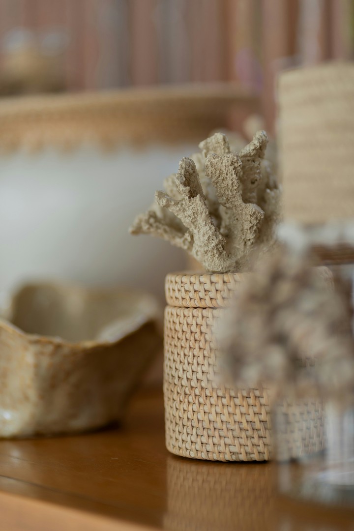
Rattan is a natural companion to this palette. Its honey, caramel and sandy tones reinforce the connection to the coast and provide a tactile contrast to painted surfaces.
Think of woven pendant lights, baskets, occasional chairs, lampshades and natural fibre rugs. You do not need to use all of these elements in one room; a few well-chosen pieces will be enough.
Layering materials is particularly important when working with a predominantly neutral palette. Linen, timber, rattan, ceramics and woven grasses each have a different surface quality, helping the room feel interesting even when the colours are restrained.
5. Make artwork the starting point
One of my favourite ways to develop a colour scheme is to begin with a piece of artwork. The vintage fish and seashell illustrations show how many colours can be drawn from a single image.
Look beyond the most obvious colour. In these prints, the terracotta and brown shades are important, but so are the subtle greys, creamy backgrounds and softer sandy tones. These quieter colours are often the ones that make a palette feel balanced.
You can use the same approach with artwork you already own. Identify the dominant colours, then look for the secondary shades that can be repeated in your paint selection, fabrics and accessories.
This gives you a scheme with a clear point of reference, rather than a collection of colours chosen independently.
Earthy Tides in different rooms
Living rooms
In a living room, I would start with a soft natural wall colour and introduce warmth through timber furniture, linen upholstery, a textured rug and a few terracotta accents.
A vintage fish or seashell print would sit beautifully above a console or sofa, particularly when its colours are repeated in cushions, ceramics or a nearby lamp.
If you want more contrast, introduce a darker brown or grey through a side table, occasional chair or painted feature. This will give the room definition without losing the relaxed coastal feeling.
Bedrooms
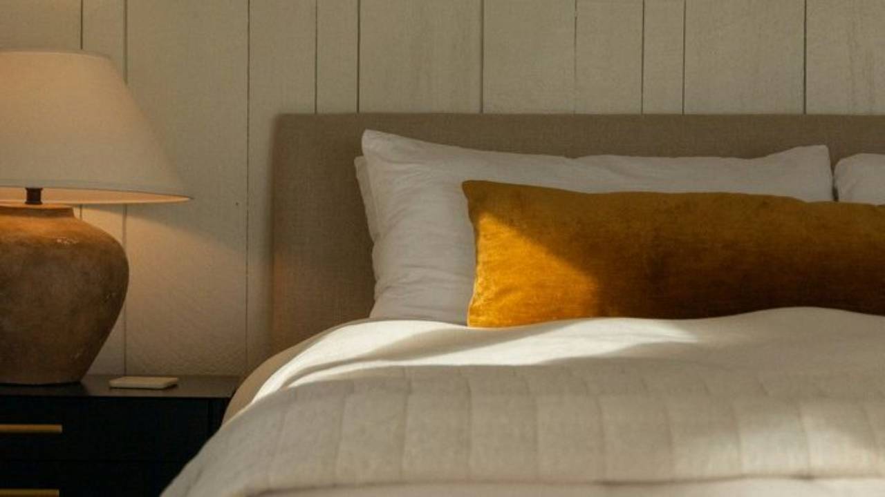
Earthy Tides would also work beautifully in a bedroom, where the combination of soft neutrals, warm browns and natural textures can create a calm, cocooning atmosphere.
Use a light neutral on the walls, then layer natural linen bedding, textured cushions and a timber bedhead or bedside tables. A deeper earthy colour could be introduced behind the bed or through smaller accessories.
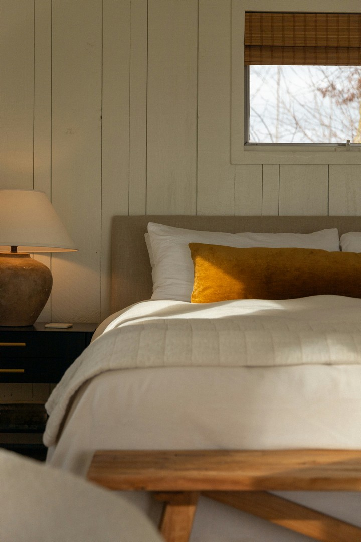
For a particularly restful scheme, keep the colour changes subtle and allow texture to provide much of the interest.
Dining areas
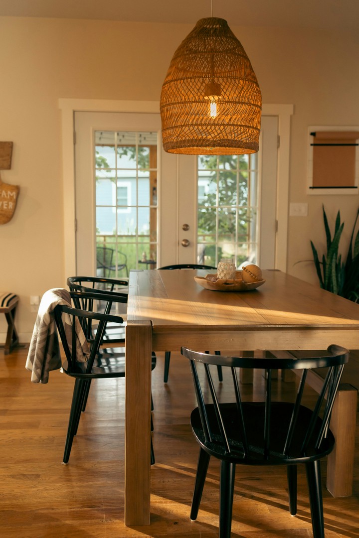
A dining space is a wonderful place to use the warmer tones in this palette. Timber dining tables, woven pendants, natural chair finishes and simple ceramics all reinforce the collected, organic mood.
If your dining area is connected to the kitchen or living room, repeat one or two colours from the wider scheme. This helps the spaces feel related without making everything identical.
A piece of vintage artwork can be the finishing touch, bringing together the earthy tones in the furniture and surrounding finishes.
Kitchens and cabinetry
If you are planning a kitchen update, consider the palette beyond the wall colour. Timber cabinetry, warm neutral joinery, natural stone-inspired surfaces and darker handles can all contribute to an earthy coastal look.
For a more distinctive scheme, a deeper brown or grey could be used on selected cabinetry, balanced by lighter benchtops and a warm off-white on surrounding walls.
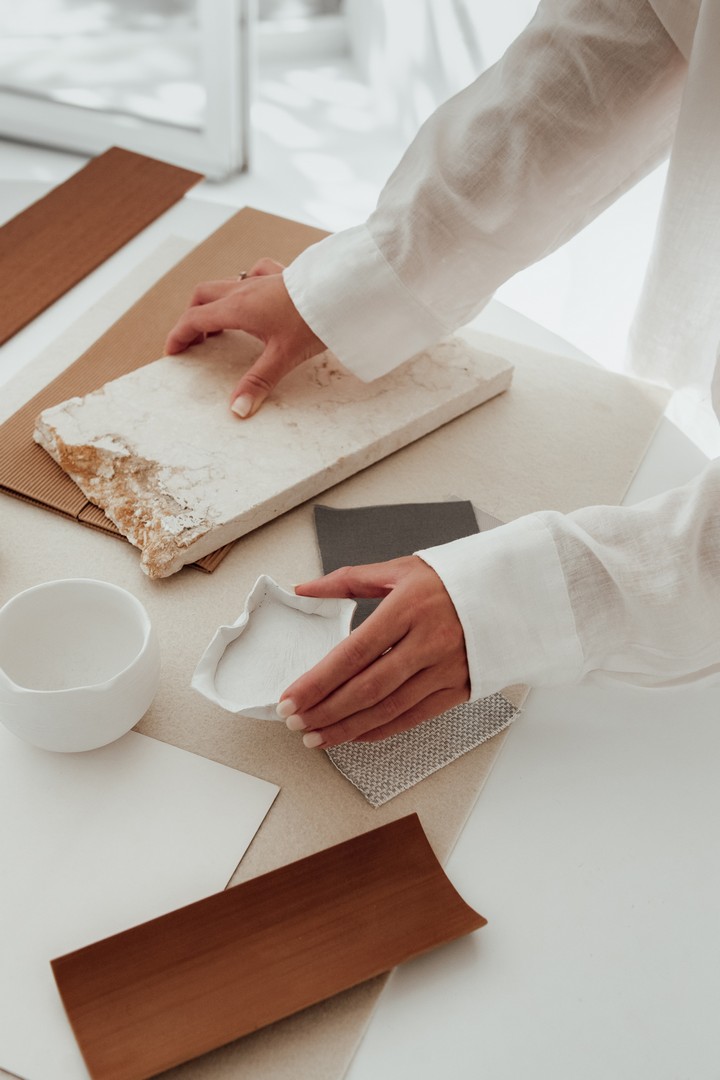
The most successful kitchen palettes consider the undertones of every fixed finish, including flooring, benchtops, splashbacks and cabinetry. Gather samples together before making a final decision, as these materials will remain in place for many years.
A new way to think about coastal decorating
What I particularly love about Earthy Tides is that it takes a familiar decorating style in a slightly different direction. It still feels relaxed and connected to nature, but it is not dependent on blue walls, white furniture or traditional nautical accessories.
Instead, it draws on the rich variety of colours found in seashells, coral, vintage illustrations and natural materials. The result is a more layered interpretation of coastal living, with warmth, depth and a sense of individuality.
You can keep the look very understated with warm whites, sandy neutrals and pale timber, or introduce more character through terracotta, rich brown and deeper grey. Both approaches work, provided you balance the colours and repeat them thoughtfully throughout the room.
For me, the most appealing interiors are often those that feel collected rather than decorated all at once. A treasured print, a piece of timber furniture, a woven basket and a few carefully chosen colours can tell a story and create a home that feels personal.
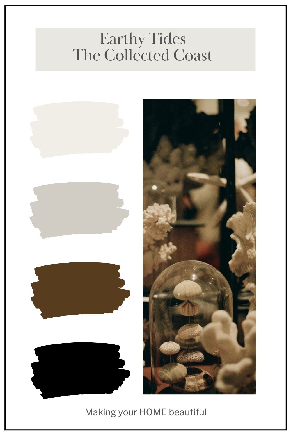
Earthy Tides – The Collected Coast is an invitation to look beyond the traditional coastal palette and discover the beauty in the natural colours we find along the shoreline.
Sometimes, the most interesting colour schemes begin with the simplest things: a shell, a vintage illustration or a collection of colours that you might otherwise have overlooked.
And that is the beauty of colour. Inspiration can be found everywhere.
Did you know I have an online colour consultation service. From just a quick 30 minute zoom session to address one or two key elements through to a full done for you solution for your entire home.
Stay connected with news and updates!
Join our mailing list to receive the latest news and updates from our team.
Don't worry, your information will not be shared.
We hate SPAM. We will never sell your information, for any reason.