Choosing multiple whites, neutrals and greiges can quickly become complicated because of undertones.
Using one colour in different strengths can give you variation while maintaining a consistent undertone and visual connection.
Instead of trying to make several different colours work together, why not start with one colour you love and explore its different strengths?
1. Why undertones matter
When you're choosing whites and neutrals, the undertone is often more important than the colour itself.
For example, two colours may both look like soft whites but one could have a yellow, pink or green undertone.
When these colours are placed next to each other on walls, ceilings, doors and joinery, those subtle differences can become much more obvious.
Using different strengths of the same colour means you already have an established undertone relationship.
2. What is a tonal colour scheme?
A tonal palette uses variations of essentially the same colour rather than lots of contrasting colours.
You can create variation through:
- lighter and darker strengths
- changes in depth
- different textures
- changes in sheen
- the way natural light interacts with the colour
This allows the home to feel layered and interesting without feeling visually busy.
Resene Paints offer many of their neutrals in varying strengths which makes life very simple.
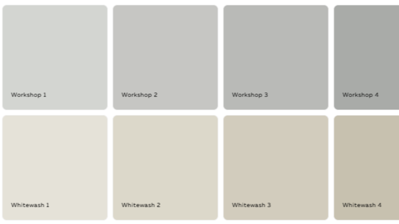
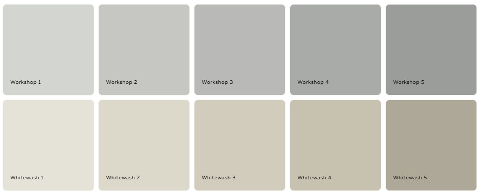
Haymes Paints also offer their Neutrals range in different strengths too:
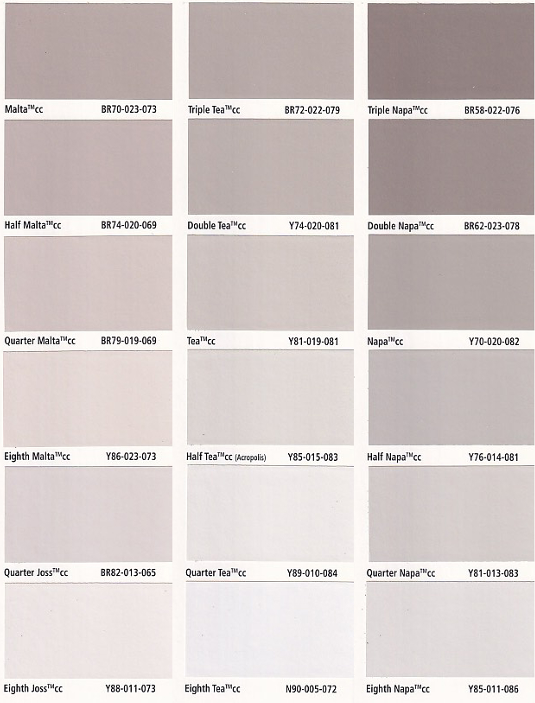
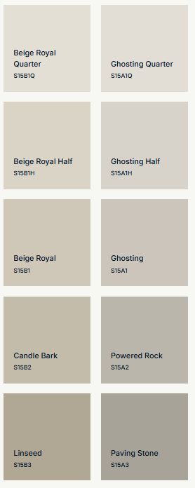
Although Dulux do not offer their range in numbers or strengths (with the exception of some whites in full, half and quarter), if you look at the colour atlas you will see that the colours are grouped in this way.
3. The Thorndon Cream example
Check out my Short Video on YouTube where I explain this process using Resene Thorndon Cream
Eighth Strength → Quarter Strength → Half Strength → Full → Double Strength → Triple Strength
The different strengths of the same colour will give you a different look and feel whilst retaining the underlying character of Thorndon Cream.
The appeal of this is that the colour becomes progressively deeper, rather than introducing a completely different undertone.
4. How to use one colour throughout your home
Ceiling
Use the lightest strength for ceilings where you want a soft, warm white rather than a stark white. Generally the cornices are painted to match the ceiling too.
Related: What colour do I paint my ceilings
Trim, architraves and skirting
A slightly different strength can create subtle definition without introducing another colour. This is particularly useful in homes where you want a relaxed, cohesive feel.
Related: What colour do I paint my skirting boards and architraves
Interior doors
A medium strength can give doors more presence while still connecting them to the overall palette. This could be particularly effective with traditional or character homes. Or you can choose to paint your interior doors the same as your skirting boards and architraves.
Related: What colour do I paint my internal doors
Walls
Use one of the mid-range strengths as your main wall colour.
This becomes the "glue" of the scheme, connecting the different elements throughout the house.
Feature walls
Rather than introducing a completely different colour, use a deeper strength of the same colour. This gives you contrast while maintaining harmony.
Joinery
This could be a great application for the deeper strengths, particularly for:
- kitchen cabinetry
- bathroom vanities
- built-in cabinetry
- wardrobes
- media units
The joinery can then feel deliberately connected to the wall colour rather than being an unrelated colour choice.
5. You don't have to use every strength
This is an important point.
The concept isn't about using every single available strength throughout the house.
Instead, choose the strengths that suit the architecture, natural light and elements you want to emphasise.
For example:
Lightest: ceiling
Light: trim/doors
Mid: walls
Deep: joinery
Deepest: feature or accent areas
Or you might only use three strengths throughout the home. This would particularly be the case if you have a light kitchen which could be painted the same as either the walls or the trim.
This keeps the scheme simple and avoids creating unnecessary decisions.
6. Use contrast to create interest
Cohesion doesn't mean that everything needs to be the same. By creating variation in lightness and darkness you achieve an interesting scheme.
For example:
very light ceiling → slightly deeper walls → deeper joinery
This creates a gentle visual hierarchy.
You can also introduce contrast through materials rather than colour:
- timber
- stone
- metal
- linen
- wool
- textured fabrics
- natural fibres
Related: Colour Palette Focus: Warm Coastal Calm
7. Don't forget the light
Remember that even though the undertone remains consistent, each strength will respond differently to natural and artificial light.
You should always view paint samples in different areas and at different times of the day:
- north-facing rooms
- south-facing rooms
- morning vs afternoon light
- warm artificial lighting
Related: How to sample paint colours
8. The beauty of a tonal scheme: fewer decisions
Choosing finishes for a renovation or new build can involve hundreds of decisions. A tonal approach simplifies the process.
Instead of asking:
"Which white goes with this greige?"
you can ask:
"Which strength of my chosen colour works best here?"
That is a much simpler design decision.
9. How to create your own one-colour scheme
This is a simple formula to follow for putting together a paint scheme:
Step 1
Choose your foundational colour.
Step 2
Look at the available strengths.
Step 3
Choose your lightest strength for the ceiling or other very light elements.
Step 4
Choose your main wall strength.
Step 5
Choose a deeper strength for joinery, doors or feature areas. Or keep your joinery and doors the same as the trim colour and introduce darker elements to feature alcoves or walls. Always consider the feature area and don't just paint a large wall for the sake of it.
Step 6
Layer in texture and natural materials.
Step 7
Sample everything in the actual space.
10. When this approach works particularly well
This strategy can be especially effective for:
- open-plan homes
- homes where you want good flow from room to room
- neutral interiors
- homes with lots of architectural detail
- renovations where you want to simplify the number of finishes
- smaller homes where visual continuity is important
Conclusion — Keep it simple
You don't need lots of colours to create a beautiful, layered home.
One carefully chosen colour, used in different strengths, can provide the continuity, contrast and flexibility you need — while removing much of the uncertainty around undertones. This is your foundation palette. You can then add other colours with soft furnishings, rugs, artworks and accessories.
One colour gives you the foundation. Different strengths give you the flexibility. Together, they create a home that feels effortlessly cohesive.
If you are building a new home or renovating the one that you have, you should purchase my checklists. You will find all the elements of a new build or exterior and interior renovation that you need to consider, with plenty of space to write down supplier and product details for reference. Gain control and satisfaction when you can check each one off the list.
I also have an online colour consultation service. From just a quick 30 minute zoom session to address one or two key elements through to a full done for you solution for your entire home.
Stay connected with news and updates!
Join our mailing list to receive the latest news and updates from our team.
Don't worry, your information will not be shared.
We hate SPAM. We will never sell your information, for any reason.