This is one of the most common misconceptions I come across when helping people choose paint colours for their homes.
When I mention a warm white, I often hear, “Oh no, I don't want anything yellow.” And I completely understand that. Nobody wants their beautiful new home to suddenly look cream or yellow simply because they chose a warm white.
But there is a big difference between a warm white and a yellow white.
Warm whites can be soft, sophisticated and incredibly versatile. They can make a home feel welcoming and relaxed without looking yellow at all.
In fact, when choosing white for your home, I believe the most important question isn't “Is this white warm or cool?” but rather:
“What mood do I want to create, and which white will work best with the light and finishes in my home?”
In this post, I'm looking at four Dulux whites that demonstrate this beautifully:
- Dulux White Beach Quarter
- Dulux Snowy Mountains
- Dulux Natural White
- Dulux Whisper White
Warm white doesn't automatically mean yellow
When we describe a white as warm, we're talking about its undertone.
A warm white might have subtle yellow, beige, cream, pink, peach or even greige influences. These undertones may be extremely subtle and, importantly, you won't necessarily notice them when the colour is used on its own.
This is something I think is really important when choosing paint colours.
If you look at a warm white painted on a wall in a room filled with natural light, you may simply see a beautiful soft white.
Put that same white beside a much cleaner, crisper white, however, and suddenly its warmth becomes much more apparent.
This is why looking at a collection of whites together can sometimes be quite misleading.
You may look at a paint card containing several whites and immediately think:
“That one looks yellow.”
But once it is on the walls of your home, surrounded by your flooring, cabinetry, furniture, fabrics and natural light, it can look completely different.
Undertones become much easier to see when colours are compared with one another. But this can make you avoid whites that look too yellow.
Start with the mood, not the paint colour
One of the things I encourage my clients to think about is the feeling they want their home to have.
Do you want it to feel:
- crisp and contemporary?
- fresh and light?
- soft and relaxed?
- warm and welcoming?
- classic and timeless?
- coastal and casual?
- sophisticated and layered?
There isn't one perfect white for every home.
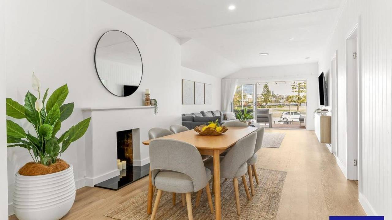
A very crisp white can look fantastic in a contemporary space with plenty of natural light, clean lines and cooler finishes.
But in another home, particularly one with warm timber flooring, natural stone, linen, woven textures and softer furnishings, that same crisp white can feel quite stark.
A warmer white can help to bring these elements together and create a much more comfortable and cohesive feeling.
This is why I always recommend choosing the mood first and the paint colour second.
Dulux Snowy Mountains Quarter
Look at the aspect of your home
The amount and direction of natural light your room receives is also incredibly important.
A north-facing room will experience light differently from a south-facing room, and the same white can look quite different depending on the aspect.
You also need to consider:
- How much natural light enters the room?
- Is the light direct or filtered?
- What time of day is the room used?
- Are there trees or buildings outside the windows?
- What colours are being reflected into the room?
- What flooring and finishes are already present?
A room with limited natural light may benefit from a softer, warmer white that helps create a welcoming atmosphere.
Conversely, a very bright room may be able to accommodate a cleaner white without feeling cold.
And this is where I think it is important not to get too caught up in the idea that warm is good and cool is bad — or vice versa.
The right choice depends on the room.
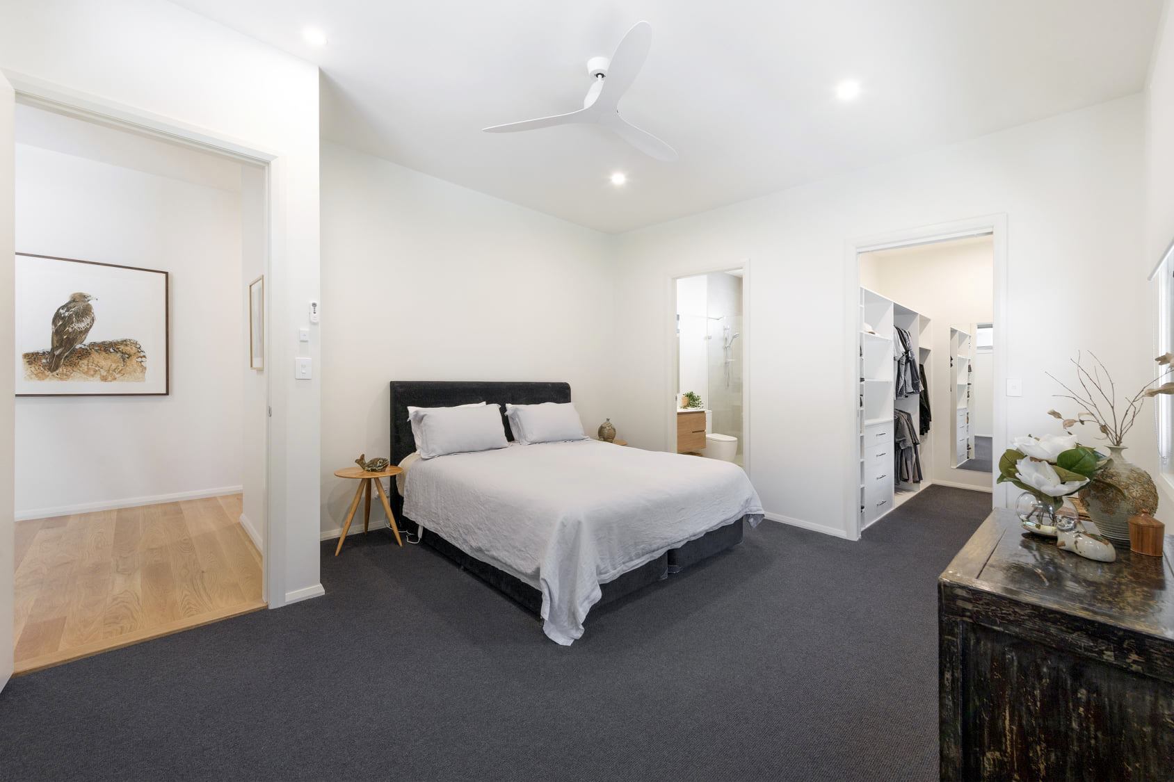
Dulux White Beach Quarter
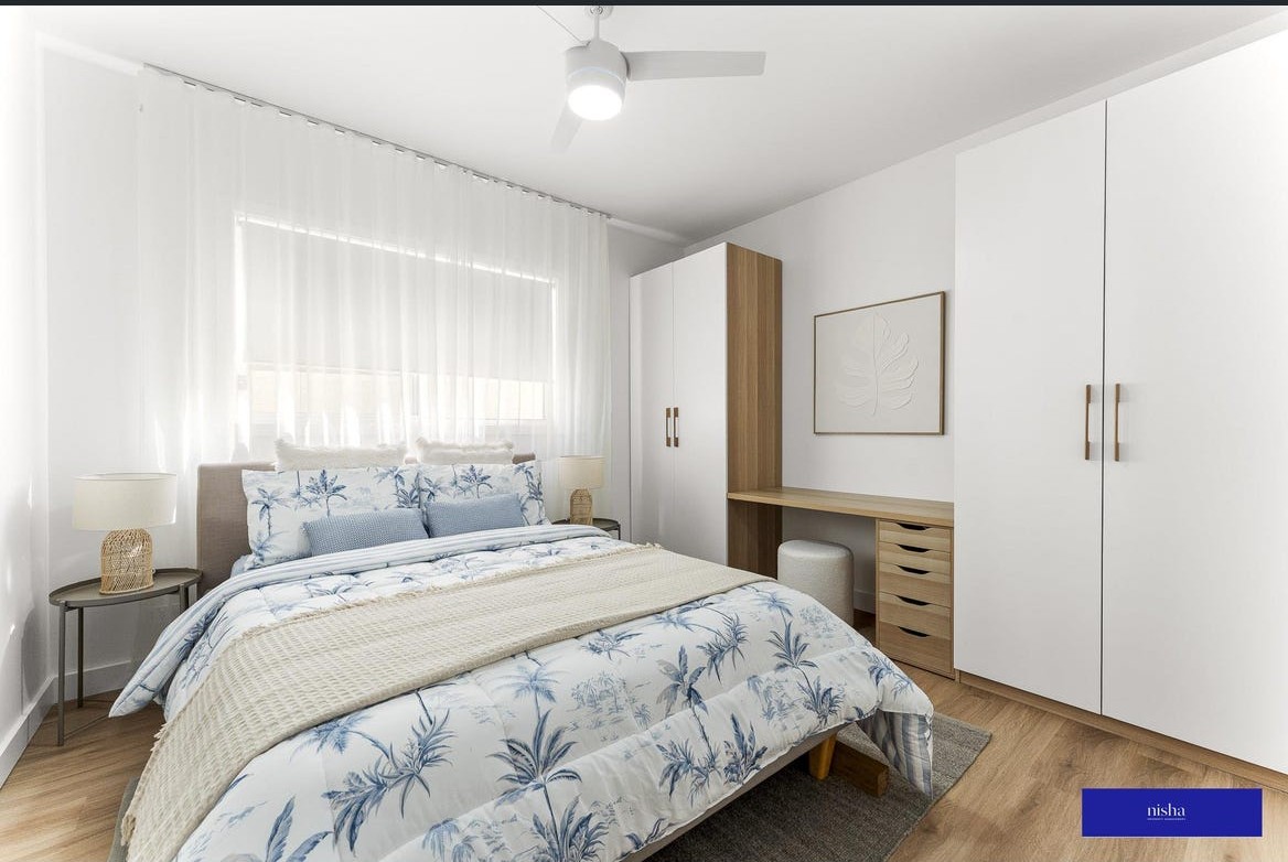
In this bedroom, the white walls provide a gentle backdrop to the darker carpet, timber flooring and furniture.
There is warmth in the room, but it doesn't come from the walls looking yellow. Instead, the overall scheme feels soft and comfortable.
This is something I particularly like about using a warm white: it can take the edge off a space without adding an obvious colour.
It allows the other elements in the room to do the talking.
Related: How to use White Beach Quarter

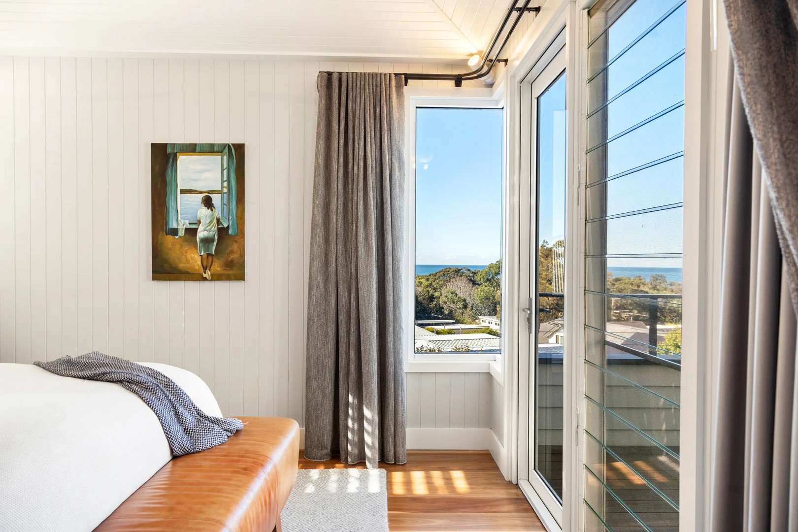
Dulux Snowy Mountains – full, half and quarter strength
One of my favourite ways to create a cohesive colour scheme is to take one colour and use different strengths of it throughout the home.
Dulux Snowy Mountains is a great example of how this can work.
Using the full, half and quarter strengths gives you a family of whites that relate to one another, while still providing subtle variation.
This is particularly useful in an open-plan home or when you want to create a sense of flow between rooms.
Rather than selecting a completely different white for every space, you can use the same colour family and adjust the strength according to the room and the effect you want to create.
Why I love this approach
It gives you a scheme that feels considered without being overly complicated.
You might use:
Snowy Mountains Quarter
for larger areas where you want a very soft, light white.
Snowy Mountains Half
where you want a little more depth.
Snowy Mountains Full
as a stronger version for a feature, a particular room or somewhere you want the colour to have more presence.
Or you could use Dulux Snowy Mountains Half on the walls with Dulux Snowy Mountains Quarter for the ceiling and trim.
The important thing is that they all share the same underlying colour DNA.
Dulux Snowy Mountains Quarter
Related: How to use Dulux Snowy Mountains
Dulux Natural White
It has a softness that makes it particularly versatile for whole-of-home schemes.
In the image below, the white works beautifully with the timber cabinetry, natural materials and soft neutral finishes.
This is where I think warm whites really come into their own.
Rather than trying to make every surface look as white as possible, you're creating a layered neutral backdrop that allows timber, stone, fabrics and furniture to sit comfortably together.
A warm white can actually make a home feel more sophisticated because it avoids the sometimes harsh contrast that you can get with a very stark white.
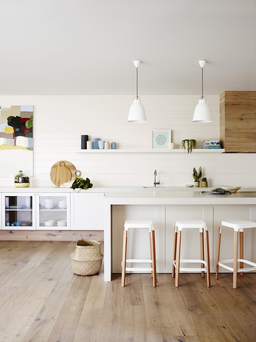
Image: Dulux Australia
Related: How to use Dulux Natural White
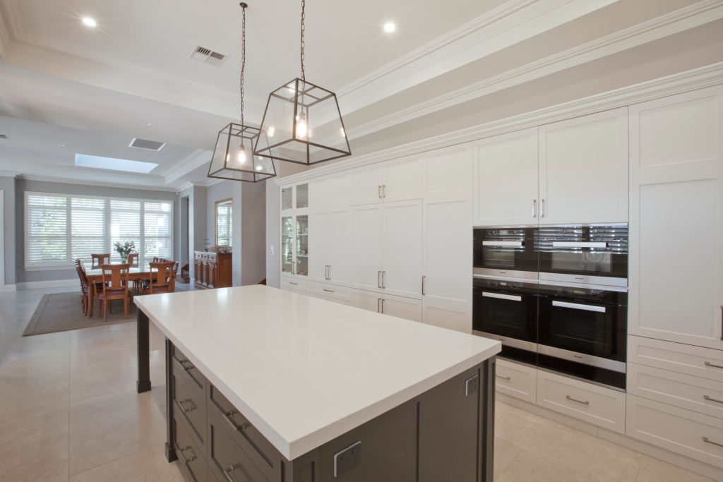
Dulux Whisper White
But here's the interesting thing.
When you use Whisper White on its own, without introducing other, cleaner whites into the scheme, it simply looks like a soft warm white.
This is such an important point when choosing paint.
If you place Whisper White next to a much cooler or cleaner white, its warmth becomes much more obvious.
But look at it within a room filled with warm timber, natural textures and complementary finishes and it becomes part of the overall warmth of the scheme.
This is why I don't think you should reject a paint colour simply because you can see a yellow or warm undertone on a paint card.
Ask yourself how that colour will behave in the context of the entire room.
Kitchen, ceiling and trim in Dulux Whisper White
One of the biggest lessons I have learnt from working with colour for more than 23 years:
Colour doesn't exist in isolation
Your wall colour is affected by:
- natural light
- artificial light
- flooring
- cabinetry
- stone
- splashbacks
- furniture
- window coverings
- surrounding walls
- exterior colours
- greenery outside the windows
And, of course, the colours sitting directly beside it.
This is particularly noticeable with whites because we tend to assume that white is simply white.
It isn't.
There are warm whites, cool whites, clean whites, creamy whites, grey whites, pink whites, green whites and whites with subtle beige or greige influences.
The differences can be tiny, but they can have a significant impact on how a room feels.
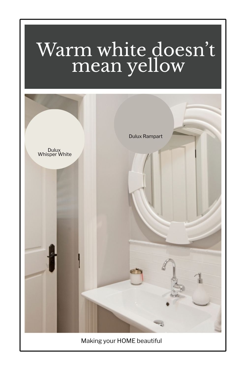
Dulux Whisper white trim and interior door with Dulux Rampart on walls
Why comparing whites can be confusing
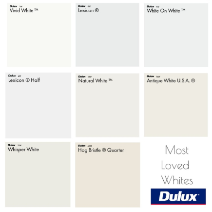
If you place all of these whites together, you'll immediately start to see differences in their undertones.
And this is useful — but it can also be deceptive.
When you compare five whites side by side, your eye becomes extremely sensitive to the differences between them.
A colour that looks beautifully soft on its own may suddenly appear quite yellow beside a cleaner white.
That doesn't mean the colour is wrong.
It simply means you are now seeing its undertone in comparison.
This is true of all colours, not just white.
It's one of the reasons I always recommend looking at your paint samples in the actual space where they will be used.
So, which warm white should you choose?
There isn't one answer.
And that's actually the point.
The best white for your home is the one that works with your light, your aspect, your existing finishes and the mood you want to create.
If you love a soft, relaxed and welcoming home, don't automatically dismiss warm whites because you're worried they will look yellow.
Instead, sample them properly.
Look at them:
- in your actual room
- at different times of the day
- against your flooring
- beside your cabinetry
- alongside your stone and tiles
- with your fabrics and furnishings
- in both natural and artificial light
And, importantly, don't judge a warm white solely by comparing it with a much cleaner white.
If you are building a new home or renovating the one that you have, you should purchase my checklists. You will find all the elements of a new build or exterior and interior renovation that you need to consider, with plenty of space to write down supplier and product details for reference. Gain control and satisfaction when you can check each one off the list.

I also have an online colour consultation service. From just a quick 30 minute zoom session to address one or two key elements through to a full done for you solution for your entire home.
Stay connected with news and updates!
Join our mailing list to receive the latest news and updates from our team.
Don't worry, your information will not be shared.
We hate SPAM. We will never sell your information, for any reason.