I am often asked, what is Greige and why all the fuss about it? Quite simply, Greige is a combination of beige and grey. I love it and find it is one of the colours that I specify the most. Find out why I like it and how to use it in your home here.
What is Greige? Let's start with the Beige component
Kassia St Clair has written a great book about colour. In it she has a section on beige which is just brilliant and sums up what has to be perceived as the most boring colour available. Did you know that the colour beige was taken from the French word for undyed sheep's wool? That certainly doesn't sound too inspiring! Kassia laments that beige is not a colour that we hope everyone will like, we just hope it won't offend anyone!
Beige was in fact the favourite colour of Elsie de Wolfe who is credited with starting the interior design profession in the 1920s. She raved about it. Call it Buff, Camel, Biscuit or Calf Skin and you start to evoke a completely different feel.
Usually when we refer to a house as just being so beige, what we are actually commenting on is that the home has little soul or personality. The problem isn't necessarily the colour we have painted on the walls, it is everything else we have used in the scheme.
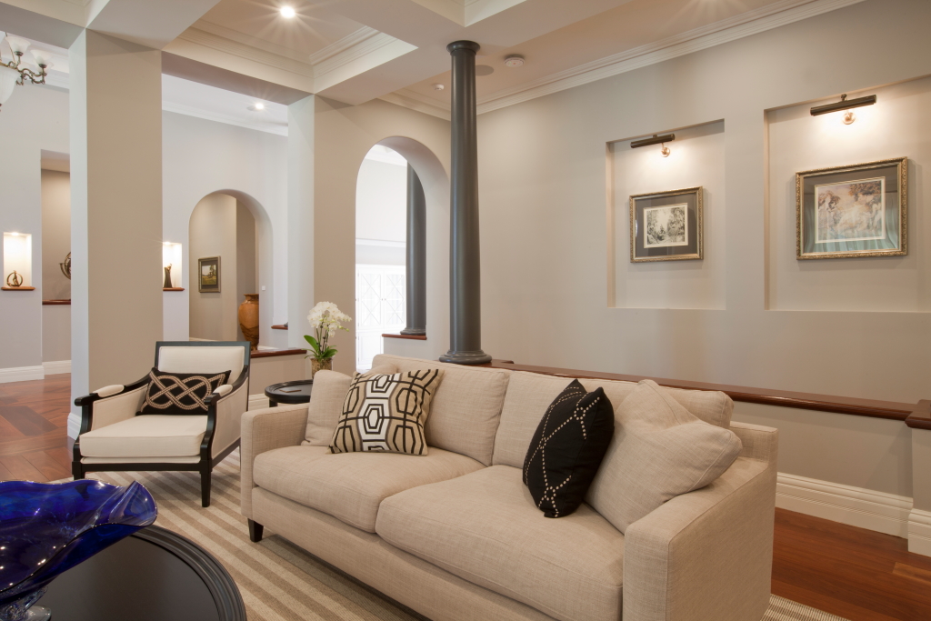
You could hardly call the image above bland and boring. The beige has simply provided a gorgeous backdrop for the addition of colour.
Often referred to as a neutral, this is not quite right as usually with beige you can see the underlying warm tones of yellow or orange. As it is unassuming it is often used when people don't know what else to paint on their walls or they're too timid to try something new. Don't underestimate it though. When used as a backdrop for artworks and partnered with rich gold tones, a beige can become quite gorgeous.
Just don't paint it throughout the house, add beige sofas and chairs, carpet and window dressings. This gives you the beige (and boring) home, not the colour on the walls.
What is Greige? The grey component
Grey is the modern day buzzword when it comes to painting your home. Loved and appreciated by designers for some time, it has now come into the mainstream and property owners everywhere are liberally using this outside and inside their homes.

As much as I love it and as much as it looks great in homes, it has the same issues as beige. When layers of grey are used without any complementary colours, the look can appear flat and depressing.
When using grey you need to pay particular attention to the underlying colour. You can often only see this when comparing different greys. One person's battleship grey is another's sophisticated cool blue grey. You therefore need to be clear about the look you are trying to achieve.
The question I am most often asked is what is a neutral grey? There are very few that are absolutely neutral. When they are, they act as a great backdrop but when overused they can be flat and lifeless.
Grey benefits from contrast and comes alive with a white trim. A black trim adds sophistication and a border to the blandness.
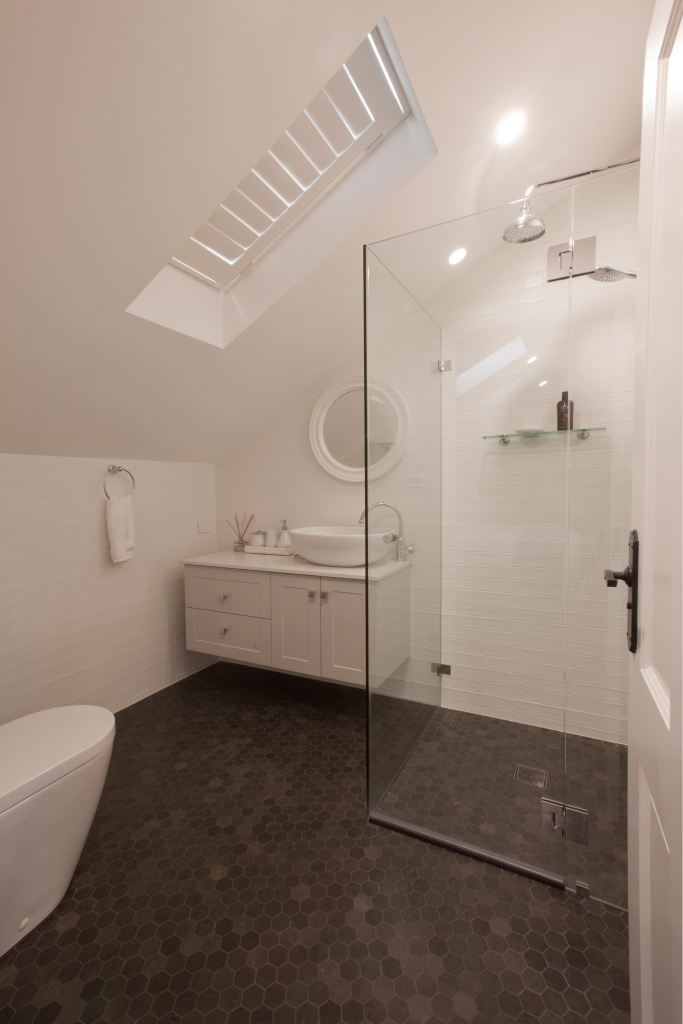
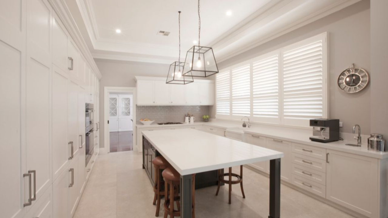
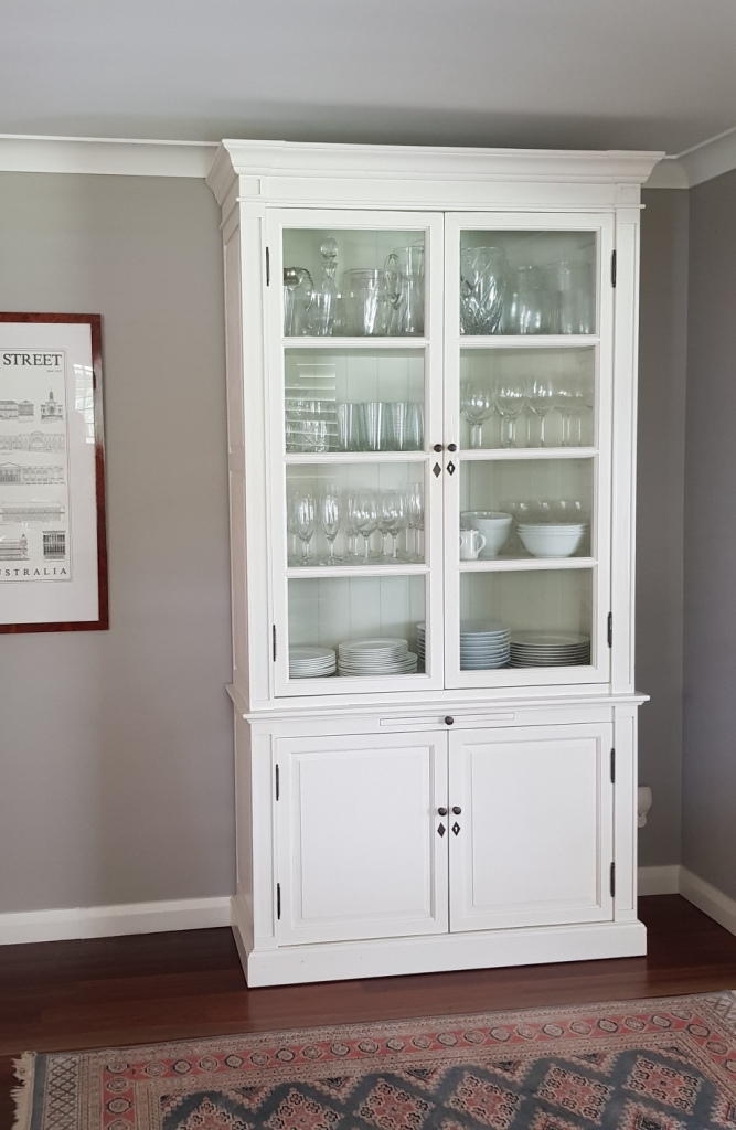
A soft greige on bathroom joinery will link the floor tiles into the scheme and give you a subtle contrast to the white.
The benefits of Greige
It is clear that both beige and grey are good base colours for a colour scheme. But it is when you combine them that you really get the most user-friendly neutral to use throughout your home.
Often the trouble with beige is the yellow undertone but by adding a touch of grey, you knock this out and are left with all the good bits.

So, when I am asked, what is Greige? I say that it has the warmth and stability of beige with the sophistication and contemporary style of grey - a winning combination.
These are some of my favourite Greige colours:
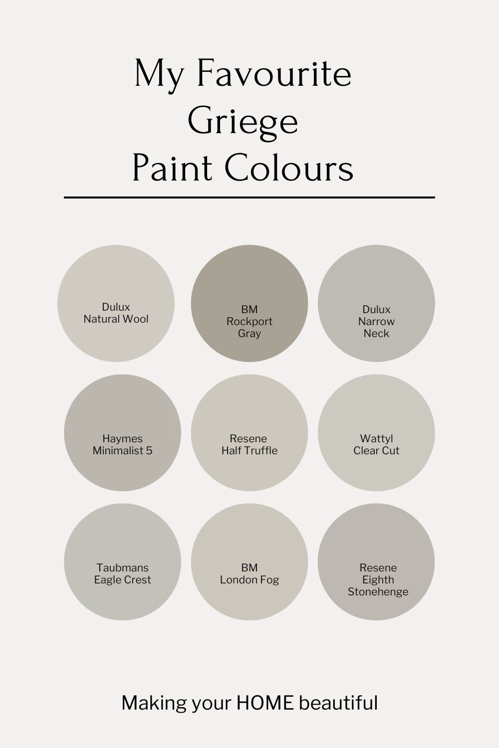
A favourite of mine and one I have used in my own house is Porters Old Stone Wall.
What goes with Greige?
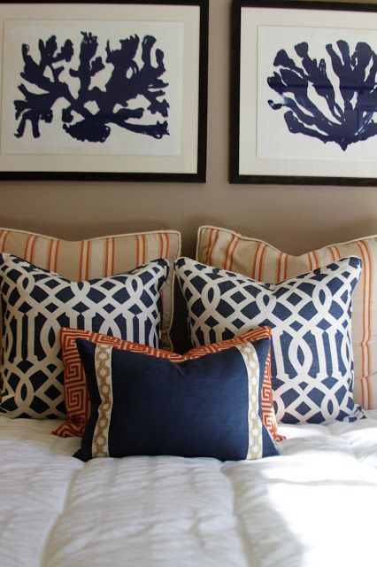
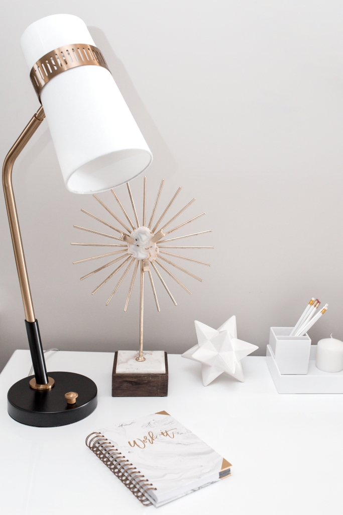
Greige should always have a trim colour, usually a fresh white but a dark off black can work too. I particularly like black framed artworks against a greige wall.
Always consider the undertone of your chosen greige as some are distinctly warmer than others. This will dictate which colours complement it the best. I do find though that as most greige colours are fairly neutral that you can usually add most colours as an accent.
A Greige colour palette
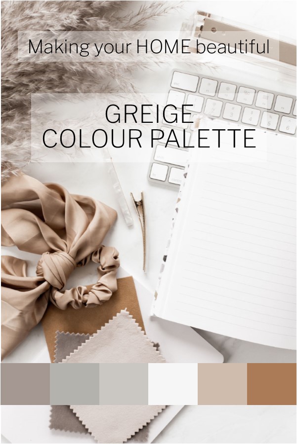
Greige is perfect set off with crisp white and I really like it partnered with some rich tan colours to give it a lift.
Greige as an exterior colour
There is no doubt that this is also a winner for exteriors too. The more grey in your chosen greige, then the better it will stand up to sunlight. As sun washes out the grey in an exterior colour you need to ensure that a greige that you select for an exterior contains enough grey so that when it is washed out you are not just left with the beige element.
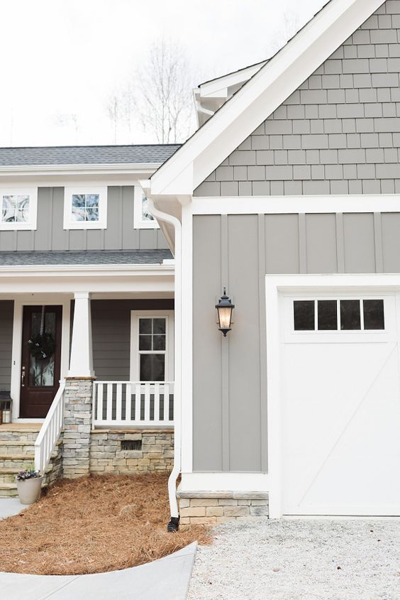
I can't stress how valuable a greige is for an exterior scheme.
The colour is timeless and will look just as good in 10 to 15 years time. When used with a white or black trim, possibly some timber and/or natural stone, you have a classic look that will stand the test of time.
Related: 7 tips for a neutral beachside scheme
Related: Why I love a crisp white trim
Don't forget to leave me a comment and let me know whether this is a favourite of yours.
If you are building a new home or renovating the one that you have, you should purchase my checklists. You will find all the elements of a new build or exterior and interior renovation that you need to consider, with plenty of space to write down supplier and product details for reference. Gain control and satisfaction when you can check each one off the list.
I also have an online colour consultation service. From just a quick 30 minute zoom session to address one or two key elements through to a full done for you solution for your entire home.
Stay connected with news and updates!
Join our mailing list to receive the latest news and updates from our team.
Don't worry, your information will not be shared.
We hate SPAM. We will never sell your information, for any reason.