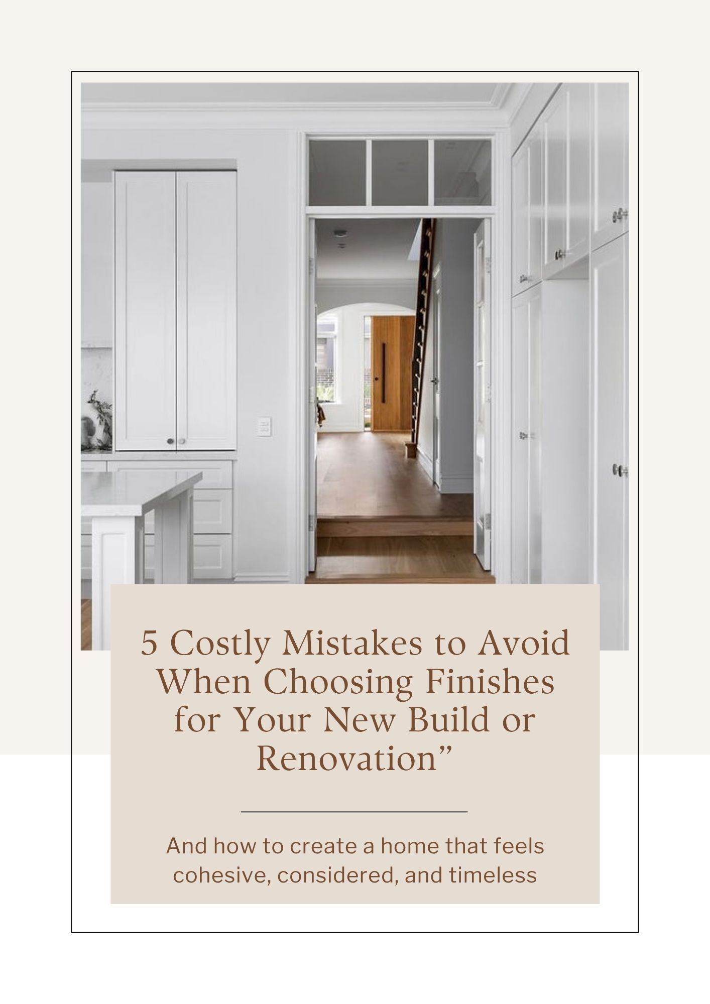
Colour can feel overwhelming in home decorating, and many people approach it with a set of rules they’ve picked up over time. While some guidelines are helpful, many commonly held beliefs about colour can actually limit your choices and lead to safe, uninspired schemes. Let’s clear up a few of the most common misconceptions.
“White goes with everything.”
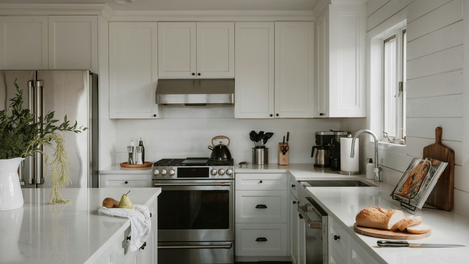
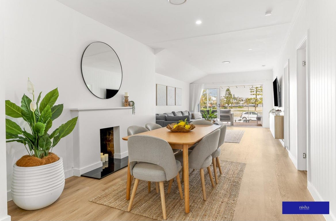
White is often seen as the safest option, but not all whites work with all homes. Whites have undertones just like any other colour, and the wrong white can make a space feel cold, flat, or disconnected from surrounding finishes. Choosing white thoughtfully — in relation to flooring, cabinetry, and natural light — is far more important than defaulting to it as a neutral.
You should also consider the type of style that you would like to decorate your house in and whether an all white scheme is suitable. The coastal look of white, oak and grey looks perfect, but if you were decorating a country style home or in a French Provincial or Transitional style, all white interiors would be wrong.
Related: How to find the right white
“Dark colours make rooms feel smaller.”
Dark colours don’t automatically shrink a space. In fact, used well, they can add depth, warmth, and a sense of intimacy. In rooms with good natural light or strong architectural features, darker tones can feel sophisticated and grounding rather than heavy. It’s not the depth of colour that matters most, but how it’s balanced within the space.
“Neutrals are foolproof.”
Neutrals are often assumed to be easy, but they can be some of the hardest colours to get right. Subtle shifts in undertone can cause neutrals to clash with tiles, benchtops, or soft furnishings. Without enough contrast or variation, a neutral scheme can also feel flat or unfinished. Neutrals still need careful selection and layering to work well.
As with whites, all neutrals contain an undertone and it will jar if you use a stone based neutral with one that has a warm taupe look. Many paint companies will have groupings of neutrals - use these as a guide in different tonal strengths to give you layers and contrast in your scheme.
“If it looks good in the shop, it will look good at home.”
Lighting plays a huge role in how colour is perceived. Colours seen under showroom or store lighting can look completely different once they’re in your home, where natural light, shadows, and surrounding materials all influence the final result. This is why testing colours in your own space is essential.
Whenever you are shopping for furniture and accessories, bring your paint samples with you rather than relying on memory. If possible you should obtain samples of upholstery and curtain fabrics and rugs to try out in your home environment.
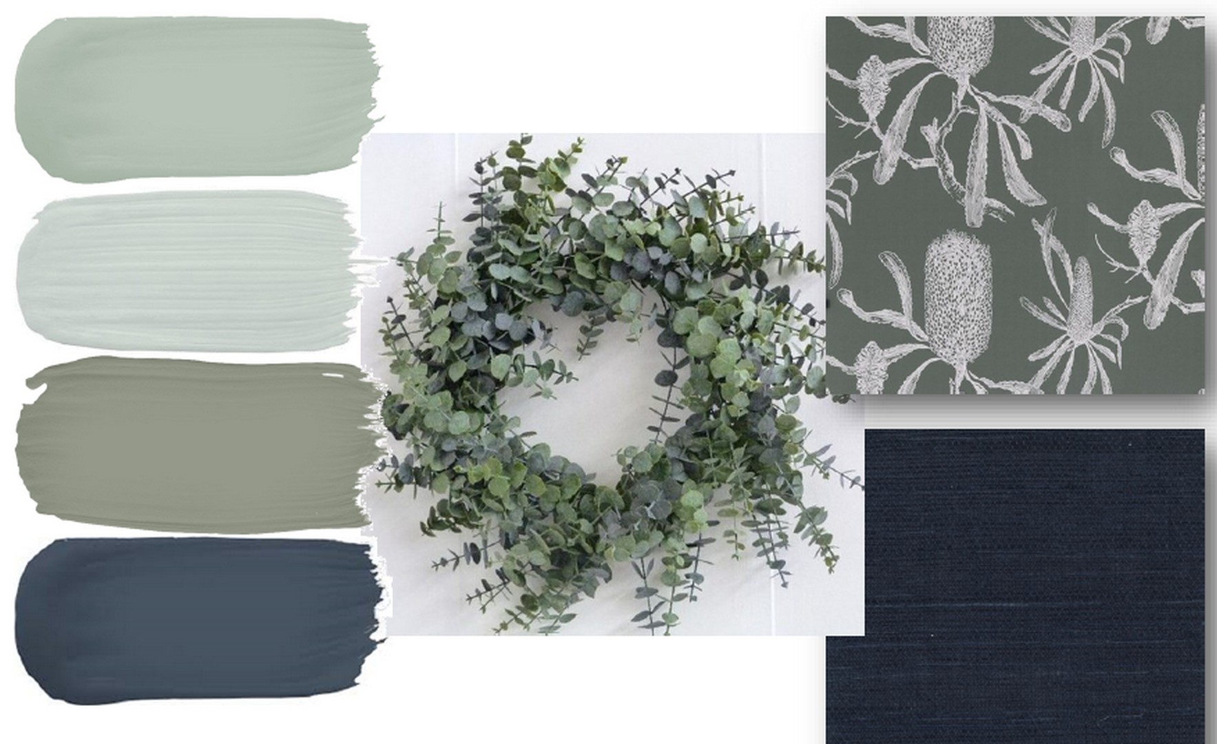
You should always put together a physical mood board - even if you just take a photo of it to keep on your phone, this can be very handy when you are out shopping for accessories and furniture.
“You should follow trends to get it right.”
Trends can be inspiring, but they don’t automatically suit every home, style, or location. A colour that works beautifully in a magazine or on social media may feel out of place in a different architectural style or climate. Successful colour choices are based on context first — trends should be a reference point, not the starting point.
Remember that next time you are going down the rabbit hold of Pinterest and Instagram. This is your house and should reflect your personality. Inspiration is great, but shouldn't be followed to the letter.
“There are strict rules you can’t break.”
Many people believe colour comes with rigid rules: never mix warm and cool tones, never use bold colours, always match everything perfectly. Undertones in neutrals and whites that are your foundation colours should be similar, but then you can introduce contrasting colours to create interest.
In reality, great colour schemes often rely on thoughtful contrast to inject personality into a space. Understanding colour principles gives you more freedom, not less.
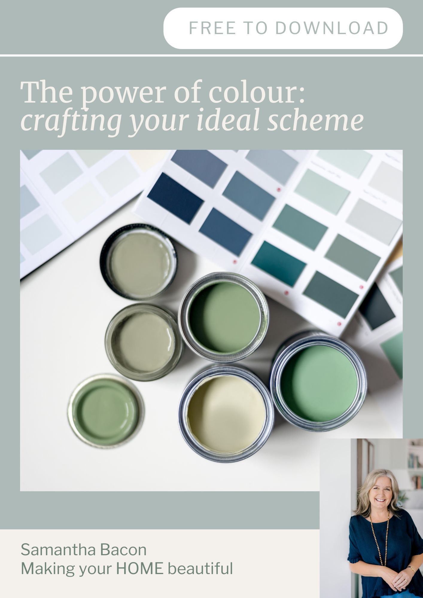
Grab my freebie to learn more about the basics of colour. Download here.
If you’re in the middle of a renovation or new build and would like help selecting the perfect colour scheme, my online colour consultations are designed to guide you through the process with confidence.
Stay connected with news and updates!
Join our mailing list to receive the latest news and updates from our team.
Don't worry, your information will not be shared.
We hate SPAM. We will never sell your information, for any reason.