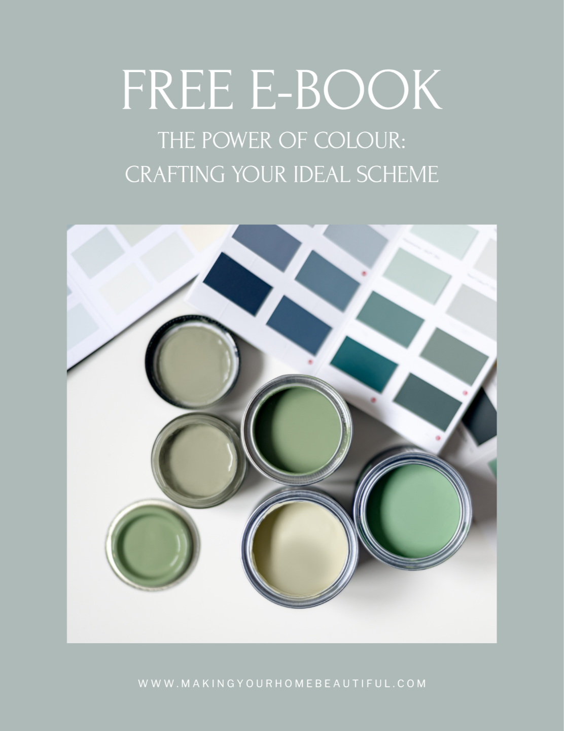
Almost daily, I am asked 'How to choose the right white paint'. In terms of paint selection it is definitely the current question of the moment and I know is one that you will be struggling with.
Serene, calm and crisp are just some of the many adjectives that you can use to describe the colour white so it is no wonder that it is a perennial favourite amongst home decorators. White paint works equally well in a clean cut contemporary interior or in a country style setting.
The question is - How to find the Right White.

Do not be fooled into thinking that this is an easy option as it is one of the hardest colours to get right.
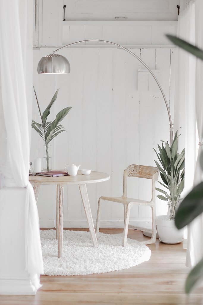
Finding the right white can be tricky as white for interiors is never just that. There is a minefield of underlying hues waiting for you out there and it can be a challenge to choose exactly the right one for your environment.
How to choose the right white paint - look for the underlying colour
The main point to remember when trying to find the right white is that all white paints have an underlying colour.
This can be most successfully recognised when the sample is on its own against a pure white background, for example a piece of paper. You should then compare the sample next to other whites to build upon your understanding of the undertones. This is probably one of the most important steps to take when selecting your colour palette.
Once you establish what this underlying colour is, then you need to follow general colour rules which I have listed below.
How to select a cool white
A cool white paint will have either a blue or blue/green undertone.
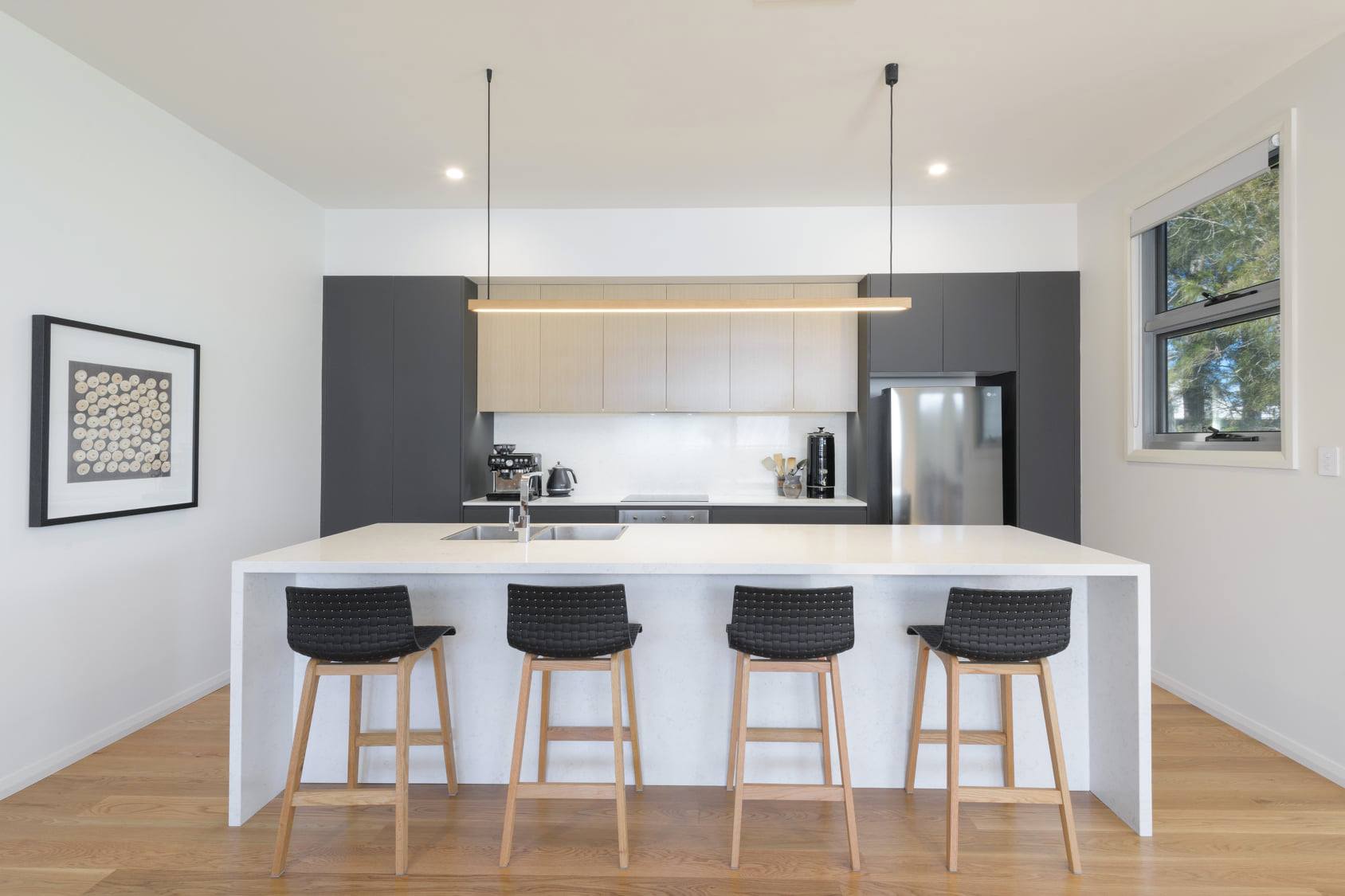
Those which have a blue base can be particularly difficult to work with as they are quite unforgiving and can bring an almost clinical feel to some rooms, particularly if they do not receive much natural sunlight. However for a room that is flooded with natural sunlight it can work really well as a foil to the heat. The image below is a room with Dulux Lexicon Quarter which is a classic cool crisp blue white.
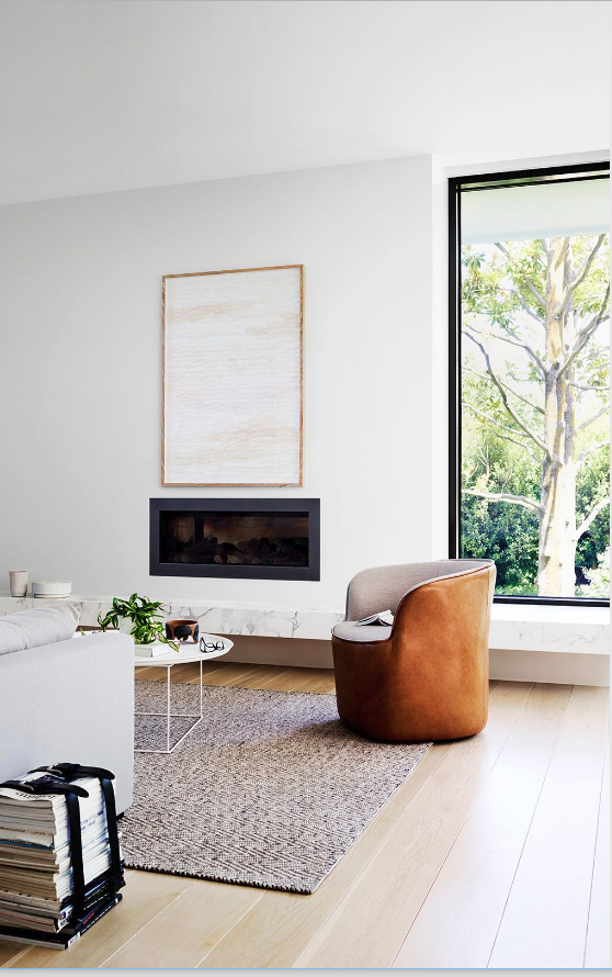
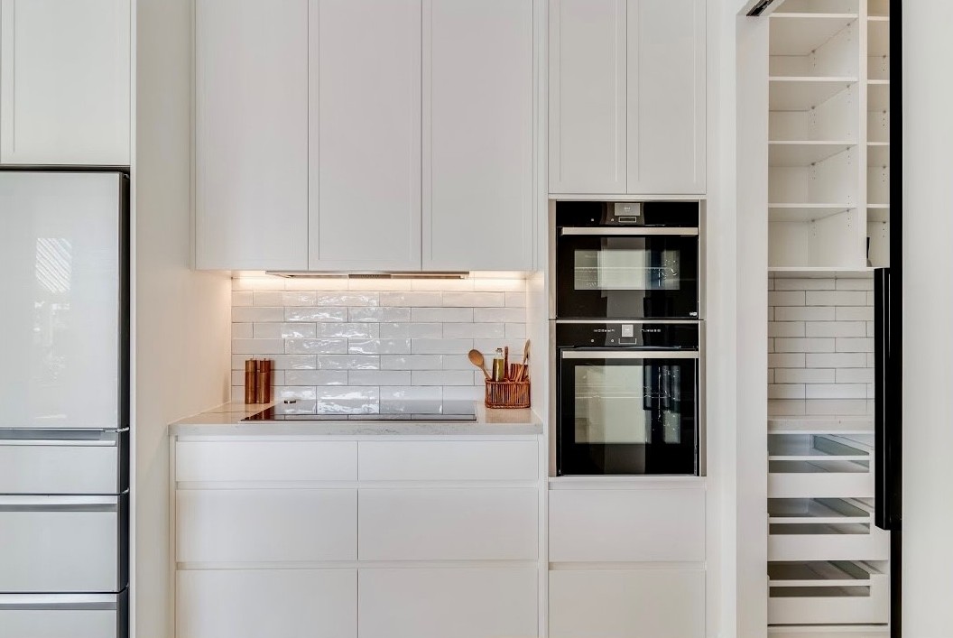
Dulux Lexicon quarter on the kitchen cabinetry and Dulux Lexicon half on the walls
Crisp cool whites are also great to use for kitchen and bathroom joinery - just ensure that unless you want to see more of the blue colour you select a quarter strength so that you take out as much of the underlying blue as possible. The darker the white, the more of the undertone you will see. You should always take a paint sample to the tile showroom with you as white tiles will all have a different undertone.
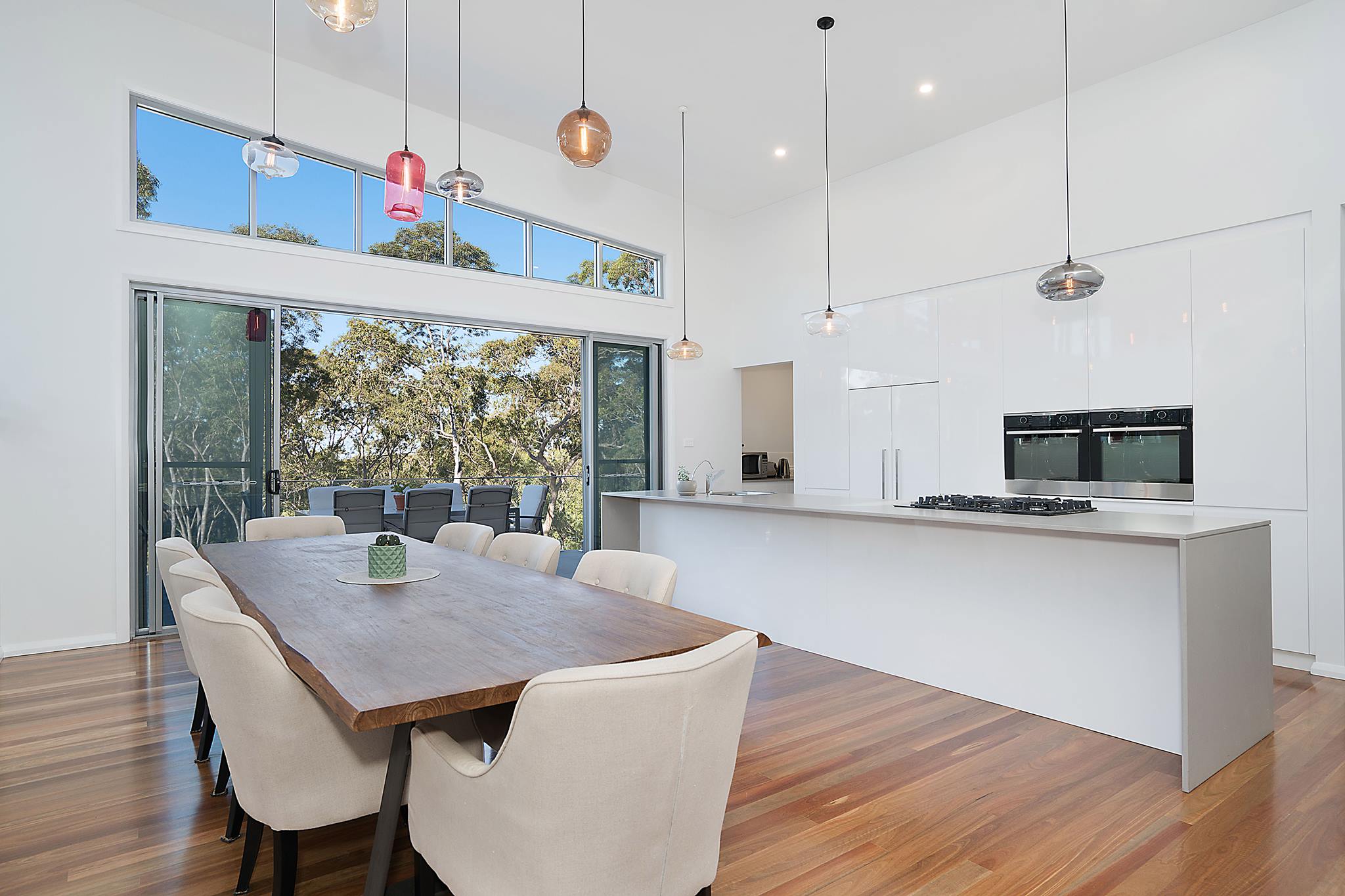
The room above is painted in Dulux White on White which is an even cooler blue white. This can be a good white for kitchen joinery and is great for contemporary interiors but should be used in a room with lots of natural daylight so that it doesn't make the room too cold. It should only ever be used with other blue based whites though as it can throw an entire scheme if not used correctly. My video below details more about the possible pitfalls of Dulux White on White.
Green based white paints are relatively easy to work with as they complement so many other colours and are fairly neutral.
These tend to be my go to whites.
As these whites get darker, they become the beautiful stone colours that are brilliant for exteriors. Clients often describe them as a nothing colour - this is a true neutral. Working with these neutrals in either their darkest of lightest form, creates a very classic and timeless look for your home.
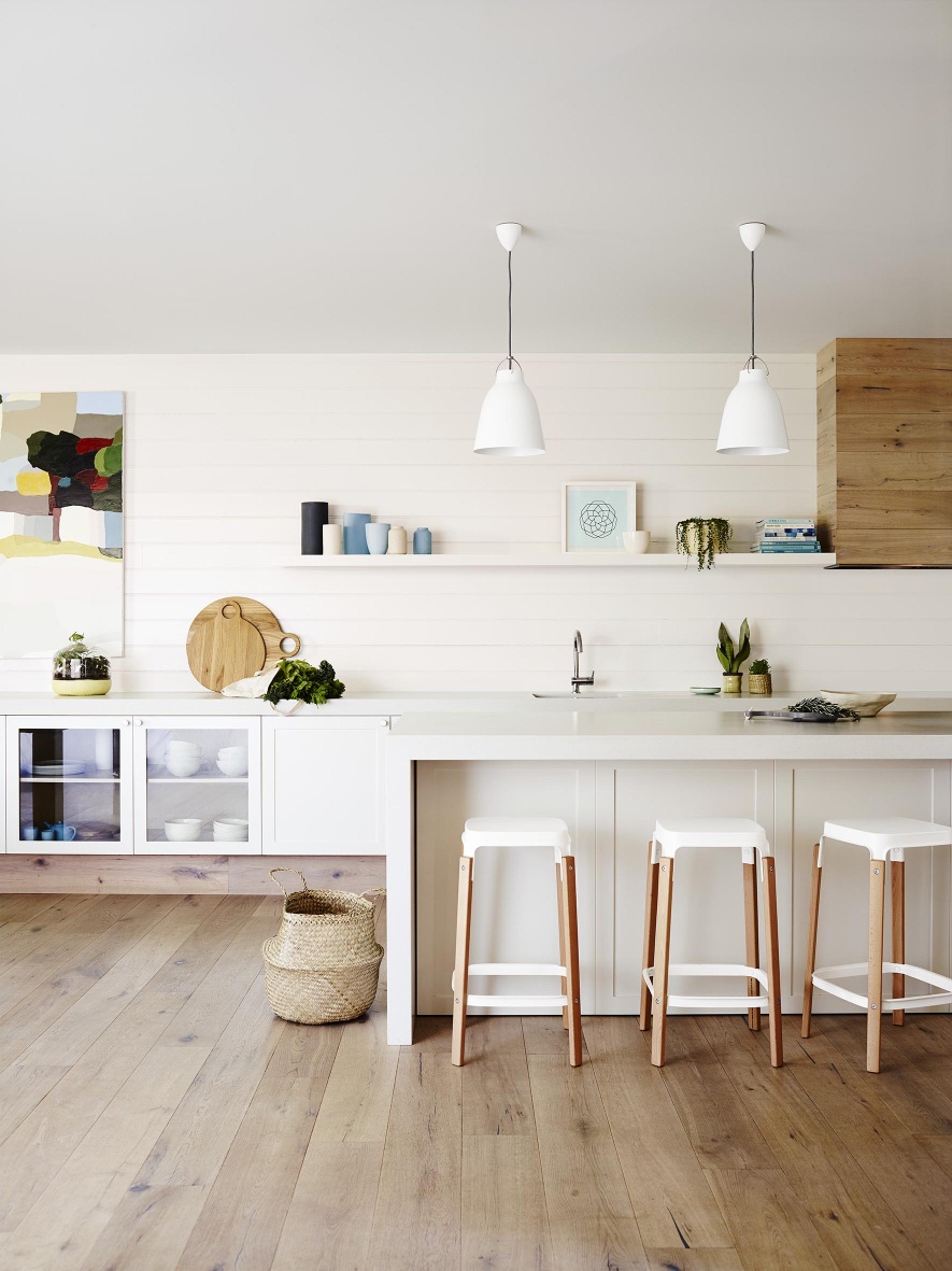
Dulux White Verdict Quarter is a classic green based white that works really well in interiors.
The above kitchen cabinetry is all in Dulux White Verdict Quarter
Related: How to use Dulux White Verdict Quarter
Dulux Casper White is a soft grey white with a cool lavender undertone. This can work well as you get the sophistication of a cool white but without the austere blue undertone. As this white gets darker it turns into a very approachable soft grey.
The above room is painted in Dulux Casper White Quarter
How to select a warm white
Yellow based whites are obviously warm. These can sometimes lean towards being too creamy which is not always so successful for a contemporary palette, however they can be perfect for a cottage style home. Whites that just have a hint of yellow can make a room feel very comfortable as these whites are soft and welcoming. If you are careful to use these soft whites without introducing other whites with different undertones, you don't even see the yellow, creamy tones - you just end up with a very liveable white.
Often the whites that work well in decorating are the ‘dirty’ whites that can appear a bit grey and grubby when viewing a sample but on the wall create a successful modern look. So if you think your home needs a warmer white then consider one with a creamy base but one that also has a touch of grey.
The image above is with Dulux Whisper White on the walls. I love this white because it is a touch creamy but also has a touch of grey. A very approachable white that seems to work well for many homes.
Dulux Natural White has a soft apricot undertone and has been a popular white for years. Don't be deterred by the reference to apricot - this just makes it a very welcoming and soft white to work with.
Image: Soul Home
Related: How to use Dulux Natural White
Dulux White Beach Quarter is another favourite of mine as it is a warm white without an obvious yellow undertone.
Dulux White Beach Quarter has been used on the walls in the above kitchen.
Related: How to use Dulux White Beach Quarter
Before you write off the creamy whites completely though I want you to consider the style of your home.
Creamy whites can look fantastic in a country style setting so don't be put off by their creaminess.
Pink based whites are very soft and can work well with the addition of some grey. These whites are great to use when you are using a lot of pink, for example in a child's bedroom.
A pink based white can also work really well with brown tones and is a good option where you require a warm white but want to avoid any yellow tones. You can be put off by the thought of pink, however these can be very effective for a cold and dark area of your home where you won't necessarily see the underlying colour just the warmth that it brings to the scheme.
Just remember not to mix the whites - so don't use a creamy yellow on the wall and then a cool blue tinged white for the trim - keep it simple!
A white to fit the right mood
You must always consider the mood that you want to create in addition to the style of the home. This is true with selecting any colour - concentrate on how you want the room to feel when you make your decision on the undertone that you want.
White on White colour palettes
You can see when you test your chosen white against a pure white background what an effect this has on the colour and the same occurs when you partner other whites with your choice. So in addition to considering the type of white you would like to use for your wall colour, you also need to think about which one you will use for architraves, internal doors, skirting boards and ceilings.
Sometimes, a grey white will look a little grubby but when you place a lovely fresh white next to it, its appearance is greatly enhanced. So rather than take the easy route and just paint everything in one type of white, consider using a lighter trim to give everything a lift.
Related: How to use Dulux White Exchange
My Fail Safe Formula for selecting the right white paint
Many paint companies now market their whites and neutrals in varying degrees of strength. A great rule to follow is a full strength of your chosen white on the wall, half strength on the trim and internal doors and quarter strength on the ceiling and cornice.
Sometimes you can knock out the middle man or if you feel your choice is too dark in full strength then just use half strength with quarter on the trim, internal doors and ceiling. Kitchen cabinetry can also be treated the same way as internal trim and doors.
Whilst talking about ceilings, don't be tempted to use a paint company's ceiling white. These often completely throw a wonderful white palette and all your planning goes out of the window!
Colours appear twice as dark when they are horizontal so ceilings also need to be treated carefully. Definitely opt for a quarter strength here or even an eighth strength if you are using a quarter on the walls. Your cornice, if you have one, should also be painted the same as the ceiling.

Another great way to use a white in varying strengths is throughout different areas in your home.
If you have a room that faces north or west with lots of doors and windows then you can confidently use a full strength white but if your room is darker and faces south then you may benefit from just a half strength of the same white.
This way, you achieve a wonderful flow throughout the house, particularly if you ensure the trim and ceiling is the same throughout.
I have a more in depth post about how you should paint your trim here:
Related: What do I paint my skirting boards and architraves
The right white paint is the perfect backdrop
Let’s face it, white is often the fall back colour for people who really don’t know what to put on their walls and then they add interest and colour with books, soft furnishings, artworks and rugs.
I hear this a lot and there is certainly nothing wrong with this at all. It provides a lovely crisp, clean blank canvas for all the other wonderful items that you have at home.
But what if you are really a true lover of white and you want to use it throughout the space including furnishings and accessories? If this is you then to make the room successful you will need to consider some other design elements for the room.
The most important design element to remember if you are using a white theme is to employ varying textures so that you create a layering effect.
Mix up accessories in different finishes, for example cool, slightly rough linen with fresh crisp cotton and heavy knit throws.
Remember too that if you use any colour at all in this kind of environment then your eye will be drawn straight towards that object and it becomes a main feature in the room, so unless this is the point, you need to ensure that your accessories and furnishings are all white or a soft natural timber or stone. This creates a gentle flow and increases the feeling of serenity.
My go-to white paints
I have to say that this changes regularly and is definitely affected by many different factors including client preference, room orientation and current trends. You need to ensure that rather than selecting something that I have discussed, a friend has used or another publication has talked about, that the choice is right for your space.
At the moment many of my clients really love Dulux White Cloak as it is a lovely warm choice. This is one of those 'dirty' whites that is warm but without any obvious creamy, yellow undertones as it contains a touch of pink. It looks terrific with Dulux Vivid White which I absolutely love for trims and ceilings.
Another favourite is Dulux Snowy Mountains which is a cooler crisper white and I find the quarter strength of this is really great for joinery and internal doors. Don't forget to consider how much of a tonal variation that you would like to see as this will impact the difference that you leave between the tones. I have more to tell you about Dulux Snowy Mountains in full, half and quarter strength in this video:
Related: How to use Dulux Snowy Mountains
Resene are well known for their whites and neutrals and they are very obliging in providing these in varying strengths. Resene Blanc is a fabulous pink white that works really well for a soft country look or Resene Sisal in half, quarter and eighth strengths are one of those great green based neutrals that works in many environments.
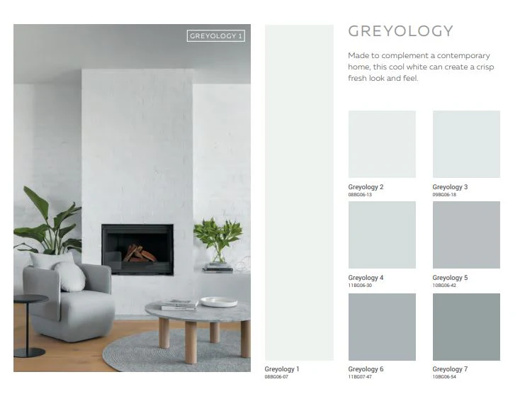
Haymes Paints also have a range of whites and neutrals in varying strengths. For example, their Greyology range comes in different strengths from 1 through to 7. This makes it very helpful when putting together a colour scheme as you can be confident that you are not mixing different undertones. Greyology 1 is a very crisp cool white. You could partner this with Greyology 2 or 3 and still have a very white on white scheme. It's always worth remembering that when you look at colour samples in a brochure or small colour chip that they will look much lighter in situ.
I hope that this post has been informative for you.
If you are building a new home or renovating the one that you have, you should purchase my checklists. You will find all the elements of a new build or exterior and interior renovation that you need to consider, with plenty of space to write down supplier and product details for reference. Gain control and satisfaction when you can check each one off the list.
I also have an online colour consultation service. From just a quick 30 minute zoom session to address one or two key elements through to a full done for you solution for your entire home.
This post was first written in 2016 and has been updated over the years to recognise new colours and ideas.
Stay connected with news and updates!
Join our mailing list to receive the latest news and updates from our team.
Don't worry, your information will not be shared.
We hate SPAM. We will never sell your information, for any reason.