
Finding the right neutral grey for your interior project can be as fraught as looking for the right white. Each paint company offers a wide range to choose from and as with whites, they all have a different underlying colour. You need to be careful with your selection so that you find the right grey to fit in with the rest of your decorating and at the moment, the grey that I am asked about most often is a neutral one.
In this post therefore, I am going to concentrate on how to find the right neutral grey. This means that it won't have a very obvious underlying colour and in my experience as a colour consultant, this is the grey that everyone is trying to find.
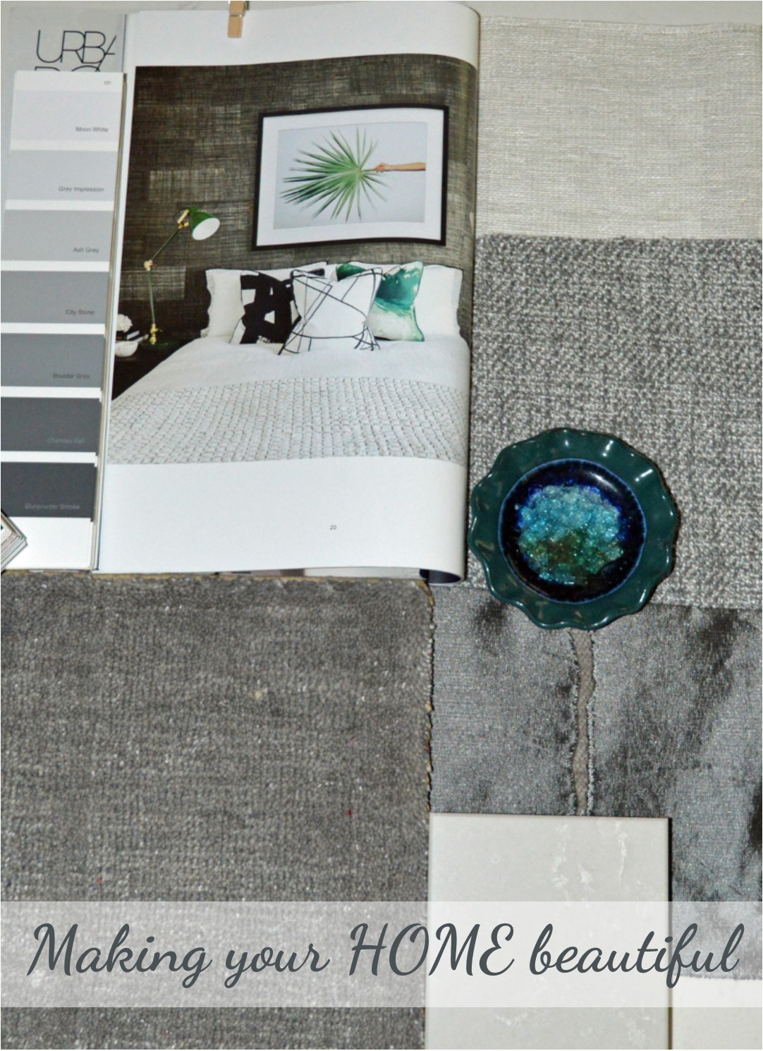
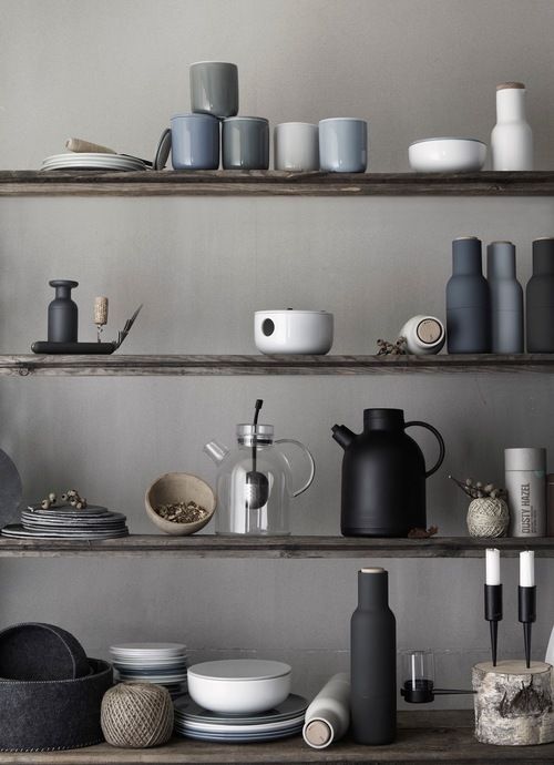
A neutral grey mood board
I have put together this mood board to demonstrate what I mean. A neutral grey tends towards being silver but without any obvious blue. I find that these work really well with green and look stunning when partnered with white. But of course, being neutral, they will work with most colours and this is the beauty of them.
City Stone from Haymes paints is a fantastic neutral grey – shown in the middle of the fan deck below and once darker, as Haymes' Gunpowder Smoke, becomes a fabulous dark, almost off black but without the blue undertone of charcoal.
You can sign up to my Free Resource Library where I have a free e-book on how to put together a mood board. Sign up for free here.
How to see the underlying colour
When looking at a chosen grey, the trick is to isolate the swatch of the colour with a piece of card – a professional fan deck will have an isolation window which makes it much easier to see the colour when it is by itself. Compare it to other greys and you will start to see the underlying colour in each one. Many do have a blue undertone, which can be great but it will limit your choices more. Often greys are warm, with even a touch of purple in the base and again, this is a fantastic look but it may not be the one you were hoping to achieve.
Be careful not to combine greys
I find that a neutral grey will sometimes read ever so slightly green or may have a slightly warmer brown base. There will always be something there but some are less obvious than others. Combining greys in a decorating scheme can also be an issue, so if you are in doubt it is wise to select one from a paint company that offers the same grey but in varying strengths, from a cool silvery off white through to a very dark sophisticated grey or even off black. This makes your job so much easier! Great paint companies that offer this are Haymes in their Natural series and Resene, amongst others.

The more you look at neutrals, the more you can understand them
There are so many fabulous paint colours to choose from and it can be a minefield finding the one that is just right. I really like putting mood boards together as it helps to keep you focussed and to only choose from colours and neutrals that are right for your project, rather than going off on a tangent when you see something else that you love!
So browse Pinterest, take cuttings from magazines and pieces of fabric that you love and put them together with the things that you can't change and this way you can start to find the right paint colour. The more that you look at neutrals, the more you will understand and begin to see the differences and the underlying colour.
I hope this helps you to find your perfect grey for your interior decorating project and I would love to hear from you in the comments section below.
Do you want just a hint of grey in your decorating scheme? Or do you want the perfect white palette to act as a backdrop for a grey sofa? If so you might also find my post on the 5 mistakes to avoid when selecting white helpful.
If you are still confused and need help I have an online colour consultancy with lots of different packages. More information is here.
Want to find the right grey for your exterior project?
This can be as tricky as finding the right white but in this post I cover all the different guises that this beautiful neutral comes in.
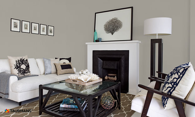
A pale neutral grey is often used in Scandi decorating schemes
When partnered with white, this is a classic combination for this look. I have written about my 5 key elements for Scandi style which includes the right colour palette – see more here:
Hi Sam,
I have just found your site and I love it! Just in time I might add as our renovation is underway. I have an east west orientation and currently it is all dark brick on the interior so impossible to judge how much light we will have in the house. The entire eastern side will have glass doors but we will be adding a covered entertainment area, which will impact on the amount of light we get inside. From what I’ve read, cooler colours are not the right way to go. We are very close to the beach in QLD, so am trying to create a relaxed coastal look. My selections so far, are Polytec classic white kitchen cabinets, with a white stone bench. I’m after a grey for the walls and really like Dulux Vanilla Quake. Second choice is Dulux Pipe Clay. As for the trims and ceiling, I was thinking Lexicon quarter. The flour will be smoked American Oak, in a matt finish. I would love your feedback on these selections, as I am really after a nuetral look-I really dislike anything that looks cream. Thanks so much.
Hi Susan lovely to hear from you and I hope your renovation goes smoothly – getting rid of dark brick inside sounds like an excellent starting point! Dulux Vanilla Quake is a lovely warm grey but it does have a tendency to look a little Lavender. I have had a client use this and she liked it – it does look great but it can look Lavender so make sure you are happy with that. Dulux Pipe Clay is a lovely neutral stone colour but can look a bit green. Dulux Ghosting is in between the two – perhaps you could give this a try. This is a great favourite of my clients at the moment but whatever you do, paint large sample boards and look at them with the Lexicon Quarter – which is a lovely clean crisp white and your kitchen colour to make sure you like the effect in your house. Polytec Classic White cabinets are slightly warmer (not cream) so you should look at that with the Lexicon Quarter too as you may be better off with Dulux Vivid White as your trim. Remember to consider current furnishings too – these underlying colours are not bad but they need to work with what you already have and love. Good Luck!!
Thanks so much, Samantha. I have used Vivid white before in 2 previous kitchens and it is lovely. I will definitely get a sample pot or two to try ghosting and vanilla quake. I will discount the pipe clay as I have an A4 swatch and can definitely see the green in it. Although with all this hideous brick, cork floors and pale yellow paint I am struggling to get a clear idea of colour – I think it makes everything look warmer than it is. As far as other furniture goes, we are planning to purchase all new lounges etc as our current items are passed their use by date – very liberating! Thanks again for your advice – much appreciated 🙂
Hi Samantha,
Just thought I’d let you know, that i went with the Vanilla Quake half and lexicon quarter trims and it looks amazing! No hint of lavender at all – just a true nuetral grey! It must have something to do with the light in the space, which is why your advice to get sample pots is so important. Thanks again for your wonderful bog!
Help. I discovered the hard way that “Pipe Clay” looks green. I thought it was perfect and couldn’t see any difference between it and Ghosting. I honestly thought it was a double up.
I bought 10 litres of Pipe Clay and painted two square meters and it looks decidedly green on my walls. NOT the effect I wanted.
I wish I’d seen this conversation earlier. Why oh why don’t these paint companies put a little commentary with each colour – from a colour expert such as yourself!
I’m headed back to the store to see if the 10 litres can be re-tinted to Ghosting, but I don’t like my chances.
Hi Julie So sorry to hear your story! The paint store will be able to make the colour lighter and you won’t see so much of the underlying green – hopefully that will work. Good luck Samantha
I am still planning my beach cottage. The builder uses Sherwin Williams. The local store told me the do not use strengths of paints. I cannot seem to find this concept in the US. What to do? It seems a great idea, and I think my style must be Australian or Scandi Coastal as I like your styles so much.
I like the grays and working towards a whitish ” Boat house” look with some natural pieces such as a live edge table and bar. Would like to have a soap stone island.
Thanks
Caren
Hi Caren The cottage sounds lovely – I love a boat house look which is very typical to the Australian coastal look but we borrow so much from other parts of the world too and with our love of navy, white and grey, we really look to East Coast America for elements of our look. I’m sorry I can’t be much more help but perhaps if you get together lots of imagery and then ask a local designer for help to make sure you pull it all together and are happy with the end result – good luck Samantha x
Hi Sam, l am seeking your help once again with our kitchen paint colours. We are now planning on polytec polar white cabinets for the back wall, Quantum Quartz Michelangelo stone bench tops. I have an Island bench l would like to use a grey 2pk paint for the under cabinets that will work with the stone bench top and polar white back wall cabinets. Are you able to suggest a grey that will work with these 2 finishes. The room is filled with natural light. Floors will be Australian Chestnut or Spotted Gum. Your advice is greatly appreciated. Thank you in advance. Julie
Hi what would be the closest taubmans match to dulux grey pebble
Hi Maree I think a close match is Taubmans Grey Ghost – you should try out a sample though before you commit to make sure you like it. Samantha
Hi Sam, I’ve been reading the above conversation having read through your blog and had a question for you. We are doing Vanilla Quake quarter on the walls throughout the major areas of our house. Floors are a smoked mid tone oak, white oak island, carrara marble benchtop and combination white and grey kitchen cabinetry. Would you have any advice on whether the grey cabinetry should be the Vanilla Quake as well (or should it be different grey) and what white would work in the cabinetry against this without being too bright a contrast and what colour trims should be (I’ve heard same colour architraves as walls is more modern). We also have a couple of very gloomy rooms on the opposite side of the house with entirely different light, where Vanilla Quake doesn’t work. Is it acceptable to introduce a completely new white with a yellow base (given these connect to the Vanilla Quarter rooms) or is this a mistake? I’m also wondering what ceiling paint colour you would put with Vanilla quake quarter? Would so appreciate your advice.
Hi Liz You might like to look at a half or even a full strength of the Vanilla Quake for your kitchen and then the white you use should be the white that you take through the house for your trim and ceiling. Dulux Snowy Mountains Quarter is a nice soft white that I find works well but you would need to look at a sample next to the Dulux Vanilla Quake Quarter and your bench top, flooring etc (and the full strength Vanilla Quake) to see how it all blends together. There is certainly nothing wrong with adjusting to a warmer off white for the other rooms – just ensure you like them with the trim colour you opt for. I hope this makes sense – do test it all out first! Samantha
Hi Sam
You’ve given me wonderful advice in the past about colours in my house and now I’m seeking some help with my sister’s renovations please. It’s for her bathroom, toilet and laundry – three separate but connected areas.
We have selected a mid grey tile for the floor. To give you an idea of the colour, on a Taubman’s fan deck it is similar to Observation (T15 29.3) and Wolf Cry (T15 29.4). I think it’s a warm grey. ???
We need advice on a wall colour for these rooms please. (Later we may extend it into the hallway and living areas) The bathroom is quite small – we’re having white akril for the walk in shower walls, white vanity and the remaining walls painted. Do you have any suggestions for warm white or grey walls that would suit these tiles?
Also, would you suggest a white ceiling or a quarter/eighth strength of the wall colour?
We have access to Taubman’s, Dulux, British Paints and Wattyl paints. Their colour charts have such a wide variety of whites and greys it’s mind boggling, hence my SOS to you. Thanking you in advance Sam.
Cheers, Lorraine
Hi Lorraine good to hear that I was able to help. I have had a look at Taubmans Observation and I think that something like Taubmans Grey Matter (a light warm grey close to the grouping of greys that Observation is in) could work. Probably look at a quarter strength of that for the ceiling. Do try samples of it first though – I haven’t actually used that colour and it will depend a lot on other factors in the house too. Hope this helps! Samantha
Hello Samantha, what a useful resource your site is. I’m reaching out to you as I am driving myself mad with my inability to choose external paint colours for my California Bungalow and I’m hoping you can help. The house is currently painted cream and salmon. My garden is full of silver, purple, white and a few pink plants. I’d like to paint the house to complement the garden. I also need to replace the colorbond roof. I am not sure whether a very cool grey like a Haymes greyology would be best or a warmer grey like Dulux grey pebble half or tranquil retreat would be better suited to my 1926 house. I like white trims and I thought maybe Shale grey might be a good roof colour. My husband thinks there isn’t enough contrast in my choices. I’m going round in circles and am paralysed by choice. I’m hoping you can help. Warm regards, Lauren
Hi Lauren I tend to agree with your husband that you don’t have much contrast which is important on an exterior. The colours you are looking at are also very light greys which will appear very light in the sun. Perhaps consider a warmer grey like Dulux Silkwort as this would complement the silver/purple tones of your garden rather than a blue based grey like Greyology and Tranquil Retreat. This is also a slightly darker colour which will give you more contrast with a fresh white – perhaps look at a sample of that as a starting point? Good luck Samantha
Hi Samantha
I’m reaching out again for help with the interior colours in the open plan living space. The kitchen cabinets at Polytec Classic White, bench Caesarstone Bianca Drift and all trims in Vivid White. I’m searching for a neutral wall colour with some warmth in it, but definitely not yellow or cream. I’ve samples of Dulux Beige Royal Half, White Duck Half and Pipe Clay Half. Am I heading in the right direction?!
Hi Jaimia If you want some warmth you are best sticking to Beige Royal half as White Duck and Pipe Clay have more green in them – lovely colours but may not give you the warmth you need. Good luck Samantha
Thanks Samantha,
I’ve ended up ruling out the Beige Royal Half because it looks pink/brown in the space. The Pipe Clay looks like a lovely neutral and I can definitely see a bit of the green undertone peaking through in some areas. Interestingly the White Duck looks the pinkest of them all – I’m actually getting another sample pot because I’m sure it must have got mixed incorrectly?? Have you ever had White Duck look pink? Anyway at this stage leaning towards the Pipe Clay.
Hi Jaimia No I haven’t ever seen White Duck look pink. You need to be careful about what else is around that could be throwing pink or it could be a poor mix. I suspect you like Pipe Clay as it is a little more grey – it really is a great neutral colour. Samantha
It must be a poor mix because there is nothing in the house and the walls are all painted undercoat at the moment. Anyway we’ve decided to go Pipe Clay. Thanks heaps for your help.
Hi Samantha,
I love your post and was wanting some advice please. . I am looking for a nice grey to paint the exterior of our weatherboard country home. The colours I like are dulux Mt Hikurangi, Shale Grey, timeless grey, dieskau and Milton Moon. Very confused over which one. We have I think Deep ocean gutters like a navy blue and Dulux Natural White trims. Or would you suggest another nice colour even if its not grey that might work. There are so many nice colours out there. Hope you can help. Thanks.
Tracey
Hi Tracey The greys that you are looking at have a wide range of undertones, for example Shale Grey reads a little green, Timeless Grey is more blue, as is Milton Moon but considerably lighter and Dieskau has a lavender undertone. Therefore you need to decide firstly the depth of colour that you want – if you have a large house, a darker tone will make it look smaller – and you need to decide which undertone you will be happy with. Just because you have a blue trim, you don’t have to have a grey with a blue undertone. So think about how dark you want the house to be and what undertone and this may help you to narrow down your choices. Good luck Samantha
Hi, I really need your help. We have a new hamptons looking home in Scyon weatherboard and are struggling with the exterior paint. We have already chosen the basalt colourbond roof and white trims around the frames but want a grey to paint the exterior. We want a grey ish colour but not too light/ creamy but not to dark either. We have been recommended full strength vanilla quake or grey pebble both Dulux but was interested in your thoughts. A lot of the new kit homes seem to be doing a traditional grey colour so wanted something different. Pls help
Hi Danny Dulux Vanilla Quake has a slight lavender undertone and is very light. Grey Pebble is more neutral but again very light. Dulux Rampart is a slightly deeper tone and gives you some nice warmth and certainly not the same as the traditional greys that are very popular at the moment and which can sometimes look a little flat. You really need to test colours on a large piece of board and place in the sun to get an appreciation of how washed out they get. Good luck Samantha
Hi Samantha … I’m going backwards and forwards with a colour for our contemporary new build exterior – we have a grey brick one side … with shale grey windows all round …except a large sloping feature window on front is monument … this window is set into axion vertical board (wide) … monument roof, shale grey fascia …. I was thinking for the vertical board axion & eaves – surfmist … however it does look grubby in some light… your thoughts on terrace white? Also on the interior I’ve used Rottnest island on walls previously, your suggestion for trims & ceiling please. Thank you so much
Hi Anne Dulux Terrace White is a crisper, cooler off white which will work better with the grey brick and shale grey etc. In terms of the interior, it depends how much contrast you want to see with Rottnest Island. The darker the white obviously the less contrast. Snowy Mountains Quarter is a great trim colour that is fresh and would work but you need to test it out as you’ll be surprised how different it can make the wall colour appear. Hope this helps Samantha
Hi Samantha You have been very generous with your time & advice to everyone. I too would like to seek your help. I have a Queenslander & interested in exterior grey house colour. Was looking at a medium grey. I liked flooded gum but after reading previous information you’ve provided ,I like the idea of the neutral greys you speak of rather than a warm grey. You mentioned Lyttleton as this but unfortunately it isn’t available in Australian dulux colours. Could you suggest a medium neutral grey & a white to go with it for windows & stairs & trim. House faces south, is high set on stumps & very little of roof is visible. I liked the white you showed in photo on your website & said sometimes use with older houses- White Duck Quarter. Any assistance would be very appreciated.
Hi Jennifer Although Lyttleton is a Dulux NZ colour, it is available in Australia and I use it quite regularly here. It does have a green base which makes it very neutral but you will see a slight green undertone. White Duck Quarter is a lovely trim colour and something like either Dulux Paving Stone or Dulux Stone are a great simple neutral greys that you might like to look at. Hope this helps Samantha
Oh I hadn’t realized. Will get a sample pot in Lyttleton & have a look at the other greys. Thanks so much Samantha, was a little bogged down but am enthused again 🙂 Much appreciated!
Hi Samantha,
I was wondering if you could answer one last question. In the end I have decided to go with flooded gum for my Queenslander wall colour (relief to have made that decision:) & was thinking to have Snowy mountains quarter on stairs & trim. Do you think this would be ok or should I pair it with a different white. Thanks so much for your time…
Hi Samantha,
i have built and not sure which grey to use on the outside on the rendering, my double garage door and gutters are Monument an window frames black, cant decide whether to go Endless Dusk or maybe Flooded Gum, was going to go Shale Grey but i think to light and Wind Spray ??? what do u think please.
Hi Jacqualine Endless Dusk has a slight blue undertone while Flooded Gum has more of a purple undertone. Windspray is a green/blue colour and Shale Grey is a very neutral paler grey. There isn’t a right or wrong, it just depends on whether you prefer a slight blue undertone or a purple one. Have you tried large samples in the sunlight? This is the best way to see the undertones and get an idea of the overall effect. Good luck Samantha
Hello Samantha, I am trying to decide between Grey Pebble Quarter and Ghosting Quarter for my interior walls. Planning on using Snowy Mountains Quarter for the trims, doors and joinery. Is one warmer/cooler than the other or throws a particular hue? Will have dark brown timber floors, most windows face west. Would love your advice. Thank you
Hi Samantha hoping to get your thoughts on an external house colour. When I purchased it was a white and needed a re-paint which we then painted over using Taubman’s Ashen mist And kept white trims. External fence wall is painted DuLux tea house. We are doing a renovation and adding a second level and I would like the external to be a warm white not too stark definitely not cool but not cream either. Can you recommend a colour? DuLux Beige Royale or DuLux ghosting has been recommended – what are your thoughts? We were intending to keep the Teahouse wall colour on the external south side fence wall only, and match the external eastern external wall to the house colour.
Hi Deborah I really like Dulux Ghosting as an exterior white as it is a soft tone which has a touch of warmth. Dulux Beige Royal can be a bit yellow so not a great complement to Dulux Teahouse. Test out a sample first though! Samantha
Hi Samantha
We have an old weatherboard cottage next to our house and are painting the exterior weatherboards . It has predominantly weatherboards but some reddish orange bricks adjioning on one wall and on a path, a windspray roof and gutters . Looking for a warm greige that will not throw pink near the bricks . Weatherboards on main house are Russian toffee and at times it looks pink . ? Dulux smooth taupe or pipe clay
Hi Sam
Your blog is so amazing! Thank you for sharing your expertise so generously.
Could you please advise on a soft griege that would work with dulux fair Bianca half strength? I want to paint the walls but not the doors and trims, which are all fair Bianca half. I’m thinking perhaps dulux feather soft. What do you think?
Thanks so much in advance
Hi Helen I’m glad you’re enjoying the blog. Dulux Fair Bianca Half has a yellow undertone and Feather Soft has a slight pink undertone. They may work together though depending on the light. You should paint a large piece of board in two coats of the Feathersoft and move it around the house next to the doors and trims to see whether you like the effect. Hope this helps Samantha