
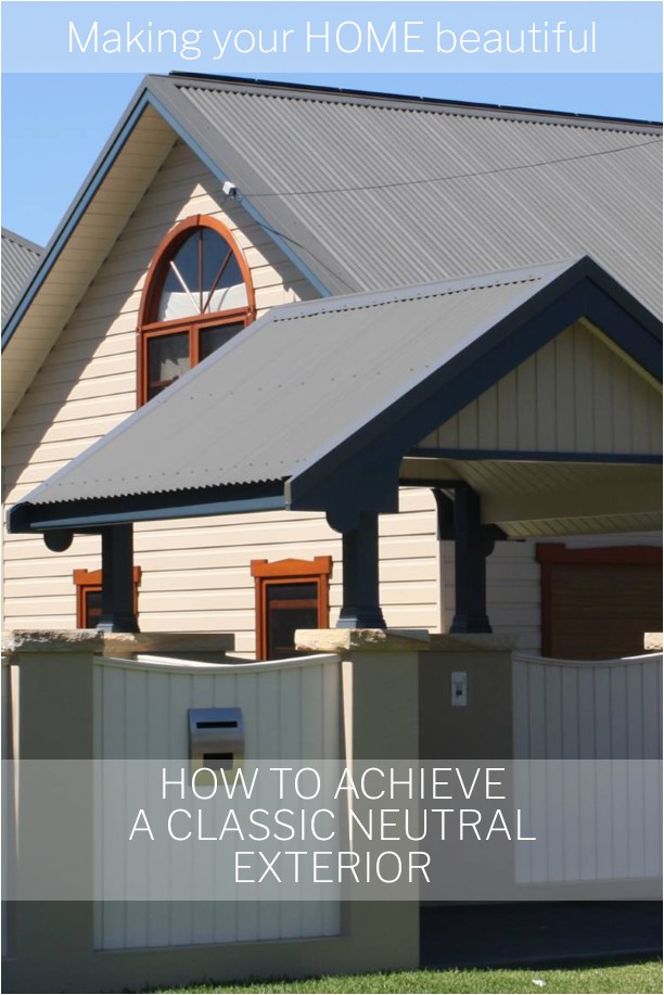
Why opt for a classic neutral exterior scheme
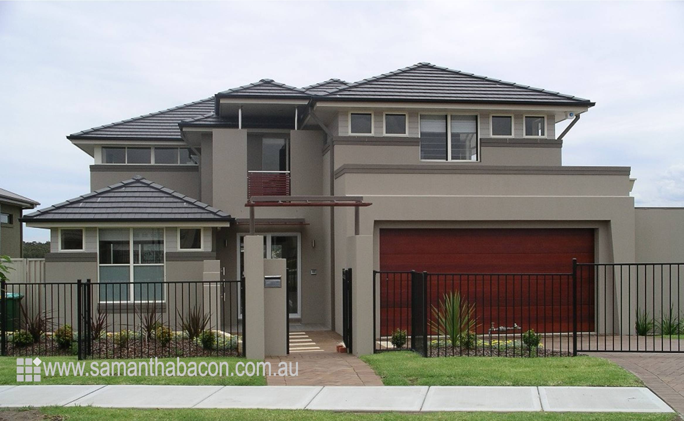
About 15 years ago a local builder asked me to design an exterior colour scheme for his new display home. We wanted to achieve a classic timeless appeal for the property as it was important that the house remained contemporary and relevant for as long as possible and so I opted for some warm neutral brown grey tones – the quintessential neutral exterior palette.
I knew at the time that this colour scheme would be a classic but I really hadn’t appreciated quite how enduring it would be. There isn’t a week that goes by that I am not asked about these colours and they are still as popular today as they were 15 years ago. This really is a great lesson and one that I often relate to clients as re-painting the exterior of a house can be very costly and this is really only something you want to undertake every 15 years or so.
Don’t be alarmed though, my blog is not all about being safe with colour but for those of you who like a time honoured classic, you can’t go past an exterior neutral scheme like this one.
Sounds great – but how do I achieve a neutral exterior?
Of course, a colour scheme on one house cannot always be translated successfully to another.
Quite often the appeal of a wall colour is enhanced by a contrasting trim for the fascia board or window corbelling. Without this the colour may be dull and uninspiring.
A roof on one house may be dominant and add to the scheme or it may be a skillion style that you don't really see.
The art is in pulling it all together so carefully consider what has to be painted on the exterior of your home and finishes that can't be changed before translating a scheme directly to it. Remember that even though the exterior scheme is neutral, it will have a subtle underlying colour that may not be quite right for your location.
A neutral exterior is a monochromatic scheme – this is how you do it
I am sure you have walked into a neutral interior scheme that doesn’t quite work. This is not because there isn’t any colour, the problem lies in the fact that there isn’t enough tonal contrast or textural difference in the scheme.
The same principle applies for a neutral exterior scheme.
A monochromatic colour scheme is simple yet can be very striking and successful. Take one colour, or in this case a neutral tone that doesn’t have an obvious underlying colour. Perhaps it is a stone grey or a taupe grey/brown and then use lighter and darker tones of this. The greater the contrast between the tones, the greater the impact on the look.
Have you ever seen a professional fandeck or colour Atlas that a colour consultant or interior designer uses? If so you will appreciate the many different tones available of just one colour – it is certainly not a boring array to select from.
Three points to achieve a classic neutral exterior
1) So you have a selection of twelve or so different tones in front of you from almost white to a very dark interesting brown/grey – what do you do with them? Firstly, and this may sound obvious but so many people don’t do it, take the colours outside into the natural daylight. Colours look so much lighter outside and the grey in the neutral begins to get washed out.
2) Secondly, remember that all neutrals, greys, browns or whites will have an underlying colour, some more than others. Often the lighter the tone gets – the more of that colour you see. Now hopefully if you are standing outside, you will see that an off white that you think will look great on your exterior trim may end up being a brilliant stark white once you are outside and may not be the look that you wanted to create at all. So you may need to select a colour for an exterior scheme that looks quite dark and grey but in fact will show as off white outside.
3) Finally, ensure that you leave a gap of two spaces in the fandeck between the tones for each area that needs to be painted. For an interior decorating scheme, two tones that sit side by side in the fandeck may work but for an exterior scheme they will appear exactly the same. You need to take into account the natural bulk of the building and the shadows that it creates on different elevations and you will see that two similar tones will just be wasted. A tone that you chose for your window frames which you thought would offer you a lovely contrast may merely run into the wall colour and look exactly the same. Don't forget the colour of your eaves too.
Related: My guide to painting eaves
Related: Why I love a crisp white trim
Don't take monochromatic to the nth degree for a neutral exterior
I must say that with neutral colour schemes like this one, I do really like a traditional dark grey roof, either a glazed and painted terracotta, concrete or slate roof tile. Roof tiles are available in similar brown/grey tones but I feel that this is stretching the monochromatic friendship a bit far!
So use the monochromatic palette for the main body of the house – walls, accented weatherboard areas, fascias and corbelling and a simple dark grey roof to keep it interesting.
A neutral exterior must have texture
Remember what I said earlier about a neutral interior scheme falling a bit flat? Often this is due to the lack of different textures in the room.
Therefore, don’t forget that natural timber or stone will truly enhance this type of colour scheme – like a piece of fabulous costume jewellery for a little black dress, these are the perfect partners for a neutral exterior.
If you are currently building, renovating or just painting the exterior of your home then you will find my comprehensive exterior checklist invaluable. Sign up to my Free Resource Library for this and other e-books which you may find helpful. I will be adding each month to the library with lots of free e-books and checklists to help you with your renovating and building projects. Sign up free here
If you are still confused I also offer an online colour consultation service to help you choose your colour scheme. You can have help with just one colour or I can put the whole look together for you from photos, plans and phone conversations. All the details are here.

Follow me on Pinterest for lots more ideas and inspiration to help you find the perfect neutral exterior.

Other neutrals that are so popular for exteriors are white and black and I have two other posts that you may find useful if you are considering painting the exterior of your home.
How to find the right white for your exterior
Don't paint your house black until you have read this
Is your favourite neutral grey? If so you can read more about how to use it for your exterior project here:
How to select the right grey for your exterior
Hi Samantha,
I came across your blog from searching google for answers!! I am desperate!
I have 24 sample pots and still can’t decide. I am after a sophisticated
grey for a modern rendered home, I thought I finally found the colour (Dulux
Colourbond Dune), the painter has done the big front wall of the house, and
now I think it looks beige!! My driveway and front fence is Domino, my roof
and facia is black and my eaves white, my windows are black and I am getting
a new front door which I also want to paint black. Am I on the right path? I
really want a sophisticated grey (not very dark) that is not going to have
too much hues of green, brown, yellow, blue, red or purple. Please help.
Thank you. Maria.
Hi Maria lovely to hear from you! It sounds to me as though you need more of a true grey for your house rather than one that will be too brown. Dulux Stepney is a warm grey that is not too dissimilar to Colorbond Dune but knocks out the brown element. This colour is also slightly darker which I think your house needs to balance the black elements. Otherwise something like Dulux Timeless Grey may work as this is more neutral again but also a cooler grey and this may end up too stark. Have you tried one of these two yet? Hopefully not! But I do recommend you paint a large board with two coats to compare against what your painter has done so far on the front of your house. I hope this is helpful Thanks Samantha
Hi, we’re renovating our home, it’s time to repaint the roof,
our exterior rendered walls are Dulux Linseed (planning to go similar lighter colour like “set in stone”one day)we have new white windows, timber main door, surfmist garage door, & faded woodland grey roof interested in repainting in a more lighter matching colour with slight beige tint any recommendations for tile roof colours except surfmist since will get dirty easily?
thanks George
Hi George you could look at Colorbond Gully, however you need to also consider your gutters and fascias and it all depends a lot on how much of the roof you can see and the style of house etc. Hope this helps Samantha
Hi Samantha
We have just started building our dream home and I just wanted to sure up my colour choices before we get too far into the build. Would you mind giving the following colour combination some consideration please…btw so far the bricks have been chosen and are underway…
Bricks- PGH Alloy (majority of the house), with some sections ie around the garage, fireplace as PGH Slate bricks as a feature. We have also incorporated sections of linear board and were thinking Surfmist (possibly 1/2 strength). Roof and gutter- Colorbond Basalt, with Surfmist fascia. We thought the garage door would work well in Colorbond Dune as it is similar to the Alloy bricks but will contrast with the Slate. I’ve tried a number of colour selection apps but none give a true indication. Would really appreciate your opinion. It’s going to be a large house.
Forgot to mention we the windows are Monument…thanks ?
Hi Danielle I think this all sounds OK but unless you want your linear boards to be really stark white I would probably just stick with Surfmist. Once outside this is very light and half strength will be really bright. You might just like to do your eaves in half strength surfmist as colours when horizontal appear twice as dark. If you are sure that Colorbond Dune works with your lighter brick then this could work for your garage. You haven’t said what your front door is and often people match this to their garage. You also need to consider your downpipes – perhaps if Colorbond Dune is a good match to the majority of the house you could go with this and that will help to include the garage in the scheme. Otherwise you might like to consider Surfmist for the garage door to tie in with the boards? Lots of options but the main thing is to get large sample boards painted up of the colours you want to use and prop them up next to the brick, view in different lights and this will give you a good indication of what you will end up with. Good Luck! Samantha
Thanks so much for your prompt and thoughtful response Samantha. The front door and posts supporting the entry portico will be timber. Hopeful you don’t think it will be too busy?!? Will definitely be tying the down pipes in with dune garage door but will give some thought to your suggestion of surfmist. Thanks again. Really appreciate your expertise.
Hi Samantha
Just bought a house wich is classic cream with heritage green trims . Not my style as its been this colour for 30 odd years was thinking of changing the colours to colorbond Dune with colorbond wallaby for the trims. I need to be carefull as where I live we get a lot of red dust.
Im trying to update it but keep a country look. What do you think
Thanks
Hi Natalie I think that a combination of Colorbond Dune and Colorbond Wallaby makes sense with your location and they certainly look really nice together. You might want to perhaps lighten the eaves though with an off white – I’m hesitant to say to bring in too much white with the red dust but I think perhaps a little to give the house a lift would work. Hope you like the end result – a big change from Cream and Green! Samantha
Hi Samantha ,
Thank you for your wonderful blog & ideas. It is very difficult to determine what will look good once it is built. I am currently building a home in Port Macquarie and love the light nutural colours (browns, creams, grey tuft etc).
I have made numerous appointmens with our building company (who have been wonderful) and changed the ideas three or four times but I am still worried that the exterior colour scheme doesn’t look right.
We went with Stonecrop Render, Surfmist Colorbond roof, windows etc and DECO Casuarina Wood garage door and large front door . I am worried that the combination of colours will clash. I have looked at them in natural light and in the house and something doesn’t seem right. I was wondering if we need to change the render or garage doors for the colour combination to work. Our interior designer has said that it looks great. But I think there is something wrong with the colour combination (possibly the colour of the door or render?). Could you please let me know if there is something small we could change to make this exterior facade fit the Costal or Bali beach look. It is our first home and I don’t have much insight when it comes to colours. Any help would be greatly appreciated.
Kindly,
Belinda
Hi Belinda My own house has Dulux Stonecrop render and I love it – I painted it over 10 years ago and I think if I was to re-paint, which is actually on the long list of jobs to do – I would just use it again. I partnered it with creams but Colorbond Surfmist will look lovely and fresh with it. It may be that the Deco Wood Casuarina is putting you off? I think it works and will look good but perhaps you would prefer something a little darker like Deco Wood Natural Chestnut? This is a browner, more neutral and less orange timber look colour – perhaps look at a sample of that to see if you like it better? These dark timbers would certainly be suited more to a Balinese look. I hope this helps and that you love your first home!
Thank you Samantha, I feel much more at ease now. The render itself is lovely, and I’m much happier with the darker combination. Good luck with repaint 🙂 and have a wonderful year.
Hi Samantha,
We are planning a coastal home with colourbond roof.
We are considering Wallaby but are a little concerned it will be too brown. We were thinking to match the fascia and gutter to the roof and have the garage door either match the roof or be a Knotwood Timber ( I have a bit of a thing about lookalike materials but the contrast looks nice).
Will have a 1200 timber front door and the portico posts will be rendered with timber at the top.
The remainder of the house will be rendered and bagged with some use of weathertex.
We were thinking Dune for the windows, but it seems a little on the brown side of grey for the render as well, so need some advice on a render colour that would make the wallaby look a little less brown and more grey, but still go with the dune windows.
Also have extensive back decks on 2 levels and are having powder coated balustrades with perhaps timber top rail. Would you match these to the wallaby? It seems like a colour that can disappear a bit so thought it may be OK.
Cheers Jo
Hi Jo-Anne Colorbond Wallaby is a nice colour, definitely warm but with enough grey to be sophisticated. It’s also one of the Ultra steel colours if you need that for near the ocean. Dune also works well with it for windows. For your render, you may want to go a little lighter if you have a coastal look home and this can look great with the timber accents on the house – perhaps an off white like Grave Couloir Double which is one the New Zealand colours from Dulux – it’s actually just a nice off white but without the glare of true white. It really depends so much on the type of look that you want for the house and how much contrast you would like to see so perhaps a sample pot of that could be a start? Wallaby would certainly work for the balustrades – you look through and past dark colours so these work well for balustrades. good luck – the house sounds lovely! Samantha
Hi Sam, can you help me please ? I am lost with all these greys. I have a basalt roof and monument gutters can you suggest a nice grey to go on the weatherboard ?
Hi Marlene Colorbond Basalt is one of my favourite roof colours as it is a great neutral – not too dark and really goes well with a range of other neutrals. There are hundreds of options for a grey – it really depends on whether you want a light or dark weatherboard, the colour of your windows and fascia and whether you want to see a contrast. So it is really difficult to give you some definite advice. A great neutral exterior grey is Dulux Timeless Grey – not too dark or too light, it is a nice cool neutral that works well on exteriors but really you need to consider the overall look you want for your house, the amount of natural sunlight and the other elements but hopefully this is a good starting point for you? Good luck!
Hi Marlene,
I was wondering if you could please give me some advice, my head hurts! We are building a double storey home 1km from the beach and have Colorbond Wallaby as the roof and gutters and surfmist on the facia. The eves will also be painted surfmist. We have dark grey (storm front windows from Jason’s Windows). I am worried about the render colour. I was thinking paperbark textured render and I was wondering if it would be to dark? Have you any suggestions. It is hard to find houses with the wallaby roof colour as it is a newer colour. The house render was going to be one colour for the top and bottom. Any help or suggestions would be appreciated.
Kind regards, Tracey.
Hi Marlene Paperbark is just a warm creamy off white so will be very pale on the house. I don’t think it will be too dark but it really depends on the effect you want. Yes it is too dark if you envisaged a crisp white house, but if you wanted a more neutral grey/beige etc then it is probably too light. So firstly you need to think about the effect you want to achieve and how much variation you want to see between your windows. Colorbond Wallaby is a great roofing colour and as you have surfmist on your fascias then you break it up and prevent it from being too much of the house scheme. This does also depend on the style of roof – do you see much from the street – are there several layers or just one, is it a pitched roof? All of these will make a difference. Wallaby goes well with a lot of colours as it is very neutral – a lovely warm grey/brown. so firstly decide whether you want a light off white house or a darker one and remember that if you go with paperbark you are introducing a soft yellow to the scheme. I hope this helps your aching head a little! Samantha
Hi Sam,
Needing to repaint my timber home in the country, in a bushy tree setting. It’s currently an oil stained from many owners ago and has a headland (red) colourbond roof, its double storey too.
Needing a colour suggestion for the timber walls including window trims, something to lift it and the double garage metal lift doors.
Your thoughts appreciated.
Hi Tash the colour you select for your exterior will depend on the type of look you want for the house. Do you want it to nestle into the bush or make a statement. My advice would be to use an understated grey neutral for the walls – something with a green base like Dulux Greenwood and then give the house a lift with lighter trims and eaves – Dulux Livingstone Quarter is a much lighter version of Greenwood. However it all depends on how dark you want the house. You will need to get some good advice too regarding covering a previously oil stained exterior as you will need a good primer and undercoat but your paint supplier will be able to guide you here. This is just a thought as the possibilities are endless but start by thinking about the mood you want and depth of colour and remember that a trim needs to be quite different to stand out. Good luck! Samantha
Hi Sam,
I am struggling with what colors to choose for my house extension, l have a red brick home/red tile roof but am adding a weatherboard extension, lm thinking of a basalt color bond roof & lm really liking the Palladium Silver Pearl powder coat range for the sliding doors & windows. Do you think the silver trim will be ok with the Basalt roof?
What color would you recommend for the weatherboards & guttering ?
Regards
Tracey
Hi Tracey silver windows definitely work with Basalt and as this is the roof colour I would use this for your gutters too. For your weatherboard extension you might like to use a white to keep the look simple and this will pick up the white in your red brick mortar or you could go with a really dark option and something like Dulux Baltica which is a darker version of Colorbond Basalt would look stunning against the silver windows. A shale grey fascia with this would work too. It all depends though on the link you want between the original house and the new one. Dark colours make the house smaller and less obvious and light colours larger and will stand out more. Hope this helps and double check any colour you choose on a large piece of board next to your original house to see how they tie in together. Sam
Hi we have terracotta/red roof tiles and are currently rendering our house. I was thinking of colourbond dune for the walls, vivid white for the timber windows. I am stuck for the gutters and garage door – monument or woodland grey? Any help would be extremely appreciated. Thank you
Hi Patricia all sounds good. Colorbond Monument is completely neutral whereas Woodland Grey has a touch of green but is slightly lighter and softer. Do you have any other elements to consider – fencing, balustrades etc. which may help you to make a decision? You can go either way as both will work but I think I might lean towards Woodland Grey – green is a complementary colour to your roof tiles but if you want something absolutely neutral then Monument will be the way to go. I hope this helps you to make a decision Samantha
Hi Samantha.
We are struggling with our garage colour choice! Roof, gutters and eaves are Surfmist. Window surrounds are white gloss. Front door and posts Merbau wood. Bricks are PGH “Tigers Eye”. We can not decide whether to match the garage to the Surfmist roof or add a little more depth and slight contrast by having a Dune garage door? Any guidance or suggestions would be wonderful! Still deciding on a render colour also.. leaning towards a grey/green-eucalypt colour?? Thank you and regards. Narelle
Hi Narelle I think that your garage choice has to tie in with your render colour too so you need to decide this first. Surfmist is a safe bet to tie in with all the other trim colours and will look great with a grey/green. I wouldn’t really consider adding Dune into this mix but it does depend on what you decide on for the render. Good luck Samantha
Hi Samantha
We are renovating and close to time of updating exterior. For budget friendly we want to work with the roof but keen to modernise and lighten. The roof is a dark sandy colour maybe close to evening haze. We were thinking surfmist for walls and monument for guttering and posts…..maybe a dark grey for doors??? we have a updated white silver grey interior. also should we use one of these colours for driveway and porch and patios….your thoughts will be golden?
Thanks in advance
Lisa Mitchell
Hi Lisa this sounds good – I like the idea of a smart dark grey for the doors and then replicate this for driveway, hard landscaping etc. Samantha
Hi Samantha, have just found you through Google 🙂
We have a painted brick house. Trim is a charcoal grey, windows are primrose and at the moment the brick colour is Dulux mango.
My husband is retired and wanting to paint the brick walls himself – a very big job! He has been doing the windows slowly and feels like he can do the bricks as well.
Issue is getting a colour that will go with the primrose but not look dated.
Would appreciate any suggestions that you may have.
Thanks
Kerry
Hi Kerry If you want something more modern you could look at Dulux Gnu Tan which has a yellow base and goes really well with charcoal but is a nice brown neutral. I’m not exactly sure of the effect you want – light, dark etc. but this might be a starting point for you to look at – Remember paint as large a piece of board as possible with a sample pot to see what you think out in the open. I hope this gives you a start and that your husband doesn’t get too exhausted!! Samantha
Hi Samantha,
Thank-you for providing a wonderful service. We are building a “Hampton” style house and I am not sure which way to go with the roof. I can’t decide between Colourbond Basalt or Colourbond Monument. I have decided to go with Surfmist for the Gutter and Fascia. Weatherboards will be Surfmist. Rendered areas will be Dulux Silkwort. Windows – White. Garage Door – Surfmist (I will clad the garage walls with a walling stone). Front Door – Dulux Black Caviar.
I’m leaning towards Basalt for the roof but am not sure. Your opinion would be greatly appreciated.
Kind regards,
Renata
Hi Renata both of the Colorbond colours that you are looking at will work but I also feel that leaning towards Basalt will be preferable as it is less heavy and certainly suits a softer Hamptons look – I hope you enjoy your lovely new home Samantha
Hi Samantha,
We have a two story Edwardian and I’m after something not too grey with the warmth of brown. I’m thinking Dulux Ancient Ruin Or White Duck with Vivid white for the windows but still need a trim color. Can you suggest something? It is current the cream Brunswick green combo with a red roof. We will be replacing the Red roof in the next 12 months To steel but I need a replacement for the green. Thanks!
Hi Liz Dulux Ancient Ruin is a warmer and darker tone that White Duck which will be quite light so you need to consider which you prefer as a starting point. Also consider the colour roof that you will replace the red with and your front door colour needs to be considered. Also, do you have black railings or any other highlight feature? You need to consider all of these before you can decide on a trim. My feeling is something dark like Monument but it depends where the trim is and the eventual roof colour etc. Hope this is a start Samantha
Hi Samantha.I was unsure what colours would look good on a weather board house with timber doors windows posts etc.roof is shale grey gutters and fachia woodland grey.also trying to blend in with paperbark and woodland grey shed.thanks Melissa
Hi Melissa The colour really depends on the tonal depth that you want on the house. I love the earthy tones of Dulux Gnu Tan with timber and this also goes really well with Paperbark and Woodland Grey but you need to consider firstly whether you want light or darker weatherboards. A light colour will make the timber stand out more and the house appear larger and a darker colour will make the trim blend in more and give the appearance of a smaller house. You also need to consider whether the house is in shade – is it surrounded by a verandah etc? Basically you need a lovely simple warm neutral to go with the timber and paperbark so look at Gnu Tan as a starting point and go lighter/darker or greyer from there. I hope this gives you a starting point! Samantha
Hi Samantha, would it be possible to find out the neutral colour that was used on the two storey house with the timber garage door. I just keep returning to that photo for some reason so i would like to get a sample.
Thanks
Tristan
Hi Tristan the colour is Dulux Shipwreck but be careful not to just translate this to your house – you will need to do up a large sample board and look at it on your house – it is also affected by the colours that go with it. Hope this helps Samantha
Hi Samantha, thanks for the reply. Ok i will get hold of a decent piece of cardboard and try it out. The house is an early 70’s brick. Not sure on the description but its a just an average house. We have had the roof repaired and re done in monument as well as the gutters and facia boards, and now the small roller door for the garage. The eaves and window frames are done in Dune so we were looking for a colour that will blend with these but also add a bit of impact if thats a way to describe it. Would it be possible to send you a photo to get an idea on your thoughts or can you suggest something from what i have mentioned. Thank you very much for taking the time to reply as this is becoming a nightmare to select the correct colour and we have the renderer starting next Wednesday.
Ps i dont mind painting the windows and eaves again if you think you have a better match for the monument.
Thanks
Hi Samantha, hoping you can advise me I am building and have selected monument for the roof, windows, garage and front door colour. Exterior render colour dulux is tapestry beige and stone pillars on the front verandah are boral country ledgestone in the aspen colour. Do you think I should have a second render colour or alter any of this?? Inside I was thinking dulux beige royal with vivid white ceilings, skirts and architraves and monument internal doors. I’m open to your suggestions! Thanks in advance Donna
Hi Donna It all sounds really great. I especially like the idea of the dark internal doors which I think will be very effective. I am not a fan of using different render colours on exteriors unless there is a real reason to do so. For example, you can introduce a darker render on pillars, porticos or corbelling etc but you already have the country ledgestone to provide a point of difference. You can sometimes add a darker colour to a perimeter wall but generally I like simplicity. Unless you have a different substrate like weatherboards I don’t see any reason to introduce a second render colour on the main part of the house. Hope you love the end result Samantha
Thank you so much for your reply Samantha…I feel more confident now with my choices it’s just nice to get that reassurance from someone with your knowledge! I hope the end result is exactly as it is in my head!! ?
Could you suggest an exterior render colour for large two storey house. Roof is Monument tile, windows and garage doors Classic Cream, dark timber gables and dark silver aluminium shutters on verandah. Dune looks pink against windows. Needs more depth than Dune but still neutral. Would Stepney or Malay Grey work with the dreaded yellow classic cream and silver shutters or can you suggest something else.
Hi Samantha, we are planning on building our new home soon. We already have our block and have built our shed, the shed colour is Surfmist roof and walls with Windspray gutters and roller doors. I really had my heart set on Surfmist and Shale Grey but changed to Windspray because our future neighbors used Shale Grey on their new home. I am now regretting not using the Shale Grey. For the house can I do Shale Grey roof,gutters and roller doors and Surfmist render and windows ? There is also a portico that can be a feature. Would I need to bring the Windspray into the house as well? Or am I better off just sticking to the shed colour combo? I had planned on having a subtle neutral colour scheme.
Cheers
Debra
Hi Debra I certainly wouldn’t let your shed dictate the colours of your house, particularly as these are all soft greys so you are not changing to a completely different colour. Colorbond Shale Grey is far more neutral than Windspray which has an underlying blue/green hue but they are all cool greys and whites so it should be fine and I imagine the shed isn’t attached? Once you have your landscaping completed I think it will all work together and it is important that your main house looks the way you want it to. At the end of the day, you could always paint the Windspray garage doors on the shed! But even some large statement pots in a colour similar to Windspray and plantings that are silvery green/blue in your garden will link the two nicely. Good luck! Samantha
Thank you so much for replying Samantha. There is a house pic floating around that I absolutely love, I think it is called the Straddie at Coomera? It pops up everytime I google anything about Shale Grey or Surfmist. I feel so much better now thanks to you .
Cheers
Debra
Hi Samantha
Please help with my colours
I have my heart set on surfmist for roof gutters and fascia
The other colours we have chosen is monument for Windows roller door and front door need some colours for render and portico
Our garage will be set into hill with stair leading into house so we have 4 rooms sitting on top of a garage all street level and steps leading up to front door
Head hurts can’t decide
Thanks Lyn
Hi Lyn in selecting a colour you need to consider the red bricks and whether you want it to blend in with these tonally or be much lighter or darker. Also with selecting a colour you need to think about whether you want your windows to contrast or to blend in, do you want a light and airy house with the windows well defined or more of an urban trendy dark look. These considerations will help you to get a starting point which is what you need because there are so many options. If you have no idea it really is worth considering these points first to pin down the look you want, perhaps collect some images from Pinterest and then get the help of a local colour consultant who will be really worth the investment if you have absolutely no idea what you want. They will come with lots of samples and ideas. Good luck! Samantha
Hi Samantha
We are now considering
Surfmist roof gutters and fascia ( would u do the gutters different colour or leave the same )
Rendering in Dune
My husband thinks we should do monument Windows ( I’m not sure about hi lighting the Windows but he just hates aluminium Windows and thinks we should hi light them ? )
Second render for portico we can always pick later
We just need to select the roof and Windows now so builder can order
I’m open to any colour selection
Help thanks again
Lyn
Hi Samantha
I have an established home and am looking to add roller shutters on the outside. The walls face East and are a limestone brick with cream mortar. The roof and gutters are dune. The fences are paperbark and the window frames are charcoal. There is a limited choice of surf mist, classic cream, paperbark or jasper. My husband would like paperbark but I’m worried everything will look a bit too beige, especially as the windows are very large. I’m leaning towards surfmist, as I don’t really like paperbark inside, what are your thoughts?
Regards
Jacqui
Hi Jacqui my initial thought is to use Paperbark as you have that in your fence and you do have a limestone brick. However as you also have Dune and Charcoal on the house I think you could get away with the Surfmist. The Paperbark is a definite creamy yellow – as you can see from your fence and this will bring more of this colour in to your overall scheme. I have Paperbark on my house – it’s an established house too and would be a fortune to overhaul it all – but I do like it as it is soft. However it sounds to me as though you are craving something a little fresher. Perhaps get a sample pot of Surfmist paint and paint a large board in two coats and hold it up to your brick – a bit fiddly but I think worth it to see if you like the effect. Good luck Samantha
Hi Samantha, I’ve loved reading thru these Q&A colour schemes, was hoping someone would have ours but doesn’t appear so. We have a brick house with aluminium blinds which are classic cream and our gutters are paperbark. We also have a colourbond fence which is the same cream and paperbark. We are rendering next week and can’t agree on a colour. I am leaning towards something like limed white or male but concerned they may be too similar to the blinds/fence and make the house one big block. Would a grey tone like dieskau or parita be better for some contrast?
Hi Kelly I would actually lean more towards the greige neutrals. These are the ones that are stone coloured and actually are very neutral. Male and Limed White are a little pink and I don’t think will go with the cream and paperbark while the Dieskau and Partita are a little lavender. I also think for your render you need a little bit of depth so that it doesn’t look like a block of colour. So perhaps look at the neutral stone colours like Calf Skin, Oyster Linen, Linseed etc to see if these appeal to you both. You will need to paint out large samples and place them next to your cream/paperbark trims and remember that if the aspect of your home is north or west the sun will really wash out these colours. I would even go a bit deeper maybe but it really depends on the overall effect that you want for the house. Good luck!
Hi Samantha,
I’m trying to decide a colour to repaint our salmon-coloured painted brick home (with bright blue gutters!). The roof is an old tiled roof, probably used to be blue but now weathered to be pretty close to the new Colorbond Wallaby. I’d like the house to sit easily in our garden – lots of eucalypts and natives – and am attracted to heritage colours generally. I was planning on repainting the gutters in Wallaby and was thinking a wall colour similar to Colorbond Paperbark, with whitish/cream window trims (and perhaps a maroon front door). Our to-be-built outdoor entertaining area/shed would then be the same combination of Wallaby and Paperbark, with natural timber and/or sandstone elements. Do you think this would work? Given the advice in your excellent article, I’m worried the Paperbark may be too light? Or not the right undertone?
Thanks in advance,
Kate
Hi Kate well, I can’t think why you would want to replace salmon walls and blue gutters!! Seriously though, I think you are absolutely on the right track with the colour combination you are looking at, particularly if you want to keep within some heritage colours. Paperbark can be a little light and in some lights the underlying yellow will show through more than others but it really depends on the overall look that you want, the aspect and size of the house etc. If you are having cream windows, you may not see enough of a contrast with Paperbark in which case a colour like Dulux Gnu Tan may be preferable to give you a touch more depth but be very similar to Paperbark. I hope this helps! Samantha
Hello Samantha!
I have a problem in deciding on aluminium window colorbond colour which will look good both inside and out. My choice is between Dune and Surfmist. The new house has Hawthorn bricks downstairs and fascia upstairs. I do want a warm light feel inside and feel Dune, which looks lovely outside, will be too dark and “purpley” inside. On the other hand, Surfmist looks better inside but rather stark and stand out too much outside and perhaps less up to date ? We are having mouldings around the windows which would be in another colour and am guessing this could detract from the actual window frames making them not so noticeable. I guess I would describe what I would like as classical. To date it is early stages but the window colour has to be settled asap. Most grateful indeed for any feedback you can give! Liz
Hi Liz This is one of the biggest problems with aluminium windows. There are suppliers who do double sided colours but as you can guess, they are right at the top of the market. However I think with your house as you are having external mouldings around the windows, it is more important to select the colour that you want to work with inside as these mouldings will certainly disguise the external frame colour. Both of these window colours are popular choices and I usually tell clients to be guided by all the other selections on the house – gutter, fascia, garage door, fencing, balustrades etc. as they all need to tie together so this may help you to make a decision. You can of course hide window frames inside with shutters, or disguise somewhat with drapes and blinds. Personally I think that Surfmist probably has the longevity for inside. I selected White Birch about 12 years ago which was really popular at the time, however I now think it is way too yellow, but being an off white it is easy to disguise and still works with a lot of white choices and doesn’t pin me down as much as a distinctive grey would. At the end of the day, you can usually date when a house was built or renovated by the window colour so you just have to go with what works the best for you now. It’s not a conclusive answer unfortunately as there really isn’t one but I hope this has helped you to weigh up the pros and cons of each choice. Good luck Samantha
Thank you so much Samantha, particularly for the quick response. Your experienced comments certainly provided me with a direction I didn’t have. Think one needs to build a house before building a house!!! Liz
Dear Samantha I have so enjoyed reading through your blog and replies! We have a 50 year old house, which we’ve recently repainted in Dune with Woodland Grey trim. At the time we couldn’t afford to replace the roof (colorbond Eucalypt, I’d say), but we are now in a position to do this which is great. I’m stuck as we are on the low side of an established street, in a bushy area north of Sydney, so there’s a lot of roof on show from the street. I’m thinking of a windspray (or possibly wallaby) roof and repainting all the trims and fascia white? Or even surfmist to lighten it up, but does surfmist go with dune? Any help would be so appreciated! X
Hi Mel So glad you are enjoying the blog and finding it useful! I know the north of Sydney well and many of the streets in these beautiful bushland settings don’t always get a lot of light but I know they get a lot of leaves! I would therefore strongly recommend a darker colour as Surfmist would look good for 5 minutes! Colorbond Wallaby is a great colour to put with Dune and it is also very practical and this would be my choice. By lightening up the trims with white you create a barrier between the two warm tones – which could be all a bit the same without this, and also lighten up the house and define the edges well. I think this is a winning combination good luck Samantha
Thank you very much for your time Samantha, Wallaby it is!
Mel
Hi Samantha!
I am painting my weatherboard home in Taubmans Quill. The roof, gutters, fascia and Dow pipes are surfmist.
Question: what colour should the window trim be? Dulux Natural white? Vivid white? I’m really confused! Please help!! 🙂
Thanks so much! Katrina x
Hi Katrina I am not usually a fan of introducing other whites and would normally recommend going with Surfmist however Taubmans Quill has almost the same tonal value as Surfmist so you won’t see much of a variation – Taubmans Quill by the way is a beautiful neutral – well chosen! Why don’t you stick with the Taubmans range and use Brilliant White – it is a lovely crisp white but has a warm base to complement Quill. Do try it out though on a sample to make sure you like the contrast and effect. Good luck Samantha
Hi Samantha, we are renovating our home and quite confused over exterior
colour scheme. House bricks are monier hawthorn originals with blue/ white, windows are paperbark aluminium, we need to decide on new colorbond roof and paint colour for timber above and below windows. We think roof and gutters should be the same and quite like wallaby. Your expertise would be greatly appreciated.
Thanks from Sue
Hi Sue I like the gutters to be the same as the roof too as it tends to hide them more but it does bring the roof colour down into the house scheme. I like Wallaby but you would need to look at a sample of it with the bricks as it is important to get a bit of contrast or the house can look like a big blob. I do know the bricks but in situ they can look quite different. You also need to consider your fascia and eave colour – did you want the fascia to be the same as the windows – ie Paperbark? This can work well. I hope this helps! Samantha
Hi Samantha, yes we do like the idea of paperbark facia and perhaps antique white under eaves. We now think basalt roof and gutters would be a better contrast with our brick and the weather boards above the Windows paperbark and boards below windows a grey colour also.
Do you think this would be the best choice.?
Muchly appreciate from Sue 🙂
Hi Samantha, thank you for sharing all your knowledge!
I’m struggling to decide on garage door colours.
It’s a South facing house, thinking monument roof and gutters, surfmist fascia, a taubman beige ash render, woodland grey window frames and dark brown brick feature pillars. Our front door will be a wood stain (unsure of colour yet). So no idea what colour garage door… a decowood? Or lighter like surfmist or match the roof to monument? What would you recommend?
Also do you think those colours will work?
Many thanks Sarah
Hi Sarah garage doors can be tricky as often they take up a large degree of the front aspect of a house but often are a second thought re colour. So you really need to consider how much you want the door to stand out. Certainly if you are having a timber front door then it makes sense to go with a Decowood garage door as this will link the two and will settle nicely into the render colour. You don’t have much Surfmist on the house so I’m not sure about this but it certainly would give the house a nice lift which it may need facing south. Monument could look smart but it may be a little heavy. Perhaps try out an online model and colour in the areas and see the effect you prefer. It’s a difficult one – I think I am leaning to Decowood – only because the timber look goes with everything and it keeps the look simple….good luck! Samantha
Thank you so much for taking the time to reply!
Thanks again for replying Samantha. I’m struggling with a roof colour.. would you go basalt or darker monument with the pepper bricks and beige ash rendered pillars? Again South facing but I don’t know if that matters.
Hi Sarah – difficult to say as both would work – you just need to consider how dark you want your roof to be. Remember that lighter colours will reflect the heat so Monument is the least effective for a hot summer but the most for a cold winter! Monument is very smart as it is so neutral but it is very dark and rather than thinking about what will work with the brick colour, consider the overall look of the house to see which one you find the most appealing. I hope this helps! Samantha
Hi Samantha I want to paint my pergola area which is currently a light grey/ blue colour . It has a rendered wall and joins a small shed. The home has a pebble wall in white , a grey stone garden box and sandstone pavers. The bricks are red and windows are a bronze colour. It’s all a mixture of tones and I want to choose a colour that can flow. I’m thinking of painting my shed monument and for the pergola and gutters either dulux dune or dulux surfmist. What are your thoughts?
Hi Steve I think you are on the right track although I would discount the colour Dune and stick to more neutral tones of Surfmist and Monument. I actually like the idea of using Monument as your linking colour for everything as it will give a nice smart touch and will work well with the red brick, white pebble wall and red brick. You look past dark colours so this often works well for posts/pergolas etc to stop them standing out too much but it really does depend upon the effect that you want Samantha
Hi Samantha, I am currently rendering my house and need to choose a colour which will work with primrose windows and red roof tiles. Currently my guttering is green and I’m deciding whether to paint this red to match the roof tiles or going with something different like woodland Grey. Please may you give me your thoughts on the colour for the gutters and also what colour I should use on the render. I would like the house to look modern and not have the primrose stand out so much…
Thanks Carly.
Hi Carly Firstly if you paint your guttering in red then you will bring more of the roof colour down into the house scheme and I think it is probably better to not highlight this too much if you want more of a contemporary rather than a heritage style. You are on the right track with Woodland Grey – it has a green base but is very neutral and I find seems to go well with most colours. For the render I would stick with something very neutral that has a warm base to tie in the Primrose windows. A good standby is Dulux Stonecrop – a lovely neutral that is not too grey and will therefore still work with the Primrose. Try a sample first on a piece board to check that you like it and also that the depth is what you are looking for. This will change quite drastically depending on the aspect of the house and how much sunlight you receive. I hope this has given you a starting point Samantha
Hi Samantha,
Thanks for your great ideas! My partner and I are in the process of building a new home. The whole house will be rendered and we’re having trouble picking the right greys.
Our windows, gutters and garage door are Monument with charcoal roof tiles.
We originally liked Dulux Ashlite or Flooded Gum but then thought it may be a little dark as we want to have a darker colour as a feature for our portico area.
We then wanted Ashlite half but are unable to use that as our builder only has a certain list of Dulux colours which they will use.
I’ve since purchased numerous sample pots and painted them on large pieces of cardboard. We’re trying to get a true grey and avoid anything that shows blue, purple or brown/yellow undertones.
Dulux Smokebush was our next choice but it seems to throw too much purple in certain light and Dulux Brume tends to come up slightly blue.
We’re currently down to Rampart, Pipe Clay, Powered Rock or Putty for the main and feature either Malay Grey, Caps, Homebush or Whakarewarewa (Stepney is a fave but not on the list)
I like Shale Grey but unfortunately that’s not an option for us and wondering whether I should get a sample of Tranquil Retreat.
I would greatly appreciate your opinion as to what you think may work best for us!
Many thanks,
Sarah
Oh dear Sarah! You certainly have been through the range and must be exhausted by the process! You are on the right track with looking at Dulux Tranquil Retreat if you want a true neutral – Dulux Milton Moon is just one tone darker and very similar to Shale Grey – but what I would say is that this will be very very light outside. You could use Timeless Grey or for something a little darker, Teahouse with it as an accent. These are true greys but if you wanted a warmer option then Whakarewarewa and something like Dulux Putty could work. You have been looking at such a range that you need to go back to basics and think about the look that you want for the house. Do you want a warmer softer grey or a sleek contemporary neutral grey? Do you want the main colour to be very light or more of a mid-tone with a darker accent for the portico? Consider these first and then it will be easier to pin down what you want. For example Pipe Clay, Powered Rock or Putty all work as a great exterior colour but are more neutral stone colours rather than true greys and they are all different tonal strengths. Shale Grey/Milton Moon is a very definite grey and will offer a completely different look. Both work so you need to decide the look that you really want and this should help you to decide. I know it is difficult too when you don’t have the full range of options and your builder won’t use the colour you want but hopefully you will get there! Samantha
Thanks for your reply Samantha. I definitely think I’m confusing myself with all the colours I’ve looked at!
I think I’m leaning more towards a warmer grey and do want the main colour to be fairly light (without looking white) due to the Monument windows/garage and darker roof tiles. Our rental at the moment is Surfmist quarter – that is far too light for my taste and gets quite dirty.
Do you think Rampart would go with one of the darker colours I mentioned for the accent and not look too pink/purple? I am liking the look of Pipe Clay, Powered Rock and Putty too.
Thanks again, I really appreciate your advice!
Hello Samantha, I hope I’m writing in the correct section. I so glad to have literally stumbled across your website as I have a dilemma with my exterior paint colour also. I really hope you maybe able to help me as I have read so many positive responses from previous comments.
A couple of years ago we built a colourbond shed – roof Surfmist and trims only- Dune. We have recently built a new house -colonial cottage style, with the roof Surfmist and to work/compliment with the visible from the road shed, I’ve trimmed the house gutters, and down pipes in Colourbond Dune also. I’m thinking I may paint the front verandah posts Dune but keep the facia board white so it’s not too strong with Dune. I’ve painted all the verandah timbers Lexicon Half and I’m intending to paint the wooden window architraves Lexicon Half. At this stage the front door will be a dark “black” colour although not chosen yet. Can you please suggest a colour for my weatherboards? I’ve tried Dune Half and Dune Quarter but I don’t like Dune quarter. I’ve looked at a few other paints (with grey bases) but I’m concerned about too much brown in the Dune although my husband doesn’t like grey because there so much of it out there now. Is there a nice brown/grey blend which would work with Dune? Thank you in hopeful anticipation of your assistance.
Regards Teina
Hi Teina I think that a colour like Dulux Grey Pebble could work for your weatherboards as this goes well with Surfmist and Dune. It is a couple of tones lighter than Dune but won’t have the pinky tones that Dune in lighter shades gets. Despite the grey in the name it is just a really nice neutral – perhaps try a sample of this one to see what you think? Good luck Samantha
Dear Sam,
I write on behalf of my Mum who is trying to choose colours for a new built.
“I hope that you would be able to help me arrange colors around the a
Austral brick of ASH that I have chosen.
I would like the colours of paperbark jasper and surfmist but I don’t know how to arrange them for the best look for the windows, roof, fascia etc.
I know you advise that a grey roof is preferable to a brown. and also wondered if I could put the jasper or paperback as the gutter and was thinking of using one of those colours for the render which is just on one front wall to tie it all in with. I hope you can solve my dilemma thank you.
Kind Regards
Bronwyn
Hi Bronwyn Paperbark and Jasper are both rich warm colours while Surfmist is a cool white so I wouldn’t mix these together. Surfmist is a great colour for windows as it gives you more flexibility when you are decorating inside as Paperbark really ties you into a creamy, warm colour scheme but Surfmist is a little more neutral. I like guttering the same as the roof so that it disappears and then possibly Surfmist on fascia, eaves and windows to keep some consistency. Your render colour really needs to tie in with the brick and the best thing to do would be to get a colour card with some options and place it next to the brick at the Austral display centre. This is the best way to see what you like with it, knowing that you have a nice simple neutral in Surfmist to work with. I hope this makes sense and narrows down your options a bit – just remember to go with either a warm or cooler scheme to make it work. Samantha
Thank you very much for the advice. I never considered the window colour on the inside which is helpful as I will think of that. Actually the display house that I liked the colouring on had the surfmist and had a grey roof and I think maybe ironstone gutters. I could probably put monument gutters and maybe a greyish render as the render on the display was near white which I wasn’t keen on with a surfmist garage door. Could I put a monument garage door as well. Thank you you have been most helpful.
Hi Bronwyn – glad you have found the feedback helpful. You certainly could use a Monument garage door if you are using Monument trim. It is a very smart neutral and will work well with a deeper colour render. I hope you love your new home Samantha
Hi Samantha,
I am loving all your q & a’s.
I would love some advice please.
We are building our first home which is our retirement home.
2 stories, large pivot door and entrance way.
all our views of the water are out the back.
We have the surf mist roof, eaves and guttering and fascia and white windows.
Now we have the dilema, as looking at the different colors, tints etc, i am totally confused.
The house is a modern/contemporary style.
Could you please suggest some alternative for us.
I appreciate your help and look forward to your reply.
Thank You
Denys
I would greatly appreciate your help
Hi Denys With your basis of Surfmist you have lots of options to choose from so it really depends on the look and feel that you want for your new home. As it is two stories, you probably need a colour with some depth but as it is by the water you also will benefit from a light and airy feel. Being contemporary in style you may like to look at some of the greys that are currently popular. Perhaps something like Winter Fog which is on the latest Dulux colour card might work – I like it as it is very neutral – not too cool or too warm. You also need to consider your garage door and whether the house has weatherboards or render or both. Weatherboards are more forgiving for colour as they have the shadow line. You might want to employ a colour consultant who would come to see you with all the samples for you to try – I think if you have no idea about which way to go this could really be of help to you. I hope you love your new retirement Samantha
Hi Samantha
I hope you can help me find my way through my dilemma…
We have a 1920 brown brick and terracotta tile cottage. The gables, fascias, wooden trim and picket gates been painted the same rich cream, golden wheat and bronze olive for the last 30 years and I am very ready for a change! I would like something more modern but which still honours the features of the house.
I am thinking a warm neutral stone with less contrast than we have currently. I have tried a number of sample pots and quite like Dulux Self Destruct and Stonecrop. I’m having trouble with a lighter colour that is not too high contrast. I’ve tried Toasted Almond but it is much lighter than Self Destruct.
Are you able to suggest an alternative? Should I still be looking for three colours or is that old fashioned?
Thank you for any advice you can provide.
Hi Anne I don’t think Dulux Self Destruct and Stonecrop are old fashioned – I have them on my own house!! They are classics and in fact Stonecrop is in the latest Dulux brochure as an exterior favourite. I like them as they are not too grey, they are warm without being too yellow and they just work. They will certainly knock out the golden wheat and olive tones and bring a contemporary touch without looking out of place. I hope this helps and that you love the updated look Samantha
Thank you so much for your reply, Samantha, and for generously sharing your expertise.
Do you think there is enough contrast between Self-Destruct and Stonecrop if we use just these two colours on the exterior, or should we do everything the one colour?
Hi Samantha,
I’ve just stumbled over this thread, and I’ve been interested in your ideas on Woodland Grey! Just wondering if you have any advice? We have a browny/red smooth brick and thinking of replacing the gutters/fascia and painting the roof in Woodland Grey. Do you think the red brick will make the WG appear ‘dark brown’. The green/brown in WG is coming through loud and strong when up against our brick!
Thanks for your blog!
Rebekah
Hi Rebekah I always see Woodland Grey as a lovely neutral grey with a green base but in certain lights in can appear brownish, although once put next to a true brown, it appears to be very much a grey. With roofing you need to consider the pitch of the roof, how much sunlight it receives and whether you continue the colour into the gutters and fascia. Often you can only really see the true colour of the roof from these trim elements. If you like the idea of a Woodland Grey roof you could paint it this colour and add guttering in Woodland Grey but then have your fascia in a different colour – perhaps one that ties in with your window colour and this will give you the smart grey roof but a different colour next to your brick. I think the Woodland Grey will be OK but there are so many elements to bear in mind that you can only really tell with a very large sample placed at the roofline. I hope this helps Samantha
Hi Samantha, i am so pleased I found your blog and great ideas while trying to find inspiration. There are just too many choices, my brain hurts.
My house is rendered, currently painted Arizona White, black tiled roof and white window trims and creamy coloured panel lift garage door. I have a rendered wall with stained timber slat panels on the front boundary as a fence, currently painted Iced Coffee half strength. Both the house and fence need repainting.
I like Limed White and White Duck, but can’t choose, and am conflicted about painting the house and front wall/fence the same colour. Should I use different strengths of the same colour for some contrast or can you suggest something else? I live in Brisbane, the house faces east. Thank you, Mari
Hi Mari You need to understand the difference between Dulux Limed White and White Duck – the first has a warm pinkish undertone while the second has a cooler neutral greenish undertone. Both will appear white though on the outside and you must paint samples of both on a large piece of board and hold it next to your garage door and window trims as they will be different whites – it sounds like your garage in particular is quite creamy – and you must assess it next to these elements. Sometimes when you have a house painted in a white it is nice to have some contrast so a rendered wall/fence in a colour 2-3 tones darker than your chosen white could work. But the most important thing to consider are the other off white elements of your house that are not being painted as whatever you go with it must look right next to these. Good luck! Samantha
Thank you so much Samantha for your helpful advice. Think I will paint the garage door as well so it all looks fresh. I do like the idea of the front wall in a darker tone.
Hi Samantha,
Awesome to see a blog helping with this!. My wife and I have just started our first home and have been looking at exterior colours for way to long! to date we are on a monument roof and guttering with basalt walls and timber look garage door along with timber pole on façade and front door. Just worried the house may be to dark the house front is reasonably basic with no real opportunity for multiple wall colours. Any comments would be appreciated.
cheers,
Chris
Hi Chris
It all sounds great but my feeling on reading through too was that it may be too dark! You should certainly paint your eaves a nice off white/soft grey. You haven’t mentioned your window colour or fascia choice – perhaps this could be a way to add some lighter tones – possibly silver grey or surfmist? It also depends on how large the house is – a smaller house can certainly get away with these dark colours more than a very large house and clever landscaping can help. You also need to consider your front door – will this be timber to match your garage or could it be a lighter paint colour? Don’t be put off as a dark statement can really be effective but just be mindful of ways to introduce a lighter contrast if you think it is all getting too gloomy. Good luck! Samantha
Hello Samantha,
We are in the process to build our first home, the facade is a balanise style so it will have a little bit of wood at the front (caoba color) also the front door and garage door will be caoba color.
So we are thinking on monument for the roof and gutters, surfmist for the fascia and here is where we are a bit stuck, which wall color would go good with this? We were thinking on something light and have the windows also in monument. What would you suggest?
Thanks!
Hi Peter I think you need something with some depth to work alongside the Caoba and create the Balinese style. A warm taupe neutral springs to mind for this tropical look – something like Dulux Fudge or Natural Stone for something lighter – I wouldn’t recommend much lighter than this but it depends on your house and the aspect. This is really just a suggestion so you must paint up a sample or even better get a colour consultant in to help you find the right colour and depth to get the look that you want. Good luck! Samantha
Hi Samantha
We have hit a roadblock re exterior and really hope you can help. Roof and gutters are wind spray. At this stage suggested render in shale grey with linea board feature in windsray. We are stuck on what white for Axion. Terrace white has been suggested. Thoughts?
Hi Claire Terrace White is lovely – it has a blue base and works well with those two colorbond colours – double check on a large piece of board to ensure that you are getting enough contrast between all the elements as it will depend on the amount of natural light the house receives. Samantha
Hi Samantha. We are building a small house in the country- colour bond roof, linea board and some custom orb cladding. I was thinking of surfmist roof, dune custom orb, lexicon white for most linea with some smaller areas of linea highlighted /painted in wallaby. Not sure about whether to have black or white windows. Do you feel those colours will work. Thanks so much. Jane
Hi Jane This all sounds good – Are you continuing Surfmist for your gutters and fascia? I think this would work well and I like the idea of white windows as the black against this light look may be too definite but it does depend on the look and style of the house and whether you really want to define the windows. My only thought regarding the Lexicon White for the linea boards is that it is very white and may get dusty in the countryside? Perhaps select a white that is a little more forgiving? But again, it depends so much on the style of the house, its location and the look and feel you want. Good luck! Samantha
Hi Samantha. We rendered and painted our house three years ago with Woodland grey gutters and Self Destruct house . The front gets a lot of sun so I’m not a fan of the yellow it throws off and I’ve never liked the woodland grey. We just renovated the front of the house so I wondered whether I change the gutters to monument or change the house colour to a different colour all together. We can’t move forward with Reno til I decide on colours. Maybe Ngu Tan would get rid of the yellow. I’ve paid a colour consultant but she tells me to leave it. I’m just not happy. Grace
Hi Grace Often the lighter the colour, the more yellow it throws off. I think though that as well as going a touch deeper you should consider something a touch greyer too like Dulux Prairie Dust or to knock out the yellow a bit more Dulux Barnfloor – you should look at samples of both to see what you think. Monument is a great neutral Colorbond colour which is a good choice if you don’t like Woodland Grey however with these neutrals I also really like charcoal blue – if you are painting the gutters you can just use this or you could look at Colorbond Ironstone – I like the charcoals with this scheme but you do have to like a touch of blue! Hope this helps Samantha
Thankyou for your advice: we are definitely thinking of monument: we will be trying samples of Barnfloor and Prairie Dust:
Thanks again
Hi Samantha. We are building a rendered home in the country. The roof and gutters are basalt.
the garage door and window frames are surfmist. I am thinking about painting it dulux limed white, but am unsure if it will be too pink. I am also not wanting to have a colour that shows the dirt too easily. Do you have any other suggestions?
Robyn
Hi Robyn you are right – Dulux Limed White will read just a touch pink and I think with Basalt and Surfmist you should stick to something more neutral – possibly Dulux Grey Pebble or Dulux Heifer for a little more practicality – these light neutrals go well with your chosen Colorbond colours and are still warm but they knock out the pink. Hope the build goes to plan Samantha
Hi Samantha,
We are building a house behind a house arrangement with a 4m wide driveway down the side of the front house to the back. New house at rear has colorbond basalt roof, gutters and roller door. Shale grey fascia, front door and similar silver/grey window frames. Brick is cream. I’m stuck on the driveway and fences. Shale grey or basalt fences? Cream or grey concrete driveway? Nice green 0.5m landscaping to soften along fences. I like basalt for fence and cream driveway with green plants between but afraid we aren’t bringing in the shale grey enough?? Your advice would be a great help thanks
Hi Tom I always like fencing in dark colours – you need them to be an unobtrusive backdrop. They are a necessary evil and not something you make a feature of. Cream driveways are lovely – but do show oil stains. You don’t need to worry too much about the shale grey fascia as this is tying in nicely with the window frames so is doing its job there. Hope this helps! Samantha
Hi Samantha, Struggling with the the selection of 3 exterior render colours (estate requirement) for the house we are building . Option 1) Shipwreck, Russian Toffee and Monument. Option 2) Linseed, Aumbry and Beige Royale. Our roof is the colour Barramundi and windows are white. Love the contrast of the white windows against the shipwreck or the linseed. Which one would you suggest ? Or do I need to swap the colours ? The main render will be either the shipwreck or the linseed and the other 2 colours will be one for the balcony and smaller pillar and the other for the wide/large pillar . Your suggestions will be a great help. I absolutely love the pic on this blog. What is that contrast colour with the shipwreck render ? If I can try that with the shipwreck, which third colour will you suggest ?
Thanks, Priya
Hi Priya I love both of these exterior neutrals – Shipwreck is slightly warmer and also a bit darker than Linseed so this is a consideration when choosing between the two. A trim in Aumbrey gives you a lovely rich brown or the trim in Monument is a smart off black. The trim with Shipwreck in this photo is Congo Capture with Camel Train on the weatherboards. So you need to decide how dark you want to go with your render and whether you want a brown or dark grey trim and this should help to focus on which one will work the best. Hope this helps you with your decision. Samantha
Hi Samantha,
I’ve got a front door dilemma that I hope you can assist with! I’ve been scrolling through these comments looking for my answer but alas, we might be a little unique!
We’re building a weatherboard heritage style home on our farm in country Victoria. We have a zinc roof, Colourbond Wallaby gutter with white (pearl white) aluminium fascia and windows. We are currently tossing up between Dulux Oyster Linen or Dulux Apparition for the weatherboards – (I like Oyster Linen / husband likes Apparition. I had in my mind that I would paint the front door in Wallaby and also the base boards below our veranda so that we had a few levels of this colour. I love Wallaby but there’s not much of it because its just on the gutter so I wanted to try and feature it in a few other places. The Dulux colour consultant said it would wash out on the front door and that we should paint the front door Monument (or alike) to make it stand out. Our painter thought Monument would be an odd choice because we haven’t featured black anywhere else. I was looking at the houses on The Block and some of them featured a black front door while still having very neutral weatherboard colours!
Please help! The advice is so conflicting! (I love your opinion on the Oyster Linen VS Apparition too!).
Thanks kindly
Donna
Hi Donna Firstly I would opt for Oyster Linen – the depth of colour just won’t be there with Apparition and even Oyster Linen will still be light but against the Pearl White will look lovely. The beauty with your front door is that it is the opportunity to do something different and the trend now is for people to even paint their front door a colour – so a duck egg blue or a scarlet red without there being any other colour on the house so I tend to agree with your colour consultant here. You will probably have other black accents, maybe pots? But in any case it really can be a stand alone colour or darker tone that anchors the house and makes the entry important. You can still use Wallaby too but remember that not everything has to match perfectly. I have a post about Making an Entrance and colourful front doors that you might find useful too. Good luck with the house – it sounds lovely! Samantha
Hi Samatha
We are looking at painting our (new two storey home ) render and weatherboards either Dulux White Verdict Half or Dulux White Duck Quarter, do you think we could do Monument gutter, Surfmist Fascia and Basalt Roof ? Or Just Basalt Gutter to match with Roof ? We have a few accents like balcony/ Finials/ Door Frames that will be Lexicon Quarter.
Appreciate your input!
Thanks
Kelly
Hi Kelly just a word of caution here as you are looking at a lot of different whites. Dulux White Verdict Half or White Duck Quarter will just look brilliant white outside and will make the Surfmist on your fascia look a dirty grey and against these with a Lexicon quarter trim you won’t really see a difference. You must look at colours outside. I would recommend matching your gutter to your roof so either opt for Monument or Basalt. You need to consider whether you want a contrast between your trim (Lexicon Quarter) and you wall and if so go for a darker white. Surfmist would work or a greyer white and you must paint large sample boards with two coats and view outside to get an appreciation of how it will look. Hope this helps! Samantha
Hello, we are just about tearing our hair out trying to make a decision on the exterior plaintiff of our house! We are thinking Colourbond Basalt for the roof The window frames are Classic Cream and we don’t want to repaint them. But what colour for the rendered walls, garage door?? We have tried Hogs Bristle 150% but in bright sunlight it is very bright. Colourbond Paperbark is another thought? Can you please suggest a colour that will blend with the window frames that is light and modern. The house is almost cottage style. Hopefully, you can help as this dilemma is causing great angst!
Hi Pamela You really need to go quite a bit darker for exterior colours than you anticipate. Classic Cream is a tricky colour to work with so it is good to stick to a neutral with a warm yellow base. Paperbark would work or for a touch more depth which I think you can get away with is Dulux Gnu Tan. See what you think of these two – they both work with Colorbond Basalt and hopefully will leave your hair intact! Samantha
Hi Samantha, we are about to render our 1950’s brickveneered workers cottage which we have renovated internally. It is double fronted and a single story so only a small area. We have a shale grey roof and fashia. We will also render our fence and update our front door and garage door. What colour render would work. I love shale grey but I don’t think you can have roof, fashia and render all the one colour. It seems to me we can only now paint the render something lighter than shale Grey. I have used Fukui Natural white internally. Would that be an option. I got think a light roof and a dark house colour would work. What would you recommend. We are north facing.
Hi Alix you can go either way with your render – light or dark it just depends on the look and feel you want for the house. A light colour makes the house appear bigger which may be a plus for you and you need to consider your garage door too – are you painting it or does it need to be a Colorbond colour? The render colour choice will also depend on whether you wanted something very neutral or with some base colour. Dulux Timeless Grey works well with Shale Grey for a darker render or Terrace White for a very light off white. Remember to consider your aspect and how much sun the house gets and to also think about windows and doors – paint up large samples to ensure you get the colour right and the look you want. Hope this is a good start for you Samantha
Hi Samantha
I enjoyed reading through all the posts on this page. I am considering painting the exterior metal walls of my transportable home in Taubmans Quill. I like the idea you suggested to an earlier question about using Taubmans Brilliant White for the window and door frames. I was wondering what you might suggest as a complimentary colour for the guttering, lower skirting, verandah poles, window ledges and front door. Is Beige Ash to close in colour to Quill to use?
Thank you for all your great advice
Tricia
Hi Tricia great to hear from you, I think that Taubmans Quill will look lovely with a white trim but I think that Beige Ash may be too close in tone – it really depends on the amount of light that you receive. You might be better off going one tone darker with Wistful Willow which will add some definition – but do check with large samples if you can as it will depend so much on the light. Glad you are enjoying the advice and hope you are happy with the look of your home. Samantha
Hi Samantha
We are about to render our 1960’s yellow brick home. We are also rendering our pool wall. We are thinking of Surfmist for the house colour and perhaps dulux Grey Green for the pool feature wall. Do you think these colours work? We will likely go for a Basalt or Monument roof down the track (fencing is monument). We thought of doing a grey pool wall but wanted to try something different!
Hi Emma Sufrmist is a great house colour as you end up with a contemporary white but with a touch of grey to ensure it is practical. I don’t know the colour Grey Green or do you just mean a grey green from Dulux? I like to consider the pool colour when I am doing a pool feature wall and tie this in so if you have a blue pool, it is better to go with a blue grey so consider the pool colour including any mosaic trim etc when selecting a colour for here. I have used greens though for green and aqua swimming pools and they look stunning, especially with white. Either Monument or Basalt will work – just bear in mind Basalt has an underlying blue but is a lovely roof colour if you don’t want to go too dark. Good luck! Samantha
Hi Samantha
We are looking at painting our exterior windows, woodwork and guttering in either monument or woodland grey. We are having trouble deciding. We have red brick older 70’s house that currently has a eculpytus green on trim. Wanting to modernise the house but also wanted to choose something that doesn’t date.
What are your thoughts? Could I send you a pic of bricks?
Thanks
Sarah
Hi Sarah Colorbond Woodland Grey is a classic – colours come and go in this range but this one has always been a favourite and seems to go with everything – this would be my pick, particularly as you have a green on your trim. I don’t review pictures unfortunately as this becomes a consultation which I may offer in the future – hope this helps for now! Samantha
Hi Samantha,
We are renovating our nineties home which has windarah brick (light and dark tones) with light greyish mortar. What I am finding it difficult to work with, are the two large alluminium primrose windows at the front of the house that go all the way down to the ground (also I used white venetians -however when looking from the outside they look like they are greyish/light blue).
Between these large windows there are the security double doors (also primrose with black mesh) these open to a porch area which has a 90cm height brick wall on the side and front of porch and there are two columns. (the porch floor will be done in timber)
The house faces south and the the garage is on the right side of the house and is next to the high black side gate.
It has been suggested I use a dark colour for the roof due to the condition of the tiles so I am considering Monument (also considered Deep Ocean) for the roof/ gutters/columns and maybe surfmist for facias/ area above the porche (gabled) area above the garage (gabled) and garage as well, but not sure how it goes with the primrose. I am trying to find a colour that will work with the brick / monument / the black and the primrose, but a colour that is not too yellow and that will keep it all neutral. I am on the right track? or will I need to paint the primrose windows and security door to achieve a neutral look? if so what colour?
I also have two downpipes at the front of the house (left hand side of left window and right hand side of right window and have no idea what colour to paint them.
Hi Samantha,
We are renovating our nineties home which has windarah brick (light and dark tones) with light greyish mortar. What I am finding it difficult to work with, are the two large alluminium primrose windows at the front of the house that go all the way down to the ground (also I used white venetians -however when looking from the outside they look like they are greyish/light blue).
Between these large windows there are the security double doors (also primrose with black mesh) these open to a porch area which has a 90cm height brick wall on the side and front of porch and there are two columns. (the porch floor will be done in timber)
The house faces south and the the garage is on the right side of the house and is next to the high black side gate.
It has been suggested I use a dark colour for the roof due to the condition of the tiles so I am considering Monument (also considered Deep Ocean) for the roof/ gutters/columns and maybe surfmist for facias/ area above the porche (gabled) area above the garage and garage as well, but not sure how it goes with the primrose. I am trying to find a colour that will work with the brick / monument / the black and the primrose, but a colour that is not too yellow and that will keep it all neutral. I am on the right track? or will I need to paint the primrose windows and security door to achieve a neutral look?
I also have two downpipes at the front of the house (left hand side of left window and right hand side of right window and have no idea what colour to paint them.
Please help!
thanks
Denise
Hi Denise Firstly for your roof, my choice would be Monument as it is a lovely neutral dark grey and isn’t bringing another colour into the equation – Ocean Blue will look very blue on your house and will throw everything. The Primrose windows are a bit of a problem as they are so large. I actually painted my aluminium windows. I employed a professional as they use a product that adheres to the aluminium which then doesn’t easily scratch. It might be an idea to just do this rather than find something to work. You will also really need to consider your brick and mortar and it is difficult to suggest something here. My advice would be to paint the Primrose to work with your fascia and columns – this really will solve the problem and give you a nice updated look. Good luck! Samantha
Hi Samantha,
Your post and the comments below have been so helpful!
We are building a brand new duplex home (with my brother in law). It’s two story and obviously modern, but in an area with more traditional homes.
We have monument roof and gutters, monument garage, a timber feature under the porch and some medium grey bricks around the garage. Black windows.
And of course I’m stuck on the wall/render colour! It is so hard…I think I’ve tried about 15 sample pots. We’d like a grey but I think maybe a grey/beige so it’s not too cool and doesn’t throw blue…
We don’t want it too dark, or too light…
After much deliberation we finally settled on colourbond dune…and it’s done…but I think it’s wrong!!! You know hat feeling where you can’t breathe everytime you look at it? That’s me at the moment ? it just looks too dark…hubby says we can repaint it but IF we do that I want to make sure it will be better. I don’t want to get it wrong twice.
I would so appreciate your advice on what might be a better colour for us given our other colours.
Thanks!
Hi Christie I am sorry to hear you don’t like the look of your home – Dune really isn’t a very dark colour, particularly against the grey and black that you have. Are you sure it is the depth of colour you don’t like? I wonder if it is the warmth and underlying pink tones that are clashing with your brick? If you liked Dune but want something a touch lighter and a bit greyer you could look at Dulux Clear Concrete but this is a stab in the dark really and you would need to look at samples – particularly on a large board. If you are going to the expense of repainting, it might be worth employing a colour consultant – one from Dulux is very cost effective and makes sure you get exactly the right look. We really need to get you breathing again! Samantha
HI Samantha, I am loving all your advice!! We’re building a 2 storey home and are using the bowral gertrudis brick on the lower half and cladding on the upper floor painted either taubmans Quill or Beige Ash – monument colorbond roof.. I’m very confused about what window colours to go with, surfmist or white or even dark like monument? then what garage door? arrrgh it too many decisions, I would love you help ?
Hi Sarah You can go either way with your windows but you need to decide on a couple of things – firstly remember that with powdercoated windows you have to work with the colour inside as well as outside. This may help you decide. Surfmist is a great window colour for exteriors but it is quite grey inside and you need to be sure that you like it against the wall colour and palette you are choosing for inside. Monument windows are classy and look great against the Gertrudis brick, however they will stand out more against the cladding. Pearl White is a lovely fresh white and great for interiors but it can be very bright outside – sunglasses bright – it is great for a Hamptons look where people want to use crisp white trim but it depends on the look you want – they will certainly really stand out against the brick. I would then probably match the garage door to the window choice but you need to think about the plan of the house and where it is situated and also the overall look and feel you want for the house – light and airy or more classically neutral. A Monument garage door will look great against the brick and it may be that you can still get away with Surfmist is you want. There really is no right or wrong, just consider these points – inside colour, look and feel and how bright you want the white to be outside. Good luck! Samantha
Thanks so much for the reply, the house is south facing and I would prefer a classically neutral home. If I went a dark window frame, do you think it will look weird with white shutters from the outside? Again thanks for taking the time for all your help.
Hello Samantha! I’ve been reading your blog and your advice is awesome.
Im hoping to seek some exterior colour help as well. Surprise, surprise… haha
So, my partner and I are building our first home in the bush of Tasmania. Long and simple narrow rectangle shape (3 small bed and 2 bath). We are thinking to use colorbond steel Basalt for the roof (or a dark colour other than monument/ black…. many new houses in the area are using monument). The windows will be black however.
We just aren’t sure often main colour of the home. We are trying to keep costs as low as possible in this bushfire zone with still keeping with our style. So the top half of the cladding will be Scion Matrix panels laid horizontally. While the bottom (below bottom of windows) we are thinking rough sawn timber laid vertically (approved for our bushfire rating)- which will stay unstained and turn ashy grey I believe.
So we are just hoping you can provide some insight on a colour for the Matrix style cladding ?My partner suggested Shale Grey which I like, but may be too light? someone suggested it was too “pretty” . Other thoughts we had were Windspray, Wallaby or Dune etc … I’m drawn to greys (not too brown though)
May I also add my partner is actually colourblind so a bit of pressure on me to make our place look good. lol
Thank you soon much for any advice at all.
Emily
Hi Emily Your house sounds lovely – it is very costly building in a bushfire zone but hopefully once completed you will love the location – I back onto bushland too and the additional costs involved are horrendous! Are you using the Weathertex natural cladding – this goes to BAL19 – if so this does turn a beautiful grey within about 18 months. So you need to consider that your house will look different for its first year and a half but you really need to consider the outcome that you want once the boards are grey. I believe that Shale Grey may end up being too light but also too much the same as the boards once they weather. I think Dune will be too brown for you and again quite light – I must say I really like the darker greys with the timber – both when it is in its original state and once it weathers. Remember you can always bring it back to its original look by staining if you change your mind about the way you want the house to look. Wallaby is a beautiful rich grey but again can look a bit brown. You could consider bring the Basalt more into the scheme – this is a beautiful grey with a touch of blue but really pretty neutral. I hope this helps Samantha PS: I come across a lot of colour blind men!!
Hi Samantha,
I’ve only just come across your blog and I really wish I had seen it earlier. We have picked an exterior colour for a Queensland weather board house of Grand Piano as I love that the tones don’t have too much yellow or green. (We have neighbours one side with a light green house and the other side with a very strong yellow house which may also be affecting our paint choice). The only problem is that the Grand Piano looks a little too washed out in the sun. We are teaming it with white trims and still undecided on another colour (dark like Klavier or a lighter colour that will tone in with the Grand Piano). Any suggestions would be greatly appreciated. I’m really struggling with finding the right colour that will not look too washed out in the harsh Queensland sun.
Thanks
Hi Jen It certainly sounds as though you have lots of personality either side of you! Dulux Grand Piano is a lovely colour but it will appear just a light off white outside. You need to consider the look you want for the house – were you trying for a white house or more of a subtle neutral? I think Dulux Candlebark or Linseed will be better exterior colours – similar to Grand Piano, just a touch darker and greyer to cope with that sun. They both look lovely with white trims. Perhaps then bring in a smart dark grey for a front door? Take a look at these two colours and see what you think. Good luck! Samantha
Hi Samantha,
We also have a Woodland Grey roof with Dulux Shipwreck rendered walls! So happy with how it looks 5 years on and after soooo many sample pots!
I would like your opinion regarding our son’s first home though….we’ve selected Colourbond Monument for roof, gutter, fascia and windows. The garage door and rendered walls will be in Dune, as wanted the garage door to blend in as it’s the biggest part of the house. There are two rendered columns on the front porch and have selected Wallaby for the columns and the front door.
What do you think? We were set on a Woodland Grey roof until we saw the security screens that will be installed are not in Colourbond colours! Hence picking Monument to go with black security screens. Appreciate any advice, thank you!
Kind regards,
Kim
Hi Kim I think it all sounds good – Colorbond Monument and Woodland Grey are a similar tonal level but you just knock out the underlying green – as you say, it will go much better with black screens – it sounds like a classic palette which I am sure will stand the test of time! Cheers Samantha
Thanks Samantha, really appreciate you taking the time to answer, especially this time of year!
Merry Christmas!
No problem Kim – have a great Christmas x
Hello how are you I need some help to pick the right render colour for my house the gutters are heritage red and all the windows are primrose I am totally lost and have no idea what to choose thanks joe
Hi Joe I think with these strong colours you need something very simple for the render. Perhaps a neutral stone colour like Dulux Linseed – give a sample of this a try. What you end up with will depend on how much light you receive etc. If you are totally lost then perhaps a local colour consultant could help? Dulux has a good service and you get money back for your paint. Samantha
Hi Samantha,
I have a double storey flat roof fibro house near the beach at the moment is painted in sea coral with a classic cream garage door and tea cake on the windows. I would like something to match with the garage door and was thinking of taubmans wistful willow half strength with maybe full strength on the fascia I have tried quite a few paint samples and am back to square one could you please help with any suggestions would be great. I have recently looked at classic khaki colour I was wondering if cream and green is a bit dated. Your help would be appreciated thank you.
Hi Samantha,
I posted some time ago about our exterior and the painting is now underway. We have two story semi-cottage style with Powered Rock on walls, Black Caviar gutters and front door, and I ended up choosing Quarter Snowy Mountains for the trims but wish I’d gone Half. Do you think Quarter Snowy Mountains will be too stark? I’m seriously considering getting them to go over their white work so far as they haven’t finished yet, but not sure going up a quarter of a strength will be worth the hassle! :0
Also, they’re asking if I want the front door gloss or semi. We’re south facing so I had thought gloss but I don’t want it to be too harsh as we don’t have grand architecture to support anything that looks heavy.
Lastly, we have a picket fence yet to be painted. with the above scheme would you keep the fence all the same colour i.e. wall colour or do posts wall colour and pickets white. I was concerned it may look too broken up as we’re just a little semi so not a huge frontage. Possibly all wall colour or posts wall colour and pickets white.
thanks so much in advance. It’s a bit daunting when the painting is underway!
Vanessa
Hi Samantha.
We have a modern house with zinc allume roof, bull nose veranda and the fence is a rendered wall with horizontal palings. We would like to have a fresh modern look to fit in with a new garage door which is colorbond dune. We are considering White Exchange Half, Terrace White or Casper White for the walls, including the rendered fence wall, with Vivid White or Casper White Quarter for the windows, door and veranda. For the fence palings possibly the same white or alternatively Dune to match the garage door. Would love to have your opinion?
Hi Karen my preference on the whites is Casper White – I think White Exchange Half will be too light and Terrace White too blue against your Dune garage. Then I think go with the quarter of Casper White for the windows etc. Hope this helps – whatever you do – try a sample pot first! Cheers Samantha
Hi Samantha,
We live in Coastal Queensland and are just about to begin renovating the external of our 1980’s style house including replacing the roof, gutter & fascias with colourbond, rendering the walls, adding wooden bifold doors to the front of the house, along with new colourbond carport and timber decking area.
Our neighbour on the left side has mainly rendered Dune with Deep Ocean roof & trims while on the right side the neighbour has brick, red tiled roof with Ironstone trims. So would prefer to steer clear of these colours.
We were thinking that having a Surfmist or Shale Grey Roof colour might be the best option for this hotter climate plus the house is very standard in size. A darker roof would look great but will also make the house look smaller and after viewing many coastal houses the darker roof colours seem to fade quite fast. The windows are anodised silver which we won’t be replacing.
We have been throwing around lighter shades of grey or white for the walls to bring out the wooden doors & decking (eg. Grey – Dulux Flooded Gum & besides Surfmist the white we can’t get right) . There are a couple of areas of cladding which could be used as features with darker tones. eg pitched roof area.
The front fence will also be in Colourbond (probably Shale Grey) with Wooden Posts and Surrounds.
One concern is that there will be a lot of roof area between the house, carport & patio?
We are a bit confused and are open to any suggestions?
Hi Mark and Karen I am a little confused too as it is hard to imagine the house – I would say that you are on the money with a lighter roof and if you are thinking of bringing the grey into the front fence then this might be the way to go for your roof too, particularly as you have the silver windows. The roof choice will also depend too on how much you can see from the road – I suspect that as you are concerned about the roof area that you look down onto your house? You may benefit from using a local colour consultant – renovations can be trickier than new builds and I feel you may need some help to pull it all together. They will bring along large samples of all the popular greys and whites and I think this would help you to make the right decision. Good luck! Samantha
Hi Samantha,
We are building and have a Woodland Grey roof, Surfmist gutters and fascia and Dune on the weatherboards and a glossy black front door. My question is do I continue the surfmist on the door and window trims or go vivid white?
I also have brick columns – what colour should I do this? I can’t change the roof, gutters/fascia or weatherboard colour. Thanks in advance
Jess
Hi Jess It really depends on how much contrast you want between the windows/doors and the weatherboards. Surfmist will give you a subtle change and of course will tie in nicely with your roof trim but if you want a really crisp trim that will make your weatherboards appear darker then Vivid White could be the way to go. My feeling is to go a slightly darker neutral than Dune for the columns – perhaps try a sample of Dulux Champignon – a touch darker and greyer than Colorbond Dune. Hope this helps Samantha
Hi Samantha
We have a fibro beach house in need of an exterior paint, at the moment it is faded classic cream with a bright blue trim. We have colourbond fences which are classic cream with deep ocean trim. My delemer is should we paint to match the fences or go completely different. We are looking at Dune or Solid stone walls with deep ocean trim, gutters etc. We have decking and was thinking about painting that surfmist. I feel we are going wrong trying to blend the deep ocean trim with the deep ocean in the fences. Should we maybe go for wallaby trim, gutters beams etc with the wall colour. Your help would be much appreciated with the house paint and decking, my head is spinning. The more sample pots you get, adds to the confusion.
Ronny
Hi Ronny I think I would try to disguise the fencing as much as you can with plants and then look at something more contemporary for the exterior of the home. Perhaps look at a charcoal trim rather than the Deep Ocean – this keeps to the blue theme but is a much more sophisticated, dark blue grey. Then a nice neutral like Dune could work. Decking in Surfmist is beautiful but very difficult to keep looking good – you will have the mop out daily! Perhaps opt for a charcoal? Just some ideas for you so check out sample pots first!! Good luck Samantha
Hi Samantha
Thank you for your advise. We have gone for Dune 100% for the walls and Wallaby for the gutters and trim and verandah posts. We were thinking going Dune 50% for the eaves but are worried it will look too pinky.
Can you suggest a colour for the eaves, looked at White exchange half? Also we were thinking about Wallaby for the front door but unfortunately there is a smoke colour glass panel next to the front door, I feel it will look odd to say the least, any suggestions.
We are looking at decking colours also as surfmist would be too light.
What do you think about Nile grey for the decking?
Sorry about all the questions. Thanking you in advance.
Any advise would be great.
Ronny
Hi Samantha
I’m in a pickle. We are building a large house on acreage but which is seen from the road.
It has a Woodland Grey Roof and gutter and timber posts at the entry, around the deck and western red cedar gables above the garage door, entry and deck. The windows and fascia are Surfmist as the garage door will be also.
A large amount of the house is weatherboard top section with a bagged brick base up to about 900mm. We have two large gables on the sides of the house which will be quartzite stone in tones of greyish green, and iceblue colour with bits of dark grey/green streaks and is absolutely gorgeous. Sounds like a lot going on doesn’t it? !!
We saw a colour consultant who advised Dulux Viridis for the base brickwork and we have Gamelan on the weatherboards. Up close it looks very blue (Gamelan) and grey (Viridis) but from a distance it has the greeny tone that was needed.
In an effort to change the overall colour of the house , I had bought more sample pots than you can imagine working on the S19 – 21 pages in the Dulux colour atlas but nothing seems to work, so we have decided to leave it as it is.
My question is that we have a bagged feature wall at right angles facing the road between the weatherboard/ bagged brick …. it has been suggested that we paint it and the brickwork on either side of the garage doors (which are in the same plane) …Woodland Grey but I am concerned that on brickwork this will look too dark/flat ……….. what are your thoughts?
I can send a photo if you would find it easier.
Many thanks
Hi Angela I love Woodland Grey on render/bricks. It is a very user friendly dark grey and I feel will help to add to the green feel that you want from your house. I have used this successfully on houses and seen it on lots of properties and I believe it works really well. Good luck Samantha
Hi Samantha
I am so pleased I have stumbled upon your website! I have to decide on colours pretty soon and I am so confused with all the choices that are available. I am really hoping that you can help me,
We are starting to renovate our little 1980’s brown brick house (I think the brick colour is called Coffee). I have my heart set on a Surfmist Colorbond roof and guttering which means that we will probably need to paint the bricks.
What external paint colours will go nice with Surfmist roofing? The inside of my house will have a ‘Scandi-beach’ feel so it would be nice to have something that complements it on the outside, too.
Really appreciate any advice you can give me.
Hi Laila I think you are right with painting the bricks as the contrast between roof and walls will be very strong. As you like the Scandi look then you should probably go for a pale grey or off white for the bricks. Have you seen the work that Three Birds Renovations do? They paint house bricks and really lighten up their houses and the effect is great. So you need to consider whether you want a white, a soft grey and if a grey whether you like the idea of a green or blue undertone or if you want something very neutral that doesn’t have an obvious underlying colour. Consider your windows and garage door too. I like Dulux Lyttleton Half so this could be a starting point but really there are a lot of unknowns so you need to consider everything. Hope this helps with your thinking! Samantha
Hi Samantha,
Thanks for getting back to me so quickly!
I picked up a few colour charts on my way home from work yesterday. I would prefer a white but my hubby doesn’t, so we need to compromise. I am now leaning towards ‘Going Grey’, ‘Grey Frost’ and a lighter version of ‘Steel Dust’ (so far).
It’s hard to know what these colours would actually look like on the bricks, though. I’ll probably change my mind 100 times before I finally decide on a colour (and then I’ll still not be sure I’ve made the right choice!) Fortunately, I have a few weeks yet before the final decision.
The website you mentioned had some great ‘before and afters’ – they do great work and painting the bricks really made a huge difference.
Thank you for your advice. Much appreciated.
Hi Samantha,
What a great page you have I’ve been reading all the comments!
We are rendering our old 70’s brick home and are trying to decide on a color that won’t date..
We have a charcoal roof and new monument window frames and white shutters, house front is South facing.. Fences are monument and side fence merbau as is the step..
My husband likes Dulux Dune and I was leaning towards dulux linseed but worries these will be too light once painted over the whole area..
Were after a neutral colour that will work with the limited colors we already have..
Any Ideas?
Hi Katherine glad you have found the blog useful! Dune is a warm neutral – almost pinky while Linseed throws more of a neutral green/stone colour so you will need to decide firstly which way you want to go. I do agree though that on a large house these colours can become washed out but with a south facing aspect you have a little bit of grace. Perhaps try just one tone darker – Dulux Mud Pack (warm) or Dulux Barnfloor (cooler). Test out large sample boards to get the idea before you commit! Samantha
Thanks Samantha,
I love the mud pack colour, prefer the warm tones. Will give them a try on a larger scale.
Thanks again!
Hi Samantha, we are just about to start building a second storey addition on our brick house. Our brick colour ranges from red/orange to dark grey/brown. We will be getting a new colorbond roof and like Windspray. We want the weatherboard cladding of the addition to be a nice neutral grey. We live in a coastal area and this will go well with the other houses in the area. We are tossing up between Dulux Putty and Dulux Grey Pebble 200%. We are having aluminium windows in pearl white. My two questions are, will both Dulux Putty and Dulux Grey Pebble 200% look good with a Windspray roof and guttering and the brick? What white will work with these colours and the pearl white windows?- this white will be used for fascias, eaves, window trims. We are also having a double garage built and would like a wood look door.
Thank you
Hi Ellie I can’t say about the bricks as they are a bit of an unknown. Windspray is a green/blue grey which is a gorgeous coastal colour. Colorbond Dune is more of a match but the contrast may work in your location. I think though that you might find a local colour consultant helpful as this is such a big and expensive decision! Samantha
Hi Samantha,
Thanks for all your wonderful advice.
I am looking for a colour for the rendered walls of our house and rendered pillars (topped with sandstone) of front fence. House and fence are fairly close together with only a small front garden, so they need to tie together.
The timbers of the front fence are Hog Bristle Half, we have a grey roof and are planning to paint the gutters Woodland Grey or similar (currently a dark red), Hog Bristle Quarter for under the eves. The fascias beneath the guttering are Paperbark as is the current garage door. We thought the window frames were Paperbark too however they appear to be a bit darker. When we tried Gnu Tan as a wall colour on a sample board, it seems to almost exactly match the window frames. The front of the house faces south/south west so is often in shade with just some afternoon sun. The fenceline captures a bit more sun.
For the walls we have looked at Barnfloor (lovely with Paperbark/too grey with our window frames which seem to throw up more yellow) and have just tried Stonecrop Half but not sure that’s going to work. Can you suggest something that is not too dark as it is a large frontage, but might provide sufficient contrast with the frames? We will probably try to put some lighter stonework around the entrance, with possible a Hog Bristle Quarter/Half or timber front door???
Would very much appreciate your input… we are going in circles!
Thank you
Fiona
Hi Fiona I suspect your windows frames are either Stone Beige or Pottery – this was a window colour that was used a lot a few years ago and both are similar to Paperbark. So you need to consider whether you want to go lighter for the render and make the windows stand out or much darker. As you don’t get a lot of sun and your front fence is an off white you could look at Dulux Russian Toffee which is lighter than you have been looking at or go with Dulux Stonecrop to be just a touch darker than the windows – this goes really well with Paperbark and is a very user friendly neutral and will look nice with lighter stonework and front door. the window colour does make it tricky so you will need to try large sample boards next to them. Good luck! Samantha
Hi Samantha
I came across this page and thought you might be able to help 🙂
My husband and I are renovating and I am completely confused about exterior colors. We have chosen surfmist garage door and ironstone roof. But now not sure if they will even go together? Ironstone ended up looking quite blue and I am worried the surfmist garage will be too white (hasn’t been installed yet). We do also have some woodland grey window frames on the new part of the house (which is at the back).
Would you also have any suggestions about what colours we should use for render/gutter/window etc?
I would appreciate any advice – thank you so much!
Hi Marta Ironstone is quite blue but it’s a lovely deep grey blue which looks nice on houses and certainly goes with a Surfmist garage door – the key really is what the rest of the house is – the walls etc. If you want to limit the roof colour then you can do the gutters and windows in Surfmist too – if you do the gutters in Ironstone then this brings in more of the blue but it also does hide them when you match them to the roof. You need to decide on these two – The Woodland Grey frames at the back have an underlying green colour so if you bring these through to the rest of the house you are introducing another colour. I really think with this combination you need a local colour consultant to help you to bring it all together – I hope what I have been able to help with makes sense! Samantha
Hi Samantha, would love some advice please. We have a red/brown blend brick ranch style home on acerage and would like to repaint the exterior including the corrugated roof and bullnose verandah and cedar colonial style windows. We are considering Woodland Grey for the roof, gutters and downpipes, and White Duck for the trims and posts. However, we are not sure what colour to paint the cedar windows that have panels that go right down to the floor and are quite a prominent feature of the house. Any thoughts? Thanks so much! Jane
Hi Jane Generally you will paint your windows to tie in with your fascia/trim and posts. White Duck is a lovely white and as you have a verandah I suspect that they are predominantly in shade? Therefore they shouldn’t stand out too much in this colour. Are you sure though that you want to paint them? You can update the look with the roof, posts and trim etc. and still leave your windows in timber. You don’t necessarily have to go the full way to update the look. And remember that windows don’t take kindly to being painted on one side only as they will start to warp so you need to paint inside and outside if you are going to do this. Good luck! Samantha
Hi Samantha
I am having a timber pergola installed and can’t decide on what colour to have the posts and frame painted.
We have recently landscaped the back yard and have installed fences in the Woodland Grey colour. The house is cream brick with cream window frames. The tiled roof and gutters are black. The backyard gets quite a bit of afternoon sun. The roofing on the pergola is a laserlite in the gunmetal colour so that we still get light coming through to the family room which the pergola will back on to. There will also be a gable at each end and one mid way so when you look back at the house you can see the gable in the middle. The lawn has grass and plants and also some timber features.
Suggestions have been Woodland Grey by the landscaper or Paperbark by the installer, but am not sure whether to go light or dark. If I choose Woodland Grey, would half or three quarter strength work?
Thanks so much
Hi Mel the golden rule is that you look at light colours but through and past dark colours so my feeling is to opt for Woodland Grey. I don’t like to mess around with the strength of it though and if you want a third option you may need to get some colour help. Based on what you have said I would say WG but it is difficult trying to visualise it with the cream house as it may appear too heavy. Sorry I am a bit indecisive but it is probably one that needs to be seen first. Samantha
Hi Samantha
Hoping you may be able to help with my colour selections. We are about to start building our new Hampton style home on an acreage.
I am looking at a grey / white combo.
Definetly have decided on white windows with white reveals.
I don’t want any undertones of blue/purples greens ect, I would prefer a true grey tone.
With the Hampton style would you suggest a surf mist roof or would you prefer a darker basalt roof ?
We have timber decking on front verendah.
It’s all very confusing.
What is your recommendation for grey/white Hampton combos?
Thankyou
Michelle ?
Hi Michelle Firstly, for a Hamptons look, I prefer a darker Basalt roof but you need to consider too whether you want the heat reflection that a Surfmist roof gives you. However, look at any classic American Hamptons house and they have a shingle grey roof. All greys will have an undertone of colour and this will change in the light and on the aspect of your house. I like Dulux Maraetai in either full, half or quarter but you will need to paint out large sample boards and view them around your exterior to see whether it is the look that you want – good luck! Samantha
Hi Samantha,
So glad I found you as your expertise is exactly what I need!
We have a weather board house in a small country town that needs some serious attention – hasn’t been painted in 15+ years. House is on a hill and is an L-shape. It was designed in the 70’s by a local architect. We are planning to use a cladding product as the house needs additional insulation and we think this is the best solution without over-capitalising. As the house is on a hill and has a very flat roof, the roof is not visible from street. Roof is plain silver colorbond (new so not planning to change).
We are trying to achieve a look that is – simple, neat, tidy, elegant …..
We are limited in the colours we can choose from for cladding. Am thinking Colorbond Dune. Looking to use a darker paint colour (as a feature) on a section of rendered wall (about 3.5 metres wide and about 5 metres high) and same colour on a rendered retaining wall (about 3.5 feet high) that runs along the street front (about 8 metres). Want some contrast to try to “lift” the presence of the house without being too bold and out there – small country town :).
What do you think of Accent’s Fox Hound? Enough contrast against Dune? Other options Colorbond Gully or Jasper? Local paint shop suggested a Dulux product called Texture Medium Cover as working well for rendered finishes – any experience with it?
And for fasias would you go with the same darker colour as above, or just do in Dune too? (too dull the same – although “safe”?)
The cladding guy suggested eaves in Dune – maybe half strength. Suggested same colour as cladding, so eaves don’t stand out and look like a dominant stripe around the house, esp. because it’s up on a hill.
And window timber trims (which are already painted) in white (Dulux Vivid white), or Surfmist (not enough contrast – too dull?)
In summary, suggestions for your feedback …………
Cladding – (vinyl product) that matches Colorbond DUNE
Fasias – Dulux to match – Colorbond – GULLY? ……..or ?
Eaves – Dulux to match – Half Strength Colorbond DUNE? …….. or?
Window Trims – Dulux VIVID WHITE? ……… or?
Feature walls (house and retaining) – Dulux to match Colorbond GULLY? ……. or?
Am very much looking foward your input.
Thank you (in advance :))
Alis
Hi Alis You have a lot of points to address here so I will just say a few pointers – Dune is a great exterior colour and I think it will work well. Colours get twice as dark when horizontal so you must go half strength Dune on your eaves – nothing darker than this. Nice to have a contrast on your fascia and as you are considering Woodland Grey for the feature wall this might be an option too. I prefer Woodland Grey to Colorbond Gully with Dune. Or you could go Vivid White with your fascia to match the windows which always look great in this lovely fresh white against Dune. I like the Dulux Texture Medium cover – it should work well. Hope this puts you on the right track. You are absolutely right to check everything outside and then double check with large sample boards – the initial effort is worth it! Samantha
Thank you so much for your input Samantha. I really appreciate your expertise, time and attention to detail. I am off to the paint shop to get some Woodland Grey in a sample pot! I look forward to checking out the sample board in situ. Kind regards, Alis
Hi Samantha,
I took your advice (from earlier responses to people) and checked colour swatches outside in different lighting conditions. Another option for feature wall & fence might be Colorbond Woodland Grey? I am a little concerned it might be way too dark (especially as a solid block of colour?), but out in natural light against Dune, perhaps the contrast would work and not be too dominant? What are your thoughts?
Thanks,
Alis
We’re building a house, and have decided on using the Austral Urban Silver bricks, Deep Ocean garage and front door, and silver framed windows. We had originally thought to do a Dune colorbond roof, but after seeing a sample at the window shop the other day I am very hesitant. The Dune sample looked very brown (not the warm grey I had expected). We prefer to have a roof that is not too dark (CQ sun, trying to keep our energy costs down), so I am now a bit stuck. Do you think a Shale Grey or Basalt roof would be a better fit? Any other suggestions?
I feel that as you have already introduced some blue into your exterior then either the Shale Grey or Basalt roof will be a better fit. You also need to consider the gutters and fascia and with silver framed windows you might like to just use all Shale Grey to tie it all in? There are Colorbond roofing displays around at various hardware suppliers where you can view a reasonably large piece of the steel and this might help you to make up your mind too rather than viewing from a small sample. Hope this helps Samantha
Hi! We are currently renovating 1980s reddy/ browny/ blackish feature brick home in a coastal town in NSW and want to modernise the exterior color scheme . Rendering is out of question due to the features/facets in the brick. Window frames are bronze. Front is facing west and the roof is skillion shape and is quite large and dominant.
Roof tiles are currently painted wheaty cream. I have already painted the garage doors, porch and all timber cladding in Colorbond Dune. Guttering and fascia have just been done in Woodland Grey.
My plan was to do the roof tiles in Woodland Grey, but I scared now thinking it will be too much and too dark. Please advise re roof color.
Hi Miia Colorbond Woodland Grey is a very nice roof colour and seems to work well on lots of houses and it makes sense to continue with this as you have used it on the gutters and fascia and clearly like the effect with the brick? I think it may be a big step for you as you are used to having a light coloured roof and it will be a very big change. I can’t see why it wouldn’t work – often dark roofs can be less dominant than light ones but it is really difficult to say. Perhaps paint a really large piece of board – the largest you can find and place it up on the roof to see if you can judge the effect? Hope this helps Samantha
Many thanks for you advice.
My roof finally gets painted next week and my painter recommends a medium grey, not too dark not too light.
I’m now leaning towards Colorbond Wallaby or Gully. I will leave the Woodland Grey already painted on gutters and if it looks wrong with the roof, will repaint it to match later.
My driveway also will get painted after the roof. Im thinking of using a color similar to Woodland grey there to tie in the trims on house if needed.
What are your thoughts please?
Hi Miia Either will work – Gully has more of the green undertone and Wallaby is a more neutral warm grey – I recommend painting large boards with two coats of each and holding next to your Woodland Grey to see which effect you prefer – it will really depend a lot on the aspect and the amount of light etc. Hope this helps Samantha
Hi Samantha!
I love your website.
We have a large two storey (three storey at back) house currently painted in off white and has a very ‘big white house’ look.
Garage doors are Evening Haze. Thinking of doing the whole house in Evening Haze as I don’t mind the consistent look and love the colour. Not sure if it will be too dark though!
Other ideas are Dulux Apparition, have tested Putty, Greenwood and a range of other colours that are very ‘greige’ but seem to think a more beige look suits the era of our house – early 70s with big arches. Beautiful home and could look even more beautiful but with the right colour.
A colour consultant I had said Beige Royal or Russian Toffee from memory but I wasn’t convinced by her.
Would like your feedback please! Painters are coming in soon.
Thanks
Stephanie
Hi Stephanie glad you love the blog! Dulux Apparition is very close to Colorbond Evening Haze but just a touch lighter, so I think from your comments that this could be a good solution for you. I certainly wouldn’t consider this a dark colour by any means. Try out a large sample on a piece of board and move it around the house to check whether you like it. Good luck Samantha
Hi Samantha!
Thank you for your blog, reading through has been very insightful.
I was hoping you could help me with the colour scheme of our post war house with a non negotiable manor red roof! I’m wanting to move away from the heritage colours and make it a bit more modern. Would surfmist walls and basalt trim work ok with red? I’ve painted a section of wall surfmist and it appears very stark. The other colour I thought could work is dune however the red roof is really throwing me! Any advice or thoughts would be much appreciated. Thank you 🙂
Hi Rebecca The best way to limit the impact of a red roof is to paint the gutters and fascia in a smart dark grey as this takes away the vastness of the red. Basalt could do the trick here. Surfmist is a little stark and your idea of Dune will give you a softer look and will work with the red as it is a warm grey/brown. It looks good too with Basalt and I think will give you an overall nicer look than Surfmist. Try out samples first though – hope it is the look that you want Samantha
Thank you so much for your expert advice Samantha 🙂
Hi Samantha
I’m looking for your expert feed back. I have read all the posts. We have used a colour combination of loft on the roof and fascia, warm neutral colour weather tex on the walls with black window frames and posts, balastrading. Merbau decking on some other villas on the property. The colorbond loft is no longer available. My husband wants monument but I think it’s too heavy so thought basalt would be ok for the roof. But would basalt look good with the warm neutral colour or can you suggest another colour for the walls and roof.? We are trying to not change everything but this our long awaited house 10 years. It’s a 1 bedroom villa near the rainforest North Queensland. Our house isn’t near the other villas. But we do have to build a machinery shed, another villa and spa hut near our house so we would like to carry the colour to those structures for cohesiveness. The house is a contemporary style skillion roof.
Thank you
Yvette
Hi Yvette I really miss Colorbond Loft – I loved the colour and used it a lot, particularly on heritage homes. I think Basalt might be a good solution – it is a mid grey that throws a little blue but this might be better than the heaviness of Monument which is a lovely neutral dark grey but can be very dark and I am not sure it will work in a rainforest setting. The other alternative is Colorbond Woodland Grey which has a green undertone and is just a bit softer than Monument. You will need to partner samples of them with your warm neutral wall colour to see which one you like the look of the most. Samantha
Hi Samantha,
We are finally renovating our home and due to location and for maintenance we are going to clad with colorbond iron. The roof & guttering are standard zinc. Problem- how to pick colours!?! Thank goodness I found your site! I am thinking Dune for the walls and Surfmist for the eaves and new screen doors being made up. We are keeping our double hung windows but not wanting a stark white for them. Does this colour sound ok and what would you suggest for windows? Thank you.
Hi Belinda Dune is a good external wall colour with Surfmist. Just consider the colour though for screen doors as you don’t really want them to stand out which they will if they are lighter than Dune. Perhaps look at Dulux Vivid White as a nice crisp trim colour for the windows which will give the Dune walls more depth. Hope this helps Samantha
Thanks Samantha- as screen doors have to be colorbond would you keep them as dune?
Also have windows vivid white as well as the boarder/architrave around them?
Thanks again for your advice.
Belinda ?
Hi. My house is being rendered in Dulux Stone (C12) with a Surfmist Roof and White accents. I am trying to figure out what colour to do my portico in. I would like it to be a darker colour but am worried about picking the wrong tone. Any suggestions? Thanks, Mandy.
Hi Mandy To see a difference outside you need to leave a tonal gap so something like Dulux Bare which is two tones darker than Stone but the same colour – could work for the portico – perhaps try a sample of that one? Samantha
Thanks. I had been considering Dulux Estate which I have a swatch for although now can’t find on their website. Do you know of this colour? The Dulux Bare almost looks a bit greeny (I may be wrong). Regards, Mandy.
Hello
Your blog is very helpful! We are currently deciding on exterior colours for our house. It is a weatherboard home that sits on a brick garage (we will be painting the bricks most probably the same as the weather boards), we are surround by beautiful native trees. We wanted a colour that is light but not too harsh and something that won’t get too dirty from all the leaves! We were thinking to go for dulux white duck, surfmist or linseed and with basalt or wallaby as the roof colour… any help would be appreciated! Also what colour would we paint the garage door? Thank you for your time 🙂
Hi Andrew Dulux White Duck will just look white outside so you may need something a bit darker – Dulux Oyster Grey could work for you. Your garage colour will depend on whether you want it to stand out or not and may also need to tie in with your roof option. Samantha
Hi Samantha! I have just finished renovating and am moving on to the exterior and really struggling to choose colours. The windows are white and I would like to use greys. That’s all I have. A new colourbond fence is being ordered this week, but I can’t decide on a colour. I originally chose basalt but then painted a sample and it’s got quite a strong blue tone. So I did the same for wallaby and like that much better as a grey. The house is on a corner block so the fence will be quite a large part of what you see when you look at the house. So I don’t know if wallaby in a large amount will be too flat. I like woodland grey and this it looks sophisticated and more shiny but I keep questioning if it’s too dark. I really like tranquil retreat for the house. We will render it then paint. We don’t have a garage but do have a carport. The gutters and carport I was thinking of doing the same as the fence colour. Roof colour not sure and that will be done at a later stage.
I don’t want the grey and white cottage look but more of a smart, trendy grey look. I have used tools online but just wonder how accurate they are.
So at this stage does wallaby go well with the tranquil retreat or would basalt or woodland grey be more effective? I do want a bit of contrast.
Thanks so much!
Hi Katrina you have a lot of things to consider! I do like Colorbond Wallaby on fences – it is a very smart grey but is quite soft. Tranquil Retreat will be very light so double check this in a large format to make sure you don’t need more depth. Remember it looks dark inside but outside will be much lighter – not necessarily wrong – but you need to double check it is what you are expecting Good luck Samantha
Hi Samantha, please could you advise. A double storey townhouse near the beach, with rendered walls in Tuscan yellow, faded black aluminium windows, fascias in Domino, gutters in a blue, roof a faded light grey/silver colourbond. At this stage the large square gutters and fascias need to be painted because of rust. Easiest is to paint both gutters and fascias in Domino, but concerned that too bold and contrasting with roof colour? Would it look strange to have gutters in a light shale grey with Domino fascias? Or should I consider Monument instead of Domino for both?
Many thanks.
Gaye
Hi Gaye Gutters and fascias in this instance should definitely be the same and I would opt for Monument in case you need to renew any parts later on. If you do want different colours the fascia is the one that should be light and the gutter dark not the other way around. Hope this helps Samantha
Hi Samantha, I have just come across this fantastic blog and would love your assistance please. We are building a two storey, narrow lot home opposite a park -loads of beautiful big trees) and near the coast. It’s north west facing I believe. I am really struggling with the external colour choices to the point of lunacy. I am thinking Shale Grey for the garage door and main render colour and need another colour for some subtle highlights. For the roof, I was origInally thinking surf mist roof/gutters/fascia but think it may be just too dull? Would a darker colour roof such as Wallaby or Basalt be a better choice do you think? I am
just totally stuck 🙁 Our elevation is quite simple – we will have a frameless glass balustrade and a full-height pillar that we hope to clad in tile or stone to add some texture. Am I able to send you a elevation sketch to get your opinion please? Many, many thanks Fran ?
Hi Fran you can send images via email but I charge for that service – as a quickie Wallaby is a brown grey and Basalt is a blue grey – you can still have Surfmist fascia but keep the roof and gutter darker to give some definition to the house. Some stone on the pillar will add some great texture. Hope this helps Samantha
Hi Samantha
We are renovating our 20 yo double storey house quite close to the beach on the Sunshine Coast and having a really tough time choosing the exterior paint scheme.
We were initially going for Shale Grey on the roof (there is quite a lot of roof visible from the street) and Surfmist on the walls with maybe some Shale Grey on the trim although the way the house is rendered there is not much trim. Our builder said that the combination is possibly a bit too light and suggested a darker grey roof (Wallaby or Basalt) with Surfmist on the walls, there is a large wooden front door visible from the street which we hope will complement the scheme.
We are not sure which way to go, dark or light roof and if we are maybe playing it too safe with our colour combo, we also like Dune but not sure if we can throw that into the mix.
Any advice will be appreciated.
Thanks
Lynn
Hi Lynn your builder is right in that he feels you should have some contrast to define the various parts more. With Colorbond roofing it is difficult to tell all the light colours apart – even with my experience in the sunlight I can’t see the difference between all the light colours so your house may end up looking like a large block. People do paint houses similar tones but some definition can look better. Basalt is a nice mid-tone option and it has a lovely sophisticated grey/blue look. Dune is just a warm grey version of Shale Grey so exactly the same issue will arise there. I think a mix of Basalt, Surfmist and natural timber could work well – Go to a local roofing place to see if you can see larger samples of the Basalt before committing. good luck Samantha
Hi
I was very happy to find your site and have a quick question. We are building a single story home in Far North Queensland in a beach community and are finalising the selections for the exterior.
So far I have chosen:
Roof and gutters: Colorbond Basalt. The rook will also have timber gables in red cedar.
Fascia and Windows: Colorbond Surfmist. Some windows will have timber look louvers in a cedar colour.
Eaves: Half Colorbond Surfmist.
Front door: Meranti timber which should harmonise with the gables and louvers.
My question is about the exterior broad wall colour. I would like a greyed beige or warm grey in a mid tone (not too dark or pale). I am considering Dulux Calf Skin or Colourbond Dune. Thoughts? Are there any other colours you would consider?
Thanks so much!
Kind regards
Mich
Hi Michele Out of the two colours I prefer Dulux Calf Skin as it has some warmth but not as much as Dune which can throw a little pink. Depending on the amount of light your house receives, it may be a little washed out but it depends on the look that you want. Dulux Mud Pack is one tone darker and over a large expanse may work better but you should try samples of both to see the effect you prefer. the house sounds lovely! Good luck Samantha
Thank you so much for your advice!
Hi Michele,
Just wondering if you could give some advice please?
I am building a new home with a coastal/hamptons vibe to it (rendered with some linea boards to a section of the front facade.
I have decided on Colorbond Basalt for the roof and gutters, white windows and trim. I was considering painting the boards and render all in Shale Grey, and doing the garage door and fascia in Shale Grey also. My question is, will this all work and do you have any suggestions on improving this or perhaps even going more neutral for the main house colour?
Thanks so much in advance.
Kind Regards,
Amanda
Hi Amanda You can’t get a much more neutral grey than Shale Grey – a lot of people are using this as an exterior grey with crisp white and Basalt. This will look good but perhaps paint a large sample board to see if you like it? Hope this helps Samantha
Hi Michele
I have just found your website and what a godsend! I have our colours appointment this week (eeek!) and have got myself all confused about exterior colours. I really hope you have time to get back to me, it would be so very much appreciated
We like a warm, light-filled, boho, slightly scandi kind of interior with plenty of flexibility in the colour scheme to introduce some eclectic furnishings and decor down the track. inside colours are sort of under control but i have completely lost the plot for the facade
House will be a contemporary style, single story and we are building with Loxo panels (like hebel) so whole house will be rendered. I really like dark window frames, not a fan of light coloured ones so thinking Colourbond Monument will look nice from inside . This hopefully will pick up on some of the dark grey spots in the spotted gum floorboards and contrast with the lighter walls and kitchen we have planned.
We will be out in the north of Melbourne, lots of gum trees, opposite a park full of of them. As we are paying extra for double glazing, 4.5 insulation in the roof and the Loxo panels for insulation, we want to maximize the house’s energy efficiency with lighter colours on the exterior, especially on the roof.
I was thinking of Paperbark render all over with either Dune colourbond roof, or evening haze, maybe even Gully….with a contrasting tone for the two porch pillars (also rendered) and then I just get a bit hazy and confused! now I think that Paperbark doesn’t even match these tonally. I have no clue what to to do with the gutters, fascia and garage – help!
I want to achieve a modern, clean look but I find all grey houses a little cold and inside will have lots of warm tones. But I don’t want to end up with a beige house that will looks like it wants to be a mudbrick house. (my dream home is actually a strawbale house with a lot more rustic finishes… next time, sigh)
Just after some suggestions on the lighter, slightly warmer modern tones but that could still have some modern greys to tie in the monument windows. Trying to find a roof colour that isn’t too dark but isn’t going look like it fades to white in the sun either.
other points to note –
– we can’t afford to upgrade to timber window frames or decowood garage door, so worried the paperbark will be too earthy for a modern facade with not much timber.
– We will have two large, rendered porch pillars, which we could change to rendered piers with thick, stained timber beams, then maybe add a small timber deck to the entry way on porch to add some natural materials to go with warmer tones. (as we plan to get a security door i don’t want to fork out for a lovely timber front door that will be obscured by security door)
– we are required by estate to plant some large trees in the extremely wide nature strips (over 3m side street, and over 4m on front- we are a corner house) so house is well set back and will be framed by some gum trees and 2 other more colourful trees
– driveway will be exposed aggregate, colour depends on the house obviously but not sure whether to go dark in contrast to the lighter house or a creamy colour with dark flecks.
Any suggestions would be gratefully received ! (sorry for any typos, it’s late and my baby keeps interrupting me, poor lovie is sick)
yours truly in eternal gratitude
Fleur
Hi Fleur Firstly I think you may be disappointed with Paperbark as it is quite yellow in the sun – something like Dulux Linseed which has a touch more grey and is not so yellow but is the same tonal strength as Paperbark may work better – it’s a really nice exterior colour that would go with Monument. It’s still an earthy colour but a little more contemporary than Paperbark. Gully for the roof could work as it is one of the mid-tone colours so should reflect some heat but will stand up to all those gum leaves – I like the idea of bringing in some timber on the façade and on the decking. Front door could be Monument with a screen to match? I like driveways to tie in with roof colour – the creamy aggregate with some grey could work – you don’t want to make a feature of it – not too dark for the heat and not too light that it shows oil stains. Hope this has set you on the right track – try a sample of Linseed before you commit though! good luck Samantha
Hi again, so sorry Samantha, I got mixed up and called you Michele in my previous message as the comment box was right under a reply to you from some called Michele. Sorry!
Don’t worry Fleur – I’ve been called a lot worse!!
Hi Michelle, we are extending our house upwards which will be rendered . I’m struggling with colours we have colonial windows and down stairs have some wooden big Spanish ones but are having powder coat colonial upstairs. We are thinking tranquil retreat on the rendered walls. It looks very light on the render a bit fluorescent! And white windows . I was looking a vivid white do you think this is too much on render or even not practical? I know it’s popular on weather board. Am looking at monument for the roof going colour bond and thinking of a nice mint door or something soft! Advice please ! Love the look on weather board but might look funny on a rendered house . Love Hampton style. Please steer me in the right direction!
Thanks
Kelly
Hi Kelly you are right – Vivid White will be too much on render – I even think it’s too bright on weatherboard – it will look good for about 5 minutes. If you go a touch darker you can have the crisp white windows which will then stand out more. If you do want a white for your exterior you could try something like Dulux Caspar White – looks grey inside but this washes out to a white on the exterior but with a little bit of grey to help with the dirt. Try a sample of that and you will see what I mean – hope this is the right one for you – paint a large board with two coats and move around the exterior – a south aspect will be completely different to a north or west one. Cheers Samantha
Hello,
This has made for some excellent reading!
We are looking at renovating a 15 year old brick home on the coast which is surrounded by bush land in NSW. We face north, so receive the morning sun but shadowed by trees in the afternoon.
We feel a light roof (as much as I like them) would show all leaves and branches etc.
So, we are thinking:
Windows: White
Eaves: White
Garage Door: Surmist
Roof: Basalt
Gutters: Bassalt
Fascia: Not sure???
Render: Dune or Flooded Gum or other?
Any help on the render and fascia (or other elements i.e. roof, windows etc) would be greatly appreciated!
Hi Ben You are right about light roofs – if you have trees nearby they will look dirty in no time. Colorbond Basalt is a lovely mid colour – not too dark so gives you some heat reflection – it is also a very neutral roof colour. Fascia could be Surfmist or Basalt – depends how much of the roof you want to bring into the scheme. I think I would opt for Dulux Flooded Gum. Windows could be Surfmist too and then you don’t bring in another white but this really does depend on inside too as you see more of the grey in the Surfmist when it is indoors and this may not work with your interior ideas. Hope this helps Samantha
Hi Samantha
Hope you can give me some advice on colours please. Recently we replaced our old roll-a-doors with new wallaby ones. Our house is a cream/beige brick with a red roof and cream fascias. We are now in the process of building a new front fence and was wondering if surfmist panels with timber posts would coordinate ok with the dark wallaby doors or should we do a dark fence or perhaps a lighter shade of grey. So confused and probably have confused you too. Basically need to know what colour fence would coordinate best with wallaby garage doors. thanks
Hi Sherrie I think I would be tempted to use Wallaby for the fence rather than bringing in another colour – you look at light colours and past and through dark colours so I tend to prefer these for fencing unless you are going for a traditional picket fence or your house is very white too. Hope this helps Samantha
Hi Samantha,
Thank you for assisting us ordinary folk with your colour choice expertise.
I must say – it is the most daunting thing one could do, to re-paint the exterior as you want to get it right the first time. Would appreciate some of your advise.
I am currently re-painting the exterior of my home, currently have the older heritage colours, aswell as some red brick. In much need of a re-do.
I am liking the idea of a Basalt Colourbond roof. Also I think Surfmist really compliments Basalt, so will paint my top story level Surfmist, with white window trims. Will leave some of my red brick as a feature in small areas of the facade. Do you think Surfmist render and white trims will go well, as surfmist is already a light colour.
Thanks for your help.
Hi Zoe You need to go very white – like Dulux Vivid White – to see a difference against Surfmist and then what this does is really bring out the grey and slightly beige appearance of Surfmist. This isn’t necessarily wrong but you need to be happy with the effect so you should try out the two whites on samples boards – two coats each – and hold it outside in the sunlight – Basalt is a terrific roof colour and I like the idea of keeping some of the brick – hope this helps Samantha
Dear Samantha
I have a Dniel Robertson (Cambridge) brick house with rendered banding and front porch which I am thinking of using the following colors:
Banding and front porch: color bond paperbark or Dulux hog bristle
Windows: Colorbond Woodland Grey or Dulux Ticking
Paving: would a sandstone or bluestone paving blend in with my colors.
Your advice will be truly appreciated,
THank you
JUne
Hi June – I love Daniel Robertson bricks so I am sure your house will look great. Personally I like the depth of Paperbark as Dulux Hog Bristle will just look white outside – Colorbond Woodland Grey works really well on windows and is a classic grey. In terms of paving, either will work but sometimes some bluestone is good to provide some contrast. Using those bricks, it sounds like you might be in Melbourne? If so I would definitely use the lovely bluestone of the region. Hope this helps Samantha
Hi Samantha,
I’ve spent many a night reading through your answers to see if I could deduce a colour that I could use on my 2 storey inner city, featureless 80s house, So I’ve decided to just ask you instead!
Front of house faces directly north. So I’ve found all sample colours I paint on it to be very washed out and orangey in the afternoon sun.
To make matters worse, we have ironstone colorbond gutters and garage doors and front fencing to work with! With colorbond deep ocean boundary fencing!
House is rendered a coral colour at present.
We have no architraves and aluminium windows are black.
What colours can work with ironstone? The garage door and slat fencing at front shows up the ironstone colour a lot!
I tried Dulux partita and lavender greys but it looks white in the harsh light we get On our house.
Any mid to dark greys that work with ironstone?? It all seems to clash!
Is a lighter colour the only thing that will work against ironstone?
Not a fan of brown or beige. Any suggestions in the grey spectrum would be greatly appreciated!
Gemma
Hi Gemma I actually think you need a darker neutral to work with Ironstone – something similar in tone will disguise it but a light colour – whatever it is will make the Ironstone stand out. As your front elevation is north, you can also afford to go a bit darker and with the fence in Deep Ocean, I think I would bite the bullet and paint it the same as the house. Something like Dulux Maraetai Half could work – this is a neutral grey that is still lighter than Ironstone but much closer in tone to what you have been looking at. Start with a sample of this and you can see where I am coming from – a lot is going to depend on the style of the house etc. Good luck Samantha
Fantastic. I will go and buy the sample pot as you suggested!
House is hodgepodge style! Also in finished in the trowel on (vertical scratchy lines) effect rockcote render, so may sample colour I paint on is going to look quite different once it is rendered in smooth finish.
Thank you so much for your quick reply.
Gemma
Hi Samantha,
After agonising over external colours and finding your brilliant blog, I thought I’d ask your valued opinion on my colour scheme for our “forever” new build. I’m undecided on roof colour. I’m going to use nickel flash bricks, dune fascia, gutter and garage door, and have a portico that will also be rendered in dune, windows will be white. It’s a large ranch style home – 35m long located in the Hawkesbury area on a one acre block. I’m wanting to use a colourbond roof but struggling with deciding between monument, woodland grey or basalt. I am going to have a 25 degree roof pitch. Which colour would you suggest?
Hi Saskia My feeling would be to lean towards a Basalt roof as I think this works tonally with the Dune trim and isn’t too heavy. This is good for Basix requirements too as it is not too dark or too light. However you need to consider how the house sits into the landscape too. Hope this helps Samantha
Hi Samantha,
Sorry I sent my post accidentally before I had a chance to say thank you in advance and any advice or suggestions you could give me, would be greatly appreciated.
Saskia
Hi Samantha,
Our house currently has a woodland grey roof, fascia , gutter and windows. Render I think is Bearsfoot/bearspaw?.
We want to change the colour of the render to something greyer. Have looked at Dune but want something a bit greyer. I love Dieskau, Stepney and Flooded Gum but not sure what it would like without the white accents. Any suggestions?
Thanks!
Hi Eden You are on the right track with these greys – they look good with Woodland Grey but you will need to consider the depth you want – if using white accents you need to think about how much contrast you want to see. Dulux Dieskau will be very very light outside so I think you need more depth but it depends on the look that you want, the aspect of the house etc. so play with some samples next to you chosen white outside in the brightest sunlight so that you can see the effect you will get. good luck Samnantha
Hi Samantha,
We have a brick home with the heritage colours ( red roof, green gutters and green garage door and primrose windows) we have renovated inside with mostly greys and whites. It looks very modern so we now need to do the outside. We are having to keep the primrose windows and are struggling to pick a colour to render our house, paint the roof and gutters in. Its hard to pick something that matches the primrose. I would love your opinion. We also want to paint the pebble concrete as well. Looking forward to your ideas. I do love greys and also looked at a pale eucalypt. I have no idea as we are trying to make it look modern.
Hi Jodie I would keep to the stone grey neutrals for the exterior as these will tie in best with the Primrose. Many modern greys really make these windows stand out so you need to look at a compromise – a grey stone (green based) neutral blends better than many of the new modern greys. This can be a very tricky one though so it might be worth looking at a colour consultant for some help to avoid a costly mistake! Good luck Samantha
Hi Samantha,
Thank you for posting such great colour advice. I’m trying to decide on the colour of a small garden shed (2.85×2.47) in my back yard which actually faces onto the street as a back frontage. I’m hoping you can help with my colour choice.
The house is rendered a creamy white with a surfmist skillion roof with some feature cladding in a shade a little greyer than paperbark (possibly birch). The back of the house has a limestone tiled porch with timber posts and faces the western sun. It’s abit cottage like with lots of hedges, white flowers and tropical birch trees. Timber furniture on porch.
The shed will sit close to the house and backed up against the neighbouring fence which is greyed wood. It will need to be screened from the road as much as possible with planting (Lilly Lilly small tree & hedges) sitting behind the lower back wooden fence with very dark posts (charcoal/darker woodland grey) and lighter wood in between.
I’m tossing up between Merino (Paperbark) or Woodland grey colourbond, as my only two choices for the shed. It’s a metal Stratco small garden shed. The woodland grey would certainly recede into the landscape but I’m concerned that it may still just look like a dark box in the garden against the house, as everything is cream/white. Merino would tie into the house more but I’m concerned the colour may have a bit of yellow in it and on a larger scale, it may stand out too much. With light coloured sheds it seems you need to get the colour right as it may not be as forgiving as a darker colour such as woodland grey. Any advice would be very welcome.
Amy
Hi Amy you are right to say that the dark colours are less noticeable and more forgiving with undertones etc. I am with you on the Woodland Grey as it blends well into the garden and is a very smart and timeless dark grey – hope my reply is not too late to help you Samantha
Hi Sam
Just love reading your posts. We need Help please. We have a small house with white cladding. We have a picket fence which we painted monument and a also a small verandah out front which we painted monument. We need a colour for our roof and gutter etc. honestly we cannot decide. Can you please suggest something.
Cheers
Kali x
Hi Kali It sounds like you have a country style home and I feel that either a Windspray or Shale Grey roof could work – I am concerned from what you say that Monument on the roof and gutter may be all too much but it’s difficult to say without seeing it. Hope this helps Samantha
Do you know the render colour in the Image – Greige Design?
Hi Claire – No unfortunately it is not a house that I have worked on. Samantha
Hi Samantha
Would appreciate some help if you have time. I have a 25 year old double storey display style home with external granocite render. The roof and gutters are terracotta (orange base) and the external walls are a cream base (close to Taubman’s Telopea) which has dated. To save some money I was hoping to update the external wall colour only. Is there any modern colours that would match in with the Terracotta roof. Also should I paint the gutters the same colour as the walls to minimise the older terracotta roof.
Thanks J
Hi Jacinta there are lots of options with a terracotta roof – some of the most expensive houses in Sydney have Terracotta roofing and they look gorgeous with a whole range of modern warm greys. The trick is to paint the guttering and fascia so that you don’t continue with the orange tones into the house scheme. So I know you don’t want to paint the trim but it really is the way to make the walls easier to choose. Think about a nice dark smart trim to go with a lighter warm grey perhaps? You will need to also consider garage and window/door colours so I couldn’t say which colours but I hope this has given you a start. Samantha
Hi Samantha
I’m building a new house and would appreciate your opinion re colours I have selected.
I have a very long and narrow brick house with a rendered facade – my colour selections are as follows:
Bricks – PGH Red Clinker
Roof – TrueOak in Basalt
Gutters/Facia – Basalt
Front Render – Dune
Porch Render – Surfmist or perhaps an antique white?
Front window/Garage door – Basalt
Front door – Capsicum Red or Heritage Red
Windows/doors around house – Primrose
Downpipes – Primrose
My concern is that the facade won’t match the red bricks. Am I mooshing 2 styles together? Bricks are already on order but everything else could be changed.
Thank you!
Hi Kim You certainly are using quite a few colours so I think I would look to streamline it all a bit. Colorbond Basalt is a good choice and the render colours are good but I would leave out the Primrose windows and downpipes and use one of the colours you have already used – maybe Surfmist if you want light windows or Dune or Basalt – think about whether you want light or dark windows and then consider your front door colour – the red may be too much on a small house but maybe you could consider this when everything else is done? Hope this clarifies your thinking a bit Samantha
Hi Samantha! How wonderful are you for sharing your knowledge so generously?! Thank you.
We are really struggling with the final decision of our exterior on our new build.
We’ve selected goldfield haze for our brick, a windspray steel roof (is this a good option?) and surfmist windows and fascia. We need to select a colour for some render and also the colour of the garage door. Do we match the windows or the roof?
Our house is narrow and long (although a wide block) so wanting it to look neutral and bigger than it is!
Hi Trudy Colorbond Windspray is a nice roof and will keep the house looking light and airy but it does have a definite blue/green undertone so it depends whether you like the idea of bringing more of this into the colour scheme or sticking with the Surfmist. Surfmist would certainly work for the garage door and you might look at a colour that works with the brick for the render – something that tones with the brick and gives a little bit of contrast tp the Surfmist trim. Hope this gives you a good starting point Samantha
Hi Samantha,
We have an red-orange brick single story house which we are looking to update. The tile roof is currently a faded green which we are looking to get repainted. We are looking at colours like woodland grey and monument. The aluminium windows and garage door are primrose as are the fascia and eaves and front door which we will repaint. We are also getting a new colorbond fence which we will probably get in the same colour as the roof. Would you suggest woodland grey over monument to suit the warmer tones of the primrose windows and garage door? What would you suggest for the fascia, eaves and front door? I like grey tones but want to make sure it doesn’t look too stark with the primrose windows and garage.
Thank you for your help
Hi Nicole the good thing about Monument is that it doesn’t have any underlying colour – it is very neutral and therefore works well for painted roofs. Woodland Grey has an undertone of green and is slightly lighter on painted roofs. A classic colour though and a very popular roofing colour. You could possibly consider using Woodland Grey for everything – gutters/fascia and front door. Eaves should be a white and difficult to say without seeing the brick. Perhaps paint large sample boards of both to see which you prefer next to the brick? Hope this helps Samantha
Hi Samantha,
Such an interesting blog!
I have gotten myself thoroughly confused with picking the external colours for our house and any advice/help you can offer would be amazing.
We are renovating a 1920’s bungalow. We did have a colour consultant come out initially but our plans have now changed and I am spending a fortune on sample pots!
The front of the house is rendered with the gables going to in weatherboard. We are putting a small extension on the back which will also be weatherboard. The front veranda will have a rail and picket like fence with wood decking. My issue is that the side walls are still exposed red-brick and the house in mainly in shade. We live near the beach so I would love something fresh and relaxed. I have been advised to use white polar quarter for all the window surrounds, railings, picket bits etc. For the rendered front wall and weatherboard Lyttelton half, Terrance white or Silver Tea set with a Basalt roof. After reading your blog I was wondering what your thoughts would be on keeping the white polar half for all the trims and fascia with monument window frames and either Milton moon or oyster linen for the main walls with a high gloss monument door? If so what roof colour would you suggest? I don’t want to go anything too dark. I am completely happy to be guided by you if you think I am going down the wrong path- like I said I have gotten myself very confused!!
Thanks again. Your help is very much appreciated.
Judy
Hi Judy you can’t go wrong with a Basalt roof as it is a nice mid grey – does have an undertone of blue but very slight and I find it is one of the most neutral Colorbond choices without being too light or too dark. Dulux Milton Moon does have a blue undertone while Oyster Linen is a much more natural stone colour with a green hue so you need to consider what sort of undertone you want on the house. Choose a lighter version of the render for the weatherboard rather than mixing colours too. I hope this helps – you have a lot of things to consider and now your plans have changed it might help to get a colour consultant back to go through it all again? Good luck Samantha
Hi Samantha,
Thank you so much for your reply.
Sorry to ask for more help but I have since trialed White Duck and Winter Fog and I quite like both. The only thing with White Duck is that it does throw a bit of a lime green tinge. Have you any suggestions for a similar colour that is not quite as lime greeny? I do prefer the green undertones to brown though.
Thanks again Judy
Hi Samantha,
We have just bought a small, quaint cottage (built in 1928) in the Southern Highlands in New South Wales. After years of neglect, the old house needs a new Colorbond roof & some exterior paint. I quite like Colorbond Monument for the roof, what paint colours would you recommend for the exterior walls & trim? I like grey and white, but am overwhelmed by the choices! Also, would you recommend a pop of colour for the front door? Thanks, Vanessa
Hi Vanessa I love the idea of a cottage in the Southern Highlands – lucky you. You might like to think about the gutter to match the roof and then some pretty white trim. My feeling for a heritage cottage would be a warmer grey rather than a steely blue grey if this is any help? You need to consider how dark or light you want the house to be. Dulux Mason Grey is a lovely warm grey or Dulux Grey Baron is a little softer and warmer again – Soft teals/duck egg work well with this look for a front door – Make sure you try everything in sample pots first as this is just an idea to get you started. Good luck Samantha
Hi Samatha,
I need your help…we have a single storey white metal clad home (the white is like a vivid white) and we are now looking at replacing the roof tiles and guttering for a colorbond roof. Not sure what colour to go with. The window trims were brown bronze but repainted in stepney a few years ago, as were the front rendered pillars on the patio. Our side fence is Woodlands Grey but will be hidden by plants. Was thinking woodlands grey, wind spray or wallaby for the roof and guttering as a lot of the roof will be visible from the street. Your thoughts ? Thanks, mel
Hi Mel You need to consider whether you want a light or dark roof – light reflects the heat while dark keeps it in so you choose differently in Queensland to Tasmania! As your white is very white I would be inclined to go with a lighter roof to balance it and Windspray is a good option out of the ones that you have selected. It is a lovely grey which looks a touch green/blue depending on the light but certainly will go with Woodland Grey – even though it is pretty much obscured. Hope this gives you a starting point! Samantha
Hi Samantha have recently replaced our guttering & fascia with ‘paper bark’ colorbond on a blond brick house the house has cream shutters & whilst we dont love the colour of the shutters we dont want to go to the expense of changing them. I think I’ll be replacing the roof with ‘Dune’ colorbond so its all relatively understated. What colour would you reccommend for the eaves? I don’t like the idea of white.
Hi Jocely I like to treat the eaves like an interior ceiling. I never use ceiling white as I feel it ruins the look of a carefully put together scheme and therefore I never use just a white outside either. Remember when colours including whites are horizontal they become twice as dark. Take the Colorbond Paperbark as your lead and look for a creamy white that will go with this and your blond brick. Something like Dulux Hog Bristle could work with this – check a sample to see whether it works with your brick and also whether it gives you the look you want – you might even want to go a shade darker. Good luck Samantha
Hi Samantha,
We are currently building a house that faces north. The bottom is being rendered and the top is either Stria or matrix. We are thinking of Dulux dieskau for the top and stepny for the bottom level. However, we are looking for a grey and are worried that they may look brown? We have looked at tranquil retreat and timeless grey, however we feel they are a little blue and stark. We have also considered dieskau and flooded gum. Do you think they are different enough that you could see the contrast? Would you say that warmer greys are better exterior colours or cooler greys? If we do decide on dieskau and stepny, we are struggling to decide on a window, roof and garage door colour? Do you have any suggestions ?
Thanks in advance
Hi Chris it sounds as though you need a colour consultation as you haven’t decided on so many aspects – windows, roof, garage etc. These are fundamental to help you make a decision about which wall colour you want and perhaps by looking at this aspect it may help you to decide whether you prefer a cool or a warm grey. There isn’t a right or wrong -it just depend which one appeals to you. I would say that to see a difference on an exterior scheme you need at least one, preferably two tones between the colours and remember that the greys will look a lot lighter outside, particularly in a north facing position. The warmer greys – Flooded Gum, Stepney etc do look a little brown and even lilac/pink in some lights but the Timeless Grey can look a bit blue and flat. So you are on the money with how the colours look – just take a step back and look at all the other finishes and this may help you come to a decision. Good luck Samantha
Hello Samantha, you are a world of colour knowledge! I need some advice please – I need to make a decision within days on my roof colour. My husband and myself keep going around in circles. We live in a leafy suburb on the Sunshine Caost. Our design is Queenslander/Country style. My thoughts are – Wallaby roof, Dune weatherboards/render and Surfmist trims. Or swap the Wallaby for Basalt?
Any input would be greatly appreciated! It would settle my mind and help us move forward with confidence. Thank you.
Hi Jane Colorbond Wallaby has beautiful warm grey undertones, as does Colorbond Dune so they make a perfect pair. Offset with Colorbond Surfmist, this is a classic look. Basalt is lovely too – in fact one of my favourites as it is a lovely neutral mid grey and works well on the Hamptons style at the moment which is probably not too dissimilar to you Queenslander/country style home. It really depends whether you want to make the roof more of a contrast or you prefer a more harmonious scheme, in which case Wallaby is the one. Hope this helps with you going around in circles! Samantha
Hi Samantha, I’d love your opinion on our colour scheme. We are building a holiday home in the far south west of WA (cooler climate) and have chosen these colours.
Roof and gutters: Monument
Render and some weatherboard: Shale Grey 50%
White windows.
Barge boards: Lexicon Half or Vivid White
Fascia: Surfmist (to match Surfmist garage door)?
Just wondering if the Surfmist will look out of place with white windows and barge boards?
As this is a holiday home sticking to a colourbond colour would be easier maintenance and less cost than to paint white.
I’d love your feedback. Thanks. Therese
Hi Therese There is a difference between Surfmist and your trim colours but this is not always hugely noticeable unless they are right next to each other. What I think you should check is how the Shale Grey at half strength looks next to the Surfmist garage door and fascia (incidentally as your fascia is Surfmist you might want to have the barge boards the same). Shale Grey at half strength is very light so I think you should paint a large sample and place it next to a Surfmist garage door as there won’t be much variation in tone at all. I hope this helps Samantha
Hi Samantha
Loving your blog for information and ideas! I would love your thoughts. I have narrowed down my choices from previous comments. We are building in Tassie surrounded by bush and mountains. The house will be a skillion roof style with one side of the front a feature corrugated iron wall and weatherboards the rest of the house. We have already purchased our shed and water tanks in Dune. I was thinking of using the Dune for the corrugated iron wall and Dulux Grey Pebble for the weatherboards (stole that from your comment to someone else), or if you have a better suggestion for contrast. The roof Wallaby, Basalt or Woodland Grey. Surfmist the fascia, under the eaves and window frames and maybe front door same as roof (there’s no garage at the front). Thanks so much for your help.
Hi Janelle Your house sounds lovely – what a perfect setting. It makes sense to use Dune for your feature wall but you won’t get a lot of contrast with Dulux Grey Pebble – although there will be some and they certainly work really well together. The Dulux house in this article which is the third image down is Dune on the weatherboards and Woodland Grey roof so you can see there how those two go together. I think they work really well and Woodland Grey is such a classic colour – of course with your skillion roof you will have a different look. I would keep the gutters the same as the roof and if you bring in Surfmist it will give the house a nice lift and tie in the windows well. I like to have a bit of fun with front doors so I think you can have lots of different options! Wallaby and Basalt work well too – Wallaby goes really well with Dune as it is also a warm grey while Basalt has a blue undertone which will work for the roof but not so sure about bringing more of it into the scheme. Hope this helps and that you love your new home Samantha
Hi Samantha, was just wondering if you can tell me what the colours are in the first house on your blog please. Exterior and eaves? We were thinking going solver peace pipe but also not sure of what eave colour? We have monument roof and black frame windows and wood colour doors and also some wood features around house.
Hi Amanda The main exterior colour on this house is Dulux Shipwreck and the eaves were painted Dulux Sandy Day. Make sure that you test samples of these to see whether you like them on your house with the black window frames as paint colours do look different in other locations. Good luck Samantha
This page is AMAZING! You are a true hero 🙂
We are building a 2 story with a modern exterior but I’m loving hamptons vibes and it’s confusing me considering we have glass balustrade on the balcony and no weatherboards etc.
Colour wise we have white pearl windows and I’m thinking Milton Moon main render, Timeless Grey balcony, Basalt Roof and Shalegrey downpipes and garage.
My question is 1 do you think this would be too dark and also do you think a lighter balcony might look nicer? Maybe Tranquil Retreat? I never thought this could be so confusing! Would appreciate any advice you may have. Kind regards. Tanya
Hi Tanya glad you have enjoyed the blog! Colour wise, Dulux Milton Moon will not be too dark for the render – Dulux Timeless Grey will just give a little bit of contrast and definition but of course is a bit darker (although not much) and a Hamptons vibe would generally have lighter, whiter trim. Basalt roof works perfectly as does Shale Grey. Therefore you could look at Dulux Tranquil Retreat but there isn’t much contrast between this and Milton Moon and in some lights you might not see anything at all so test out a sample before you commit. I hope this helps you to make up your mind! Samantha
Hi Samantha,
I stumbled across this website and what a find! There is so much information here. We are in the final stages of our renovation, its a red brick federation style house. We have extended out the back and the scyon linea cladding has been painted in dulux silkwort and lexicon quarter for the trim. It looks fab! We have used ironstone for the fascia on the new part of the house. We are stuck on how to paint the front gables and trims for the front of the house though, anything we do will have to complement the red brick and terracotta tiles, but I think the same combo of silkwort (in particular) may be too light for the front facade. Do you have any suggestions? Many thanks
Hi Lucy glad you’re enjoying the blog! I think for the front of your house you could consider still using Ironstone for the fascia – your gable could be a couple of tones darker than Silkwort – Dulux Stepney perhaps? You should also still be able to use the white for trims but it is tricky for me to advise without seeing and you must consider whether the front of the house gets more sun and whether you can see the two areas together at any point? I’m sorry – lots to consider here! Give Stepney a try with a sample against the brick and then perhaps a richer white if you feel the Lexicon quarter is too bright and spoils the appeal of the façade. Good luck Samantha
Hi Samantha,
We are renovating and decided to paint out the old paintwork on the front of the house. We have currently painted our portico colourbond dune, the garage door and windows trims are colourbond classic cream and now we are stuck on what to paint the rendedered front of the house? It was originally a mustard (As you can imagine it’s quite a sight at the moment!) What colour do you suggest to tie in the featured dune and the cream window tints for the main rendered brick? Our roof is a light brown tile.
Thanks!
Hi Lauren I think you need to look at the Dulux range that is close to Colorbond Dune – if you visit a trade centre they will show you this and then you can look at something that is a couple of tones darker for your render – a nice earthy warm grey brown I think is what you should be aiming for. Hope this helps Samantha
Hi Samantha,
I am building a largish Hampton Style lowset (white triple garage doors) with a Basalt Colorbond roof on a corner allotment.. in Hervey Bay. I really want the white window/door trims etc to pop against grey weatherboards (James Hardy Linea boards).. What exterior colour grey would you suggest to paint these weatherboards? Front door has white trim around glass sections and black front door. Verandah has posts (no railings) going around – which will also be white. Windows have white trim around them with those small boxed sections at the top – typical to Hampton style. Also – which external white paint would you suggest? I really appreciate your input…
Many thanks,
Helen
Hi Helen Dulux Lexicon Quarter is a good fresh clean white that will really pop outside however you need to consider the white for your garage doors when selecting a white trim – if they are Surfmist this is a dirtier, darker white and therefore it might be better to have all your trims in Surfmist to match this – it really depends how close together it all is. If you use Dulux Lexicon Quarter then a softer lighter grey will work but if you use Surfmist you will need a much darker grey to get the contrast. Start by considering your white and then once you know which way you are going, look at samples of grey outside – not inside – to see if you like the contrast. Good luck Samantha
Hi Samantha –
Thanks for so much great information here! We’re trying to decide on a repainted roof + new gutter colours and can’t decide between Windspray and Basalt. The house is already clad in a light grey cladding with flecks of brown through it (we’d like to draw out the grey and minimise the feel of brown). We want the roof to be dark enough that there is good contrast with the cladding so that it doesn’t feel washed out, but we don’t want it to feel too top heavy and dark.
Is there a difference in overall look between Windspray and Basalt? Does Basalt feel a lot heavier? Will Windspray be dark enough to give a good contrast with light grey?
Thanks for any help you can give!
Mary
Hi Mary Colorbond Windspray sometimes looks green and at other times blue – it is a great coastal colour and you really see the green/blue in the gutter. Once on the roof, depending on the pitch etc, you will most of the time just see this as a silvery colour and in fact it is difficult to tell it apart from any of the other light grey Colorbond colours. Basalt is a very neutral grey with just a hint of an underlying blue. It is a great option as a mid tone grey – neither too light or too dark and I use it a lot for this reason. Again, you really see the tone and colour in the gutter but when the sun is shining on the roof it looks much lighter. Hope this helps with your decision making – without seeing the grey on the cladding it is difficult to say for sure but both will be lighter than they look in the sample chip. Good luck Samantha
Legend – thanks for your help. We’re going to go with the basalt.
Hi Samantha,
Thanks so much for an informative blog! Your knowledge is admirable and I’ve enjoyed reading the posts and your replies.
My partner and I are building a shed and of course considering shed colours (what a task!). Our biggest decision is the colour of the shed roof – we are tossing up between light and dark. My partner likes the look of dark roof and roller doors – so I’m thinking Basalt as I love Grey/blue tones. What exterior colours do you recommend to go with Basalt roof? We would prefer not to go extremely light like white as my partner is worried about marking the exterior of the shed with dirty hands etc.
Thanks so much!
Hi Amy Basalt is a great neutral choice for the roof – you didn’t say whether the walls of the shed were Colorbond too but they often are in which case you might like to consider Windspray – a grey/blue/green which sits well in a garden/rural environment and works well with Basalt for roof and garage doors. You need to consider too whether it is near your house and whether you want to tie the colours in there so you need to consider that too. Hope this helps Samantha
Hi Samantha,
Thank you sharing all this information. Really helpful!!!
I am building my first home so bit confused with the extersior colour that I have picked so far. I need your help to see if the tone/colour that I have choose are not too dark
Colour combination looks like this:
Brick Type – Urban One Pepper
Roof – Monument Colourbond
Colourbond Fascia – Dune
Colourbond Gutter – Monument
Whirlybird – Monument
Garage Door – Classic Cedar
Window Colour – Dunne Matt
Front Door – Stained Finish.
We are rendered the front of the house with – Cookie Jar Colour
On left side we have cladding, colour that we have choose – Dune
Look forward to hear from you
Hi Samantha
Thank u sharing all this information. It’s very helpful.
I am building house for the first time and I bit confused with my current choice of exterior colour. We have choosen roof as monument colourbond with render to front as Cookie Jar. We have bit of cladding and colour is dune with windows frame in dune Matt.
Now I am thinking it that going to all too dark?
Hi Ankit Taubmans Cookie Jar is a darker neutral but outside it will not be too dark and it goes really well with Dune – this will provide a nice contrast – in my opinion it is fine but consider the aspect of the house – does the street view get a lot of sun for example? If you go lighter with the render you won’t have much of a contrast with Dune so my advice is to keep it as it is. Hope you love your new home Samantha
Hi Samantha,
Thanks for this great post and all the Q&As have been really interesting to read.
We are building a French Provincial inspired house. We have settled on Wallaby for the roof, and we are 90% settled on Pale Tendril for the horizontal weatherboard cladding. Can you recommend a soft white for our door and window surrounds? We don’t want anything too crisp or stark.
We also have some small areas of feature cladding in a vertical board, and would love some advice on a darker contrasting grey or blue-grey that would complement Pale Tendril without making it look too green.
Thanks for your advice.
Hi Claire I think White Verdict Half strength will work as a nice trim colour with Dulux Pale Tendril – it has a touch of grey and in some lights reads green – ever so slightly. It will still be fairly crisp but otherwise you won’t see a difference in the natural daylight. Possibly a dark very neutral grey like Dulux Castlecliff could work – not sure quite how dark you want to go so try a sample. This is dark and being very neutral (not blue) should be the best way to go to not draw attention to the underlying colour of the weatherboard. good luck Samantha
Hi Samantha,
We have the typical red tile roof house, mottle coloured brick and the dreaded classic cream (primrose??) aluminium windows, facias, down pipes etc.
The roof is off its colour and dirty looking so we are prepared to have it resprayed/painted along with the brick walls, facias, downpipes etc.
Unfortunately we’re not prepared to repaint/spray the aluminium windows.
What are some colour scheme combinations that will tie in with the aluminium windows.
We are open to all colour choices
We live country part rural based with lots of grey gums surrounding us which I love the colours of.
Thoroughly enjoyed reading all the Q&A’s as I was hoping to find a similar problem.
Look forward to your reply
Trina
Hi Trina You need to look for a render colour that is a warm neutral – something like Dulux Stonecrop is a mid tone yellow based neutral that is a nice natural stone colour and partnered with a grey like Woodland Grey for your roof and trim could look smart and would work with the windows – don’t just take my word though – get some samples on large board if possible, to see how you like it in your location. Good luck Samantha
Hi Samantha,
Thankyou very much for a very informative post.
I am renovating and currently not sure what to do with the exterior colour and just wondering if you can offer some suggestions. we changed the gutter and fascia and will be rendering the facade.
Roof- red terracotta tiles,
gutter – woodland grey and white fascia .
The initial plan was to have the wall in Dulux Buff , windows in natural white and the area under the gable and the barge to be white. It unfortunately once the fascia was installed , i think it is too white/ bright especially for the barge, just wondering of you can give a few suggestions as how i can keep it neutral and tone down the whiteness in the facsia. Thankyou
Thankyou
Hi Linh I am assuming the fascia is Colorbond Surfmist? I think for the gable and barge you could consider switching to a darker grey. For your walls, do you mean Dulux Buff It? This is also very light outside and will appear just an off white and I think you possibly need to review all your colours – ensure you look in natural daylight with as a large a sample as possible. Hope this helps Samantha
Hi Samantha,
We are currently renovating a twenty year old two storey house that faces west. We have a Monument painted tiled roof and white aluminium windows. The front door is a stained jarrah wooden door plus I have some timber bifold doors (facing the front of the house) painted the same stain. Currently the main colour of the house is light leather. It all looks very bland from the front and it doesn’t look cohesive, so I am thinking of changing the main exterior colour and putting some feature trims around the windows and columns plus add some stone cladding. If I paint the main exterior Shipwreck, what darker feature trim colour would you suggest to go with it. My eaves will be either Sandy Day or Surfmist. The garage door will be a timber look to match the front door. I love the look of the timber garage door of the main picture in your article. What stain/colour is that as it looks like either dark cedar or jarrah?
Thanks for your help as I find choosing colours overwhelming and being a Libra doesn’t help:)
Nicole
Hi Nicole The darker trim colour in the blog image is Dulux Congo Capture which I think defines the Dulux Shipwreck really well. This timber door was from a WA company a powdercoated lookalike – I can’t remember the supplier but I have a feeling they are not around anymore. It was a jarrah colour in any case but just check with other companies as sometimes their Jarrah doors can be too red. Carefully look at some samples though as Dulux Shipwreck is really not too different to Dulux Light Leather – just a touch less warm. The dark trim will make a different and maybe this is all you need with your current colour? Sorry if I have confused a Libran even further!!! Samantha
Thanks Samantha. Appreciate your help.
Hi Samantha,
We’re building a new build and are stuck on rendered colours. Currently thinking:
Brick – PGH Alfresco Espresso with ironed off white mortar
Monier Horizon concrete tiles in Sambuca
Gutters, down pipes,fascia in Monument
Eaves in Surfmist
Windows in monument
Garage door, front door and timber posts in merbau
Bluestone pavers on porch and front path
Grey driveway.
We want a bit of a contemporary look so are considering pairing this with Surfmist and Basalt render.
Will this work or should we go half strength Basalt (if this exists) to have more of a contrast with the bricks? Builder uses Taubmans and I’m really not familiar with their colours but he has said he will colour match if we want to go Dulux.
Thanks!
Hi Felicity Colorbond Basalt is quite a neutral grey but it does have a slight blue undertone – this would work well with your bluestone pavers but you would need to double check a large sample against the bricks? Half strength will bring out the blue base more. I do like the idea of a dark grey with some white as you are suggesting but you must look carefully at the Espresso brick. Dulux Western Myall is similar to Colorbond Basalt – perhaps get a sample pot of that as to match Basalt you would need to buy a minimum of a litre – and see how you like that against the brick. Ensure you look at it carefully in sunlight to ensure you like the effect. Some Surfmist would work too to pull out the white mortar in the brick. Hop this helps Samantha
I have moved in to a house that has classic cream roof with ironstone gutters which are allstill in good condition and don’t need to be repainted. the current exterior colour is yellow and I would like to change this. What colour would you suggest for the exterior of the home. It is a 1980s double storey rendered home. Thanks
Hi KathyI think with a classic cream roof I would opt for a soft biscuit neutral to update the current yellow – possibly a colour like Dulux Self-Destruct. You really need to also consider how light are dark you want the colour to be – a darker one will make the house appear smaller. Hope this helps. Samantha
Hi Samantha,
Thanks for your great skill with colours!! I have picked my internal paint and kitchen based upon your suggestions to other people and will see the results next week which I am sure will look fantastic. I am now trying to determine the external render colour of our house. We have AustralBrick Bowral 50 in Gertrudis Brown feature brick at the bottom of the render, windows in Pearl White, Gable Scyon Linear Ends in Vivid White, Roof Tiles in Slate Grey, Fascia in Surfmist and Gutters and Downpipes in Ironstone. We were thinking of neutral colours for the render and possibly using Murobond Murowash Ash but it looks the cost to apply this is too much and may have to go back to a Dulux paint and colour. Can you please provide some suggestions that may be similar colours to Murowash Ash?
Thanks
Hi Simon glad you are finding the blog useful – the closest Dulux match that I can see to Murobond Ash is Dulux Fossil Grey. However as you know the traditional handmade paints will look different to a Dulux paint. I have never been successful with matching either a Porters or Murobond paint to one of the mainstream companies so just try a sample first to ensure that you like the effect. Good luck Samantha
Hi Samantha ,
I’m having a lot of trouble choosing colours for our exterior. We have just ad the roof painted in Monument and the bricks are an Off White with a very slight cream in it. I have no idea what colours to us on the garage, trim , gutters or fascias. I have bought teahouse, dieskau and vivid white . Painted the garage, front door with teahouse and trim vivid white (not sure I like the white against the brick colour) or even the tea house , gutters are currently black and want to change it but dont know what too.. please help ( cant change roof colour or brick colour). I dont the house to look too heavy
Hi Elouise As your bricks have a touch of cream you need to match your off white trim to this colour or go with a different darker, contrasting trim. Again your garage and front door colour also need to relate to the underlying tone of your bricks so you may have more luck with more warm neutral tones than greys. Simple neutrals like Dulux Paving Stone which is a classic light to mid neutral and this might work better as a contrast or even darker deep black/browns for example for trim. It’s difficult to tell without seeing the bricks but my feeling is that you must take your lead from these and I suspect ditch the very modern greys and whites and opt for something more classic – it can still look great and modern. Hope this gives you a starting point Samantha
Hi Samantha,
I am really enjoying your blog. We have just purchased a room and need to replace roof and paint exterior.
Only problem is the Primrose aluminum windows.
I love Basalt for the roof.
Could you suggest some colours for render and trimmings that would work with this. I do not want the windows to stand out.
Thanks so much
Sorry that was supposed to say house/ not room!
Hi Nat To disguise Primrose aluminium windows you really need a warm neutral stone colour rather than a grey. I would look for something like Dulux Stonecrop but you could go a bit greyer if you wanted to – just ensure that you stick to a more neutral warm colour rather than a true grey. I see lots of houses around that opt for the modern greys with primrose windows and I just think that it makes them stand out too much. Good luck Samantha
Hi Samantha, this is extremely useful! We are renovating a house that has a sandstone front with most of the sides and all of the back part of the house weatherboard. It is also on the low side of the street so the roof is quite visible.
We like Tranquil Retreat for the weatherboards, but are less sure on roof and trim. Do you think Lexicon Half is OK with both the boards and sandstone front? We are thinking either Woodland Grey or Monument for the roof- but not sure if too much of a contrast !
Thanks!
Hi Leon Dulux Lexicon Half will go with the Tranquil Retreat but the roof will be very dark in contrast – Woodland Grey has a green undertone and Monument is completely neutral – if you wanted something softer you could consider Colorbond Basalt which is a mid tone grey and has a very slight blue undertone. I do like Woodland Grey though with sandstone as they are both very classic colours and go together very well. Good luck Samantha
HI Samantha, we really need your help. We are in the process of building a brand new home, two storey, balcony with two piers on either side which we have paid to get glass balustrade. It is in the shape of a ‘H’ if that makes any sense. After changing the bricks a few times, we finally changed to ‘Austral, Whitsunday Orpheus’ brick with off white mortar. Given I didn’t particularly like a dark brick don’t ask me how I’ve ended up here, but it looked nice on another house. Windows and garage double hung at front and are in surfmist colour. Roof is dark a boral terracotta but like a shingle bluestone. Gutter is monolith, downpipes are monolith, front door stained. We have just finalised the front pavers in a x-rock beige colour to try and lighten up the brick, we liked the charcoal but given the brick colour thought this may be too dark. We are worried about what to do with the render front bit which we paid to upgrade but are not sure it even goes with this brick type. Initially, we had picked Farrier and Calico by Taubmans being one on one pillar and the other colour on the other side and middle. We are looking at changing, if you have any ideas. Would you go dark or light in your render choice? Which do you think would give the home a more classic look. Thanks in advance for your much needed help. Whilst I have you, have you heard of Iron Bark red timber floors. Is that very red or a balance of red and brown tones? Putting in ground floor just with a white, osprey kitchen. Thanks,
Hi Pam your new house sounds lovely. My advice would be to go with a light render to give the house a lift – I’m not sure exactly which colour as I haven’t used that brick before but light I am sure is the way to go. Ironbark can be quite dark brown rather than red but it depends on the batch that you get – that’s the wonderful thing about real timber as it changes. Perhaps ask to see whether you can look at a sample of what will be delivered? It is a beautiful floor though and very tough so will be a really good quality. Good luck Samantha
Hi Samantha, loved the house shown at beginning of article. Our house is a 1970s box so has no outstanding features. It has two things we cannot change, White Birch aluminium windows and doors and Woodland grey gutters and fascias. While the roof is currently brown tiles would like to replace it with grey tiles. We need to paint the render.
We desperately need suggestions for colour of render.
Our garden has sandstone coloured retaining walls and naturally a lot of garden which gives off a greenish hue.
Thank you for any help. ?
Hi Vicki the colour on the house you like is Dulux Shipwreck – the windows on that house were White Birch so it worked really well together. If your roof is in good condition you could just consider having the tiles cleaned and painted a dark grey? Possibly even Woodland Grey to work with your gutters and fascias. Good Luck Samantha
Hi Sam, thanks for the lovely blog and great advice. We are renovating and rendering our brick home on lower level: upper floor is sycon linea. It is a federation style house. Am thinking of the following exterior colours:
exterior colour throughout: Paperbark double strength.
Colourbond Roof: exists both levels. Basalt
gutters fascia: shale grey
garage: shale grey
windows: white gloss
front door: baltica for a pop in colour
interior feature walls to be baltica as well.
Your thoughts?
Hi Parvati glad you are enjoying the blog! Paperbark in double strength will work with the Basalt, Baltica and the white but I think the Shale Grey will not sit so well with this. Remember that the Paperbark is a very warm neutral with a yellow base. This can work well with charcoals and darker greys but not with Shale Grey. You could consider Surfmist so that you have white fascia, windows and garage door. I like the idea of bringing the Baltica inside too to link the two areas – just consider which walls carefully. Perhaps a small wall in the entry that has an artwork or mirror etc. These can look great against a rich blue/grey wall. Don’t just pick a wall anywhere – carefully consider the effect the dark colour will have – it will close a room in if it is on a large wall. I hope this helps Samantha
Hello Samantha,
Thanks for your informative blog! Picking colours is a real challenge sometimes and it’s so great to have people like you to talk things through.
We have a large property and are building a house that will be surrounded by Australian bushland. We will be rendering the house and want a contemporary colour but nothing that will stand out from the surrounds too much. It needs to blend in (sit well) with the land.
We have been tossing up between Dulux Paperbark (full or half) and Dulux Beige Royal.
I am quite conscious not to have it too ‘yellow’ so am leaning towards Beige Royal.
Our house is north facing and has Woodland Grey roof, gutters and windows and Paperbark fascias. We will be having a timber from door and garage door.
Thanks so much!
Hi Jo my feeling is that Dulux Beige Royal may be too light – it really is quite white outside. Paperbark can also be a touch yellow but is certainly deeper in tone than Beige Royal. You might like to look at Dulux Candlebark which is one tone darker than Beige Royal – it still works with Paperbark but just knocks out the yellow a bit and I think will sit better in your beautiful landscape. I would even also compare Dulux Linseed which is darker again – an absolute classic neutral with Woodland Grey – a bit darker but when it is on an entire house it shouldn’t be too dark. You have to consider how light you do want the house and also how much sunlight it gets as this will affect the tone that you opt for. Perhaps try out a couple on large sample boards to give you a better idea Good luck! Samantha
Hi Samantha
What a wonderful blog and amazing source of advice – only wish I had discovered this some time ago!
We have a house located on the NSW south coast – looking across to the ocean through spotted gums from the front (facing north east) and with the main wing and living areas looking out over an estuary and mountains to the south west.
The house is a low-set ranch style with wrap-around porch at the front, with a more recent contemporary wing to the rear. All sides of the house have pine eaves (alas tending yellow due to varnish). The central courtyard is paved sandstone and the large rear deck is tiled in a similar neutral stone tone. The other givens are specified below.
We are about to repaint the rendered exterior – which was painted a hideous mustard yellow by the former owners. I veer to a neutral stone grey colour scheme – both to reflect the surrounding spotted gums and bush colours, but also to blend with our givens – black and grey colourbond, the pine eaves and paving.
Givens:
Roof / gutters: Night sky
Balustrading on front verandah – Woodland grey
Windows: recessed – black framed
Eaves: pine
Proposed colours – hoping you can advise:
Render: Dune or Dulux Natural Stone ?
Fascia: Keep woodland grey … Not sure?
New garage door adjoining frontage: Dune
Porch floors – Woodland grey or Dune?
Front door: Teal for a pop in colour
I was originally looking at Wattyl Scallopini for the render, with Colourbond Dune for an adjoining garage door at the front, and Woodland grey for the fascias.
But having prepped some sample boards – Scallopini seems too light, while Dune looks too mauve and not warm enough for our landscaping. Any suggestions welcomed! I saw you recommended Natural Stone in another post.
Lynne
Hi Lynne glad you are enjoying the blog! I have reviewed your house colours and my thoughts are to use Woodland Grey for the fascias. Porch floor will depend on what is next to it – pathway colour – indoor colour etc. but I tend to like nice simple grey entryways, particularly as you have lots of other grey on the house. My feeling is that you need a really simple neutral with a little more depth than the Dune and I wonder whether you have looked at Dulux Mud Pack. This is a great user friendly neutral that is not too dark or light and works with Woodland Grey and Dune and should be dark and neutral enough to stand up to the pine eaves. You will need to check a large sample as you did for the Scallopini as this really is the best way to see whether it suits the light and aspect on your block. I hope this helps Samantha
Terrific – will try a large sample of mud pack. Have also since sampled Dulux Linseed which seems to work better with the pine eaves, sandstone and tiles … green undertone is better than the mauve in Dune! Thanks so much for your advice.
Hi Lynne – yes your pine eaves will really dictate what works so just review both next to the eaves and the garage etc. to see which one you prefer – good luck!
Hi Samantha
wondering if you could provide some information on the cost of a color consultation?
Thanks
Lynne
Hi Lynne my fees depend on the location and whether I will come to see you or do an online E-consultation. I can do an online consultation from photos and this starts at $165.00 for a couple of colours through to $440.00 for an entire new scheme. If you are local I can quote on that too. You can get in touch by emailing me at Samantha@samanthabacon.com.au thanks Samantha
Hi Samantha,
Wow what a great blog with so much great information. I’ve read through all your comments on this thread and you seem to really know how colours work together.
We are ready to repaint all the outdoor trims on our house and I’m a bit stuck with which colours to use. We have a 1940’s red clinker brick house with a terracotta roof. Currently the gutters, fascias and eaves are all classic cream. The windows are wide timber windows painted classic cream and a deep golden yellow. All the flyscreens are powder coated classic cream. The front door is cream with black wrought iron. Inside the windows are all painted white, so not worried about the inside of the windows.
The roof over our back deck is colorbond classic cream with black posts. The french doors leading to the back deck are stained timber. The front fence is brick pillars with black wrought iron infills and gates. The driveway is a charcoal exposed aggregate and all our external paving, front path, porch and pool surround is natural bluestone. We have recently built a freestanding rumpus room which is a modern style with Monument colorbond on three walls, the other wall is timber with Monument aluminium stacker doors.
I dont want to change the colour of the bricks or roof so want to work with the red. I want to get rid of the dark yellow colour on the windows. I was thinking to use Monument on the gutters and fascias. I would still want a light colour under the eaves. Would Monument look ok with the classic cream on the windows, or should I use a different colour with the Monument. I would prefer not to have to buy all new flyscreens, but could look into the cost of that. If we didn’t use the classic cream how do I tie it in with the classic cream Stratco veranda- I dont really want to paint that. I was thinking of black for the front door.
Would love your thoughts on whether the Monument would work on the gutters and fascias and then what colours we should use for the two tone windows, eaves and front door.
Hoping you can help out with some suggestions.
Regards
Fiona
Hi Fiona I think I would start by painting the gutters and fascias in Monument to tie in with your new extension and I would also use this on the front door rather than a harsh black and I think this will work better with your Bluestone. Once you have done this you may find that you like the Classic Cream as this will tone it down considerably. If you still think the windows are not right you could just adapt the colour slightly to more of a creamy yellow white. You will probably find that your flyscreens have faded a touch and if you just go a little whiter you get an overall fresher and more contemporary look without giving up on the creaminess altogether and this way your Stratco veranda and the flyscreens should still work. Hope this helps Samantha
Hi Samantha,
Good idea to check the colour of the flyscreens as they most likely have faded over the last 15 years. Monument on the front door sounds good too.
Thanks for your help.
Fiona
Hi, have recently painted our home inside with 1/4 strength Grand Piano. We love the colour. Would like to extend this colour, or slight contrast to the outdoor area which is very visible from inside area. Our problem is our house has a reddish tumbled brick and windows are aluminium smooth cream. Any suggestions for colours that will go with smooth cream, as windows unfortunately are there to stay. was perhaps thinking a grey as the bricks do have bits of grey through them. Just don’t want to go dark.
Hi Tania As you love the Dulux Grand Piano Quarter and you have Smooth Cream windows I would stick to this palette and to accommodate the exterior light perhaps go with either full strength Grand Piano or one tone darker is Dulux Tuft – they start to get a bit grey as they get darker but still go with the cream – you need to consider how much light the wall gets so paint up a large sample board and see what you think of it against your brick and windows. Hope this helps Samantha
Thanks for your reply Samantha, I did full strength Grand Piano and it looks light grey outside. Feel I need to go darker, so its a contrast with the cream. My bricks do have a little splashes of charcoal in them. Any other suggestions?
Also forgot to mention did warm neutral too. Still looks too light outside.
Hi Tania sounds as though you really need to consider a much darker neutral as you are clearly after a much darker look. If you like a colour inside on a colour card – go at least 2 tones darker to get the look outside. Warm Neutral has a warm pink undertone while Grand Piano is a yellow/green undertone so also consider which undertone you want too as at the moment you have a variation in colour and tone. Good luck Samantha
Hi Samantha
We are in the process of renovating our 1950’s bricks veneer Unit for sale. The exterior of the Unit as it was when purchased is a pale blue brick with peach coloured window frames (truly undesirable).
Rendering the property falls way out of our budget at the moment so we are looking to re-paint the existing brick work with 2 coats of paint (and match the street facing picket fence the same colours).
I would love to be able to send you a photo of the façade to give you a better idea as to what we are dealing with.
I am not sure if we should opt for Dune with White window frames, or a light grey colour with white window frames.
The gutters seem to be a woodland grey type colour (but cant be certain).
Please let me know if I can send you my photos. Thank you so much.
Hi Katrina I am happy to answer simple questions via the blog and of course happy for you to send photos but this then becomes a paid consultation. If you want to drop me an email Samantha@samanthabacon.com.au – I would be happy to review this and let you know how much it would cost for an online consultation. Thanks Samantha
Thank you for your prompt reply – I have sent you an email 🙂
Hi There
We have a large 2 storey rendered home painted in Dulux Aviva. Garage door and windows are primrose, fascia and gutters look to be shale grey. We are “courtyarding” our front lawn by having a modular wall front fence installed 150cm high, the top 30cm being powder coated slats, plus a slat gate 150cm high.
The plan is to paint the new fence in Aviva to match the house but not sure if the slats and slatted gate should be primrose or shale grey? Any advice much appreciated!
Hi Garry as Primrose is your predominant second colour it should follow that the slats should match that – hope this helps Samantha
Hi Samantha,
I am after some advice regarding what colours would go with natural sandstone. We have just recently paved our pool area with natural sandstone. It looks divine but now doesn’t go with the Light Leather walls. Could you please suggest a few colours that would go with the earthy colours of the stone. (I took a piece of the sandstone into try and get a colour match, however it was too ‘blotchy’). We have a monument roof and white windows.
Thanks,
Peter
Hi Peter I think it depends on the dominant colours in the sandstone – the natural Gosford sandstone where I live ranges from an almost white through to one that has lots of soft pink or the more traditional orange and brown. Perhaps if you have the traditional colours it is blending too much with the Light Leather and it might be that you prefer more of a contrast. So you could look at something more grey and darker again which will really make the sandstone pop. Or you could go with a much lighter version of Light Leather or even a white to make the colour in the sandstone stand out as it is darker. Perhaps take a photo of the sandstone to the paint store to see what complements it – my feeling from what you say is that Light Leather is a neutral that would match with some sandstones so it may be that you’re not finding it pleasing because it is all too the same? Samantha
We have a timber home above a garage. We are looking at painting the timber surfmist and windows a white. Either Ironstone or Monument for the facia and spouting, which would be best? and would like to paint the barge boards up to the floor of the house and the garage door a darker colour. Would you go with ironstone or monument or can you suggest something else? Thanks.
Hi Joy Ironstone and Monument are both great neutrals – Ironstone has a very definite warm charcoal blue undertone in the sunlight while Monument is completely neutral – a dark off black. Both will work so it is difficult to say – Ironstone gives you a softer look as it has some colour and Monument gives you a crisper look and definitely more contemporary – but Ironstone can be contemporary too so don’t discount it on that basis. There isn’t a right or wrong – consider the environment the house is in – your neighbours, the amount of light it gets and the overall finished look you would like – touch of colour or completely neutral? Hope this helps you with your thinking Samantha
Hi Samantha,
What a fab blog. Really enjoyed reading it and through all the comments, and hope you don’t mind me getting on your knowledge bandwagon.
We have an Edwardian weatherboard with a Local heritage listing. It is currently cream and green. The front facade faces south, and we have quite a large front garden with a lot of greenery. We want to update the colours without offending our council. I am thinking the following scheme:
– Weatherboards, Dulux Powered Rock
– Trims, Dulux Stoney Creek
– Window frames (that are in shadow under verandah eaves), either Dulux Whisper White or Lexicon Quarter
– Front picket fence – Dulux Golden Glow or Inca Gold, which are both very similar colour’s to some of the feature federation style glass in the windows. I believe it is also a heritage specified colour. I am probably leaning more towards Golden Glow.
Can I ask what you think of this colour scheme please? or if you have any other suggestions? I like the warm greys and have also looked at Heifer (boards), Mudpack (trims), but was concerned they were too beige and brown.
I would really appreciate your thoughts as I have been mucking around with colours for some time.
Thanks so much, Rebecca
Hi Rebecca Glad you are enjoying the blog! Dulux Powered Rock and Stoney Creek look great together and are fabulous stone coloured neutrals. My pick would be Whisper White with these as Dulux Lexicon Quarter will be a bit harsh. If Golden Glow links well with the house, this should be OK but generally your picket fence would relate definitely to the house – so for example with a white trim you would have a white fence or with Stoney Creek on the trims you would have this on the fence. Perhaps consider also painting this colour on the front door to bring it into the scheme? You absolutely must check with your local Council though – with a local heritage listing there will be all sorts of considerations to bear in mind with colour and you don’t want to have to re-paint!! Good luck Samantha
Thanks Samantha. – I know the Golden Glow is a bit odd one out but hopefully it will provide some cheer in the sea of grey and beige. LOL.
We have a 30 year old double storey redish/brown brick home with timber cladding upstairs, just added new guttering and downpipes in colorbond wallaby and tiled roof also been painted in colorbond wallaby. We wish to also paint the cladding upstairs and around the side of house, can you give us suggestions re changing the color of the cladding which is currently creamy yellow. We have tried several greys but now leaning towards colorbond dune to match in with the brickwork. However my wife is still not 100% sure can you suggest an alternative please.
Hi Christian On the face of it it does sound as though Colorbond Dune will work as it complements Colorbond Wallaby well and also has a pink undertone to go with a warm brown brick. Perhaps it is the depth of colour that isn’t right which could be raising questions for your wife? Perhaps review something like Dulux Mud Pack – a little less pink and a touch darker. Or Dulux Heifer will give a similar look to Dune but a bit lighter – consider the aspect of the house as the sun will really wash out this second option. I hope this helps Samantha
Hi Samantha, we have a 70’s brick house with terracotta colour tiles and those horrible mottled brown bricks. We need to replace all the guttering due to damage and was wondering about Jasper for the gutters . There is a possibility we will render the brickwork down the track. Thank you for any suggestions
Hi Stuart Colorbond Jasper will certainly work with your current look but you might also prefer to look at more of a brown/grey – Colorbond Wallaby is what I have in mind – compare it with Jasper and see what you think. I feel it may work with more contemporary neutrals if you come to render down the track but it is still a brown that will work with your current orange/terracotta tones. Roofing showrooms have large samples of the Colorbond range and it is useful to see these in the sun if possible. Hope this helps Samantha
Hi there Samantha,
I have enjoyed reading through this HUGE thread- very informative and interesting! I can’t seem to find any tips for a green colour bond roof in wilderness though, hence my query below.
Currently our house is dark brown 80s brick (yuck!)so looking at rendering it but stuck with what colour. Another thought was to go for a traditional cement render for more of a raw and natural look and then painting trims in either white or a dark grey like monument or woodland grey, and then adding some wood paneling for a pop. We could change the roof colour but have been advised against spraying a colorbond roof. We are down a dirt road surrounded by bush land.
Thanks in advance for your time and thought,
Chantelle
Hi Chantelle The traditional cement render in it’s natural form gives you a very raw, almost industrial look which I am not sure will be right in the countryside – I would opt for a softer, mellower look. Dark grey gutters in either Monument or Woodland Grey will work to disguise the green roof and prevent it from being dominant in the scheme. I would look for a classic neutral like Dulux Stone which is very neutral but if anything looks slightly green – perhaps try something like this with some dark grey and natural timber panelling. Don’t be concerned about the roof – I think it suits its setting perfectly Samantha
Samantha, this information is much appreciated – thank you so much.
Hi Samantha – love your Blog – Samantha please can you give us some advice on what colour to render our house – we have a colourbond fence in Riversand and posts are Estate – we would also need advice on the colour of the roof – I like the photo you have on this post about the house colour story 10 years later – Renee Thanking you in anticipation
Hi Renee this house is Dulux Shipwreck – it is a nice neutral that will go with your fence colours and works well with a simple dark grey roof. Hope that is a start for you Samantha
Hi Samantha, thanks for puttting this blog up it is very useful and has given us some clarity whilst trying to work through a colour scheme for the exterior of our rendered house.
We have recoated our tile roof in woodland grey and have also used woodland grey for an aluminium refurb/respray.
We are looking at going with a lighter grey wall colour although still haven’t finalised a colour yet. The thing I am hooked up on now is my blind colour (exterior side).
I have been looking around at other houses and was thinking of going with a darker vision/day night blind to set a contrast but I haven’t seen anyone else do it.
Most houses seem to have a white or light shade blind and I was thinking of trying to create the contrast. Is this a bad idea when I’m dealing with a two window single floor frontage? Your thoughts are welcomed
Hi Keiran I actually love exterior blinds in a dark grey – they are really sophisticated and contemporary in a darker palette and will go well with the combination of greys – you will find that they will not be so obvious is a dark grey too – hope this helps Samantha
Hi Samantha, I live at the beach in a small scenic town in a small contemporary house built 2007. The external cladding used was an inferior product that has been withdrawn from the market. New horizontal weatherboard-style cladding will be overlaid on top of the previous cladding over the next four weeks.
Not having anticipated this I hadn’t given any thought to paint colours and I’m panicked by the short time frame. I’m thinking a warm brown neutral with a marine blue or teal fascia, possibly Dulux Hog Bristle Half with Dulux Sea Paint or Snorkel Sea. Maybe Dulux Devil Blue for the front door.
My mother feels very strongly that window frames should be picked out in a lighter colour. I don’t think I agree. Would using Hog Bristle Quarter on window frames be sufficient contrast, and in your opinion is contrast desirable?
Should I go stronger Hog Bristle rather than Hog Bristle Half?
Are there other warm brown neutrals you’d suggest? I don’t want a brown that’s too grey, pink, orange or yellow.
Any suggestions sincerely appreciated!
Thank you
Elly
Hi Elly Dulux Hog Bristle Half will just look like a creamy white outside – it will be very white indeed once the sun hits it which is fine but it is certainly not a brown neutral – you will need to go at least 3-4 tones darker. So start by looking at the colours in a large sample outside – you can go lighter or darker with window frames – white gives a more traditional look and is the colour choice for most people, however darker frames can look great. My advice is that although Hog Bristle Half looks like it has some depth on the colour chart – outside it is simply white so you should look at either Dulux Gnu Tan if you want a brown (4 tones darker) or Dulux Prairie Dust for the same tonal level but a touch greyer. Hope this helps with your thinking Samantha
Hi Samantha, love your blog and have just been down the rabbit hole reading all the comments above. Your talent is obvious in your replies.
We have a 20yo home that we built with a federation style facade. The bricks are a blend of red (2), buff (pink tone) (1) and grey/brown (1), with off-white flush mortar. fascias and roller door are classic cream, gutters & downpipes are Heritage / Hunter Red. The faces of the dutch gables, and eaves on the house are painted what was called Smooth Cream, I think they call it Classic Cream now. This has become quite yellow looking over the years, and is all in need of a re-paint.
We are replacing the front door and retiling the small porch area in a timber look tile which picks up the grey / brown brick.
We are removing the finials & freize from the dutch gables, and installing gable vents, and so are looking at paint colours for the gables & eaves. We can’t afford to replace guttering / fascias (and they are still in good condition) and so are stuck with the cream and burgundy there. I was looking at Dulux Mt Aspiring or Vintage Linen as a way of staying with a soft white that won’t clash with the other colours going on, but that will bring the pallette slightly away from the overload of cream. Would love your thoughts if you have the time. Thank you.
Hi Sue I think that Dulux Mt Aspiring won’t be quite right as it is a grey white and although you want to get rid of some of the cream if you put a completely different white next to it then it may exacerbate the yellow and highlight it more and I also think you need a touch more depth so that it isn’t startling white next to all your more deeper and muted colours. Possibly look at something like Dulux Hog Bristle for the gables and half strength for the eaves – try a sample and see what you think – still very white outside but with some muted yellow warmth. Hope this points you in the right direction Samantha
Hi Samantha,
So glad I found this site. I have a brick California Bungalow with an upstairs extension that is rendered Grand Piano with teracotta roof tiles. All the windows/doors/gutters are Deep Ocean. Eaves and the inside of the windows is Lime White. Front fence posts are also Deep Ocean and the pickets are Grand Piano. I don’t mind the front period part of the house.
The more modern back extension has aluminium Deep Ocean windows & doors and all the walls are rendered Grand Piano. I’m renovating and adding a side extension. I’ve ordered the new doors & windows in Deep Ocean to match and will also use Grand Piano. I need help with other colours though. I don’t want to use Deep Ocean anywhere else as it’s too blue. But for other things in the back extension like the boundary fences, gutters, spiral staircase, pergola, I was thinking of using Ironstone. Then I also have to decide on a the colour of the DecoWood battens for the balcony, the tiles for the balcony and whether I should stain for the deck that’s currently merbau. And a colour for the driveway aggregate & side fences. Ugggh, I’m so lost….please help!
Hi Natalie you have lots of questions here but I have some advice – Colorbond Ironstone is a nice colour but still quite blue – a more purple warm blue than Deep Ocean and I’m worried that the two blues may not work together. You could possibly switch to something more neutral like Colorbond Monument – this would work well on the fence and staircase in particular. With your DecoWood battens I would match this to the decking colour. By adding a very neutral dark grey and one type of timber to your blue and neutral scheme you are streamlining the look and this can continue in other areas. Hope this helps Samantha
Thanks Samantha, you hav confirmed my reservations about the purpleness of the Ironstone! Monument was the other colour I was thinking of going with initially but when I stood outside with my sample, it just felt too dark, almost black rather than the dark grey that I was after And there doesn’t seem to be a slightly lighter version of it, is there?
You could try Colorbond Basalt – this is a mid grey with a very slight blue undertone.
Hi Samantha,
We are building a house and I came across your page. I have thoroughly enjoyed reading your advice to others. Would love to get your thoughts on our project.
We live on rural acreage and are liking the idea of a Woodlands grey roof and a sandstone coloured render (not yellow based). The house will be surrounded by a merbau timber veranda. Can you suggest a light render and paint colour for gutters, veranda posts, window frames, down pipes, facia etc.
Thank you for time. Jane
Hi Jane Pretty much all sandstone colours will be yellow based to a degree so you need to consider whether you want more of a brown sandstone or and orangery colour. I really like Dulux York Stone from their traditional range but it is more yellow. To go more brown you could consider Dulux Self-Destruct or Dulux Gnu Tan. All will be quiet light outside – York Stone the lightest. For your gutters I would use Woodland Grey so that they disappear into the roof – if downpipes are on the wall then they should be the wall colour and if on a post to match that. White window frames would look good and then probably white posts. It’s very difficult to say for sure until you decide on a wall colour and this is a very tricky one as sandstone can represent a few different colours. You can even have some warm whites and pink blends in sandstone which may suit you better if you want to avoid any yellow. Sorry to be vague but I think you may need a colour consultant to visit you with this one. Good luck Samantha
Thank you Samantha. Agree..it will look too yellow. As it will be a large country home I am looking for a light coloured render. Do you think surfmist (or quarter/half strength surfmist) would go with a woodlands grey colourbond roof and white window frames and posts? Or can you suggest another light render colour that would go well.
Hi Jane I think more of a stone neutral leaning towards green to knock out the yellow – something like Dulux Pipe Clay or Putty would work so perhaps look at a sample of that?
Thank you very much Samantha. It’s not just one wall it’s a whole house and you want to get it right. Really appreciate your thoughts.
Hi Samantha, I’m looking for a nice greige for my exterior. I have mid blue joinery and a redwood garage door and front door. I’m looking at Mangawheka Half at the moment. Do you think this has the right hues underneath it? I don’t want it to look too bright or too dark and I’m struggling!
Thank you
Hi Mylinda I like Mangaweka Half – in fact I love all the NZ Dulux range as they are such lovely neutrals. This colour is warmer rather than cooler but is a lovely mid colour and mid tone. It will tend to look lighter than you think so I would try a large sample on the exterior – paint a board so that you can look at it next to the garage and away from it as this will impact the colour a lot. Good luck Samantha
Hi Samantha, Hoping you could help me. We have an old hardiplank home on stumps and are repainting and putting in new aluminum windows. Roof and gutters will be jasper and looking for a light beige for the walls (not yellowy) and thinking white trim (around windows and veranda posts) as it is a smallish home. As we need all new external sliding doors and windows we were going to order jasper but i now think that it might be to dark against the light walls. Any help on colours would be appreciated. Many thanks Leah
Hi Leah Something like Dulux Vintage Beige is a nice light biscuity beige that will go with Jasper. However I think you should avoid Jasper for the windows as it will be very brown and dark and I think something more neutral like Surfmist would give you a more modern look and has wide appeal if you come to sell the house. Hope this helps Samantha
HI Samantha, wow. what a great blog. I have read most of the questions and responses. FANTASTIC. I hope you can help me with my dilemma………. I have quite a large cream brick home, with a sort of upper floor covered in verandah section with gable above. I also have a gable over the double garage. The over side of the house is very visible from across a canal….. the roof is quite a steep pitch and interesting with skylights and changes in direction. anyway……..cream brick, classic cream/primrose window frames, thinking of painting roof black, thinking of painting both gables that are currently classic cream…. white ,………….. so then trying to add white to the house that has cream brick and classic cream windows etc etc. My question is…………. should roof be black , or dark charcoal ( I don’t worry about cooling…. I have no air con now and dont’ think with wind I will need ), and what white goes with classic cream windows…….. I would have thought vivid white. but friends said No……… I like the idea of the contrast????,defininitely needs to be a warm white not cool, garage door at moment is classic cream, but I could change that…… to white or surfmist? ( which may be a bit grey and cool)……. at the moment my gutters are woodland grey……… but I just feel the place needs a lift….. so thinking charcoal or black roof………….thinking black??? no-one on your blog has mentioned black…………. I am only thinking aesthetically…..???? love some advice………….. thanks. PS. The classic cream windows are the killer. so thinking a white frame around them could look good maybe. with a black roof????
Hi Lynne Wow – you have a lot of things to consider. Firstly I think that black is a little heavy for a roof particularly as it is so prominent on the house – if you have Woodland Grey gutters my advice would be to have a Woodland Grey roof and bring some of this into the scheme – it goes very well with the cream/yellow and then in terms of a white you need a nice creamy white like Dulux Hog Bristle to go with the yellow – this may seem dark but it is just a white outside. Perhaps your garage door could be the Woodland Grey. I am concerned about putting too much white – particularly a really crisp fresh white like Vivid White with your scheme as it will exacerbate the Primrose/Classic Cream – you need something creamy but much lighter to go with it. I hope this helps Samantha
Many thanks…… xx
Hi Samantha,
I’ve been reading your blog for quite some time now- I think you are fantastic!
We are building a new house and are yet to choose all external colours.
Do you do private colour consultations (for a fee, of course)?
Please let me know.
Thanks.
Alysha
Hi Alysha Yes I absolutely do provide private colour consultations – I’m based on the Central Coast so do consultations locally – North Sydney and the Coast but if you are further away I also do E-consultations. Get in touch by email Samantha@samanthabacon.com.au and let me know what you need and where you are and I can let you know details. Look forward to hearing from you Samantha
Hi Samantha, we live on coastal acreage and tomorrow we are getting our old manor red colorbond roof sprayed but still unsure of colour.
Bricks and windows are cream, posts for bullnose and picket fence is white and new guttering is ironstone. Can’t decide between Monument, Ironstone or Basalt?
Any recommendation would be appreciated.
Regards
Craig
Hi Craig I think that any of these choices will work – Monument is the most neutral but is quite dark, Ironstone will work with the cream and of course you already have gutters in that colour and Basalt will work too and will be the lightest and although has a touch of blue is more neutral than the Ironstone – Basalt is a mid tone roof. So it really depends on the overall look that you want for the house. Hope this helps you to make a decision Samantha
Thank you Samantha, we decided to go with Monument and the primer was done yesterday, can’t believe the transformation as the solar panels now blend in and don’t stand out. The white poles and picket fence now are focal points. Will look great once finished!
Regards
Craig
Hi Samantha,
Your blog has helped me so much, it’s brilliant, but now we are down to render choice and I’m struggling… can you please help me?
Here is what we already have:
Roof & Gutter: Colourbond Basalt
Facia: Surfmist
Garage Door: Surfmist (not yet locked in)
Balcony Balustrade: Surfmist
Windows: Pearl white
Garden retaining wall will be charcoal grey Bunnings blocks
Driveway is light grey coloured cement
Back & Side Fence: Colourbond Ironbark
I’m looking at Dulux Winter Fog because it’s so neutral or even in a half strength to lighten it up.
Also looking at Winter Terrace.
Do you have any thoughts about these colours? Or recommend something better?
I was recommended Shale Grey & Tranquil Retreat but they look so blue.
I’m aiming for a classic soft light neutral that matches the basalt but also allows the garden & hedges to be the main star of the show!
I would really appreciate your help. I have a massive headache and am doubting all my choices here!
Hi Michelle Dulux Winter Fog will go well with your scheme and will bring some warmth – it is a lovely warm grey but outside it will be very light – a half strength will give you an almost white house – not too different in tonal strength to your Surfmist trim. I would therefore recommend that you try a sample of the Winter Terrace on a large board in the sunlight to see what you think. I like the idea of the Surfmist garage with this too. Hope this helps Samantha
Thank You so much Samantha! The render is now done and we have received many wonderful compliments about the colours we have used – and more importantly, WE love it! I am so grateful to you, if you only knew the anxiety I was feeling about the whole thing when I first wrote to you. Thank You for saving the day and helping me! You are a true gem. xx
Hi Michelle thanks so much for the feedback – I am very happy that you love the end result – you have made my day with your kind comments xx
Hi Samantha,
Your blog has lots of lovely inspiration for exterior colour schemes. I am seeking some help with a very unusual split level home we just bought that is about 40 years old. We are having to replace the tiled roof as there are many leaks and given we are in the bush with a constant leaf problem I thought colourbond Wallaby would be a good neutral colour to go with for the roof. As we will be painting the house ourselves over a period of time we need the walls to blend with the existing creamy yellow colour and have opted for Colourbond Paperbark on the top level weatherboard which is just on one side of the house. I thought I could do a 50% Paperbark to the rest of the brickwork, will that look ok.? My biggest issue then is gutters (which can’t bed to hide the dirt as we are in the bush) and down pipes plus all the wood rafters that are visible. I am at a loss as to what colourbond colour to choose for gutters and down pipes and what colour to paint the many visible rafters and would love any suggestions.
The biggest feature of the house is two wooden balconies that come out from the front of the house. I know in order for them to be a feature they need to be light, do these tie in with rafters etc. I really don’t want to get this wrong and would love your help. I can send a photo if required. Many thanks.
Kathy
Hi Kathy Firstly Wallaby is a great roof colour for a bush setting so this is a good start. Paperbark is a nice exterior colour but I wanted to let you know that on a large house, particularly if you get a fair degree of sunlight, will be quite light – just an off white creamy colour. 50% of this will just appear white and won’t really be much of a contrast to your weatherboard. You have to think that with a big house some is in shade and some in sunlight so you need to leave a big gap in between the two tones to see a difference. Your gutters could just be Wallaby to blend in with the roof and disappear and downpipes are often in PVC now and painted the same as the wall. For your rafters it really depends on the look that you want and how they relate to the eaves but you could do these in the 50% Paperbark. I am happy to look at photos but when I do this I have to charge a fee – if you would like some more help please feel free to message me on samantha@samanthabacon.com.au – good luck! Samantha
Sorry Samantha, I neglected to mention the fencing is Woodland Grey, this includes the pool fencing which is attached to the house. The windows are the very old olive green / bronze look that was popular years ago.
Thanks
Kathy
Hi Samantha,
Have loved reading your comments and other people’s colour scheme ideas. I was wondering if I could get your feedback on our proposed colour scheme. We are building in a rural area on an acreage in the Wheatbelt in WA.
Bricks – Midland Brick Tammin
Roof – Surfmist
Gutters and Fascia – Surfmist
Garage door – Surfmist
Paving – Midland Brick heavy duty taupe
Shed – Colorbond Wallaby
Fencing – Colorbond Wallaby
Our house design has wood beams and raw timber log posts at the front verandah and alfresco.
Originally I was keen on Hamptons/Coastal exterior colours but it is just not practical for our location (due to dust). I suppose my concern with the Tammin brick and the Surfmist is that the white will look too stark against the red. Should we introduce another colour to soften the contrast?
We also have the option of adding render to the entrance wall and garage walls, but we are contemplating just leaving the full brick exposed. With the roof, brick and exposed wood, we already have 3 colours in the mix.
We need to have a light coloured roof as we will be using off grid power so need to keep the energy efficiency as optimal as possible. Even though we have chosen a red brick we want to keep the overall scheme reasonably neutral and light.
Appreciate any feedback or comments you have.
Many thanks!
Hi Danielle I love the sound of the colour scheme but as you are in a dusty area I would avoid a Surfmist roof and the garage may be a little stark next to the brick – it will certainly stand out. Have you considered Wallaby for your garage as you are already using this on the estate? You might also consider a colour like Dune for the roof which is still light but just knocks back the white and goes well with Wallaby. You would need to look at large samples next to your brick though to double check you like it – the Surfmist will work though – it’s just practicality that I have in mind. I would probably keep it all brick too rather than introduce render. I hope this helps Samantha
Thanks so much Samantha!
Hi Samantha
Have read all your advice to others and still would love some help.
We have a rendered brick 1980s home and have just had the tile roof painted dulux Wallaby, the house gets a lot of sun and it looks much lighter than I had anticipated which has thrown my colour choices.
We are after a timeless neutral look with no creams. The gutters down pipes and fascia will all be Wallaby, the window frames will be surfmist as well as under the eaves. Across the front of the house there is a single roller door 3 large windows with white internal shutters and a pebblecrete porch under the roof line. The garden across the front will all be natives and the fences are woodland grey colourbond. Colours we have looked at are endless eg milton moon, grey pebble, dieskau, pale tendril, tranquil retreat,white duck and silver tea set. Also should the roller door be the same as the roof. I have done afew colour boards but they all look white so am unsure if we are looking at colours that are too pale? Any suggestions would be appreciated.
Nadine
Hi Nadine Yes, I think the colours you are looking at are far too white. As Wallaby is a warm brown grey I think your walls should be similar but just lighter. I think Dulux Grey Pebble has come the closest in the range that you have looked at but you need to be quite a bit bolder in the depth that you go. You can see with your roof colour how much lighter exterior colours are when in the sun so consider the aspect of the front of your house and how much is in shadow. You could look at something like Dulux Doe which is a grey brown and will give you a lovely contrast against your Surfmist windows. Your garage could be either Wallaby or Surfmist if you like the contrast and wanted to lighten the house up – it would certainly go with your white shutters too. Look at this as a starting point in a large sample and see how you go – good luck Samantha
Thanks Samantha,I will now look at those deeper tones which I had been hesitant to consider. Nadine
Hi Samantha, Lots of helpful advice from your blog.
Wondering if you can suggest a scheme or comment on what we have proposed to freshen up a two storey Modern Queenslander (circa 2000) from a Colourbond Cream scheme? We would like to update the look of the house for a more contemporary one (thinking of staying away from in vogue greys though). Current scheme: Surfmist roof, mountain blue / ocean blue guttering, fascia, cladding, garage doors and timber posts are all cream, with white balusters/trims and ocean blue top rail / decorative baluster insert and primrose powder coated window frames (and internal 90mm timber shutters – white).
The house stands high, at the top of a culdersac, with large expansive walls to the west & front bedroom gable wall. The front (southern), eastern and northern sides have mostly verandas with only two sections of cladding exposed beyond deck line, with west side all wall / windows. One side gets lots of bright sun exposure ontop the cladding and less to others.
Two schemes we have come up with:
(1) Colourbond Deep Ocean to Gutters, (add) Fascias & Top Rail to Balustrade, Dulux Beige Royal to Cladding, Dulux Lindseed to Timber Steps, Dulux Snowy Mountains to Balusters, under soffit timbers and posts, Garage doors – Lindseed maybe;
(2) Colourbond Deep Ocean to Gutters & Top Rail to Balustrade, Colourbond Dune to Fascias and Stair Treads, Wattyl Scallopini to Cladding (looks similar to Dulux Vintage Beige), Wattyl Magnesium to Balusters, under soffit timber and posts, Garage Doors – Dune
We’ve done the sample pots and these seem to both work both in sun and shade.
Any suggestions would be appreciated.
Kind regards
Jeremy
Hi Jeremy To update the look you may need to consider painting the gutters to an Ironstone rather than the Deep Ocean which they currently are – the house may not end up looking as updated as you had hoped otherwise. The combination of Dulux Beige Royal, Snowy Mountains and Linseed works well. To keep it more modern I would paint the balustrades all one colour – the white. Garage doors will be less obvious in Linseed so I think I would tend to go this way – good luck! Samantha
Thanks Samantha ! Definitely through in a wobbly with the Ironstone but can see why. Combination works well, though I do like the warmer tone of Mud Pack in lieu of Linseed. The one colour for balustrade is a good call. Off to get one more sample pot and doing some test panels for seeing in sun/shade before finally committing to the change.
Cheers Jeremy
Hi Samantha,
wondering if you can suggest a colour for my Aluminum windows. The house was built in 1960 but in 1978 it was changed to a brick exterior which is Red brick with fired black bits in them. The bricks are awful but I believe with all the right colours and garden redone the kerb appeal should definitely improve.
We’re going to repaint the tile roof in Monument or a very dark grey, gutters will match the roof colour and fascia will match the window colour. But we’re not sure whether we should go with Dune or Merino/Paperbark windows.
Should we have a dark front door to match the roof and highlight the black bits in the red bricks? And we’re also going to add a garage door, should we match the roof or the window colour.
Really appreciate your help and suggestions.
Regards
Susie.
Hi Susie It’s difficult to say exactly for the windows – my feeling is Dune but I am not sure how this would translate to the garage too as it would depend on the look/layout of the house etc. Certainly the Monument sounds good for the roof etc and would look very smart on the front door too – Try a sample of each of the Colorbond colours next to the brick – paint a large sample to get a good idea – and assess it from there. Good luck Samantha
Hi Samantha
Our home which we purchased about 8 years ago it is rendered and painted Paperbark at present with possibly 1/2 for window trims. We are looking at repainting it. The garage door is colourbond Paperbark and so are the gutters the paving is in a light sandstone colour.
The painter has said the roller door could be painted but I am not a fan of painting over colourbond and would like to leave the garage door and gutters in original colours and perhaps window colour in Paperbark as well. The roof is tile in a light grey/beige.
The front fence is also high and rendered. I would also like a pop of colour for my front door, at present it is painted black, but it faces west and becomes very hot of an afternoon. So perhaps a nice soft teal blue.
I have been following all through your other answers looking for inspirations, I notice that Paperbark is stil a classic.
Cheers
Judy
Hi Judy yes – Paperbark is still a classic and I wouldn’t paint over this as it will go with your trim and sandstone. A light colour would be better for a front door facing West – I think something with more green than blue like Dulux Coalition would work better with the Paperbark but if you have your heart set on blue then possibly a classic Duck Egg Blue could work. Good luck Samantha
Hi Samantha
Great blog -thankyou
I am building an extension to a 1920s state bank bungalow that will be in old red brick to match original. It will be reroofed as well as repainted. the new window frames will be in satin white. The originals are wood and will be repainted and will not be visible along side the old
I can’t decide between woodland grey or basalt for roof, gutters. I don’t like the green of woodland grey especially when it fades but am concerned that basalt may be too blue or too dark with the bricks. I also would appreciate advice on colour for fascias, verandah posts and eaves. Am wanting a light colour to make sure front facade is not too dark. (it appears as all roof and bricks from the front -no big fascia)
Thank you so much for your help
Cathy
Hi Cathy Colorbond Basalt does have a slight blue undertone but I don’t consider it a dark roof, it is a mid-tone and certainly lighter than Woodland Grey. You could do your gutters, posts etc. in Surfmist so that you don’t see so much of the roof colour and this would work with your windows but I am concerned it wouldn’t suit the heritage foundations of your home. My gut feel is to go with Basalt but without seeing it I would really not like to commit but I hope this helps! Samantha
Hi Samantha
Our house is currently rendered in Gnu Tan but we’re looking to repaint. Is it a little dated now? Is there a similar, more modern colour with a little less yellow.
Thanks
Janine
Hi Janine Dulux Gnu Tan is quite a classic colour and I don’t think it is outdated. However if you feel it is too yellow you could look at Dulux Prairie Dust which is a similar colour but with a touch more grey but this takes you into more brown tones so you will need to consider all the other colours that you have on the house. Hope this helps Samantha
Hi Samantha, thanks so much for helping so many people 🙂 We are wanting to update and have a 2 Storey house with blue ridge/deep ocean roof and windows, the gutters and fascia are terracotta and walls are a warm cream colour (lighter than primrose colour unknown)…and garage door has edging of terracotta and primrose garage doors.if we had to leave the windows the blue colour any ideas for roof, gutters, fascia, walls and garage doors……I love surfmist and shale grey as well as greys that feel calm and relaxing, open to any ideas that look more contemporary…..Cheers Denita
Hi Denita If you are going to the expense of changing the roof, trim, garage etc. you may want to also consider painting the windows. Powdercoated windows can be painted but best done by a professional as there is a bit of a process involved. If however you are keeping the blue then I would opt for a grey on your walls that is tonally the same so that you don’t draw attention to the blue. So you may find that something like Dulux Klute which is a darker grey may work and then introduce some Surfmist in your trim, front door, garage etc to give the whole thing a lift. If you make the walls too light then whichever grey you go with you will find that the windows will stand out. I hope this has given you a starting point Samantha
Hello Samantha
This is a great blog, and if possible we would really appreciate some colour advice. We are fully renovating out flat-roofed home in the bush- it is an older home but we are trying to modernise it inside and out.
So far we have chosen Colorbond Gully for the exterior walls with Colorbond Monument trim (gutters and eaves), and with black windows. We now need to choose a colour for an external wooden feature wall and wonder if we should go for Cabot’s Rich Walnut or Jarrah stain (to match Gully and Monument).
Just to complicate matters, we have beautiful sandstone steps and low retaining wall leading to our front entry which will also have wooden features (posts and lintel and double french doors) and need to match the wooden feature wall. We also need to choose coloured tiles or slate for the entry patio.
If you could advise us on wood colour/stain and entry floor colour to pull together the dark paints and light sandstone steps and wall, we would be very grateful. Or do you do a private colour consultation by any chance?
Kind regards
Janet and John
Hi Janet and John My initial feeling is that a brown stain – like a rich walnut will work better than a red Jarrah stain with your colour scheme. I think that anything too red will jar with the mellow colours of Gully, Monument and natural sandstone. However you will need to paint samples on the different timbers. As I am sure you know, the stain will react differently depending upon the base timber – so it will read differently on a blackbutt timber to a merbau etc. I think that the tile you select for the patio should follow on from the sandstone – something very simple that blends into it rather than creating a major contrast here. I do private online colour consultations if you would like to send me a message at Samantha@samanthabacon.com.au but you will still have to do the leg work of testing the stains because of the different timber substrates. I hope this has helped? Samantha
Hi Samantha
Thank you VERY much for your advice. Your suggestion of a rich walnut makes perfect sense, but we will certainly follow your suggestion of trialling different stains as a starting point.
All the best
Janet and John
Great thanks Samantha, will look at Klute….I think this is has green tone to it…could you go with a colour like city stone (Haymes colour) or is this too light….also would you do the roof surfmist too? Also what if we only changed the terracotta on gutters and fascia and left everything else would we go with a colour like monument or ironstone or perhaps a grey? Really appreciate your time…for these extra questions….:) 🙂
Hi Denita Klute is a very neutral mid grey – I don’t see any green in it. Haymes City Stone is similar but lighter and you may see more of a contrast here with the Deep Ocean windows. Regarding your roof and trim you really need to give some thought to the extent of your renovation so that you choose the right colours. I would recommend getting together quotes and then deciding the scope of the project. Once you do this you know which colours are staying and which ones are going and this will help you to define what you want. You could certainly go with Monument for the gutters with this colour scheme – it really depends on what you do with the roof. Good luck Samantha
Hi thanks Samantha,
I looked at Klute but feel it is too similar to next door…..
So thinking shale grey on roof, garage door and front door, guild grey on gutters and on sections of walls which have the ocean blue windows, snow season on fascia, trim around front door and trim around garage, then either endless dusk or Milton moon or tranquil retreat or even shale grey on remaining walls …..decided to leave windows ocean blue as most can be covered by shrubs and on sides of house won’t stand out….
Could these colours work?
Many thanks Denita
Hi Samantha,
We are repainting our roof tiles and gutter and fascia to Monument colour. The house is fully rendered and beige colour.
We would like the pillars and the garage door a dark grey with no blue undertones. Do you have any suggestions?
Thanks
Hi Hemali You need to look for a neutral warm grey to ensure you don’t see any blue. It will depend so much on the type of beige that you have but you could consider Colorbond Wallaby which you could have on a garage door and then painted on the pillars. It does read quite brown though. The alternative could be that you have the garage door in Monument to match your roof and then just a darker colour of the walls on the pillars. Hope this helps Samantha
Hi Samantha,
Just want to check I am on the right path. We have a red brick unit with a red terracotta roof. The red brick has blotches of grey. The front window is a large colonial (approx 2.4m wide, 1.8m high) with 80cm timber inset below the glass section. The garage door/gutters/window frame and door are all currently as 80’s green. To update I am thinking of Woodland grey garage door/gutters/door surround and window frame, with a paperbark security door, and feature section below the window (the paperbark will be framed by the woodland grey). The eaves paperbark as well and maybe the fascia board? Your thoughts would be appreciated.
Hi Corinne I think this all sounds OK – my only thought is that sometimes security doors can be a bit ugly and you notice them less in dark colours. I like the idea of Paperbark on the window but am just wondering whether the screen should be Woodland Grey? Difficult to say for sure but that is my gut feeling. Good luck Samantha
Thanks Samantha. I have actually splashed some paint around, and the gutters are fine in woodland grey, but definitely not the window. We are now going to try paperbark on the garage/window and door to lighten everything up. It’s a bit of trial and error but we will get there. Thanks once again.
Hi Samantha,
I need to paint my roof and fascias. I am looking at a color bond grey for the roof, however the walls are a dark cream called Sandbelt which I cannot afford to change. I also want to put on color bond guttering, can you add some advice please.
Hi Annie I find that Colorbond Woodland Grey is a nice neutral grey for roofing and trim and goes well with the traditional sandy/dark cream tones. It has a slight underlying green tone but this is what makes it work well with these schemes. Perhaps look at that one? Good luck Samantha
Thanks Samantha, I have been thinking about Woodland Grey, your advice confirms my thinking.
Cheers Annie
Hi Samantha,
We have a timber pole home that was built in the 80s (not by us). The timber oiled, the steel uprights are mission brown (sigh), the window frames are heritage cream and the trims a green. While I’m keen to maintain the timber I am completely lost as how to modernise the trims and uprights. While I’d love to replace the cream window frames the cost is prohibitive.
Any advice or suggestions would be very much appreciated.
My thanks in advance,
Mellise
Hi Mellise I would look at dark colours as they recede – something like Woodland Grey for the trims and uprights could work? Good luck Samantha
Hi again Samantha,
and thank you for the advice.
Kindest regards
Mellise
Hi Samantha
We have a Californian Bungalow built on sandstone foundations with stucco walls.
The stucco is currently painted Dulux York Stone. We are looking to repaint the woodwork and get new guttering, but leave the York Stone.
We were looking at Woodland Grey for the gutters and facia, Whisper White for the windows, the pickets on the front verandah, the rafters and the battens on the gable.
We have thick supporting posts for the gable on the front verandah and the front porch. We are looking for some suggestions for a colour that will bridge the gap between the York Stone and Woodland Grey.
Do you have any suggestions?
Thanks
James
Hi James It’s difficult to say as the scheme sounds really nice and I’m not sure of how much the supporting posts will impose onto the scheme. Sandstone from the Dulux Traditional range may help – a slightly darker tone than the York Stone? Samantha
Hi Samantha,
Thank you for this amazing blog!!!
We are trying to work out what to paint the front of the investment home that we are selling, and I was wondering if I could please get your help?
The garage door is paperbark, the gutter is Jasper and the eaves are woodland grey.
At the moment the driveway is exposed aggregate, but it looks old (even after lots of cleaning), so we are considering painting, and we also need to paint the render.
Do you have a suggestion for a colour to paint the render and driveway?
Thanks so much!!
All the best,
Genvieve
Hi Samantha,
I also thought to mention that the roof is a faded teracotta colour (we aren’t going to paint this as we were quoted $2500 minimum).
Thank you so much again for your ideas!
All the best,
Genevieve
Hi Genevieve I think with your colour scheme and roof I would opt for a neutral stone colour – it really depends on how dark or light you want it to be but Dulux Linseed might be a good place to start with a sample to see what you think. Your driveway should just be a mid to dark tone grey to keep it simple. Hope this helps Samantha
We have a weatherboard home that sits tall on the high side of the street. I’m repainting it and thinking Calf Skin with white trims (Lexicon?) and Woodland Grey or Wallaby for gutters/fascia and then Lexicon Half or Surfmist for the eaves? In the back we have a covered veranda that has colourbond Surfmist roof, hence my thoughts on the Surfmist eaves (just blend into that) – but that’s only the back of the house.
We have dark charcoal stone on the front veranda floor (travertine?). Probably the Woodland Grey or Wallaby for the veranda handrails and poles too.
Anything standing out as “Please don’t do that!”?
Hi Kim this all sounds fine – Wallaby is a brown grey while Woodland Grey is a green grey. So consider whether you want to build on the brown neutrals of the Calf Skin or introduce a contrast. Both will work so perhaps see which one you like on the poles next to your dark charcoal stone. Good luck Samantha
Hi Samantha
We are getting our tile roof fixed and everything painted. Being a tan/orange brick house 1980 I think the breaks may be called sandstone we have decided to go woodland grey roof and gutters. I should mention our colorbond fence is already green with cream trim and we will be getting a red oak timber front door. I’m not sure what colour will go for the fascia and downpours. Initially we liked surfmist but thought it may be too light. We are looking paperbark, evening haze or dune. I don’t want natural cream which makes me less favouring paperback although husband does
Or advice would be so valuable
Thank you!
Hi Jess if you are stuck on a fascia colour remember that you don’t necessarily have to have a contrasting colour – both gutters and fascias can be Woodland Grey. You then just need to select the downpipe colour that will be disguised the most on your brick – I suspect it may be Paperbark. Hope this helps Samantha
I ended up going with woodland grey roof and gutter and paperbark fascia and downpipes. How do the colours go together? Pretty natural colours which is what I wanted. Thanks so much for your advice
Thanks Jess – good to hear from you x
Hi Samantha,
I have a small three bedroom house that is about 18 years old and looking to update the exterior rendered walls (it’s currently a dark yellow colour). We will be leaving the roof, gutters and fascia colour which are all Paperbark. You can’t see much of the roof from the front of the house, but you can see some of it driving down the street. We are looking at a neutral colour in either Dune or Shale Grey, what would you suggest?
Many thanks in advance for your advice.
Regards, Kelly
Hi Kelly I think out of the two options I would go with Dune with the paperbark – consider your windows, front door and garage too. Good luck Samantha
Hi Samantha
Thank you for sharing your invaluable advice on this blog; I’m learning so much!
We are just about to start a renovation on our 20 year old two-storey rendered home that sits in a bush/parkland housing estate in QLD.
We have settled on re-spraying the roof tiles and gutters in Dulux/Colorbond Wallaby, but I’m having difficulty choosing colours that will bring out the grey in Wallaby more than the brown. Currently, Dulux Paving Stone for rendered walls & Dulux Snowy Mountains Quarter for pillars, gable ends etc are appealing. Would you have suggestions for a better colour choice?
Fascia is black, but happy to paint. Window frames are black and have to remain. Garage door will be re-painted to complement the scheme…
Some colour wisdom would be greatly appreciated!
Linda
Hi Linda Dulux Paving Stone is a nice grey brown that is very neutral but it will be quite light outside – make sure you paint a large sample board and look at it in the sun – if you want more depth you could look at Dulux Stony Creek which is one tone darker. Dulux Snowy Mountains Quarter will be very bright outside, particularly in the QLD sun – perhaps look at the half strength of it and compare. I think the Fascia in black will give some nice definition to the scheme so you could see how it looks before painting that too. Hope this helps Samantha
Thanks so much for your guidance Samantha – I am leaning towards getting more depth as suggested.
Regards
Linda
P.S. Do you offer on-line consults for a fee?
Hi Linda thanks for your note – I have just launched a new website with online consultation details – that is why I have been quiet for a while as I couldn’t update anything! Details are on the site or you can email me direct with any help you need. thanks samantha
Congratulations – I’ll definitely be in touch!
Hi Samantha,
We have quite a flat facade and are having black roof tiles and monument windows and bluestone pavers but I’m really struggling with the render colour. The house will be full render.
We like Surfmist but thinking it may be too light. Builder has suggested Milton Moon. We don’t want anything that’s too washed out and a nothing colour but aware front is in full north sun and back will be in shade so it needs to work in both sides. Nothing too blinding in the sun but not too dark in the shade. It also can’t be too cold and depressing in the winter. And not sure if we pair with a monument or Surfmist garage door? Thinking Blackbutt front door as the door we like can’t be painted.
Any help would be hugely appreciated as we’ve been struggling with this for ages!
Thank you,
Felicity
Hi Felicity Dulux Milton Moon has a slight blue undertone which will come through in the full north sun. You really need to consider the undertone that you want – a warm grey, cool grey, off white etc. Once you get the look of the house it will be easier to pin down the colour. Surfmist is not too glaringly white – many people use much brighter whites than this at the moment. Hope this helps Samantha
Thanks Samantha! I’ve since discovered Dieskau and Silkwort which seems to offer the warmth I feel Milton Moon is lacking but I’m worried with the higher red element that it might look purple in certain light. Are you familiar with these colours and what are your thoughts on these instead of Milton Moon? Thank you!
Hi Felicity,
We have a long ranch style dusty country house with wrap around verandahs that we are renovating. It over looks a river with clay banks and red river gums. The roof is possibly originally a colourbond, however is faded so much that you can think it used to be a sage green colour with matching gutters. The windows are new with frames in monument. We intend to build a large decking that will take the inside out….I need help here. Walls will be half strength dune. I am thinking of Navy Blue for the front door and Surfmist for the verandah posts. What colour should I do the gutters and fascias? What colour would look ok under the verandah eaves? Any ideas on the colour for the decking…..the rails and or the floors.
Thank you so much in advance for your reply
Hi Barb as you are using Surfmist for the posts I would be tempted to use this for gutters, facias and eaves too to give you some continuity. This should also help with the roof being faded. You could make a feature of the gutters and facias and paint them Monument to match your windows and this would certainly stand up better in a dusty environment but it really depends on the look of your roof so you should stand back and see the effect and consider the type of look that you want. I have a post on how to choose roofs, gutters, facias and also one of eaves which you may find useful. Hope this helps Samantha
Hi,
We have an old Queenslander we have refurbed. Surfmist colourbond roof and gutters, Dune walls, chrisp white trims. What colour do we go on the concrete driveway and patio. We are trying to keep it neutral but classical looking. We were leaning towards Wallaby or maybe even Gully (but that looks a bit green). We have tried mid grey and it is too blue looking. Any advice would be fantastic.
Hi Helen I think I would stick with something like Wallaby – it goes well with Dune and is not too dark for your QLD sun. You could paint a large piece of board in two coats and place it next to the house before committing to the expense of the whole project. Good luck Samantha
Hi Samantha,
We are currently renovating a cement render brick home. The main wall colour is Shipwreck. Our windows are white aluminium. We have a timber glass front door painted Merbau. Our roof is Monument and now it is time to paint the gutters, facia and eaves. I am going to paint the gutters Monument to match the roof. Would it be best to paint the facia the same colour as the gutters and the roof or would it be better to try and match it with the white windows like your main picture on the blog? Would Vivid White be a good idea? If I go a light colour on the facia to match the windows, would the eaves then be the same colour? If not, how do you pick an eave colour? Is there a ‘rule’ regarding where you use the same colour on different areas of the house? Like having the roof and garage door and fence the same colour? How many colours is too many for the exterior of the house?
To Sum up:
Roof – Monument
Main Wall Colour – Shipwreck
Windows – Aluminium white
Front Door – Timber stained Merbau
Garage Door and Fence – possibly Monument
Eaves – ?
Fascia – ?
Gutters- Monument
Appreciate any help you can give to help clear my confusion.
Thanks,
Nici
Hi Nici I have also written posts on how to choose an eave colour and how to select gutters and facias which you should read. The windows in the house on my blog are actually White Birch (this house was done about 13 years ago) and I used Colorbond Paperbark for the facias to link with the windows. If you bring more of the Monument into the scheme you get a heavier look. The eaves are best relating to the wall – something like Dulux Grey Pebble or half strength would work with Shipwreck – you would need to test samples to see if you like the effect. Hope this helps Samantha
Thanks Samantha, I just found that post last night. Thanks for your help:)
Hi Samantha,
We have a 1920s (rough sawn) weatherboard house with a Colorbond roof in Pale eucalypt (currently painted a pale mint green with yellow trims – Argh!). Wondering if you can help? We are looking to paint in a grey/beige/tan tone and hopefully with natural white windows to make it easier (as that is what the interiors are). The roof slope and bullnose verandah means we see a lot of the green roof and I am finding it hard to find a colour for the weatherboards that looks good in shade and sun against the green. We live inner city but have a fair amount of greenery. Thanks
Hi Sarah have you considered something like Dulux Stone? This is a great neutral almost nothing colour but although a brown/grey it is leaning towards the greens in the spectrum. It really is just a simple stone colour – not too dark or too light and perhaps with a darker grey on the gutters and facia, you could cut down the influence of the Pal Eucalypt? Try a sample first to see what you think? Good luck Samantha
Thank you! That’s great.
We’re building a new contemporary style house on a Qld canal, house will have solar panels. Looking at shale grey for the roof, woodland grey for the gutters, fascias and windows and Dulux snow season for the render. A merbau timber front door with glass panels. The portico/facade will have stacked stone posts with brown and grey tones, and merbau timber slats below the roof line of the potico. Garage door of 5.8m to be colorbond wallaby. Do you think these colours will work? One of my concerns is how the woodland grey windows will appear on the interior. Note, the interior will have light grey tones too.
Hi Pauline Wallaby and Woodland Grey are lovely earthy colours but Dulux Snow Season is a cool, crisp blue white and you may need to consider a softer white unless you really want that crisp look for your render? It’s difficult to say without seeing the plans and elevations for how it can all come together but this would be something you might want to double check. In terms of the windows, Woodland Grey is a great colour (with an underlying green) and looks good as a window colour but you definitely will notice it from inside. So you need to think about what window coverings you will have and whether they will hide/disguise the windows or whether they will be on full display. I think some definition to the windows can look really good but if this is something that you will focus on it may annoy you? The alternative is to use a silver grey for your windows. This completely changes the exterior look though as you will lose the definition of your windows against your light walls. Hope this has helped Samantha
Dear Samantha,
Thank you for your all information on the Blogs. I need some help please. We have painted the interior of the house Dulux Grand Piano Half strength and the trims with Dulux Neutral White. The house was built in 2010. The roof colour of our house is Loft which is discontinued. The gutter is Loft, the facia is Paperbark, the eaves are a lighter colour than Paperbark, the garage door is paperbark, the window frames are White Birch and the front door is wood.
We want to repaint the exterior of the house in neutral colours. – render walls, gutter, facias, eaves and garage doors. As we have solar panels on the roof, we can’t paint the roof. The new carport still to be built and the colours can still be changed – roof, gutter and facias colours will be Jasper, the ceiling and posts will be Surfmist. The shed on the other side of the house is Paperbark. We have four pillars in the front we would like in contrast colour to the rendered walls. We want to add aluminium slate fencing to the carport side of the house. I still need to choose a colour.
We would like neutral exterior colours. You have Taubmans Iron Age, Taubmans Grey Comfort and Taubmans Ash Brown and the Taubmans Classified colours in your Blog. Would this work? If not, what colours would you recommend? Thank you for your assistance. Kind regards Monica
Hi Monica these Taubmans colours are warm grey browns so should work with the Jasper and Surfmist. You should test out large samples though and consider how light or dark you want the render to be. Hope this helps Samantha
Thanks Samantha, very helpful. After doing some colour samples and viewing all the colours together in various lights we feel Snow Season will be too cool and light and hubbie doesn’t like the green hue of Woodland Grey. So it’s back to the drawing board… we did some other colour samples are now considering doing the render in Tranquil Retreat, Changed to Monument for the gutters, fascia and windows. Still using Wallaby for the garage door and Shale Grey for the roof (as we don’t want the roof and garage door too dark in the hot Qld sun).
The block of land only has a very slight elevation of about 200mm from front to back and front of the house is facing N to NE.
Not sure these colours work so think we need to do more research. Appreciate your feedback.
Hi Samantha,
We are building our 1st home and I love neutral brown colors..can you please advice if my colors are complementing each other or im off a bit..the roof ,gutters and fascia are paperbark..(I’m thinking should we go jasper) the big front door and garage are timber look rich chocolate ..window trims are hamsley brown. It’s a double story so stowe white cladding at the top and warm neutral render everywhere else. Also we have a feature rendered pillar shaped n in the in the centre of the house and its color is coconut husk.
Hi Zia I love the sound of your rich colour palette which is a nice antedote from the cool greys and whites. For your roof, gutters and facia you need to consider whether you want it dark or light. A dark roof will cap the house well, particularly as you have the Stowe White on the upper level. With a Paperbark roof and trim you get the feel that the house is bigger but it kind of just disappears. I think I like the sound of a darker Jasper roof but it is difficult to say without seeing the design. Good luck Samantha
Hi Samantha, reading some of your comments it seems you have a really good idea of what works well together in exterior colour schemes. We are building a new home and our primary colours externally are a dark charcoal brick downstairs with a natural concrete render upstairs with accent black window frames and cladding panels between windows. A modern box-look design. Trying to achieve this sort of look:
http://www.renderitoz.com/portfolio_page/street-appeal-using-concrete-look-render/
We are trying to decide on a colorbond parapet capping colour to go with the natural concrete render. Wallaby, windspray and basalt we had narrowed it down to but not sure which is the right tone… please help!
Hi Mark it is difficult to say without seeing the actual concrete. I can tell you that Wallaby is a warm brown grey, Windspray is much lighter and reads green/blue and Basalt is a blue grey. Hope this helps Samantha
Hi Samantha,
Can you please tell me the colours used on the house shown in the ”Dulux Australia” image on your website. We are wanting to use this colour scheme for our exterior.
Thank you!
Hi Bianca I believe they are Colorbond Dune on the weatherboards and Colorbond Woodland Grey on the trim and roof. Samantha
Hi Samantha,
We are currently building a double storey home. We have selected PGH mineral velour brick for the bottom 1.2m high of the front facade with a brick corbel and the rest upwards rendered Taubmans Taupe Stone. Roof is Monier roof tile Barramundi, gutters Basalt and eaves Surfmist. Garage door Surfmist.
Windows and upstairs balcony doors are brilliant white, upstairs balcony railing white, we are putting white mouldings around all the front windows, door and garage door.
I have selected a light stain for the front door but am now re-thinking this (a bit wishy-washy I think) as we will be putting a security door and I’m not sure about a white security door. I’m not sure whether to stay with a stained front door but a bit darker stain or a white front door or totally change it up and do a darker door as in perhaps a basalt colour to tie in the roofing and guttering and matching colour security door would tie in much better. Really not sure which way to go with the front door. Everyone tells me I am overthinking this but personally think it could totally change the look.
Thank you for your ideas and suggestions.
Then I will leave my poor husband alone!!!
Hi Carolyn I’m really not keen on white security doors over a timber door – you really do lose the whole look of the front entrance. Ideally I like a screen door to match the front door. You can get screen doors in a metal timber look finish. A darker one of these, perhaps Merbau, could look great with a Merbau stained front door. Choose the screen door first as this won’t change and then look at a timber stain to match. Alternatively go for a dark grey that you can have the front door and screen door matching – Basalt could work or even a very neutral Monument. Hope this helps – you’re not overthinking it – it’s a big decision! Samantha
Hi Samantha,
We have just repainted our tile roof, gutters and facia in ironstone, but now I really don’t like the orangy bricks and beige window frames any more. Can’t afford to replace all the windows, so stuck with the dark beige, almost yellow (late 70’s), but would consider painting the bricks. Would a bright white be too stark? What other tint would work? There are also 2 smaller parts in the back under the kitchen windows, that were painted green facia boards, which I have already painted in ironstone and now the house looks a bit too dark to me. Any help would be appreciated
Hi Nori I really like warm coffee coloured neutrals with Ironstone and this would also complement your beige window frames. If you don’t like the frames you need to be careful about painting the walls in a different strength of colour so something like a white will really make them stand out. If you use a colour that is neutral and not necessarily the same colour as the windows but a similar tonal strength, you will find the windows will not stand out so much. So look for something with similar tone in a neutral coffee or stone colour to go with the Ironstone. Hope this helps Samantha
Hi Samantha,
What a great website and resource you have created.
I’d appreciate your thoughts on our colour choices.
We are doing the exterior of a 1979 built brick place on the Gold Coast. The faded brown tiled roof is to be repainted and a new render has just been finished.
Gutters were replaced previously (Dune) and fascias painted in same (to tie in with the roof at the time).
There are few visible areas with gutters – front of house and both sides have large A-frame pitched walls – and as they’re relatively new I don’t want to replace or change them. I’ve been trying to work around them with colour choices moving forward.
The east-north-east facing front also has a flat rendered fence which is quite long. So there’s a lot of flat rendered surface to paint and few opportunities to add texture or difference.
There will be a new front entrance built on one front-facing wall, which will add some timber for texture, and there’s a large charcoal shade sail over the driveway.
I’m trying to tie in with the Dune I dislike overly brown or yellow looks. But don’t want it to look cold either.
At the moment, I’m thinking Woodland grey will be the safest roof colour.
I had been thinking of doing most of the walls in the Dune, but am worried it will look to ‘sandy’, and I’d also like to introduce a darker grey colour as a feature colour in the front, either on the front entrance wall or an adjacent north-facing smaller wall. I was going to add some weatherboard for texture but it may not fit the budget.
I’ve seen the photos of the Dune and Woodland Grey together but would appreciate your thoughts, as well as on a second wall colour to break up all the big flat spaces.
Many thanks,
Rachael
Hi Rachael you do have a lot to address here but to start I would say that Woodland Grey should work OK as it is a very neutral colour and I find that out of all the Colorbond colours it is one of the most enduring and neutral. It does have an undertone of green which depending on the aspect and slant of your roof can show through so you need to be aware of this. Rather than appearing sandy, Dune often appears more pink in large expanses so if you love greys you may prefer to look for something more neutral. I hope this helps Samantha
We are currently building a double storey duplex. We have selected PGH pearl grey brick for the main building, and we are selecting the colour of render on one feature wall on east elevation and the upstair balcony on south elevation ,however the bottom 1.2m high of building was built with the dincel wall as an extra storage area which also needs to be rendered. Roof is Monier roof tile Nouveau Titan, gutters and trim is sky night. Window is brilliant white.
Would you please give us suggestion on the render colour scheme?
Hi Carol To select the right render colour you will need to put samples next to the brick. My feeling is to look at the brick and go a couple of tones darker. Bricks are tricky as you have to see them in reality to make a colour choice. Good luck Samantha
Hi Samantha,
Lots of great content here; thanks so much for sharing your expertise.
We are building a contemporary style single level house on an island in SE Queensland. We’re after a modern coastal look with relatively light colours to reduce heat transmission. A lot of the roof (22.5 degree pitch) will be visible from the street and the water. The roof has 3 polynesian style gables on the front facade.
Our initial thoughts on colour are as follows:
– Rendered walls: Rendered in a sandy colour like Dulux Pale Parchment S13D2.
– Gable faces: Same as wall render?
– Feature walls: Colorbond mini-orb steel cladding. Some are visible from the front façade, but are set back. No idea about colour!
– Fascias (including those on gables): Colorbond Deep Ocean or Ironstone.
– Roof and gutters: Dune or Shale Grey. I am wondering if the Dune will clash with the render colour.
– Eaves, soffits and trim: White?
– Window and door frames: Interpon Pearl White gloss.
I would really appreciate your thoughts on the above.
Thanks,
Geoff.
Hi Geoff there is a lot of information here – just quickly Ironstone will stand up to the QLD sun better than Deep Ocean which may appear too bright – I think I would slightly adjust the render to suit the Dune a little better. Difficult to say as it is a whole house to review but I do have an e-consultation service which may help you if you wanted a full review? Hope this helps Samantha
This does help, thanks. Agree about the Ironstone – it’s less saturated and darker than Deep Ocean.
The render is tricky as the Dune is a bit green compared to the warmer sandy colours we like. We could just use Shale Grey for the roof of course.
Thanks for letting me know about your e-consulting service. I’m just checking what our builder provides as far as colour consultancy goes.
Hi Samantha
We are on an acre in Melbourne. Our house is Daniel Robertson Autumn Blend brick with a ‘terracotta’ concrete tile roof, hidden gutters. All fascia boards and windows plus the ‘weatherboard’ above the windows are painted in a very yellowy cream (think 80’s/90’s), eaves seem to be a plain basic white. We have recently painted our undercover pergola Woodland Grey which looks fantastic in comparison to the yellowy cream. We are considering painting all the fascia boards and downpipes Woodland Grey and then all windows and ‘weatherboard’ Surfmist, but are not sure if Surfmist will be a warm enough colour next to the warm tones of the brick and roof. We’re also not sure about how the terracotta of the roof will look with the contrast of Woodland Grey at the fascias. We have wide clerestory windows at the roof line which are the yellowy cream, and aren’t sure if the fascia board above them should be Woodland Grey with the windows Surfmist, or do the whole lot Woodland Grey. I’d appreciate your thoughts.
Hi Megan it’s difficult to say for sure without seeing the house but I am pretty sure that the Woodland Grey will be successful for all the trim as it works very well with your colour scheme. The windows and weatherboard may be a little stark next to the brick in Surfmist. As you are painting you’re not restricted to the whites so you might like to consider something that has a touch more depth and warmth? Hope this helps Samantha
Thanks Samantha, any thoughts on a colour with a touch more depth and warmth? I got a paint swatch the other day of Classic Cream Colorbond, and that exactly matches all our current trim that we find too yellow and would prefer to replace with a more modern but warm colour
Hi Megan it really depends on what you are putting the trim with. Paperbark is a more contemporary version of Classic Cream as it has a touch more grey and depth but still goes with the same colours that Classic Cream would. Hope this helps Samantha
Hi Samantha,
We are building new house, and we already decided babylon concrete roof, Dune window, woodland grey gutter and fascias, Dulux serena half rendered walls. We also have merbau deck and pool fence posts. We are planning to use serena half for skirting under house, and woodland grey for patio pergola roof. We are just wondering color of aluminum fence to much. My husband really likes black, but I think woodland grey or lighter color are better. It would be appreciated if you could give me advice.
Regards
Susie
Hi Susie I think you may be right – black may be too heavy with your colour scheme. However sometimes simple black railings can be very effective as they are neutral but it will depend so much on the design and style of the fence. You have to consider whether it is solid or just railings. Woodland Grey will work well as you already have it on your house. I do have black balustrades with nothing else on my house black though so it can work but depending on the style. Hope this helps Samantha
Hi Samantha,
I’m struggling to find trim colours (for gutters, fascia, front carport triangle and posts) that would suit a 1960s yellow brick house with light brown mortar. Trims are currently in mission Brown and cream. Any colourbond colour combinations that would suit?
Thanks, George
Hi George Colorbond Wallaby is an updated contemporary brown which you might like to try? Good Luck Samantha
Hi Samantha,
I’ve been reading through all your posts and thank you for all the information. You are also so generous to answer so many questions. I’ve been reading through all the questions here and haven’t managed to find one similar enough to mine so here goes…
We are currently renovating an 80s home in south east Qld. Its a redsish brown brick (quite contrasting throughout) with lots of very dark flecks (look like ironstone when it’s held next to it) as well as cream and a tile roof. We don’t plan on rendering. We are in the process of building a carport and patio with a scillion roof that will be colorbond. We also have timber features (hardwood support posts and some batten screening). We are looking at doing a roof and gutter colour in the grey tones (and will spray the existing tile roof to match the new colorbond as well as replacing gutter and fascia). We are leaning towards basalt, though wallaby was a big contender but I’m worried it (wallaby) will throw too much brown (thoughts?). I’m wanting to do a lighter fascia and will do the eaves the same colour and this is really where my question is…would you recommend any colour based on my description? I was looking at surfmist originally but I’m worried this may be a bit too stark against the brick we have. Or would I be better going with something a little more like the cream to complement the cream flecks in the brick? How would this contrast with basalt?
Thank you so much in advance.
Hi Michelle Colorbond Wallaby is certainly a very warm grey and will thrown brown tones so I think you are probably right opting for the Basalt which is a good mid-tone colour for Queensland. Surfmist may be too stark and fight with any cream elements that you have. You could look at Paperbark as the trim and then a half strength of this for the eaves? Difficult to say for sure but perhaps if you get some paint and paint up a board to review outside against your brick it could help you to visualise. Good luck Samantha
Fantastic article!!! Thank you very much for sharing this detailed post on ho to achieve a classic neutral exterior. It was very helpful and I really enjoyed reading it.
Hi Samantha we are nearly completed our renovation and we need some help please with our exterior colours. Our roof and gutters are monument and our rendered walls are Spanish olive with natural white trim. We are planning to paint our rendered front fence with Spanish olive but we need to select a colourbond colour for the fence panels and garage door. We have been tossing up between shale grey, wind spray and wallaby? We also have some natural grey welsh stone on the front of the garage as well. We would really appreciate your thoughts! Thanks Greg
Hi Greg all 3 colours will work with Dulux Spanish Olive so you need to consider the effect you want – do you like the rich contrast of the Wallaby, the green on green of the Windspray of the very soft slight contrast of the silvery Shale Grey. I think the main thing to consider is the Welsh Grey stone and as this provides a contrast you may be best looking at the green on green of the Windspray? You would need to put all the colours together, ideally in large brushouts, so that you can see the effect of it all together. Good luck Samantha
Hi Samantha,
A fabulous site to happen upon! Your advise & insight is wonderful. Thank you.
I have a question re choice of exterior house colour.
We are in a rural area in Southern NSW. Extremes of Cold winters and Dry hot summers.
The roof is Basalt colorbond with shale grey guttering, down pipes and verandah posts.
We have a large woodland grey water tank 4 m from house and away from the house a small colorbond woodland grey garden shed with skillion roof.
Alongside the house is a large garage & studio in colorbond wallaby, with basalt roof, shale grey gutters and light grey window frames/ sliding doors – Looking front on 2 garage doors and a large window with an open carport alongside.
The house is a large, one level rectangle. It faces north with a deep verandah (2.2 m ) wrapping around it – At the front of the house the verandah is enclosed as a sunroom for 9m.
Each room has a sliding door ( framed in a light grey ) leading onto the verandah
I would like to separate/ground the house from the garage/studio. ( it is currently painted a light linseed that’s ok but throws a purple tinge on the western side in the afternoon.)
At this stage I have painted samples on board of – Dulux Raku & Hammer grey. Also Woodland grey & Monument.
A mass native planting around the house 3 years ago is starting to take off.
I was looking for a grey/brown and wanting to avoid blue/ purple tinges – especially when the sun hits directly
Hammer grey – good but wonder if it is strong/deep enough.
Raku much deeper and I can visualise this also but I’m wondering, as the morning & afternoon sun, shines under the eaves, if will throw too much blue.
Woodland grey also good but wondering if too same, same – water tank, rural.
What are your thoughts & are there any other colours you might suggest looking at? Open to ideas
Thanks in advance : ) Sharon
Hi Sharon Dulux Raku may thrown purple rather than blue – Dulux Hammer Grey is a lovely rich brown/grey but if you don’t think it’s dark enough you could try a sample of Grey Cabin – all very warm greys though and they do have a tendency to throw a bit of purple and quite a different look to the more neutral Woodland Grey. Difficult to say for sure here as you have a lot to consider but it sounds as though you might be safest with Woodland Grey if you don’t like blue or purple tinges. Hope this helps Samantha
Perfect! I Have purchased and painted a sample of Grey Cabin this afternoon.
It is still drying but already looking like the colour we are after.
Will keep you posted : )
Thank you very much for taking the time to get back to me.
You really have a wonderful eye for colour Samantha. My apologies as I thought I had responded again after the above post.
We went with Grey Cabin and 2 years later with the banksia, grevillia and gums really taking off the house looks very settled in and happily dressed for its surrounds.
..Now looking for comments on exterior colours to now go with a Gully roof . I may utilise your online consultation service if we don’t settle on a colour this week.
Hi Samantha,
I was wandering if you could tell me the colours of the roof and walls in the ‘Dulux Australia’ image?
Thankyou!
Hi Bryce I believe they are Dune weatherboards with Woodland Grey roof Samantha
Hi Samantha. Put off painting house for 5 years as no idea of colour. It is currently heading towards weatherboard natural grey as the paint slowly peels! ? The roof is classic cream colourbond and I’m not going to repaint it as it is fairly new. It has a deck on front that is stained timber so nog painting this either. Wondering what wall colour and trim colour to use as I can’t find many pictures of qlders with cream rooves. Any advice greatly appreciated as i hope to paint over the holidays. Thanks in advance, Mandy
Hi Mandy the current trend is to use grey so there are not a lot of images around at the moment. You could use a white or a lovely warm biscuit tone to go with a cream roof. You need to consider other elements too like windows/doors etc. Good luck Samantha
Hi Samantha
We bought an old house which we renovated recently.
The bricks are a yellow/orange wheat colour. This is the actual colour of the brick – see https://www.realestate.com.au/property/10-kimpton-st-banksia-nsw-2216
We built an Alfresco area at the back with one wall and column which we intend to render and the roof is Monument .
Want to know what colour might work well to paint the render.
At this stage we don’t intend to render the house
Thanks
Hi Patrick Thanks for your question. I’m happy to answer broad questions and give general advice through my blog but to review images and then recommend exact colours would involve a consultation – I have an e-consultation package for just one question if that is of interest to you? https://www.makingyourhomebeautiful.com/product/just-one-colour-question/ Thanks Samantha
Hi Samantha. We have a stucco californian bungalow which we are looking to paint. I’m thinking Dulux Self Destruct for the stucco walls and Woodland Grey for the gutters. We have thick verandah posts and cross beams which I thinking of doing in Dulux Stonecrop. Will there be enough contrast between Self Destruct and Stonecrop? What white would you suggest for the windows and verandah pickets? Thanks in advance.
HI Samantha
We have purchased a 1925 Bungalow with a nice wide verandah and sandstone front walls, white gutter and window trims. The current roof is a very faded green and we are about to put solar panels on.
I have been driving myself crazy with colour choices! First we thought dark grey, like Basalt or Monument, but driving around our heritage suburb, there are no older bungalows with dark grey and sandstone- usually they look great with blue stone and sandstone (Adelaide is known for this architectural feature) but not straight sandstone- I fear Basalt or Monument are too “modern”.
I then swung to Dune, but fear this will look pink or just too beige against the sandstone, so have finally been looking at Wallaby as a very neutral colour. Woodland Grey looks too green to me and some of my street have this roof, but faded, and it really fades to a brownish green.
We have painted our interior in natural white and have polished dark floors, so quite neutral, stylish but not modern.
Help!!! We are holding off on solar until we decide upon the colour and I am STUCK!!
In a nutshell, what colours suit heritage homes with 100% sandstone frontage, in a heritage listed streets cape zone (i cant go crazy with modern touches) Do you think a warm grey like Wallaby will fade like Woodland Grey, or is too “light on?” , or is Basalt richer in colour and might provide a dark grey that is not blue (ironstone) or black (monument)?
Thanks for your feedback, i stumbled across your blog and will be a follower from now on
Hi Jaclyn It’s difficult to say for sure but my feeling is that Wallaby may be too brown and blend in too much with the sandstone. I would lean towards Basalt to give you a little contrast. If you keep the white gutters you don’t see a lot of the roof colour – you really only see a lot of the roof colour from the gutters and fascia – and it should just look like a mid grey which I think will be a classic look with the sandstone. I’m presuming that you want something a little darker to hide the solar panels? Sometimes in heritage areas, Colorbond Windspray is used as when it is just on a roof and not on gutters, it can look like the classic Zincalume. However I think I would balance it more with the darker Basalt. Hope this helps – I can’t be absolutely definite without more info. Good luck Samantha
Hello Samantha,
Your articles have been very informative and I have learnt a great deal from them. However, I am now thinking a lot about all the options that have been mentioned and ideas discussed.
We are building a new 2 storey home (wentworth) from a project builder (clarendon) and selected the Axis façade for our front exterior. We want to achieve a greyish contemporary/modern look.
Could you please help with some color options for the different aspects of the façade – Roof tile, Cladding board, Garage door and front render ?
Thanks a ton !
Hi Nick I can certainly help through my online colour consultations on my website. https://www.makingyourhomebeautiful.com/e-consulting/ Thanks Samantha
Hi Samantha,
Thank you for this blog. Very informative! We have a 1980’s pink brick home with Classic Cream fascia, eaves, door and gutters and Mission Brown windows. The fences are Ocean Blue. We are looking to paint the brown concrete tiled roof and replace the barge boards and gutters. I am struggling to find a colour scheme that will work with the Classic Cream and Mission brown to give the house a more modern look. I would love your suggestions!
Hi Marika you could look at Colorbond Wallaby which is a lovely grey brown. This is a contemporary colour but with its earthy brown tones it could work with the cream and brown. You would need to look at a large sample next to your bricks and windows etc. to check that you liked the effect. Good luck Samantha
Hi Samantha, I stumbled across your website and thank you for sharing your invaluable advice. I have a 1980’s (I think) red brick high set house on the Tasmanian coast. It has a zincalume roof with Manor Red gutters and fascia with a cream colour eaves. Also has aluminium roller shutters to the windows in cream and manor red tones. It has external concrete stairs and verandah painted in Ironstone. The steel supports to the stairs and verandah rails are Manor Red and the timber hand rails up the stairs and on verandah are, you guessed it…Manor Red. I feel overwhelmed with all this Red.
Wondering if I should paint the gutters and fascia in Ironstone or Shale Grey. Also the steel supports to verandah rails in Ironstone. Hand rails in Surf Mist?
I am totally stumped and would welcome your advice.
Hi Sandy I find that the dark grey tones go better with a red brick house as it balances it nicely so I would consider this when you are thinking of a colour good luck Samantha
Hi Samantha.
I have a 1970’s red brick home with the windows and doors done recently in ironstone, which I think looks good as it picks up some of the blue stone flecks in the bricks.
I have a timber verandah, steel post and gutter all painted Indian red. I have decided to paint these in either Dulux Chamignon (which I quite like ) or Dulux Hammer Grey, but are not sure which one to choose. I would greatly welcome your opinion on this decision. Thanks in advance!
Hi Anita Both colours are nice – Dulux Champignon is a little lighter and I feel that Dulux Hammer Grey may balance out the tone in the Ironstone better. Both are gorgeous brown greys. You need to consider too how much light the verandah will receive so you should paint samples of both on board and hold them up next to the bricks and Ironstone in full sun to get a better ideas. Good luck Samantha
Hi Samantha,
We have a 40 year old brick (random sandstock) house and were considering painting
: the guttering Loft color to match roof and window colors
: garage doors, facia and side timber gates in Paperbark and
: for patio ceilings and eaves, possibly Classic Cream (half strength)? We have used Antique White extensively inside.
Would be interested in your thoughts on colors and suggestions re gloss levels (eg full gloss, low sheen etc). Thx
Hi John It is difficult to say without seeing the bricks – Paperbark is a classic colour and Hog Bristle is better for eaves than Classic Cream half but I couldn’t say for sure – perhaps try large samples next to the brick in different lights to see what you think. Good luck Samantha
Hello Samantha, I really need your help with choosing the roof, gutter and fascia colour. We are building a Hamptons Home. We are tossing up between Monument for the Roof and Gutter and Surfmist for the Fascia and Basalt with Sirfmist for Fascia. The Cladding colour we like is Milton Moon. The roof is quite large with two prominent large identical gables on each side with a smaller porch gable in between. Our worry is due to the size of the roof the Monument colour event though it makes the gables pop may take over the rest of the building. On the other hand I am not sure whether the Basalt will make them stand out as much. Really confused and hope you can assist. Thank you in advance
Hi Alex it’s difficult to say for sure but I do love a Hamptons home with a Basalt roof and it will balance the Milton Moon well. Hope this helps Samantha
Hi Samantha I love reading your newsletters they are very interesting & helpful.
I’m really stuck on a colour for the outside of our two story brick home which is 10 years old close to the beach facing due south on the NSW central coast. The bricks are painted in a horrible pinkish paint & roof, gutters, fascia, windows & garage doors are all in woodland grey which I find is more greenish than grey, I found a tin of paint when we moved in with eaves/ post written on it and that is vivid white. I have tried quiet a few different grey sample pots on a wall at the back of the house but I’m finding they make the windows look even greener. Do you think surf mist would work OK with the wood grey? Your thoughts would be much appropriated
Hi Gayle Glad you are enjoying the newsletters. The undertone of Woodland Grey is green and I suspect if it has been there for 10 years it may have faded too which makes it more apparent. As you face south the back of your house must be north and this full direct sun will exacerbate the green as it washes out the grey so with samples you should paint them on a large board and move them around the house. You may find you prefer them on the south facing aspect. Dulux Lyttleton has a slight green undertone and is an off white/grey just a bit darker than Surfmist. Rather than finding a soft grey/white that fights with the Woodland Grey it may be better to opt for one that complements it. I feel that a slightly darker colour than Surfmist will work better so there is not such a strong contrast. Hope this helps Samantha
Hi Samantha, love your website and advice. We have a painted white brick 1970s home with Monument aluminium windows and balcony balustrade; the garage door is Surfmist; the front of the home faces north, often into direct sunlight. I’m looking to sample some whites to refresh the brickwork, are there any that you could suggest? Many thanks, Caroline 🙂
Hi Caroline It really depends how light and bright you want the bricks to be. I always find Dulux Mt Aspiring to be a good external white – it will be lighter than the Surfmist garage though. You could also consider just using Surfmist for the bricks which doesn’t then fight with the garage door and I think that in a north facing aspect will be light enough. So consider the depth you want and whether you want your garage to stand out. Hope this helps Samantha
Thanks so much Samantha, a great help! I will get samples of both and paint a couple of big sections to compare in the sunlight. Health and happiness to you and yours at this time, Caroline
Hi Samatha. This blog is just the best I have come across! We’re renovating a large beachhouse with Woodland Grey roof, fascia and gutters. Windows & garage door are all classic horrible brown (hopefully you know what I mean). We’ve painted metal veranda balustrade and door trim in white (untinted? Probably like vivid white). We can’t afford to change the windows, so would like to paint the house something neutral to help the windows blend in – but I’m having trouble finding the right colour. The front of the house is large and quite dark (we joke about it being adams family-ish), east facing but with large gumtrees casting permanent dappled light. Would Colourbond Dune work for the house front? Also, what do you think of painting garage door in woodland grey or monument to blend in? And finally, any suggestions for an interesting front door colour to have some ‘pop’ amongst all the bushland tones?
Finally, the landscaping will include some old fence posts/railway sleepers and pebbles. Many, many thanks and happy isolating 🙂
Hi Hannah glad you’re enjoying the blog! Colorbond Dune will certainly work with the brown windows and it certainly makes sense to paint the garage door in Woodland Grey – that will be give the house an instant lift. When considering front door colours you should look for something that ties in with the warmth of the Dune walls. Good luck Samantha
Hi I was hoping you could help me, we are looking at putting a shed up and are wanting a grey & wanting to tie it in with the house, but with colourbond colours all throw other colours… we keep chopping & changing atm my hubby likes Wallaby which throws a brown and the wallaby paint looks a bit different and more greyish then brown, but seems to blend in, I really like the windspray in the greys as my cousin has it on her house, but it does throw a blue my hubby feels the wallaby will be ok and similar to it. Just wanted to ask a professionals opinion please or if you have a better suggestion. For the shed hes thinking Woodland grey roof, monument gutters and roller doors and wallaby walls. and then most likely the same for the house, but not 100% on the roller door as could possibly do the timber look, if we have a timber door? Please help and Thanks 🙂
Hi Jo I think I would stick to 2 colours on the shed. Perhaps just Wallaby and Monument. By bringing in Woodland Grey too you are introducing a green undertone to the off black and brown/grey. Windspray certainly does throw blue and you also need to consider first whether you prefer light or dark colours in addition to the underlying colour. Are you looking for heat reflective colours or to retain more heat in which case you would need darker colours so also consider where you live and the climate. Hope this helps Samantha
Morning Samantha,
We have a 1950’s rendered house on property with a faded manor red roof and tiled alcove over front windows. The render is currently Matt Stone Beige which now has very pinky tones after 15 odd years. Looking to update but finding it difficult with colours and the red roof. Don’t want to go cream tones. Dune looks too mushroomy and surfmist is very cold. Was considering Paperbark for walls with Woodland grey trim or Evening Haze with Gullybut am feeling quite lost I would appreciate any input you have. Thanks Trudi
Hi Trudi I really like Woodland Grey with red – if you use it on the gutters and facia, it will cut down the amount of red in the scheme. I would then look for a neutral like paperbark or similar – possibly with a touch more grey. Hope this helps Samantha
Hi Samantha,
The front of our 2006 Georgian style home is in desperate need of been painted, as very faded and looking quite sad.
The whole of the front is rendered with architectural moulding around 3 windows, top of portico and around bottom of walls. We have Colorbond Dune roof; Surfmist garage; Dune gutter/facia; white window frames; Dulux Beige Royal for all the render except portico which is a darker colour, that I have forgotten. Also the walls that surrounds our front garden with Surfmist slats, is Beige Royal.
We are thinking of the following to go with our Dune roof, Surfmist slats and Surfmist garage door. But are in desperate need of advice as someone said Dune and Surfmist aren’t good together???:
All Render to walls: Dune
Gutter: Dune
Facia: surfmist
Moulding around window and top of portico: Surfmist
Moulding around bottom of walls: I was thinking Surfmist. But our painter advised us not too, as garden runs in front of window walls and might get dirty. Suggestions, or do we just keep it Dune??
Portico Render: not sure to do dune, 200% Dune or do we bring in a darker colour eg: Wallaby/Jasper.
Looking for a Hampton look. But any other colour selections that are neutral and go with our roof, garage, slats.
I would gladly welcome. As in a bit of turmoil as painter would like to start soon, before the rains come.
Many thanks Heather.
Hi Heather there is a lot here to consider. I agree with your painter that you should have a darker colour for the lower wall and possibly something a little darker -definitely the case for the portico – I also think you may have too much that is all Dune – roof, walls etc so you may need to reconsider. There is nothing wrong with Dune and Surfmist together – perhaps consider doing the gutter in Surfmist too to break up the Dune and make the roof less obvious. Hope this helps – I do have an online service where I view photos if you get really stuck Samantha
Thank you so much Samantha for your advice. You are an amazing person, giving painting advice out to everyone like me, whose a bit stuck with colours.
We have decided to go 200% Dune on all render at front of house and walls around front garden. With surfmist around window mouldings and on facia. As did a paint test of dune 100% on rendered wall and didn’t pop like the 200% with the surfmist trims/wall slats and garage door.
Hi
I am just wondering what colours are used on the home featured with the wooden garage door please? The first picture that appears on this page ‘how to achieve a classic neutral exterior’. thank you in advance for any start point you can suggest by way of these colours pictured on the double story home. 🙂
Hi Nicky the main colour is Dulux Shipwreck and the trim is Dulux Congo Capture. Just ensure that you test out large samples as they may not suit every house or aspect. Good luck Samantha
Wow thank you very much for your prompt reply and sharing your brilliance!
Hi Samantha, Just want to say I love this! Your advice is so helpful and absolutely love your website. I was just wondering if you would be able to help me regarding what colour I should paint/ render our house. Were undecided and have only just started looking into it as we have only recently bought our house. Currently it is an early 1950’s textured deep red brick with charcoal grey tiles at our entry. We have recently put up a new colourbond fence in the colour Dune which I LOVE! However I wish I chose a darker fence colour as I would have liked to do our house exterior in Dune…. Do you have any suggestions? I like natural greige colours, hubby wanted to steer clear of going with a dark grey for the house but i wanted to keep away from the sandstone type colour. Would really appreciate your opinion.
Also we are thinking of re-spraying our guttering (currently a deep blue) and paint our front door to tie it all in.
Hi Kya I’m so glad that you are finding my blog useful! A greige that is in the same colour family as Dune but just a touch darker is Dulux Champignon. Try out a large sample board of this as the contrast you get will depend on how the light falls and how much sun you get etc. Looks great with either white or black/dark grey trims. Hope you love your new house. Samantha
Thanks so much for your advice Samantha. I love the colour! We’re thinking of going with it and a black/ charcoal grey colour for our front door! And white trims at our entryway. Thanks for the great advice! I wouldn’t have thought about how the light affects the colour in contrast, the pallet board idea was really helpful.
Hi Samantha,
Currently we have a red tiled roof, red gutters, red window frames, and old yellow cream fascia and veranda posts. We have just installed a new garage door in Basalt and I’m needing help choosing a colour scheme for when we redo the roof and paint the exterior. Where should i continue the basalt colour scheme and what do you suggest colour wise for the window frames and also roof colour? thanks!!
Hi Charlotte as you have your garage in Basalt it makes sense to continue this colour for the roof, gutters and fascias. If you paint the windows white you then have a huge range of options for your render colour. Hope this helps Samantha
Hi Samantha, I need your help with my façade color. I am looking to build a coastal looking house with white color for all walls. I have also chosen monument for the window frame colors. However, i would like to introduce a grey color as well but not sure if i should choose colorbond shale grey or windspary as the garage color. So can you please help
Hi Deeno Colorbond Shale Grey is lighter and more neutral than Colorbond Windspray which has a green/blue undertone. Consider the type of white you are using and your roof colour and paint up large boards of each to see the effect that you prefer. Hope this helps Samantha
Thanks Samantha, i am thinking of using the same color (shale grey or windspray) for garage door and roof. The white i will be using for the majority of the render would be white on white. So do you think shale grey or windspray would go better with the costal look?
Hi Deeno Colorbond Windspray has an undertone of green/blue while Shale Grey is more neutral and lighter. Dulux White on White will be very crisp and bright outside so it depends how much contrast you want to see – both will work. Samantha
Hi Samantha,
We have chosen tranquil retreat for our new build double story weatherboard with lexicon quarter for trims and a basalt roof.
I read on an Instagram comment of someone that has used the same colours to not get a surfmist garage door as it will look ‘dirty’ and to get a white white. I just wanted your opinion on our colour choices and garage door please.
Also we love the idea of neutrals for the interior; white exchange quarter gloss for the wainscoting and feathersoft painted on the walls above…. does this sound ok greys exterior and neutrals interior.
It’s our first home and first time choosing paint so it’s all very new to us. Would you have the Cornice in white exchange also as well as the ceiling.
Sorry for the 50 questions,
We look forward to hearing from you.
Rachael 🙂
Hi Rachael yes – you may prefer the brighter white garage door. I know that B&D brought in one called Dover White exactly for this reason. It does have an undertone of blue as it is like an appliance white but that will work with your scheme. Inside sounds great – however you may like to consider semi-gloss for the wainscoting as full gloss doesn’t really suit this look. Cornice is always the same as the ceiling – you can either have a fresher white or continue with White Exchange Quarter. Colours get darker on ceilings than walls but if you are not using a different white for internal doors and trim then I would keep it all the same. I hope you love your first new home! Samantha
Hi Samantha,
I am so helping you can help me! I am drowning in Colours. We have finally decided to update our facade after 12 years of hating our brick! Our home has a contemporary feel. We have two beautiful natural stacked-stones pillars ( with greys beiges and oranges) and cobao dawn doors and windows ( colour match) so they look quite rich! So I didn’t want a colour that would compete.
Facia is paperbark and roof black tiled with night sky gutters.
I want a colour that is “stoney” has depth but not too yellow.
I have been looking at self destruct and paperbark, but our render warned us that it does look very yellow rendered! All the others I pick are very white.
I like a double strength grand piano but it’s too light as the get a lot of afternoon sun It’s going to look white!! Tuft also looks white. Any ideas for a colour that is more beige with depth that tones beautiful with paperbark?
Thanks in advance for your help!!
Tania
Hi Tania your renderer is right, Paperbark can look yellow on a large expanse, particularly in the sun. The other colours you have been looking at are far too light. Perhaps try Dulux Linseed in a sample pot – it is darker and a touch greyer than Tuft but won’t give you a dark house by any means. You may even need to go a bit darker and look at Dulux Stony Creek or similar. Hope this helps Samantha
Thanks Samantha, I’ll check it out. So far I really like the look of Russian toffee, it’s not as light as grand piano, but lighter than self destruct by one shade. It is still in the yellow tones… I’ll check out the colours you have mentioned! Thanks again
Hi Samantha,
I have a 1950’s weather board home I am doing up. I have painted the exterior walls in Dulux Tapestry Beige and plan to do the window trim in White (Qtr Lexicon?). The back deck flooring is Timber and I’m struggling to decide what to paint the eaves… white or something like Woodland Grey? The ceiling of the back deck is lined with pine boards which I plan to paint white also.
Any advice?
Hi Casey You need to consider the effect of painting the eaves white or Woodland grey as it is a completely different look. I think to go with Tapestry Beige and as you are painting the ceiling of pine boards white that I would follow this through to the eaves. I have a post all about eaves on the site which you may find useful. https://www.makingyourhomebeautiful.com/guide-painting-eaves/ Samantha
Hi Samantha, thank you for this blog it is really well written and a valuable source of information. We are looking to repaint our 1950’s weatherboard home (Melbourne) we have some dominant features we cannot change and need to work around. One is a red glazed terracotta roof (similar to manor red or Dulux Georgian Brick) and a bluestone fence. We are trying to find a way to paint the house With a warmish grey on the walls and white under the eaves And around the windows. I’ve been looking at Dulux Silkwort as something that might work in nicely (shale grey and Milton moon have been tested – I don’t mind it but I don’t love it either). Reading through your posts I’ve seen a few suggestions to paint the gutters and fascia a darker grey (perhaps woodland grey or monument) to subdue the red roof. If I were to do that I guess I should also have my carport panel door the same colour? In doing all this can the windows and under eaves still be white? Wondering if you have a suggestion to achieve all this… it’s so overwhelming!!! Thank you 🙂
Hi Luke Your guttering can be Monument but you don’t need to bring it in anywhere else – white eaves and windows will relate to the wall colour and I think you could still have your carport door light – difficult to say for sure without seeing the house but I would also say you are on the right track with a warm grey rather than a cooler one like Milton Moon or Shale Grey – Just double check that the depth of Silkwort is going to be enough for you. Good luck Samantha
Thank you for getting back to me 🙂 reassuring you know we are somewhat on the right path. I have a sample pot of silkwort so will see how it goes. Do you have any warm grey recommendations that could work? Thank you again 🙂
Hi Luke You could try Dulux Flooded Gum if you wanted a little more depth or Dulux Mason Grey could work too. Good luck Samantha
Hi Samantha,
Love your work! We are currently renovating our house and putting on a 2nd storey. We have chosen a basalt roof along with fascias and guttering. We are planning on painting the house whisper white along with the eaves. We live on a corner block so have a large fence and was thinking basalt for the fence colour (on the inside and out)- what do you think?
HI Carolyn this all sounds good. Dulux Whisper White will be very white outside but I’m presuming this is the look you want to achieve. Basalt is a great neutral grey, excellent for roofing and fencing. You may like to bring in a third element for the house to bring in another dimension – possibly some timber or a colour for the front door? Hope this helps Samantha
Hi Samantha, A couple of queries if I may. Currently have a faded manor red cement tiled roof on a 1950’s rendered house with tiled alcoves over front windows. We are surrounded by paddocks and greenery/dry grass depending on the season with large pine trees surrounding house casting shadows.
We are now changing the fairly high pitched roof (can see a lot of it) to Woodland grey and I am considering Dulux Linseed for the walls (hoping its not too dark?). The gutters will also be changed to the Woodland grey. Do you think I should do the facias the same as roof/gutters or do them in the trim colour same as windows which Im looking for suggestion on. Surfmist or a softer white eg: Lexicon? Duck white?. Thanks in advance.
Hi Trudi I think it would give the house a lift if you used a white on the fascias. Surfmist would work well with Linseed and Woodland Grey – Linseed is a lovely exterior neutral. Difficult to know if it will be too dark for you personally but I think it should be OK – I love it. Good luck Smaantha
Hi Samantha,
We have a 1980’s brick house (brown and red brick, with occasional grey fleck).
We are planning on painting the roof Colorbond Monument colour, and would really appreciate your colour suggestions for the garage doors and weatherboards (which are mostly above the front door, and a large front facing window). The front door and window frames are dark brown at the moment.
Originally we were thinking of also painting them Monument, but perhaps it may be too much dark? Then we were thinking of painting them Paperbark, but this may bring out some yellow in the brick, and look a bit bland.
Can you please let us know your suggestions? Thanks
Hi Linda I think Monument will be much too dark and Paperbark will throw a little yellow. I think you probably need a mid tone neutral that has more depth than the bricks to give you some tonal variation and difficult to say without seeing the home but I hope this has helped with your thinking. Samantha
Hi Samantha, I have just stumbled across your blog, and found some very useful information. Thank you! I’m hoping you could give your opinion on a colour scheme for a 7m x 14m shed that will be build within the house yard on my parents’ 12 acre property. There are no solid fences to tone in with, but the house is build of a dark brown speckled brick with a dark brown tile roof, brown gutters and cedar windows. I am leaning towards Woodland Grey or Monument for the roller doors, flashings and end capping, and Wallaby or Gully for the roof and walls. We will need to re-roof the house (colorbond) in the near future also, so need to take that into consideration also. Thank you.
Hi Helen I think that Woodland Grey and Gully are a good combination as you get some tonal variation. Woodland Grey is also a great roofing colour and so could tie in with the house when you re-roof it. Hope this helps Samantha
Hi Samantha, I’m building a narrow lot double storey hamptons style home in a battleaxe so trying to be complimentary to the houses in front but also develop a unique identity. My council mandated a shale grey roof, I’m thinking windspray render (so I can disguise colorbond downpipes, plumbing pipes and meter box), surfmist garage door, mouldings and facia, woodland grey gutters and boundary fencing (already in place). Windows in silver lustre with white plantation shutters. My concern is it may be all too dark? The other houses in the urban infill subdivision have the same fencing and roof colour, one house is off white render and the other camel render with surfmist trims.
Hi Francine I tend to prefer the darker colours in the range for fencing and Woodland Grey is a classic colour which is a good backdrop for your garden. Windspray isn’t a dark colour and offset with lots of white from the Surfmist will give you a nice contrast. You probably don’t need to bring in the gutters in Woodland Grey though as this really defines the roofing and draws your attention there. If you wanted the house lighter you should stick with Shale Grey to match the roof. Hope this helps Samantha
Thank you Samantha, great advice on keeping the gutters shale grey and appreciate you giving me peace of mind knowing that windspray render won’t be too dark with all the surfmist accents.
Hi Samantha,
I’m replacing the colorbond roof on our home which is a red/terracotta tones sandstock brick, with white gutters & windows & black gates .
I’ve been considering basalt,woodland grey and wallaby as options as didn’t want to go too dark. The brick has some charcoal flecks & some olivey blotches. Sorry this is a dreadful description.
Hi Colleen Woodland Grey is a favourite roofing colour of mine as it is timeless and with it’s green undertones will work with the classic sandstock brick – hope this helps Samantha
I have a faux federation home built in the 90s on the urban fringe in Melbourne that I purchased three years ago. The previous owner had not maintained it so now I’m tackling the exterior to try and modern it up but I’m struggling with a few bits and hope you can give me some advice.
The roof is terracotta, red/ brown bricks with sand feature bricks on the ground floor. The previous owner added a weatherboard extension (kinda just plonked on top). I have chosen monument for the gutters, garage door, bullnose verandah roof and I’ll be adding planks under the front verandah and they will be monument as well. ( I had started painting them woodland grey but it was way too grey didnt compliment the bricks). I love antique white USA for the window frames and verandah wooden ballistrade (tested it outside and it looks beautiful).
Where I’m struggling is trying to find a colour for the weatherboards up the top that will compliment and blend with the bricks and make a wow statement. I want something that when I pull into the driveway and I look at it and say God I love my home.
I have tried so many test pots, read hundreds of blogs and saved hundreds of pics on pintrest – I was hoping to find a medium colour that had a brown undertone but everyone in my area seems to go griege in colours like linseed, stonecrop, barnfloor. Do I go against the norm or conform to the same colours everyone else does? Should I paint the sand feature bricks with the same colour as the weatherboards or just leave them alone?
Any advice would be great. Thank you.
Hi Amanda It’s so difficult to say without seeing the house. If you have seen something that works then that is the safe option and the greige colours like Linseed do work so well on exteriors. I wouldn’t paint the bricks unless you feel you really have to. I’m sorry I can’t be any more creative from what you have told me! Samantha
Hi Samantha, I’ve just come across your site whilst getting information on external colours. I’m hoping you could provide me with advice, as I’ve started painting the external walls in the Dulux dune including the concrete fenced wall. The plan was to paint the roof in the Dulux woodland grey including the driveway slated gate (and gutters/eaves). I’m worried that the concrete fenced wall in dune together with the woodland grey driveway gate may come across too bland. Would you suggest a different colour for the driveway gate? Any advice you can provide would be much appreciated. Thank you Anna
Hi Anna you probably feel that you need a little more contrast than just the Woodland Grey and Dune to break it up. Black is a great neutral for front gates, particularly if you can link it to another part of the house, even if you just have black garden pots for example. Hope this helps Samantha
Help Samantha please,
We have built an American Barn in Woodland Grey with black gutters and roof and down pipes. We are replacing our double front doors that were stained and am not sure wether to just restrain the new doors or go with something different. The doors are the ones with the glass inserts with Kookaburras. I want to try and keep the front country looking as we were able to obtain big beams from an old sugar Mill and they support the portico at the front doors. Hoping you can give me some ideas. Any help will be greatly appreciated. All the best. Kim
Hi Kim my feeling is to stain the front doors to tie in with the portico beams. I love elements of natural timber with these dark greys so without seeing it feel that is the right way to go. Hope you love your new home Samantha
Truly need some advice. Live in central Qld in a 50+ complex. Own the building. Currently dulux self destruct exterior, paperback windows with jasper base boards and balaustrading. Decking a rich tan floor. We want to lighten the self destruct without going yellowy or pinky. Looking at white duck half or qtr, or beige royal half. We need a colour that goes with sandstone pillars as well. The roof is white and has different angles. We have white plantation shutters inside and across the back of the verandah. Confusing. Your advice would be so appreciated.
Hi Lynda I think I would opt for Beige Royal half – this will be very light though, particularly against the Paperbark windows so you might like to try a sample of full strength Beige Royal. This will still be a lot lighter than Self Destruct but may tie in better. Hope this helps Samantha
Hello Samantha. I truly hope you can help me with my dilemma. We are building a Hamptons inspired home reasonably close to the coast. I would like to keep a ‘soft’ look to the house, but I don’t want it to look insipid. I have tried so many colour sample pots on large boards and placed them all on a northerly wall, which will be our aspect, but I am struggling to choose. I don’t want the traditional grey that throws blue, and am happy to look at something different, ie Spanish Olive. Do you think this would work with vivid white trims and maybe a windspray roof (or shale grey)?? If not, do you have any other suggestions? I had initially been searching for a soft fresh crisp grey but finding a colour on the wheel truly eludes me, and digital representations of house colours online in no way reflect the true colour (so many disappointments there), hence looking at a totally different colour way. I am so totally confused now – too many sample pots and my head is in a spin! Are you able to recommend a grey or any other colour that you think may work (apart from beiges!)? Thanking you in anticipation. Cheers, Susan.
Hi Susan one of my favourite colours for a Hamptons home is Dulux Spanish Olive. I love it with Vivid White trims and a Shale Grey roof – hope this helps – it really is gorgeous Samantha
Thank you so much Samantha for your advice. I feel so much more comfortable now going with this soft combo. ?
Hi Samantha, I am so glad to see your blog, it is very helpful and informative. I would love your help to choose an exterior colour for my house, which is proving much more difficult than I originally thought. We are renovating our 1950’s style house, with red terracotta roof tiles and dark red brick wall. We are building an additional floor, and the original house will be rendered. The gutter will be Mount Blue or Brown, and the fascia will be off white. The window frames will also be white. I would like a soft warm colour such as beige, but without too much of a yellow undertone. We think Dulux Hog Bristle looks too light under the sun and Dulux Smooth beech looks a little too dark. Do you think Paperbark or Haymes Stoneware would be a good choice? Do you have any other colour suggestions? Thank you so much!
Hi Shirley Haymes Stoneware is a little more orange while Paperbark is a little more yellow. I think you will find in the sun that these will read fairly yellow. I think out of the two I prefer Haymes Stoneware but you might also look at a softer colour called Haymes Sanctuary – try a sample first though! Good luck Samantha
Hi Samantha,
we are looking at painting the exterior of our house in Perth WA. I have been looking at your website and came across the article regarding neutral paint exteriors. The 2 storey display home pictured and mentioned, we love the neutral colour scheme. We have a rendered 2 storey home that we are looking to have the exterior repainted and think these colours would look perfect on it. Can you please advise the exterior wall colour and the lower gutter facia colour. We can send you a current picture of our house.
Thank you
Kind regards
Marion
Hi Marion The main colour of this house is Dulux Shipwreck and the fascia is Paperbark. This colour scheme was put together about 15 years ago so it may need updating a touch! Happy to look at your house individually but this would be part of my online colour consultation service. Thanks Samantha
Hi Samantha, I am very lost with my colour selection and was hoping you could please help me out. I recently built a double storey house, corner lot. I have two facades, front and side.
Roof/Gutters/Fascia: Colorbond Monument- to complement the speckles of black in the bricks
Downpipes: Colorbond Surfmist
Render (top): Taubman’s Pebble Bay half
Brick (bottom)L Austral Pepperwood
Front door/window trims/garage: Colorbond Surfmist
The issue I have at the moment is that I find Pebble Bay half throws a yellow undertone, which I didn’t notice during the design selection process. One side of the house is west facing and it appears to be too stark and it’s driving me mad! I honestly did not know how to choose the render colour and settled on something that matches the mortar (off white), and clearly I have made the wrong selection.
I was looking to re-paint the render with a more neutral/grey and also elevate the facade with moulding (half strength of potential chosen colour) but I’m struggling to find the right render colour to tie in with the bricks. I keep going back to Dulux Grey Pebble for some reason but I feel this will make my windows blend in. I hope you can give me some suggestions please. Many thanks, Doris
Hi Doris Dulux Grey Pebble is a touch darker but will still be very light on the western side. It is less yellow and more grey than Taubmans Pebble Bay Half but not markedly so. It is very similar to Surfmist too so will blend in. You may like to try something with a little more depth like Dulux Heifer. Paint up very large boards with two coats and judge them in the sunlight to see if this helps you to see whether you will like it before you commit. Good luck Samantha
Hi Samantha, I cannot thank you enough for your suggestion. I will give Dulux Heifer a go. I checked with Dulux directly if they had any render like boards so I could try out my colours but due to the numerous material mix they have, they don’t carry those types of boards. So, I will be visiting the closest Bunnings/Paint store to get some large boards and sample paint pots. I am looking forward to this.
In terms of external moulding, I have come across many houses where the colour is usually matched to the colour of the render. Is this a general rule of thumb? Thank you once again.
Hi Doris I hope the Dulux Heifer works out. Generally, unless you want a very classic look, the exterior architraves can match the wall colour – good luck Samantha
Hi Samantha
We are about to repaint our house trims. We have a classic look brick with manor red roof and gutters with classic cream colour bond trim. We are going to stay with the manor red but would like something a little less yellow cream for the trim. Our window frames are called white birch and that is good. Any suggestions would be great.
Hi Mark Test out a sample of Dulux Grand Piano which goes with White Birch and is a lot less yellow than Classic Cream – you need to consider the depth that you want too. Hope this gives you a starting point. Samantha
Hi Samantha.
I am choosing external colours for a Hamptons facade lowset home. Instead of render I will be using Austral Whitehaven bricks with white mortar including on the lower front (instead of render) and around the garage. Roof, gutter & fascia will be Colorbond Deep Ocean. Window frames and wooden trims in a pearl white. I was thinking Dune paint for the weatherboard. I am struggling with going white for the panel lift door or Dune. I want a statement colour for front door so was thinking of matching to the colourbond deep ocean. Your thoughts and any suggestions would be very much appreciated.
Hi Nicole Dune works with the Deep Ocean. If you go with Dune for the garage door it will disappear which can look good but a white would break it up and help to tie in the windows. Consider whether you want a Surfmist door or a pure white door and look at samples of both with the brick – I’m thinking with the Whitehaven bricks that Surfmist would be the best but it could also be bringing another colour into the scheme so you will need to assess all the finishes and colours together. Hope this helps Samantha
Hi Samantha – Thanks for your wonderful blog. We are considering paining our modern duplex with Dulux Mud Pack. What colour would your recommend for the metal railings and roof eaves? We were thinking something dark charcoal like Monument, but our neighbour may want something warmer. Any suggestions appreciated. Thanks for your help. Kirk
Hi Kirk Monument is great for metal railings as you look through and past dark colours. The roof eaves are the outdoor ceilings and I doubt you would want these Monument – did you mean the gutters/fascia? This would make sense to paint these in Monument to match the railings. Hope this helps Samantha
Hi Samantha,
We are just doing our bricks with Gnu Tan Dulux Fine Cover. Two story house with weatherboards up top. Any suggestions for a darker colour to redo them in to complement the Gnu Tan?
Hi Rob The colour really depends on how dark you want to go and the other colours on the house. Dulux Charlie Horse is just a couple of tones darker than Gnu Tan but something much darker like Dulux Shelter Shed could look great but it will depend on roof, gutters, windows etc and how much darker you want the house to be. Good luck Samantha
Hi Samantha,
We have a weatherboard house which we are renovating, we are covering the ouside with Acrylic render and have decided on Dulux Linseed for the exterior colour. We are leaning towards Basalt as the colour for colorbond roof and gutters but I was wondering if you have any other suggestions on a colour that would go best with Linseed.
Thanks in advance.
Hi Wayne Colorbond Woodland Grey works with Linseed or something like Wallaby. Consider how much contrast you want and how dark you want your roof to be too. Basalt is a lovely classic roof colour. Good luck Samantha
Hi Samantha,
Thanks for your swift reply, Wallaby is definitely an option we will consider for a lighter roof.
Your blog is very informative and a great help to everyone.
Thanks again.
Hi Samantha
Thanks for the blog, I’ve just spent a very useful couple of hours browsing the Q&A. I’m having trouble choosing an appropriate colour for the exterior of our house. Its a 2-storey rendered house, approx 12-15 years old, that faces north. It has a large wooden feature door and frame which is stained and has weathered to an almost dark teak colour. The challenging part, for me, is that the windows have aluminium frames coloured Paperbark. The door of the adjoining garage is also Paperbark, though I’ll probably paint this.
As if all that wasn’t enough, it also has a blockwork-like feature moulding on the corners of the walls – should we keep these the same colour as the render, or pick out in a lighter tone?
From what I’ve learned from your blog, I should probably be looking at a darker colour, something like Dulux Jarrah perhaps – I’m guessing Stonecrop wouldn’t be dark enough. Also the house stands quite prominently on the street, anything that could stand out, probably will! There is no fence, we have hedges instead.
All and any advice or suggestions welcomed. Many thanks.
Hi Lee Dulux Stonecrop would give you enough contrast with Paperbark and works very well with it. Dulux Jarrah may be too dark, particularly if you pick out the corner blockwork in the lighter colour. I do like the idea of the blockwork in a lighter tone as this is how it is meant to be. Hope this helps Samantha
Hi Samantha,
I could use your help on an urgent roof colour decision. I will in Canberra and my roof was badly damaged in a hailstrom in January (what a year!). The roof painter has offered to paint the tiles before christmas and I haven’t yet chosen which colour.
I intend to paint the entire exterior of my house but have not firmed down a colour scheme. I have read through your very helpful blogs (Thank you!). Everything needs redoing, including the front door and portico/stairs flooring.
The house is currently orange-red (not terracotta exactly), with pale yellow (not cream) eaves and facia, with colourbond ‘storm’ coloured roller shutters. (which are newly replaced).
I definately want a dark grey roof, however I am unsure which colour. I have been looking at Basalt, Woodland Grey or Monument on my tiles. Noting the neighbours have monument colourbond. I tend to like warmer colours, and green is my favourite.
Is there a choice that will leave me enough room for my other decisions later?
Hi Andrea if you like green then you should opt for Woodland Grey for your roof tiles. This comes up well on roofs – different to the Colorbond as the finish is flatter on tiles than on the metal – but it is a colour that works well with a wide range of others so leaves you in a good position when choosing all your new colours down the track. Hope this helps Samantha
Hi Samantha, thanks for your blog – have referred to for a couple of houses over the years. We have purchased a rendered home with some interesting paint choices! It has a Surfmist roof, light grey/silver windows, and three render colours – Dune on three walls, Surfmist on two and a dark deep purple on the entire north facing garage and two west facing walls. I would like to repaint the purple with something lighter (to reduce maintenance with fading) and something more neutral/less imposing. I have been learning towards Basalt, however would go lighter if you think it could work – open to suggestions? We have a timber look garage door.
Thanks in advance for your help!
Hi Deanne I’m glad that my blog has helped you over the years! In terms of this new house I think that Basalt will be too dark but more importantly too grey/blue to work with the Dune on the house. I think you need to look at an earthier greige that is darker than Dune to keep it in the same colour family. Hope this helps Samantha
Stumbled across your blog and love this article!
Im in desperate need of expertise and opinion in regard to a cement tile roof refurb…. we just can’t seem to figure out what colour to go with.
I have a white brick 1970s home; with an attached patio that is Jasper – so would like to continue this colour around the trim so gutters and facia in Jasper also…. Any advise for the roof colour??
Also, we are on a large block – but the front of the block has a brick wall which is painted in Woodland Grey…. so Im trying to make sure all the colous work together!
Many Thanks in advanced!!
Hi Rebecca I’m glad you love the article! It would make sense to look at Woodland Grey for your roof. This does have a slight green undertone but is a nice roof colour that is dark but not as heavy as a Monument one. This will work with Jasper and tie in with your front wall. If you have a look on the internet you will be able to see roofs painted this colour to check whether you like it. Good luck Samantha
Hello Samantha… great article and lots of help given which is so heartening to see.
I also am having second thoughts with a project we are currently undertaking. We first built the large American barn style shed (low pitch roof) at the entry of our property in Pale Eucalypt walls with Shale Grey roof and Woodland Grey Garage doors & trim.. to blend into the surrounding She Oaks.. and it works very well for a big shed.
The old house we are renovating built in 1936 is timber weatherboard and we have replaced the roof with Colourbond Shale Grey, Monument Gutter, Windspray facia – I wanted black gutter but hubby resisted. I had intended to paint new boards with 1.5 or double strength Spanish Olive or an old colour – Pascol Lavender Bush (I went for dark windows as we get a lot of coal dust and white would always look soiled) with simple steel round black pipe railing
I am about to place the order for the windows and although the original were Western Red Cedar which are very weathered and not energy efficient…my husband prefers to go for double glazed aluminium (which sounds terrible I know) but as this is our retirement house I understand his desire for low maintenance Fortunately ‘Trend’ have an old style double hung with horns – so it will not compromise appearance unduly.
My dilemma is the window colour as the interior of the original cottage is Art Deco period..lounge room is all lined in traditional maple timber veneered ply with wainscoting detail up 2/3rds of the wall – so all timber detail with plate rack running right around the room at top of window height. I am second guessing the window colour as standing inside the Woodland grey is more noticable than the Monument which is of course darker – so it is the 3 adjoined windows towards the view in that room that as me perplexed – from the inside I’ m thinking Monument would be a better choice for all the windows in the house (the house and the large shed are some distance apart about 25m) but then I have the Colourbond Woodland Grey on the shed garage doors & two windows… would it look like a mistake to use Woodland Grey Garage door on the house extension with possibly Monument Windows and Gutter that is on the house?
Thankyou for your advice… your opinion will be very much appreciated.
Hi Helen glad you enjoyed the article! Monument is such a neutral colour for the windows and gutter that you can get away with having the Woodland Grey on the garage doors. Monument is a great window colour which will work with the dark timber inside and the Spanish Olive. Double glazing will be wonderful – for those who have it, they wouldn’t go back! Samantha
Hi Samantha – your blog is so helpful. My house was a 2 story red brick 1970’s style in the leafy upper North Shore of Sydney. We are renovating and have sandstone capped the front garage and retaining wall in mid brown tones. The bottom half of the house is rendered in Silkwort (North facing and much lighter than anticipated) and the roof, gutters etc are in monument with large decking areas in blackbutt.
The top half of the house has been cladded in weatherboard and I am second guessing the colour. Can you please suggest something? I am currently tossing up between stepney, timeless grey, paving stone, maraetai, miller mood and would love your guidance? Thanks so much
Hi Nicola I would generally use the darker colour on the base of the house. Stepney will work but it would be better with this on the base and Silkwort on the upper level. I don’t think any of the other colours you suggest will work as they have the wrong undertones to go with Silkwort which is a very warm, lavender grey. Very difficult to say for sure without seeing the house and how it has all come together. Samantha
Hi Samantha,
What are your thoughts on a monument roof and gutters with basalt trims (windows and fascia) over a ‘light grey’ painted render? I like the look of this in the online visualisers but not sure if it will be ok in real life.
Thanks
Tim Conn
Hi Tim I wouldn’t put Basalt fascia with Monument roof and gutter as they are too close. You could have Basalt windows and trim on the house but I think I would either use a lighter fascia – Shale Grey perhaps or just keep to Monument. Hope this helps Samantha
Hi Samantha,
Wow, you are so insightful and your blog is amazing! I have been through these responses but couldnt find exactly what I was after. We have recently renovated our home, including render and a weatherboard feature which is more than half of the front of the house. I have chosen Dulux Champignon for the render, as I wanted a warm grey. Roof Facsia and gutter is monument and windows are gloss white. I am undecided on the colour for the weatherboard and eaves. I think I am leaning towards a colour lighter than champignon. The front of the house gets full sun and my priority is a more timeless look, rather than something on trend. Please can you help? Many thanks!!
Hi Liz I think that you are on the right track with your colour scheme. Dulux Rampart is two tones lighter than Champignon so this could work for the weatherboards but as this colour gets lighter you start to see more of the warm, almost pinkish undertone that you don’t see when it is darker so you should test out a large sample to double check. Hope this helps Samantha
Hi Samantha,
I enjoyed reading g your expert opinion. Wondering if you could help me in choosing a grey/greige render. I have monument roof and windows with shale grey facia. Garage and front door is cedar finish.Also I’m confused whether I should pai t the front two pillars in white or leave them same as render
Thanks in advance
Hi Asha it’s very difficult to suggest a colour without seeing the house and also understanding whether you want a dark or light house. In terms of the pillars, these will really stand out if they are in white as you don’t have anything else white on the house, so I think I would paint these in a similar tone to the wall colour – perhaps find a greige that you like and then make them one or two tones darker or lighter. Hope this helps Samantha
Hi Samantha,
I have a new weatherboard Queenslander style house on acreage in a bush setting overlooking a Jarrah valley. The Skillion style roof, gutters, facia etc. is Surfmist. The windows/doorframes etc are Stormfront (Jason) in colour. I plan on using wooden floorboards inside as well.
Could you advise on some colour options for painting the weatherboard as well as the decking and wooden balustrade?
Thanks,
Simon.
Hi Simon I’m sorry I can’t just recommend colours without seeing photos as there are so many options for you. Light/dark, warm or cool neutrals, a strong contrast or a soft one etc. I do have an online colour consultation service where I can help with just one colour and I review images and speak to clients to see exactly what they would like to achieve. Thanks Samaantha
Hi Samantha, i have a house very similar to the one you have as your first photo in this article. Would it be possible to find out the colours that where used on the two storey house with the timber garage door and black steel fence including the colour of the moulds. Love the colour combination used, We just keep returning to that photo for some reason so i would like to get a sample and try it on a decent size board. My house has colourbond sandstone facia and downpipes with black gutters and black aluminium windows.
Your help will be greatly appreciated .
Thanks
Janelle
Hi Janelle These colours are Dulux Shipwreck and Dulux Camel Train. Just check samples of them though before you commit as they may look different on your house! Samantha
Hi Samantha,
Thank you for your wonderful website which is such a wealth of information! I have a question of my own I’m hoping you can help with. Due to a health scare we went into prestart today relatively unprepared and I’m now second guessing our selections, particularly the primary render. Our fascade will be facing south and we’ve gone with wallaby for the roof/gutter, surfmist for garage door and front door (for some contrast), monument for the front pier, Jason’s charcoal lustre for the windows, Midland Brick silverbirch for the brick (this won’t be visible on the front elevation) and finally, shale grey for the main render (and front downpipes). I’m wondering now whether I should have gone with dune as the primary render instead? I’m hoping to plant our small front garden as an Australian native cottage garden, so want something that will complement the earthy tones in the garden. Any suggestions would be much appreciated!
Hi Elle I think the scheme you have chosen will work well. The Charcoal windows will work well with the Shale Grey – hope you love your new home Samantha
Dear Samantha, I would love your help. We recently chose Woodland grey for out facia boards which are approx 30cm high (we have a flat roof house), and our fencing. We chose woodland grey as it matched nicely with our blonde bricks. We are now considering rendering and I can’t decide on a colour that will match the woodland grey. I have looked at Dune, powered rock, and shale grey. I think we would prefer a grey tone rather than a beige. We have white window frames. Any advise on what might work the best? Many thanks Rachel
Hi Rachel Most colours seems to work well with Woodland Grey – Dune or Powered Rock will work but Shale Grey may be a little flat on render. Hope this helps Samantha
Hi Samantha,
I am hoping you can give me your thoughts, I am about to build my mini hamptons or could say hamptons cottage, I am struggling to decide on which white to use on all trim/posts, windows etc, ie whether to go with Casper white quarter, Vivid white or Lexicon Half.
The cladding will be Dulux Winter Terrace and the render Winter Fog, although it maybe too much contrast? would the colour darken enough on the render to contrast?
The other issue im having is what colour for the roof, Shale Grey? Monument? or someone said go with Wallaby but im concerned it is too brown for Hamptons style? the roof pitch is 25deg and the house is approx 9m wide, there is a verandah with a gable above it, happy
Hi Margie Casper White Quarter has some warmth in it and works well with Dulux Winter Terrace and Winter Fog – Lexicon Half is a great trim colour too but is a very crisp cool white which can read blue while Vivid White has hardly any pigment and coverage can be an issue. There isn’t a huge contrast outside between your two main colours – you should paint up large samples and compare outside and remember that with natural shadow of a house, the two colours can come closer together in tone. In terms of the roof, a light roof will make the house appear larger and is also good for heat reflection. Monument gives you a more formal look and is good for Hamptons style but not great if you are in a hot climate. I would avoid Wallaby as it is too brown for this scheme. Hope this helps Samantha
Hi Samantha, hoping you can help me. We are currently building a single story home and are going for a modern coastal style (not hamptons) as we are close to water. We are doing a Wallaby roof and gutters with Surfmist Fascia. We have chosen a light wood for our garage door and front door. We are doing weatherboards/horizontal cladding in the Dulux Beige Royal (Double Strength) and then we have render in say the bottom 1/4 of our exterior. Just trying to figure out what render colour to go with? I was thinking an off-white? Also, do you think what we have chosen will work as I can still change paint colours (just not the roof, gutter, fascia or garage door). Thank you!
Hi Katie Dulux Beige Royal Double strength won’t be very dark and will appear quite close to an off white so you just need to be careful that you select the right white to go with it. Remember that outside colours look a lot closer together so you will need to test colours out in the sun. Good luck Samantha
Hi Samantha, just found your wonderfuk site! I have a colour dilema…We currently have a hardiplank house in colorbond classic Cream, including the aluminium windows, and glalvanised steeel roof, ‘blue’ palings across the fron vernadah – our house is Queenslander style. We are about to get the roof replaced, husband wants solar panels that until now i have refused to have because i think they would look awful on the current roof, so, thinking of having the roof done in monument, guttering in woodland grey, and the feature palings which is every 10th paling across the front, in Mangrove. My concern is that it will make the colourbond cream even more yellow looking? The fences, decks and large barn doors that are also timber were done about 6 months ago in a jarrah colour that has aged beautfully to look almost rust like, we live backing onto forest and i would rather we blend in than stand out. I would love to know your thoughts? Many Thanks
Hi Nikki it is very difficult to envisage your house but I can say that Monument is good for hiding solar panels but will be hot in the Queensland sun. I think too that if you are having Woodland Grey gutters, I would use this for the roof too as this green undertone will work well with the jarrah and cream. It is also slightly lighter than Monument. Hope this helps Samantha
Hi Samantha, just found your fab blog and hoping you can help me please. We are building a house and I need help with the window frames. We have a feature of san selmo reclaimed bricks with render in wattyl’s cloudy sky on the front elevation. Roof and garage is basalt. We have posts and beam in Wattyl’s kitty grey. I thought Jason windows storm front for the windows and front door but I’m a bit worried about this for the rest of the house as we have a raked ceiling and sandstone 2c bricks on the external walls. The other colour I’m considering is silver lustre. Would the silver look ok with our colour palette and the reclaimed bricks? I’m in WA and we are in a coastal regional area. Many thanks:)
Hi Andrea I always like light silver windows in a coastal location and feel that these will be less obtrusive than the darker grey. Natural silver goes well with reclaimed bricks, sandstone etc. as it is so neutral and you’re not really adding another colour. Hope this helps Samantha
Hi, hope that you might see this as need to make a decision quick and you seen so knowledgeable on these colors! We are renovating back yard, putting in a pool and have chosen Travertine pavers in Bianco Platnimum (lightest Travertine but beige tones), changing existing patio roof and gutters (and painting beams same color), wanted light so originally thinking surfmist but worried will have a grey tone and that paperbark could be a better tone match. Our fence is also paperbark but was thinking of painting them! Surfmist or paperbark with travertine?
Hi Leanne Both Surfmist and Paperbark work well with travertine – the whiter tones make it look more contemporary and coastal while the Paperbark tones give you a more classic and traditional look. Samantha
Hi Samantha,
Do you have any advice for exterior trim colours with ugly red brick? The current trim is red and cream I want to modernise it, there is way too much brick to render! I like the colour scheme in an image at the beginning of this page under point 3 but the colours aren’t listed. I am thinking maybe Dune for the windows, then I am stuck as to what to put on the downpipes, gutters, facia, garage and posts. Above the garage is also panelled and that is biggest stumbling block, I just can’t picture it. I keep walking into Bunnings and coming out even more confused! Thanks so much for your time 🙂
Hi Amanda the colours on that house are Dune on the weatherboards and Woodland Grey roof, gutter and facia. Dark grey trim always modernises red brick so you could consider Woodland Grey for that. Hope this helps Samantha
Hi Samantha,
We are renovating our house & have chosen Dulux Linseed with a Woodland Grey roof (thanks for your help).
We are now choosing our decking colour which is made by Trex (composite material).
The colours are down to Spiced Rum (Spiced Rum is an earthy umber with onyx black low lights) or Island Mist (Island Mist is a cool, grey colour with calm, silvery tones).
Thanks in advance
Wayne
Hi Samantha
I really love the colour scheme in the image above by Greige Design with the house with some stone work. Can you please recommend some colours to achieve this look as close as possible? We have a weatherboard house with roof gables, some sections are 2 storey in a rural/residential area. We have recently replaced some walls of weatherboard with stone walling in warm darker toned stone. Our roof is Colourbond Dune and windows and facia are white. We are thinking of Colourbond Malay Grey for the front door and downpipes on stonewalling. We are having difficulty choosing a grey for the weatherboard walls. We’ve tried many sample pots however can not decide.
Hi Robyn you could look at Dulux Grey Baron to achieve a similar effect and this would work well with Dune and Dulux Malay Grey. Hope this works Samantha
Thank you so much for your advice Samantha.
Hi Samantha, thank you so much for offering advice on this blog. It’s amazing!
I have a weatherboard house which I have just painted dulux Spanish olive with taubmans crisp white trims. I thought it would look light and hamptonsesque which it does but now I’m struggling with the roof. It’s quite dominating in it’s pitch as my house has a negative slope from the street. The roof is currently an ironstone tile color. We are getting it resprayed and originally I loved windspray but now the sample tile we painted gives off quite a mint green look when placed against. My husband loves surfmist and I know those colors would work but I don’t love it on tiles as it looks better on colorbond. We are open to other grey’s. But I want to keep it light if possible. Please help, Im starting to dream about paint every night!
Hi Brianna Colorbond Basalt looks good with this colour scheme and its underlying blue grey is perfect for a Hamptons look. It is darker but not as dark as many of the Colorbond colours. You need to be very careful when spraying a tiled roof, particularly if you want to use lighter colours, as it is really important that you engage a good quality contractor who will prepare and prime the roof properly as light colours do not last unless they are professionally applied. There are roof paints that will reflect the heat which a good contractor can show you, if you are concerned about heat absorption with a darker colour. It is difficult to say for certain without seeing the house but I hope this helps Samantha
Hi Samantha , so excited to find this blog . Thankyou so much .
We are currently building a new single level home .
I’m looking for a contemporary, resort but tranquil feel .
The house will be rendered with a colour bond roof . So far I have been thinking about painting it in Dulux Ancient Ruin and a Basalt roof . Could you please give suggestions for eaves , windows and garage door ? Do you think ancient ruin will give me the look that I am after or would you consider something else? Thankyou so much and would really appreciate your advice
Hi Kerrie These colours are lovely earthy tones and will go with a range of other colours so it is difficult to say what would suit your house. Dulux Ancient Ruin is a lovely neutral that won’t be too dark and it has some nice warmth. You need to consider whether you want your windows/doors and garage door to blend in with the walls or contrast. If you have powdercoated windows, remember that what you see outside you also have inside too. Hope this helps with your planning. Samantha
HI Samantha, we are building a single storey house with raised portico. We want a high contrast theme built around red brick (Austral Hawthorn Red). It’s a wide frontage with lots of windows that we would like to be Night Sky. We’re thinking Night Sky for the gutters and fascia’s as well. Would it be crazy to have a Surfmist roof and garage door, or this too high contrast? Would a darker grey suit better and if so what colour? I like Ironstone but think the blue hues might not work so well with the red brick? Appreciate your skilful advice!
Hi Jarrod I’m sorry it’s impossible to say without seeing the house as this is a very strong contrast and it would depend on the design and style and overall look as to whether this would work. Samantha
Hi Kerrie, We have a double brick farmhouse with bricks that have a fair bit of texture in them, bronzes, shale, black etc. We are planning on getting our roof painted Basalt which I think should be a nice neutral colour. My question is I am also in love with colourbond ironstone and have tried it in a spot on the facia, gutters and posts. It seems to draw out nice colours in the brick. Will the basalt room and ironstone match ok? I’m totally in love with either colour independently, but a bit nervous about the combo.
Sorry Samantha, I looked at your response to Kerrie and was deep in colour matching thought. I do apologise.
Hi Meagan completely understand about the name confusion – reading all these comments and answers can get mind boggling!! You need to be aware that when painting a roof in Basalt it will be much lighter than when you look at a sample of it. You could use an Ironstone gutter with it – it sounds like you love the colour and it will trim the house nicely which I think will work better with your bricks. It is too blue to paint your roof tiles but as a trim with Basalt, I think it could work. Perhaps get the roof sprayed first and see what you think? Good luck Samantha
Hi Samantha, we have a early 80s warm mid brown brick (with flecks of brown and dark grey) house with jasper tile roof, guttering and verandah posts. It all feels so brown! Interested in your thoughts on a surfmist colourbond roof to lighten things up and woodland grey or a darker grey to replace the jasper? I don’t want to highlight the ugly bronze aluminum windows/doors but would like to update the outside while still being sympathetic to the era. Thanks
Hi Jo It’s difficult to say without seeing the house. Surfmist will lighten it up but I’m not sure about the interplay with Woodland Grey. I do love Woodland Grey and much prefer it to Jasper but you might consider this for your roof with white trim? Can’t say for sure but just a bit worried Surfmist may be too light against the brick Samantha
Hi Samantha, In the throws of renovating our home in Mount Eliza in Melbourne. For the exterior we’ve chosen Dulux Barnfloor & we were thinking of just have white aluminium windows. I don’t know if you can get different colour whites with the windows or if they just come in a standard white colour. We have a flat roof which you won’t be able to see. Maybe a wood stain look for the garage, but I LOVE a front door that makes a statement. We’re thinking of Orange which would probably match the garage to a point & then I found a beautiful piece of driftwood on the beach so I’m wanting that for the door handle. Hoping you might be able to help.
Hi Rochelle I love the idea of the driftwood door handle – how gorgeous! In terms of white aluminium windows, the range will change depending on the window supplier that you use. Pearl White gloss is always in the standard range but if you can find one that offers just white matt, this is a nice choice but sometimes additional money. Pearl white is good too – very fresh and crisp. You can also use Surfmist which is a dirty grey/white which actually looks white outside. Remember whichever one you use you need to like it inside too. I have a post on using Surfmist as a trim colour which you may find useful https://www.makingyourhomebeautiful.com/surfmist-as-a-trim-colour/. Good luck Samantha
Thanks for the advise.
Sorry Samantha. Do you think the idea of the Orange door is ok? Be honest, I’m just trying to make a statement.
Hello Samantha,
I love the colour combinations on the first photo of the house from 15 years ago, may I please ask the names of the trim and wall colours used?
Hi Katie This house is Dulux Shipwreck for the main colour, Dulux Congo Capture for the dark trim and Dulux Camel Train for the weatherboards. Samantha
Hi Samatha, we are repainting our rendered house by the beach. The walls will be in Mt Aspiring and windows frames, fascia, house fins in stone river. There is a large stone feature wall in the front of the house (Southern Ledgestone Chardonnay) The deck leading up to the front door will be stained. I am hoping to achieve a weathered grey. We do have a pool area at the front of the house that has a deck and Cabana that needs to be painted. It’s a murbu timber that’s been stained so many times we cannot sand it back. We currently have sample colours on it – wild earth, ancient statue and probably our favorite rogue. I like it in some areas but in others is leaning very green. I am just wondering if you had any other suggestion that is more neutral / earthy / in keeping with the stone feature colours and with the house / window colour. Happy to send photos. Thanks in advance
Hi Sarah Rogue is definitely a touch green, Dulux Ricochet is the same tonal level but a touch warmer and this could work. If you did want me to review photos and pin down the exact colour for you, I could do this as an online colour consultancy – a one colour question is $110.00 and you can sign up for this here https://www.makingyourhomebeautiful.com/product/just-one-colour-question/ hope this has helped Samantha
Hello Samantha, I have a home in the Macedon Ranges which is a combination of cement sheeting, bagged brick and a small amount of stone. The roof is Woodland Grey and I’m struggling with the exterior colour. I have multiple sample pots and now a colour wall of Monument (too dark) Haymes sense and graphite grey and windspray and A5 sample sheets of Haymes Venetian and Stingray grey. I’m now so confused. We’re on 15 acres with the Macedon Ranges in our background. Cold you help please?
Hi Libby I can help you with an online colour consultation if that would help? It sounds like a simple exterior scheme which you can sign up here for https://www.makingyourhomebeautiful.com/product/simple-exterior-scheme/. You will need to send me photos of the house and then we can discuss the right approach. Thanks Samantha
Hi Samantha. We are looking at repainting our roof. Our gutters and fascia are Jasper so I’m wanting something that fits with that but doesn’t totally blend in. I’ve been looking at Wallaby, Woodland grey as they are more earthy tones. Also like Basalt but not sure how it will fit with the Jasper gutters . Have used the paint swatches already which is how I narrowed it down to these 3 colours. Wondering what your thoughts are on a roof colour that would compliment Jasper? Thanks so much
Hi Patrick You can go with either Woodland Grey or Wallaby but I wouldn’t recommend Basalt as it has a blue undertone. Perhaps consider which other colours are on the house to help you choose between these two – for example garage doors etc. Hope this helps Samantha
Hi Samantha, Love your site!! Wanting to repaint house to a light greige type exterior / white trim / dark blue door – however I have a million paperbark aluminium windows. Does a greige exist that might work / blend in or is this a complete disaster of an idea and I should just stick to beiges?
Hi Marg You need to look at the greige tones that are more beige but you don’t need to go to a full beige colour. You could look at Dulux Beige Filter but it really depends on how dark or light you want the house to be. If you do have architraves around your windows you could paint these white which creates a break between the wall colour and the window which is an effective trick. Otherwise add white shutters inside to some prominent windows to disguise the paperbark a little. Hope this helps Samantha
Brilliant! Thanks so much Samantha.
Hello, I have a double story build, with a very light grey render on 1st floor, light brick on ground floor, white window trim and perisher white garage door; would you suggest a basalt or monument roof on top?
Hi Mel As your house is very light, it sounds to me as though a lighter Basalt roof might be better. However, I can’t say for sure as you need to understand that Basalt has a blue undertone and the grey and your bricks may not suit it. Monument is a nice neutral to use but will be very heavy and you need to consider where you live and whether you want to reflect the heat in which case you will need a lighter roof. Hope this helps Samantha