
Exteriors
My Guide to painting eaves
There can be a misconception with choosing the right colour to paint your eaves. Often people group eaves with the fascia. Sometimes the right colour can relate to the trim of your house but this is not necessarily always the case.
Eaves, or soffits as they are sometimes referred to, often pose a problem when it comes to a colour choice. It is usually the very last colour decision to consider and often one that people don't even realise they have to make. I explain to clients that the eaves are the external ceilings. However, as with an interior ceiling, if you get the tone wrong it can throw the entire scheme.
With modern design and large alfresco areas, this colour choice is really very important. So if you would like to find out more, I have a number of points to bear in mind in my guide to painting eaves.
Eaves are the external ceiling colour
Remember when choosing an eave colour to treat them as an integral part of your exterior colour scheme
Choosing a colour and tone to paint your eaves is like choosing a colour for your interior ceiling. The main point that I tell clients is to remember that when a colour is horizontal, it is twice as dark as on a vertical wall. You can see this by getting a large sample of a wall colour – you can even see it with a white – and look at it straight on and then look up at it in a horizontal position. You can see quite clearly that it is darker.
The rule of thumb for interiors is a full strength of a white on the wall and half on the ceiling. This will make the whites appear the same. For more contrast, you can use a quarter strength of the same white. Therefore this is quite straight forward for an exterior white. For example, if you are painting the walls in Colorbond Surfmist, you can ask the paint shop to mix you a half strength for your eave colour.
It gets a bit trickier though when you are selecting a darker neutral or grey for the walls or indeed if you are using a face brick with a dark trim.
How to choose the right colour for your eaves against a darker wall
Again, consider this from the viewpoint of an interior scheme. If you have a darker wall you have possibly chosen some light white trim to go with it, either on the fascia/barge board or for the windows and architraves. You can use this white/off white as a reference point but rather than opting for a half strength as I would with an internal ceiling, I usually go with the full strength of the trim colour for the eaves.
If you make the eave colour too light against your darker wall you end up with a bright white ribbon around the top of your house. Depending upon the aspect of the house – for example if it is on the high side of the street and you look up to it – this can be very disconcerting and can spoil the entire look.
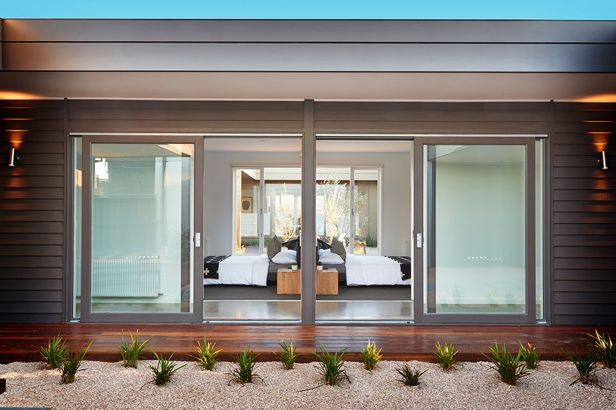
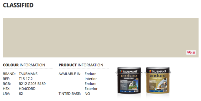
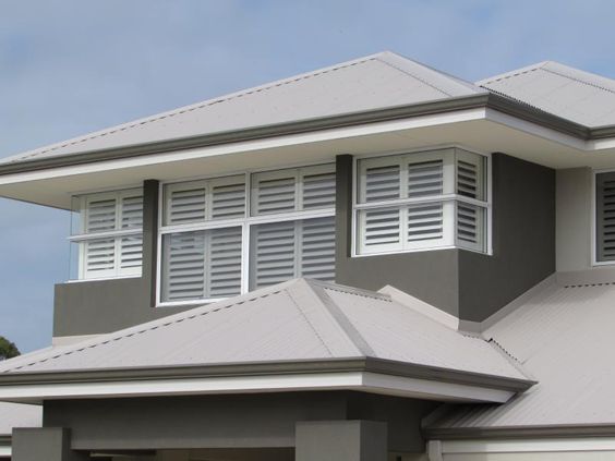
The three colours on this house are Taubmans Iron Age, Taubmans Grey Comfort and Taubmans Ash Brown. These colours are all from the same range at Taubmans and I selected a lighter option from the group for the eaves – Taubmans Classified. Although the eaves are nice and light and actually look white, Taubmans Classified is definitely not a white when you look at a sample of it.
Main point to remember with selecting an eave colour is not to go too light
The house above has a light Colorbond Dune roof but the owner has added a nice dark gutter to tie in the render colour and then added a white Surfmist fascia and used this as a guide for the eave colour.
The right colour for your eaves though does not have to relate to the trim/fascia colour of your house. For example you may have a house with a mid-tone neutral and a charcoal gutter and fascia. Most likely you will not want a charcoal eave. Therefore, you need to select the wall colour first and then look at the relevant commercial colour Atlas/fan deck to see this colour as it gets a lot lighter.
I tend to favour slightly darker eaves. My advice with exterior colour is that you often need to select one that is much darker than you originally think and this is the same with painting eaves. A beautiful exterior scheme can be spoilt with eaves that are too light.
For the house below, I specified a mid grey for the walls and a light grey for the eaves. The painter was not happy! He said that the eaves would be too dark and that the client should opt for a white (just as many people and many painters like to just use a bright harsh ‘ceiling white' for interior ceilings). However, I think you can safely say that the eaves on the house below look like a white. It just doesn't have the jarring quality of a brilliant white that would have spoilt this house. I am happy to say the client stuck with my choice.
Dulux Stepney for the walls and Dulux Dieskau for the eaves
Therefore if you make a colour selection for your walls, take the time to find out what it is in its lightest version. If you still feel it is too dark you can ask for a half strength of the lightest version. Remember to test it out first too so that you can see the overall effect. The paint store should be able to help you with this but if you are really stuck, a colour consultant would be able to help.
You may also need some assistance if you have selected a face brick and you are using a dark gutter and fascia. You need to look at the brick tonings and match them to a paint colour and then see that in its lighter incarnation.
How to paint ceiling rafters
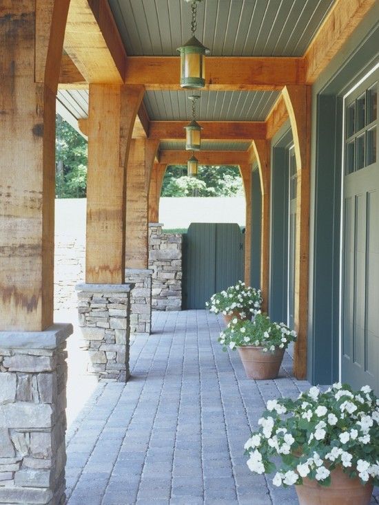
I usually treat exposed timber rafters slightly differently as a large portion is in a vertical position and also joins directly to the fascia board and posts. I tend to just paint these the same colour (often a white) as the posts/balustrades/fascia etc. If you are using dark posts, fascia and balustrade then of course you can also paint the rafters in the same dark colour.
Related: Why I love a crisp white trim
Dark contrasting eaves
As with interior ceilings you can do some clever tricks to manipulate the feel of a room. By painting an internal ceiling a dark colour you really define the lighter walls and lower the appearance of the ceiling. There is nothing to prevent you from doing the same thing with the eaves on your house. Painting them black to match your gutters and fascia is very striking and brings a strong contrast to the roofline. You can see the effect here:
Related: Manipulating a space with colour
This house above is a particular favourite of mine. Designed by Catalano Architects in Boston, they have cleverly linked the lined eaves with the sophisticated grey trim colour for the house. I really like this effect.
Eaves lined in timber are also very effective as again the darker eaves can make the house more appealing. Therefore don't automatically think that you have to paint them a bright white.
How to choose the right colour for an alfresco ceiling
Many homes now are designed with large Alfresco areas that lead off of an indoor space with doors that open up completely. In this instance indoor/outdoor ceilings are almost as one. Your indoor ceiling may be very light, something like Dulux Lexicon Quarter strength and unless you have opted for a very crisp white exterior it is unlikely that this light, bright white would work for exterior eaves.
This is where you have to make a compromise.
Assess the exterior colour and what you think to be the right eave colour and look at it against your indoor ceiling colour. You might need to adjust it to be a bit lighter so that you don't completely spoil the flow but don't be tempted to match it (unless you do have a very bright white house).
Always consider the overall look of the exterior – this is the most important element. To be honest how many people stare up at the ceiling of an indoor/outdoor room? In these instances you can make a feature of the Alfresco ceiling. You could perhaps line it with cedar boards or simply install a shiplap finish in an off white. By creating a different substrate, you can then get away with a different colour and/or tone.
If your Alfresco space is self contained and doesn't flow through to the main eaves of the house then you can easily treat this ceiling differently.
Related: How to link your outdoor room to the inside – 5 easy steps
My final point on choosing a colour for eaves
Don't forget that the eaves of a house are where the spiders make their homes too and if you have traditional rafters or rough hewn beams they can easily get very dusty. Despite your best efforts with a Turk's head (if you can reach that high) eaves are often the first surface to get really dirty on an exterior. This alone should strengthen my case for slightly darker whites or neutrals here!
I offer an online colour consultation service if you are stuck with selecting your colours. From just one key question that is troubling you, through to a full colour scheme, I will have a package to suit you. I can also tailor packages for you too. You can find out more here.
If you are renovating or building a new home I also have e-books and checklists to help you. These can be downloaded for free here.
A very enlightening article which has raised a few doubts in my mind. After seeing your Dulux Stepney rendered house, it makes me concerned that the Shale grey I have chosen as my render maybe too light. From memory Stepney is much darker than Colorbond Shale Grey. My house also gets full sun as it is north facing. Have I picked too light a colour for render?
Secondly, I have chosen Lexicon 1/4 for my eaves and I will have a Windspray roof and fascia. My first floor is cladded in Terrace White. Shale grey is the remainder of the house that will be rendered. Have I picked the right colour combinations especially regarding the eaves? I should mention my windows will be pearl white.
Hi Leonora Exterior colours do lighten up a lot – often more than people realise. The house in this image shown is also in a north facing aspect so Shale Grey will look much lighter than the house shown here. You are partnering it with Pearl White windows though so you will have a really sharp contrast and Shale Grey does work well with Terrace White which is very light outside. Your eaves may be OK if you stick with these colours but Lexicon Quarter is the very lightest you can go so they will be bright. So first of all ensure you are happy with Shale Grey – it does work with Dulux Terrace White and Pearl white windows. If you want less obvious eaves you could opt for Lexicon half or even Snow Season quarter which is a bit darker again but will still work with both Terrace White and Shale Grey. If you can, take the time to paint large sample boards with two coats of each colour and view them on your site in full sunlight. I hope this has helped Samantha
Thanks so much Samantha. Could I just as well use Terrace white on the eaves just to limit the number of whites I am using? Although, I was planning on using lexicon quater for my trims. So these would need to be changed too…
Also can you recommend a nice light grey render in case I don’t go with Shale grey? Stepney may look too dark in the shade.
Thank you for your time!
I’m so pleased I found this article of yours in eaves, it’s given me a lot of confidence to go ahead with dark eaves. I was originally going to have my roof painted in Monument, my husband protested as we are in a hot climate, so trims it was and the roof is Dune. The Monument eaves will look stunning against the brick. Thank you.
What a wonderful read, still a little confused on what colour to paint my eaves as I am building a new home I have a very dark brick ( metallix graphite ) with night sky roof/ guttering basalt fasia was thinking to keep the basalt colour under the eaves but I am concerned as I have an under roof alfresco area and a portico at the front door which I think might close in the roof space in both these areas do you have any suggestion on what I should do here?
Hi Melanie I think that Basalt may be too dark – with a very dark house and dark roof and gutters you really need something a bit lighter to give the house a lift. I don’t like white as you get a ribbon around the roof line but something like Dulux Madigan which is a pale blue based grey may work. Bricks are tricky because you need to take your lead from the colour of the brick. Dulux Terrace White is a lighter grey again and as you say you don’t want a dark ceiling for your alfresco area. Sometimes these areas are self-contained – so the eaves for the house don’t connect and if so you can use something lighter again here if you feel closed in. It is a balancing act between not have a white ribbon to spoil your grey scheme but not having anything too dark to make the house gloomy. Hope this helps Samantha
Thanks Samantha I will have a look at that colour, I was thinking that maybe the basalt would be ok if I have the colour mixed into a 3rd strength colour so it wasn’t so dark under the alfresco as the roof is set up not level with the eaves.
But I do like the colour you have suggested I will grab a sample pot of this and paint some timber and have a look next to everything.
Thanks Samantha for you help on this big decision on deciding on this, I was thrown when my builder asked ‘what colour do you want the eaves painted’
Hi, we are doing a Black modern long smooth brick exterior with a long run either black or dark charcoal roof, what do you recommend for the eaves and fascia? We will also have an alfresco area but the ceiling will be flat not raked. Any recommendations much appreciated
Hi Mandy Your eave and fascia colour really depend on the look that you want. My feeling with a contemporary home like this is to have the gutters and fascia the same as the roof. For the eaves you can either bring in a lighter off white or soft grey to give the house a lift or keep it the same as the gutters and fascias for a very contemporary feel. Both work but you get a very different effect. I do think though that an alfresco area probably needs a light ceiling colour or it could be too oppressive. Good luck Samantha
Hi
I have painted my house weatherboards in shale grey
The roof and gutters are surfmist
Fascia is Lexicon quarter
I like the shake grey but looks too similar to gutters
Is that because gutters are horizontal so surfmist looks darker anc similar to shale grey
What colour could I change the gutters too
Shale grey has a green tinge as well
Thanks
Look forward to your response
Hi Lyndall yes tonally Colorbond Shale Grey is not enormously different to Colorbond Surfmist – with the lighter white in between they will probably look quite similar outside. The colours look different inside but out in the sun they do blend together. Usually your gutters would match your roof or your fascia so it is difficult to say what you should change your gutters to as you wouldn’t want them in the Lexicon Quarter as they would be too bright and not practical. Perhaps consider introducing a darker grey for your gutters to break it up and then also paint your front door the same to link the colours? Good luck Samantha
Hi do you think surfmist eaves will go with beige royal render and vivid white guttering and Windows. roof is terracotta
Hi Christina Surfmist should work OK or you could look at quarter strength of Beige Royal – try a sample of both perhaps and see what you prefer good luck Samantha
Hi Samantha a great article. I’m painting the north facing front of my fibro cottage Dulux Grey Pebble with window frames in Antique White USA. The actual windows are aluminium White Birch. Roof is Colorbond Wallaby and I plan to paint gutters and fascia in Wallaby. Would Antique White USA look too much like a white ribbon for the eaves? I’m not sure about Grey pebble flysh against the Wallaby? Half strength?Ideas gratefully received. Many thanks Maggie
Hi Maggie Grey Pebble will come up very light on an exterior so there won’t be a huge contrast with the Antique White USA. As colours go darker when they are horizontal I think that you can get away with the Antique White on the eaves as it will not be too much different to the wall colour. Good luck Samantha
Hi Samantha,
I came across your article whilst trying to research external painting guidelines and found it to be very informative but I am still lacking the confidence to decide on a colour palate moving forward. I am renovating a beachside property and I have selected Sycon Stria vertical cladding for the outside lining which I will be painting in Colorbond Monument which is dark charcoal. The windows are black aluminium. I am trying to keep the house quite modern and my painter is quite insistent that my eave sheets and window trims be painted white which I am quite adamant I do not want to do. I was wondering what your thoughts would be on using a lighter colour for the fascia (such as colorbond Basalt) and window trims and then 1/4 strength for eavesheets)? I will also be replacing all the gutters and downpipes. Alternatively I could go black to match the windows and then a mid grey for the eaves. Any advice would be very much appreciated.
Hi,
I’ve found your article really interesting!!
I’m wondeting if you can help me out with eave colours- we are repainting our weatherboard: exterior walls- dulux tranquil retrial, gutters and door- monument, windows- Dulux Lexicon Half Strength. I can’t decide whether the eaves should be grey or white but don’t want them too dark (monument) or glaring white. Any help would be appreciated!
Hi Kym you could try a sample of Dulux Celtic Sky which is a lighter grey than Tranquil Retreat. So they won’t appear white but won’t be as dark as the weatherboards. Just try a sample first though. Good luck Samantha
Thanks for generously sharing your wealth of colour knowledge!!! Our house has a terracotta roof (weatherboard, double story, Edwardian style) which is stumping me when it comes to colour choice. Looking at monument for fascia, Haymes sense or minimalist 6 for weatherboards with white windows. Don’t want that bluish colour you often see with grays, but something rich. Is a gray palate the way to go or am I better going something with more brown undertones??? Many thanks!
Hi Tai Grey is the colour of the moment but that doesn’t mean you have to have it. Saying that though grey does go well with Terracotta but it must be a warm grey and you are right to avoid the blues here. Haymes Minimalist would be my pick out of the two but I think you should consider no. 7 in this range to give yourself a rich colour – They lighten up so much outside – you can then use varying strengths of Minimalist for trim and eaves etc. Test out samples first! Good luck Samantha
This is a brilliant article and so helpful!! So generous of you to be commenting still on it too.
We have a crusty terracotta roof on our weatherboard we can’t afford to change just yet. Our extension will have a Windspray Roof. The weather boards will be Haymes Putty Grey (a shade down from Dulux Grey Pebble to my eyes) which is a dark white/super pale Greige. I hope to change to Windspray Colorbond on the front roof also in the future.
In the meantime I am a bit worried Windspray gutters will be blue and weird against the Putty Grey weatherboards & the muddy roof. Do you have a gutter suggestion – should I go Basalt? As to eaves I thought I could do Haymes Dream for the Eaves, it’s a dark white – or even Surfmist? Thank you if you see this! Love your work 🙂
Hi Leonie Glad you enjoyed the article! Terracotta roofing does look better with dark grey gutters and as Basalt will go with Windspray and the Putty Grey I think this is a good idea. And you are on the money with the eave colour – perfect. So eventually when you change the roof you will have a darker blue/grey trim but I think this will actually work well and you could possibly bring the colour in elsewhere – front door? Anyway, I hope you enjoy your new extension. Samantha
Hi,
I’m currently making the selections for my house. I have purchased multiple pots of grey paint. My aim is to pick a grey that doesn’t throw another colour. I have narrowed it down to Shale grey. I plan to go surfmist roof, gutters and fascia.
The building company wants to paint the eaves, soffit and poles in surfmist. Is this a good suggestion? My original thoughts were to go a white but after reading your article I’m unsure.
We are also in a flood zone being close to the beach. We have to build up with concrete. On the exposed concrete, would you just suggest to paint it the same colour as the house?
Any ideas would be much appreciated. Thanks
Hi Ryanna I think you are fine with Surfmist for the eaves here – this is fairly standard with those colours on the roof, gutters and fascia, particularly as you have a fairly light grey on the walls. If you add a darker colour to the exposed concrete you could draw attention to it more and then also can break the house up but this can be a good thing if the house is very large, particularly if it is high as a darker colour at the base here grounds the house well. However unless it is very high I would probably just paint it the same. Good luck Samantha
Hi Sam
We have horizontal ironsand corrugate cladding, ironsand roof and windows – your suggestion for eaves please?
Cheers
Jen
Hi Jen as this is a blue based Colorbond perhaps something like Dulux Terrace White could work – check a sample though to see if it is the right tonal level for you – you may want it a touch darker. Good luck Samantha
Thanks – I agree that darker would probably be better. Thanks for your help.
cheers
Jennie
Hi Samantha,
We have a terracotta roof and are painting our double storey weatherboard house. We like Silkwort but are considering Winter Fog ( because it’s less lilac?)
Fence is Monument. Windows probably Vivid White (any tips for more suitable colour would be appreciated)
My main query is re the colour for fascias and gutters…we are thinking either Monument, or another rich, warm dark grey that would suit.
Your advice would be much appreciated.
Thanks,
Helen
Hi Helen Yes Winter Fog is more of a neutral and a good exterior colour. Monument would work for your gutters and fascias – this looks pretty smart with terracotta and also links in your fence so I don’t see any reason to change that – hope this is helpful! Samantha
Hi Samantha
Loved reading the article and all the great advice you’ve offered.
We live in a single story brick veneer cottage currently white brick with grey/brown concrete tiles.
The tiles are going to be replaced with a colour bond roof and my question is the following:
Should we stick with the white bricks and have a monument roof? Or white bricks and a surfmist roof?
Or finally dark grey walls maybe monument with white windows and surfmist roof. The garage door is currently surfmist. The windows are white with small squares that go all the way to the ground.
I’d be so grateful for your thoughts…
Many thanks!
Helen
Hi Helen the schemes you are looking at are so vastly different that I think you need to have a good think about the look you really want as all of these will work – it’s just a different look. Some points though to help you to make a decision – An all white house – walls and roof – is a big statement and may stand out a bit so you need to consider the location of your house and how it will appear in the street. Often this is a look suited to the coastal style. A darker grey roof with white bricks looks smart but maybe rather than Monument which is very dark you could go with a mid tone grey? Basalt is a nice alternative and isn’t as heavy but it gives you some contrast which can be quite appealing on a house. I do like white bricks rather than grey but painting them a grey would make your windows stand out more so if these are a real feature that you would like to draw attention to then this could be a good solution. Another consideration for your roof colour is that Surfmist will reflect the heat and Monument will retain heat so you will need to think about this in regard to your location. Good luck! Samantha
Hi Samantha thankyou so much for your great article and advice. I have a new build that incorporates hoop ply interior raked ceiling with a black shadow line but unfortunately I cannot continue this product to my outdoor alfresco or eaves as the product is vulnerable to black mould at our coastal location. The roofline is a skillion and it would have been lovely to be able to read all as one continuous ceiling. Any ideas for painting my external ceiling(eaves and alfresco). the house has a lovely Castlemaine stone external rock wall and I was thininking about trying to paint the eave cement fibre sheeting a grey found in the stone. The roof is monument but can’t be seen from the front because of the skillion. The rear and entrance of the home has a khaki/grey render. My architect says to paint it all monument but I feel this will be too heavy..I have been advised not to try and match interior and exterior, but I love your idea of finding a tone that compliments both indoor ceiling and exterior. any ideas or advice would be very helpful.kind regards Karen
Hi Karen I think you can get away with Monument on your eaves as it can have quite a stunning effect but I feel it would be too much for an alfresco area. I would have thought without looking at samples etc that there should be a grey in the stone which matches a tone of the khaki grey render – a lighter version of the render (though not too light) which matches one of the greys in the stone should work and I feel that the grey would be a good compromise next to the hoop ply ceiling indoors. good luck Samantha
Thank you Samantha
For the great article ?
Your advice would be much appreciated.
Our house was built in 1919 ( front door on the side of house)a 90’,weatherboar.d 2nd story . Roof is quite prominent charcoal grey/ black with a terracotta heritage trim
I am tossing between ghosting or grey pebble for the walls ? They seem similar ???
I am hopeful that lexicon quarter for the eaves andvwindows and oolong for the gutters and gables will do the trick .
The house is north east facing
Hell this is hard !!!
I would be most grateful for you expert opinion ?
Kind regards Ann
Hi Ann Yes Ghosting and Grey Pebble are very similar – Ghosting is a touch more grey and is just slightly cooler than Grey Pebble. Do try a very large sample board outside though on your NE facing aspect as you may find that these become too washed out – my feeling is that whichever one you go for you may need one tone darker but test first because it really depends on the look that you want. Oolong is a beautiful exterior colour – a rich dark grey/blue which Lexicon Quarter is an excellent bright fresh trim colour. Good luck Samantha
Hi Samantha.
Thank you for your article, a great read. I live at Perth, Western Australia. My home is almost 40 years old, rendered, with a dark grey/brown clay tiled roof and gutters and facias in Monument. I am thinking about painting the exterior walls in Terrace White and the eaves in a similar tone. My question is what brand of paint do you recommend and not sure whether to use matt or low sheen?
Kind regards
Mary
Hi Mary Terrace White is a Dulux colour so it is recommended that you use Dulux to ensure you get the colour exactly as you want. I like matt finishes for exterior rendered walls. Good luck Samantha
We are painting our weatherboard home Dulux Calf Skin and the painter is suggesting Lexicon for the trims (which we want to look classic white). Our gutters are currently Woodland Grey but I’m thinking to drop them down to Wallaby (lighter). What should my eaves be? Any other suggestions?
In the back of our house are all windows, attached to a veranda that has surfmist ceiling and guttering (that is seen from under the veranda). Now I’m wondering if my eaves should be surfmist?
It’s all so confusing. I know the colours I like (above) but the variations due your head in.
Hi, great site you have here It’s saved me making some huge mistakes, I’m a bloke so easily confused. Wife & I have decided on Surfmist colourbond roof, vivid white gutters & facia and Dune wall (rendered). We have a large deck with sandstone wall. Double garage door (surfmist). Long drive is a medium to dark brick. We live on a lake with lots of trees. Not sure what colour to paint the eaves. Any suggestions would be appreciated or you think this colour scheme is not good I would also like to know. Regards, Ken & Cath
Hi Ken The scheme all sounds good. As you have very bright gutters and facias I think that I would be inclined in this instance to continue that colour for your eaves. If you did want them to relate more to the wall colour you could look at Dulux Grey Pebble Quarter which is a grey off white in the same colour family as Dune. But please do a test first to see which effect you prefer. The darker white would certainly be more practical. Good luck Samantha
Hi Samantha!
What a great article!
We are doing renovations and are thinking of using the below colours for the outside:
– windows – pearl white
– front door – monument
– colourbond rood – wallaby
– render – powdered rock
We need to choose the colour for our fascia & eaves. I assumed we’d do the gutters and fascia in wallaby the same as the roof, but i’m Not sure what colour to do the eaves? Would you stick with a lighter version of the powdered rock? Or is there another suggestion you might have for our render colour (i’m Not 100% sold on it – we are using Tranquil retreat inside)
Appreciate and help or advice you might have. Thanks Louise
Hi Louise The scheme you have suggested is a classic one and it makes sense to continue the Wallaby onto the gutters and facias. The eaves should be a lighter colour of Dulux Powered Rock – you could look at Ghosting half to see what you think of that? Good luck Samantha
Hi Samantha! I wondered if you had any advice on exterior paint finish? We have a 1950s modernist weatherboard house. Roof is shale gray and we are painting weatherboards snow season quarter with lexicon half on the steel windows and facias and lexicon quarter on the eaves. I noticed the original paint and what seems to be common in 1950s houses with broad eaves is quite a glossy finish? We have recommended low sheen on weatherboards and eaves and semi gloss on the facsias and frames but I’m wondering whether we should go a glossier finish for the eaves perhaps semi gloss and gloss on frames and fascias? Hoping the house still reads 1950s if that’s makes sense! Finding it tricky to find people with good advice or finishes of that era! Most just want to modernise. Perhaps the original advice is correct though….wondered if a gloss would be easier to keep clean too…
Hi Magdalena If you are being true to the 1950s then you should probably use glossier paints. Remember that these houses were designed and built in a post war environment and people wanted fresh, new glossy products. They didn’t want the dull and lifeless feel of the 1940s and so gloss was in. You will probably also find that this was due to the paint technology of the time. It is only relatively recently that we have had low sheen finishes that are hard wearing – I remember even when I was young in the 1970s that all woodwork was painted in a gloss enamel. The trend now is for ultra matt finishes and of course the technology that we have now enables us to have paints that are hard wearing, water based and matt. I love matt finishes but I think if you are being true to the era then you should use some glossier ones. I’m not sure where you are based but wondered if you had ever visited Rose Seidler’s house in Wahroonga, Sydney? You probably have seen this in your research but it is worth a look if you haven’t. Another reason for gloss finishes in the 1950s was that they were seen to be practical and easy to keep clean which is what the modern day woman wanted!! Hope this has been of some help – I’m not a heritage expert but you could possibly try the National Trust for further help? Good luck Samantha
Hello Samantha
Many thanks for all of your wonderful advice so far.
We are repainting our old weatherboard look cladded house. We are beach side and have gone with Tranquil Retreat for the weatherboard, the windows are old aluminium and can’t be painted. We also have white powdercoat pergola and gutters, facias (looks to be Natural White) we built a new carport with Surfmist garage door, rendered pillars and rendered wall accross as a front fence and Surfmist pedestrian gate.
We have chosen Shale Grey for rendered pillars and Tranquil Retreat for all weatherboard and front wall.
What do you think and would Natural white work for the eaves too
Hi Michelle the colour scheme you have selected will certainly work. If the pergola, gutters etc. are powdercoated then they won’t be Natural White as this is just a Dulux paint colour. If they look much brighter and lighter than Surfmist then they could be Pearl White or a faded Surfmist depending on how old it is? I would recommend that you paint your eaves whichever colour your pergola, gutters and facia is and it may just be a case of getting a Dulux White colour card and holding it up to the powdercoated material to see which one matches the best. Sorry to be a bit vague – remember that Dulux Natural White is a warm white which I generally wouldn’t recommend with the cool greys you have chosen. Hope this helps Samantha
Great article! This brought to light some ideas and concepts we have not considered. However, after countless hours the “simple” task of choosing colors and exactly where to put those colors has become daunting. In short, PLEASE help us with making a definitive decision. Here it is…
We own a 1925 Craftsman style home that the previous owners painted a dark reddish brown. Even much of the trim is painted the same color including the large knee braces. There is no contrast to break up the body of the house from the neat architectural features we want to highlight.
We were thinking SW-Mega Greige to brighten up the house and SW-Pure White for the trim, knee-braces and fascia. But what about the soffit? Pure White as well?
The overhang is pronounced with large the soffit and knee-braces on a half-hipped roof. Running the other direction are exposed rafters in the front and back and “bump outs” along the side. I have ideas like throwing in a 3rd color, but don’t know where to put it. Is it worth the time to paint rafters and soffit different colors? There currently are no gutters on the house-Will we need to paint those when we install them? What color?
We want our home to bring a fresh, brighter look to the neighborhood as it sits high and proud on our block. Very open to your thoughts and advice (including color).
Because the house has been neglected for 20 years, many of our neighbors are watching quite closely 🙂 I apologize there is more than 1 question and really hoping you will address them all, as it all ties together in making the best decision. Thank you so much Samantha!!!
Hi Eric there is really too much here in what is clearly a beautiful heritage home for me to answer your questions here. However, I would say that your guttering should match the roof colour and you should be careful about using a white that is too bright on the eaves and rafters as you say the house sits high and proud on the block, you may draw attention to the eaves too much and spoil the overall effect. For a more contemporary look I would paint the eaves and rafters the same colour but a softer white that is closer to the Greige colour but still a white. I hope this has given you some direction but without seeing the house I really can’t say for sure. Good luck Samantha
Hi Samantha, excellent article and advice thank you. I hope you can provide some advice on roof and eave colour for our 1960’s house. We are in the process of removing all the old render and discovered beautiful large bricks similar to besser blocks but with curved edges. We have white window frames and plan on painting the house in Dulux Spanish olive. I am very confused selecting a roof and eave colour. We have a brick fence enclosing our property in Dulux grey cabin. I prefer not to have a dark roof due to heat retention. I live in the Sutherland shire in Sydney so looking for something that fits in with the local environment while staying true to the house era. Your advice is appreciated. Thank you, Robyn.
Hi Robyn the colour for your roof depends on the style -tiles or Colorbond? And you need to consider whether you will tie in the dark fence. Colorbond Windspray would work with the Spanish Olive but only if it is a metal roof and then you can have half or quarter strength of Spanish Olive for the eaves. I don’t like tiles painted in light colours though so you need to think about this. It is also difficult without seeing the house to know exactly if the Windspray would be right but it is certainly a colour for you to review. Good luck Samantha
Hi Samantha, thank you so much for your advice. A year on and we decided on Dulux still for our exterior. We went with Haymes Organic 3 for our front brick fence and stained all decking and wood slats (that sit on top of the brick fence) in Jarrah. Still struggling with roof and gutter colour and will go with colourbond. Most of our property is at the front of our house which is elevated from the street with a reasonably high pitched roof. For the roof I was thinking either a colour to blend with jarrah or blend with organic 3 and compliments Still. Do you think I’m on the right track? Thank you.
Hi Robyn glad you are making tracks with your house! I think I would keep the rich Jarrah colour for the decking and wood and look at complementing the Dulux Still for the roof. You need to consider whether you want a light or dark roof and opt for one with a green base – possibly something like Gully or Woodland Grey? It’s tricky as the roof is dominant so you need to think carefully about the depth of colour you want. Hope this helps – good luck Samantha
Hi Samantha, we had a colour consultation done with a paint company with the suggestions (to go with a windspray roof), monument fascia, gutters and windows, wishful cladding and wood grey eaves. I can’t seem to put it together in my head. Do you think this will work? It is supposed to enhance the interest in the roofline but I’m worried about there being a dark line bisecting the house from the roof.
Hi Kelly I really like some definition to the roofline so I can see where the consultant was coming from – you run the risk otherwise of the house being too simplistic with little definition to any architectural features. This isn’t wrong – they are just different looks. Perhaps have a browse through Pinterest to see both looks and this might help you to decide whether you go with a highlight dark trim or keep it the same. Good luck Samantha
Hello Samantha
Thank you for all your ideas but I am stuck on what colour to paint my eaves.
We live in a double brick rendered house which I am just freshening up again with a beige/ cafe latte colour coat, the eaves I originally painted in smooth cream as the wrap around verandah colourbond structure is smooth cream and joins the eaves but now the eaves look very yellow. The tiles on the outside verandah are an off white which look good and the second part of the house render on the split level is colour homestead and it looks nice. Greys seem to be the go at the moment but I would need 80 litres to re paint the entire outside walls which I don’t want to do.
My fascias are black and the houses internal walls delux whisper white. I need to redo the eaves as they are need to be done I’m just very unsure what colour to paint them.
Thank you
Helen
Hi Helen Smooth Cream is a very definite creamy yellow which when it is on a flat surface like a facia with the sun hitting it doesn’t seem so yellow but as colours get twice as dark when they are horizontal on ceilings and also don’t have any direct sun, you see for full force of the yellow. Ideally for your eaves you would take your lead from the main rendered wall colour – the beige cafe latte – if you know which colour this is you can ask the paint store to tell you what the colour is when it gets a lot lighter and see how much yellow if any it contains. It will depend so much on how beige or how coffee coloured the walls are. If you do like the off white tiles and the Whisper White inside you could decide to use a white on the eaves to give it a lift and knock out the yellow. But I would start with the main wall colour in a much lighter tone to see how that looks first. I hope this helps Samantha
Hi Samantha, Thank you for your prompt reply I appreciate it. I have the formula for the render colour it has a white and blue and red base with little yellow from memory. I think half strength would look great on the eaves and should work better than half strength smooth cream adjoining the colourbond verandah. There will be a lot of up and down ladders so I’m going to take your suggestion of leading from the wall colour(1/2) as a change.
Thank you once again it’s very kind of you to give your expertise advice without charging a fee.
Warm regards
Helen
Hello Samantha. I have read through your article and helpful advice; I am wondering what you think of a contemporary facade which could feature Dulux Teahouse and Dulux Bright Delight as a section in the middle at the front. The skillion roof is Colorbond Monument; which won’t really be seen from the front. Fascias and guttering will be Colorbond Windspray. Based on your advice about not painting eaves white would a lighter version of Teahouse be Dieskieu or Snow Season for the eaves? Thank you for your time and consideration of my project.
Hi Jenny You will certainly make a statement with Dulux Bright Delight on your façade. Remember that grey is washed out by the sun so it will be a very bright orange accent. This can work really well for a contemporary exterior though and will sit nicely with the grey of Dulux Teahouse. Dulux Tranquil Retreat is the pale grey that works with Dulux Teahouse so perhaps try a sample of this for your eaves to double check that you like the effect. Good luck and hope you love your uplifting splash of colour! Samantha
Hi Samantha, I am really hoping you can help me with my exterior colour scheme. We are currently in the process of building and are now picking our paint colours. I love a White House. I am thinking exterior Dulux natural white or perhaps a beige royal quarter with charcoal roof tiles. Should the gutters, fascia and downpipes be either the render colour or be a shade darker or lighter. I’m very confused in how to contrast all the colours to make it stand out. The house will have a lot of mouldings & the windows timber framed. Will any of this make a difference?
Kind regards
Hi Natasha I like downpipes to be the same as the wall and often gutters the same as the roof. To add some definition you could also bring the charcoal roof colour into the fascia too or break it up with a mid tone between the roof and walls. I hope this helps with your thinking but remember that I do -have an e-consultation service if you wanted me to review it all for you. Good luck Samantha
Hi Samantha, I have dune colorbond roof, dark cabin gutters, dune fascia and dark cabin render what would you recommend for an eave colour please?
Sorry grey cabin it’s a Dulux colour
Hi Samantha, I would SO appreciate your input on colours for our new colorbond roof, gutters & rafters. Our 80’s ranch style home has light brown tumbled bricks, Paperbark colorbond roof, mission brown gutters, verandah posts and rafters with an off-white soffit. We like Windspray for the roof but not sure what to do with the gutters, rafters and posts – would Surfmist work or would a dark colour like Monument be better? Any ideas gratefully received!
Hi Jen you look at and notice light colours more than dark so this may help you to make a decision. White trim gives you a fresher look too and gives you more of a country/coastal feel and dark trim gives you a more contemporary look. There isn’t a right or wrong – just a different feel. Hope this helps with your decision making. Samantha
Samantha, thanks for your help 🙂 It’s very kind of you to read and respond to so many enquiries!
Hi Samantha,
Great article and advice.
We have an older 1970’s single home which we have made additions too including converting the single garage (junk collector) into our master bedroom, walk in robe and en-suite. It has a very basic frontage as it was just a standard 3 bed, 1 bath, 1 garage. It is now 4 kids (3 young adult children) and a 5 bed, 2 bath, 2 living, no garage.
We have pictured renovating in some standard Colorbond colours so we can get most things to match well.
Have in Woodland grey, metal fences, back and sides also flat picket fence out front and a newly renovated tile roof.
Most windows are older anodised silver, new windows in side of old garage are white.
We had thought of doing gutters in Woodland grey, fascia in Dune, eaves and front door in Surfmist and when we can afford it, render in Dune. Once we get this done we would like to add a front verandah and would likely go with that in Surfmist.
Is this all too matchy matchy?
Is this
Hi Mel This all sounds great. You will have a flow to the exterior with a good range of colours. Hope you love the end result Samantha
Thanks for the great article, its given me lots to think about with my upcoming colour selections! So far I am using the Adburi ‘Ebony’ brick with a Basalt roof and Shale Grey for the window frames. I presume i should keep the gutters etc in Basalt? I’m also having some feature vertical cladding and think it needs to be a lighter colour…what would you suggest I look at and would I then use this colour for the eaves as well? Thanks so much 🙂
Hi Melissa Yes – Basalt gutters with Basalt roof works well. Perhaps something like Dulux Terrace White or for a little more depth, Madigan could work? Test out large samples to check first though. Good luck Samantha
Hi Samantha, I’ve been reading your great articles recently as we embark on some TLC of our exterior & I would love your advice to ensure we avoid “white ribbon”. We are 4 apartments across 2 x 1930’s double story buildings, one offset from the other by 8m. Gutters & down pipes are Colorbond Windspray. Windows, fascias & doors are currently Windspray(ish); brick walls & eaves [4 boards wide] are Ohai 1/2 strength & roof is a dark glazed tile.
For the refresh we are looking at Dulux Teahouse for the walls. Preference is not to paint the colorbond gutters if Windspray works within our colour scheme so plan is to use Windspray on the fascia & a colour with greater contrast to Teahouse on the windows & doors such as Domino/Mt Oden or Colorbond Shale Grey/Dulux Tranquil Retreat. I’m leaning towards a lighter trim colour but I didn’t consider the eaves ?. Are our lighter window & door option ok for the eaves in this mix? If we went for one of the dark trim options instead what would you suggest we used on the eaves?
Thanks so much, Kaz
Hi Karen you could probably look at Dulux Tranquil Retreat for the eaves whether you have dark or light windows. Just bear in mind though that you do start to see some blue coming through in this range of greys as they start to get lighter so paint a large board and put it in place to check you like the effect. Good luck Samantha
What an informative read. Thank you! may I ask your advice. Our interior walls are Dulux Vanilla Quake 1/2 strength and the ceiling is 1/4 strength. We have a large alfresco with ceiling at the same height as the internal ceilings. Our external walls around the alfresco are rendered with Dulux Beige Royal full strength and crackenback stone feature walls and pillars. The alfresco faces North so get the most sun. What would you suggest for the alfresco ceiling and eaves? Thank you so much in advance.
Hi Sue I think as the Alfresco area leads off of the interior that you could continue the same white. Your other option is to look at quarter strength of Beige Royal which will appear slightly more yellow. My feeling is the Vanilla Quake in the quarter strength but it might be worth doing a text patch next to the wall to ensure that you like it. Hope this helps Samantha
Thank you for your great articles, i’ve been reading along as we make decisions for our new house. I’d love some advice about paint colours if you’re able to share. We have a weatherboard house on poles with two scillion roofs, the roof/gutter/fascia all shale grey, under one roof planning shale grey walls and under the other monument, all windows white. Please help me decide eaves/ under alfresco (which is off the monument side)- since the house is up high we’ll be looking at at those eaves and won’t really see the roof 😉 Inside has a lot of windows/sun so we are planning to use lexicon quarter on everything unless you think we’d be better to go half and use the quarter for the ceilings- I guess it would be good to tie this in with alfresco in some way. Thanks so much for your help, BJ.
As you are looking up at your house the exterior ceilings will be very dominant in the scheme. My advice would be to look at adjusting the exterior to Lexicon Half so that it is not too bright. If you paint a large piece of cardboard with two coats and then tack it up to the underside of the alfresco area you will get an idea of whether or not the tone is right. I think the overall exterior look is more important than the flow from inside and as long as you are using a white with the same undertone it should be fine. Hope this helps Samantha
Thank you for your advice. We went ahead with lexicon half as you suggested and even though it’s only partly painted so far it looks great! Thanks again 🙂
Great to hear!
Hi Samantha,
I’ve just discovered your blog when trying to decide on greys. What a treasure trove of amazing information and guidance!
I’ve recently had a deck built along the full length of the back of my house. The deck is a lovely dark merbau with screens at either end and glass balustrade with black frame, the deck is also black steel frame. My guttering and fascia are black and I am about to paint the daggy old red bricks dulux teahouse. What colour would you recommend for the eaves?
Warm regards and thanks in advance
Hi Maryanne You can consider Dulux Tranquil Retreat for the eaves which is a much lighter version of Dulux Teahouse. I think the soft grey will work well with the merbau and dark grey but just test a small area to check you like the effect. Good luck Samantha
Hi Samantha. I am so glad I can across your page before finalising exterior paint colours. I have a 1950s chamfer board house, with merbau decks on the front and back, with dressed merbau posts. The roof is colourbond in ironstone, as are the gutters. The fence is colourbond wallaby.
My initial thoughts were to paint the changer boards in Duluth flooded gum, and to use silicone natural white for window trims and fascia.
I am keen to hear your thoughts on this, and what sort of colour would suit for the eaves. I had not even considered this and the impact it could have if we got it wrong!
Thank you in advance. Nina
Hi Nina I think that a lighter version of Flooded Gum would suit the eaves – you could try Dulux Dieskau – paint a sample board and try it up on the eave next to a sample of flooded Gum to ensure you like the contrast. Good luck Samantha
Hi Samantha. I am building a new contemporary two story house. We are using graphite bricks at the back and half of the side not visible from the road. The front will be render in shale grey. The other side (we are on a corner) will be barestone cimental cladding. Hopefully the two will compliment each other as the colours are very similar. The gutter and fascia will be Monument also the roof ( but it will not be visible). Also black windows. I would appreciate your suggestions on colour for the eaves, not sure if monument would be too much or maybe shale grey, or surf mist, we also have an alfresco up the top at the front and side. Thank you very much. Carol
Hi Carol I would relate the eaves to the wall colour – perhaps consider Shale Grey or if you think it will be too dark then a half strength. Remember than when colours are horizontal they are twice as dark. Good luck Samantha
I would love your advice please. My new home is built with Timbercrete bricks. They look like a light sandstone or limestone in colour. The closest colour paint sample I could find is probably The Dulux Scallywag half. Rood, gutters and fascia are Woodland Grey. Window trims are monument. Garage door and front entry door are Kwila colour wood. I am unsure on choice for my eaves colour? I want a ‘white’ look. The Scallywag quarter is still too cream looking. Should I do a half strength of the quarter scallywag or a different white based colour?
Hi Adele you could try a warm white like Stowe White perhaps. Check a sample first against your bricks to see if you like the effect. Good luck Samantha
Hi Samantha,
Thank you for such an informative blog post. Wondering what your thoughts are for Eave colour on our traditional style new build. Colorbond roof, gutter and fascia are monument, bricks are Austral Capitol Red, rendered corbels and columns are Dulux Apparition. I hadn’t even thought about Eave colour until the painter asked this week. We obviously dont want a stark white, but wondering about Dulux White duck quarter, or ghosting quarter? Would love any suggestions you may have.
Many thanks
Hi Derrie the White Duck group of colours should work well but I would possibly look at half strength as quarter may still be too light – you would need to try samples though against your brick. Good luck Samantha
Hi Samantha, loved coming across your page. We have a brick home with Jasper posts & rafters and paperbark facia & window trims etc. Our pergola is currently pitched and we are looking at lining the horizontal rafters/ceiling with colourbond and are stuck on whether we continue with Jasper or go lighter as we dont want to have the feeling of a low ceiling. Would love your thoughts. Many thanks
Hi Paula my feeling is go lighter as the darker brown throughout the ceiling will be very oppressive. Think about the colour of the other eaves around the house and perhaps match to that. Something like Surfmist which is an off white may work and be unobtrusive? Good luck Samantha
Hi! Thanks for this information . Currently deciding on house colours. We have decided to paint our cladded house in British colour systematic as my husband preferred a darker grey colour . I am so confused as to if our roof should be a darker or lighter colour grey with white trims/eaves . Should I make the gutters same as house colour and do a lighter roof like in the first photo with a light grey for eaves ? Would the light grey then carry through to the varandah railings as I originally just planned to do a white .Could you please offer any advice as I trust in your knowledge. HELP! I feel a bit out of my depth . We have the traditional looking older house with a bullnose verandah and railings out front
Hi Tracey You can go either way with your roof and trim colour. Think of the overall look of the house – a dark roof caps a house well and grounds it and a light roof makes it appear larger. By using white trim and eaves you get a nice break between the roof and the walls. However your house may suit a lighter roof – it’s difficult to say for sure for you without seeing it. To hide gutters you do them the same as the roof and your gutters and fascia/eaves don’t have to be the same. Verandah railings often relate to the trim colour – windows/fascia etc. You look through and past dark railings and at light ones which are more noticeable. I hope these tips have helped Samantha
Hi Samantha,
I was wondering if you could help me make a decision.
I have exterior Walls in Dulux Warm Neutral my roof and fascia are Charcoal,
The down pipes match the exterior walls and my windows and garage doors are
white. Which white do you think i could paint my Eaves thank you.
Hi Moira if the white on your windows and garage door is not too stark then I would use this colour so that you don’t introduce another white. Cheers Samantha
Hi Samantha
Help please! I have painted a section of our hardiplanks in Tranquil Retreat and painted the battans under the house in Timeless Grey (was planning on doing the gutters and fascia in this too). Obviously, I have totally mismatched the colours as the Tranquil looks too light (almost white in sunshine and throws blue compared to the Timeless Grey. I’m at my wits end, having tried many sample pots. I think I’d like to keep the timeless grey (Not sure whether I should do the hardiplanks in this and having darker battans but I need a grey for the hardiplanks (preferably darker than tranquil retreat). As for the eaves, I have no idea. ? Any suggestions?
Hi Dale All greys start to show their underlying colour more when they are in lighter tones. By the time you get to Timeless Grey, there is enough depth that the underlying colour isn’t so obvious. You could look at something like Shale Grey which is more neutral – a touch darker than Tranquil Retreat which would still give you a contrast. To provide some more definition you could also think of something a tough darker for the gutters. Hope this helps Samantha
Hi Samantha, our house exterior has dark red clinker bricks and concrete tiled roof. eaves are exposed timber rafter eaves intermittent with white painted fibro. Mission brown trims and windows frames.
Would like to paint all to a dark contemporary colour to take the focus off the bricks and highlight the trims. We have silver grey plantation shutters on the front windows.
Would you recommend all to be a single colour? Options I can think of are Monument or something a bit lighter like Ironstone.
Hi Sunita You need to consider the undertone of the silver grey plantation shutters to ensure they go with the darker colour you use. Monument is really nice and neutral but very dark. Ironstone shows very blue in the sun so you need to be aware of this. It’s difficult to say for sure without seeing the house so I would paint up a large board with the dark colours you like and view it next to the shutters and brick. Good luck Samantha
Hi Samantha
My house is terracotta brick colour and previously had hidden Brooke on Windows, facias, guttering and eaves.
I’m trying to update the colour and have chosen monument for facias, guttering and window frames. I’m totally not sure about the eaves as I feel painting the eaves In monument will be very dark as they are not high. Should I try monument in quarter strength or use a contrasting colour?
Hi Helen I think that you need to have a soft warm grey that tones with the brick for the eaves. Monument in a lower strength will just be a washed out grey – you need something that will relate to the walls and this will also soften the Monument too. Good luck Samantha
Hi Samantha, thank you for the guide on eaves. I‘ve painted our exterior walls in Dune colourbond and the plan is to paint the roof in woodland grey. Do you think painting the eaves in surfmist is a good colour choice for the eaves or do you think the walls in dune colourbond with eaves in surf mist will make the walks and eaves appear like it’s all the one colour? If so can you please suggest a colour for the eaves? Any advice will be much appreciated. Thank you Anna
Hi Anna there is a trend to painting the eaves the same colour as the walls or similar so this can look quite effective. Surfmist will work too if you wanted something a little different. Hope this helps Samantha
Great article. We have a Queenslander house and have decided to update the colours from brown brick and cream trims. We are wanting to stick to grey and white and were thinking Monument colourbond roof, Milton Moon render with lexicon 1/4 or vivid white for the window trims and verandah balustrade. We are totally stuck on the fascia, garage door and eaves- which are v grove panelling, similar to the Home Beautiful image above, this is the exact look we love!
After reading your article I am worried if we paint the fascia in a bright white it will look like a white band around the house. However, I would like to keep the garage door and fascia the same colour, but if I chose surfmist it may look too cream against the bright while of the verandah balustrade. I am wondering if you think it would be too light if I painted the eaves/garage door and fascia in lexicon 1/4 or could you suggest a different white? Thanks so much, Kelly
Hi Kelly Dulux Lexicon Quarter is a popular trim colour, particularly for a Queenslander. This could work but the garage door will be very bright so consider whether it gets a lot of direct sunlight – it would be better if it was in shade. Hope this helps Samantha
Hi Samantha, Can’t believe how lucky I am to find your words of wisdom on paint colour. I’ve read every word and learned a lot. I would love your opinion/options for my 1930s single-fronted house with tiled roof and a facade that is about half and half exposed clinker bricks and rendered brick. I like the combination of Domino, Dune and Feathersoft as I feel they are strong yet traditional colours and work with the blueish, reddish and cream blends in clinker bricks. I’ve painted my side fence in Dulux Domino. What do you think of this: guttering and fascia in Domino; eaves in Dune; rendered sections in Dune; window frame in Feathersoft (the lightest of the three); picket fence Domino for posts and Dune for pickets, or all Dune. (Front door is at the side so you don’t see it, but it would also be Feathersoft, same as window). I would be thrilled with a reply!
Hi Jacqui I’m glad you have found the blog useful! Domino, Dune and Feathersoft are a good combination. It’s difficult to say for sure without seeing the bricks but these colours certainly work together and the placement of them sounds good. The picket fence will look more traditional with two colours and more contemporary with just one, if that helps you with a decision! Hope this helps Samantha
Hi I’m wanting to paint our beige brick house a lovely soft white, thinking dulux snowy mountains half or quarter, can I carry this through to the eaves too? So it achieves a seamless unfussy look? Or do you have any other suggestions for a soft milky white for the bricks and eaves that’s not too yellowy or cream. Gutters and garage doors etc will probably be Dulux black caviar. I hope you can help?
Hi Hayley Dulux Snowy Mountains half or quarter will be amazingly fresh and bright outside so I would test a sample first. Dulux Natural White might be a better option for you to try a test pot of. You can certainly just paint the same colour on the eaves as it is so light. Good luck Samantha
Hi Samantha, your article has informed a discussion my husband & I were having about eaves and whether they should ‘always’ be white (we’ve had the same discussion about internal ceilings many times!). We recently bought a renovated 80s rendered brick house with a panelled barn extension on one end. We’re about to paint the entire exterior (both old & new sections) in Dulux ‘Namadji’. Can’t decide what colour to do the eaves on the older section of the house. The eaves also widen & form an exterior ceiling over the entry way which connects old & new parts of the house. The barn extension has no eaves at all. What colour would you recommend for the eaves? We’re not planning to change the colour of the roof (its unpainted aluminium) or the window frames (they’re some kind of bright white). We want to stick with colours that feel warm (no cool greys), as theres a lot of warm coffee-coloured stone paving around the house which we really like & looks good with Namadji….
Hi Cathie you need a soft greige to go with Namadji but it’s difficult to say without me trying out some options but you are right not to spoil the effect with bright white but you do have to bear in mind the exterior ceiling as you don’t want this to be too dark. Hope this helps Samantha
Hello Samantha,
I am thinking of replacing a black concrete tiled roof with Colorbond “Wallaby” to match Dulux Beige Royal weatherboards with Beige Royal Quarter trim. I am considering Colorbond “Evening Haze” for the fascia and downpipes and painting the eaves Beige Royal Quarter. The door is Haymes “Symphony”. My question: Would Colorbond ” Woodland Grey” be a better choice for the roof. The house is lower than the footpath and all you can see is roof which is why I am going to match the weatherboard colour to the fascia. There are quite a few trees around the house and I was wanting it to blend in.Help!
Lise
Hi Lise Colorbond Wallaby will work really well with Dulux Beige Royal but I wouldn’t put Evening Haze with this. Evening Haze will work with Woodland Grey as they both have a green base. Wallaby is a lighter roof than Woodland Grey so you need to consider this too. Surfmist will work better with Wallaby and is actually very close to Beige Royal Quarter. Hope this helps with your decision. Samantha
Hi Samantha,
So glad i found this site. My old brick house has just been rendered and i have been looking and sampling paint colors.
The roof gutter and fascia are Colourbond monument and the aluminum window frames and diamond shaped security screens are black. The roof looks more silver in the sun. I’m trying for colours that won’t make the house too dark. That’s what i’ve learnt so far through trial and error.
I want a light colour for the house but not white, something with grey undertones could be ok but really anything that doesn’t look too white in the sun or too dark in the shade. I have done your suggestion and painted a few large boards to see how the sun and shade effects the colour but still not certain what to do. I also need to choose the colour for the eaves. I’ve read all the posts and have jotted down names of more paints to sample. Have you any suggestions or have seen any tried and true light colours that will match with the black window frames etc that could put me on the right track?
Thank you so much
Linda
Hi Linda Have you tried Dulux Narrow Neck? This is a light warm grey that works well both inside and outside. Perhaps give this a try? Good luck Samantha
Hi Samantha, thank you for your wonderfully helpful blog! We have just had our 1960s brick veneer cement rendered and have painted the walls in Taubmans Oil Shale, but after finding your article I am now stuck on a colour for eaves. We were thinking monument for the gutters and facia. The roof is terracotta tiles and our windows are black. I was thinking Dieskau for the eaves to avoid white…what do you think? Thanks!
Hi Kirsten I think that Dulux Dieskau could work really well – it will still be light but should work with the Taubmans Oil Shale. Test a sample first though! Good luck Samantha
Hi Samantha, Your article is so helpful, thank you. I am in the middle of renovating a tall three storey house that faces west. Part of the roof is terracotta tiles which we aren’t changing (but this roof is largely unseen from the street front) and the new extension will have a ColourBond roof (which you can see). I am thinking Windspray or Basalt for the new ColourBond roof and gutters (to tie in with the terracotta roof tiles). Then we have a lot of timber balustrades, railings, verandah posts and fretwork which will all be painted white but I am unsure which white (Lexicon 1/4 or Vivid White or will these be too bright facing west?), but what about the Eaves? For the rendered walls I was thinking a warm grey (thinking Grey Pebble or Feather Soft or Terrace White) but not sure if this would tie in with the roof. I would be so grateful for your advice. Sharon
Hi Sharon you have a lot of unresolved elements here so I think you need to start with the roof and gutters as this will impact the wall colour. Grey Pebble is a lovely soft pale greige, Feather Soft is very similar but slightly lighter while Terrace White is a crisp blue grey/white which really just appears white outside. Basalt is darker than Windspray and has more of a blue base while Windspray is more green/grey. In terms of tonal level, I think that Basalt will work better with the terracotta roof but Windspray does work well with older style homes. So until you decide on the roof and wall colour, you can’t decide on the eaves. Lexicon Quarter and Vivid White are both very bright outside but it depends on the look that you want and whether you want something more understated, in which case you may need to think of a slightly darker colour for the walls. I am sure this has brought up more questions but I hope it has given you some answers and direction Samantha
Hi Samantha, we’ve in the final stages of a major home reno and we’re stuck on eave colour!!! We’ve completely changed the front facade, updating it from a tired old 80’s style to a very modern square front. The left hand side is clad in a walnut coloured aluminium horizontal plank and the other side is rendered in Dulux monument. The tin roof, gutters, flashing and down pipes and garage doors are also monument. Do we paint the eaves in monument or a lighter grey?? Please can you help us? Regards, Glenys
Hi Glenys Monument does look fabulous with timber so I think this would be my choice, otherwise you are introducing a whole new colour just for the eaves – it sounds like a statement renovation so probably a good idea to take it all the way. Samantha
Hi Samantha, can you please tell me the wall colour in the 2nd pic?
Cheers, Sam.
Hi Sam I’m afraid I don’t know for sure but you could look at Dulux Tranquil Retreat for a similar look Samantha
Hi Sam, great article. We are currently having our house painted – we have a complex house with eaves/soffits ranging from 1 ft depth (surrounding most of house) to 3-4ft over a patio. The painter is currently painting the eaves the same color as the trim (SW Accessible Beige) and the fascia and window trim is SW Cyberspace (so a greige/dark grey contrast). I think the painter is doing eaves the same as siding because it is easier. However a larger extension (2 story) part of the house (some walls with no windows) looks light on trim so wondering whether i should push the painter to do the eaves Cyberspace also.
Hi Chris lighter eaves certainly give a house a lift – difficult to say without seeing the house, but from your description I think that the Cyberspace colour would work well on the larger extension too. Good luck Samantha
Hi Samantha,
I have found you in the brink of time.
We have a North facing house. The roof is monument, windows and doors are black
I live colour and was thinking of a terracotta outside walls. Which are hebel panels, which are then rendered. I have tried about 3 different clay colours but they all look flat and don’t seem to look right.
Any suggestions please as we are using Dulex paint.
I would so appreciate your
help. Many many thanks
Hi Sue Terracotta colours are hard to get right on walls. I find that you can only get these colours right with natural paints like Porters or Murobond. You certainly need a paint that has a little texture and is course so that the colour looks natural and not flat. Dulux does have some textured paints and you may want to explore these rather than the plain low sheen finish. Hope this helps Samantha
Hi Samantha,
What a wonderful article,
We are building a north facing home with Monumemt roof, gutters and fascias and gables.
I have chosen Colourbond sandstone for the hebel panels which will be rendered. We have a lot of north facing windows which are also black brown.
Should I go half strength sandstone or stay with monument for the soffits.
I would really appreciate your help
Ps I must have 12 pots of sample paints trying to get the right colour for the outside.
Thankyou Sue
Hi Susan I think that I would opt for a half strength of the Sandstone in this case. Difficult to say for sure without seeing the house but this would be my first thought. Hope you love your new home Samantha
Hi Samantha. Love you blog and the images have been a great help. Just wondering if you could advise me of the best light grey taubmans paint for the eaves. Should i use a lighter version of the interior ice princess that I will use on the walls? Would really appreciate your advice. Regards Gina
Hi Gina your eaves should usually be a slightly lighter version of your wall colour but if the wall colour is very light, you can often get away with just using the same colour. Thanks Samantha
Hi Samantha
I always look forward to your articles, thank you for sharing. Our GF is taking shape & nearly up to deciding on eave colour. We have surfmist skillion roof & fascia, Matt basalt gutters & 3 walls in Matt basalt custom orb. The patio is painted weathertex in Pozieres, I was tossing between full strength or 1/2 strength surfmist for eaves but also wonder if 1/2 strength Pozieres would work? Windows are pearl white.
Hi Kerrie I think I would opt for half strength Surfmist to tie in with the fascia colour. Hope you love your new granny flat Samantha
Hi Samantha, I keep reading your article but still undecided on eaves colour on our rendered brick home. Render is Dulux mud pack, window frames and gutters are monument. I’ve tried sample pots of 1/4 strength Dune and Mud pack and they look very similar but I keep being told white is the way to go.