
Interiors
Green for a Country Scheme
The colour that usually springs to mind when we think of open countryside or pretty gardens is the colour green. Associated with nature, new beginnings and wellbeing, green is the colour of balance and harmony. I happen to adore the colour green and I would say it is one of my favourites. Psychologists say that people who like green are usually socially well-adjusted with easy manners and charm, which of course is absolutely right! One of green’s greatest elements is that our eyes do not need to adjust to see it which means that it is one of the most relaxing of all the hues in the spectrum. This may make green sound a little boring and pedestrian but as in the garden, when used as a backdrop for an interior decorating palette, it is perfect to complement other stronger colours. This is particularly true when seen in one of its neutral guises. But where green truly shines is when it is used as an accent in a brighter and fresher form.

Which green exactly?
Of course, as with all colours in the spectrum, green comes in many different guises. Those which are associated with nature are either true mid greens or those that contain more yellow. Greens with more blue are associated with the ocean and work particularly well in coastal style decorating. So for a country style green that conjures up the garden, select those that are fresher with more yellow. Lime greens are popular as accents but can be overwhelming, so look for greens that are similar but with just a touch less yellow and a little more grey. These are the delicate apple greens that are really pretty and particularly suit a country style look.
Which colour can I partner with green
Magenta is the complementary to this type of green. If you take this colour and add white you will achieve various tones of pretty pink, right the way through to a warm off white. In its original form, magenta is a great partner to this type of green when used as an accent and if you introduce the varying tones of pretty pinks then you create a lovely country style palette. If you prefer a crisper, cooler off white then do the same with the apple green until it is almost white.
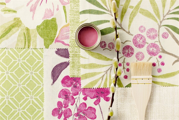
My final point
If you are confused about which colours go well together, remember that talented textile designers have done all the hard work for you. You can see from the Chika Prints collection from Sanderson that the colour palette is there ready for you to use. Partnered with fresh white and warm neutrals the green is a beautiful feature without overwhelming the space.