
Have you noticed that beautiful soft pastel tones are back on trend? In fact, even though so many interiors and exteriors are white at the moment, colour in general is also getting more popular. Which I must say I am very happy about. People tend to be a bit frightened about colour though so with all the lovely pastels in the shops now, I am going to show you how to incorporate them into your home. Here is my guide on how to decorate with pastels.
Why pastels work together
The best part when you decide to decorate with pastels is that they all work together. By softening the tone of them all with so much white, they automatically work well side by side. The more white included in the colour, the easier it is to include them all into a scheme. With strong, highly saturated colour, the effect would be overwhelming and clunky but with pastels they all work perfectly together.
Pastels are on trend
In terms of trends warm soft pink and apricot are very much the colours of the moment. Pantone's colour of the year for 2019 is Living Coral which has cemented this soft easy to use colour in fashion, homewares and painted finishes.
Related: Pantone Living Coral – How to use it in your home
Related: Colour & Interior trends 2019
Dulux colours above are Camisole Quarter, Carnelian and Whisper White trim.
Pastels for a Scandi Style
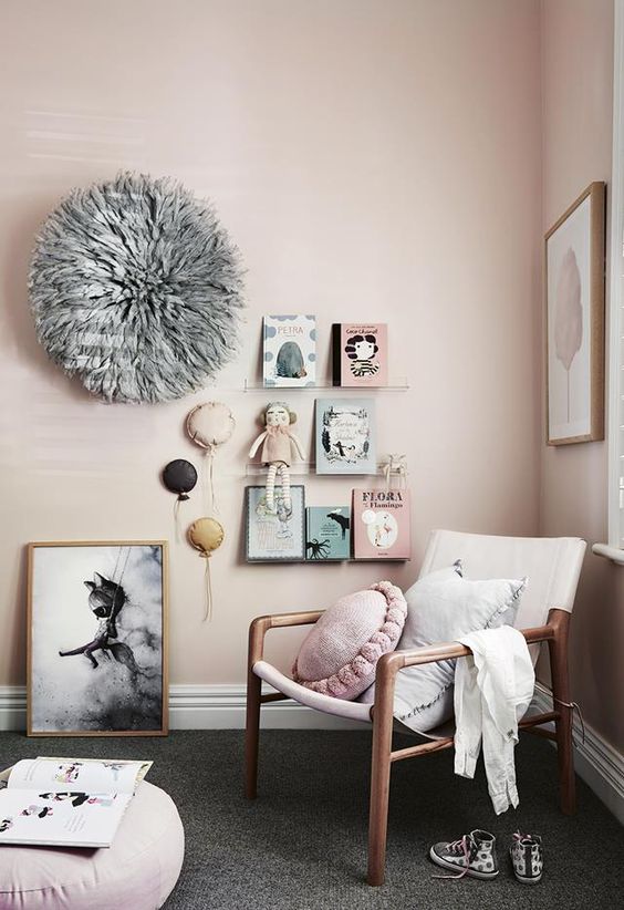
The whites and greys of the much loved Scandi Style are an enduring look. However I have noticed with this look that soft pastel tones are also being introduced, particularly the blush colours that have been made popular by Pantone's choice of colour of the year. These pastel tones bring a lovely softness to the Scandi colour palette.
Isn't this just the most beautiful Scandi style nursery from Australian Inside Out magazine?
Of course the classic soft duck egg blues and celadon greens which we always associate with Scandinavia, particularly Sweden, are an everlasting look too.
Related: 5 key elements of Scandi Style
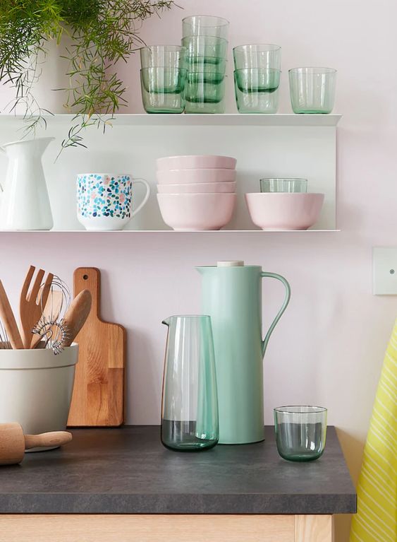
Pastels in the kitchen
Pastel tones became popular for kitchens during the 1950s. This was an era of new beginnings and after the drudgery and heartache of the second world war, people were clamouring for some uplifting colour in their lives. Technological advances from the war too were put to use in developing new fabrics and homewares and the market wanted them in lovely pastel colours. Life was picking up again – they wanted to decorate with pastels!
The soft aqua tones of our smart new toasters and kettles owe their look to this era. Too often the kitchen can be just a functional space and often when we design them they are sleek, white and crisp but without any soul. By adding some homewares and kitchen essentials in soft pastel tones we can inject some colour and personality without it being overwhelming.
Related: Kitchen Styling – My 5 top tips
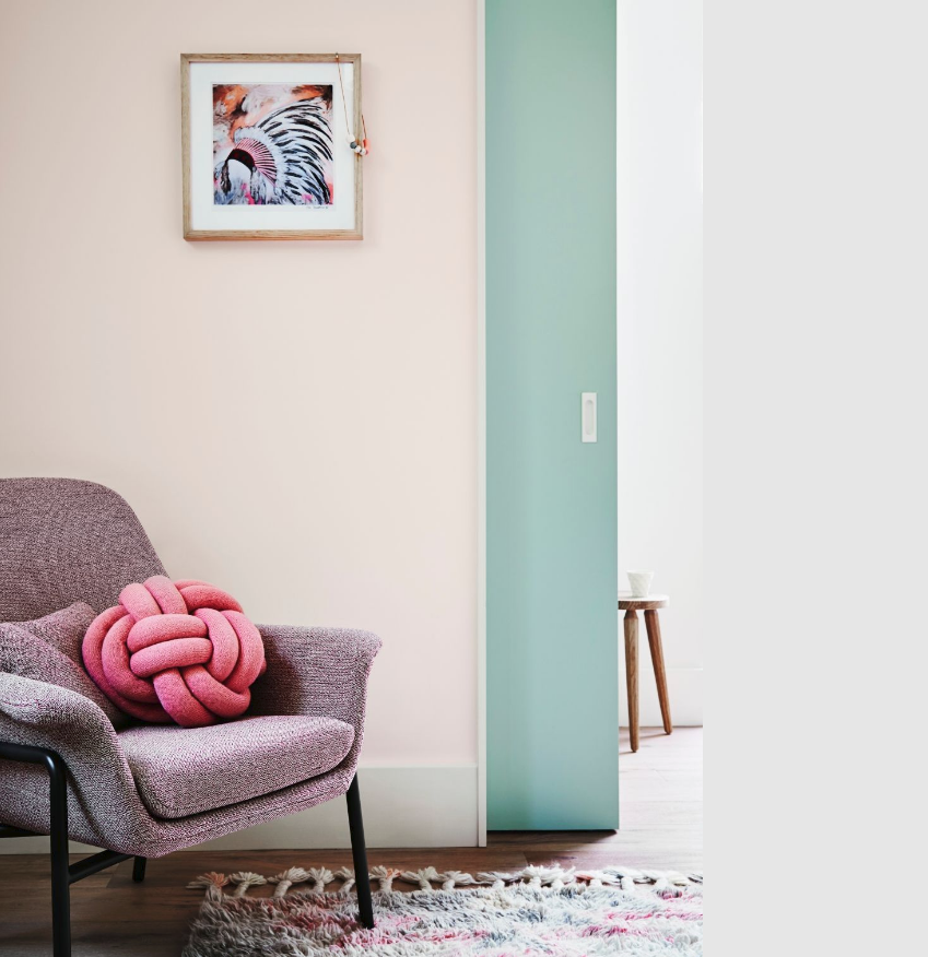
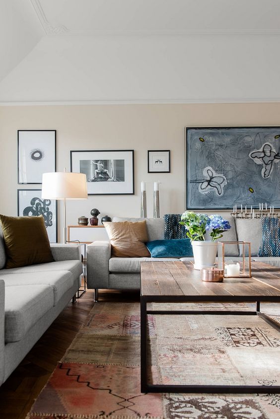
Pastel tones in the living room
Pastels are admittedly easy to introduce into a bedroom, particularly a nursery or a child's room, while an assortment of funky pastel coloured homewares in a kitchen also looks great. But, I hear you say, how can these sugary colours translate into a more sophisticated space like a living room?
The trick is to use more of a neutral pastel on the walls, so a soft apricot or yellow/cream, and then anchor the look with a rug with soft washed out pastel hues. Vintage rugs are so popular for this reason. You get the colour, texture and pattern but because they are slightly worn and faded and the colours are those more resembling pastel tones, they all work well together.
By introducing some bolder colours and accents of sophisticated black into the scheme you prevent the look from being too sugary. Touches of black are the decorators friend when it comes to interiors. I find that you can get away with bold statements and colour well when you have some black in the mix.
A pastel coloured front door
Colour is on trend again for front doors. I love a painted front door but sometimes on a house that is painted crisp white, a strong colour can be too much of a focal point and can detract from the look of the house. This is where soft pastel tones come into their own as they provide some colour and contrast but don't take your focus too much from the overall look.

I do love crisp white houses, particularly a contemporary one that gives you a classic Palm Springs vibe. Think Mad Men and cocktails by the pool. Add a pastel front door for a subtle touch of colour to really get the vibe working.
Remember that the less white you include in the original colour, the more intense it will be.

Related: Colourful front doors – what they say about you
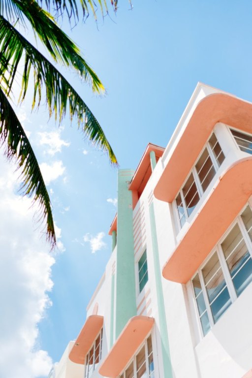
And who cannot be charmed by the Art Deco buildings with their pastel facades along Miami Beach?
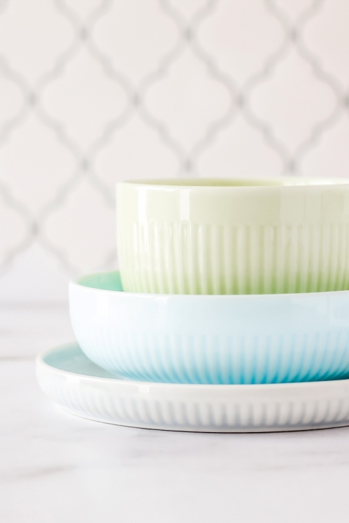
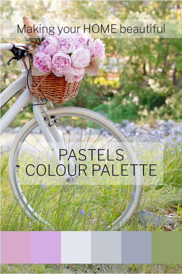
The colour palette below is a classic one of pink and grey with a touch of green. Just one of many gorgeous soft palettes to use for an interior scheme.
I hope this has inspired you to decorate with pastels. Don't just think that they're for children's rooms. A little bit of colour in our lives is uplifting and makes for an interesting space. Remember to use pale pastel tones with lots of white and you can't go wrong.
If you're having trouble pulling together a decorating palette, remember that I have a FREE resource library that I regularly update. I have an e-book there for you to download on how to put together a mood board to get you started and inspired on working on your decorating ideas. Download it for free here.
I love the blues that you typically see with Scandinavian style. And the photo of pastels combined with the splash of black is stunning!
Thanks Carrie I love that image too – I love the whites and greys that are popular at the moment but this is a nice change!