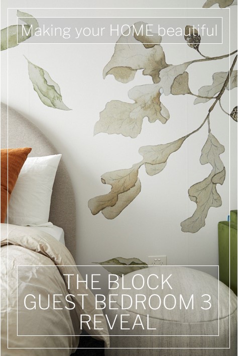
The Block Guest Bedroom 3 reveal has more than bedrooms this week and some great and not so great rooms.
I have to say that I am a fan of Jimmy and Tam. They are the only contestants who have really endeavoured to meet the original brief of decorating to an era and I like the way that they push the designs with their use of colour and pattern. It's not always right and in fact sometimes I really don't like the rooms, but their spaces are getting more sophisticated as the show progresses. Luke and Jasmin deliver gorgeous spaces that are on trend and no doubt will sell very well on Auction day and although I often love their rooms, they don't have the passion that Jimmy and Tam have.
This week saw Sarah and George take out a win, finally. I felt however that they won because it was their turn. I believe they have deserved wins in the past, but this week wasn't one of them.
There are some interesting rooms in The Block Guest Bedroom 3 reveal and a great use of the space available. I am happy to see that more living areas have been incorporated into the houses as I was getting very concerned about the amount of bedrooms/bathrooms and amazingly huge kitchens without offering enough space throughout the house to actually place your bottom!
The Block Guest Bedroom 3 Reveal
Sarah and George | Guest Bedroom 3 | 28.5 / 30
The judges' views
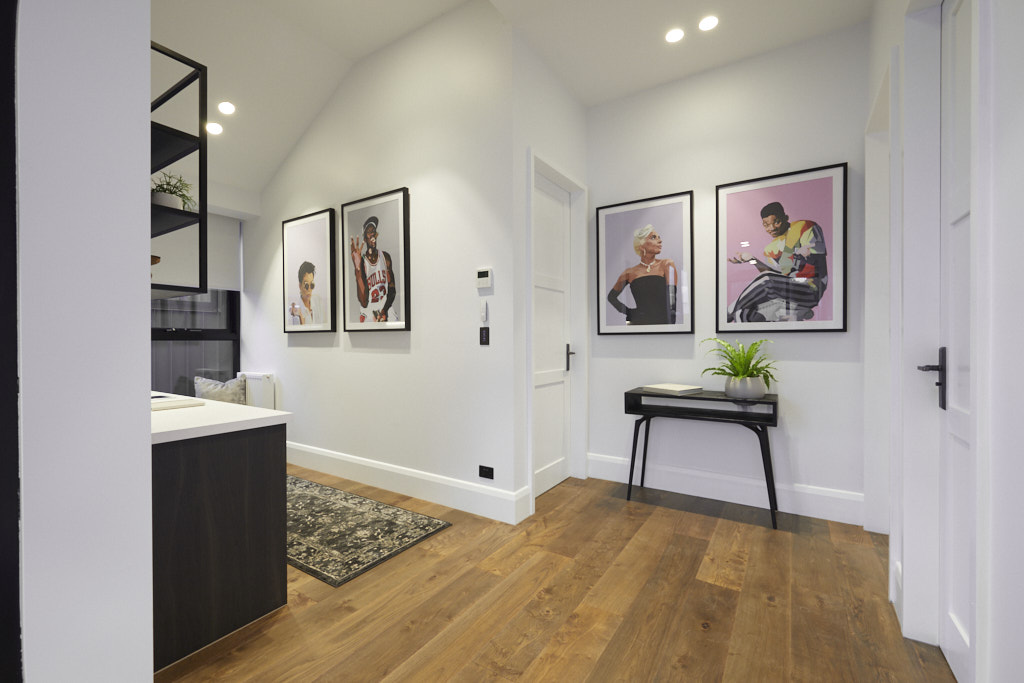
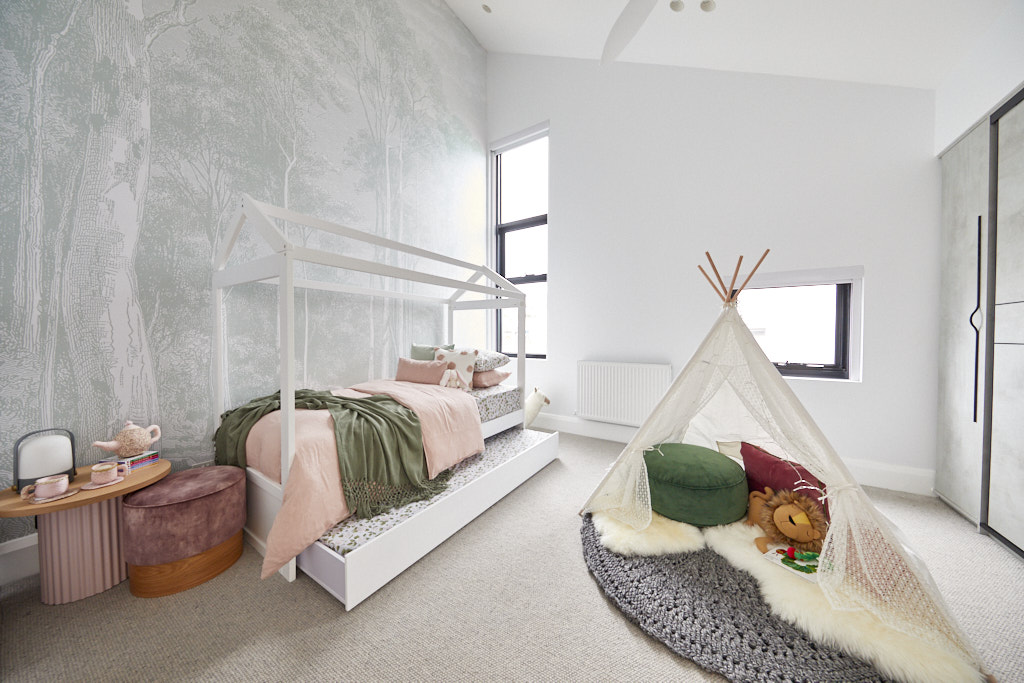
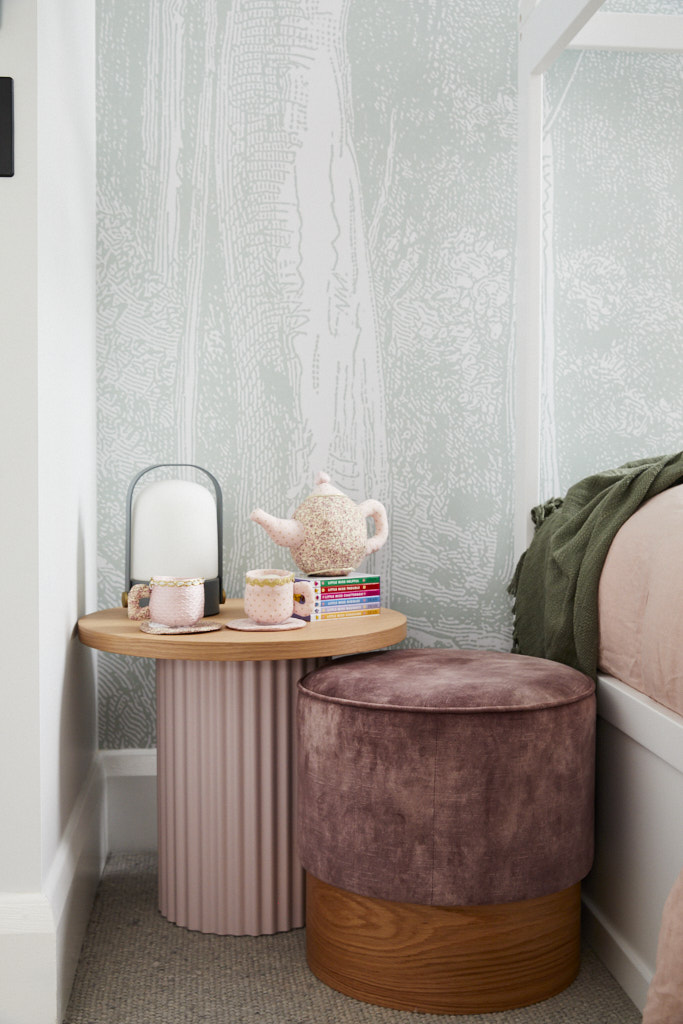
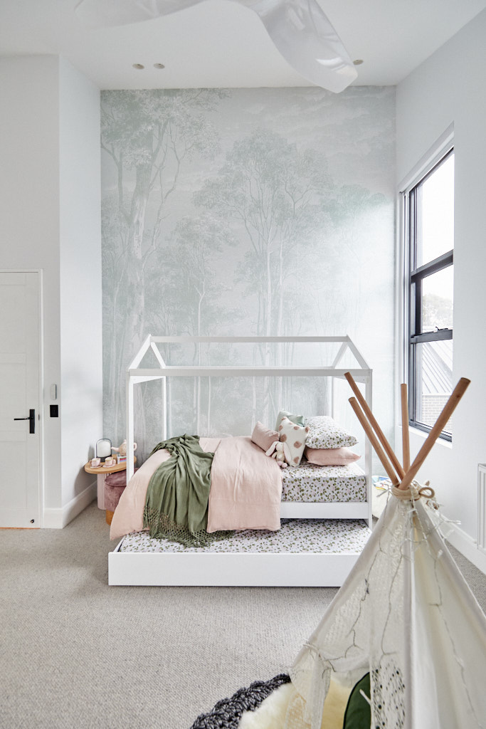
They finally did it! Sarah and George and their wonderful upstairs rooms that included a work from home space, a powder room and a gorgeous kids room, was a huge hit with all three judges. The kids’ room in particular with a teepee on the floor had that all-important emotional connection. The art work with prints of Will Smith, Michael Jordan, Kris Jenner and Lady Gaga, had immediate impact for the judges once they walked up the stairs. Sarah and George’s aim for their upstairs part of House No.2 was for a sanctuary for a child or a teenager, and they certainly achieved that. So after so many weeks of coming close to the top of the leader board, Sarah and George are finally on top and they couldn’t be happier.
My views
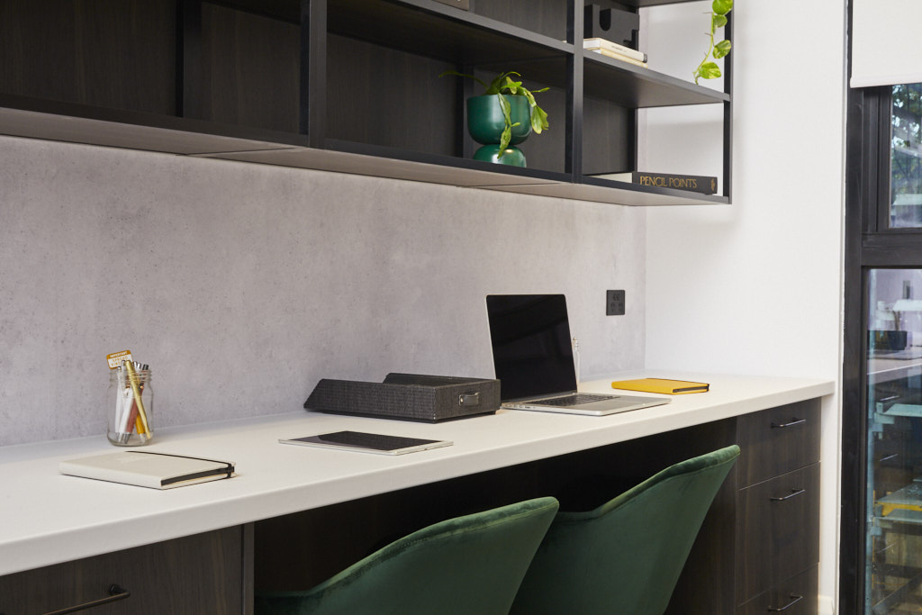
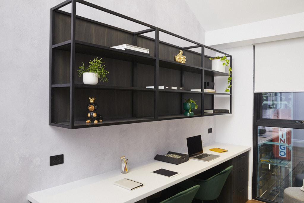
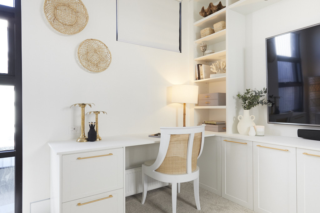
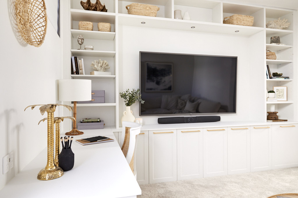
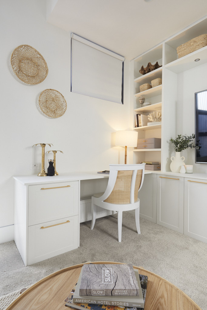
I think that Sarah and George have delivered rooms in this series that were worthy of a win, but I didn't think this week was one of them. The bedroom needed more furniture and I don't think that a Teepee stuck in the middle of the room introduces an emotional connection. Their living room last week, with its rich tones, was an amazingly welcoming space but I feel this room just isn't full enough or complete. The desk in the home office/study section wasn't large enough for two people to sit at side by side and the overhead shelving was impractical with open ends. I did like their choice of carpet and Iove the wallpaper choice which could easily be adapted to an older child or adult.
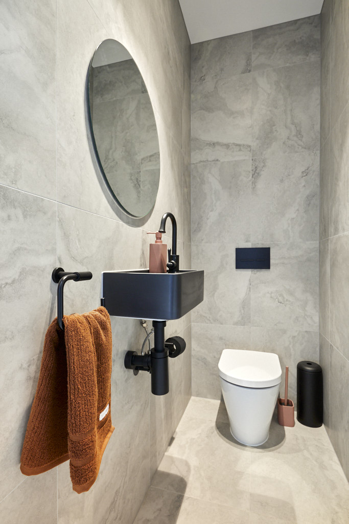
In terms of the powder room, I think that this could have been far more appealing too. The tiles to the ceiling were overwhelming and unwarranted for a simple powder room without wet areas. It was perfectly OK but didn't have the wow factor that I have come to expect from bathrooms produced by Sarah and George.
Harry and Tash | Guest Bedroom 3 | 28 /30
The judges' views
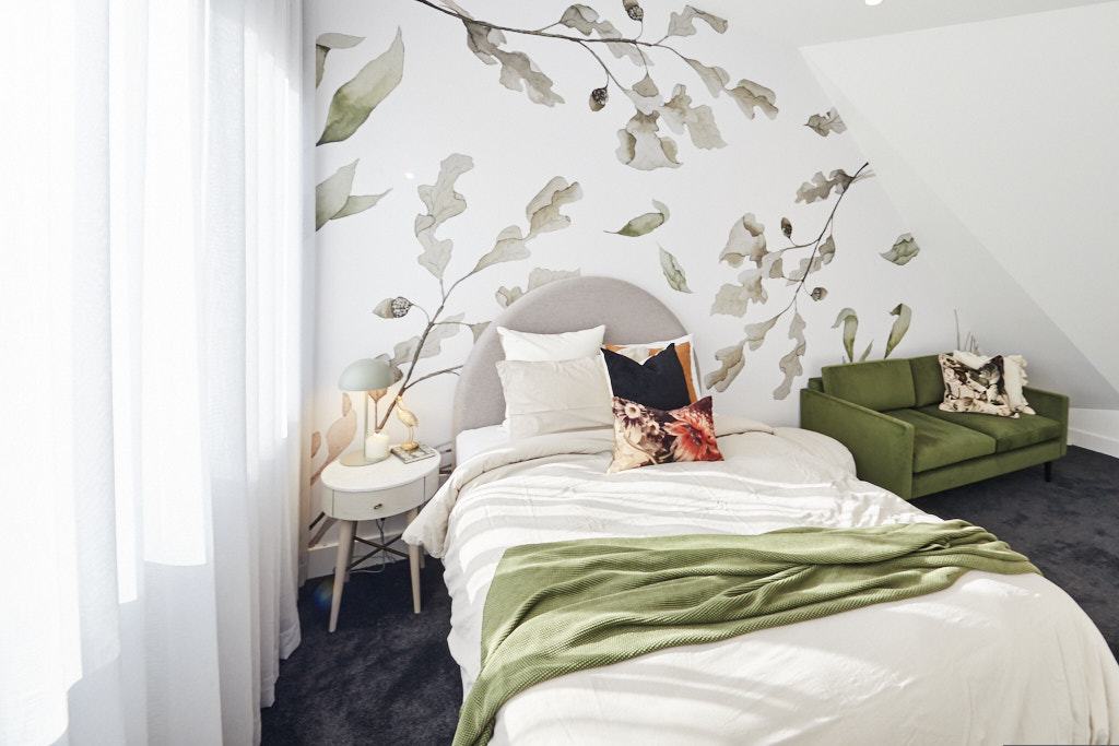
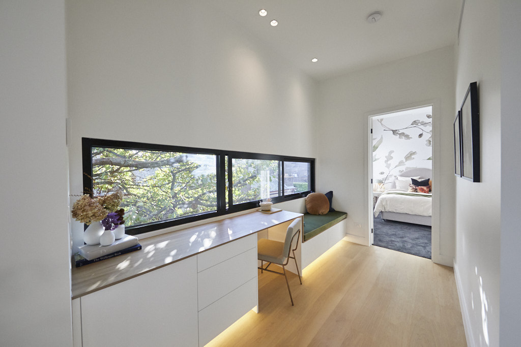
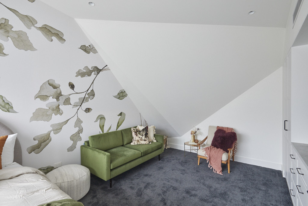
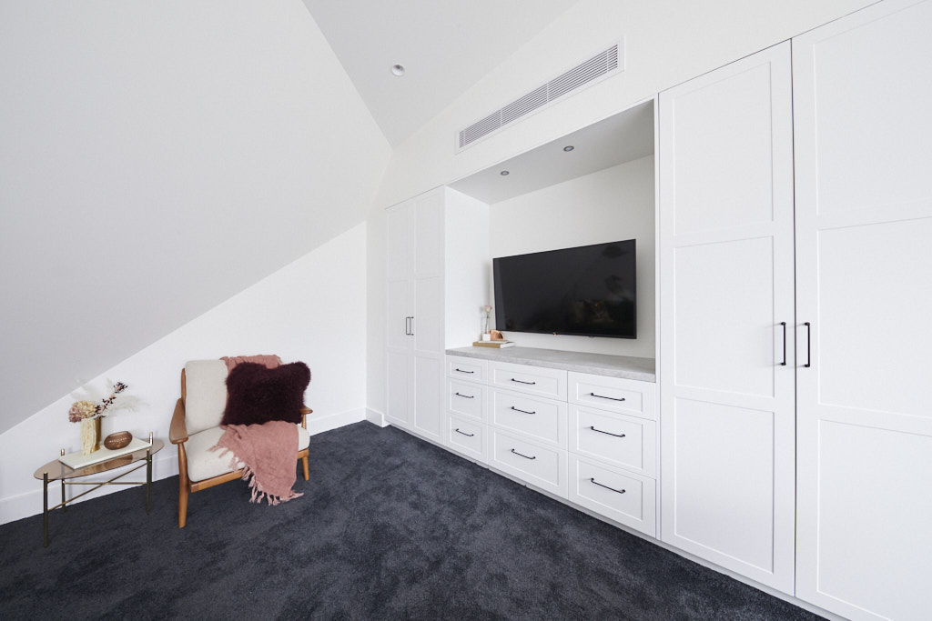
The strong momentum for Harry and Tash continued after they won the living and dining room reveals last week. The beautiful work from home space at the top of the stairs of House No.1 and the view – that incredible oak tree – wowed the judges. A day bed next to the work from home space was a stroke of genius. Inside their bedroom was a huge space and they worked very well around a complicated architectural void. The judges loved the fact that the bedroom was flexible. It could easily be turned into a rumpus room, it is that large. The Grafico wallpaper in the bedroom, as usual, was nothing but stunning.
My views
It has been interesting to see the development of Tash's styling throughout this series. The colour palette for this space is beautiful. My favourite colour is green so I may be a little biased, but the overall palette with different tones of green, brown, cream and terracotta was gorgeous. I really like the way that their design incorporated the gorgeous oak tree and was reflected in the choice of wallpaper. A very nice place to work from home and a lovely guest bedroom with a well thought out wall of storage and TV placement. In fact, a great space for a teenager to live and study in. The only thing I didn't like was the carpet, but I congratulate Harry and Tash for a very well thought through, pretty and well executed space.
Daniel and Jade | Guest Bedroom 3 | 27.5 / 30
The judges' views
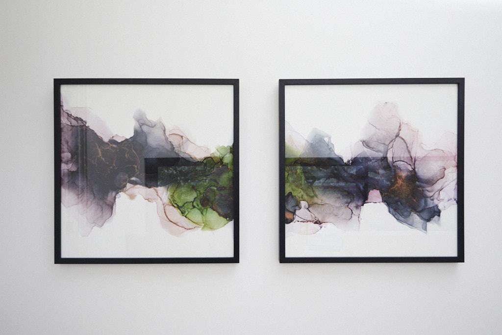
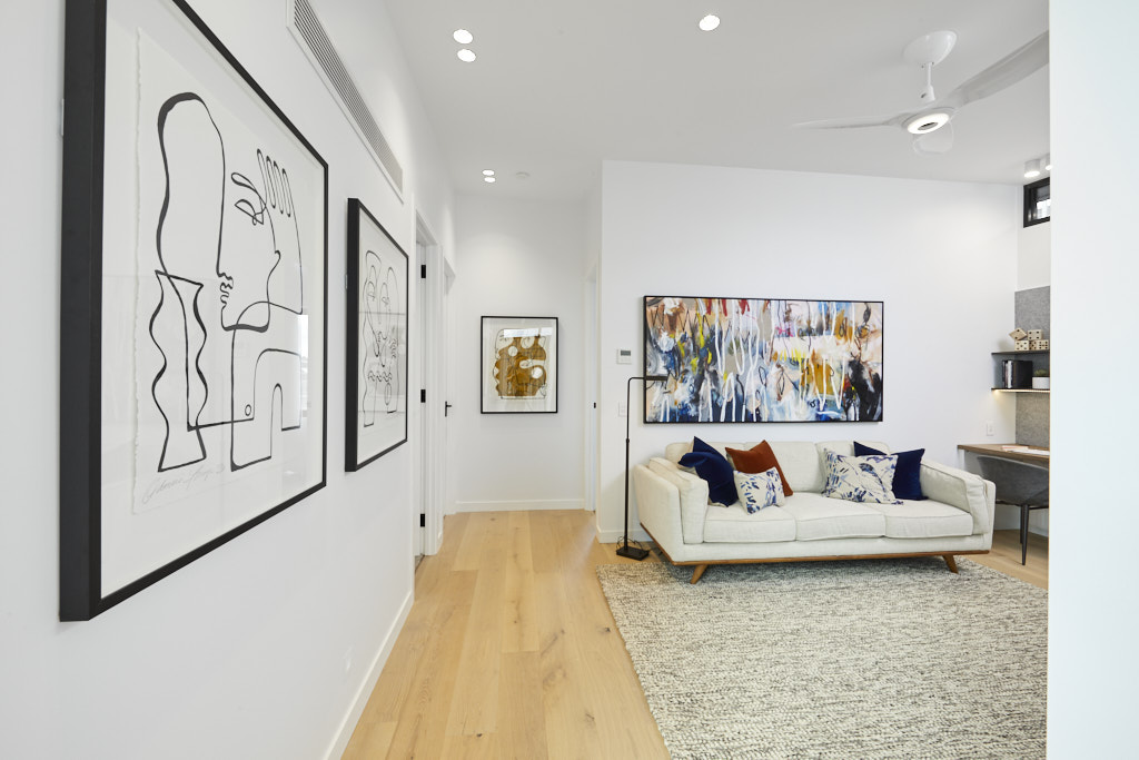
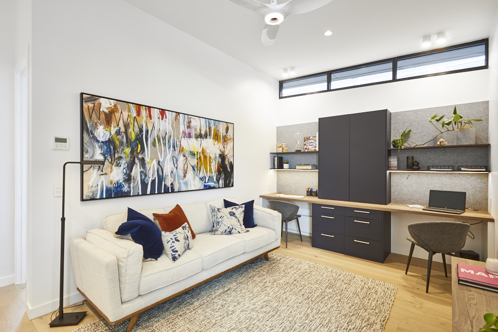
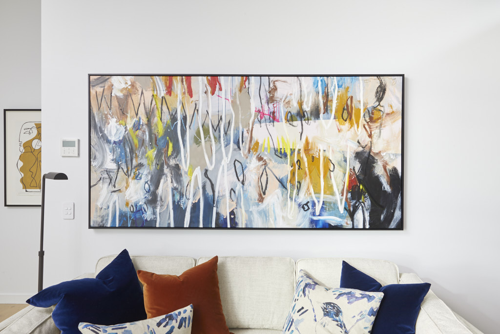
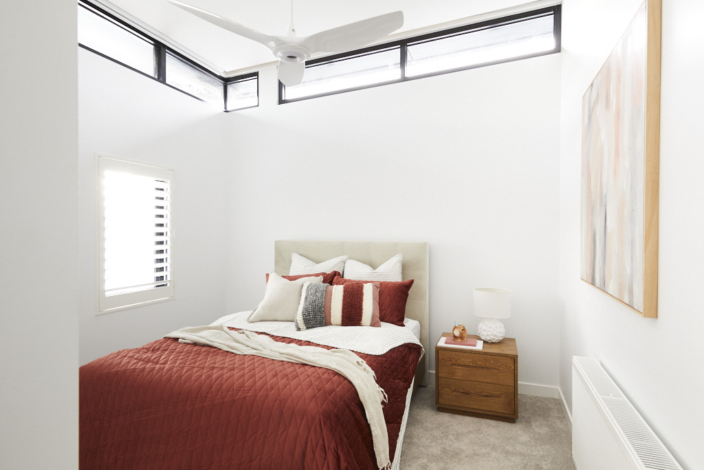
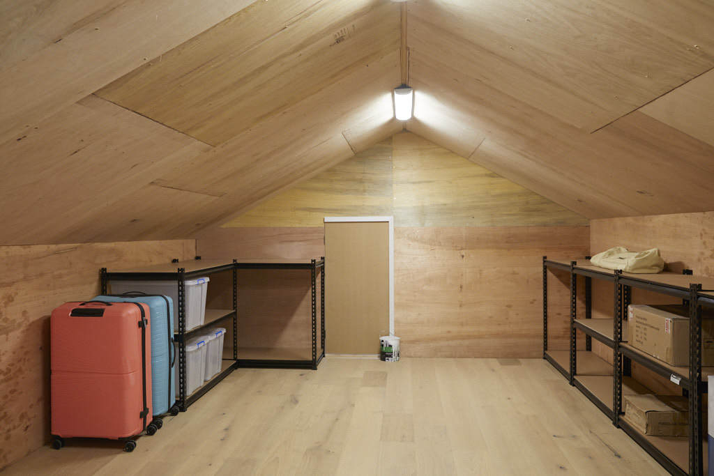
The South Australian farmers have a different space upstairs to everyone else – as well as a third bedroom, they have a secret attic that can be used for storage. Shaynna felt like doing a little dance in the attic, and why not, it’s that spacious. While their kids’ rumpus room was well laid out, it did lack that emotional connection, according to the judges. The kids’ room however was a great asset to upstairs, and with three bedrooms, House No.3 is real estate gold. Some of the highlights included a wonder print by artist Shane Bowden from Art Lovers. Daniel and Jade have never felt more physically drained on The Block as they did this week, but all the hard work was worth it.
My views
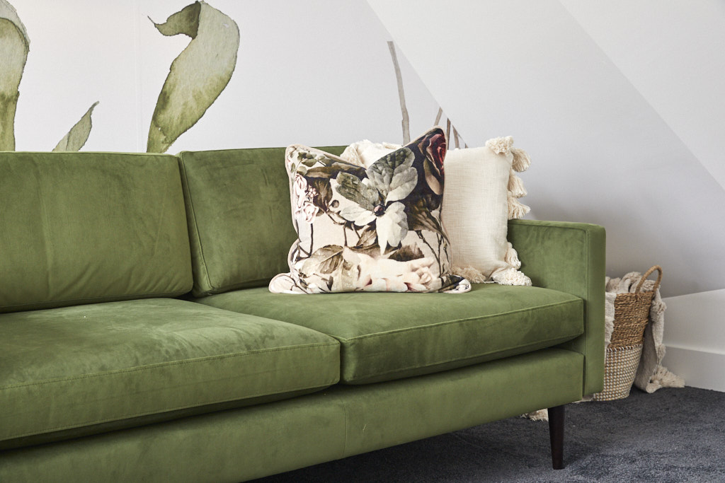
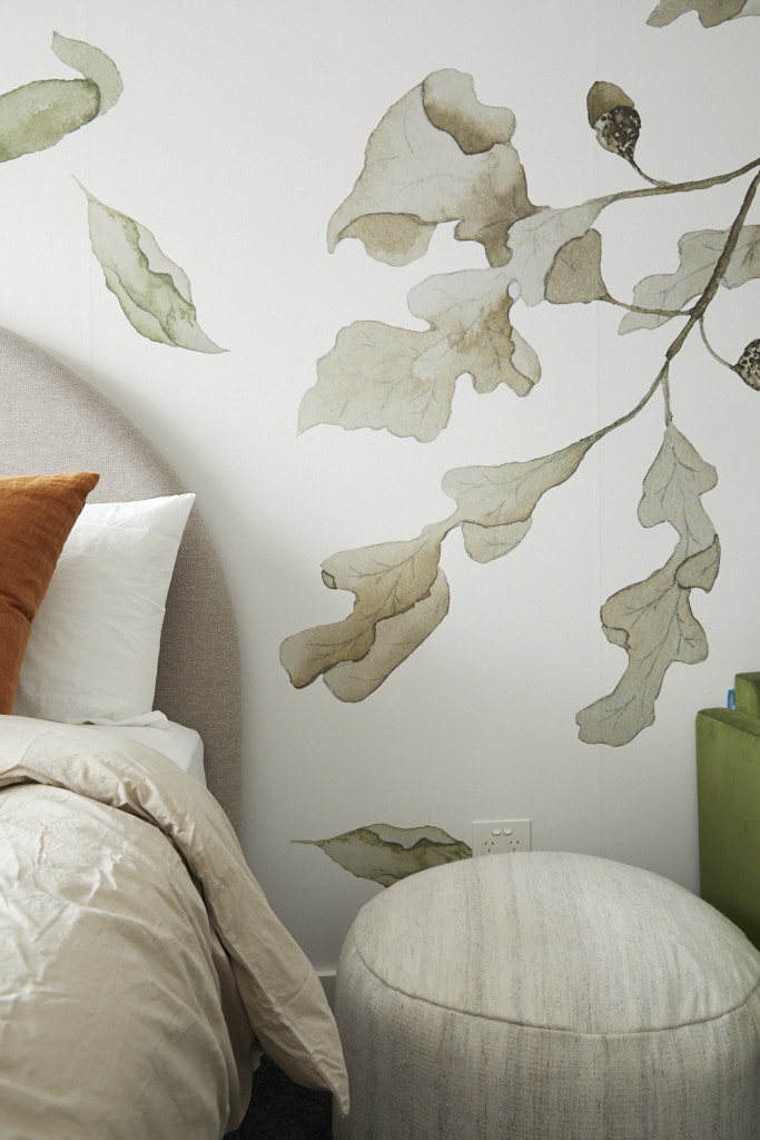
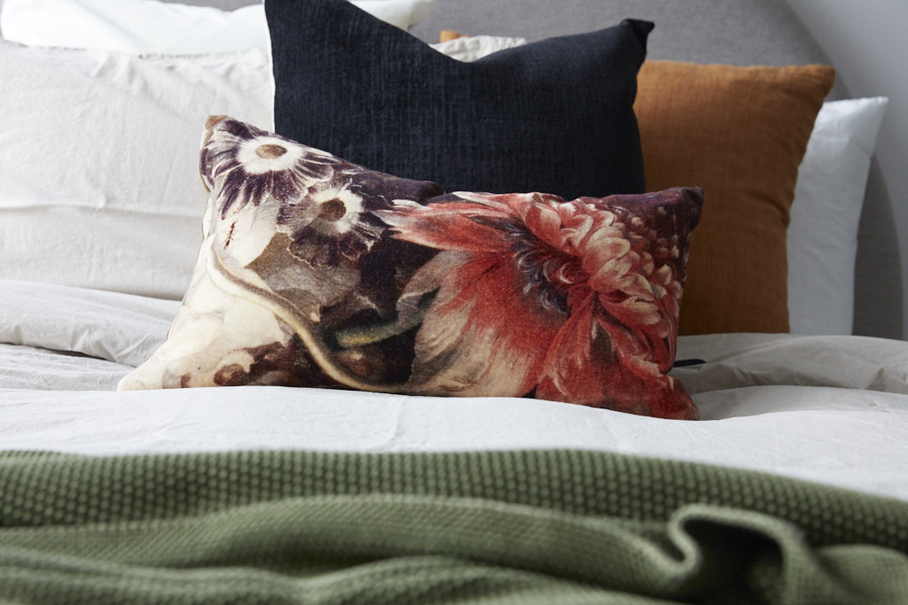
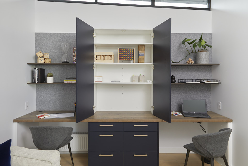
Daniel and Jade have delivered a very smart Rumpus and/or study with a nice guest bedroom. However, although I love the sofa with its slight retro feel, which is a nod to the 1930s, I didn't like the design of the home office area. The dark colour in the middle, cutting through the work bench, was visually distorting and a simple long bench with overhead shelving would have worked just as well. I do like the way that the work stations were separated though. The colours in the scheme were uplifting and punchy and I love the range of artworks which looked generous and made the room appealing and interesting. There is no doubt too that the attic space will prove extremely useful.
Luke and Jasmin | Guest Bedroom 3 | 26 /30
The judges' views
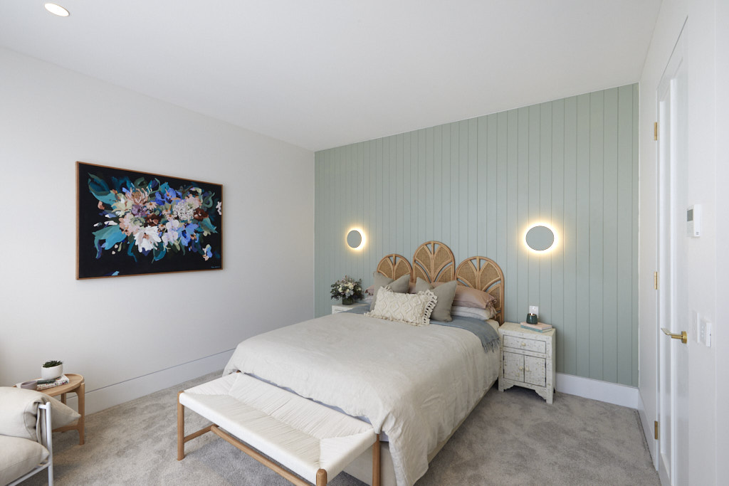
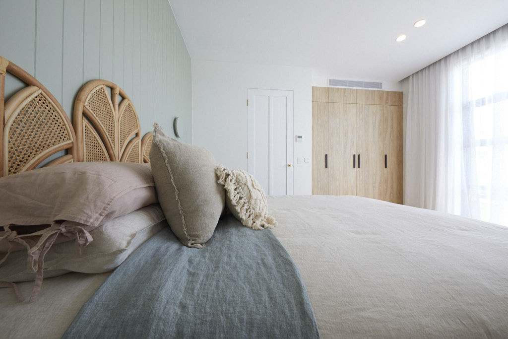
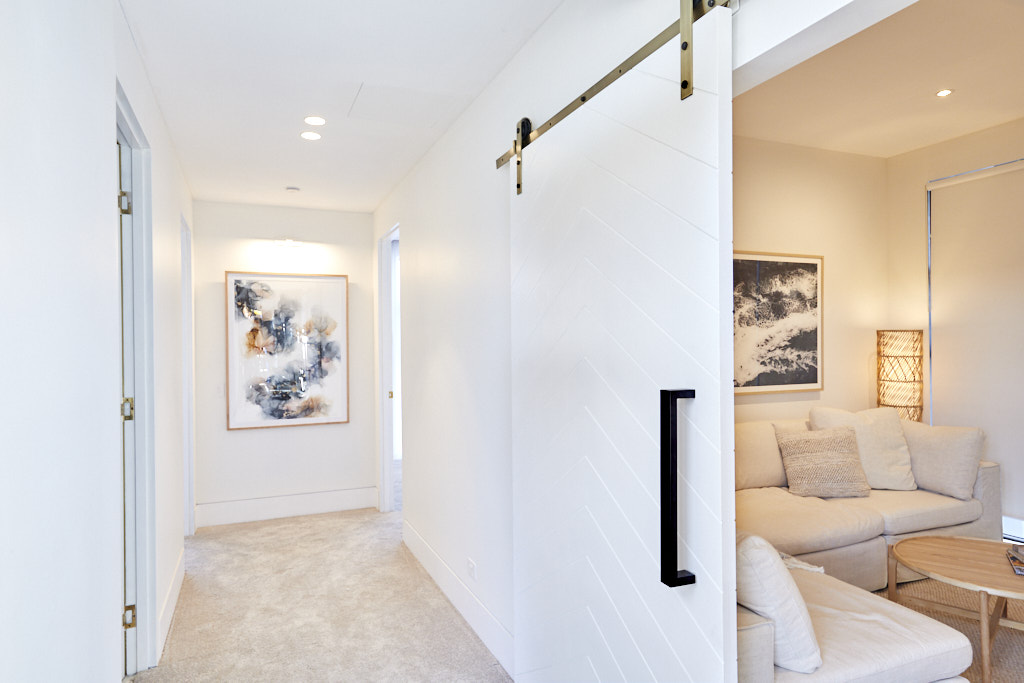
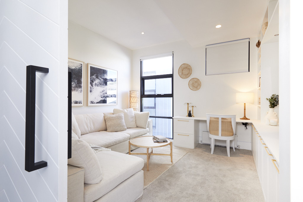
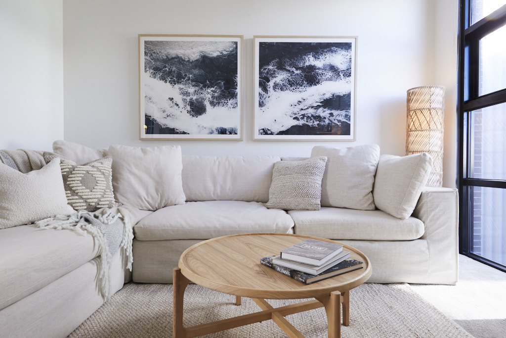
The Perth married couple had major issues this week after a squeaky floor went horribly wrong, so all things considering, they still delivered some beautiful spaces upstairs. Their living space, or cinema room, had a calm feeling about it and they got the choice of sofa just right according to Shaynna Blaze. She didn’t want to get off it. The shelves were also filled with beautiful products and Jasmin’s style was on point. The bedroom with the VJ paneling continued the beachy, coastal feel of House No.4. The finishings and painting was a bit rough, but considering what happened on the Saturday before room reveal, Luke and Jasmin did an amazing job.
My views
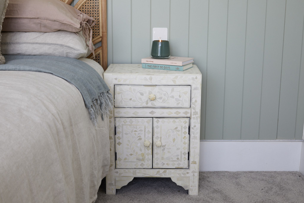
Luke and Jasmin continue to deliver spaces that are on trend and beautifully styled. The bedhead gives a nod to the organic and floral trend of the Arts and Crafts era which is a nice touch and demonstrates that it is possible to include pieces that suit today's look, while working to a brief of decorating to a retro style. The colour palette in the bedroom is divine but the strongly coloured artwork spoilt the look and was too dominant. Their living space/home office was absolutely dreamy. I love it and could spend many happy an hour on that sofa. I really like the neutral colour palette which worked as there were some gorgeous layers of texture in the space. Clearly the finishing of the rooms was not up to scratch, which would have lost them points, but I feel that this space was the winning one for this week.
Jimmy and Tam | Guest Bedroom 3 | 25.5 /30
The judges' views
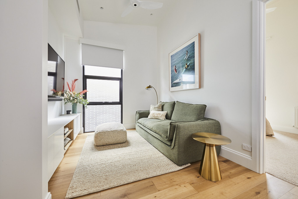
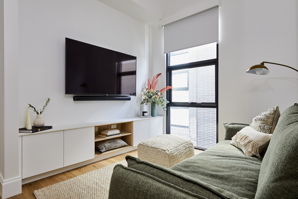
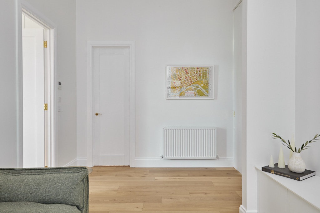
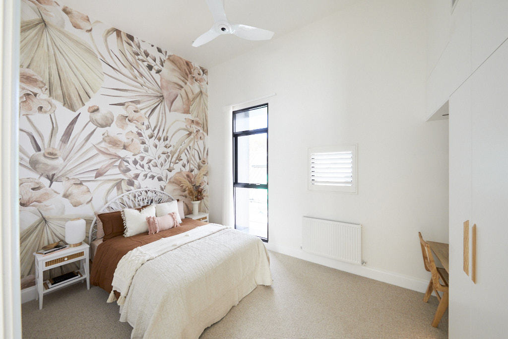
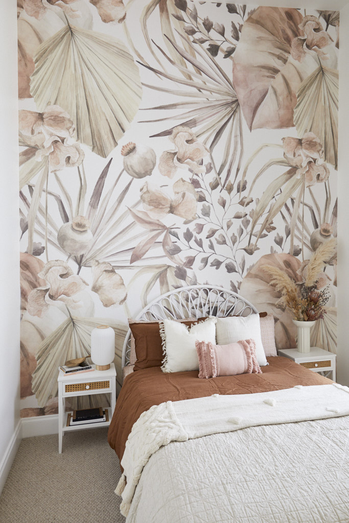
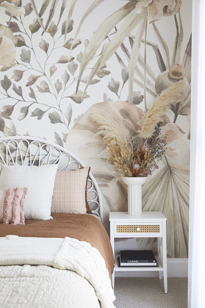
Last is not something Jimmy and Tam are used to, but don’t be too concerned, they still have their eye on the prize. Jimmy and Tam delivered a media room and a bedroom upstairs in their 1950s inspired House No.5 The bedroom with the Grafico wallpaper matched well with bedroom No.1 across the hallway and was beautifully styled. Tam had a huge arrangement of dried flowers, despite the fact Neale has been very vocal he is not a fan …. Are they having a joke with him? The big issue with the media room was the placement of the TV, all three judges thought it was too high considering the level of the couch and how close it was to the TV.
My views
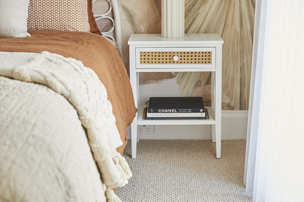
Dried flower arrangements were first seen during Elizabethan times but made a strong comeback after the war in the 1950s. As usual Jimmy and Tam are the contestants who have really taken to heart the brief of delivering rooms with a retro feel. I know that Neale doesn't like Tam's dried flower arrangements but they do meet the brief perfectly and I feel it's a shame that Tam is perhaps missing out on points by sticking faithfully to the original brief. I love their choice of sofa for the living area but I agree with the judges that the TV is simply too high. It actually would have been perfect just sitting on the built in joinery. The floor lamp is perfect and on trend for today and the 1950s. Overall, this is a nice simple space to relax in.
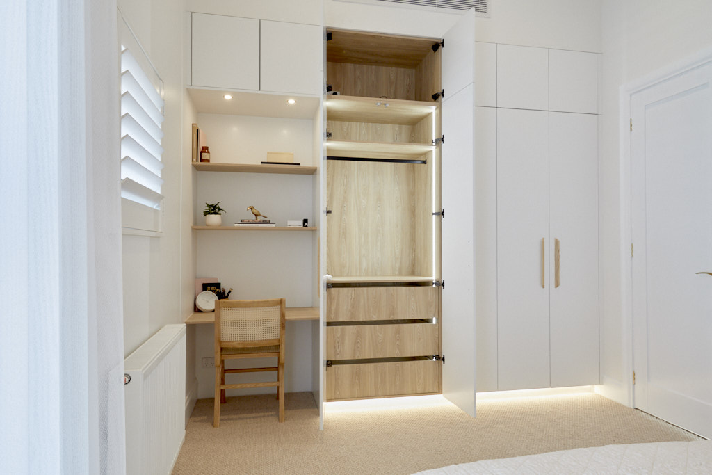
The wallpaper choice was stunning and again keeps Tam's theme going through the home but I felt that the bed was simply overwhelmed by it. The bedhead was cute but just too small for that wall. I also think that one of the cupboards could have been forsaken for a more generously sized desk, as this one is too small. The organic colour scheme though is gorgeous. I love the use of green in the living area and the warm tones of terracotta in the bedroom and as usual I love their choice of textured rug and carpet. This is on trend and in my view, far preferable to the plush carpets with their vacuum tracks.
Which contestants do you think should have won The Block Guest Bedroom 3 reveal this week? Do you agree with the judges or me or do you have your own views? I would love to hear them in the comments below.
Many of the items shown here can be purchased through The Block Shop and more information about the show and the contestants can be found on Channel Nine.
You can see last week's reveal here – Living and Dining Reveal

Hi Samantha, thanks always for your generous info, ideas and advice. I’m with Neale about the dried flowers. Firstly I think that they always seem to look a little pale and insipid, but more importantly they are a big no no when it comes to Feng shui principles. Anything that is dried out, old and not fresh is out.
Thank you again I love to receive your emails and look forward to many more. Cheers Sue
Hi Sue yes I agree, I’m not a fan of them either! I just feel that Jimmy and Tam are really making a big effort to style to the era and I think this is often overlooked. Interesting to hear about the Feng Shui principles, I’m not very knowledgeable about them but they usually make a good deal of sense. Cheers Samantha