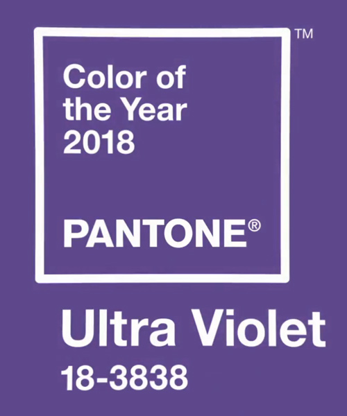
So, Ultra Violet has been chosen by Pantone as its colour of the year for 2018. Quite a provocative choice, by their own admission, particularly after the well regarded and universally liked Greenery of 2017.
What do you think of it? What do you know about it?
A little background – Pantone is recognised around the globe as the foremost source of colour information. Manufacturers, designers and forecasters rely on its information and work from a standardised colour system that is universal. Each year, various trend forecasters will gather from nations around the world to determine the colour of the year and for 2018 we have Ultra Violet.
We will therefore be seeing a lot more of this colour in fashion, advertising and interiors. What do you think of this colour? Posting this to my facebook page produced interesting feedback. People either love it or hate it and I must say it would never be my choice as a paint colour for a wall. However, looking at ideas around this colour has made me realise that it really does have some gorgeous appeal for exterior and interior design, it just needs to be used in the right way – let me show you how.
The colourful front door
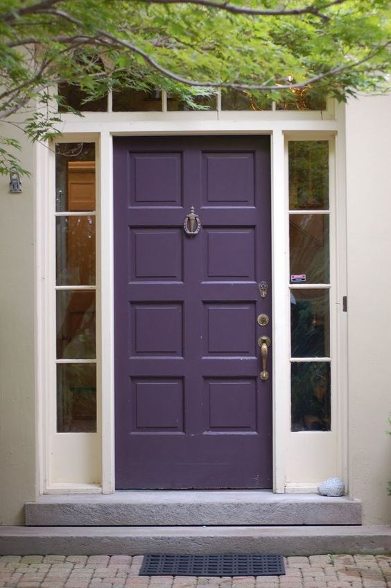
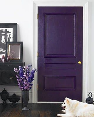
Benjamin Moore's Dark Purple is a gorgeous colour for a front door. Dark and impressive, it makes a nice change from a black or grey front door but it is not so bright that it is too obvious on the house. Purple works well with stone colours, the great neutrals that perform so well on exteriors. These are the neutrals that start to read slightly green and are classics to use. Deep Violet also goes well with soft greys.
Related: Colourful front doors – what they say about you
Using Violet in an interior scheme
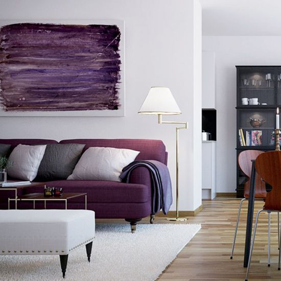
Deep purple brings a stunning tonal contrast to an all white scheme. Purple comes in many guises depending upon the amount of blue or red it contains. The beauty of violet is that it has a large degree of blue. Once you nudge around the colour wheel you start to encounter the magenta tones which contain more red.
You can see that the sofa is starting to look a little warmer but the accessories and gorgeous artwork maintain the violet feel. Violet therefore is a colour that is a great alternative to dark neutral grey but doesn't heat up a room or make quite such a statement as a magenta hue would. Dark enough that it absorbs the light, it makes a great tonal contrast to a contemporary white palette and I believe adds personality without being garish.
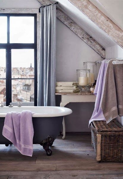
Colourful freestanding baths are now popular and again, this deep dark purple is a great choice if you want to make a statement and select something a little different but you don't want it to be too obvious. Again a great alternative to black or dark grey. This bathroom overlooking the rooftops of Paris shows off this colour scheme really well – I can just see myself soaking here and looking out onto a gorgeous Violet sunset.
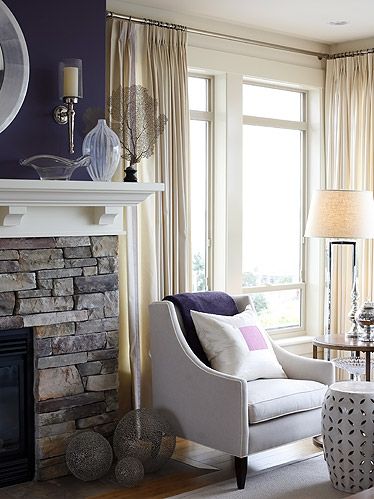
Sarah Richardson has worked magic here with the feature wall colour of deep purple. If you look at the stone in the fireplace it does contain some subtle purple hues and by painting just a feature of the chimney breast, it enhances the stone beautifully. A simple matching throw completes the look and demonstrates the less is more adage perfectly.
One of my favourite ways to incorporate a feature colour is to paint it on the interior door. I feel this is far more effective than just selecting a random wall and painting it a different colour. You get your gorgeous injection of rich purple here but in a far more interesting and creative way.
I have written about this in previous posts as I feel that the traditional feature wall has had its day, however I don't like having to give up the gorgeous injection of colour they provide. This is a great alternative and the deepness of the violet hue balances the black in the furniture and accessories.
Related: What should you paint on the inside of your front door
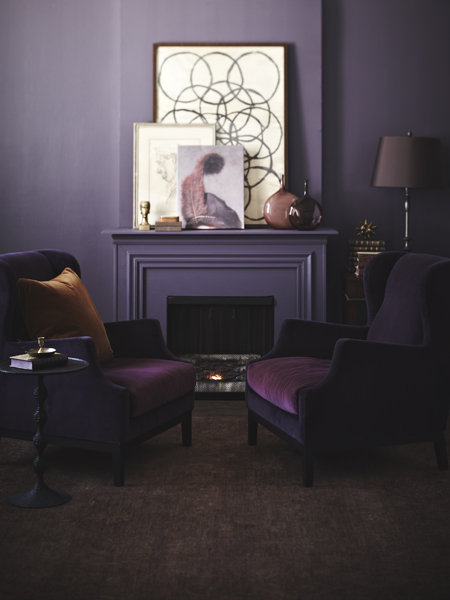
Abigail Ahern from the UK has made dark colour palettes fashionable but most people tend to shy away from them as they can be tricky to get right. What you need to bear in mind is the mood you want to create, the aspect of the room and when you will use it as these elements will determine whether it is the right choice for the space. By painting all walls in a very dark tone, in this case purple, you create shadows and the corners and perimeters of a room become less defined which brings the focus into what is in the room.
Related: How to work with a dark colour palette
The background to the choice of Ultra Violet
It is interesting to read more about the background to Pantone's decision to name Ultra Violet the colour of the year for 2018. Purple is the creative colour of the spectrum and lovers of this hue are often very spiritual and cultured souls. With a love of the arts and all things mystical, their homes are usually very creative and inventive.
Pantone see this colour as being representative of the age we are living in with technology moving apace and new ideas forming daily. In their own words Ultra Violet communicates originality, ingenuity, and visionary thinking that points us toward the future.
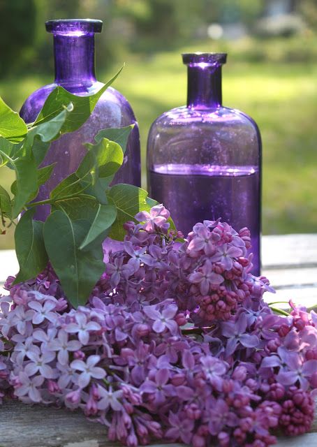
I really like this idea and feel it is a good way to start a new year. We should all look forward and explore that creative side of our personalities, even if this only means opting for violet in our choice of floral display.
I have an entire board in my Pinterest profile dedicated to the colour purple – take a look to see more inspiration for how you can use this gorgeous colour and remember that I would love to hear from you in the comments section below. Let me know what you think of this colour and whether you plan to introduce it into your life next year.

Interesting as I am in the middle of painting the outside and inside with purple hues. I have spent the past year fighting stage III breast cancer. I decided to paint my house with colors my soul was yearning for. It’s a cottage style with lightness of aspen trees out front. I am painting the exterior with a hint of violet, trimmed with a bluish purple and a light sea green. The front door I painted the sea green and it opens my soul as I enter. The interior white has a hint of pink and mauve walls in the bathroom and the other rooms will have a silvery light lilac. I’m not finished but my desire is to have the whole house interior and exterior colors work together to give it a place of magic. That my future grandkids will be excited for lots of laughter and love with grandma!
I’m also working on the front of the yard as I added an arch off the side walk as you enter the yard and will plant honeysuckle so that all senses come together. It’s a work in progress as I am still dealing with pain from side effects that the treatments of cancer has given me. So rewarding to push through it and to know I’m creating something great for my future grandkids. P.S…. my daughter is not married nor dating anyone currently but I just have a feeling. 🙂
Hi Jennifer thanks for posting your story on the blog – it is great to hear people’s reactions to colour and I believe it does have a huge bearing on our state of mind and how we feel about the environment we are in. The exterior colours of your cottage sound soft and pretty and I love the sound of the silvery lilac. It is a lovely project to have to keep you positive and motivated and a beautiful legacy to leave. Wishing you all the best with your treatment and I hope you enjoy your lovely home – and get to see some grandchildren – for a long time to come. Samantha x