
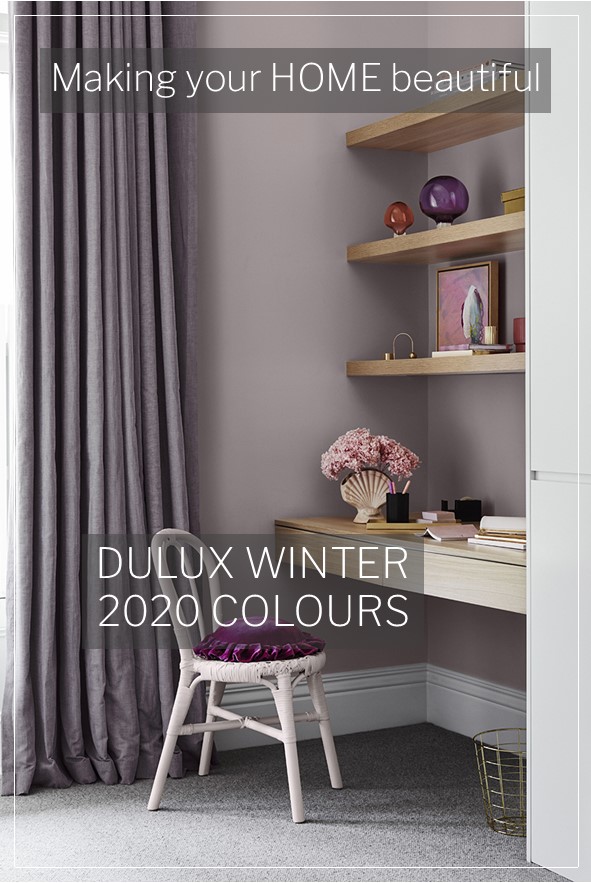
I really enjoy all the different seasons as they each have so much to offer. Winter is a time to retreat and to appreciate our homes and all they have to offer. In the midst of the Covid pandemic, we have even more reason to stay inside and I was therefore excited to see the latest colour trend predictions from Dulux. The Indulge palette is from the Dulux Winter 2020 colours. A range of gorgeous rich, warm, comforting hues with depth and interest.
The Dulux winter colour predictions are the result of extensive research into international trends, with inspiration drawn from design trade shows, fashion, technology and media. So, it's always good to keep abreast of these trends to get a taste for what may be showing up in our homewares and furniture stores.
What I love about embracing colour using paint is that it is very easy and relatively inexpensive to change. Colour too, more than any other design element, has the ability to change the mood of a space. If you have followed the grey and white trend but feel that something may be lacking, this could be the time to embrace some colour and create a room to retreat to that is welcoming and comfortable.
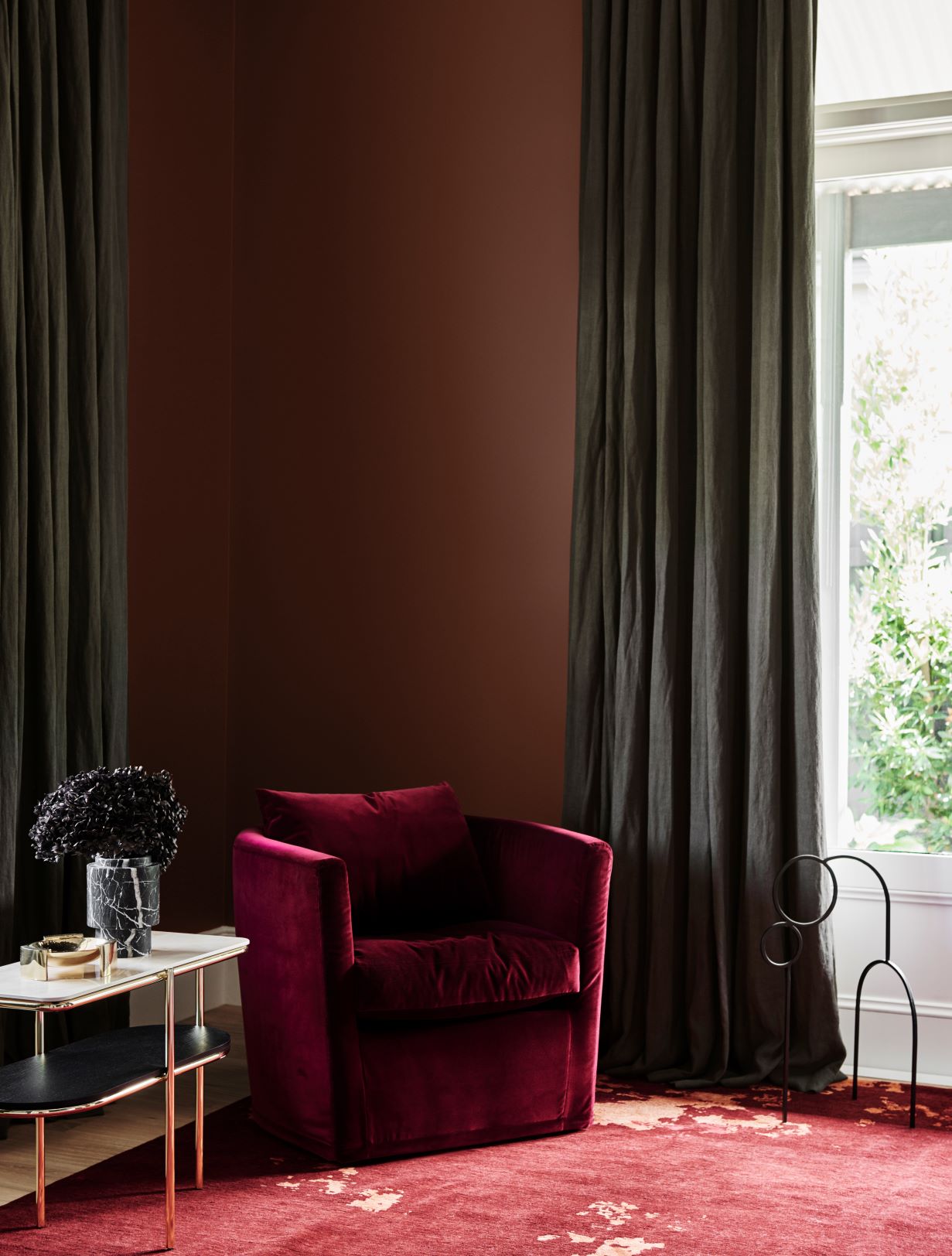
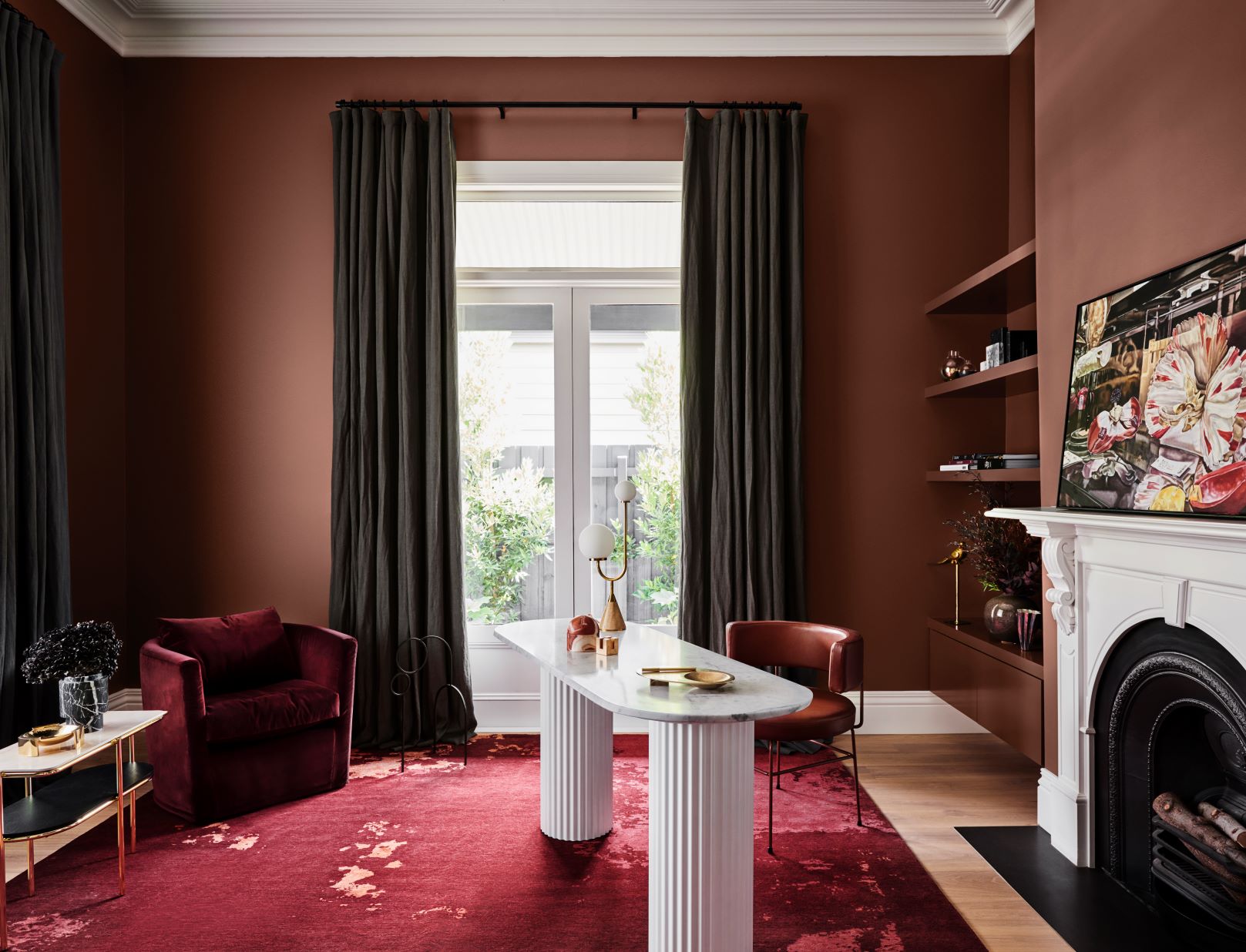
The colours featured above are Dulux Wash&Wear in Russet Tan and Dulux Wash& Wear in Natural White and the gorgeous artwork is “Still Life with Dianthus and Bee” by Dena Khan.
More about the Indulge palette
“The Indulge palette is warm and sophisticated, the ideal colour cure for those gloomy winter months,” says Andrea Lucena-Orr, Dulux Colour and Communications Manager. “Deep burgundy, soft violet and accents of coral and mustard feel opulent and exciting, with hints of art deco and 70s disco adding a touch of nostalgia.
“There are different ways to interpret this look – if you’re feeling bold, go dark and dramatic with saturated shades of burgundy and eggplant. Or, for a softer look, opt for soft grey-violet or calico. The key is to choose a hero colour and display it in different shades across your walls and soft furnishings, with one or two contrasting accents to provide that element of surprise. Curved furniture and pared-back styling keep the look fresh and modern.
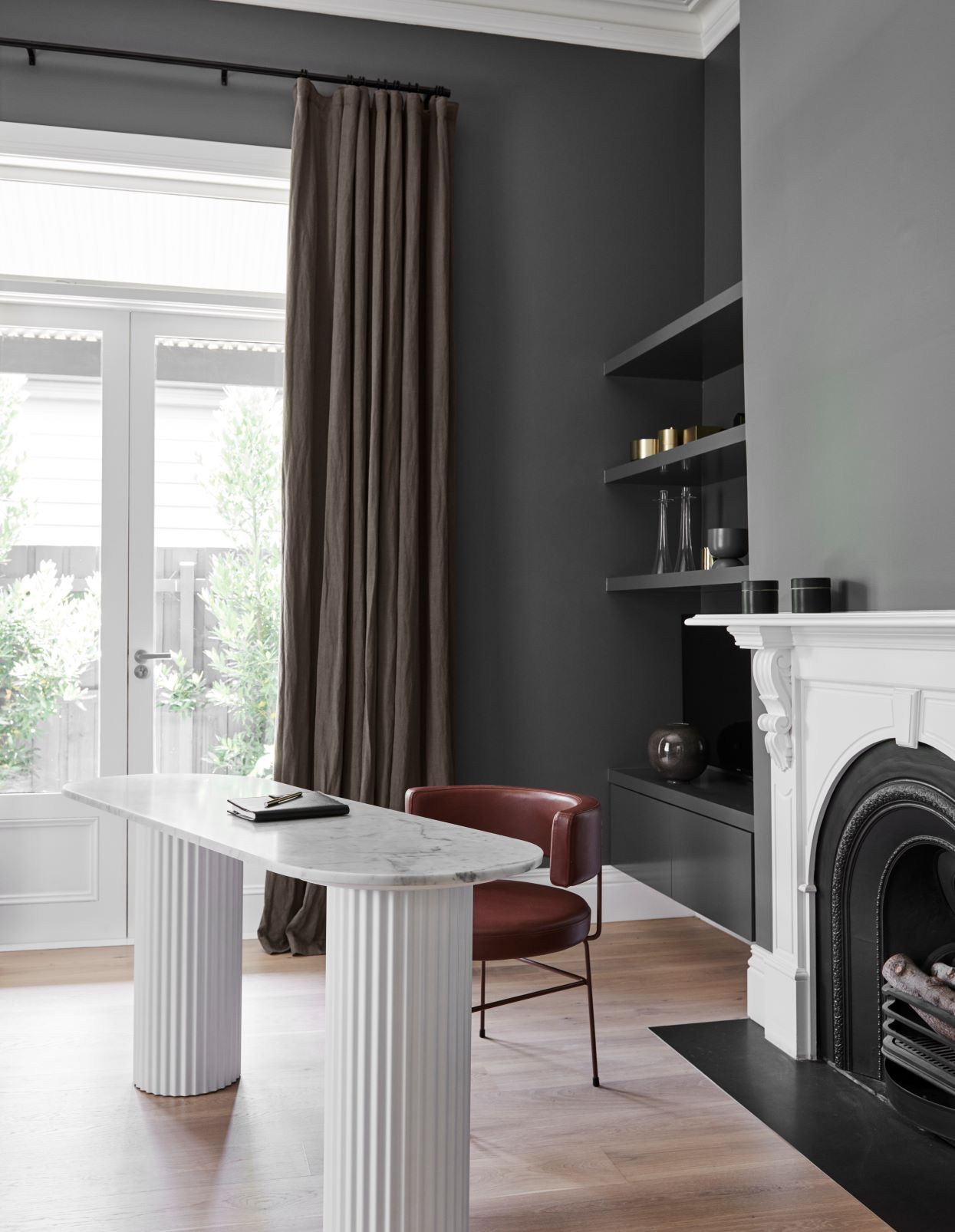
“This palette is great for revitalising formal areas in period and heritage homes, such as the living room, dining room, hallway and master bedroom. It cleverly blends old and new so you can introduce contemporary flair into your home whilst honouring its history. Add in the crackle of a fire and you’ve created a luxurious winter retreat you’ll love coming home to,” says Lucena-Orr. To show how easy it is to rejuvenate your home for winter with colour, stylist Bree Leech made over a home office and study nook in a heritage home using the Dulux Indulge palette.
“These two rooms have great bones – high ceilings, ornate cornicing, natural light and a beautiful fireplace in the home office. But the steely grey on the home office walls and the white behind the study nook felt cold and uninviting. Colour has such a huge impact on the mood of a room, and I wanted to create spaces where you’d want to linger. The furniture and built-in joinery are stunning; I wished to make these more of a feature through the use of colour,” says Leech.
“I wanted to make the rooms feel cosy and inviting and play up their best features without a huge outlay of time or money. Paint was the best way to achieve this – it gave the rooms a whole new look without replacing all the furniture or blowing the budget.
“Given the room’s grand proportions and character, the Indulge palette of rich, saturated hues was a natural choice. I chose Dulux Wash&Wear in Russet Tan for the walls and shelving in the home office, which has a luxurious, enveloping feel. Colour contrasts can be incredibly effective when you want to highlight specific features in a room; I retained the existing white ceiling and fireplace, which were painted in Dulux Natural White™ – a classic warm white, that allowed the cohesion of these elements with the white desk.
“I introduced a large rug in warm colours of rust and coral that harmonises with the walls to provide softness underfoot, and an artdeco inspired side table to tie in with the curves of the desk and chair.
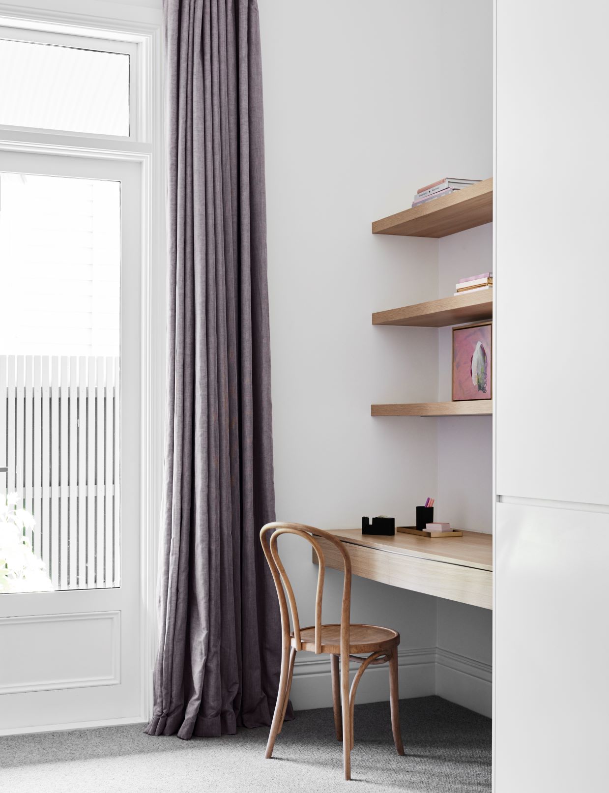
“The study nook in the child’s room was better suited to a lighter palette. I replaced the cool white on the walls with Dulux Wash&Wear in Subtle Violet – a gentle shade that added warmth without overpowering the space. It works beautifully with the blonde timber of the built-in joinery, as well as the skirtings, which were already painted in Dulux Vivid White™, a crisp, pure white.
“I gave the chair a quick update by giving it a lick of Dulux Aquanamel paint in Lilac Light and by adding a pretty pink cushion. Fresh flowers, touches of gold and some pink and violet glass pieces reinforced the feminine palette,” says Leech.
Before & After photos with the Dulux Winter 2020 colours
These before and after pictures demonstrate the difference nicely.
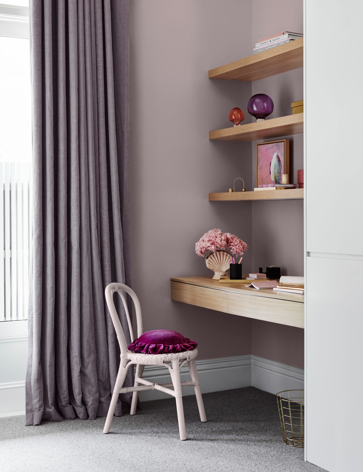
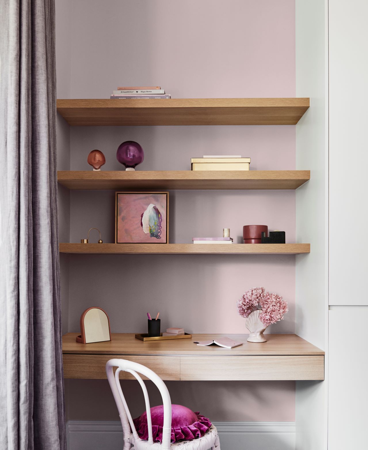
The colours in the above image are Dulux Wash&Wear in Subtle Violet and Vivid White and Dulux Aquanamel in Lilac Light. The gorgeous artwork is More than we can Know by Kate Dambach, Modern Times.
The room below is the before image and undoubtedly elegant in grey and white but I think it comes alive with the warm colour palette in the second image. I know which room I would prefer to relax in.
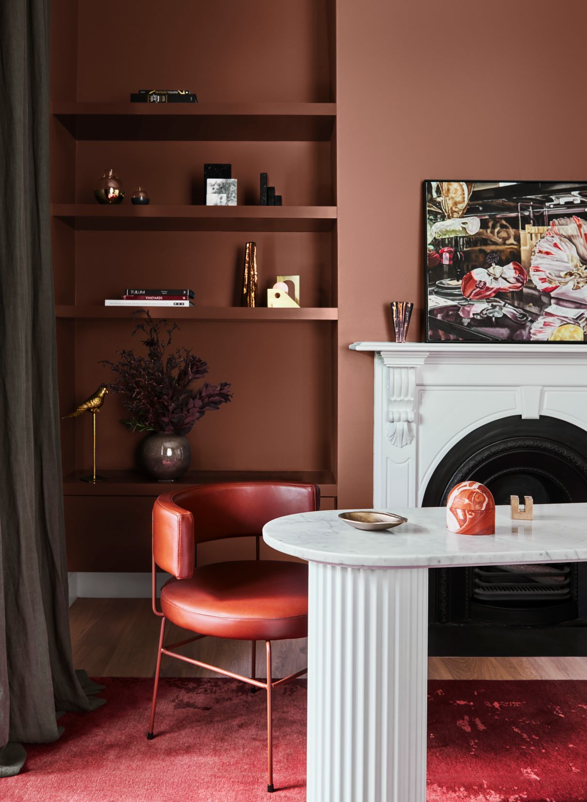
The colours featured above are Dulux Wash&Wear in Russet Tan and Dulux Wash& Wear in Natural White and the gorgeous artwork is “Still Life with Dianthus and Bee” by Dena Khan.
My tips for working with a dark colour palette
- Always consider the MOOD you want to create, the ASPECT of the space and WHEN you usually use the area. This will help you to determine whether you can get away with a dark colour palette which when used properly will inject personality and style and will be a place you will gravitate to.
- In large open plan areas dark colours can also be used to zone an area. In a classic interior, a dark kitchen looks more in place and ensures that the living area is bright and light. The strong tonal variation gives a timeless and classical feel to the space.
- Dark tones can either be offset with a lighter trim, usually an off-white, or you can use the same dark colour for your trim. It will depend upon the mood that you want to create so if you are looking for the richness of the darker colour, but want to offset it so that it isn't too brooding, then an off white trim is the way to go. If you want dark and brooding, then omit the white trim.
- Dark tones used on just one wall can close the space in, however when used on all four walls they appear to recede as you lose the definition of the corners. Rather than make the room appear very small, using dark colours like this will just make the room cosy and intimate.
- Dark tones are an excellent choice for dining rooms that are used predominantly at night time as rooms decorated like this come alive with the right lighting. Use a combination of wall lights, table lamps and some overhead lighting from feature pendants. A clever lighting plan to complement dark colours can work amazingly well.
- The introduction of mirrors too adds another dimension and helps to reflect light around the space.
I have lots more to tell you in my related post How to work with a dark colour palette. Did you know too that you can manipulate a space with colour and tone? This can be a really useful design tool to understand and you can find out more about that here.
Selecting a colour scheme that may be outside of your comfort zone can be challenging. I recommend that before putting any scheme together you create a mood board. This will help you to see how the look is coming together. I have lots of advice with my FREE e-book on putting together a mood board together with other e-books and checklists in my Free Resource Library.
If you are stuck with choosing colours I have an online colour consultancy which you may be interested in. All the details are here.
You can see all of Dulux Australia's colour trends for 2020 here.
I would love to hear if you have used rich, warm tones in your home in the comments below – please keep in touch.
Hi Samantha,
I read your article with interest.
We are selecting colours for our new coastal-themed home in SE Queensland. We are looking for a single dark colour for two areas:
– 3 recesses in the Lounge for TV and display purposes. This space is of generous size with 3.3m ceilings with large windows on east side and sheltered glass on west side. We’re planning to use Taubmans Comes The Dawn on the walls. Floor is spotted gum. Trim and window frames will be white.
– Dedicated Theatre room, which has no natural light. This room is 6m x 4.2m with 2.7m ceiling. Floor will be carpet (to be selected). Thinking of using the same colour on walls and ceiling.
Any ideas would be gratefully received.
Thanks, Geoff.