
The arrival of a new baby is a much anticipated event, particularly if it is the first one! Planning and decorating a nursery therefore can be one of the happiest times for a family. You want the room to be right for the newborn but also a place of refuge for parents too. I think that one of the few things left in our life that can be a genuine surprise is the gender of our baby. For those of you who agree with me, you will need to decorate your nursery in a gender neutral fashion. However, I know that people do love to find out before the birth whether they are expecting a girl or a boy so that they can be emotionally and practically ready!
Either way, I have lots to tell you about how to choose colours for a nursery.
Did you know that babies don't see colour properly until they are about 6 months old? While their eyesight is developing they will see red first and then progress towards seeing blue. People claim that to begin with, babies only see black and white, but it is far more complex than this and studies have shown that they do begin to see some colour from a very early stage. Some of the points below may help you to decide how to choose colours for a nursery, what to avoid and what to use, to provide the most comfortable and happiest place for you and your baby.
The Psychology behind how to choose colours for a Nursery
It is known that children respond well to colour. They love it and learn a lot by being surrounded by it. Hattwick and Alschuler have studied children's paintings and are quoted as saying “Colour, more than any other single aspect of painting, has been of particular value in offering clues to the nature and degree of children's emotional life”. They have found that infants are influenced by luminous colours such as yellow, white, pink and red.
The warm colours of the spectrum
American writer and consultant on colour, Faber Birren, believed that warm colour preferences suggest an intimate relationship with the visual world. Warm feelings are expressed in this environment with extroverts preferring the warmer colours of the spectrum.
Red
In addition to a psychological effect on the mind, the colour red also has a physiological affect too. Red will make the pulse quicken and stimulate our appetites. Excellent to use in fast food restaurants where you want people to order lots of food but not to linger. It is worth noting though that this physiological response only lasts for a very short time and the body adjusts, so this is certainly not a reason to shun red and other warmer colours.
As this is the first colour that a baby will see it is excellent to use in toys and in small amounts in artworks to stimulate a baby. However, I would avoid using this in bedding or other accessories in a nursery. Red is however a gorgeous warm colour and this is why pink has become so popular for nurseries. Pink has soothing and restful qualities and symbolises love and affection.
Orange
Orange is the convivial colour of the spectrum and loved by gregarious souls with an outgoing personality. In its full saturation, this is still too bright for a nursery but in its incarnations of soft terracotta and coral, you get the same happy and uplifting feeling, without the brightness. A neutral with this base is actually perfect for a nursery.
Yellow
Yellow is a classic nursery colour and often used for a gender neutral scheme. Yellow is the happiest colour of the spectrum and a preference for it indicates intelligence. Babies love it but as we age, the preference for it declines. Bright yellow though is to be avoided. Great for short periods of stimulation, but when used as a bright wall colour, it promotes feelings of unease and grumpiness.
The cool colours of the spectrum
Blue
Blue has the opposite physiological effect on the body to red. It will lower blood pressure and pulse rate and lessen the appetite. The most conservative of the colours, with its shorter wavelengths, this is not seen as a preference for infants. Pale blue though is a very restful colour but avoid large expanses of it without visual relief as it can be too cold and bleak.
Green
The appeal of green is that it is a neutral. The eye doesn't need to adjust to see it and it is therefore the most relaxing of all the colours in the spectrum. It isn't one of the luminous colours that infants respond to but it's tranquility makes it an excellent backdrop for other colours.
Purple
Purple is generally not seen as a Nursery colour. Children don't particularly respond to it and with its mystical associations, it is perceived as an adult colour. In its lighter incarnations, lavender and soft violet, it is far more approachable but can be a little flat and cool on a large expanse of wall.
Black and White
Although we all clamour to find the right white and use this liberally throughout our homes, when asked their favourite colour, people almost never say white! Probably because we don't think of it that way.
The neutrals of white, black and grey are rarely favourites for children. A white wall without any visual relief can promote eyestrain and the monotony of a blank wall can be as damaging as a full-on jumble of saturated colour for a baby.
The Symbolism to Nursery colours
Our perceptions and personal reactions to different colours are not just governed by the psychology of colour. Colour symbolism is learnt through our individual and cultural understanding of colours. Our inherited associations and impressions of colour are characteristic to specific groups and cultures and play a strong role in how colour is experienced. This of course is only pertinent to our preferences for nursery colours as a baby will not have this colour symbolism which is a learned response.
For example, we associate red with love and anger while yellow is often symbolised by cowardice and sickness. In the Western world, white is seen as pure, clean and fresh and is symbolic of new beginnings. However in the East, white is associated with death.
It's really interesting to note that it wasn't until the mid 1950s that we made the association of pink for girls and blue for boys. This is a relatively new phenomenon and until that time, pink was actually the colour favoured for boys as it is a derivative of strong and definite red. If you are interested in reading more about colour, I highly recommend Kassia St Clair's book – The Secret Lives of Colour – where I have found this information amongst many other interesting snippets.
Blue is associated with the Virgin Mary and therefore was always a more feminine colour. These colour differences are so entrenched now in our modern day view of colours for boys and girls which I think is a shame.
Happy & Bright nursery
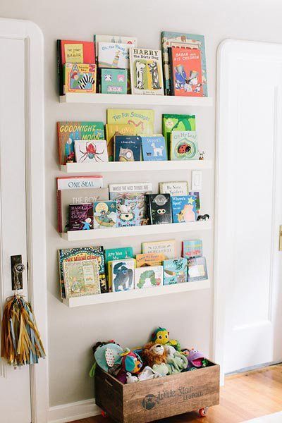
Now in order to choose colours for a nursery, you need to take all the knowledge from above, with your own preferences, to decide on the style of nursery that you would like for your baby. I particularly like a happy and bright nursery but with the injection of colour coming from books and other accessories rather than paint. Instead of a large expanse of white, I like to use a soft warm neutral for walls. These tones create an environment that is welcoming and enveloping and will create a space that is loving and safe for a baby. While the injections of colour will add stimulation to help them develop well.
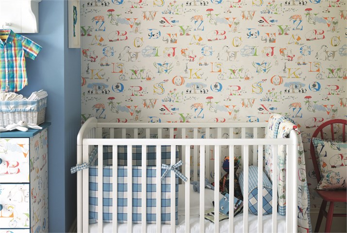
If you prefer to introduce more colour, this pretty bedroom below from Sanderson has used soft colours that are not over-whelming. A soft blue is a very successful colour for a nursery but you could use a wallpaper like this and pull out the green or yellow tones for an equally interesting effect.
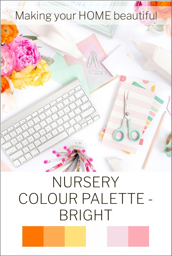
This is a colour palette that is definitely not for the faint hearted. I like it because it is clean and fresh. Remember, your walls can be a warm white and the lovely injection of bright colour can come from small accessories. Colours should never be used equally in a scheme. Consider the 70, 20, 10 rule and the scheme will fall into place. There is a lot here to stimulate a baby but think carefully about how you introduce the colours for the best effect.
A warm and pretty Nursery
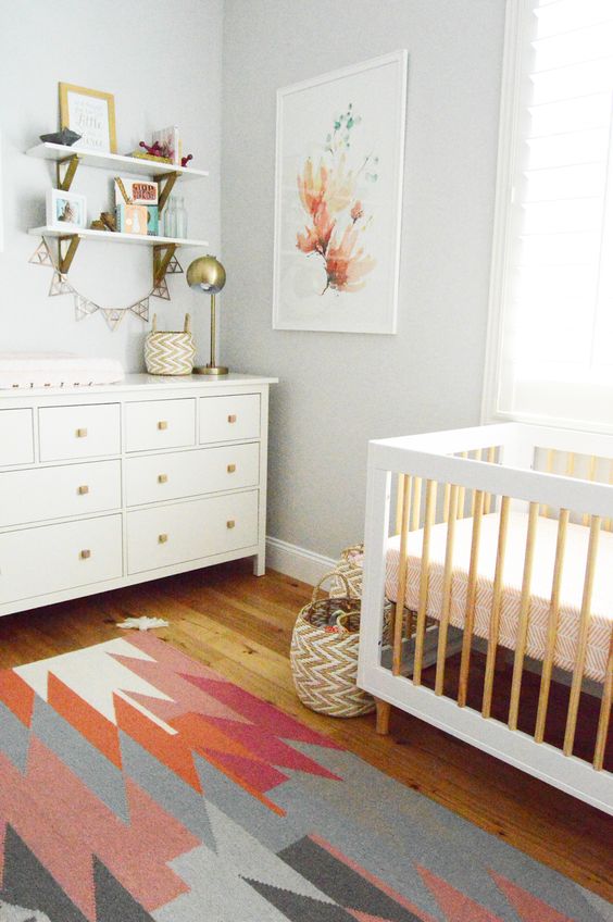
If you have a baby girl, it is very tempting to decorate with pink. And why not? Pink is the most nurturing of colours and when you consider which colours to choose for your nursery, it has be right near the top.
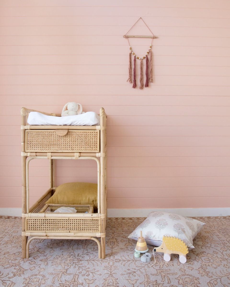
Whether you opt for a salmon pink as in the Bohemian style image above, or a more traditional sugary pink as below, the colour is just perfect.
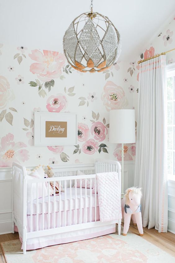
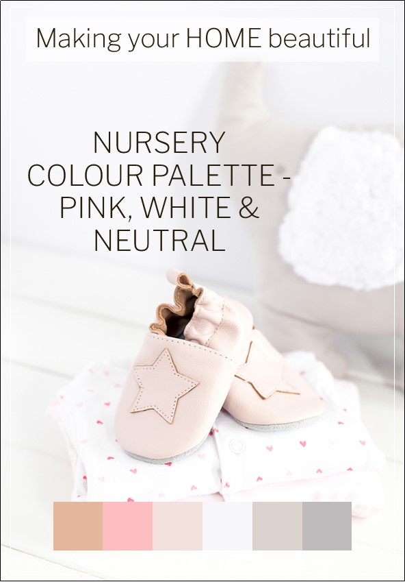
If you love pink but feel it can be overwhelming and too sugary, then consider partnering it with soft greige tones and white. You can take away the pink from this scheme to create quite a different effect.
A calming influence for a nursery
The anticipation of a first baby is one of the happiest times of your life but I think that when you choose colours for a nursery you need to be a little pragmatic too. Although your baby will bring you endless joy and love, it will also bring endless sleepless nights and tiredness! While you want to encourage your baby to be calm and happy, you will also appreciate this environment for yourself.
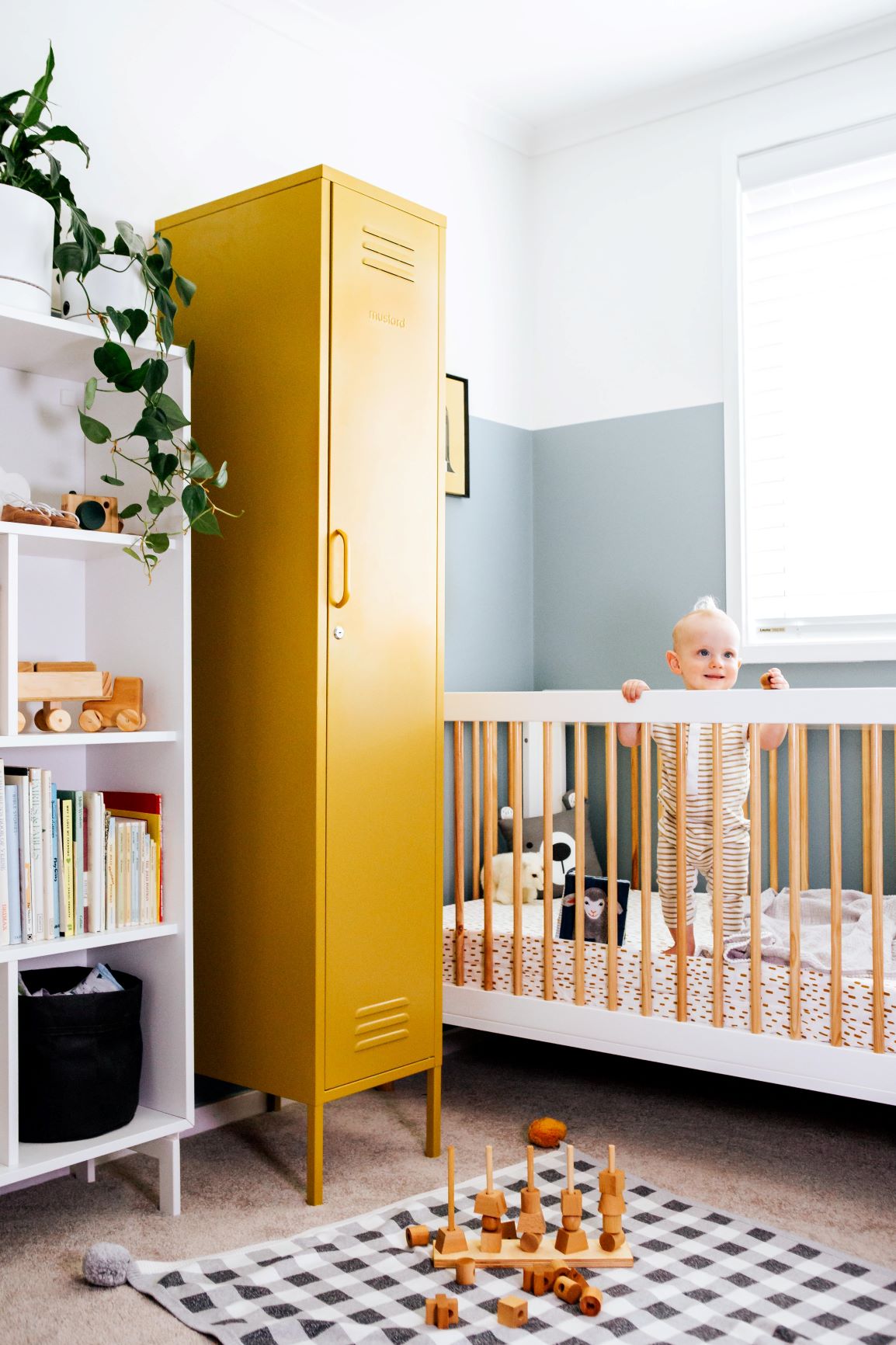
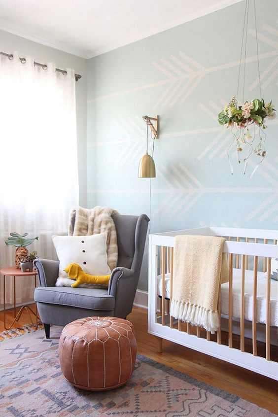
Going back to colour psychology, remember that it is green that is the most calming of all the colours. I therefore love the nursery in the image below as it is calming with some contemporary neutrals and some gorgeous rich, warm tones. It is also a fabulous gender neutral room.
You could of course introduce some natural greenery into the room too. Plants contribute so much to our environment, as they clean our air of nasties.
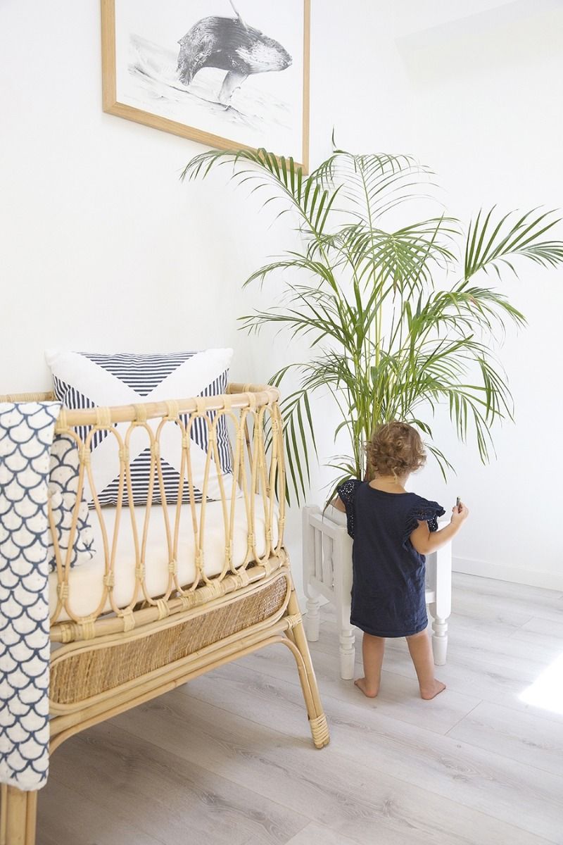
I prefer to add a little more green as it is one of my favourite colours. I love this nursery from Staple Design. Rather than a crisp white, one with more depth has been used on the walls with warm timber tones in the furniture.
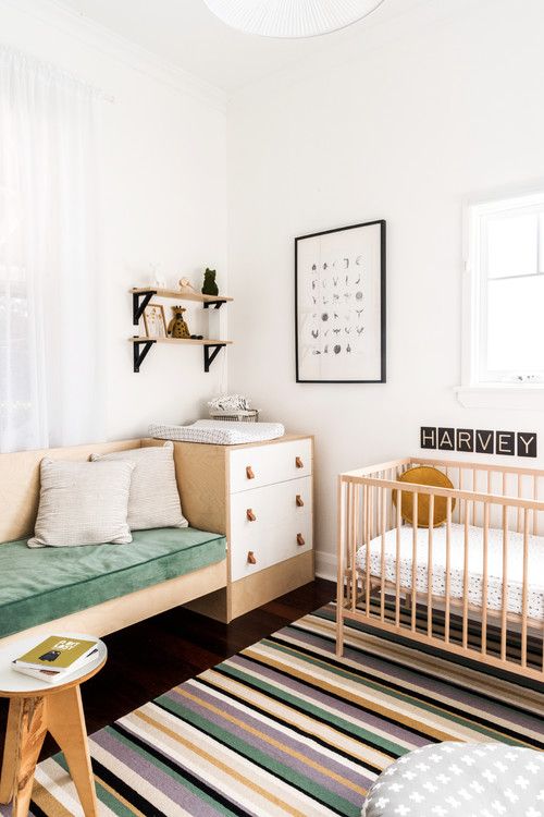
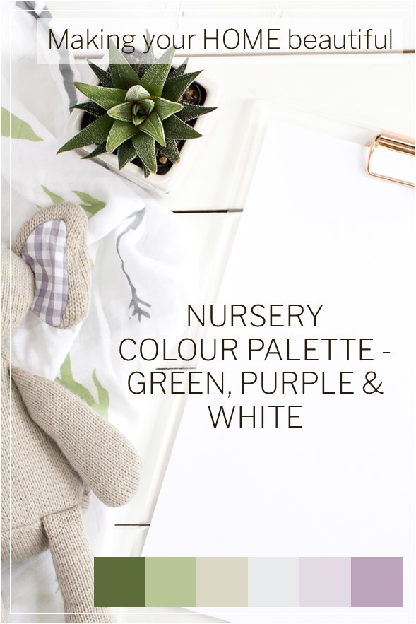
The green in this colour palette cuts through the soft tones of beige, off white and lavender. A delicate colour palette which is gender neutral and pretty.
Neutral Nursery tones
If you still love your neutral tones then remember to introduce stimulation and colour with books and toys. There is no doubt that the two nurseries below are absolutely gorgeous. Although they use a fair degree of grey, they have still managed to be warm and welcoming.
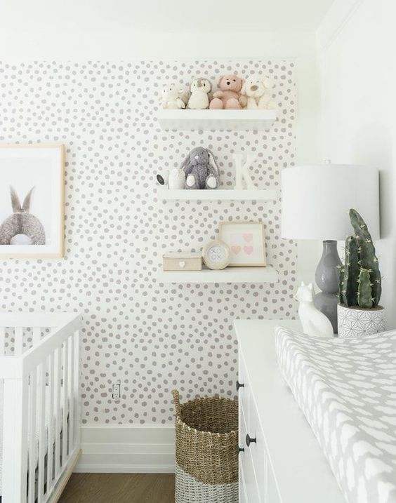

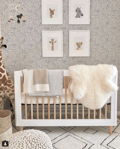
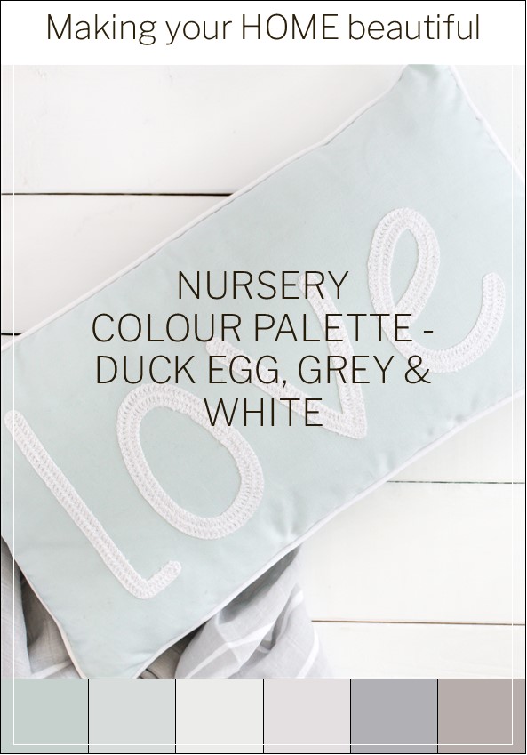
The colour scheme above is my absolute favourite. I really like Duck Egg Blue for many areas of the home and I feel it works so well with these soft neutrals. You get the best of both worlds here; an elegant neutral palette but with a gender neutral uplifting colour that is pretty and delicate. A very calming environment for you and your baby.
I hope that this range of palettes has helped you to choose colours for a nursery. I would love to hear what you have chosen for this important room in the comments below.
Before designing a decorating scheme you should always put together a mood board to see how your ideas are coming together. I have a free e-book for you to download, together with lots of other Free Resources in my Library.
I also have a related article on choosing colours for a child's bedroom which you may find interesting: Country Home Ideas: Colour Scheme for a Child's Bedroom
Pastel tones are very easy to decorate with as they all contain a large degree of white and therefore you can be confident they will work together well. Perfect for a Nursery colour scheme. Check out my article How to decorate with Pastels