Interiors
Favourite rooms in February
I have found so many favourite rooms in my trawling of the internet during February. As you know, you can get lost in Instagram and Pinterest which takes you off to some wonderful websites and blogs, but you can end up going around in circles as there are so many ideas out there to love. I have handpicked just a few spaces that I have come across that really appealed to me. With the images below, I tell you what I really love about each space.
Firstly I find it very difficult to go past a window seat and this one below took my eye.
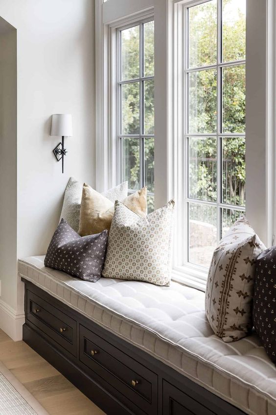
What I love about this window seat
- Firstly, the colours are neutral, but the strong difference in tone makes the window seat really attractive. With dark joinery and a light seat cushion, the area is very eye catching.
- I really like the detailing on the seat cushion. The piping, stitching and buttons elevate this to the next level. I love small details like this that sets one design above another.
- The additional storage in the joinery is a great idea as don't we always need more places to store stuff?
- The arrangement of cushions is perfect. I like the asymmetry with four one side and two on the other and mostly in different patterns. They're different, but they work together so well and it doesn't look in the least bit contrived.
- The wall lighting here is very thoughtful and demonstrates how important a good lighting plan is when you are building or renovating a home.
Related: How to design the perfect window seat
Next, I am focusing on window dressings.
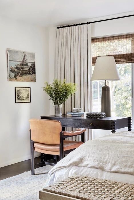
What I love about these window dressings
- Two of my favourite ways to dress a window are with natural Roman blinds and simple box pleat off white linen curtains. In this image I found them together, so I had to include it.
- I really like to see windows dressed in layers. So, a simple blind for day time privacy and then curtains for warmth and night time darkness. Sheers and curtains on a double track work the same way. I think this solution is perfect for the style of the room as the natural woven blind picks up the colour of the floor and table lamp perfectly. It's also a very classic look which works with the style of the room.
- I am also a big fan of a simple black curtain rod as this adds a touch of contrast and works well in this room with the dark elements.
- Finally, curtains must be hung well above the window and this image demonstrates this perfectly.
Related: Don't design your curtains without this one thing
My favourite bedroom this month is from Aly Morford's home, the designer behind Pure Salt Interiors.
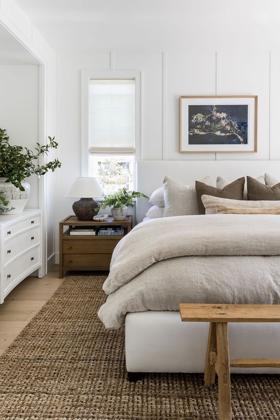
What I love about this bedroom
- I think I could stay in that bed all day. Doesn't it look dreamy? A bed should look comfortable and this one with the upholstered bedhead and base with gorgeous layers of natural linen covers and cushions looks sublime. Can you see that the two dark cushions really finish this look? That's the tonal contrast that I keep talking about. The inclusion of these in the bedding has tied in the rug and bedside tables perfectly.
- I do like white bedroom walls as the look is clean and simple, but sometimes it can fall a bit flat. The wall panelling here has taken this room to the next level and ensures that the look of the walls is anything but boring.
- The simple white Roman blinds fit into the sash windows perfectly and ensure the look is simple.
- The natural rug brings interest and texture to the scheme and is a lovely generous size. And to complete the look there is some gorgeous greenery in the room which I absolutely love.
- Note that the furniture is all different. This is what makes the room so interesting. Remember that not everything has to match perfectly and it is preferable to select pieces you love and then bring them together with the colour scheme.
Related: 5 tips to create a calm bedroom environment
Hallways can be difficult to get right, but I think this one works really well.
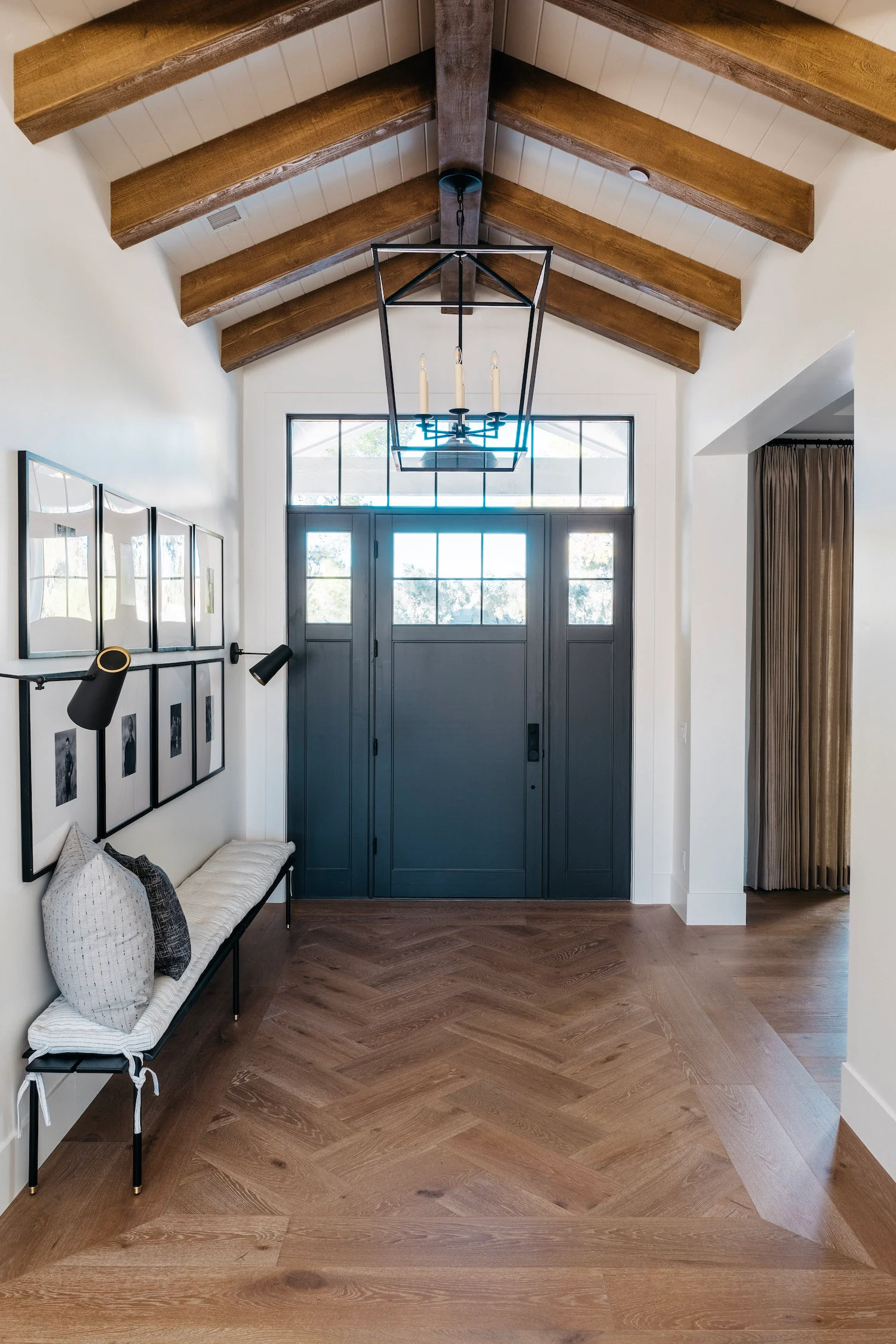
What I love about this hallway
- I really like the flooring in this hallway as it defines the space perfectly. You can only do this with a generous sized space as it can look too bitsy, but this suits the room really well.
- I just love the colour on the inside of the front door. I often get asked about what you should paint on the inside of your front door as it certainly doesn't have to be treated the same as the other doors in the house. This blue grey is stunning and suits the oak flooring.
- I love a gallery wall and the symmetry and order of this one is a great classic look. A handy seat to remove or put on your shoes is also a great idea.
- The ceiling too is sublime and I love the lighting.
Related: What should you paint on the inside of your front door
I do love a green kitchen, so I just had to include this one in the list. This entire home from Ashley Martin is perfect.
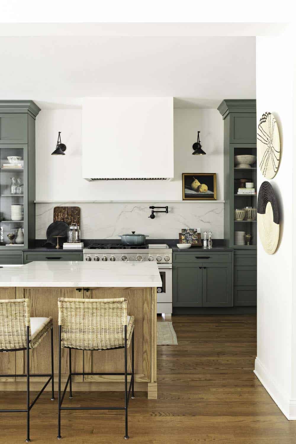
What I love about this kitchen
- Firstly, it is green. I absolutely love green kitchens, but then it is my favourite colour. I do like that this has been partnered with an oak island bench so that it doesn't overwhelm the space.
- The black handles work really well on the joinery as they are nicely understated.
- I also like that the stone splashback doesn't reach to the range hood but finishes instead with a shelf. This makes the entire back wall very balanced and will be just enough to contain splashes from the stove top. By incorporating a shelf here, you can display some artwork which works really well with the wall lighting. The kitchen takes on more personality and isn't just a working space.
- I love the dark benchtop with the green joinery and then the white with the oak and as a splashback. Again, this makes the green cabinets look more like a display area than just a functioning kitchen.
Related: Have you considered green for your kitchen cabinetry
Finally, I found this gorgeous bathroom.
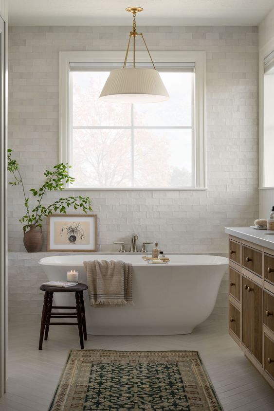
What I love about this bathroom
- Firstly, I like that this looks like a regular room rather than a clinical bathroom space. The inclusion of the rug, artwork and pendant elevate this space to the next level. This is a room to linger in, rather than to just perform your ablutions.
- The understated herringbone floor is unobtrusive, yet stylish and I love the matt subway tiles laid in a running bond pattern. The shelf behind the bath is perfect to mount the tapware.
- The bath itself is a lovely organic simple design and its placement beneath the picture window is perfect.
- The vanity unit is more like a piece of furniture, which again makes this a beautifully furnished room rather than just a bathroom.
- I love everything that Studio McGee turn out, and this is no exception.
Related: Bathroom Styling – My 5 top tips
I hope you have enjoyed seeing some of my favourite rooms in January. I'll be collating some more through this month. I would love to hear what you think of the rooms too.
If you are putting together a decorating scheme, then you must create a mood board first. This ensures that you can collate all of your ideas in one space. The internet is full of lovely rooms and you can get lost down the rabbit hole of Instagram and Pinterest, so it is great to keep going back to your mood board to keep yourself on track. I have a free e-book in my resource library which shows you how to create a mood board. You can download for free here.
I also have a Shop the Styles section where I have curated furniture and accessories for some of the most popular styles.
