SUGGESTIONS FOR INTERIOR SCHEMES FOR RAFFERTY'S RESORT
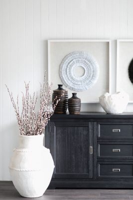
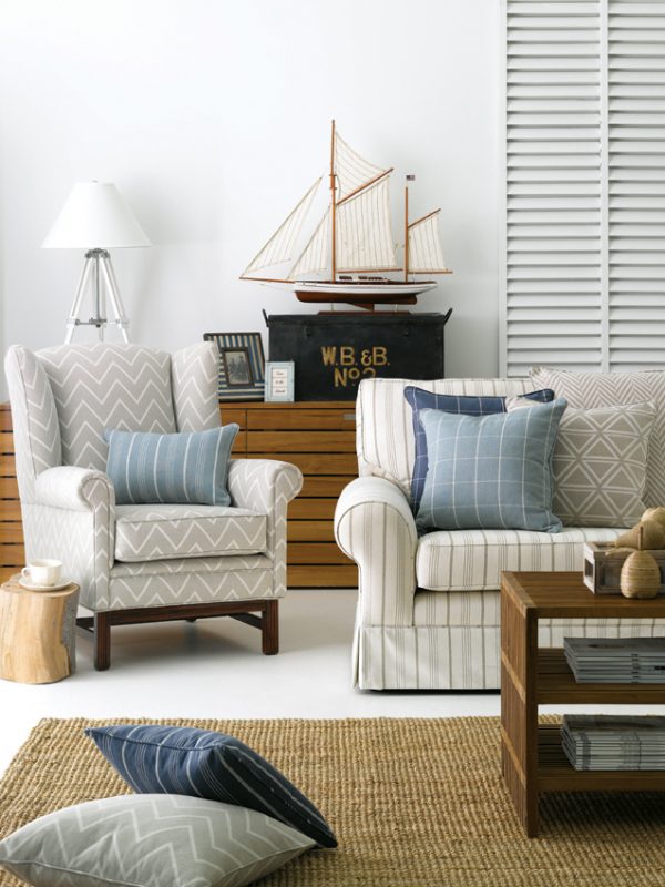
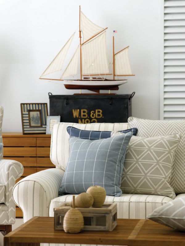
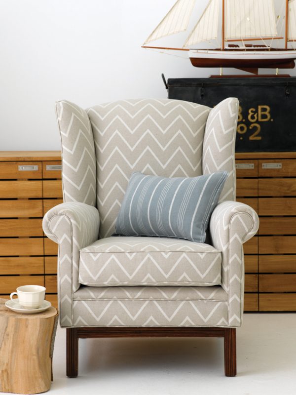
Interior schemes are far more relaxed than in previous times and this is particularly the case for holiday homes at a beach or lakeside location. The mood must be comfortable and informal and conducive to relaxation. The classic colour palette for a beach scheme draws its inspiration from the local landscape. Therefore a palette based on the tones of driftwood, shells, pebbles and the many cool colours of the ocean produces a great scheme. Sometimes this may appear bland however if you also look at the textural elements in the landscape and employ these in your decorating scheme you will have a very successful look. For example, use natural sisal rugs rather than formal carpet, soft cashmere mix throws with natural linen and cushions embellished with mother of pearl or beads to create a tactile experience. Ensure the look is unaffected with the use of natural stone and matt finishes for paint and timber.
Lovers of stronger colour however can also be accommodated. Cotton fabrics in stripes of navy blue and red look great in a holiday environment. Rather than the muted colours of the ocean you can bring in clear, bright aqua, strong navy blue and zesty lime to your colour palette. Natural rugs in these stronger colours add a happy note to the look and sofas upholstered in stronger colours really make a statement. Furniture should be in predominantly light tones, natural timber, limewash or painted white with the odd statement piece in a darker colour to bring in some contrast. Rattan is great to use in holiday homes with cushions upholstered in bright colours or the more muted beach tones depending upon your preference. Storage trunks in rattan, oversized coffee tables with reading material and hurricane lamps also help to set the mood.
We can assist you to achieve this or other styles.
Below are some ideas from Warwick’s range of fabrics, Dulux paints, Armadillo rugs, No Chintz fabrics, Bianca Loren linens, Linen & Moore quilts and cushions and Villa Maison furnishings & accessories.
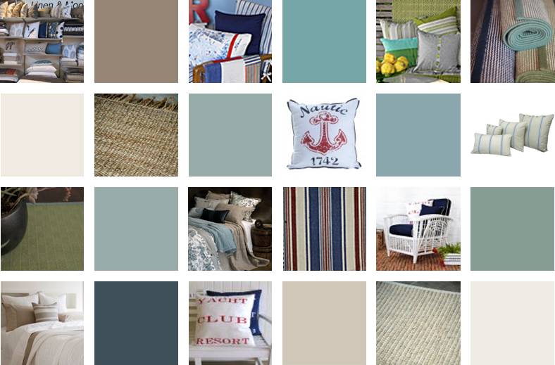


The colours in the Raffertys schemes have been selected from the Dulux range. Dulux has carefully managed the colours being presented in the images to ensure they are as close as possible to the true paint colour. Colour reproduction can vary when viewing colours on your screen. Best results will be obtained on your system by setting the monitor colour temperature to 6500K, viewing the image with a subdued surround and comparing the image against colours seen in natural daylight. For full accuracy and complete satisfaction we recommend that you test your colour selection at home using Dulux Sample Pots.