I was generally impressed with this week's bathroom reveal on The Block. There were some highs, a couple of lows, but some very solid rooms that I thought worked really well. Leah and Ash did take out first prize, but only by using their gnome. I did feel that Brett and Kristy's bathroom deserved the winning spot. The design was very good and just felt very refined.
I have all the bathrooms to show you together with the judges' and my comments on each room.
The Block 2023 Bathroom reveal
First Place: Leah and Ash 28 points with gnome
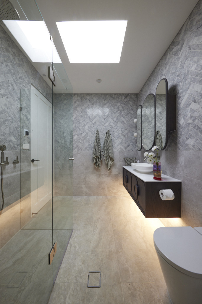
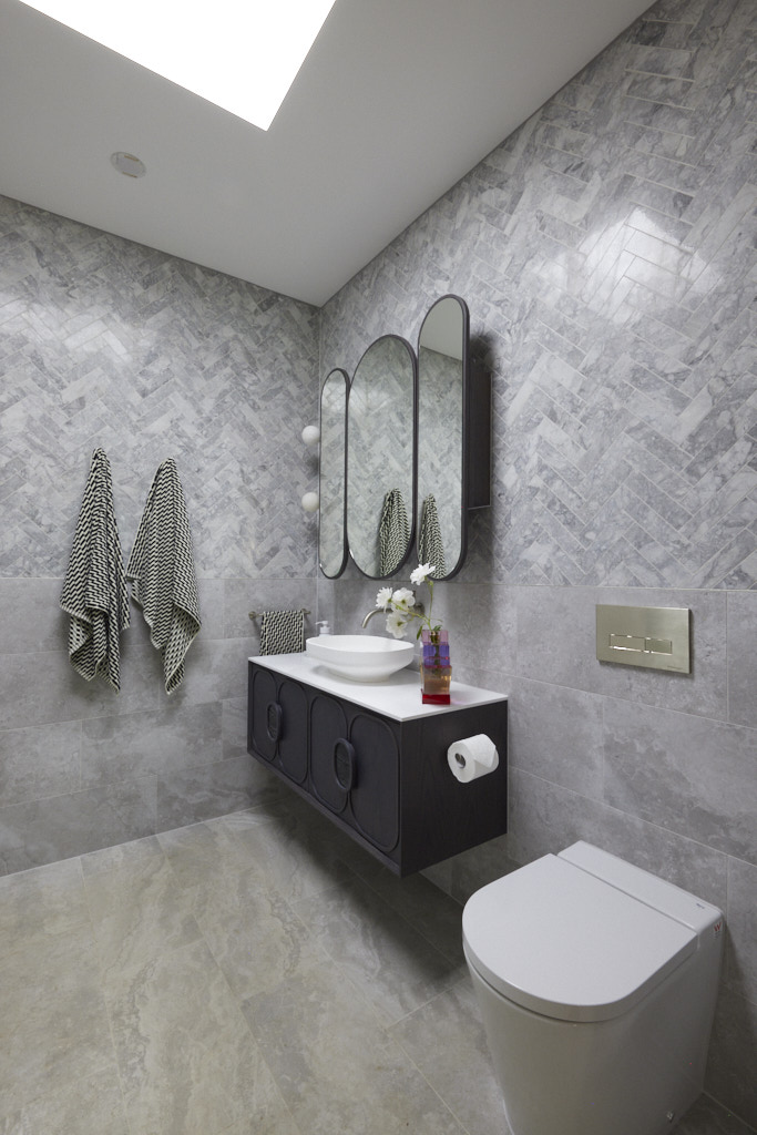
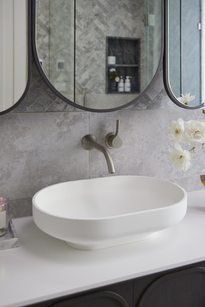
Bringing their love of marble into the new bathroom, combined with a solar skylight, art deco vanity and shaving cabinets and a clever entrance to the adjacent laundry, Leah and Ash’s bathroom serves as a powder room for downstairs guests and a full bathroom for the bedroom to come next door… “win-win!” the judges agreed. For Shaynna it was the colour choices of brushed nickel tapware and stunning styling including an amazing vase that brought the room together, declaring it “really excellent”. Her only worry being how the team’s budget must have taken a hit to reach such a high level.
My thoughts on Leah and Ash's bathroom reveal
- There is no doubt that this is a fabulous, luxurious bathroom.
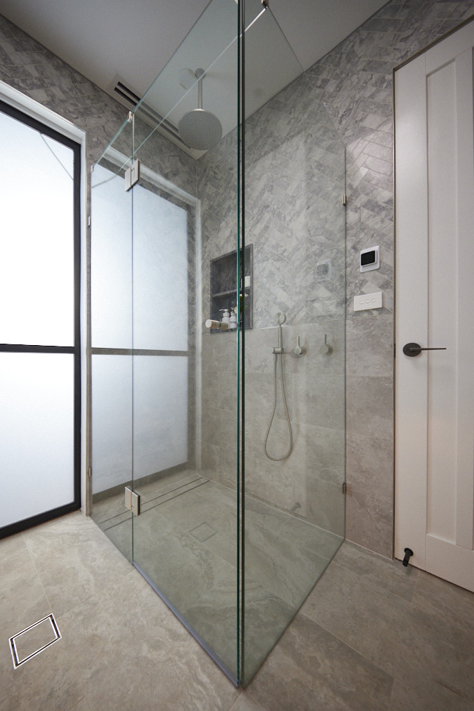
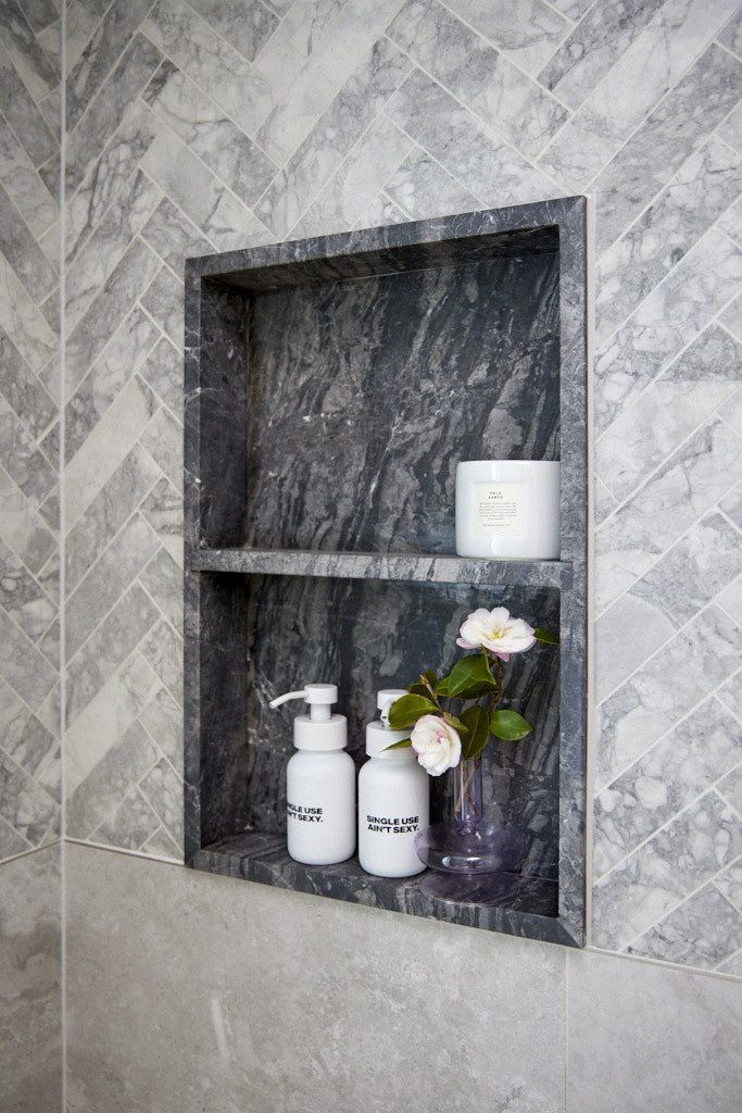
- My biggest concern with this space though is that the herringbone marble, which is absolutely stunning, is just a slightly different grey to the other wall and floor tiles. The effect is a luxurious one, but I do think that it is just a touch too busy.
- I really like the shower niche, both the design and the darker grey tone. I am not a fan of highlighting this area too much, but I do feel it works in this room.
- I love the brushed nickel tapware which suits the colour palette perfectly. It is understated and very elegant.
- I'm not sure how Shaynna thought that the vase pulled everything together – I thought it looked hideous.
- If you love dramatic spaces, then this bathroom is for you. I prefer a little more simplicity and I do think the palette was slightly wrong, but overall, this was a good week for Leah and Ash
Second Place: Brett and Kristy 27.5 points
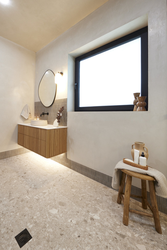
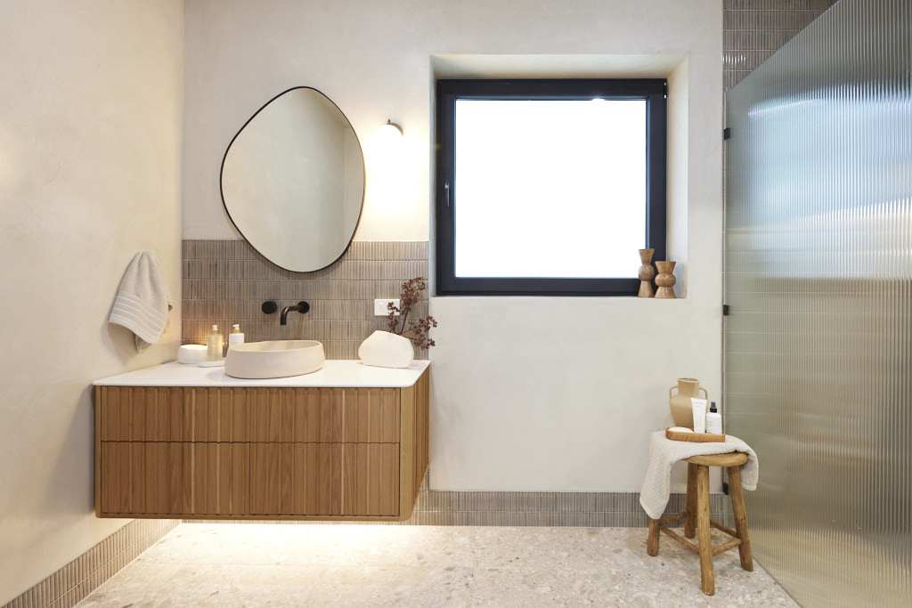
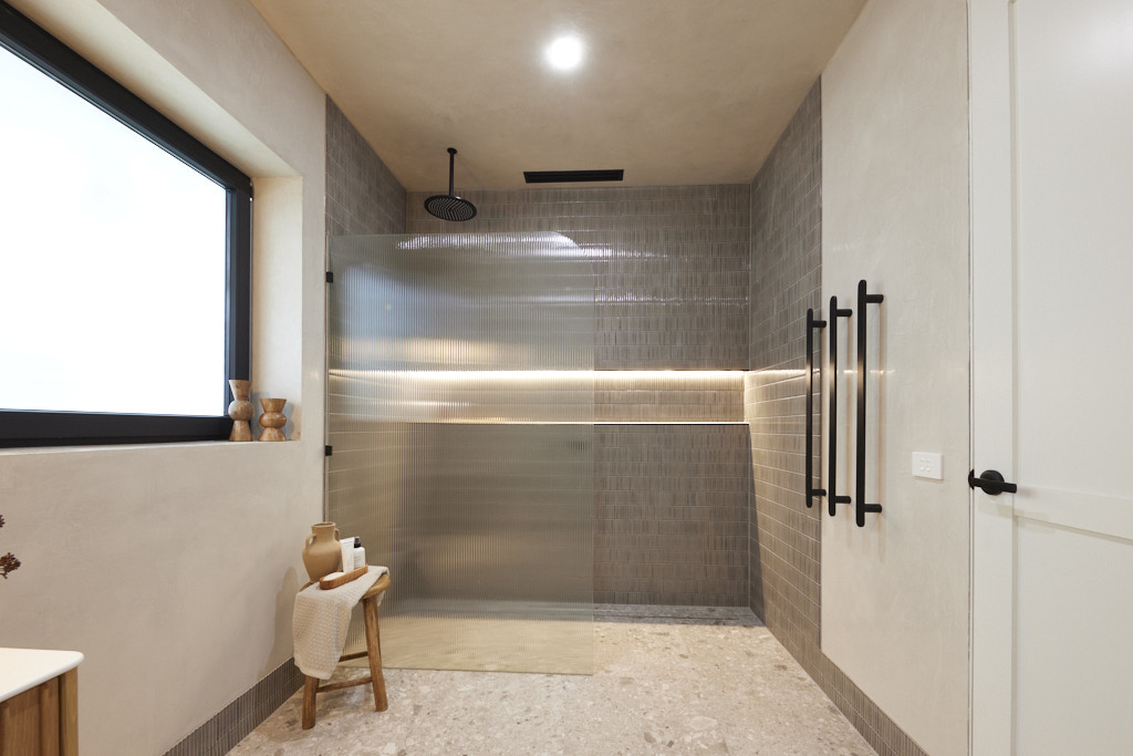
“Oooh la la!” said Darren as he walked into House Three’s luxurious bathroom, with Kit Kat tiles, polished plaster and Broadline glass catching his eye. Even better, he pointed out, it’s the perfect accompaniment to the next-door room which could easily be converted into a bedroom. “This allows them to go to market as a five-bedroom home!” Marty agreed. For Shayna it was the colour palette and lighting plan that brought things together and if a few minor tweaks, such as changing the power point colour was made, and underfloor heating for Marty, it would have been a near perfect space.
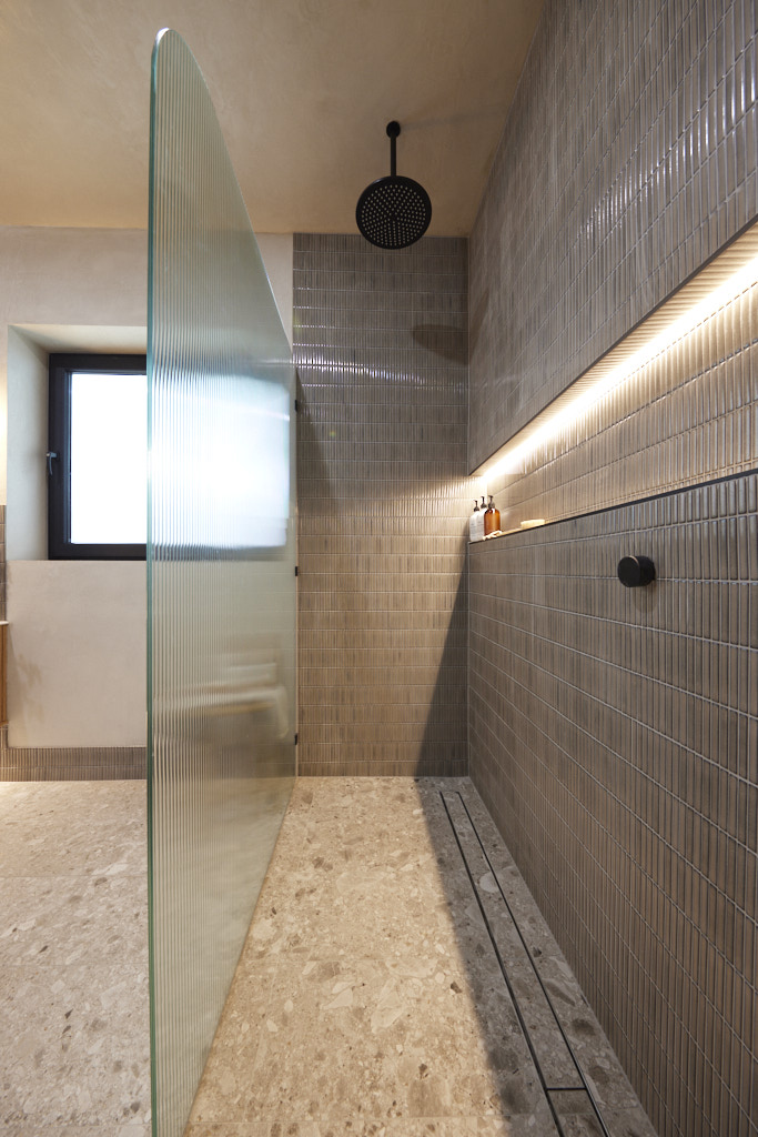
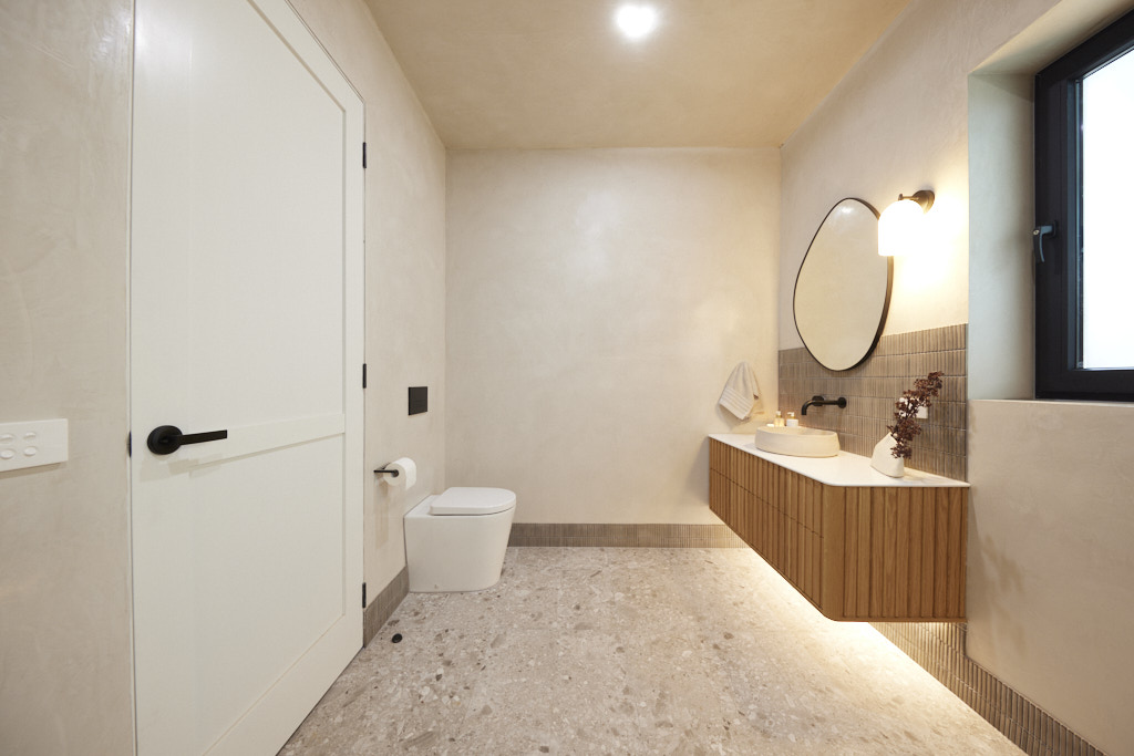
My thoughts on Brett and Kristy's bathroom reveal
- Remember that I just love simplicity? Well, this bathroom has it in spades, but it is in no way boring.
- For me, this room ticked all the boxes. A discreet toilet placed behind the door with an out of the way floor stop is the first win. This small design point can often make or break a bathroom.
- The vanity unit with its subtle curves, slim benchtop and gorgeous organic style sink was perfect.
- The flooring is gorgeous. Warm and organic in design.
- I absolutely love their use of Kit Kat tiles. By using these as the skirting board, behind the vanity and from floor to ceiling in the wet area, the effect is stunning. I really like the generous shower niche that is simply highlighted with lighting which is very effective. This is a great example of where less is more, but there are still thoughtful design touches that take the room to the next level.
- The Venetian plastered walls and ceilings are beautiful.
- My only criticism is that in addition to the rain shower, Brett and Kristy should have installed a shower on a rail too. Otherwise, I absolutely love this space and look forward to seeing more from these guys.
Third Place: Kyle and Leslie 26 points
With the couple’s trademark curved walls, beautiful artwork, a Nood Co vanity, gunmetal tapware and a cavity slider door to maximise the space, Kyle and Leslie packed a lot of luxury into a small room, the judges agreed. The smallest The Block has ever seen, in fact! And while a powder room instead of a full bathroom limited the couple’s ability to market the home as having a full ensuite accessible to the downstairs bedroom Marty wasn’t too worried. If they stick with rooms like this, he declared, they’ll have “a house that will really resonate with savvy buyers!”
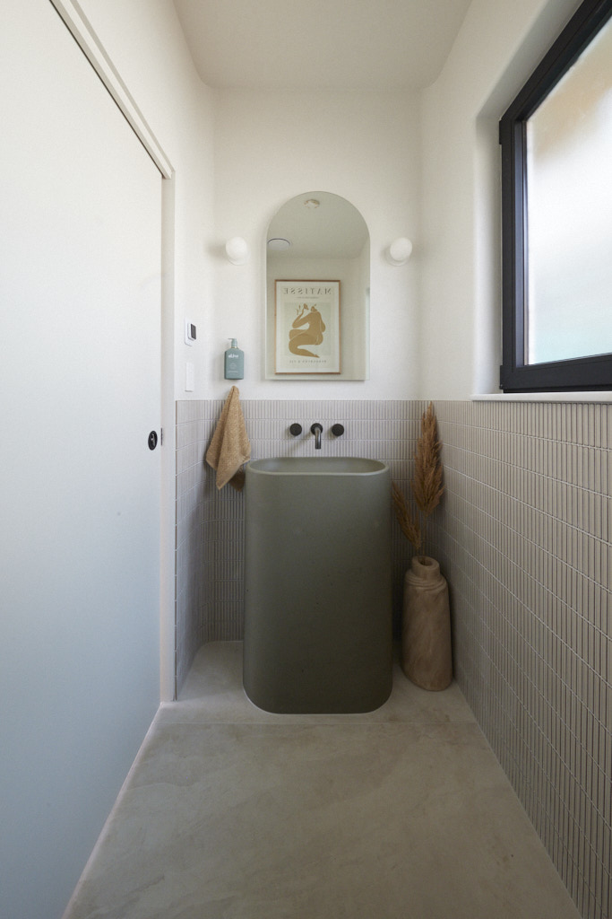
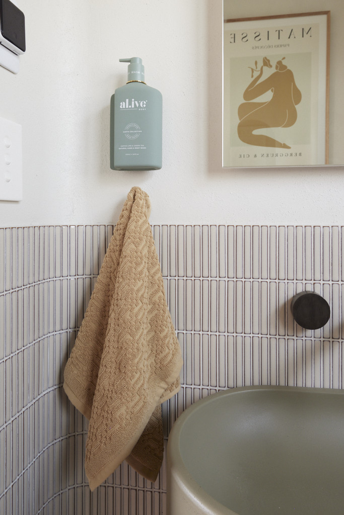
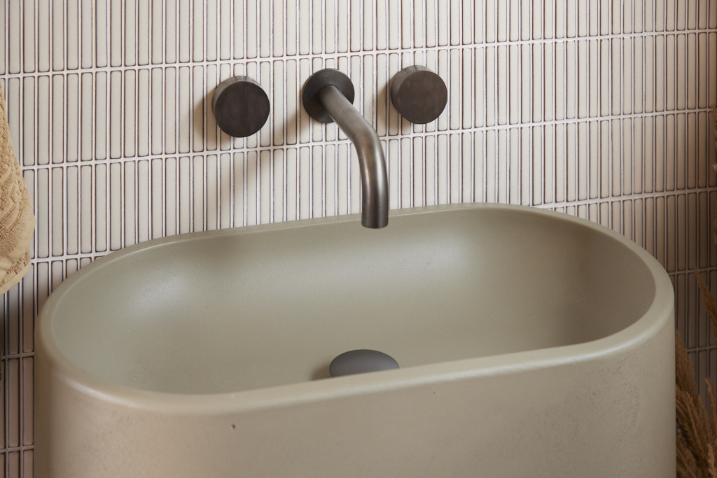
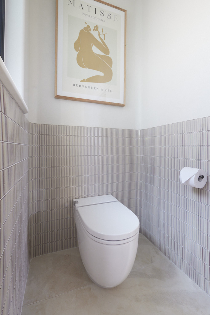
My thoughts on Kyle and Leslie's bathroom reveal
- It is difficult to compare a tiny powder room with the two luxurious bathrooms above, but this was a good outcome for a very small space.
- I love the curves in this room, which of course is what Kit Kat tiles are so perfect for.
- These curves work perfectly with the Nood vanity unit and the gunmetal tapware is perfect with the warm colour palette.
- I would have liked to have seen a window dressing on the bare window, but otherwise this is a very nicely executed powder room.
Equal fourth place: Steph and Gian 25 points
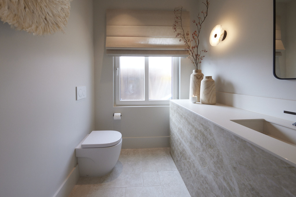
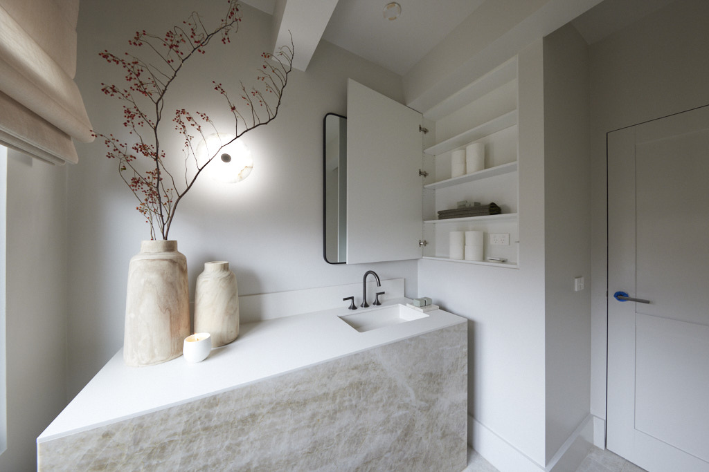
Featuring a Quartzite vanity with Dekton benchtop and integrated sink, French pattern flooring and feathered artwork opposite an ample mirror, the judges were quick to point out Steph and Gian had once again created a space that spoke to the luxury of the home they are building. But as Darren was quick to point out, there were problems with this downstairs powder room as well. The layout means the toilet is the first thing visible when you open the door, something both Darren and Marty agreed was “just wrong” and the paintwork was as Scotty generously put it, “simple”.
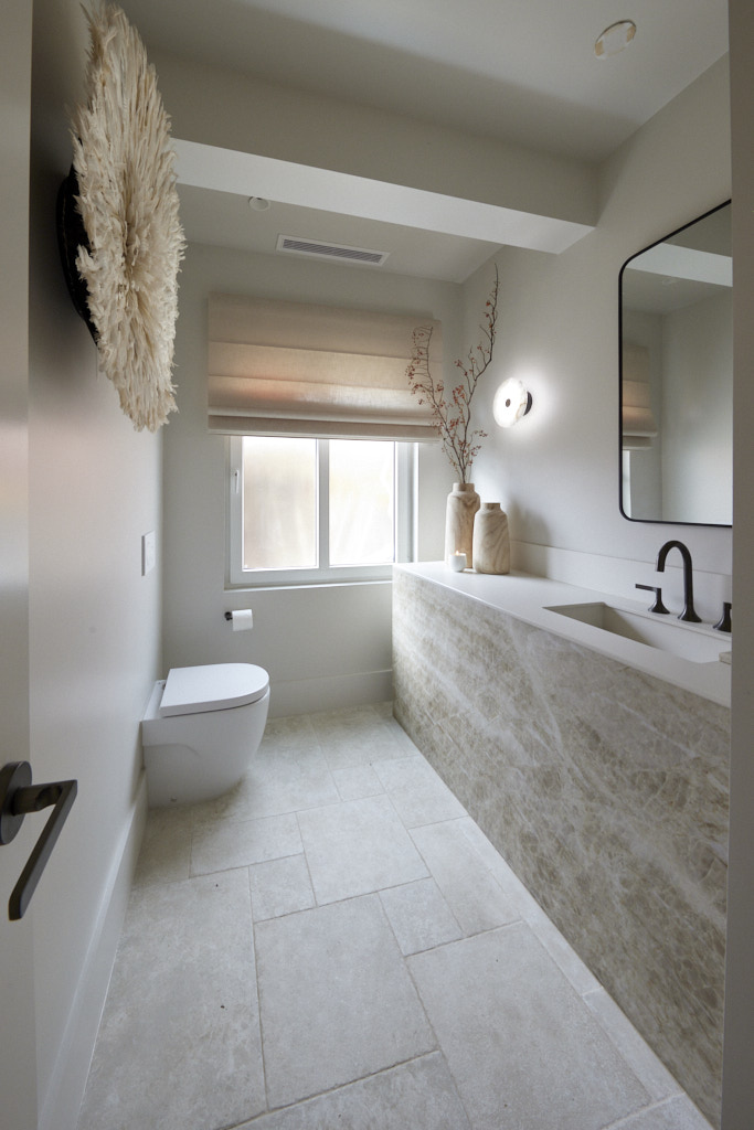
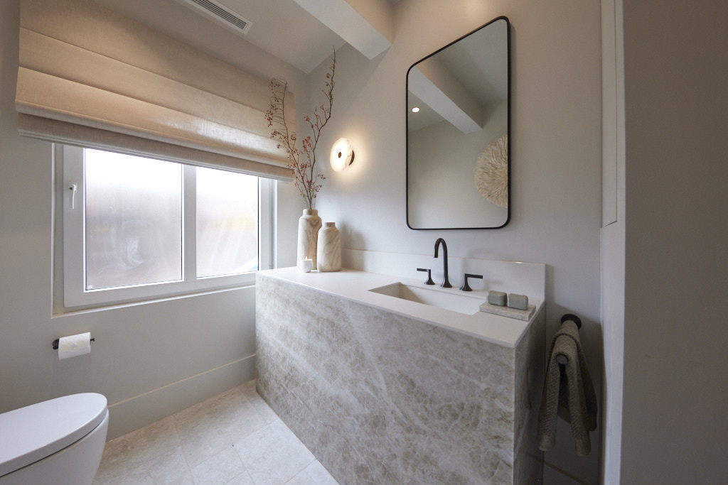
My thoughts on Steph and Gian's bathroom reveal
- I was very struck with the visual appeal of this powder room. It is luxurious, but simple too. I wasn't concerned that the painted walls were too simple as they didn't detract from the other textural elements in the room.
- I really love the vanity unit. Of course, it is totally impractical taking up such a large area without any storage, but I think it is divine.
- The lack of storage has been cleverly overcome with the hidden wall cupboard, and this is probably adequate for a small powder room.
- I really like the French pattern, natural flooring which adds a beautiful earthiness to the room.
- The Roman blind is great on the window.
- I agree with the judges about the toilet suite, but sometimes a layout just doesn't work with it anywhere else. At least it is a discreet size and nice design and is surrounded by so many other things to look at.
- I think this room deserved to be further up the points ladder.
Equal fourth place: Eliza and Liberty 25 points
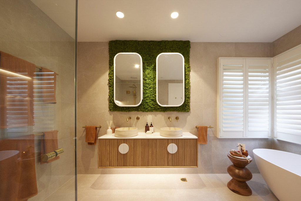
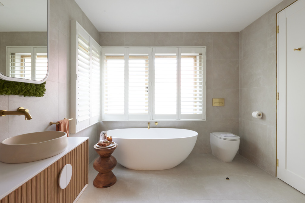
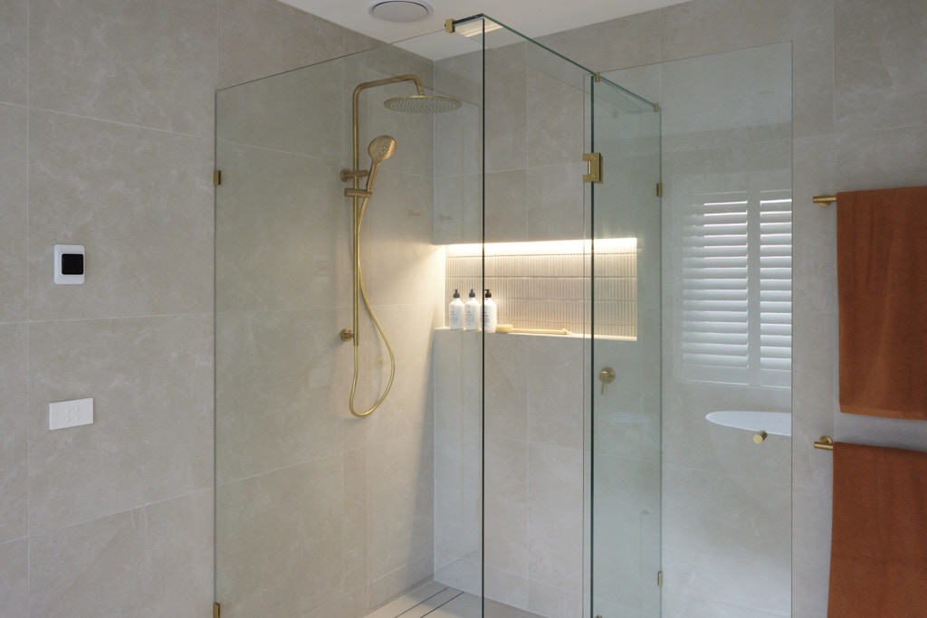
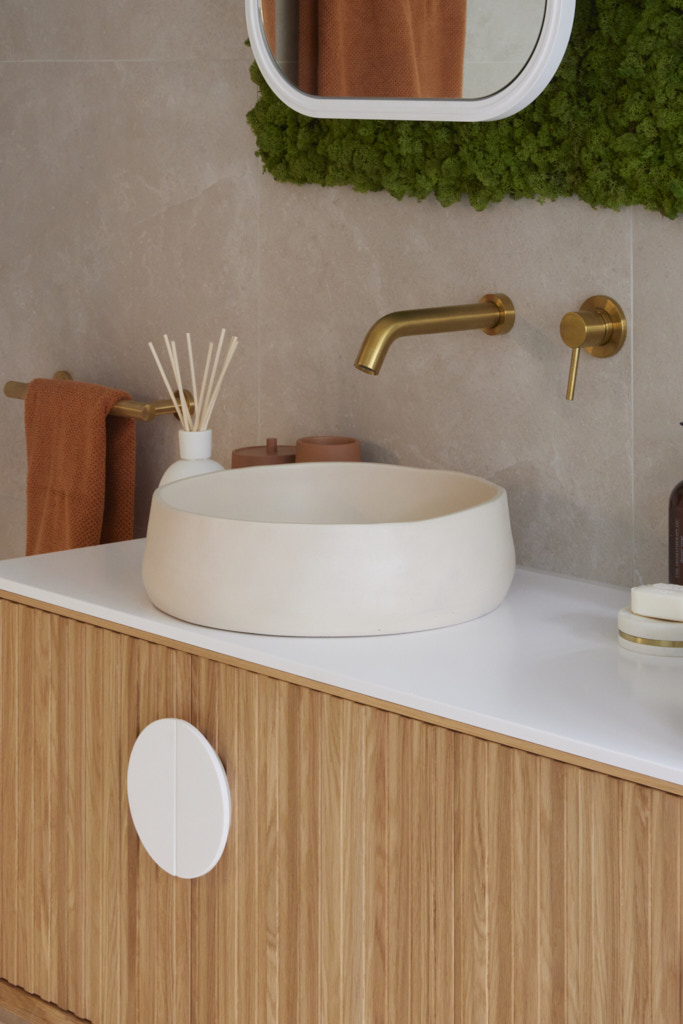
And here was the big surprise of the night, a moss-covered feature wall! “What is that?” a shocked Shaynna asked. “I can’t get my head around it!” Marty agreed as the judges took in the bright green living moss feature Eliza and Liberty had used in their downstairs bathroom. Only Darren was impressed, pointing out how it complemented the neutral colour scheme, helped acoustically and was great for the air. Marty wasn’t sold however, saying he loved the layout, fixtures and the fact this was the only bathroom presented with an actual bath… but the moss was a step too far.
My thoughts on Eliza and Liberty's bathroom reveal
- Before I can pass any comment on Eliza and Liberty's bathroom, I have to say that I thought the moss was hideous and completely destroyed what is in fact a very nice bathroom. I don't mind a little quirkiness, but what this strong contrast in colour achieved was highlighting the different height levels in the space. The shutters are a strong design element and therefore the mirrors should have lined up with this reference point. By taking the moss to the ceiling, this only compounded the variations in height.
- I love the amount of light in this room. The fresh white shutters on the dual aspect windows are a great feature in the bathroom.
- The bath is beautifully elegant and makes a great statement in the space.
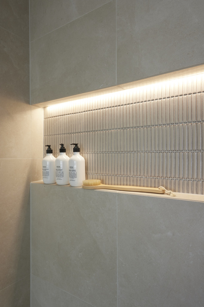
- The shower niche with the subtle change in tile colour is very effective and the brass tapware suits the warm colour palette.
- One element that I think is wrong is the floor stop placement to prevent the door from hitting the toilet suite. Placed where it is means that it has become a severe trip hazard while you make your way to the toilet suite!
- A pretty nice bathroom though, if only it didn't have the moss.
You can find out more about The Block and the contestants at Channel 9. Did you know that many of the beautiful items used on the show can be purchased through The Block Shop?
All photography credits to David Cook Photography
You can see all the rooms and my thoughts on them from previous years of The Block here.
If you are currently undertaking a renovation or building project or even just planning to re-paint your house then you should download my Free exterior and interior checklists. These can be found in my Free Resource Library which has other e-books and checklists and is updated with new free invaluable resources regularly. Join up for free here.
Follow me on Pinterest, Facebook or Instagram for more ideas and images. If you are still stuck and need help with your project I offer an e-consultation service. You can send me photos and/or plans with your questions and I will review and talk it all through with you. I have packages from just one question through to a full colour scheme service – click here for more details.

I agree with your assessment of these rooms. I loved Steph and Gian’s powder room although I did think it could have been improved upon by making the vanity wall hung and shorter so the toilet could sit beside the window and be more discreet.