I was so pleased to see that Steph and Gian quite rightly won The Block 2023 kid's bedrooms' reveal. These guys really have a great handle on the use of colour and how to use it in interiors. I cannot fathom though how Leah and Ash came second. Their approach to colour is to use lots of it without any thought for how they sit together. I love colour, as I have said before, it is why I started this blog. All colours are beautiful, uplifting and should be used more often in interiors. Colour makes you feel good, but, it has to be done right. The judges called their use of colour bold, I call it a big jumble that just doesn't work.
Kristy and Brett's rooms were not quite as successful as the winners, but again, there was lots of colour and it was done really well. Eliza and Liberty should have come joint first or at the very least second – I loved their rooms and use of colour this week.
I have all the rooms below with the judges comments and my take on each one.
The Block 2023 Kid's bedrooms
First Place: Steph and Gian 30 points
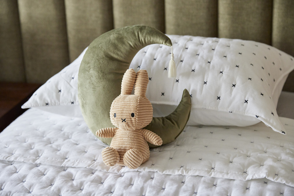
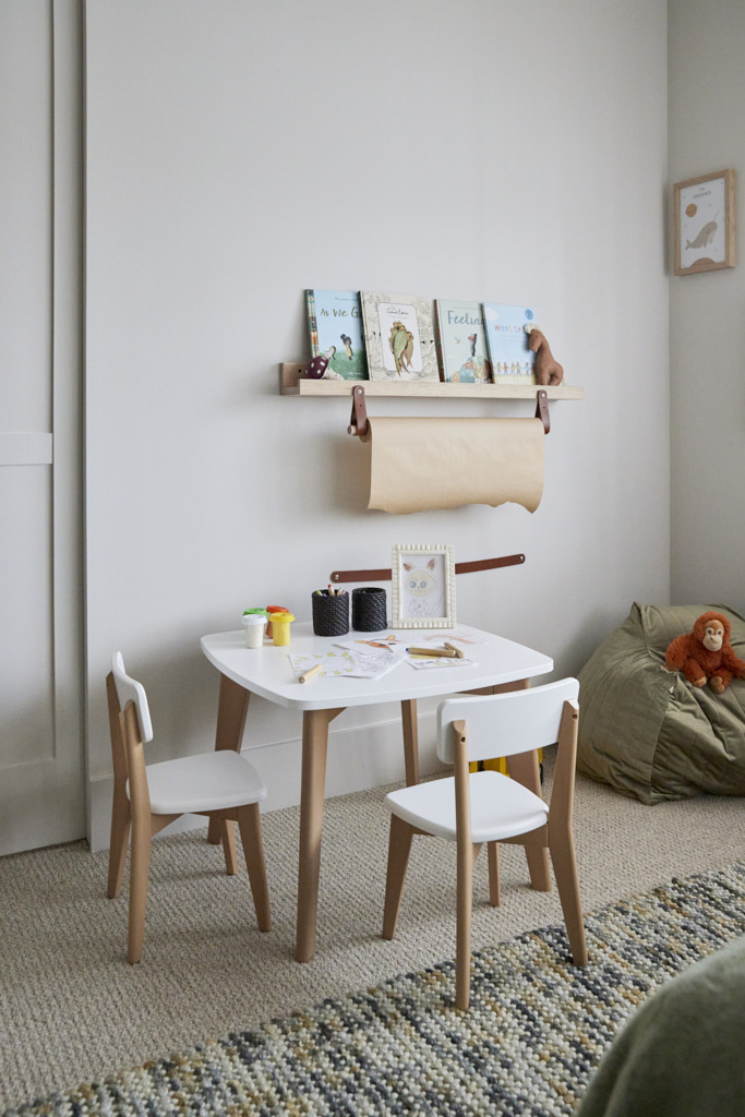
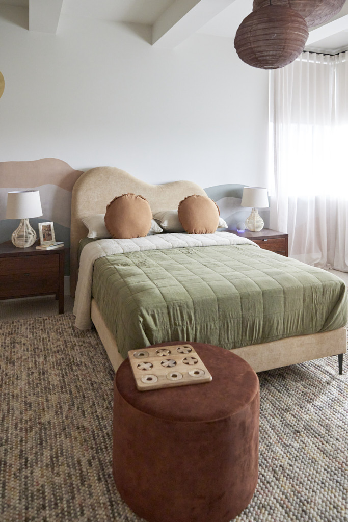
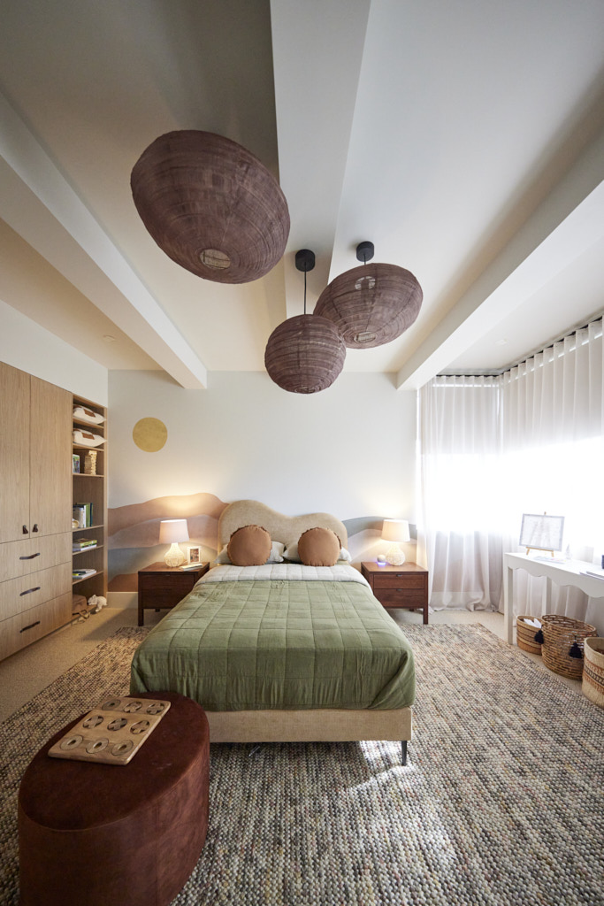
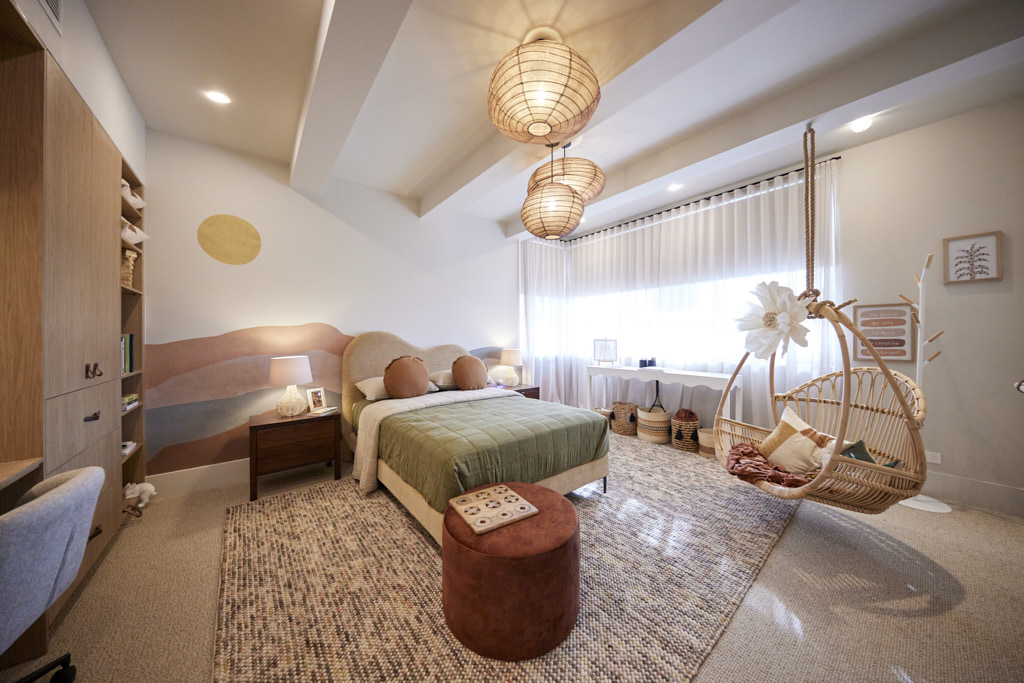
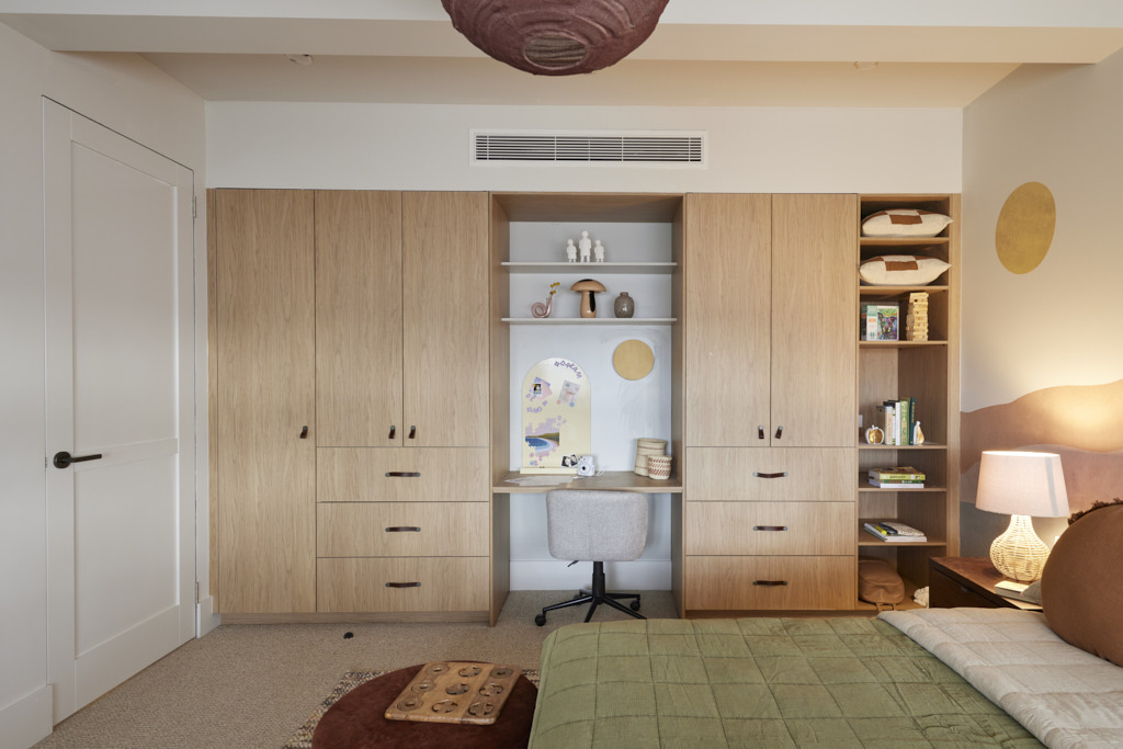
“This,” said Darren as he walked into the first of Steph and Gian’s twin rooms, “is the most sophisticated kids’ bedroom we’ve seen!” And the compliments didn’t stop there. With a soft colour palette (thankfully not all beige), the perfect pendants, bedhead reflecting the Japandi style and a swing chair, it was the best-styled room of the build, the judges said. Through the Jack and Jill bathroom into bedroom number two, the enthusiasm continued. Ample storage, on-point styling (down to hand-stickered artworks) and again a soft palette all added up to rooms that combined functionality, marketability and soul for a result Marty applauded as “brilliant flexibility.
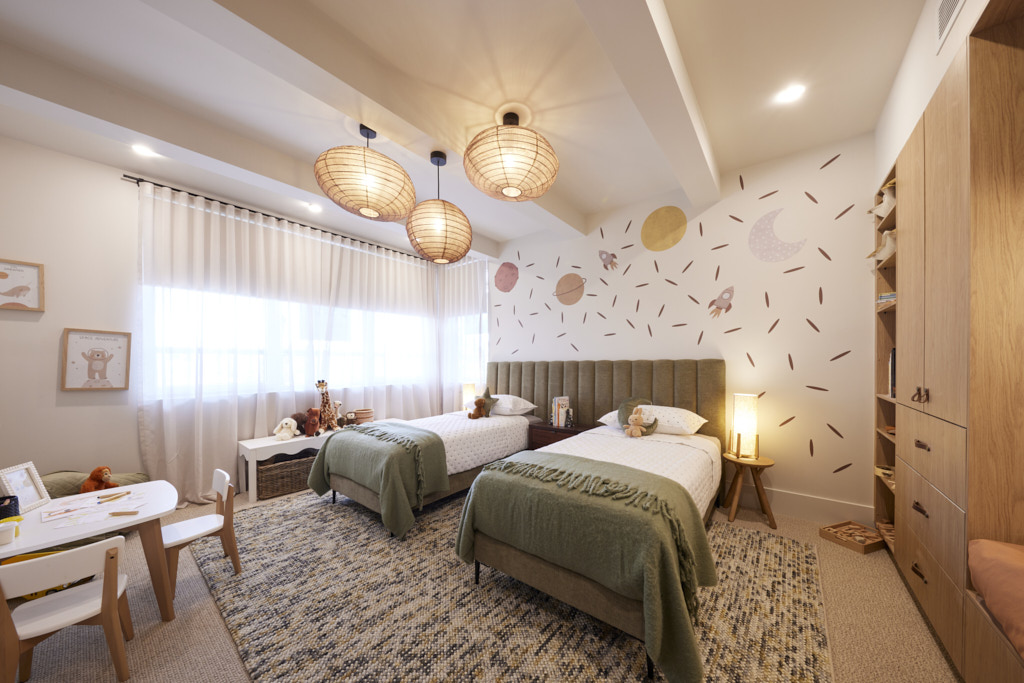
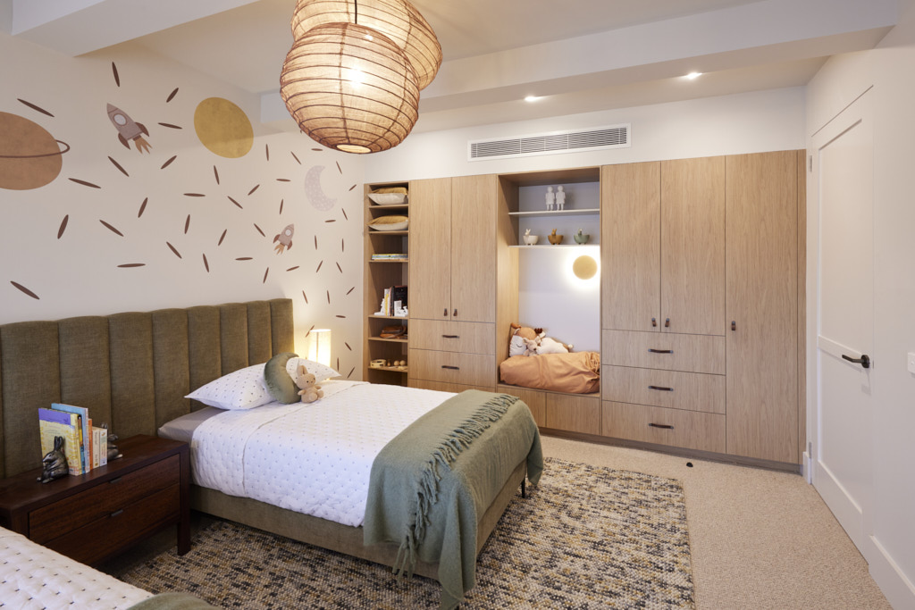
My thought's on Steph and Gian's kid's bedrooms
- The colour palette in both of these rooms is exceptional. There is interest, richness and balance which work perfectly in both spaces. Steph and Gian are very good with sophisticated colour schemes.
- They also understand the importance of introducing different textures into a scheme. Soft smooth satin looks fabulous with rich velvet and large looped wool rugs.
- The rooms are whimsical without being too childish and will be great to build upon by whomever buys the home.
- I can't find anything to fault with these rooms.
Second place: Leah and Ash 28 points
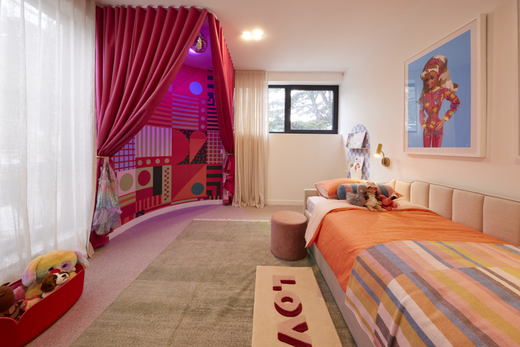
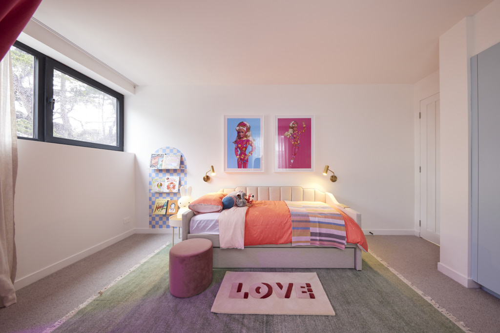
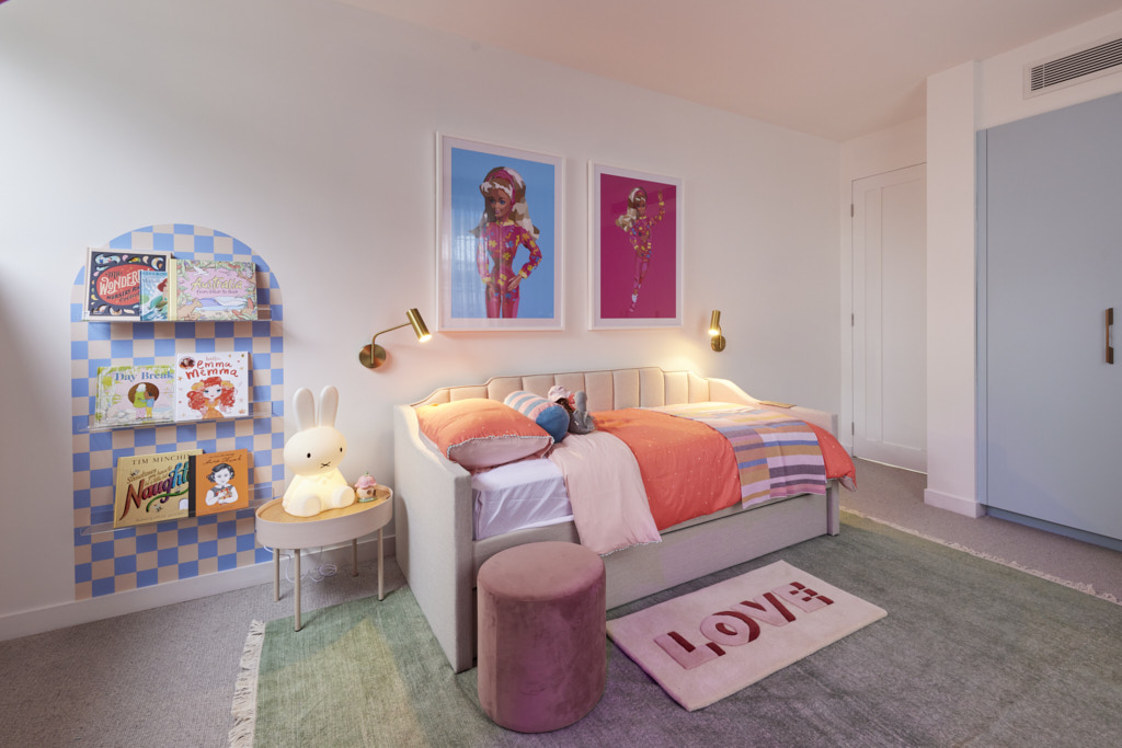
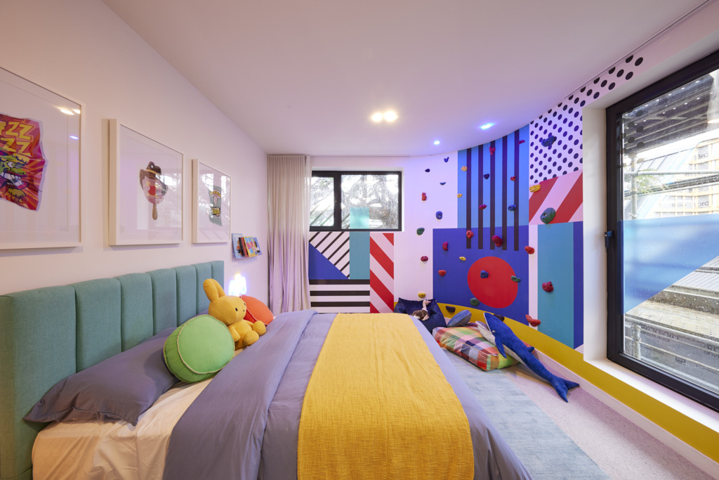
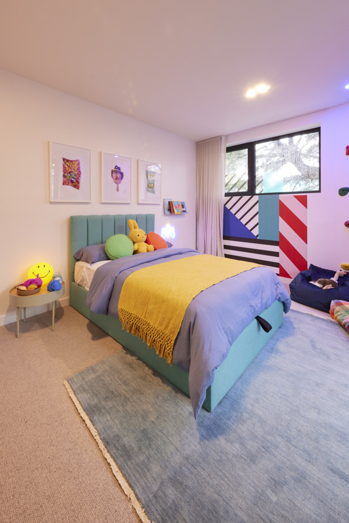
With bold Grafico wallpaper and a climbing wall along one curve, Shaynna fell in love with the bold sense of fun in Leah and Ash’s first room. “They’re back to their best,” she said. Into the second room and the same emotional connection called as the judges took in the mirror ball over a curtained quiet (or very noisy!) space. Combining great architectural elements with a sense of fun, it made for a suite of rooms that grabbed them all… nearly. The rooms had: “”a great sense of adventure and fun” Shaynna and Darren agreed, but the daybed in one room was a strange choice, Marty countered and one that could cost them.
My thoughts on Leah and Ash's kids bedrooms
- Whenever you are decorating a room it is important to consider what it is going to be used for. A bedroom is first and foremost for rest. A kids bedroom is also for play and general relaxation. For play, children need to be stimulated, but you can offer too much stimulation which can be detrimental to your health and theirs. Children respond well to colour, so it is important that this is included in play areas for them. However, too much of a good thing doesn't work. It certainly doesn't work when all colours are jumbled together without any cohesion and are added to a place for sleep.
- You can use lots of strong colour together, but it needs to be balanced and these rooms are just a mess.
Third Place: Kristy and Brett 27.5 points
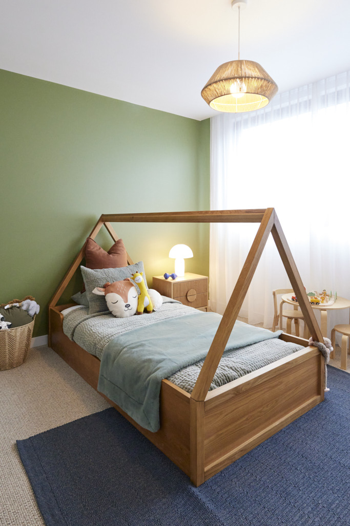
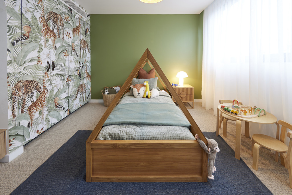
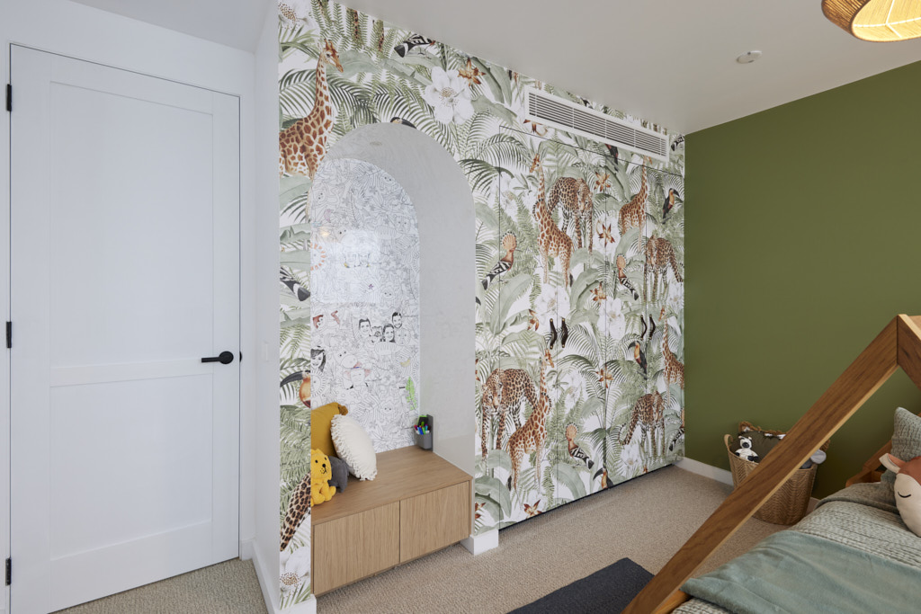
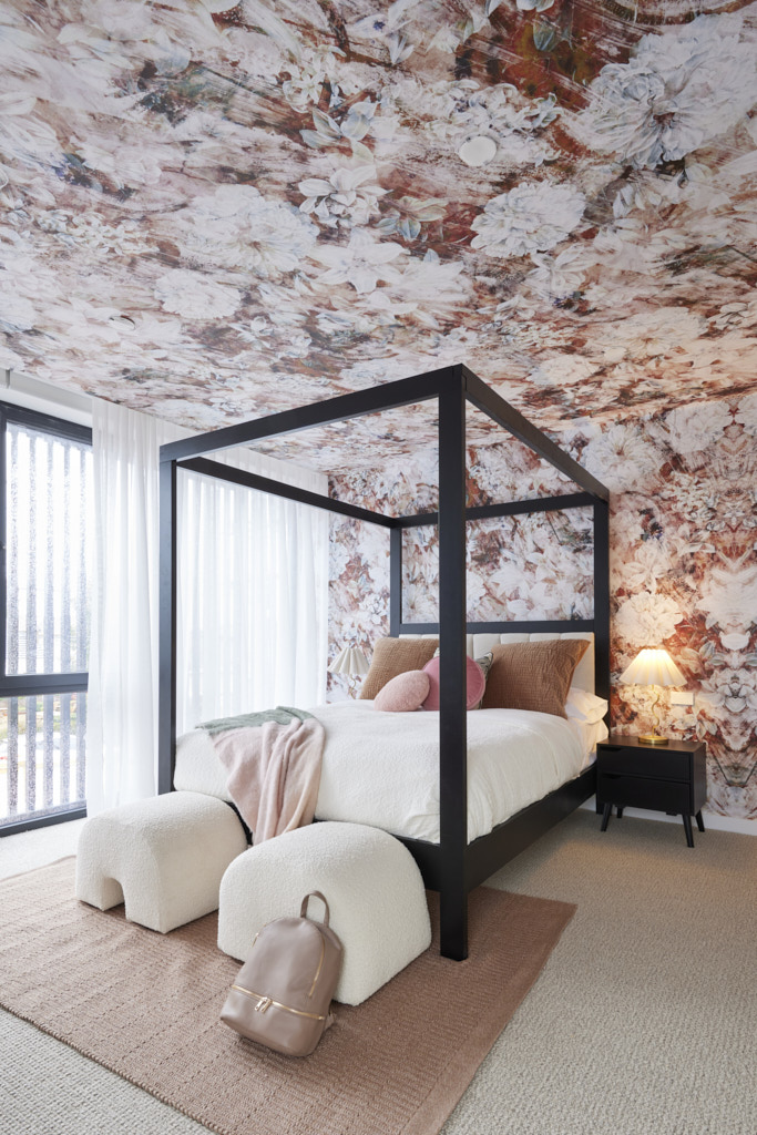
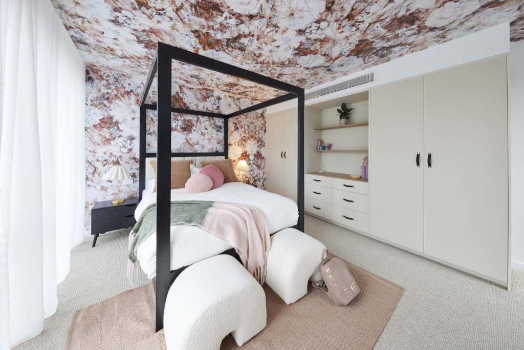
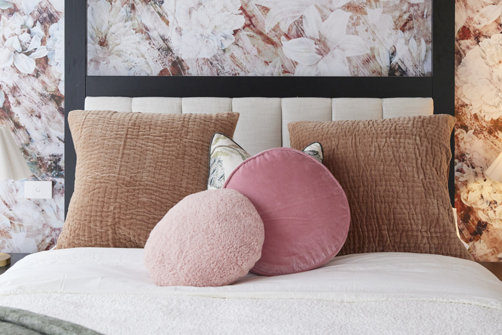
Adding the judges face into the custom Grafico colouring in wallpaper was always going to win a smile and it certainly did, with all three agreeing it was the perfect touch to the Kinsman wardrobes. With a kid appropriate bed and styling that showed how the room could easily be repurposed, Kristy and Brett’s first bedroom set the pace… but the second changed everything. With wraparound floral Grafico, sophisticated leather-accented wardrobes and a four-poster bed, this was a space for an older kid, the judges decided, perhaps one who would never want to move out! A sophisticated space, Marty summed up and in line with the rest of the build.
My thoughts on Kristy and Brett's kids bedrooms
- There is certainly lots to love here. Starting with the younger style bedroom, I really like the colour scheme, the whimsical nature of the wardrobes, the bed and the generously sized bedside cabinet.
- The room is balanced and striking and is a nice canvas to add more detail to.
- The older room is really striking. I must say I'm not a fan of ceiling wallpaper as I find it oppressive, but I do like Kristy and Brett's courage in installing it and it could easily be removed. For me, the lovely wallpaper just behind the bed would be enough.
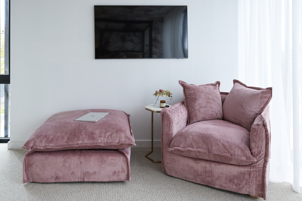
- I love the pink chair and ottoman and I like the way that it is angled away from the TV as a cosy reading nook.
- All in all, a great use of colour and texture in the scheme with enough whimsy without being ridiculous.
Fourth Place: Eliza and Liberty 26.5 points
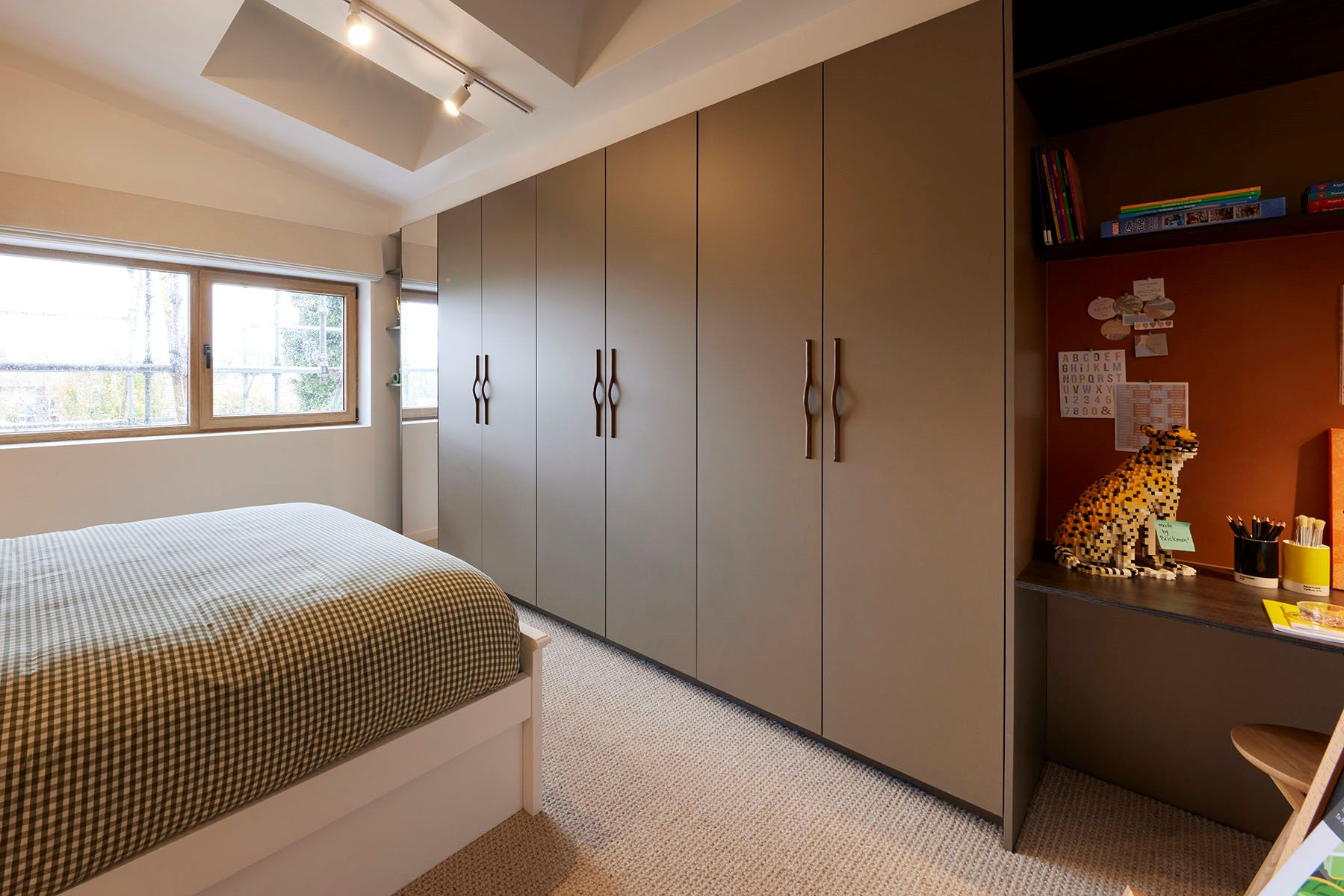
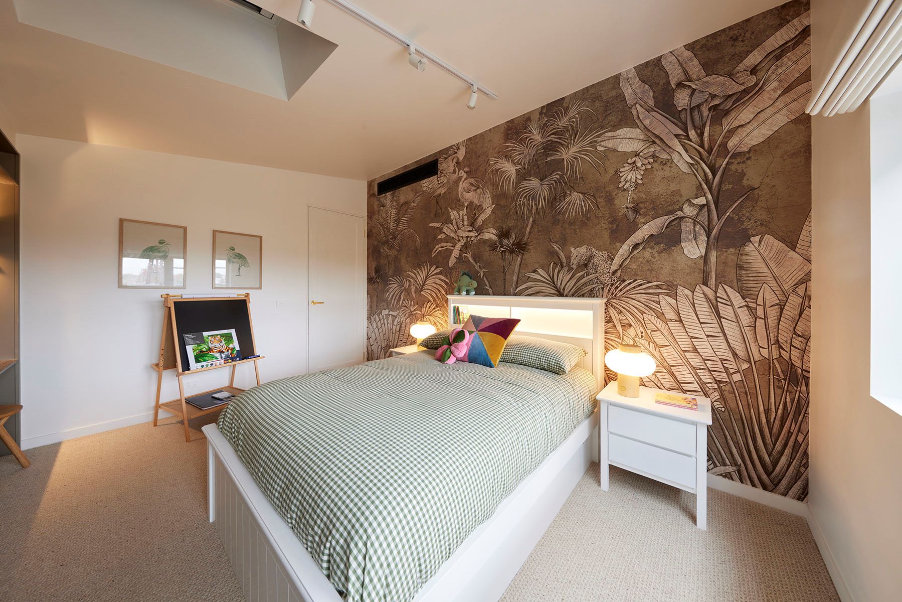
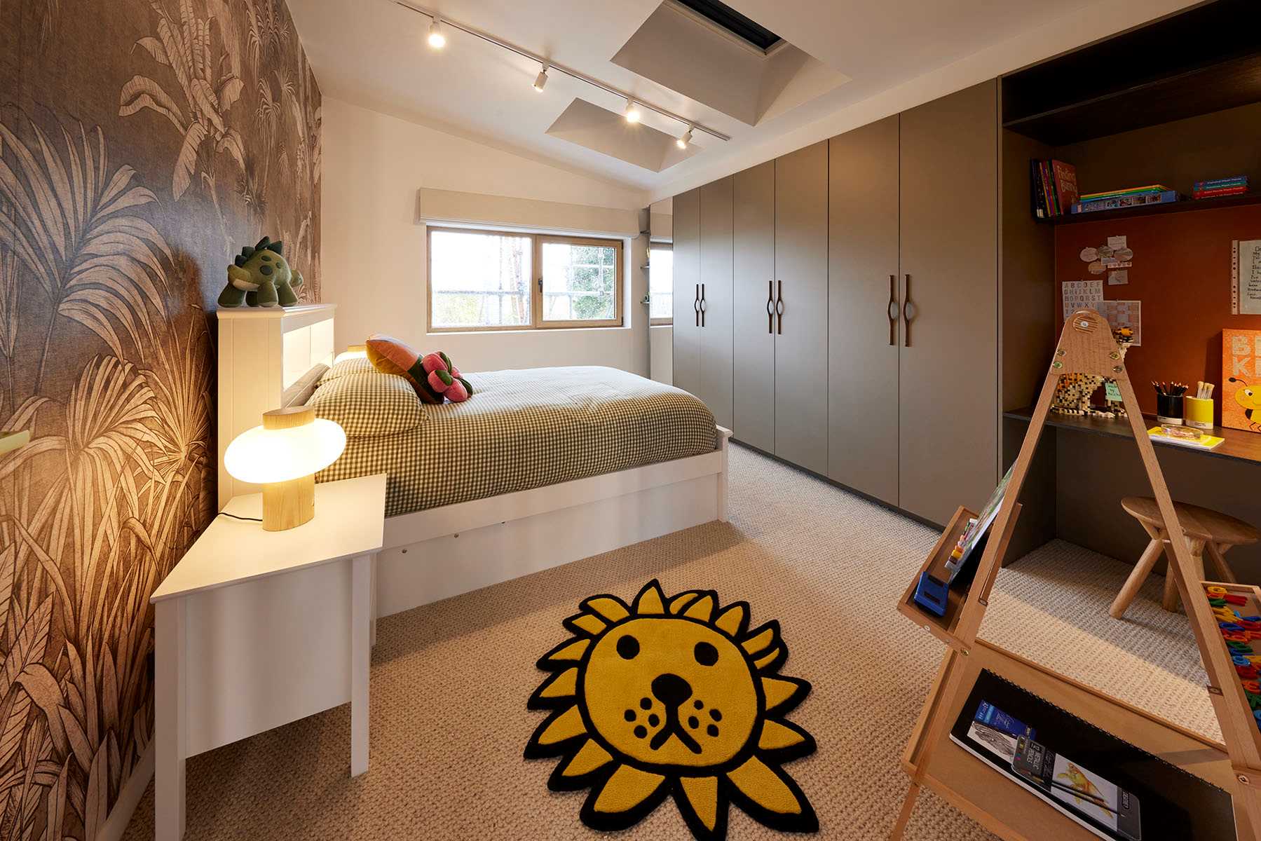
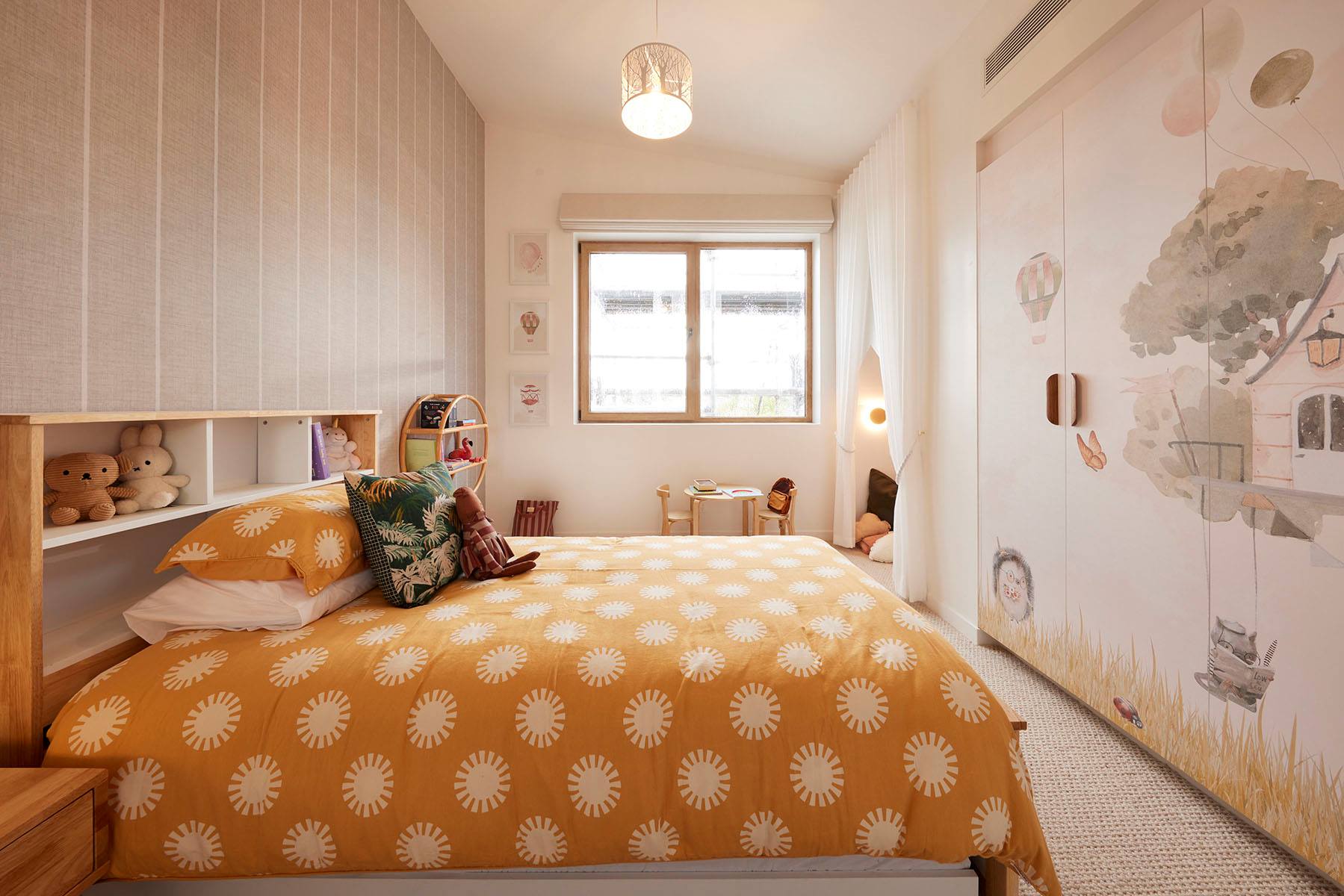
With a stunning mural playing of the deep-hued Kinsman wardrobes, custom artwork from young artist Novalie and a unique Brickman original Lego Cheetah plus the perfect bed with bedsides, Eliza and Liberty’s first room was off to a great start. But it was let down by track lighting, Marty said and a blackboard that just didn’t fit. It was a “damn good room” Shaynna agreed, but one in search of an age group. But into their second space and the judges’ spirits lifted. The mural-fronted wardrobes and reading nook were stunning, Shaynna said, the executions spot on and even the pared back styling looked intentional, Darren said and not just a cost saving measure.
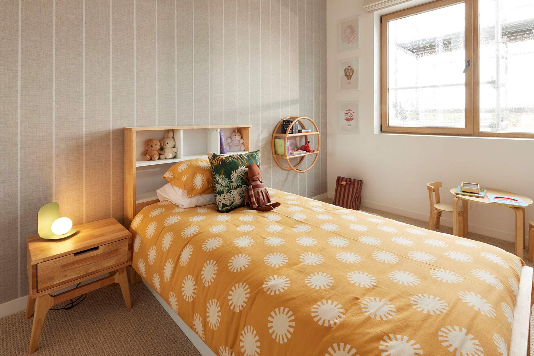
My thoughts on Eliza and Liberty's kid's bedrooms
- I love the use of colour in these rooms. I think that Eliza and Liberty have really grown through this process and they have delivered two beautiful kids bedrooms.
- There is strong colour in both, but it is rich and enveloping in the first bedroom which is perfect. The brown tones of the wallpaper is a stunning backdrop for the green in the bedding. The sunny disposition of the second room is uplifting and fun with the bright saffron tones injecting lots of personality.
- I love the secret nook in the corner of the second bedroom. A great place for children to hide and read stories. It doesn't have to be in garish bright tones to be a fun hideaway.
- The rooms have excellent storage and practical bedside tables.
- Oh and it is lovely to see the Roman blinds on the windows. I am over white sheers covering the walls.
- Eliza and Liberty should have been in joint first place or at the least in second.
Fifth Place: Kyle and Leslie 24 points
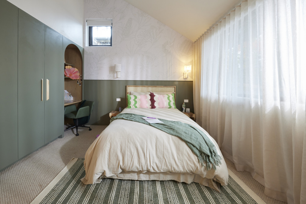
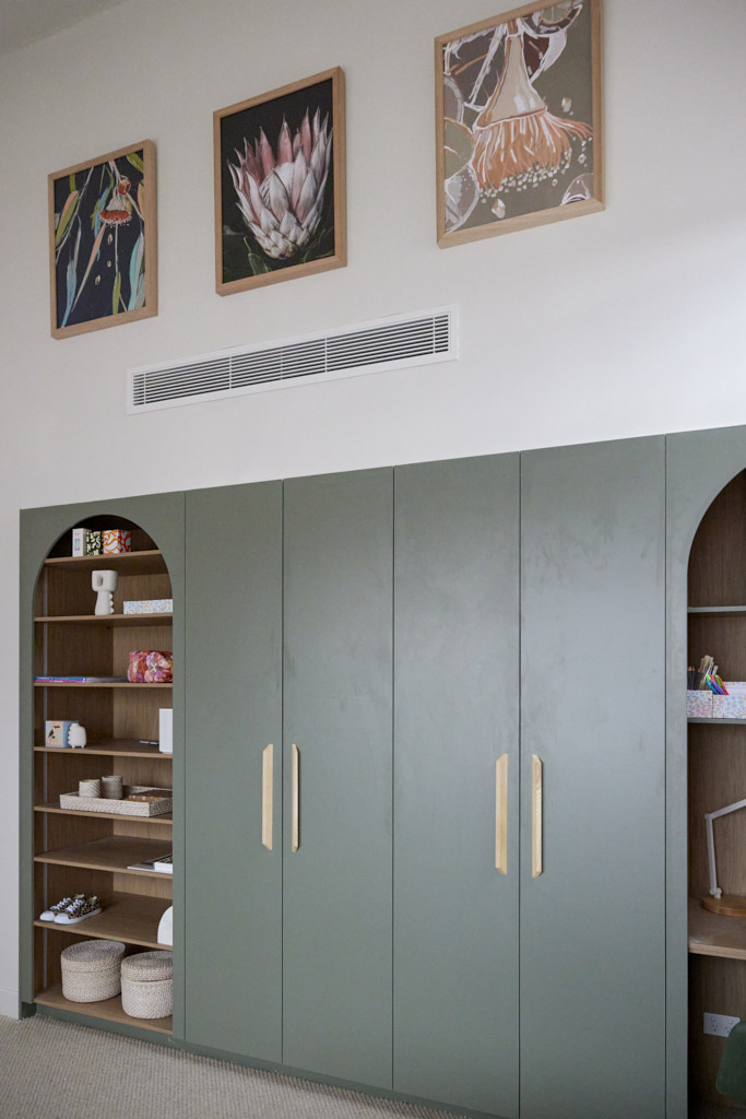
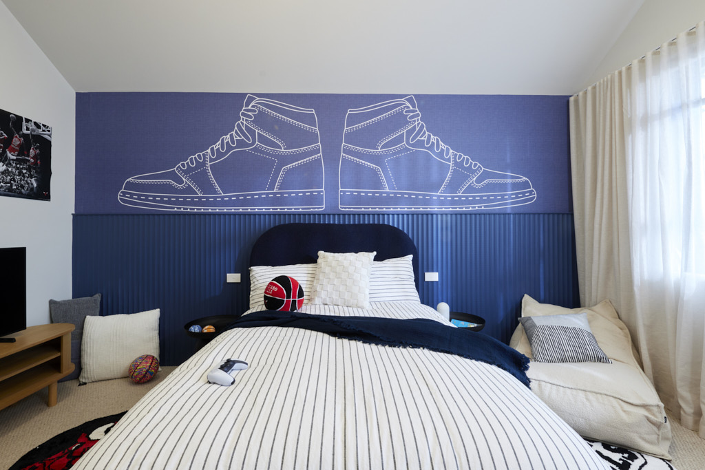
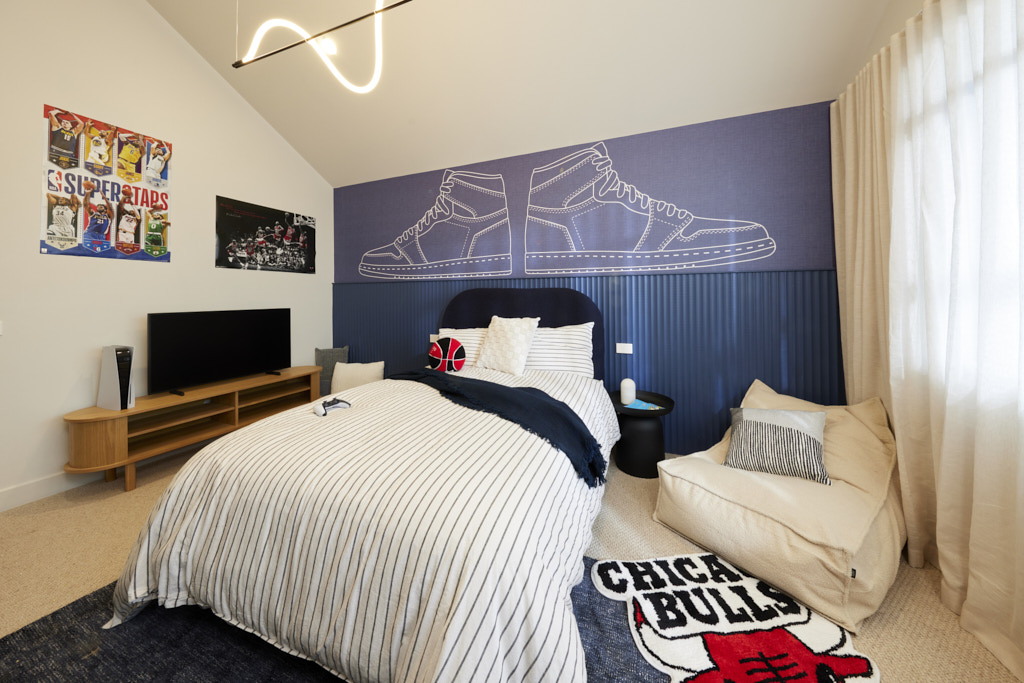
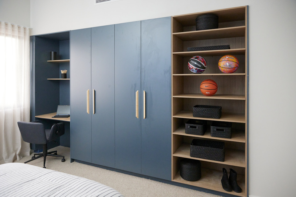
Generously sized and easily adaptable, Kyle and Leslie’s first bedroom showed great promise, the judges agreed and paired well with the second room, which boasted more of the home’s trademark curves. Both shared great layouts and were complemented by the Kinsman built-ins and muted colour palettes that were ready to be personalised, but the styling, all agreed, let them down. From the heavy basketball theme in one room, with blu-tacked posters (unacceptable, Marty declared) and Grafico wallpaper that suited a younger resident in the other, these were spaces that felt disconnected to the rest of the house. The spaces were marketable, they eventually agreed, but just not spectacular.
My thoughts on Kyle and Leslie's kid's bedrooms
- I thought these were pretty well designed and nice bedrooms. They didn't wow, but I liked that one was in green and one in blue with wall panelling that was the same colour as the wardrobes.
- Each room offered lots of storage, open shelving, which kid's always like for trophies etc. and a study nook for each space.
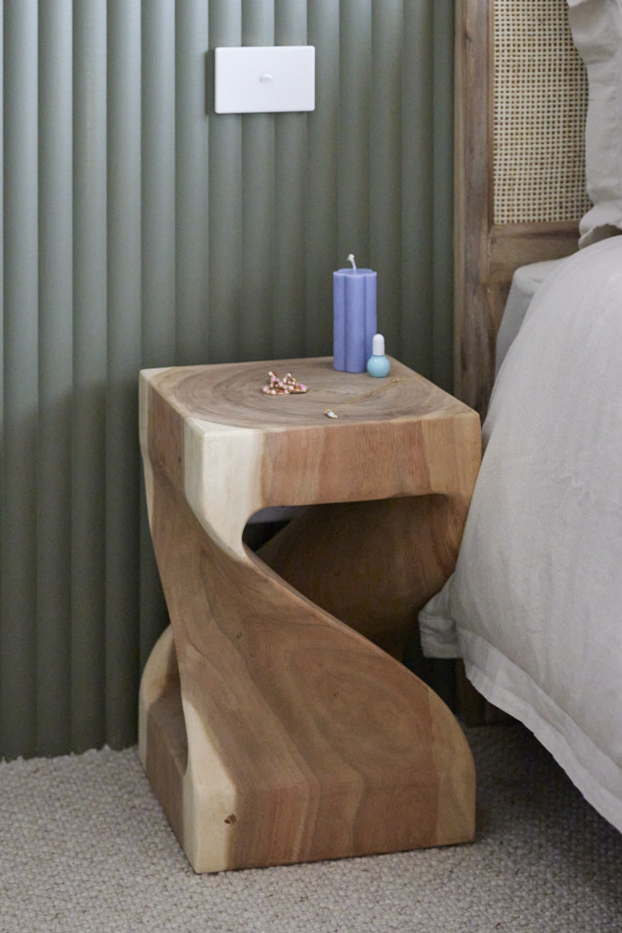
- I agree the styling was a little off; posters are a bad idea and the bedside tables were impractical, but for the buyer of these houses, there is a good solid room that is nicely fitted out.
- I certainly don't think that these rooms deserved last place.
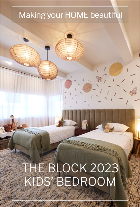
What did you think about The Block 2023 kid's bedrooms' reveal? I would love to hear in the comments below.
You can find out more about The Block and the contestants at Channel 9. Did you know that many of the beautiful items used on the show can be purchased through The Block Shop?
All photography credits to David Cook Photography
You can see all the rooms and my thoughts on them from previous years of The Block here.
If you are currently undertaking a renovation or building project or even just planning to re-paint your house then you should download my Free exterior and interior checklists. These can be found in my Free Resource Library which has other e-books and checklists and is updated with new free invaluable resources regularly. Join up for free here.
Follow me on Pinterest, Facebook or Instagram for more ideas and images. If you are still stuck and need help with your project I offer an e-consultation service. You can send me photos and/or plans with your questions and I will review and talk it all through with you. I have packages from just one question through to a full colour scheme service – click here for more details.
