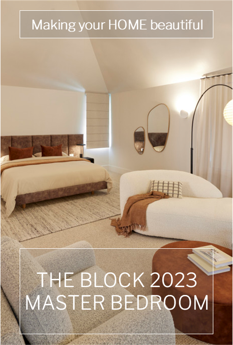
This week I did agree with the judges on first and second place on The Block 2023 master bedroom reveal. I am a big fan of Steph and Gian who were clear winners this week. Their master bedroom and walk in wardrobe was pretty much perfect. From the colour palette, to the layout, there was nothing I could fault here. The Block 2023 master bedroom reveal certainly had some great highs but, I thought, some terrible lows. This is one of the rooms in houses that is beginning to be a big selling point. Not only is it a place to sleep, it is also one to retreat to, and so the inclusion of fireplaces and seating arrangements for those who have the space, seems to be a pre-requisite.
I have all the rooms to show you, together with the judges' comments and my own. I would love to hear what you think.
The Block 2023 Master Bedroom reveal
First Place: Steph and Gian 29 points
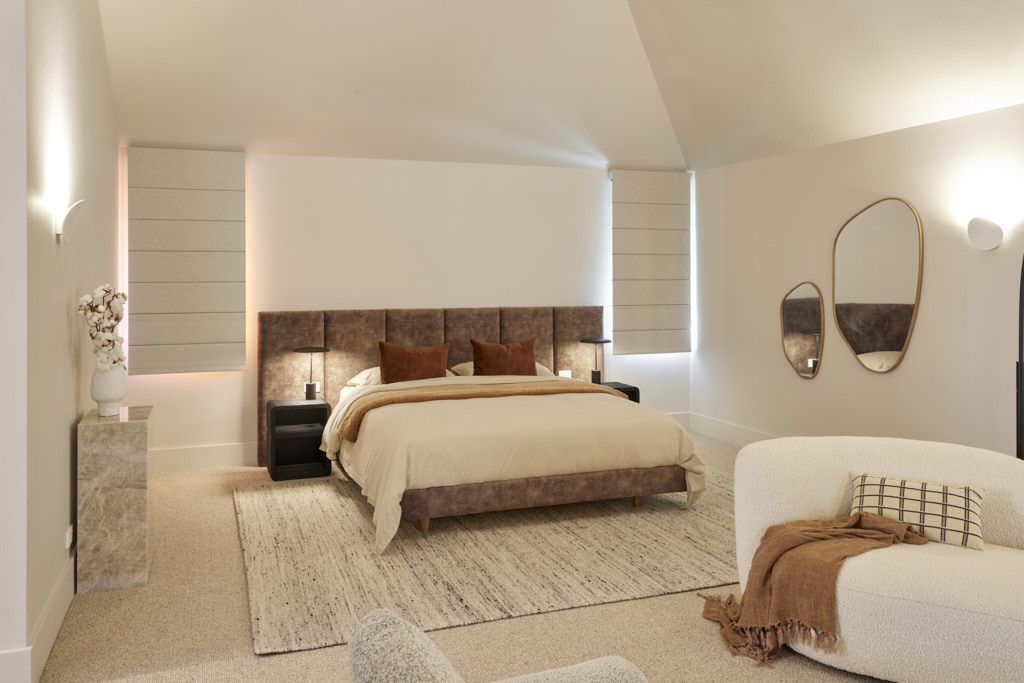
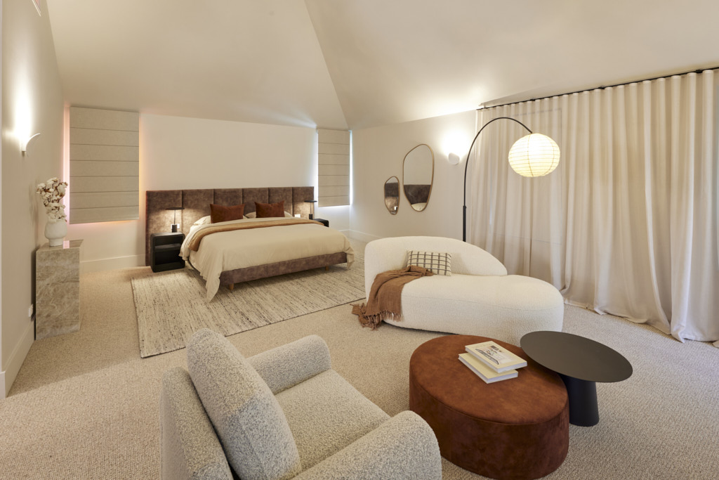
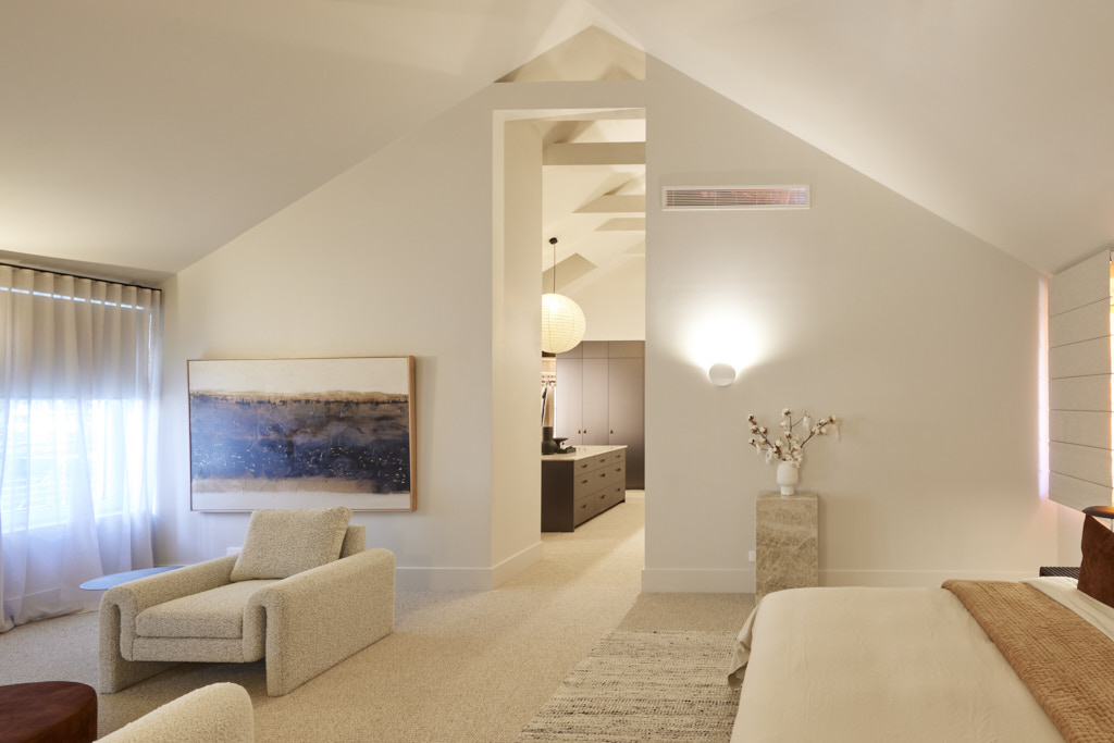
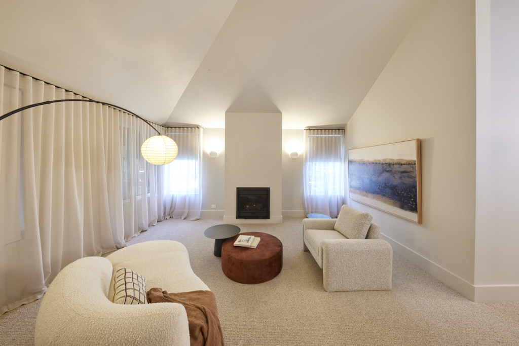
Walking into Steph and Gian’s master wing, the first thing to hit the judges was the huge walk-in wardrobe and dressing area. With a huge marble-topped island, Hafele accessories, enough storage even for Shaynna, this screamed luxury. “This wardrobe could be in a $20 million home,” Marty said… a room you used to get ready to go out and then didn’t want to leave! But as impressed as they already were, the bedroom took their breath away. “This is HOT!” Shaynna said, admiring everything from the lighting plan to the neutral palette, the layout, styling and more. With only the bedside tables earning a frown (not big enough again, Darren said) this was a near perfect room.
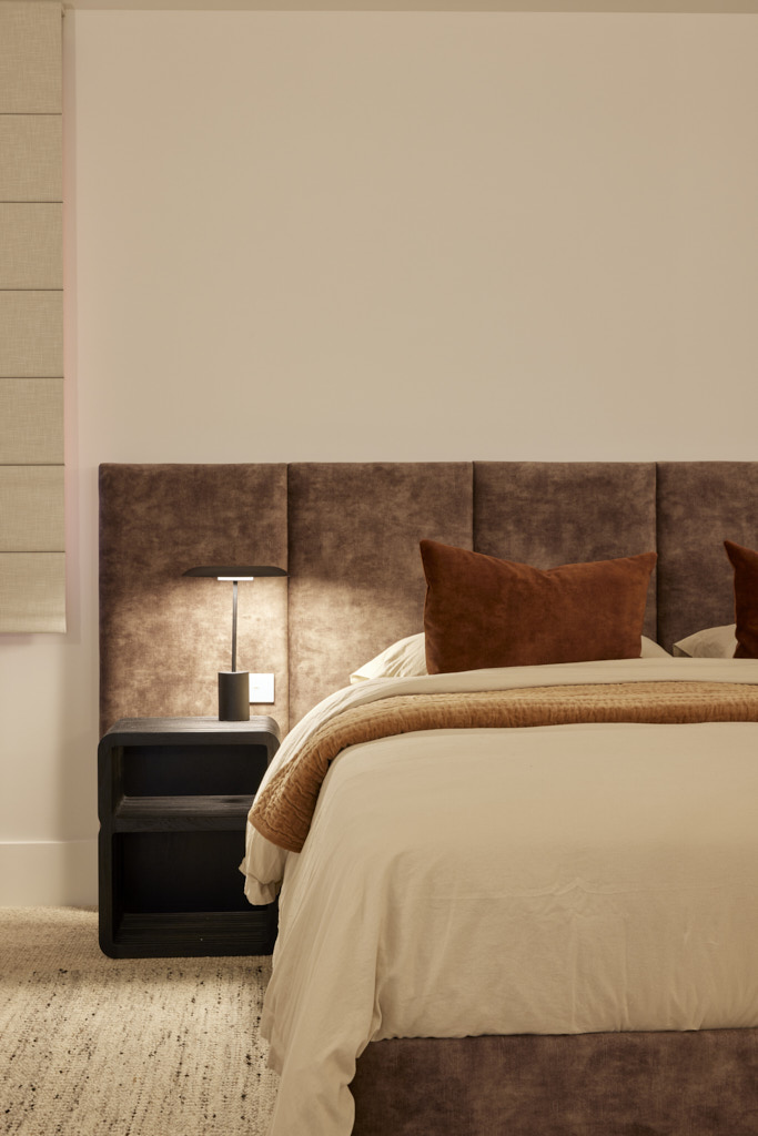
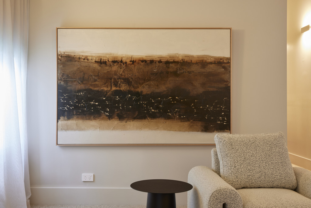
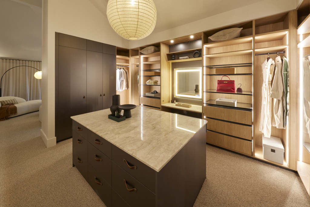

My thoughts on Steph and Gian's Master Bedroom Reveal
- Oh wow, I absolutely love this space. I don't think there is anything that I can say that I don't like here.
- I particularly love the colour palette. The judges referred to this as a neutral palette, which to a degree it is, but I think that the inclusion of rich brown and various tones of terracotta make this a rich colour palette. Remember that less is more. The addition of these rich tones has ensured that this is not a one dimensional scheme by any means. The success of this room is in the contrast of deep and light tones and rich and light colours. It really does work particularly well.
- The mix of textures is also very successful here. From the soft luscious velvet to the Boucle chairs and the rug over the carpet. All of these work together beautifully.
- The window dressings work well here too. Although I love sheer curtains, I have seen an overuse of them on this show. The inclusion of Roman blinds here works really well. You should always consider the window that you are dressing and not just choose a blanket solution for the entire room.
- Of course, the walk in wardrobe is perfect. However, I would put doors everywhere. It doesn't photograph as well, but then once you have all your multi-coloured clothes and accessories on show, the effect isn't quite the same!
- Oh, and I thought that the size of the bedside tables was just right.
Second Place: Kristy and Brett 27.5 points
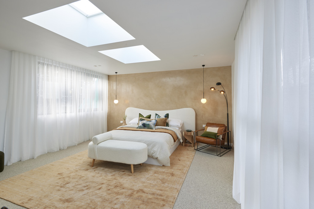
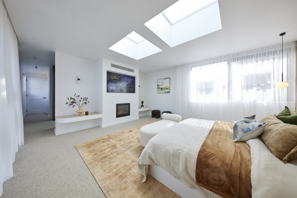
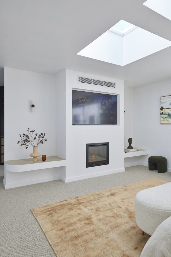
“Simpler and more impactful” Darren said as he walked into Kristy and Brett’s bedroom, admiring the warm colour palette, the Venetian Plaster wall finish, a “sensational” bedhead and rug and even an ottoman for dressing. It was a room that “gave you a hug” Marty kicked in, with Shaynna saying it was the best floor plan she had seen (so far). Laying in the bed to watch the stars through the skylights above enjoying the warmth of the fireplace would be heaven, they agreed, with Marty saying the whole space was “well furnished, well designed and really well executed.” If only, Darren added, the bedside tables were bigger!
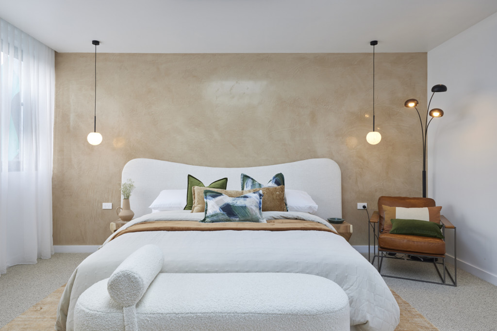
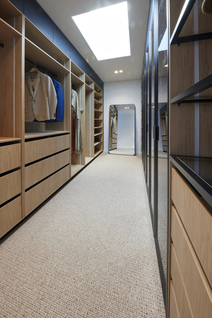
My thoughts on Kristy and Brett's Master Bedroom
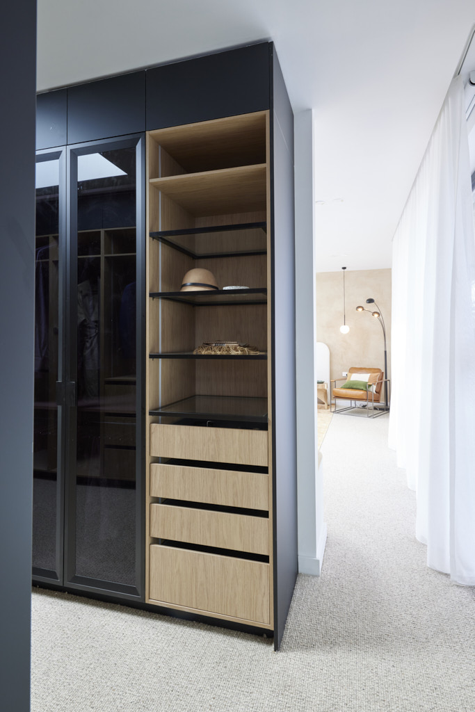
- This is another very successful master bedroom and walk in wardrobe.
- The layout is excellent and the spaces are beautifully light and airy. You will need blinds on the skylights though unless you are a very early riser!
- The colour palette is sublime. It is warm without being over-bearing and the small accents of green and blue work perfectly with the warm ochre tones.
- I really like the timber finish on the walk in wardrobe.
- Overall, a very successful master bedroom reveal for Kristy and Brett.
Third Place: Leah and Ash 23.5 points
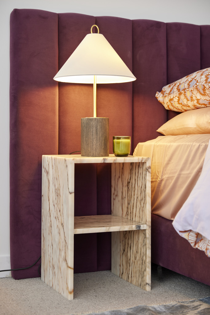
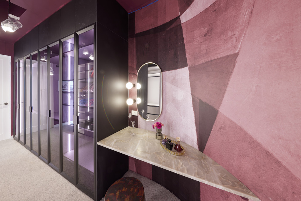
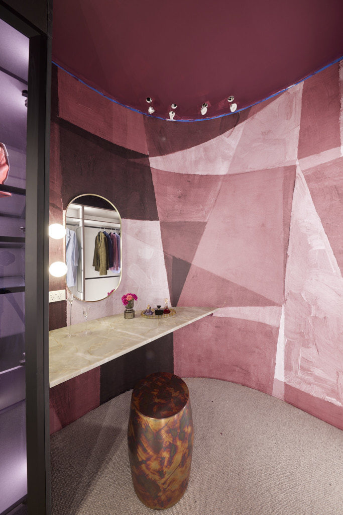
“How good is that scalloped ceiling!” gushed Marty as he walked into House 2’s master suite. “And in a week!” Shaynna added… but the compliments soon ran out. The curved bench seat at the window with floor to ceiling sheers and the Palm-Springs inspired artwork against a muted but consistent colour palette worked, the judges agreed, but some styling choices seemed there just to be eclectic and basic design points were missed. More furniture was needed, the lack of shoe storage was a problem and overall the plan could have been tweaked to make better use of that stunning ceiling and natural light, they decided.
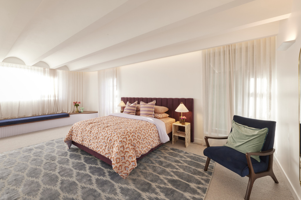
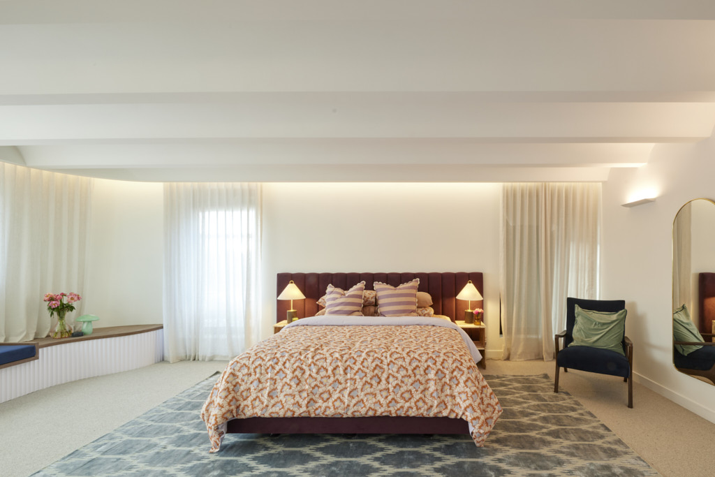
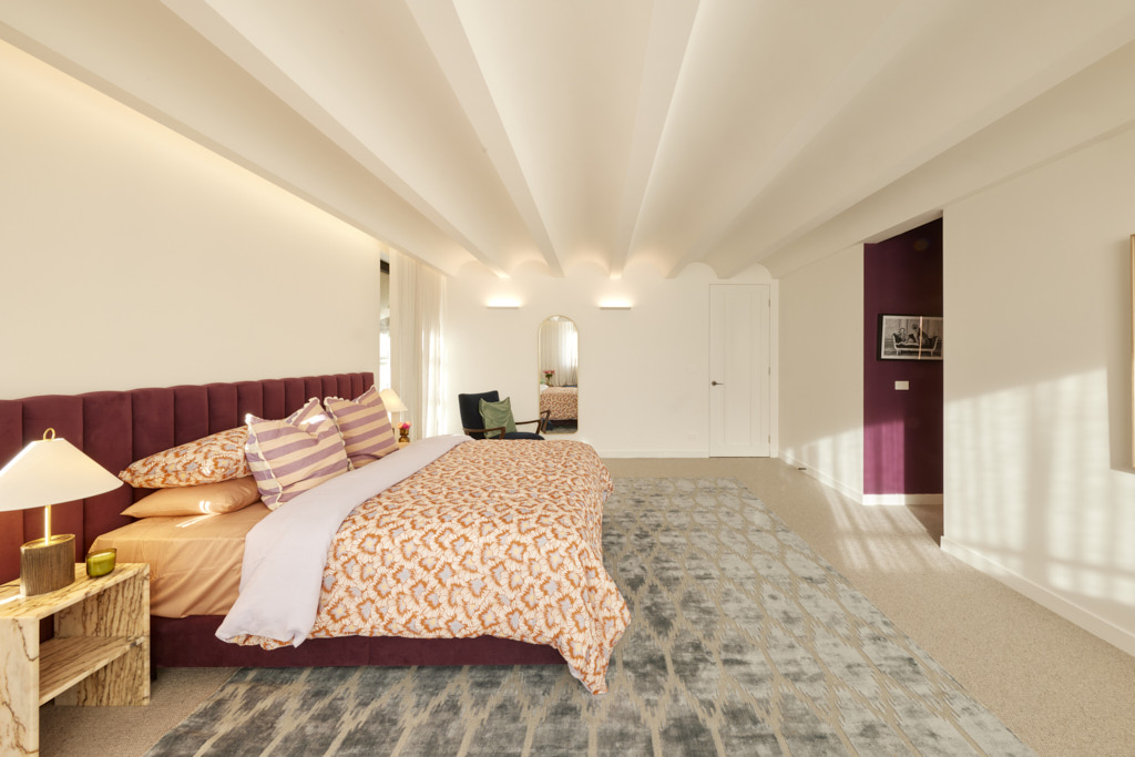
My thoughts on Leah and Ash's Master Bedroom
- The master bedroom worked well enough, but I felt that there were too many things that weren't quite right here. The window dressings should have been different on the window seat as sheers don't work here. Perhaps a blind or shutters would have been preferable.
- I did like the richness of the colour palette in the bedroom and I think that Leah and Ash got this right this week.
- I wasn't a fan of the scalloped ceiling, although the judges loved it and I am sure others will. I thought it was a bit gimmicky.
- So, it was going quite well, but then we saw the walk in wardrobe and I thought I had been transported to a dodgy nightclub in St Kilda. I think this is hideous and badly executed. I can't imagine any buyer keeping it as it is.
Fourth Place: Eliza and Liberty 22.5 points
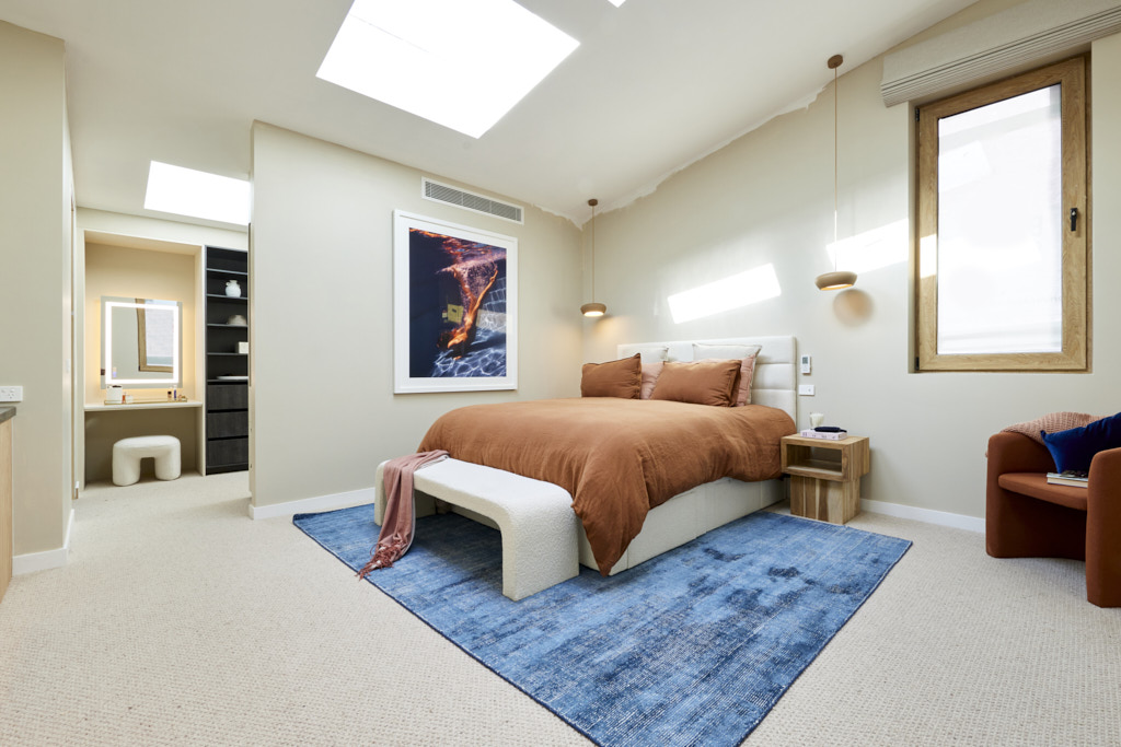
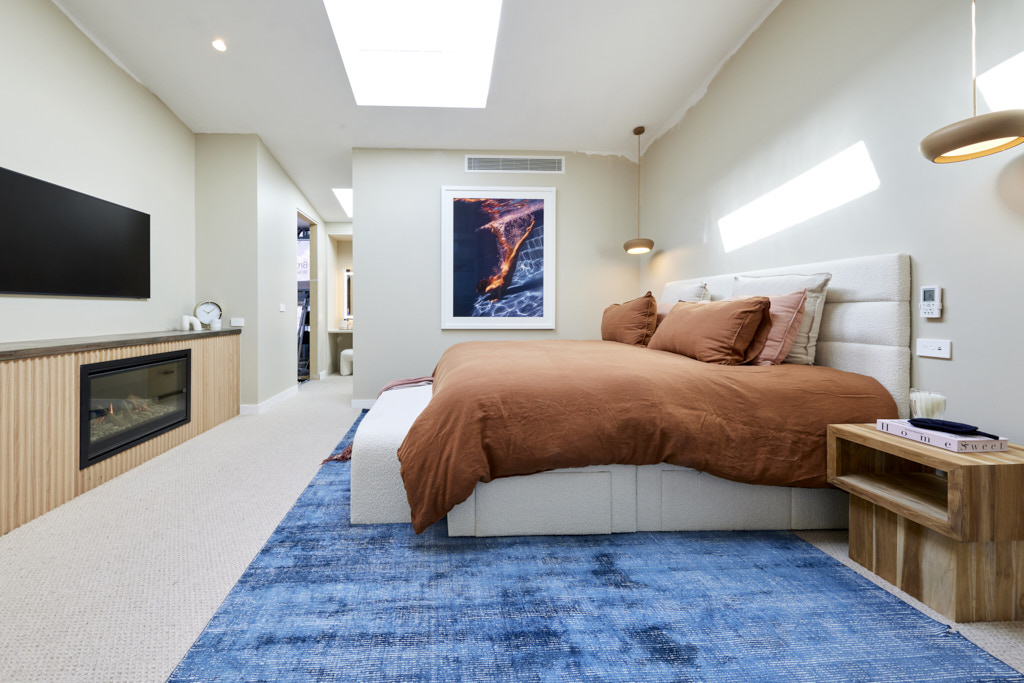
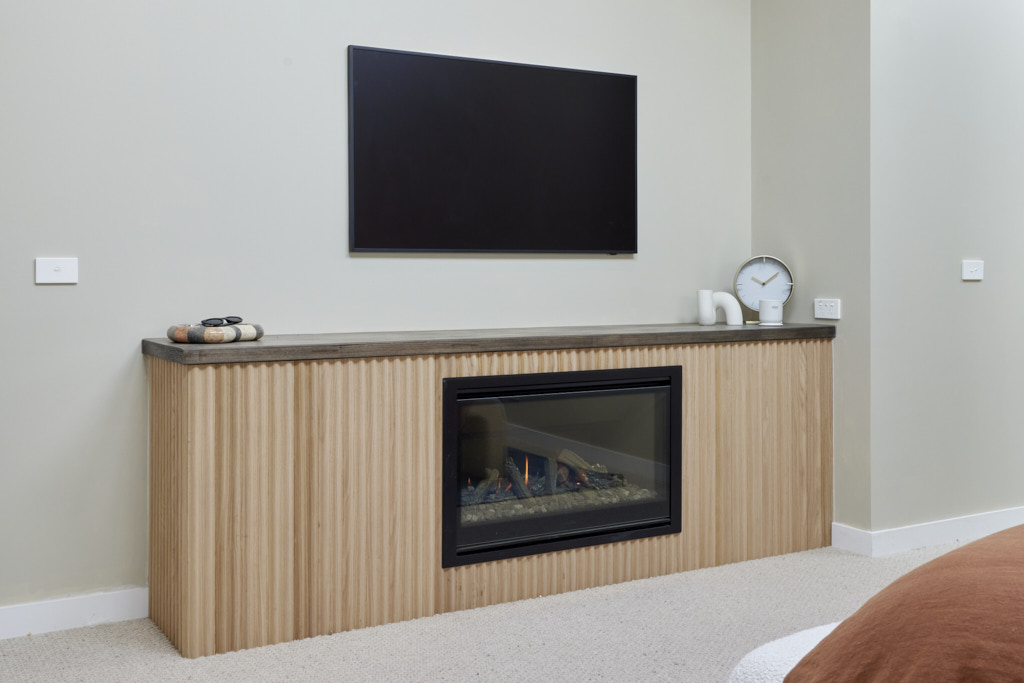
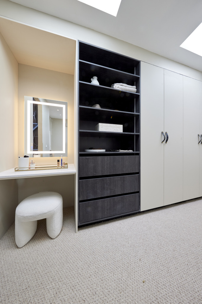
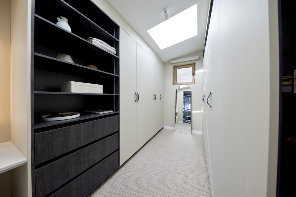
With double-glazed Aluplast windows and a fireplace to keep things warm Eliza and Liberty had created a cosy, beautiful room, but one that perhaps needed more. Simple, perhaps to the point of too little happening, the judges were concerned the pair had been overwhelmed this week, pointing to incomplete paint, sparse styling and artworks that favoured one side of the room but not the other. The layout worked well – particularly in the beautifully-appointed Kinsman wardrobes – and the colour choice was perfect for a bedroom, but with a definite sense of desperation and some choices that seemed to clash, more time should have been found.
My thoughts on Eliza and Liberty's Master bedroom reveal
- Eliza and Liberty have kept with their terracotta and blue theme, but it actually works better here as the blue is a cooler one than the purple blues they have used in other rooms.
- I like the darker paint on the walls which ties in well with the colour of the wardrobes and there are some nice mixes of texture throughout the space.
- The room though is clearly incomplete and requires better styling and more artworks.
Fifth Place: Kyle and Leslie 21 points
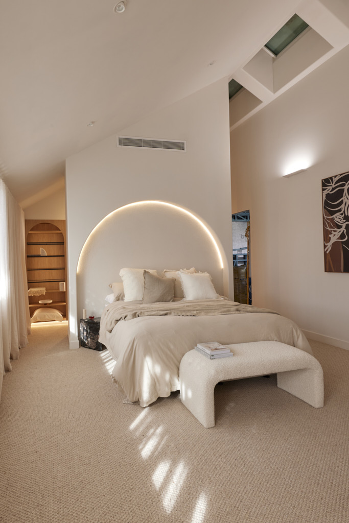
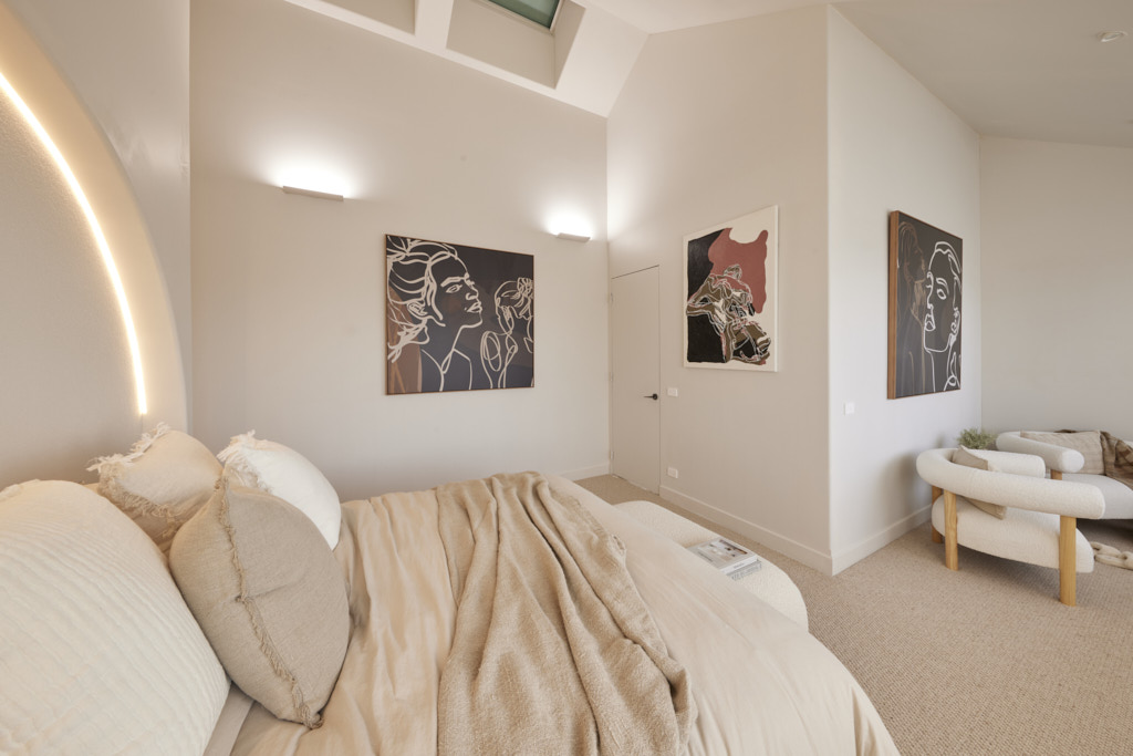
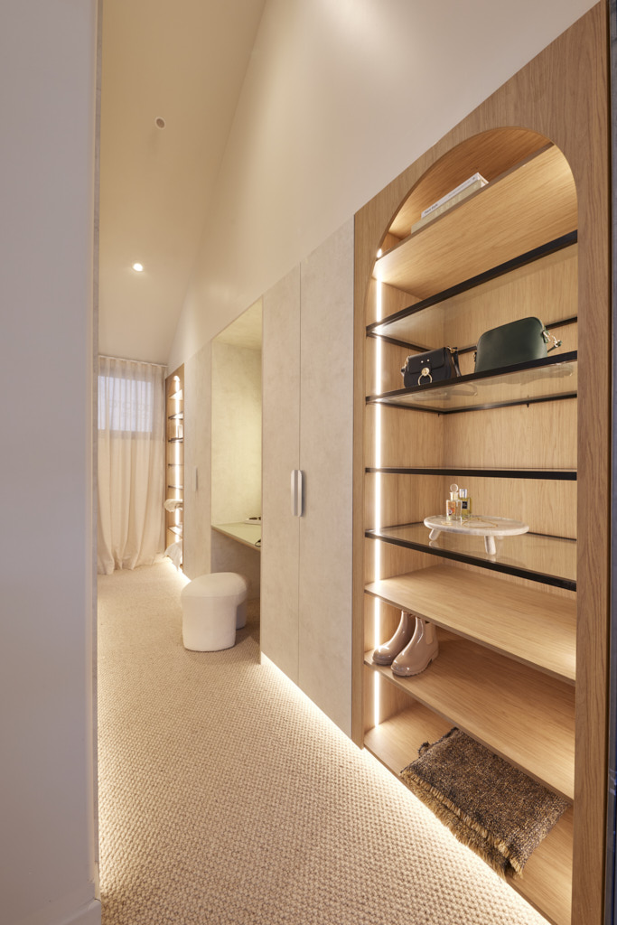
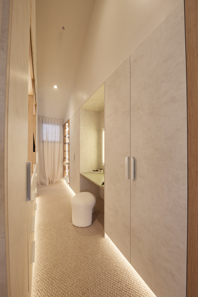
With a consistent aesthetic and excellent craftsmanship, the judges agreed Kyle and Leslie’s Master Bedroom matches the house they have created… but worried about its practicality. From the harsh texture in the recessed bedhead arch to the LED downlights directly overhead and artwork that reminded Darren of a chocolate shop, they were concerned style and been chosen over function. No dedicated make-up and dressing station for example was a missed opportunity, Shaynna said. The couple need to think: “more about what is liveable and not simply Instagrammable,” Marty added. It’s a room that will appeal to some, Shayna summed up, but going forward, more thought was needed.

My thoughts on Kyle and Leslie's master bedroom
- A classic neutral palette is great, but this room is crying out for a touch more colour. Some deeper tones were introduced with the artworks and it would have been great to continue this into the bedding.
- I do like the mix of textures, although I agree with the judges that the area behind the bedhead was too coarse.
- This is a room too where I felt that the sheers were too much. Certainly the small window in the walk in wardrobe should have been dressed with a blind or shutter.
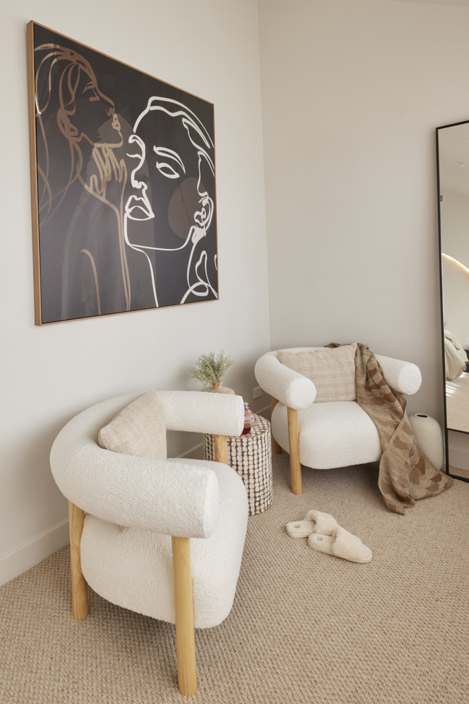
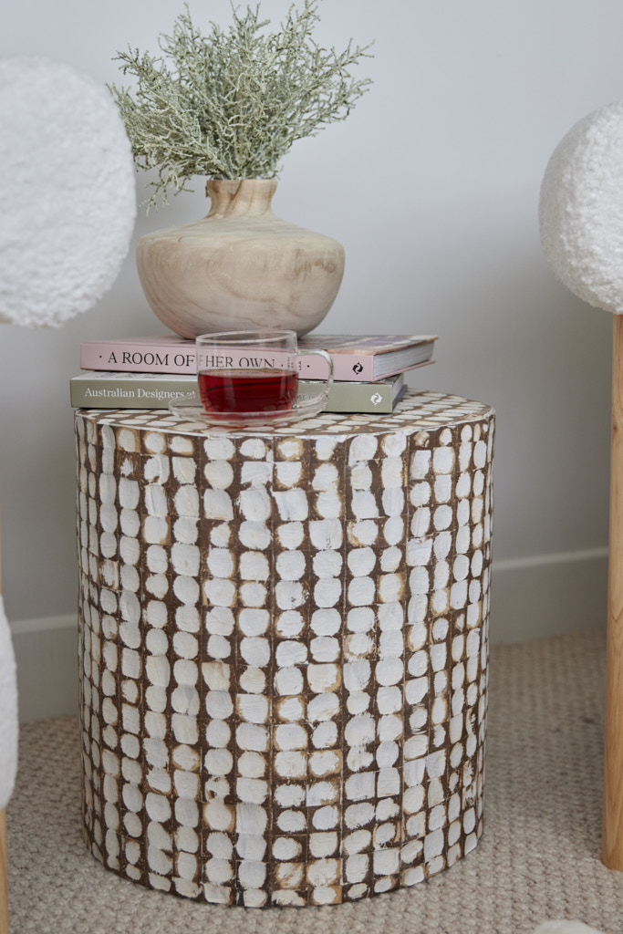
- I loved the seating area with the textured armchairs and side table. I thought this worked really well.
- There was nothing terribly wrong here, and it certainly should have taken out third place in my view, but it just needs a lift.
You can find out more about The Block and the contestants at Channel 9. Did you know that many of the beautiful items used on the show can be purchased through The Block Shop?
All photography credits to David Cook Photography
You can see all the rooms and my thoughts on them from previous years of The Block here.
If you are currently undertaking a renovation or building project or even just planning to re-paint your house then you should download my Free exterior and interior checklists. These can be found in my Free Resource Library which has other e-books and checklists and is updated with new free invaluable resources regularly. Join up for free here.
Follow me on Pinterest, Facebook or Instagram for more ideas and images. If you are still stuck and need help with your project I offer an e-consultation service. You can send me photos and/or plans with your questions and I will review and talk it all through with you. I have packages from just one question through to a full colour scheme service – click here for more details.
