The Block 2023 Studio reveal left me thinking what is the best use for a space like this as all the teams offered something a little different. Is the studio meant to be purely for guests or is this an overflow work and/or fitness zone for the family. Does the space need to meet all of these needs? Of course the answer lies with whoever buys the property, but for sale purposes, I think this should be quite clear. Each studio does have a bathroom so it is clearly meant to be a place for guests to stay. I think therefore it should be set up this way and I believe that Steph and Gian read this perfectly and made great use of the area.
I must say that this was the only room that I liked this week. I found the studio reveal a little underwhelming and rather disappointing after a guest bathroom week that I thought had heaps of merit. I have all the rooms below, together with the judges' and my comments on each space.
The Block 2023 Studio Reveal
First Place Steph and Gian 24.5 points
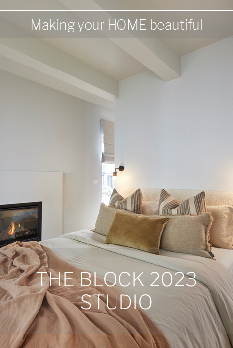
With a Stoke fireplace blazing, featuring beams overhead and a nib wall separating the bed, Steph and Gian’s room was warm, cosy and beautifully executed, the judges said. With a great bed and great flooring it was: “all really lovely!” Darren gushed, with Marty agreeing this is a space that will take a buyer’s breath away. Featuring a bar fridge and coffee station in the Kinsman wardrobe, a border-hugging lighting plan and door accents and a colour pallet that will appeal, this is a personality filled space Marty said would definitely appeal to a large audience.
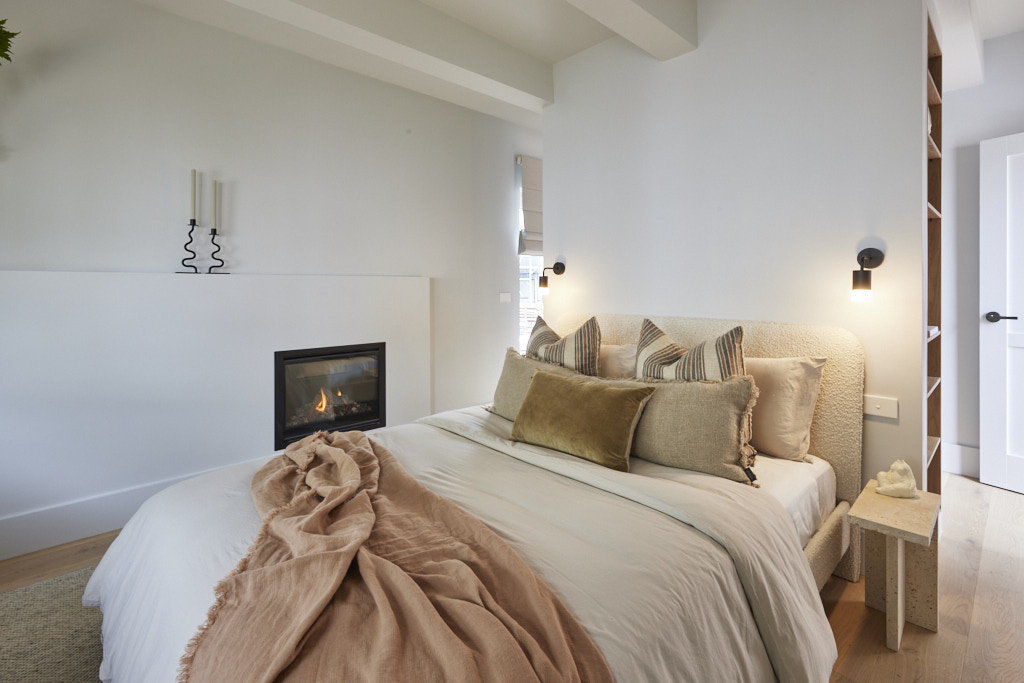
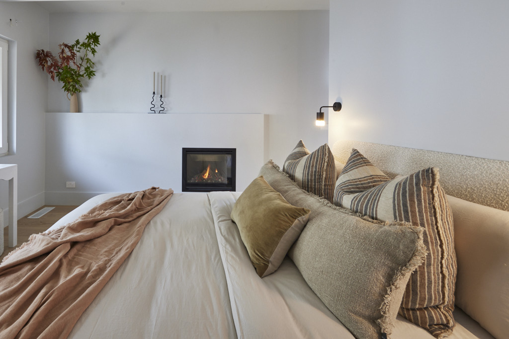
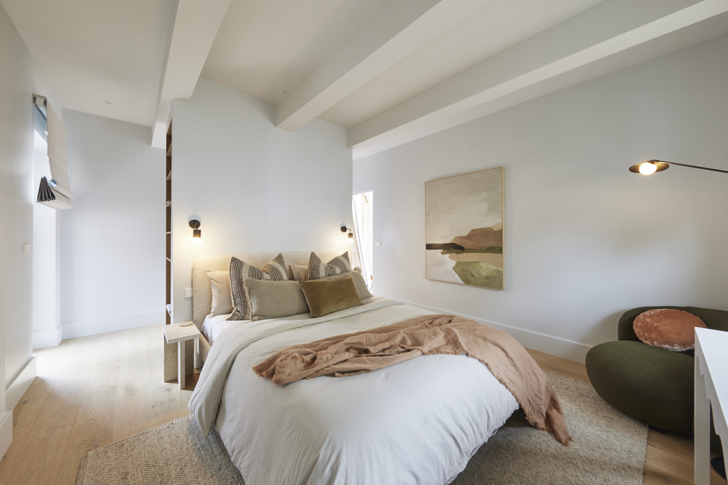
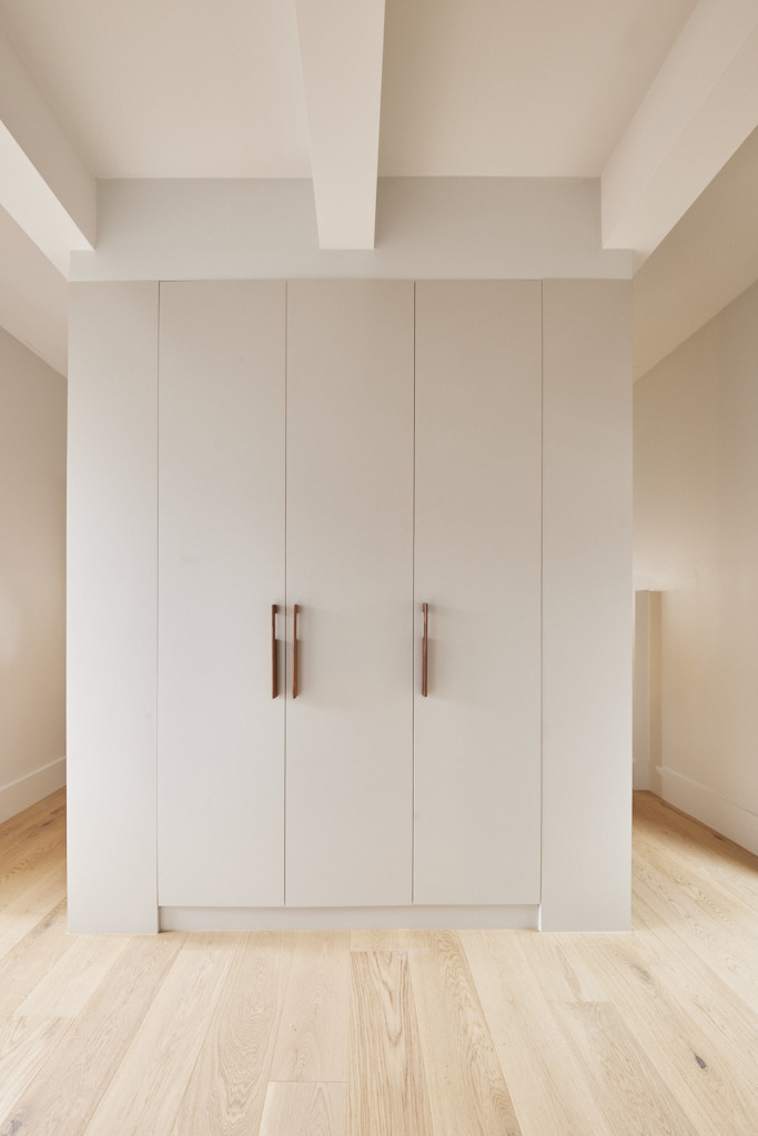
My thoughts on Steph and Gian's Studio reveal
- This is a great use of the space available from Steph and Gian. I really like the placement of the bed, the wardrobes with a bar fridge and coffee station away behind closed doors and a comfy corner chair.
- The addition of timber shelving to each side is a nice opportunity to add some styling.
- The fireplace is simple and welcoming, although a mirror or another artwork here would have completed the setting.
- I love the inclusion of the tactile rug beneath the bed and the natural colour palette of terracotta and olive with the oak flooring is perfect.
Second Place: Kyle and Leslie 23 points
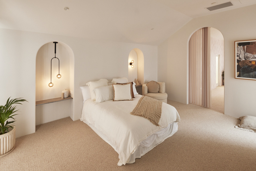
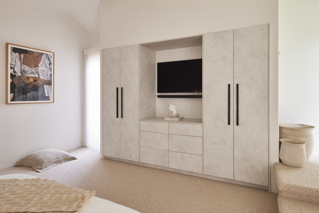
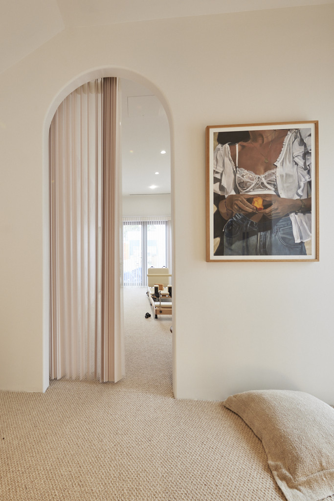
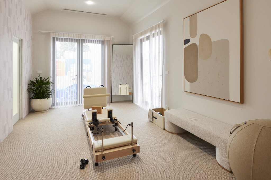
“One word summed up the judges' reactions to Kyle and Leslie’s guest studio: “Wow!”. With what Shaynna called “a real understanding of minimalism” it was a space that blew Marty’s mind. From the Hardie Groove panelling in the arches to stone shelving, concrete finish Kinsman cabinetry, Anna Blatman wallpaper and a separate pilates space that screamed luxury, this was a space all agreed would complement the home to come. But was it too big, Marty wondered. Separated from the main house, he felt a disconnect and with a pool planned for outside, perhaps a bar area could have worked. Close they agreed, but not perfect.
My thoughts on Kyle and Leslie's Studio Reveal
- There was little here that held any appeal for me. The colour palette is just too beige and one dimensional. The richly coloured cushion on the bed and the artwork were a welcome contrast, but the room needed more.
- I didn't like the lack of skirting boards, particularly where there is wallpaper, and on that note, I thought this was awful.
- The finish on the built in wardrobes is highly polarising and the curtain rods looked cheap.
- I did love the chunky carpet and the alcoves with the stone, but after a gorgeous bathroom reveal, I found this studio very disappointing.
Third Place: Eliza and Liberty 21.5 points
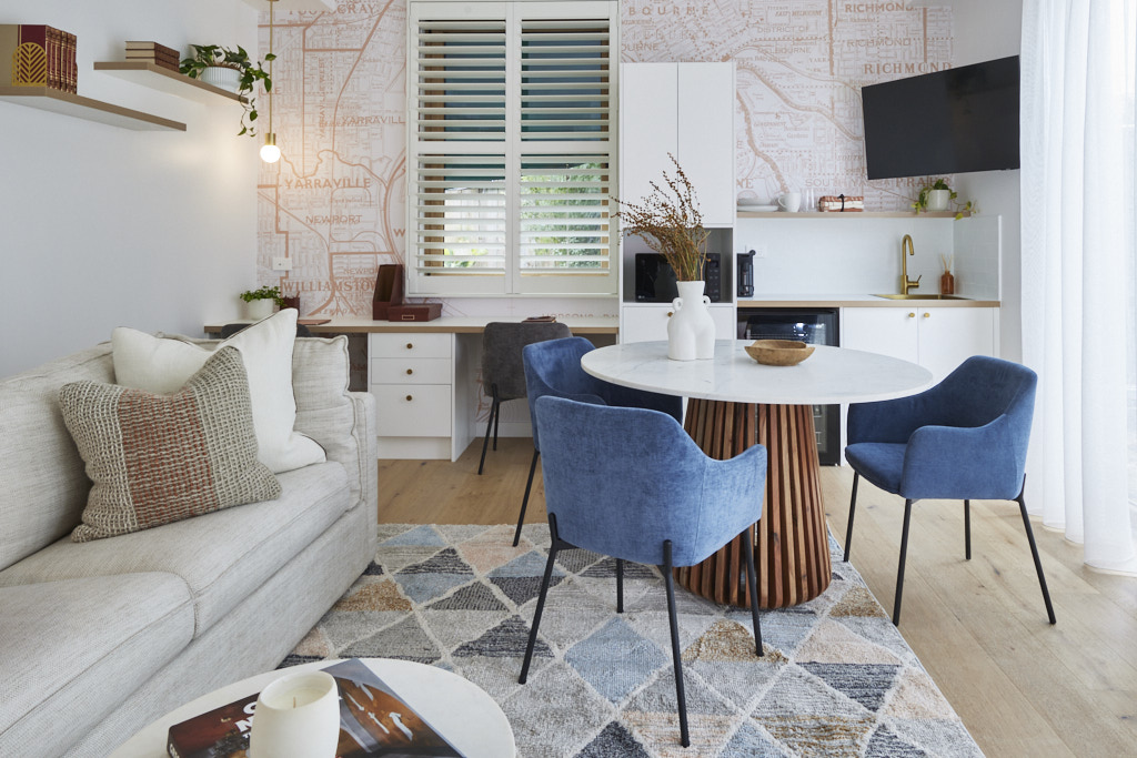
Striking a balance between serving the pool that will land outside and the needs of guest accommodation, this could be, Darren said, the “Goldilocks zone” he’d been looking for all day. He loved the space, the outlook and the amenities… and Shaynna agreed that this was a room you could sleep, relax and work in. But then Marty stepped in. The wallpaper, he dismissed, was juvenile. The styling was outdated and if he’d been presented with an empty room, he summed up, he’d have been happier. A crushing judgement for Eliza and Liberty, but with time to tweak, it left them with a lot to consider.
My thoughts on Eliza and Liberty's Studio reveal
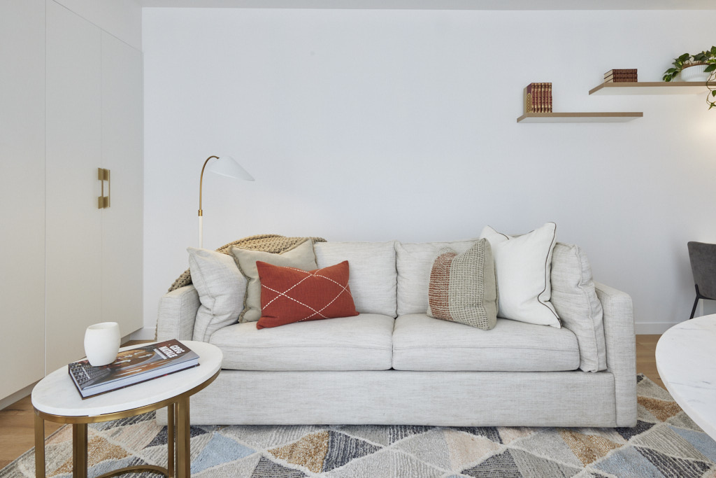
- There is a lot to love in this room. However, I agree with Marty that the wallpaper is completely wrong. It is a little dated, but more importantly it is simply too busy and makes the space very messy. There is a lot crammed into this room, so you need to create a sense of simplicity and serenity.
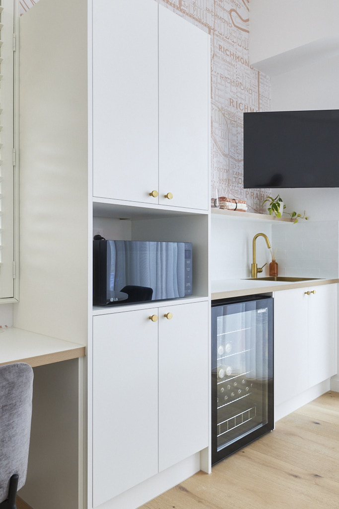
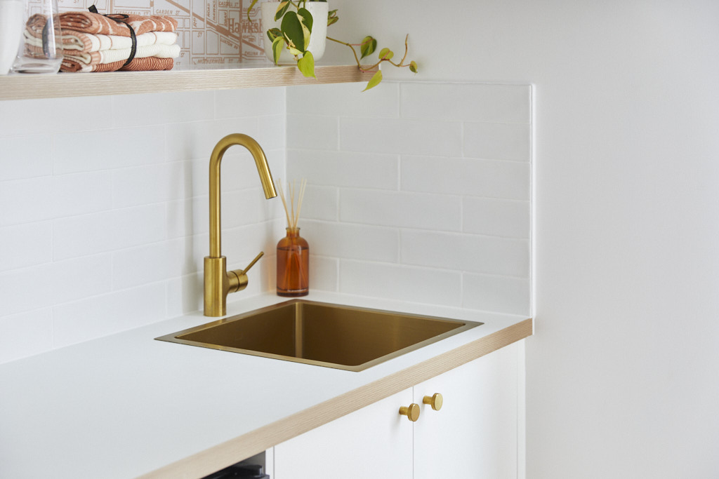
- I really like the sofa and the built in cabinetry. Simple white joinery with brass hardware is timeless and far less polarising than one with a stippled finish.
- I felt that the table was too dominant and again, the rug too busy for this small space.
- However, the bones of the room are good and for a space by a pool, the kitchen will be most welcome.
- I just felt that there was too much happening here, but it is a space that the new owners can very easily adapt to their own needs.
Equal 4th Place: Kristy and Brett 21 points
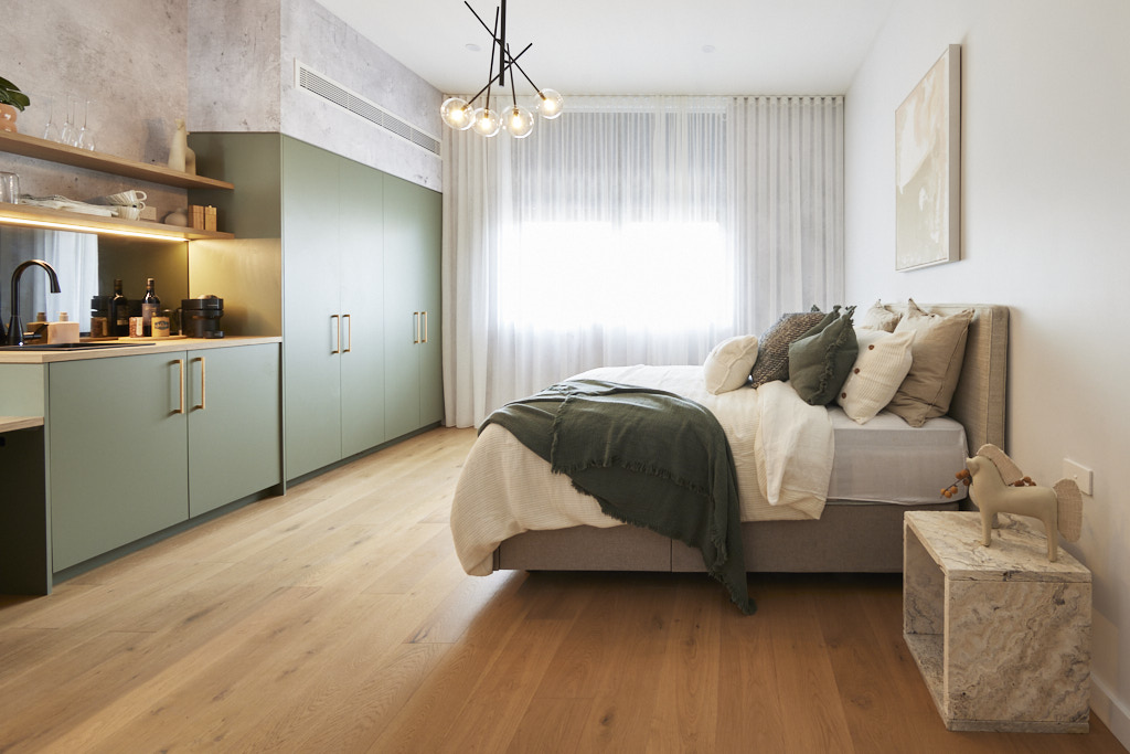
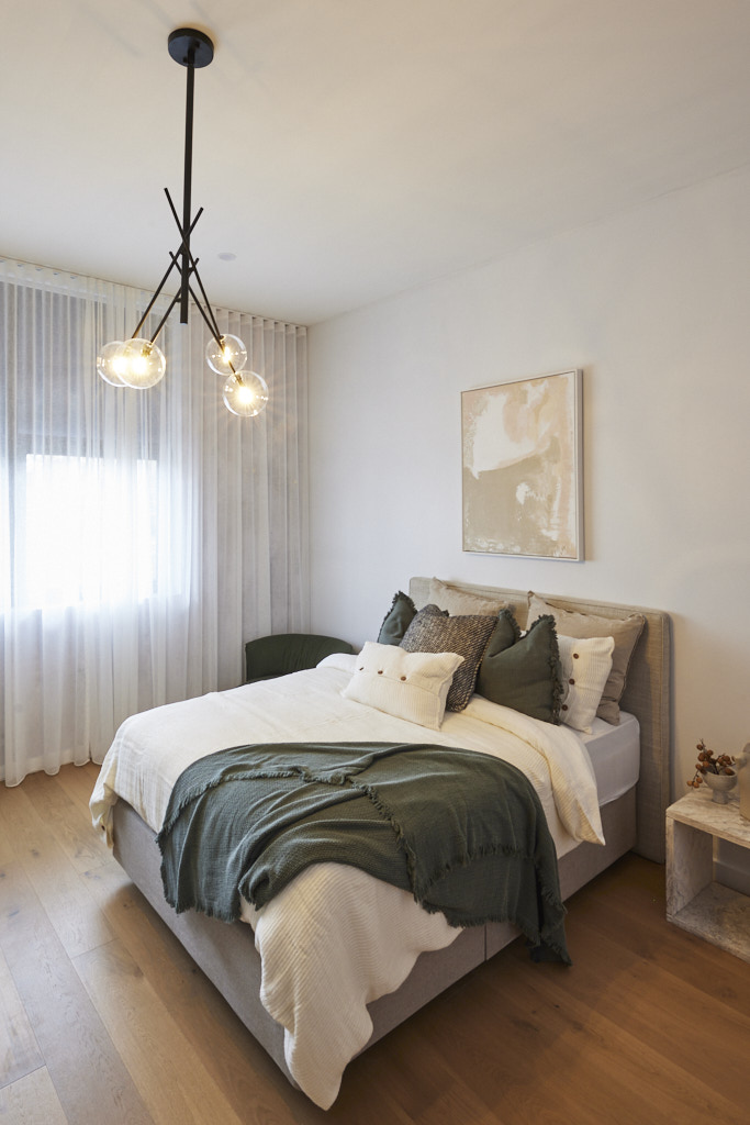
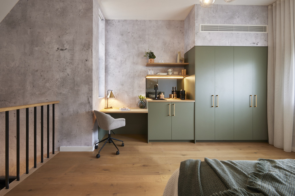
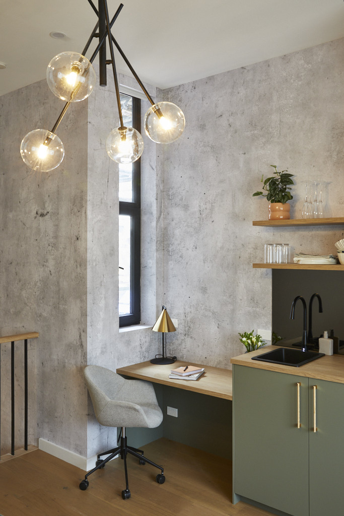
Sultry, moody and with a beautiful view to the adjacent tree thanks to the Velux skylights, Kristy and Brett’s has, Marty summed up, a definite New York loft vibe. Is that a good thing, though? Shaynna asked, pointing out last week’s bathroom – just downstairs and part of the same studio space – had a more Moroccan feel. Either was fine with Darren, who saw a Moroccan, industrial, coastal mashup happening, but he was concerned that for a guest space it wasn’t as self-contained as he’d like, with perhaps a washer, dryer and dining area needed. That aside, the judges agreed the execution was perfect and with a few tweaks, this could be a perfect retreat.

My thoughts on Kristy and Brett's Studio reveal
- I need to imagine this space without the concrete style wallpaper. This saps every ounce of energy and warmth from the room and is completely at odds with their bathroom reveal. I don't like to mix styles throughout a house. I like an eclectic space, but a room like this has a definite industrial feel and is completely wrong.
- View the room with the simple white wall behind the bed and it is very appealing.
- I love the natural colour palette with the green accents and the oak timber floor. However, the room was screaming out for a rug underneath the bed. There were simply too many hard finishes in this space and it needed to be dramatically softened.
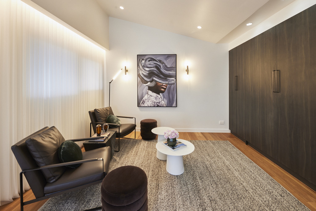
Equal Fourth Place: Leah and Ash 21 points
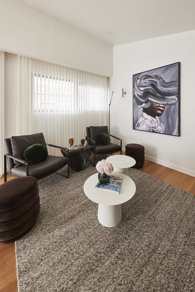
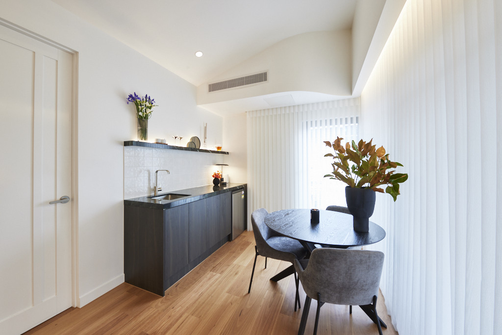
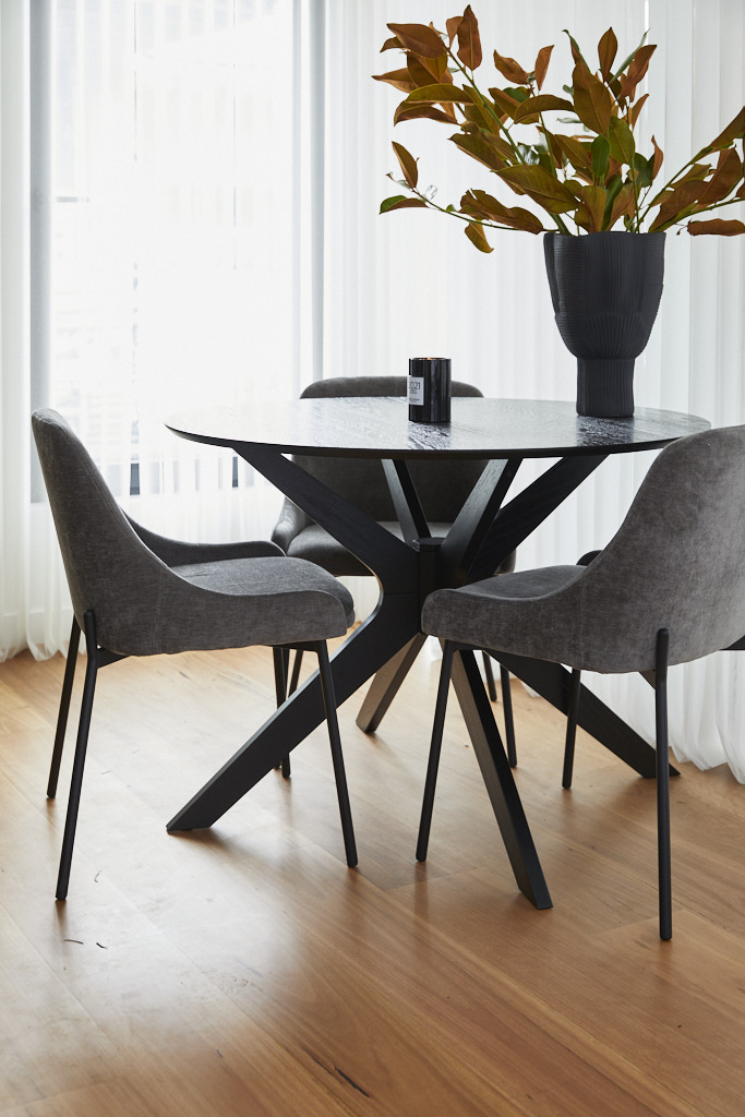
With a fold-down bed, separate bar/kitchenette area and living space looking out over what will be the backyard, Leah and Ash’s studio had a lot to earn the judges’ praise. Darren in particular loved the colour scheme, with the floors complementing chocolate-coloured furnishings and velvet ottomans and marble benchtop echoing the nearby bathroom. But where was the personality, he asked. And Marty agreed. By trying to combine a studio with a pool cabana, neither theme truly worked, he said, but it was a great start. Swap out the existing bed for a sofa, he suggested, bring in a television and inject more drama!
My thoughts on Leah and Ash's Studio reveal
- There is a lot to love in this space, but it needs to be styled a little differently as I felt it was more akin to an office waiting room and kitchenette.
- The artwork is dramatic and very appealing, but we needed to see more here. I love the textural rug and the colour palette with the rich warm floorboards.
- The idea of the foldaway bed is very practical and leaves room for the area to be used for different purposes.
- This is a home however, and perhaps just needed a little more personality.
You can find out more about The Block and the contestants at Channel 9. Did you know that many of the beautiful items used on the show can be purchased through The Block Shop?
All photography credits to David Cook Photography
You can see all the rooms and my thoughts on them from previous years of The Block here.
If you are currently undertaking a renovation or building project or even just planning to re-paint your house then you should download my Free exterior and interior checklists. These can be found in my Free Resource Library which has other e-books and checklists and is updated with new free invaluable resources regularly. Join up for free here.
Follow me on Pinterest, Facebook or Instagram for more ideas and images. If you are still stuck and need help with your project I offer an e-consultation service. You can send me photos and/or plans with your questions and I will review and talk it all through with you. I have packages from just one question through to a full colour scheme service – click here for more details.
