
Well, I have to say that I did not agree with the judges this week at all for the outcome of the Master Bedroom room reveal. If the contestants are being judged on how well they interpreted the era, then this really wasn't the right outcome. As a designer, when you're given a brief, you do need to work to this but also offer your client a unique interpretation of that brief – that's what they are paying you for. But you can't stray away from the brief completely and do your own thing. That just shows an egotistic approach – a good designer should always work with their client. So, as we go through the contestant's rooms this week, I will give you my views on each couple. I know it's hard taking on a project like this without being a trained designer, so I do go easy as I think under the circumstances and the pressure, they are all giving it a great go.
The Master Bedroom Room Reveal
Below are a selection of some of the images from each contestant together with the judges views and my own. The winners for me this week were Daniel and Jade with their 1930s Art Deco inspired room.
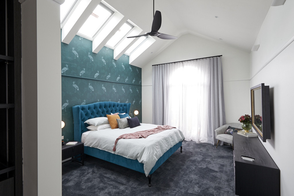
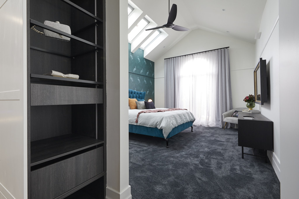
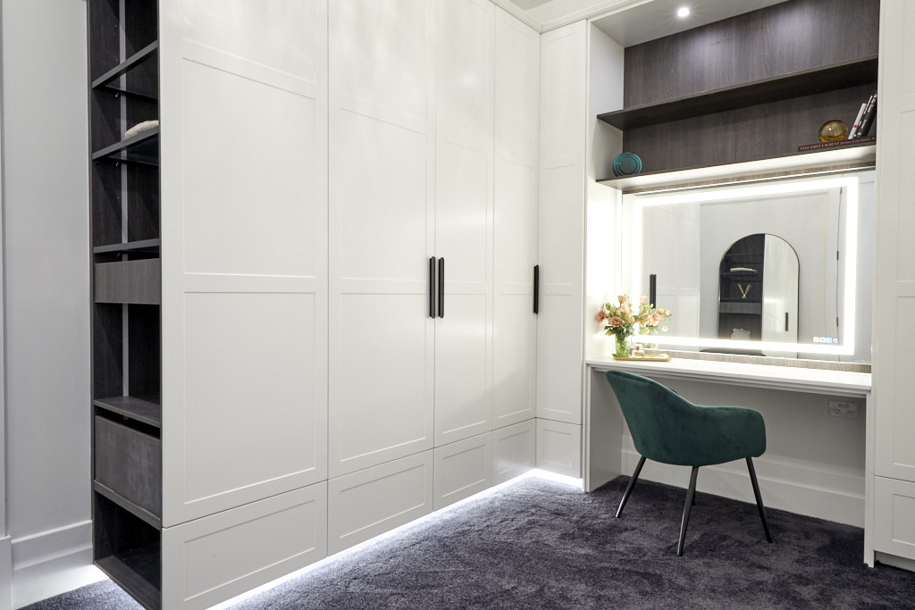
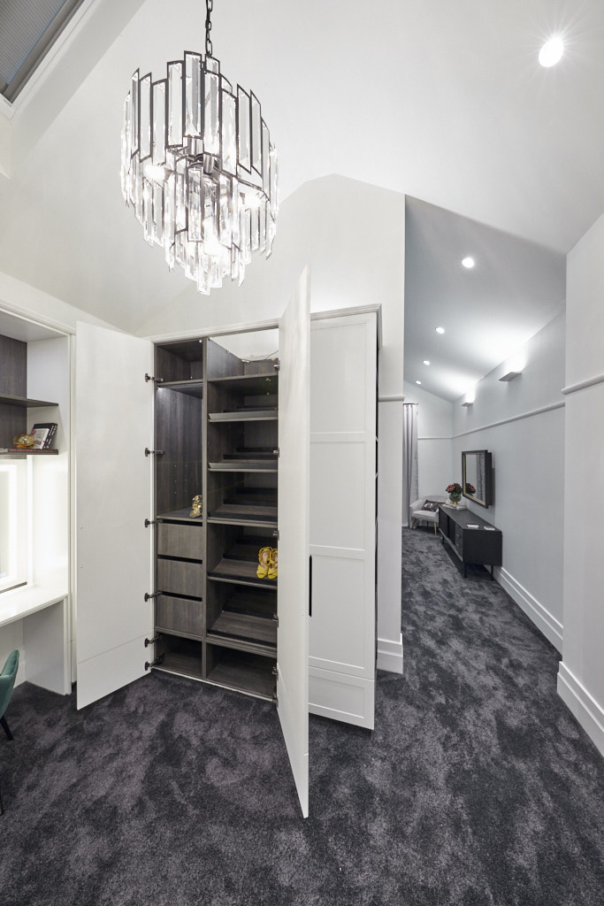
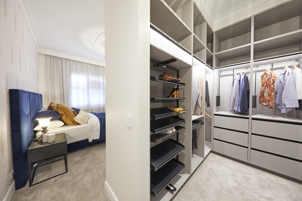
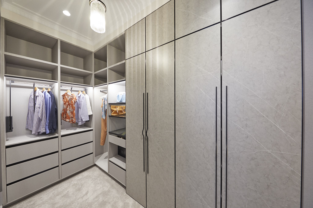
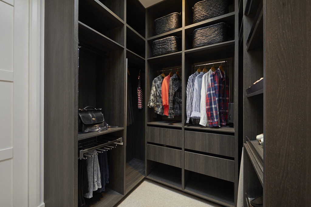
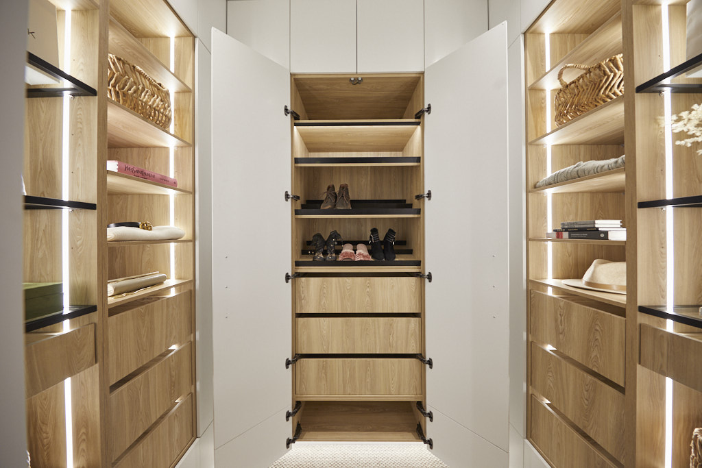
Harry and Tash Master Bedroom and Walk In Wardrobe 25 ½ /30
The judges' views
The father and daughter this week pulled the hipages lever because of the sheer size of their Master Bedroom and Walk In Wardrobe. The judges really loved what they did this week, it was grand in nature and glamorous. The Grafico wallpaper was on point as was the mirrored TV that Tash chose. They had some criticism with their carpet choice in week one, but Shaynna loved the darker look from Carpet Court in the Master Bedroom. The Walk In Robe had a huge amount of space, the only criticism was the hanging rack was too high. The beautiful light in the Walk In Wardrobe was a highlight. The Big Ass Fan and Velux skylights also worked. Taking out the win, it was a very happy end to the week for Harry and Tash.
My views
The distinguishing features of the Art Deco period of the 1920s were simple, clean lines and a streamlined look with geometric shapes combined with expensive materials. Stylised images of animal figures in a zigzag pattern were popular and I therefore feel that the wallpaper chosen by Harry and Tash is in keeping with the era. I would have preferred to see this combined with a more streamlined bedhead though. The Art Deco period also saw a profusion of decorative lighting devices which were very showy. I love the pendant in the walk in wardrobe but I would have preferred to see a second one in the bedroom as I thought the big ass fan was somewhat incongruous. Rugs were popular in this era which I would have preferred over a dark plush carpet. There is no doubt that this room is a great improvement on the rooms delivered previously by Harry and Tash so they are clearly learning fast, but I would not have ranked this room the winner.
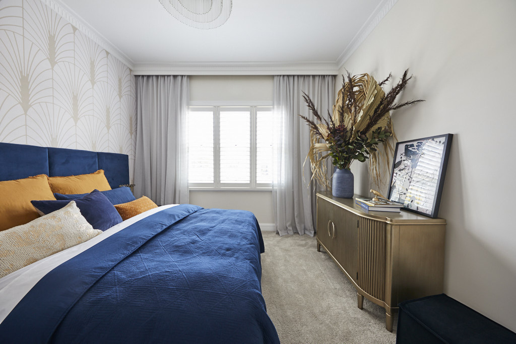
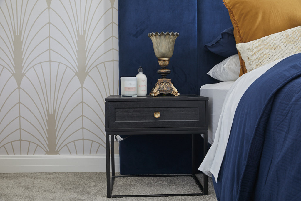
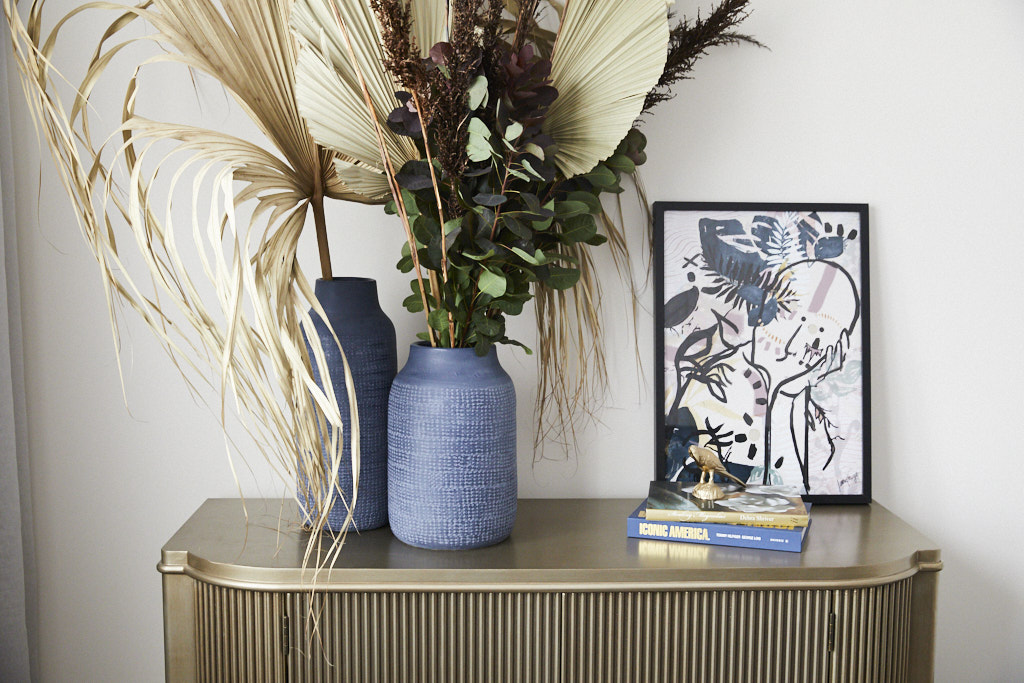
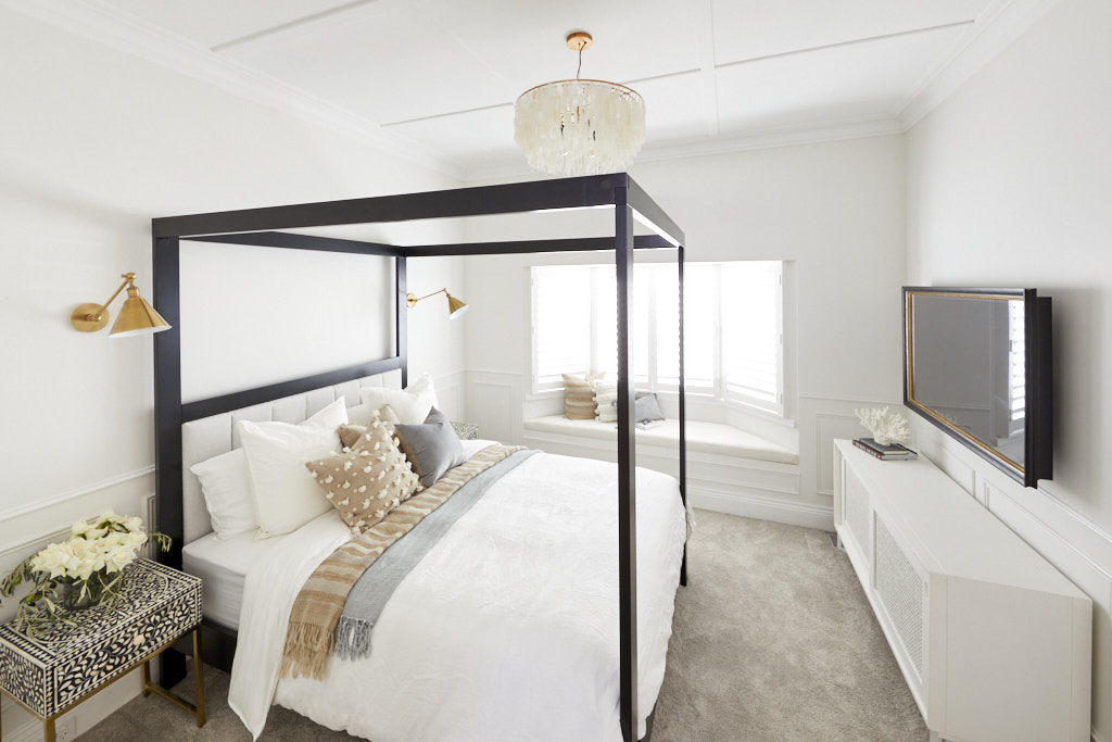
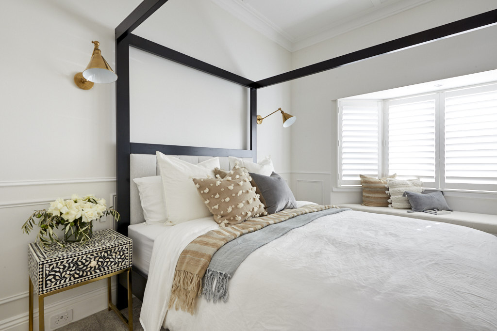
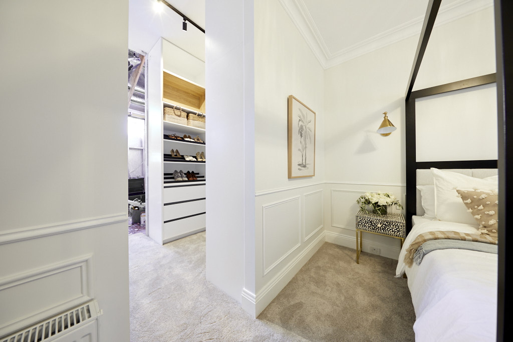
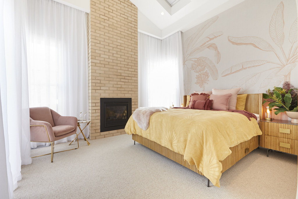
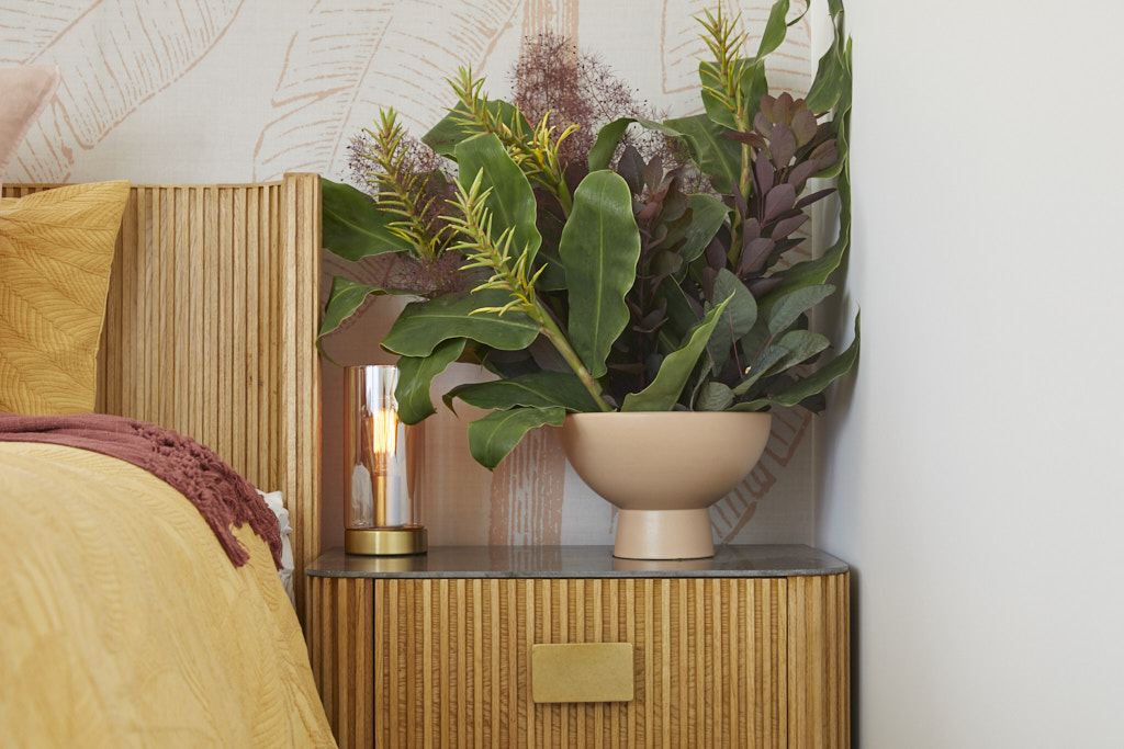
Daniel and Jade Master Bedroom and Walk In Wardrobe 25 /30
The judges' views
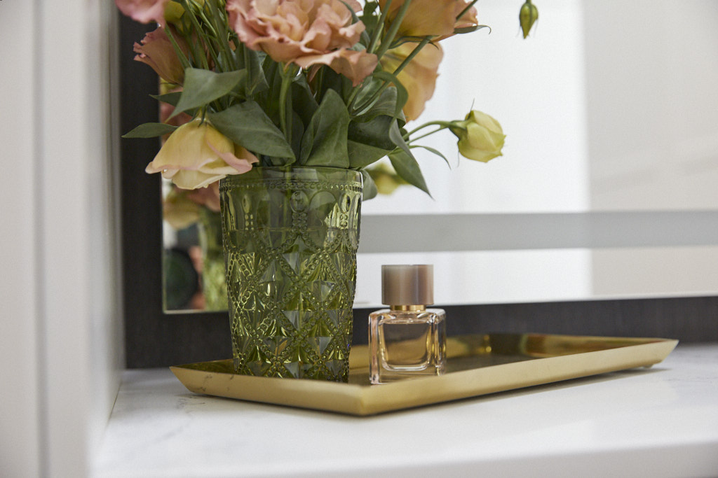
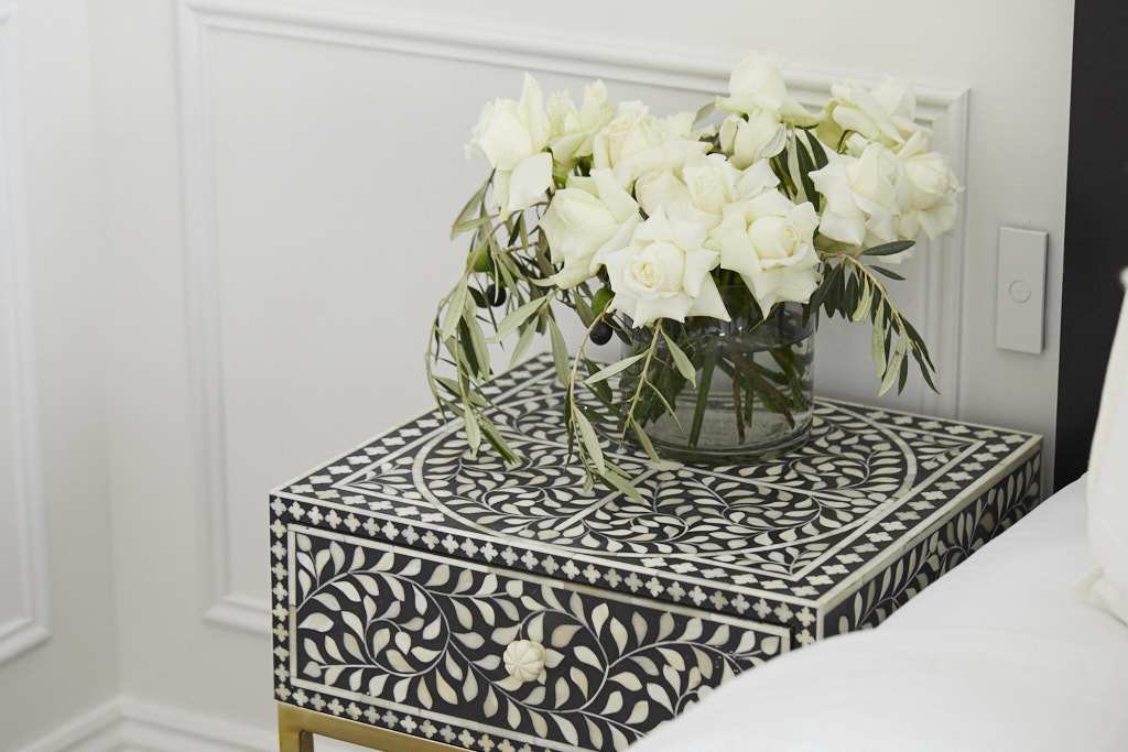
Very Hollywood was the feedback from all three judges as Daniel and Jade nailed the 1930s brief this week. The cabinet in the Master Bedroom was simply stunning, as was the floral arrangement that Jade delivered on top of it. The judges would have liked to have seen a king size bed as this is Brighton, but overall they loved the Master Bedroom. The Walk In Wardrobe had great storage and had that all-important aspect – glamour. Daniel and Jade are back on track after a tough week in week two on The Block.
My views
Towards the end of the Art Deco period in the 1930s the look was becoming less ornate and more modern with coloured walls giving way to white and I feel that this room met the brief perfectly. I love the wallpaper which reminded me of the iconic Chrysler building in New York together with the finish on the wardrobe doors. This wardrobe fit out is the only one out of all five to give a nod to the relevant era. The dark navy and rich golden yellow is a classic colour pairing from the Art Deco period and I absolutely love the sideboard. This is a really good interpretation of the 1930s Art Deco period while also being a very contemporary space. The bed could have been bigger or just centred better in the room, but otherwise I feel that Daniel and Jade were the stand out winner for me this week and should have won the Master bedroom room reveal.
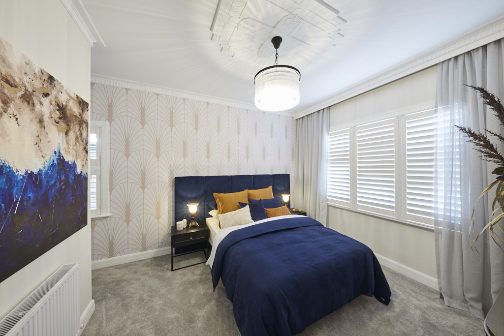
Luke and Jasmin Master Bedroom and Walk In Wardrobe 25 /30
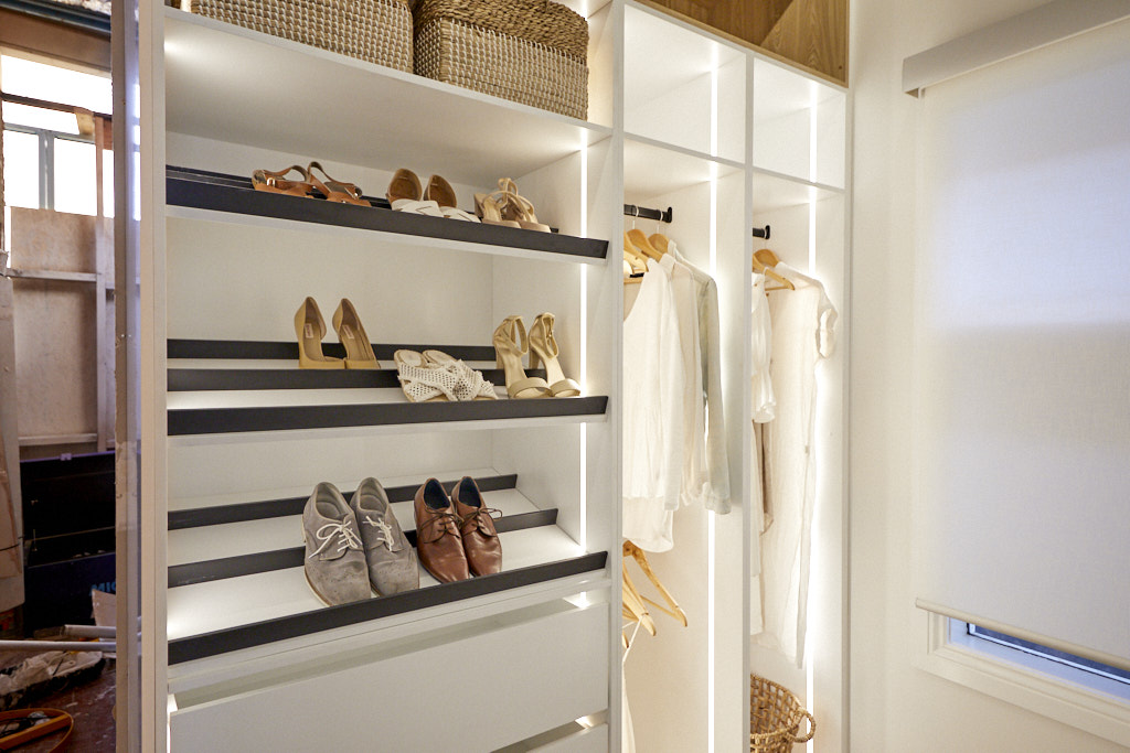
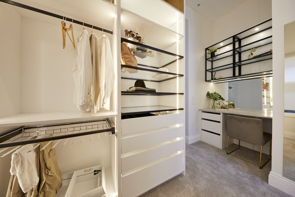
The Perth couple have really got their act together in terms of working to the 1910s brief the past couple of weeks. The judges loved what they did with the bay windows and the window seat, a very beachy, coastal Federation style. The four-poster bed was a hit, however once again they were questioned as to why they didn’t have a king size bed in Brighton. The styling by Jasmin was praised. However their Walk In Wardrobe let them down. There simply wasn’t enough storage.
Federation homes in the 1910s borrowed features from the English and Americans in their design with bay windows and timber clad gable ends but the one thing that set them apart was the use of typical Australian fauna and flora throughout the homes. I would really love to see Luke and Jasmin introduce some of this into their designs. Designs of palm trees and coral suit a coastal theme beautifully but some iconic Australian flora and fauna would have hit the spot nicely. The Art Nouveau period was one of simplicity with natural organic designs and I therefore love the simple colour palette with the wall panelling and the bone inlay bedside table. The Walk in Wardrobe does appear to be on the small side but I think this room was one of the better contemporary interpretations of the era.
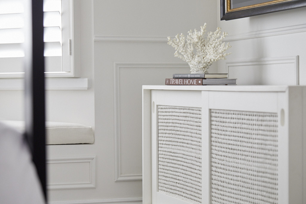
Sarah and George Master Bedroom and Walk In Wardrobe 23/30


The judges' views
The stunning restored ceiling rose that George dubbed Ceiling Dion was a huge hit with the judges, definitely the highlight this week for Sarah and George. Shaynna loved the bed head that Sarah chose, but the Grafico wallpaper mural overpowered it. While the Walk In Wardrobe was functional, it lacked a certain amount of glamour that they are looking for in a high end Brighton house. Sarah and George looked despondent as they took in the judges’ feedback, hopefully next week it will all come together for the Western Sydney couple.
My views
The post war period of the 1940s was one of optimism and the beginning of the post war mid-century modern movement. I Like the crisp lines of the room but feel that the wallpaper, which I don't believe bears any connection to this period, completely spoiled the effect. The red bedhead looked great and with the green bedding, suited the period perfectly and I loved the style of it and felt this worked well but it was fighting hard with the feature wall behind it. Although Marilyn Monroe did some modelling and early filmwork in the late 1940s she was not widely popular until the 1950s and early 1960s and I feel another more iconic 1940s star like Ginger Rogers would have suited better for a feature artwork in the room. The ceiling rose with its geometric design hit the spot. The room almost met the brief but I'm afraid that the choice of wallpaper, in any era and in any room, was just awful.
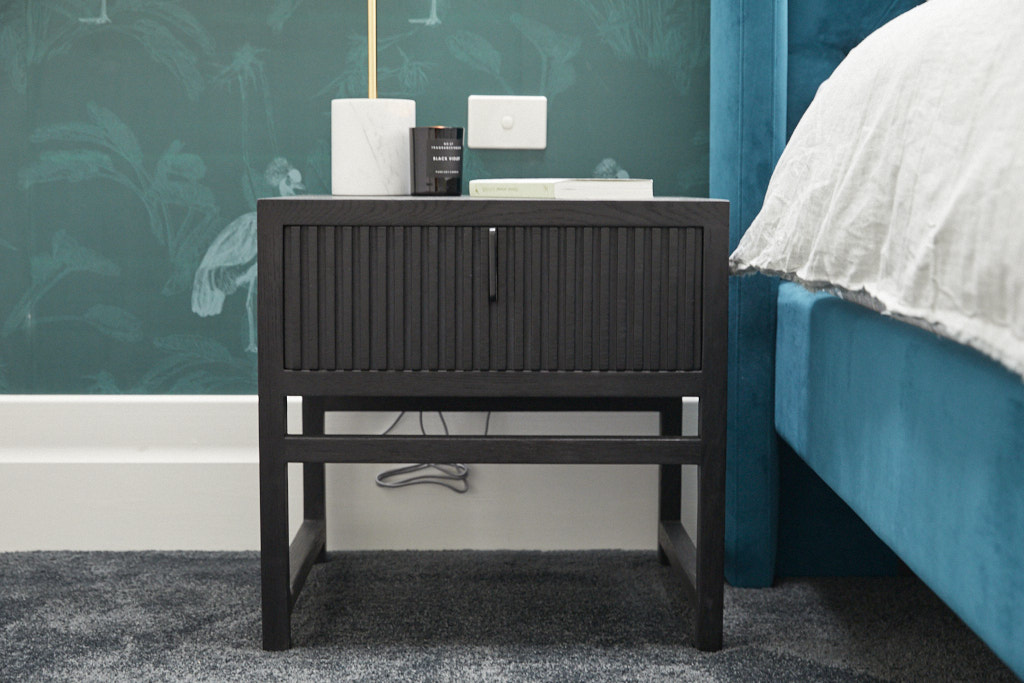
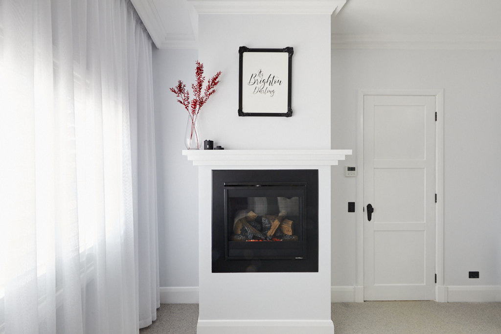
Jimmy and Tam Master Bedroom and Walk In Wardrobe 21 ½ /30
The Judges views
The Queenslanders made a controversial decision that didn’t pay off this week. By having their Walk In Wardrobe next to their Master Ensuite, leaving whoever lives at the house having to walk through the bathroom to get to the wardrobe. The planning decision wasn’t a hit with the judges … nor was the size of their wardrobe. In some positive news, they loved the stunning 1950s inspired bedroom that Jimmy and Tam delivered. Some highlights included the beautiful floor to ceiling fireplace and chimney, the high ceilings, and the very Palm Springs bed. For the note, the judges also loved Tam’s purchase of the Slim Aarons prints in the bedroom.
My views
I agree with the judges that this master bedroom was a good interpretation of the 1950s. Clearly their room planning let them down this week and the walk in wardrobe doesn't appear to have much hanging space but I believe they met the brief in terms of the styling. For me, I would have preferred to see the bedhead and side tables matching but the entire bed in the timber was a bit of overkill and battled with the yellow of the bedding. The soft coral pinks were inspired and certainly worked for the era perfectly.
What are your thoughts on the Master Bedroom room reveal? Do you think that Harry and Tash deserved to win or another couple? Are you in agreement with me that Daniel and Jade's 1930s inspired master bedroom room reveal was the best? I would love to hear your thoughts.
Many of the items featured in these rooms can be found through The Block Shop.
More information about all the room reveals and the contestants can be found on at Nine Now.
If you are renovating, building or decorating a room you should sign up to my Free Resource Library as I have invaluable checklists and e-books for you to download. And if you are stuck for that elusive colour or need help with a project, I have an online consultation service.
Photography credits: David Cook Photography
I was thrilled to stumble onto your sight by searching “painting interior doors” …oh what fun! I have bundles to learn from your site out here in South Dakota. In general, I enjoyed the fresh color combinations.
I agree with your assessment in regard to the “winner” because I wasn’t distracted or annoyed by much of anything in the room. There is a seamless appeal here–understated–a place that I would love staying in for a spell. I see what you mean about the undersized bed. It jangles a bit like they didn’t have enough time or budget to get a bigger bed which was problematic in Sarah and George’s room as well.
I too was distracted by the Marilyn Monroe image–which is used EVERYWHERE. However, the word art above the fireplace in George and Sarah’s room was even more jarring to me as it screamed “Hobby Lobby” cheap kitsch–ubiquitous in the US.
Some overall observations– it must be difficult to carve out enough hanging space in the wardrobes, uber big wallpaper graphics are VERY popular, the vacuumed lined carpets (which I love in my own bedroom) were distracting.
Finally, I can’t help but wonder if there isn’t a photo optic bias with the judging. The winner had a grand space to work with and seemed to be the most camera worthy and perhaps had more impact on the judges when they actually walked through it–a strong foil to the other rooms which seemed to be cramped.
Hi Karen Great to hear from you! Your observations are brilliant – I’m with you on the vacuum lined carpets – thanks for joining in the conversation! Master ensuite room reveal is this weekend. Samantha
So beautiful, Love them all