
Did you know that beige is back in fashion? That non-colour that everyone derides as being boring is on-trend. So much so that Dulux UK announced this week that their colour of the year for 2021 is Brave Ground. According to Dulux UK, this earthy beige hue connects us to nature and will bring a sense of warmth to our interior space. Brave Ground is a versatile new neutral that will work perfectly when paired with darker browns, cinnamon, light beige hues and caramels. For those of you a little bored with grey, I hope this is some welcome news. Although this is a UK trend, I have seen it begin to evolve here in Australia too as we are embracing the warmer colours and neutrals of the spectrum.
The new beige though is not what it used to be and my philosophy is that there are no bad colours or neutrals, it's just that sometimes we don't use them properly and then they get a bad name.
Beige was in fact the favourite colour of Elsie de Wolfe who is credited with starting the interior design profession in the 1920s. She raved about it. Call it Buff, Camel, Biscuit or Calf Skin and you start to evoke a completely different feel.
Kyal and Kara embraced the warm beige tones for their recent new build at Blue Lagoon.
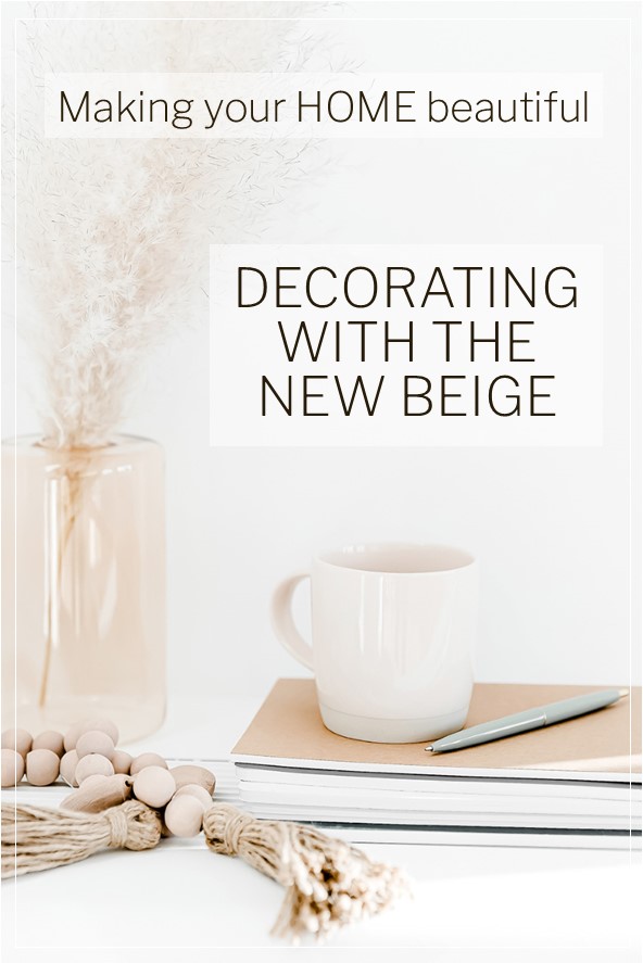
Decorating with beige
Warm colours are back in fashion. Even our whites are warm again, however they're not the creamy yellow whites of recent times that fell foul of fashion. The new warm whites have a touch of grey added and create a very welcoming space. Whenever you are decorating a room, you should always consider the mood you want to create together with its aspect. Take into account the amount of natural light that the room receives and how hot it is in summer.
The point about the mood of the room is very important and one that is often overlooked. People get caught up with which colour sofa they should have and then the accent colours they should introduce based on their preferences, but then forget to consider how, when it is all put together, the overall feeling they will create.
You can add some warmth to a room by painting the walls in a warm buff tone and introducing layers of caramel and cinnamon tones together with rich timbers. This creates a gorgeous enveloping environment which is perfect for a cooler part of the home. However, this may actually be overwhelming if the room gets very hot in summer. This may also not appeal to those people who prefer a clean crisp look.
By introducing a beige that is leaning towards the green/stone based neutrals, the look is more classic and less warm. By adding layers of white and olive green, as in the room below, the look becomes very sophisticated.
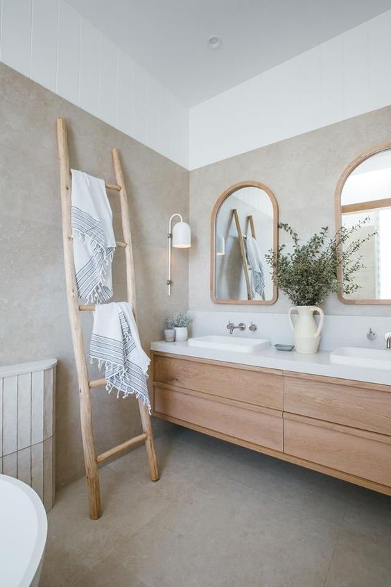
If you are still a big fan of an all white space, consider using some soft natural beige tones in your styling and accessories. I love travertine with fresh white, honey coloured timber and warm beige toned accessories. The room below is crisp and fresh but with these accessories, it is warm and welcoming too. If you have problems choosing white you should read my related articles – start with How to find the right white.
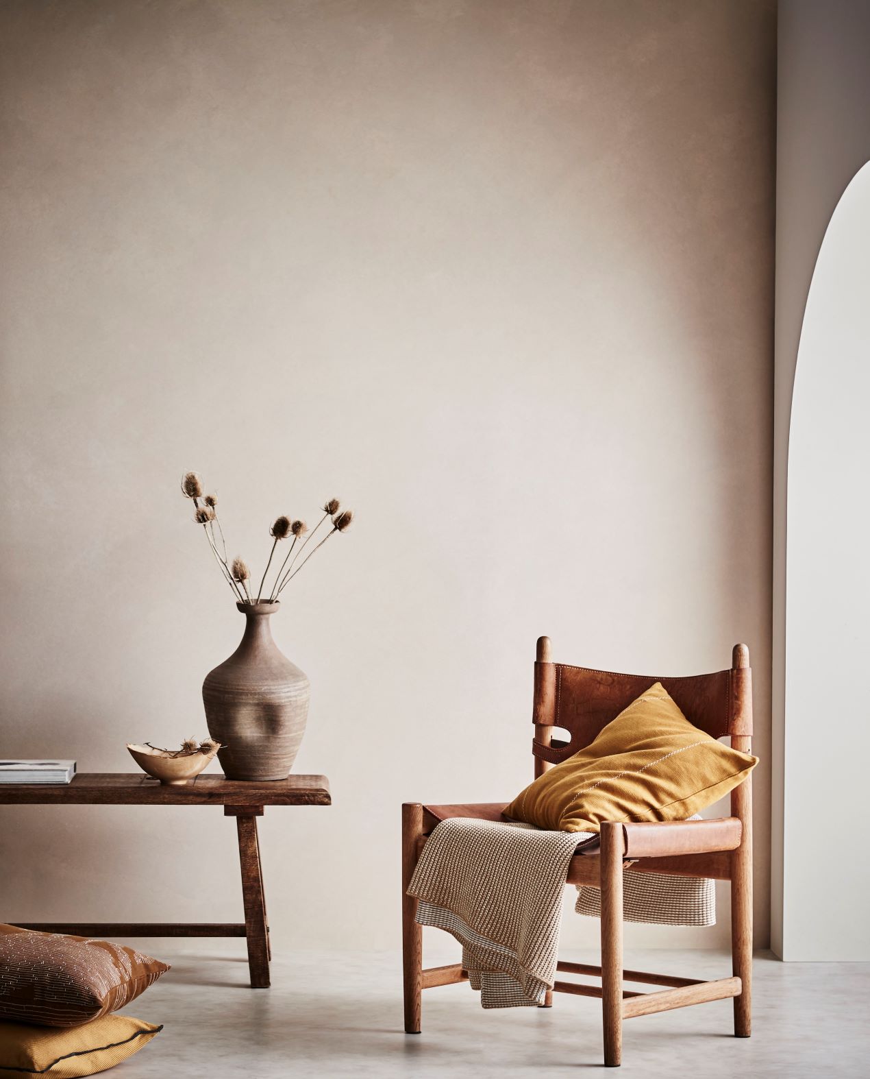
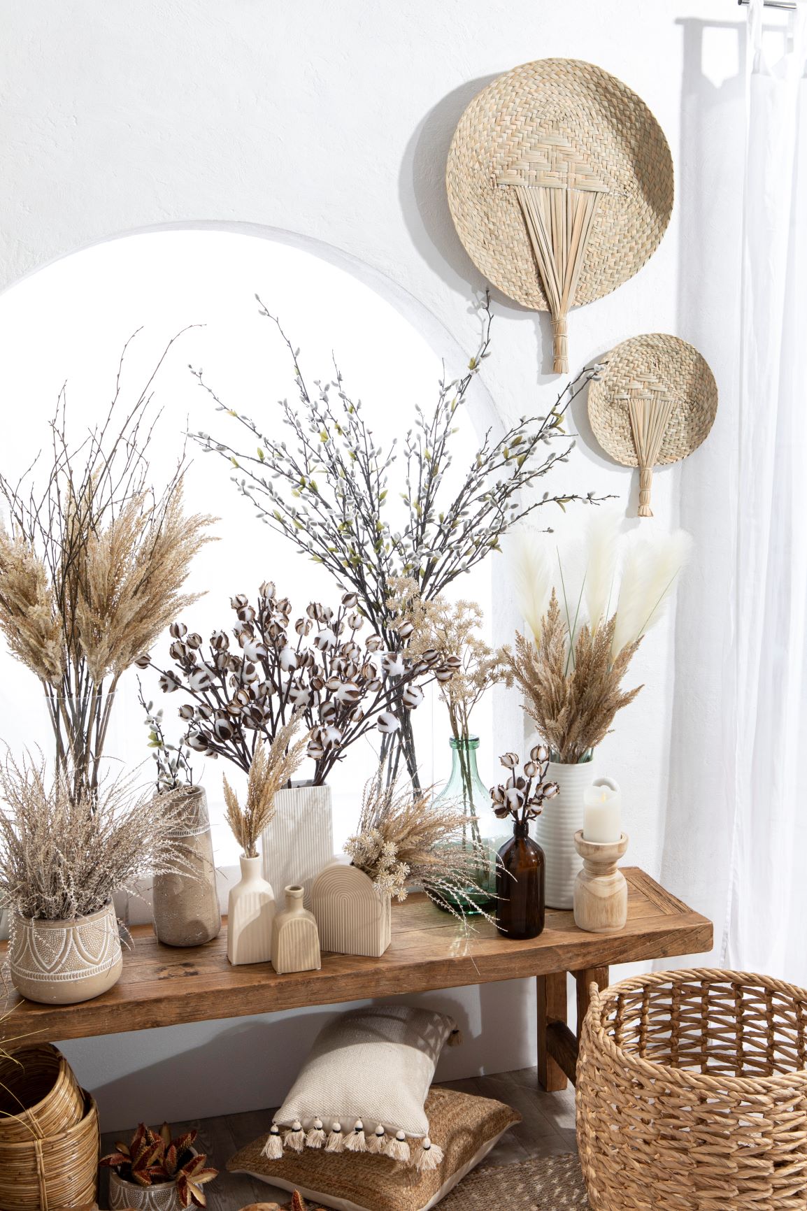
I believe that one of the reasons that beige is now on trend again is due to the popularity of the natural earthiness of rattan furniture and accessories. The tones below in the dried flowers, baskets and timber are all warm. Don't think that by introducing beige into your scheme that you have to paint the walls this colour as there are lots of ways to add this gorgeous hue.
What does beige go with?
Decorating with beige is easy as it works well as a background neutral to many colours. The best partnerships though are either with other simple whites and neutrals, it's opposite colour, blue, or as a related palette with other warm tones of terracotta and yellow.
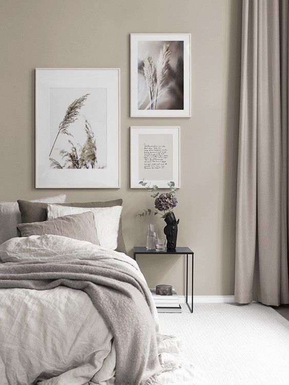
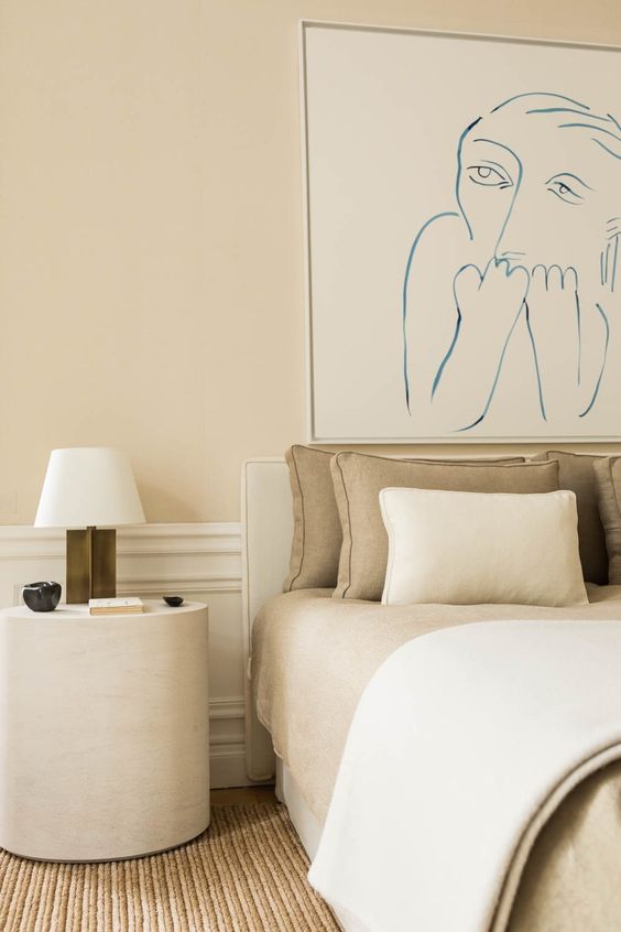
A soft greige – the combination of grey and beige – creates a beautiful neutral backdrop to a simple linen bedhead with very soft beige tones. Often referred to as Flax by textile companies, this warm neutral is perfect for bedrooms. The overall look is a very sophisticated and contemporary grey but the beige in the bedlinen softens the look beautifully. This is the most subtle of the beige schemes with just a touch to complement grey. If you like the idea of some warmer neutrals but still love the pull of grey, you may like to use grieige in your home.

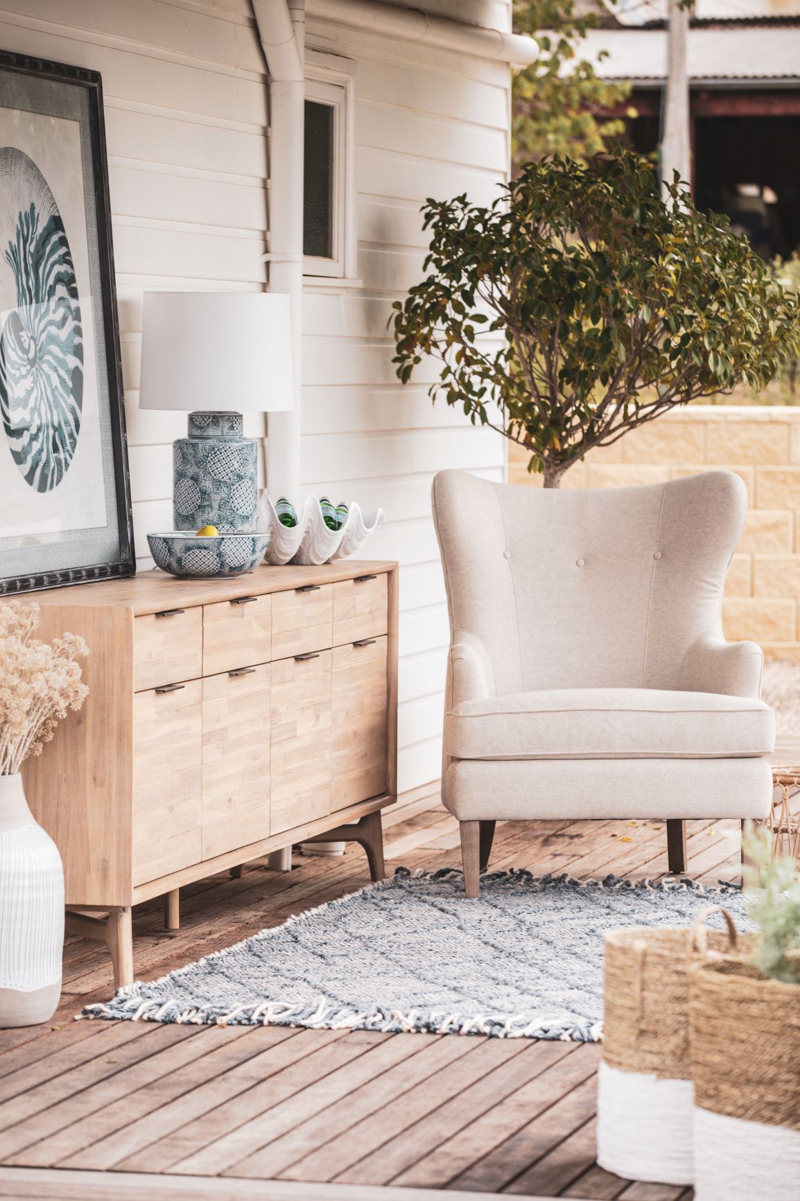
The colour blue is a natural partner to beige as yellow and blue are opposites in the colour spectrum. This is a complementary colour scheme and to be successful the partnership should be 80/20. The white on the weatherboards is a lovely warm white and the overall look is very welcoming.
Again, the touch of blue in the artwork complements the various beige tones here well.
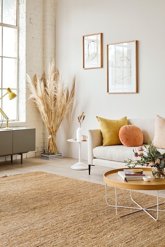
The alternative is to opt for a related (harmonious) colour palette. By using a soft beige with other natural tones and accents of related orange and yellow, the look is very harmonious.
Some of my favourite beige tones
If you fancy decorating with beige, I have some go-to beige tones that I love to use. My favourites are:
Dulux Vintage Beige. This is a gorgeous modern beige that is very light on an exterior but a lovely richer neutral for interior schemes.
Dulux White Beach. A slightly lighter beige which also comes in half and quarter strengths making this a very versatile neutral to use for interiors.
Taubmans Taupe Grey. This is a cooler beige as it leans more towards the greige tones. I love it as it is a fabulous neutral that works with cooler or warmer tones.
Haymes Organic range. What I love about the Haymes natural range is that each colour comes in a range of tones from very light, almost white, to a gorgeous dark hue. The Organic range is a lovely soft beige and you can play around with the different tones for various rooms throughout the home.
Resene Spanish White range. Again, Resene, which I believe has the best range of whites and neutrals, offers these in various strengths. Triple Spanish White is a lovely rich classic warm beige which at Eighth strength is a lovely soft white. Parchment too is another favourite of mine which is a little more neutral and cooler.
Below are some of my favourite pieces that are on-trend now. You can see from these gorgeous accessories that beige truly doesn't have to be boring.

- Leather Strapping bedhead, teak and natural – Fenton and Fenton
- Beige Impression no. 2 poster – Desenio Australia
- Alice Knitted Organic Cotton throw – Ecodownunder
- Edina framed art – Vavoom
- Anteia striped linen throw – Zanui
- Nomadique rug – Tribe Home
Last week I wrote about the colour forecast for 2021 from Dulux Australia. Their Nourish palette has a full range of gorgeous warm beige neutrals. You can read more about their full forecast here.
If you still love grey but like a warmer, toned down version of it, then you will love the colour greige. I wrote about this recently: What is Greige? Find out how to use it in your home.
Don't forget to leave a comment below to let me know what you think!
Thanks for a great article. Choosing colours & textures for a new build atm & this is great insight.
Thanks Samantha I’m so glad you mentioned vintage beige! I’m looking to paint the exterior of my 1910 villa which has an ironstone facade. It’s currently painted cream and dark green (!) and I’ve been looking for a neutral (beige) which will match with the grey/brown stonework. I tried vintage beige and it seems to the right mix of earthy/stone tones I’m after. I’m thinking I will go with 1/2 or full strength vintage beige for the main colour, the trims (window frames, gutters, ironwork) in Dulux Monument and Dulux Wallaby for the roof. I had thought of using Dulux Linseed (1/2 or full strength) as another complementary stone/beige colour around the stonework on the windows but not sure if that’s overcomplicating things.
Hi Teresa This combination sounds good. I would probably opt for the full strength Vintage Beige outside to appreciate the depth of the earthy stone colour. I’m not sure about Linseed too – it will work as a complement but just be careful with half and full tones to ensure that you end up seeing enough of a contrast to make a difference. Difficult to say without seeing the house but the palette certainly works together well. Hope you love it! Samantha
Beware the pink beige!! If you accidentally choose it , it is a bully that makes other colors look dirty and limits choices terribly .
Yes, you’re right Kieran, too much pink in a beige can look like a bad foundation day! Samantha
Hi Samantha, am I glad to have found your brilliant new article! Thank you! I’ve been searching for a wall paint colour for our new reno and mood inspo (Ashgrovian home in Qld – modern mid century style) and was reading older blogs on the internet which mostly talked about crisp whites and cool greys and I thought I got it all wrong! So pleased to see that the new beige is the latest trend because I love the warmth and the earthiness it brings to a space.
We are decorating our downstairs rumpas/ living room with European silver travertine stone floors (with linear limestone pattern), brushed brass finishes on fixtures and white French doors, wooden windows and trims. May I ask if Dulux Ghosting Half (with Lexicon Quarter for trims) would be fitting to achieve the sophisticated gorgeous look you’ve described in your article? Is Ghosting considered a modern greige but not too much yellow or creamy undertone (which I’m trying to avoid)? Thanks so much – your opinion would be truly appreciated!
Hi Sandy Glad you enjoyed the article! Dulux Ghosting Half is a lovely greige that is very popular and Lexicon Quarter provide a lovely crisp trim. It certainly doesn’t read yellow or cream but in some lights it can throw a touch of lavender – not hugely but you may just test a sample to double check. I don’t want to put you off as I think it will be perfect with the silver travertine and sometimes I find that these underlying colours don’t come through as much if you go to a full strength. Hope this helps Samantha
Thanks for this article. We’ve just bought a house with beige aluminium windows, so this is great news.