
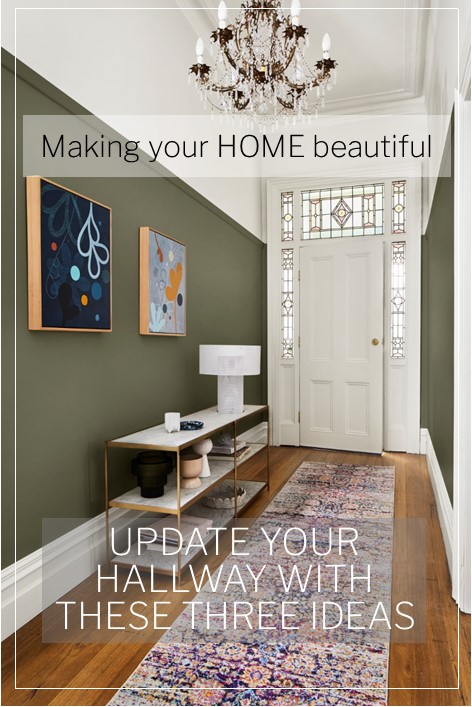
You never get a second chance to make a first impression. What do you think of this old adage? That first impression really does count and I was therefore excited to see these three ideas from Dulux Australia to update your hallway. Make this space one that is inviting and that you want to linger in, rather than just rushing through. Andrea Lucena-Orr, Dulux Colour and Communications Manager and stylist, Julia Green have the following tips.
Kids, pets, shopping bags bumping against the wall – a busy hallway can take a battering. “Whilst it might not be a functional room, your hallway is a hardworking space that deserves decorative attention,” says Andrea. “It’s the first thing guests see and it sets the tone for the rest of your home.” Is your hallway looking a little worse for wear? A fresh coat of paint and a few decorative tweaks can make all the difference.
Stylist Julia Green gave a classic hallway three inviting looks using three different palettes from the Dulux Colour Forecast 2021 to show you just how easy a refresh is to achieve. “This hallway had great bones – a high ceiling, decorative mouldings and trims, with a generous width – but it lacked energy. Being a relatively small space, it didn’t take much time, effort or outlay to jazz it up, and livening up the colour was the perfect place to start,” says Green.
“There are many ways to style a space – these three palettes all look incredible here and each tell a story,” she says. “Colour is such an emotional thing. It’s really about identifying those hues you instinctively respond to and having the confidence to use them in your home. And remember – it’s not a lifelong commitment. If you change your mind, you can simply paint over it.”
Look no. 1 from the Dulux Reset Palette
“For the first look, I chose colours from the Reset palette to create a cosy and contemporary feel. I ran deep, dusty pink (Dulux Wash&Wear in Terra Rose) up to the picture rails, and warm white (Dulux Wash&Wear in Snowy Mountains Half) on the upper section of walls and the ceiling. I used the same white to highlight the beautiful original mouldings and trims. “Choosing a darker colour for the lower part of your walls can be a great way to disguise scuffs and marks, while a lighter colour above keeps your hallway feeling open and airy.
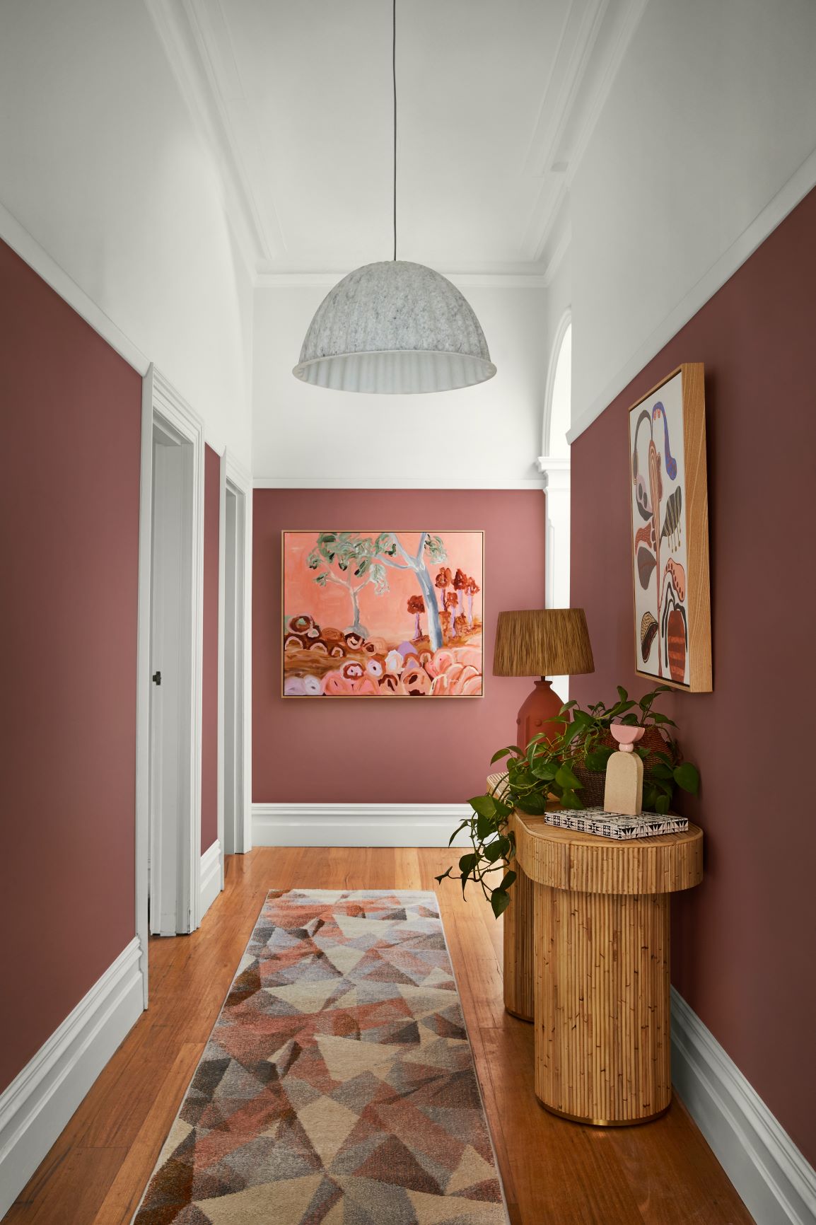
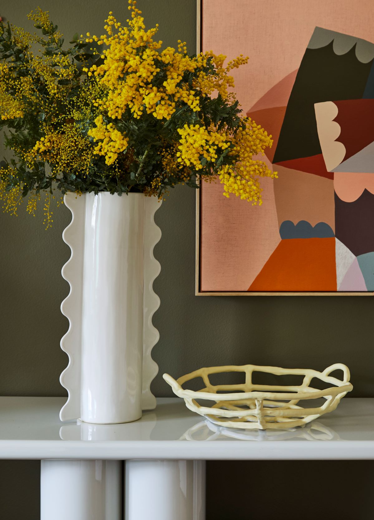
Stylist: Julia Green, Photographer: Armelle Habib.
Back wall artwork – ‘Muted Reflection’ Artwork by Doulene Walker. Art above console – ‘Happy Days’ by Doulene Walker, both via Greenhouse Interiors.
“A few smart styling touches completed this look. You don’t want clutter in a busy hallway, so I kept my focal points to the walls, floor and console table. A joyful artwork at the end of the hall adds interest, whilst a geometric-patterned rug creates softness and hides a multitude of sins in a high-traffic spot. All these elements are in tones of pink and coral, creating a lush, layered effect against the dusty pink walls. “To create a cohesive feel, look for opportunities where you can replicate shapes and themes. Here, I chose a curvy console table that echoes the arched doorway. The ribbed base adds texture, whilst a pretty vignette consisting of a lamp, vessels and a trailing plant makes for an easy-to-achieve and eye-catching feature on the tabletop,” she says.
Look no. 2 from the Dulux Retreat Palette
“I wanted to give the second look a more luxurious feel whilst drawing attention to the home’s original features, so I selected timeless colours from the Retreat palette. Rich bottle green (Dulux Wash&Wear in Mangrove) on the walls picks up on the tones in the stained-glass window, and warm white (Dulux Wash&Wear in Whisper White) above the picture rail keeps the entrance light and inviting. “Mixing old and new elements is a great way to add character. An ornate chandelier contrasts beautifully with a sleek modern table lamp, while graphic, contemporary artwork adds a touch of the unexpected.
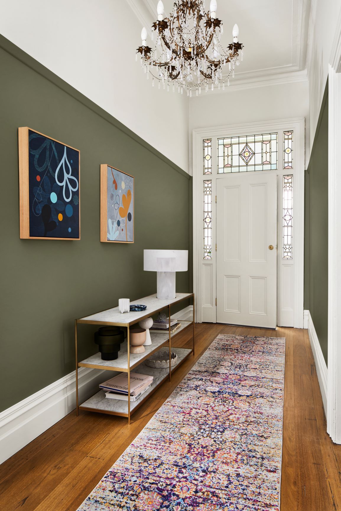
Stylist: Julia Green, Photographer: Armelle Habib.
Artworks from Castle & Things
The old-meets-new runner has a traditional look, but in bright, modern colours. “If space or budget is tight, invest in one or two pieces that really make an impact. Here, I splashed out on a marble and brass console – it feels luxurious and contrasts beautifully with the green walls,” says Green.
Look no. 3 from the Dulux Nourish Palette
“To provide a calm and comforting welcome, I chose soft, nature-inspired colours from the Nourish palette for the third look. These tones are incredibly easy to work with as they sit comfortably alongside the whites many of us already have in our homes. Plus, they bring a sense of the outside in – which you can emphasise by styling with natural textures and greenery. “I used soft pistachio on the walls (Dulux Wash&Wear in Sedia), pale pink (Dulux Aquanamel in Skip To) on the front door, and cool white with a neutral undertone (Dulux Wash&Wear in White Exchange Half) on the trims and ceiling.
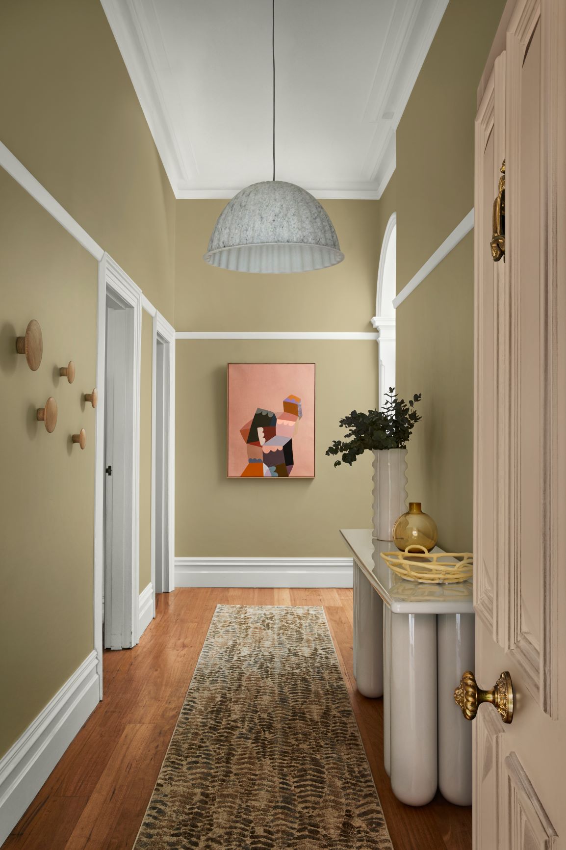
Stylist: Julia Green, Photographer: Armelle Habib.
Artwork from Castle and Things
“To boost functionality without sacrificing precious floor space, I added timber storage hooks to the walls for coats and bags. “A bright and cheery painting picks up on the pink of the front door and draws guests into the home. I chose a console with curved legs to add volume without crowding the space, in a grey-white that matches the trims. A fern-print rug ties in with the natural theme, and its busy pattern means it won’t show every bit of dirt and dust. “Each of these looks took less than a day to create – and turned a drab hallway fab,” she says.
Related: What should you paint on the inside of your front door
Julia’s hallway styling tips
If you are inspired to update your hallway with one of these three ideas, Julia Green has some excellent tips to share to get the styling right.
- Create a focal point: Draw guests into your home with a striking artwork, a gallery wall or a mirror at the end of the hallway.
- Choose a durable paint finish: Busy hallways require a tough, washable paint finish – Dulux Wash&Wear Low Sheen has a velvety finish and it’s hardwearing and easy to clean.
- Test it out: Purchase a Dulux sample pot or Colour Sticker online and live with the colours for a few days. For Colour Samples, visit colourshop.dulux.com.au.
- Choose the right rug: A robust, flatweave rug in a forgiving colourway is the best choice for a high-traffic area.
- Light it right: Add warmth with a layered lighting scheme consisting of overhead lighting and lamps at different heights.
- Mirror Magic: Make a narrow hallway feel bigger and brighter with a strategically placed mirror.
- White and bright: One of the best ways to visually lift a low ceiling, bounce light into a space or for colour contrast is to have a white ceiling – from the picture rails to beyond
Stylist: Julia Green, Photographer: Armelle Habib.
Puzzle Artworks from Castle and Things
Related: Manipulating a space with colour
I hope this has inspired you to update your hallway with these 3 ideas. Which one of these would you choose? If you would like to read more about hallways, I have 7 steps for the Perfect Welcoming Hallway here.
There is lots more information and inspiration about Dulux Australia's 2021 colour forecast here.
If you are building a new home, renovating an existing one or simply undertaking a weekend project like this one I have lots of checklists and e-books for you to download in my FREE Resource Library.
I certainly wasn’t expecting to see that block wall colour would be in vogue in 2021 but there it is. It reminds me of the 1980s/early 90s. I’m not a fan of pink and I prefer the dark green to the pistachio. It makes for a moody and dramatic entrance for sure but wouldn’t you have to use the colour to set the tone for your interior colour scheme?