
Navy blue is the new black. Many will argue that grey is the new black, however as a long time lover of grey and one who appreciates its suitability to many decorating schemes, I still contend that for right now, Navy is the current all star.
There is no doubt that the colour partnership of navy and white has to be one of the most popular colour combinations around. Whether you love the Coastal look, the Hamptons style of East Coast America or just a classic country style look – Navy Blue and White fits the bill. In case you hadn't caught on – it is a definite favourite of mine – let me show you how to use it.
Putting together a colour palette
Associated so closely with the Ocean, I actually got the inspiration for this colour palette below, from an image of the mountains which I really love. I think this demonstrates that this colour scheme is equally at home in a country style look as by the sea.
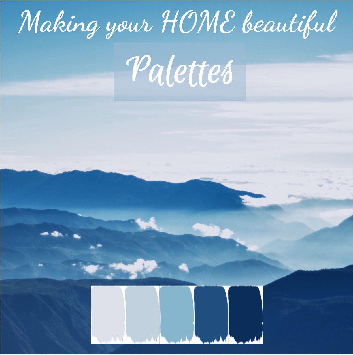
The simplistic approach to a monochromatic colour scheme is this: You take one colour and use it in varying degrees of strength, from its very lightest to its very darkest tone.
The classic example is black which when you use the two extreme tones you get black and white. Navy Blue and White is based on the same monochromatic principle, and of course you can achieve a palette like this with any colour.
The beauty with using navy blue as your starting point is that you achieve a colour palette that is similar to black and white, in that it is fairly neutral, but it is just a touch softer. It’s the sophistication of the blue and the simplicity that is really the appeal with this palette.
Related: Monochromatic colour schemes – Black and White
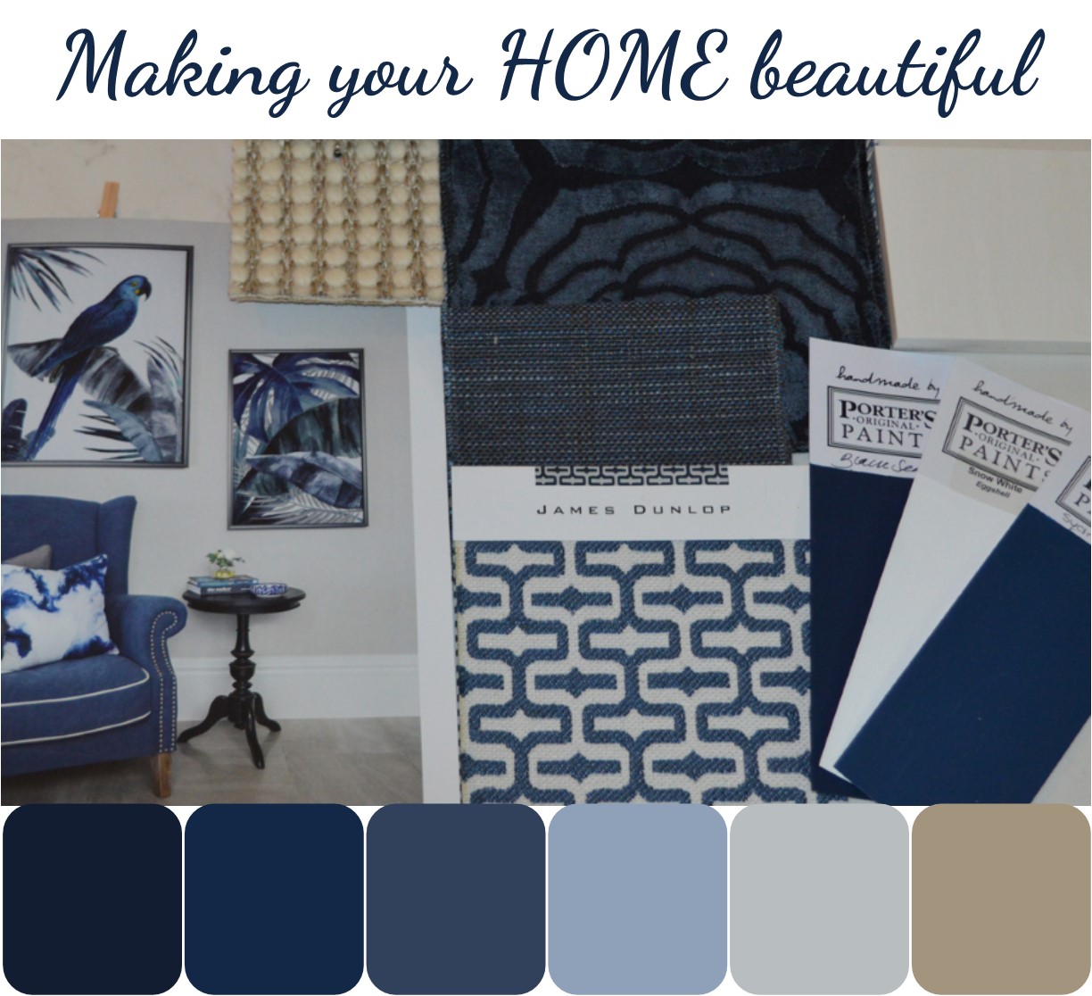
I put this scheme together for a client and used my initial inspiration but softened the scheme slightly with the addition of a neutral carpet, so although not an absolute monochromatic palette, I feel that the natural flooring just adds a touch of warmth to the scheme.
Remember if you see an image that you like in a magazine you can use this as inspiration to extract the colour palette – you don't have to start off with a blank page each time!
More ways to introduce navy blue and white
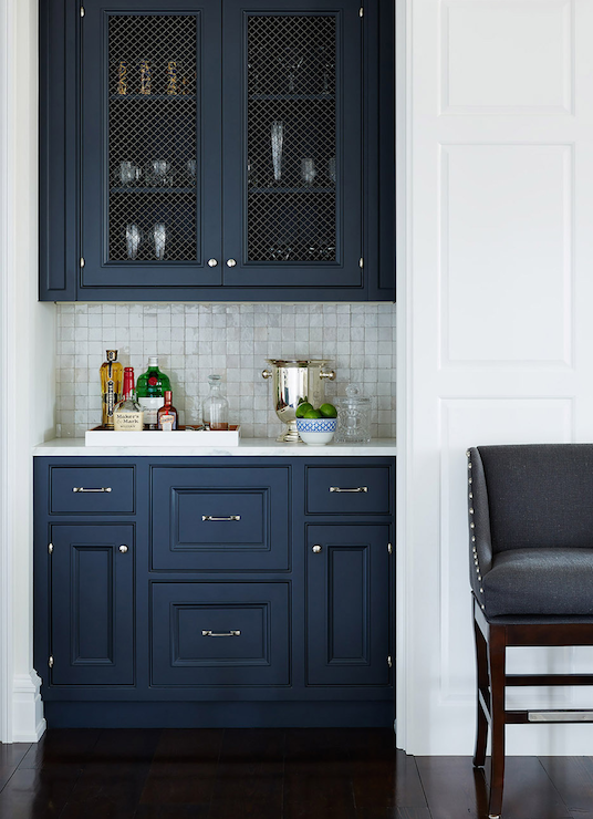
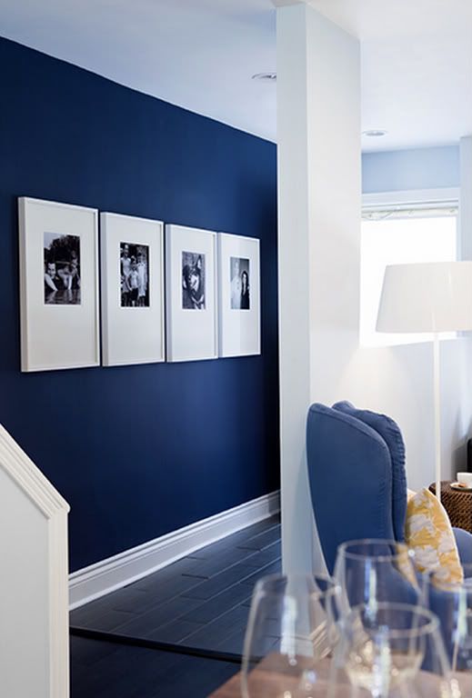
I really love dark navy blue cabinetry and feel this is an excellent way to bring the sophistication of the colour into a decorating scheme. I have written an earlier post on this subject which proved very popular.
The designer here has also painted the skirting board which ensures that this looks like a piece of furniture rather than a kitchen unit – a fabulous masculine style bar. Styled with silver handles, the look is very contemporary but can be more classic with the addition of gold handles which gives quite a different feel.
Related: Have you considered using blue for your kitchen cabinetry?
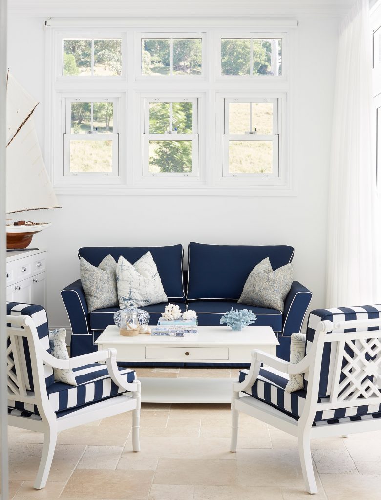
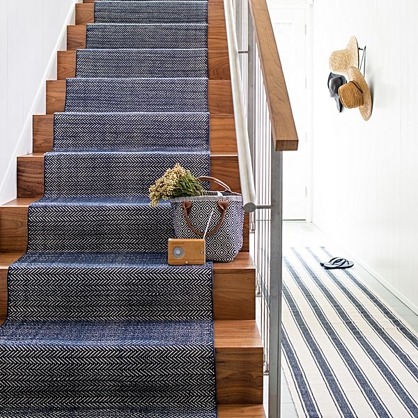
Navy blue is also very successful for carpet and upholstery.
The look here is predominantly light, white and bright but the classic, almost neutral of the blue, grounds the scheme and gives it character without being overwhelming and detracting from the serene feel. I like hallways to be welcoming but simply styled too so that visitors are not overwhelmed when they arrive.
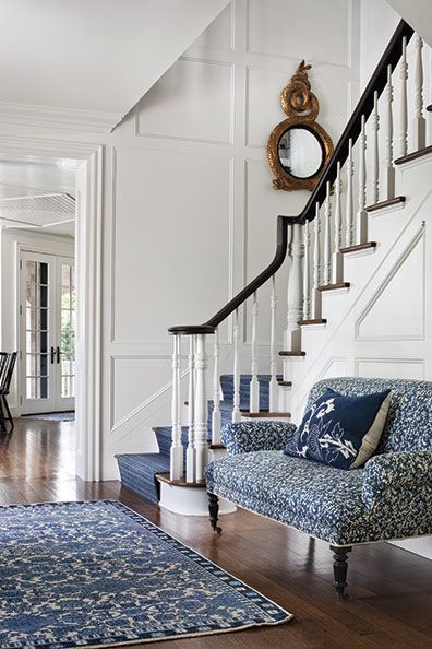
Related: 7 tips for the perfect welcoming hallway
The psychology behind the colour navy blue
The psychology behind blue is interesting as this colour is perceived to be the most conservative of all the hues. Colour psychologists have found that blue types are successful, wealthy, accomplished and self-assured and for these reasons, blue is a great colour to wear for a job interview.
With that qualification, I think we should all be wearing it more! Navy blue indicates refinement and solidity and in whichever way blue shows itself it is an extremely calming hue.
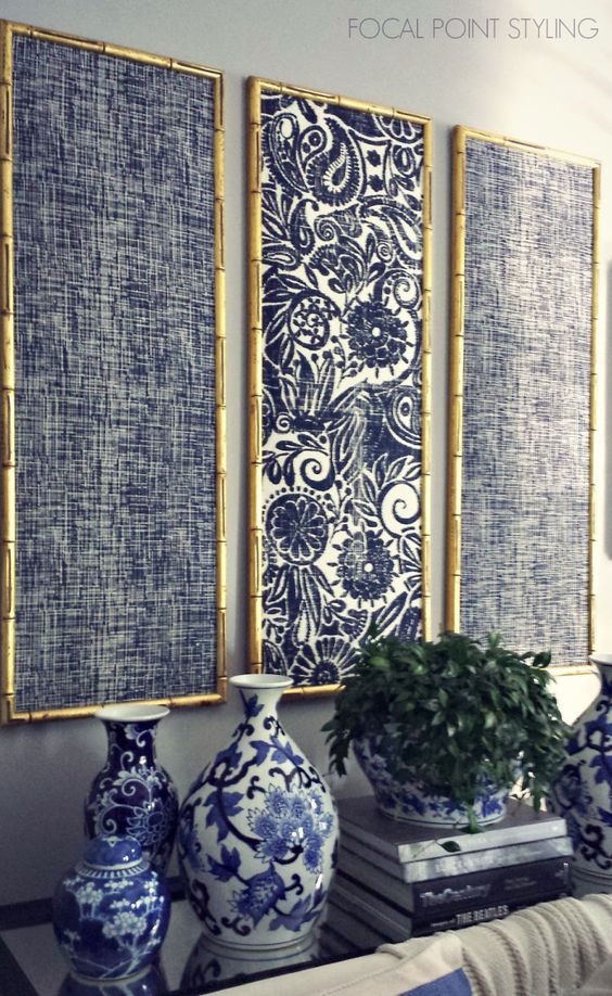
Navy blue and white can also be found in schemes with an Oriental feel and I really like this way of styling for a classic home interior. With the addition of comfortable natural linen sofas, soft rugs and textural layers, you create a very striking yet simple interior scheme.
Related: My Guide to Hamptons Style
The classic navy blue and white stripe
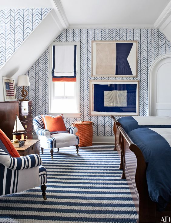
Navy blue and white stripes are always in fashion. The tonal variation here can be used successfully in interiors to produce a dramatic mood.
Splashes of orange, blue's complementary colour, really gives the scheme a colour lift. However take them away, and it would still work. Throw some red into the equation to conjure up images of laid back coastal homes on the East coast of America where the stars and stripes of the nation’s flag are used in accessories. The Union Jack on the Australian, British or New Zealand flags can be used in the same way.
The mood is a very masculine one as the colours and tonal variations are strong, bold and definite. Keep this look simple and only add a couple of strong accents as other colours will dilute the look and the mood will be lost.
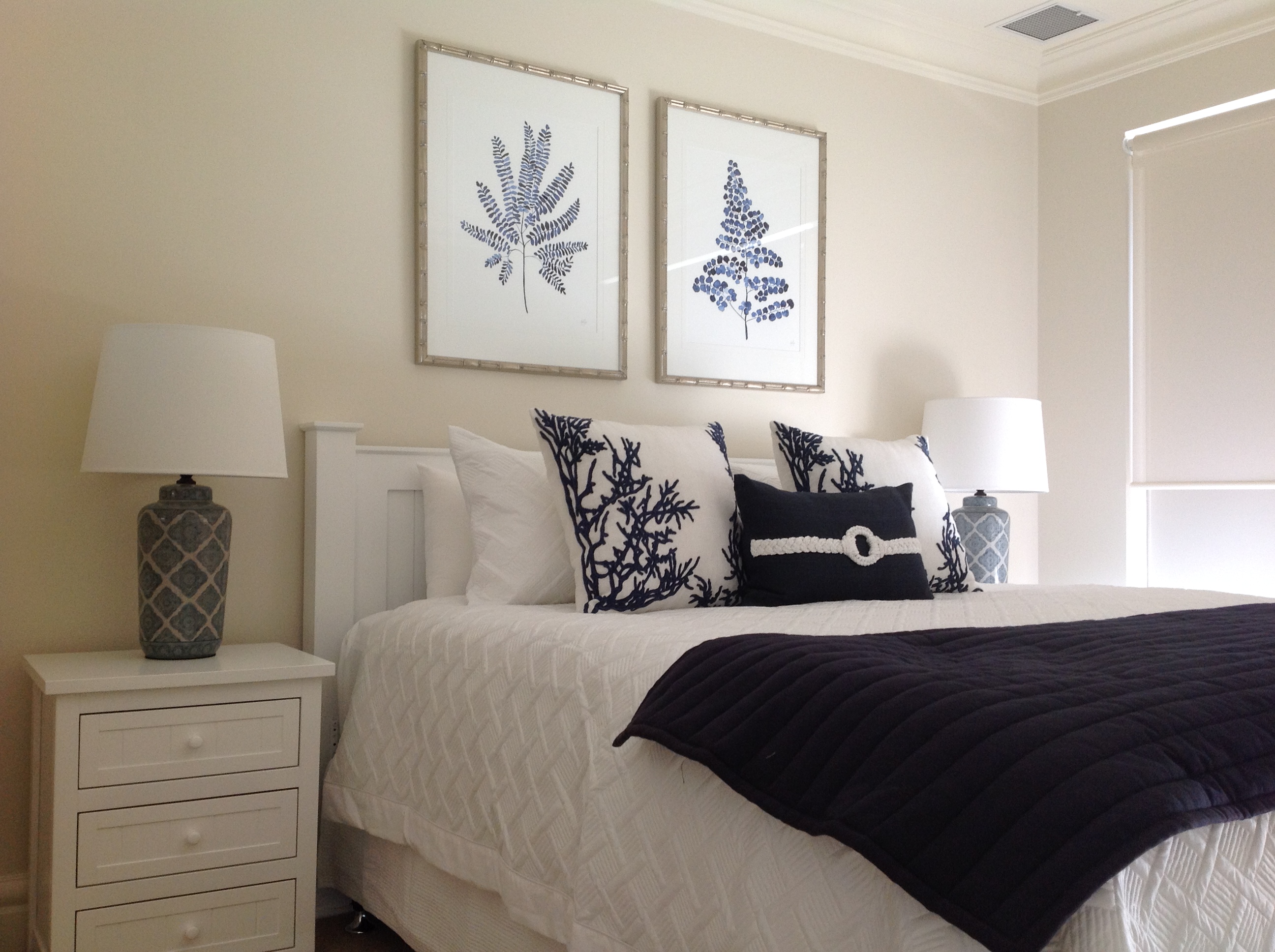
A classic bedroom scheme
The tonal contrast here between dark navy blue and white is stunning. A gorgeous coastal style look that is contemporary as it doesn't have too many unnecessary frills.
I hope that this post has given you an idea of how successful the partnership of navy blue and white can be and what a great alternative it is to the classic black.
You can follow me on Pinterest to see lots of colour and decorating inspiration – I have a strong attachment to blue schemes there – and I would love to hear from you and answer your questions about using this fabulous colour on either the interior or exterior of your home.
Are you having difficulties finding the right white to go with Navy Blue? You might like to read my post about the 5 mistakes to avoid when selecting white.
Related: 5 mistakes to avoid when selecting white
Coastal schemes are often very neutral now but a classic coastal look will always contain a touch of blue. Find out more in my top 7 tips for a classic coastal look.
A good starting point for putting together a colour scheme is to create a mood board. In my Free Resources Library I have an e-book on how to put together a mood board. You can sign up for free here.
I love navy blue too, and the softer blues as well. Especially teamed with white and timber.
If i was to use some black trims with navy should it be a deep jet black or a charcoal?
Hi Joyce great to hear from you. For the trim, you really need to consider what other elements are in the scheme and how obvious you would like the finish of the trim. My first choice would be jet black so that you have a definite contrast and this is nice if you have other black items in the room however if you are not a fan of black or you would like a more subtle approach then a deep charcoal would work really well too. Consider any trim that you use to be part of the overall colour scheme and see how it fits with everything else. My advice would also be that whether you select deep jet black or charcoal that there is a difference, otherwise the trim should just be in the navy blue to match. Good luck with your project Samantha
Single beds in guest room with white and blue floral quilted bedspreads should I use navy blue dust ruffle or white the walls are white and so is furniture floor is beige carpeting
Hi Agnes My feeling is to keep the look fresh and use white – also consider the colour of your bedheads if you have them? Samantha
Hello Samantha, in your article 5 top tips for a kitchen there are a pair of brass pendants. Can you advise where I may purchase please. Your website is fantastic and so ver helpful, we will be looking to do a kitchen in the navy presidential and white.
HI Esther You can purchase similar ones at Emac & Lawton Samantha
I love navy blue in decor! My favorites are stripes and chinoiserie patterns. I am getting ready to add a stair runner and the one in the photo you shared has me thinking that navy might be the way to go.
I have and navy blue sofa withblue on one side and an silver and white tone on the the side I bought whit drapes but they look so dull. What can I do . I have a lot of blue and white pieces .
Hi Areatha This all sounds a nice combination so you probably need to consider your wall colour. Is this what is making the room look dull? Perhaps you need a fresher white on the walls or some artworks/mirrors. Good luck Samantha
The pillows have blue on one side and a silver and white tone on the other side
Hi! I’m loving Nave but am wondering how it would pair with a buttermilk white color. Would the buttermilk look like a dirty white? I am wanting to do the Buttermilk wall and Navy Trim? Thoughts?
Hi Tammy There’s no reason that Navy shouldn’t pair with a warmer white. You often see it with a crisper white but the only way to know for sure is to paint a sample board of each and put them next to each other in the rooms that you plan to paint. Consider all the colours for the room to – carpet, rugs, sofas etc. I always recommend putting together a mood board with your colour samples to see how the whole room hangs together. Hope this helps Samantha
Hi Samantha, you have helped me before and you’ve provided me with fantastic advice, so thank you. I hope you can help me again or reassure me at least. I have two 2700H x 1100W French provincial style bookcase cabinets that I’d like to give a new life, a sophisticated one at that. They will be going against a ‘formal’ living room wall (with a built in appearance) which you walk past to get to the family room. Sort of open plan. The room will have a Persian rug predominantly red/navy colours, pure white board and batten wainscoting to 1200mm high along two walls, white picture window on opposite wall. I’m thinking of getting them painted in a dark navy. I remember taking note of a beautiful colour in a shop in the UK a couple of years ago, it’s name was Stiffkey. A gorgeous colour. What is a local colour that would be similar to this and give my furniture a classic, classy look? I’d like a British Colonial theme in this room. Thanks.
Hi Rosemary Stiffkey blue is from Farrow and Ball which are paints made in a traditional way so you need to look at a company like Porters Paints to get the same feel – the traditional paints have a gorgeous depth to them which is hard to replicate. I think that Porters Mayfair would be worth a test pot – it is a gorgeous dark navy. Hope this helps Samantha